

Simply put, responsive design allows websites to adapt to different screen sizes, from desktops to smartphones. Without it, users may encounter significant usability issues, leading to frustration and a poor overall experience. When visitors struggle to navigate or interact with a website, they’re likely to leave and find solutions elsewhere. This not only results in lost potential customers but also directs them straight to competitors who offer a better user experience.
While WordPress offers some built-in responsiveness in its themes, it has limitations, particularly in customizing designs for different devices. This is where having something like Kubio AI comes in handy, offering advanced solutions for responsive design and theme customization.
Let’s take a look at some useful tips and tricks on how to use Kubio to improve the responsiveness and customize WordPress themes!
Understanding the value of responsive design
Statistics reveal a significant shift towards mobile use, with 55% of global web traffic originating from mobile devices. This trend shows the importance of ensuring websites are responsive and optimized for various screen sizes.
Having a responsive website design is not just about making the user experience better, it also helps with Search Engine Optimization (SEO). Google, for example, gives priority to websites that are mobile-friendly in its search results because it understands the significance of catering to mobile users. With responsive design, you can ensure a smooth browsing experience on any device, which leads to increased user engagement and better SEO performance.
When it comes to WordPress, Gutenberg is the go-to editor with basic responsive features. Although Gutenberg makes it easier to create content, it does have its limitations when it comes to customizing blocks for different devices. This is where Kubio comes in, providing advanced solutions that surpass Gutenberg’s capabilities by offering improved responsiveness and customization choices.
Kubio Theme is designed to work perfectly with the Kubio page builder, which offers more personalized mobile experiences and greater customization options than Gutenberg. If this doesn’t suit your needs, try out other responsive WordPress themes like Astra, GeneratePress, Kadence, OceanWP, and Neve that provide different options for users looking for responsive design solutions that suit their individual requirements!
Most useful responsive tools in the Kubio builder
When it comes to crafting responsive websites in WordPress, the Kubio builder has exceptional features designed to simplify the process. Let’s explore three key aspects that make Kubio an ideal choice for responsive design.
Responsive design out of the gate
Kubio is built with a mobile-first approach, ensuring automatic responsiveness for all its templates and blocks. This design philosophy means that every element you add to your site will inherently adapt to different screen sizes, providing a consistent look and feel across devices.
For users with limited technical skills or resources, this is particularly beneficial as it eliminates the need for extensive customization or additional plugins to achieve mobile responsiveness. With Kubio, even those new to web design can create professional-looking, mobile-friendly websites easily!
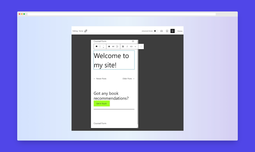
Ability to preview and test mobile designs
Kubio’s preview and testing means users can see how their site will appear on various devices directly from the builder. This feature is important when ensuring your site offers a consistent and optimal user experience, whether viewed on a smartphone, tablet, or desktop. By identifying potential issues such as layout problems, text scaling, or slow loading times during the design phase, you can address them promptly, avoiding potential user frustration and enhancing overall site performance.
Ability to create separate mobile and web designs for your site
One of Kubio’s features is the ability to create separate versions of the design for your site for mobile and desktop viewers. This capability allows for more tailored designs and functionalities, enhancing the user experience for each type of viewer. For instance, mobile users might benefit from more condensed information and simpler navigation options, while desktop users can enjoy a richer, more detailed interface.
This feature is particularly useful for businesses looking to optimize their site’s performance and engagement across different platforms, ensuring that each visitor receives the best possible experience tailored to their device!
When is it useful to create a tailored mobile page?
In many cases, the default mobile pages generated by the Kubio builder will be perfectly sufficient, ensuring a responsive and functional experience across devices. However, there are situations where creating a significantly different version of your website for mobile users makes more sense. These scenarios often involve specific user needs, behaviors, and technical considerations that make a separate mobile site advantageous.
High mobile traffic with different user intent
When a significant portion of your traffic comes from mobile devices, and these users have different intentions or behaviors compared to desktop users, a separate mobile site can be beneficial. For example, mobile users might be seeking quick information, such as contact details or directions, while desktop users might be more interested in detailed content or extensive browsing. If your business sees a high conversion rate from mobile users, investing in a separate mobile site can further enhance the user experience and drive more conversions. This can include mobile-specific promotions, simplified forms, and easy access to customer support.
Mobile-specific features
Certain features are more relevant or useful on mobile devices, such as click-to-call buttons, GPS-based location services, and mobile payment options. A separate mobile site can be designed to leverage these features effectively, providing a more tailored experience for mobile users.
E-commerce optimization
In e-commerce, mobile users often prefer a simplified shopping experience with easy navigation and quick checkout processes. A separate mobile site can focus on these aspects, offering a streamlined shopping cart and payment process that caters specifically to mobile users’ needs.
Content prioritization
Mobile users typically have shorter attention spans and are often looking for specific information quickly. A separate mobile site can prioritize content differently, highlighting the most important information and making it easily accessible. This can include larger buttons, simplified navigation, and concise text.
Avoiding complex responsive design issues
In some cases, the differences between the mobile and desktop versions of a site are so significant that trying to accommodate both with a single responsive design can become overly complex and difficult to manage. Separate sites can simplify development and maintenance by allowing each version to be optimized independently.
Troubleshooting tips on common responsive design issues
Responsive design is crucial for a seamless user experience across devices, but WordPress users often encounter several common issues. These include layout problems, unresponsive elements, and compatibility issues with specific browsers or devices. In this section, we’ll explore actionable solutions to these common pain points, helping you create a responsive and user-friendly website.
Layout issues
Layout issues are among the most common responsive design problems. They often occur because of fixed-width elements or improper use of CSS. To fix layout issues, consider the following tips:
- Flexible grid systems: Use flexible grid systems like CSS Grid or Flexbox to create layouts that adapt to different screen sizes.
- Media queries: Implement media queries in your CSS to apply different styles for different screen sizes. This ensures your layout adjusts appropriately.
- Chrome DevTools: Utilize Chrome DevTools to simulate various screen sizes and identify layout problems. You can access DevTools by right-clicking on your page and selecting “Inspect,” then switching to the “Device Toolbar.”
Unresponsive elements
Unresponsive elements are those that do not adjust properly to different screen sizes. This often occurs due to fixed dimensions or missing CSS properties. To address these issues:
- Fluid widths and heights: Ensure elements have fluid widths and heights using percentages instead of fixed values.
- Responsive images: Use the srcset attribute for images to provide different image sources for different screen sizes.
- Testing tools: Regularly test your site with tools like Google’s Mobile-Friendly Test to identify unresponsive elements.
Compatibility issues with specific browsers or devices
Compatibility issues arise when a site does not function correctly across all browsers or devices. These problems can be mitigated by:
- CSS prefixes: Use CSS prefixes (e.g., -webkit-, -moz-) for newer CSS properties to ensure compatibility with older browsers.
- JavaScript conflicts: Check for JavaScript conflicts that might cause issues in certain browsers. Debugging tools like Chrome DevTools can help identify these conflicts.
- Cross-browser testing: Use tools like BrowserStack to test your website across a wide range of browsers and devices, ensuring consistent performance.
Kubio’s customizable blocks and AI-powered builder are designed to ensure site-wide responsiveness, addressing many common issues automatically. The builder optimizes each site element for mobile users, reducing the likelihood of encountering layout or responsiveness problems. Kubio’s intuitive interface and built-in testing capabilities make it easier to identify and fix compatibility issues, streamlining the design process.
To highlight how Kubio can solve these issues effectively, let’s explore its benefits in different aspects of website design:
Optimizing your header for mobile users
A responsive header is crucial for creating a positive first impression. Kubio’s customizable blocks and AI-powered builder ensure that your header looks great and functions perfectly on all devices. By automatically adjusting the layout and design elements, Kubio reduces the likelihood of encountering responsiveness issues. This means your site’s logo, navigation menu, and any other elements in the header will be displayed optimally on mobile screens, enhancing user experience right from the first interaction.
Ensuring effortless navigation
Kubio’s intuitive interface allows you to create navigation menus that are easy to use on any device. The builder’s responsive design capabilities ensure that menus collapse or expand appropriately on different screen sizes, making site navigation a breeze for mobile users. This reduces frustration and keeps visitors engaged with your content, lowering the risk of them leaving for a competitor’s site.
Enhancing brand identity with customizable blocks
With Kubio’s wide range of customizable blocks, you can create a header that truly reflects your brand identity. The AI-powered builder helps maintain consistency across different devices, ensuring that your brand’s colors, fonts, and styles are preserved whether viewed on a desktop, tablet, or smartphone. This cohesive look and feel helps establish a strong brand presence online.
Streamlining the design process
Kubio’s built-in testing capabilities allow you to preview how your header and other site elements will appear on various devices before going live. This feature makes it easier to identify and fix any compatibility issues, ensuring a smooth and efficient design process. By addressing potential problems early, you can save time and avoid the hassle of post-launch adjustments.
Remember: Regular testing and updating helps maintain a responsive WordPress site. Use mobile compatibility tools frequently to check your site’s performance!
Take your WordPress responsiveness to the next level with Kubio
Responsive design is crucial for enhancing user experience and improving SEO on WordPress sites. With the increasing prevalence of mobile browsing, ensuring your website looks and functions flawlessly across all devices is essential.
While Gutenberg can automatically generate mobile versions, it often falls short in creating unique designs for different devices. This can leave your site looking and feeling generic, failing to engage visitors effectively.
Kubio steps in with unmatched features, allowing users to create tailored, highly functional websites that cater perfectly to every user, regardless of the device they’re using. Kubio’s customizable blocks and AI-powered builder ensure site-wide responsiveness, addressing common issues automatically. The builder optimizes each site element for mobile users, reducing the likelihood of encountering layout or responsiveness problems.
With Kubio, you can effortlessly optimize your site’s responsiveness and unlock a world of customization options. Its intuitive interface and built-in testing capabilities make it easier to identify and fix compatibility issues, streamlining the design process and ensuring your website not only looks great but also performs.
Ready to elevate your WordPress responsiveness and design capabilities? Experience the difference Kubio can make for your website. Get started with Kubio today!