Whether it’s Christmas, Black Friday, Easter…or International Cat Day, if you’re running some special promo campaigns, you need to know how to prepare your website to help you maximize sales.
So, in this article I’m going to talk about:
- How to promote your campaigns on your website;
- UX tips and tricks for higher conversion rates.
Let’s go!
How to promote your campaigns on your website
So, you decided on some discounts or coupon codes. How do you let your website visitors know? You can design some eye-catching dedicated website pages, banners, hello bars, and popups. Let’s take them one by one.
Dedicated website pages
If you have some special products being sold for the campaign, you can revamp a bit your website by adding some dedicated website pages. The idea is that old customer are already used to your website. Habituation can become your enemy. So you need to come up with something that breaks the pattern your customers are used to so that you can induce a sense of novelty and desire.
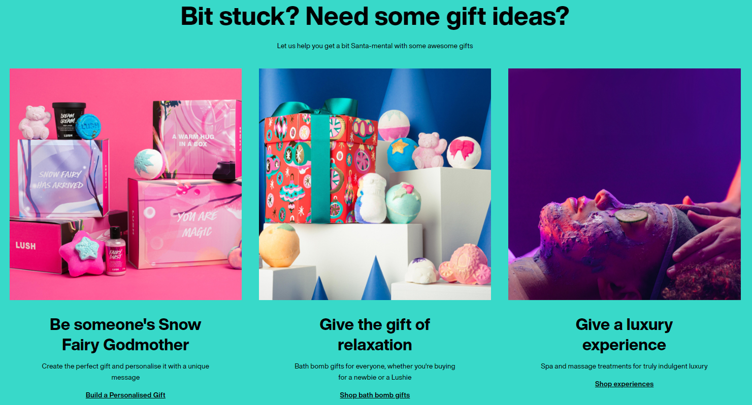
For example, the folks at Lush have bundled some of their products as special Christmas gifts. They always use powerful and eye-catching colors to tell their story.
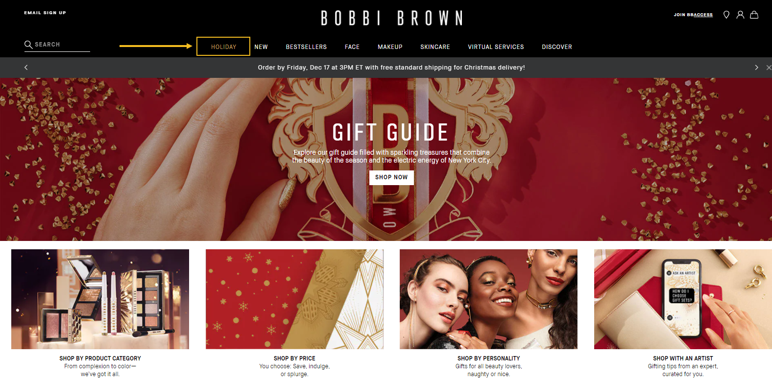
Bobbi Brown Cosmetics has created for “Holiday” sales page for the Christmas season, with lots of product bundles and a gift guide.
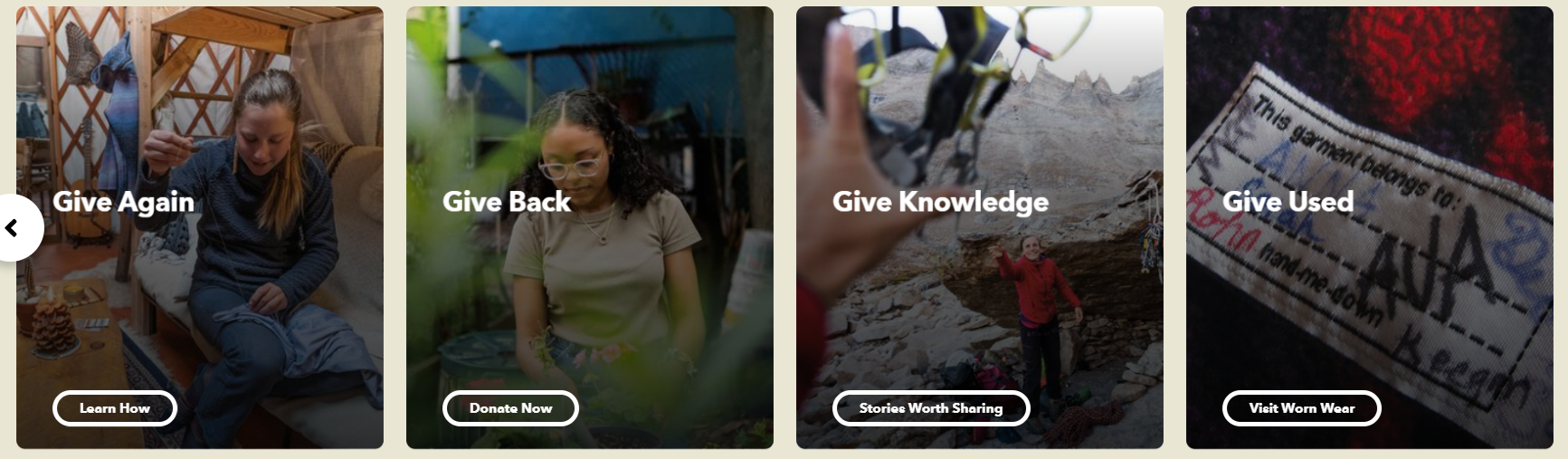
The folks at Patagonia have created some dedicated pages for Christmas on the topic of giving…a damn. For them it’s all about giving back, giving knowledge, giving used stuff, and more. Such campaigns are desired when you know that you share the same beliefs as your audience. And the Patagonia customers are really nature and climate-aware, so they definitely relate to such a campaign.
Website banners
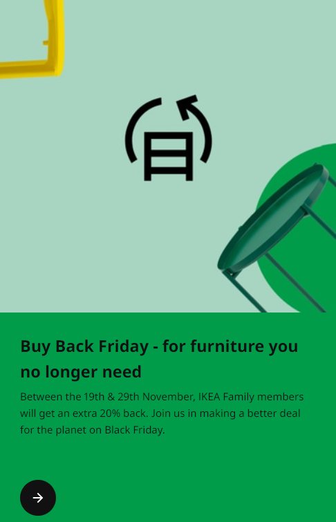
When you start your campaign you need to announce it straight from your homepage using visible banners. For example, Ikea used for Black Friday 2021 a tall banner to announce their campaign for a greener planet.
Here’s another website banner from Usborne:
The folks at Books-a-million are using a carousel of banners with their latest offers. Among them, here’s the Easter banner:
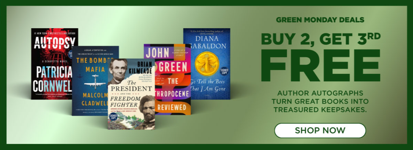
Green Monday is a more recent shopping event…Few online stores are preparing campaigns for this, because it’s right in between Black Friday and Christmas. Books-a-millions is one of them:
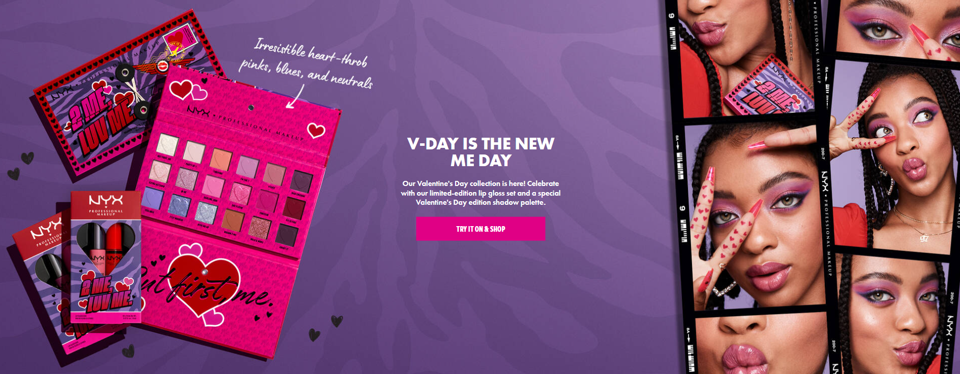
The folks at NYX Cosmetics are inducing FOMO by promoting a limited-edition cosmetics collection for Valentine’s day on their website banner.
Website hello bar
A hello bar or a floating bar is a tiny banner that sits on the top or bottom of a website. It usually carries a welcome message or an important notice. You can use website hello bars to announce your promo messages.
Don’t forget to incorporate FOMO in your copy as well. FOMO is a concept that means “fear of missing out”. You can induce this when you use in your copy “limited edition”, “only 2 days left”, and even countdown timers. This is how you create a sense of urgency that might lead to an increase in sales.
Here is an example of a hello bar from Manta Sleep. They are using an absolute discount instead of a relative one. You could test this out. Some experiments proved that when a product or service costs above $100 when promoting absolute discounts, the sales go up. But this might depend on the niche.

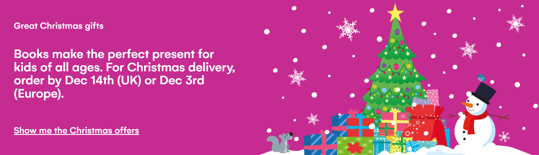
The folks at Barns and Noble use hello bars to notice potential customers that there are few more days left for delivery before Christmas. They are using a countdown timer to announce when standard shipping ends.

Delivery does not depend only on the online store. The delivery partner of an online store has a huge amount of orders to process during seasonal campaigns, especially Christmas. Some of them even hire some extra seasonal workers, but oftentimes the workload gets overwhelming and they can’t process everything. This means that online stores need to set a deadline for orders that need to be delivered before a certain date, to avoid customer frustrations.
Website popup
Popups are windows that appear all of a sudden in the foreground of the visual interface. They are used for lead generation, promotions, etc.
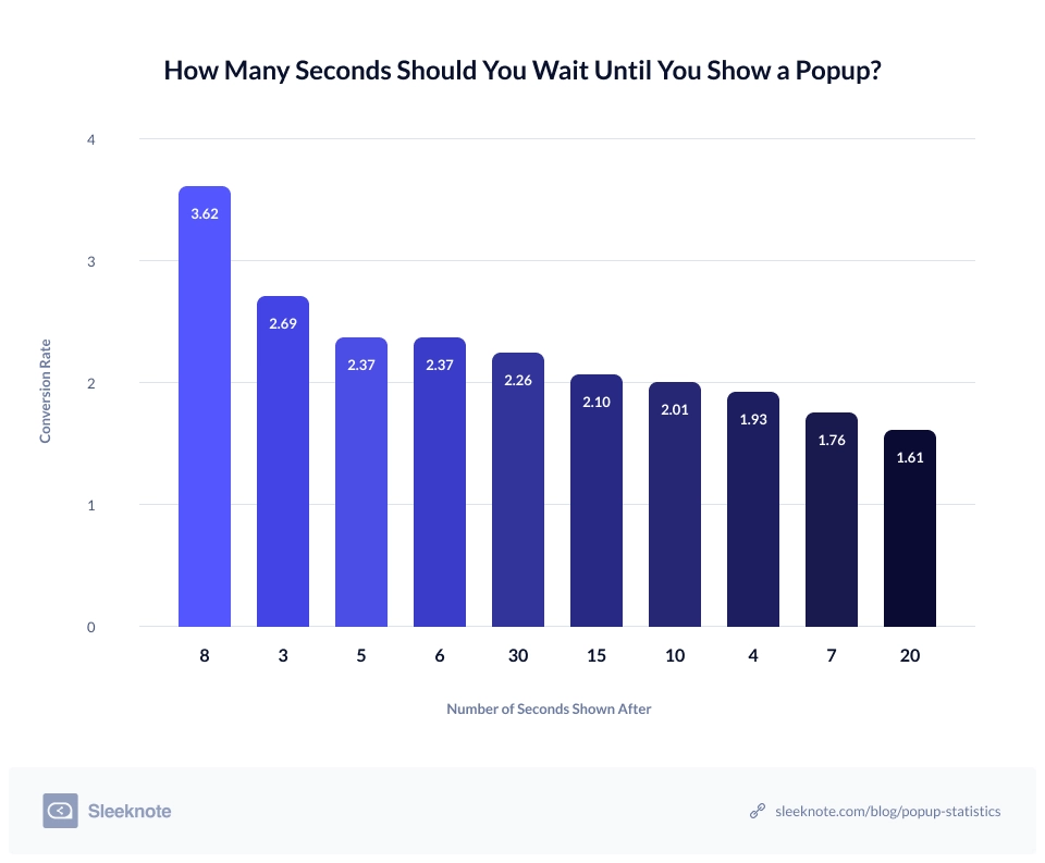
Some marketers love them, some don’t, and the same goes for the users. Now, when used smartly, they do bring in results, as shown by a survey by Sleeknote. For example, they found out that popups that are shown after eight seconds convert better than popups shown before or after.
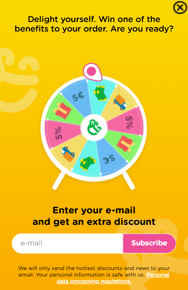
Now, here’s a popup I like. The folks at Dedoles are using a gift spinning wheel in their website popup. One can win an extra benefit for their order when they spin the wheel.
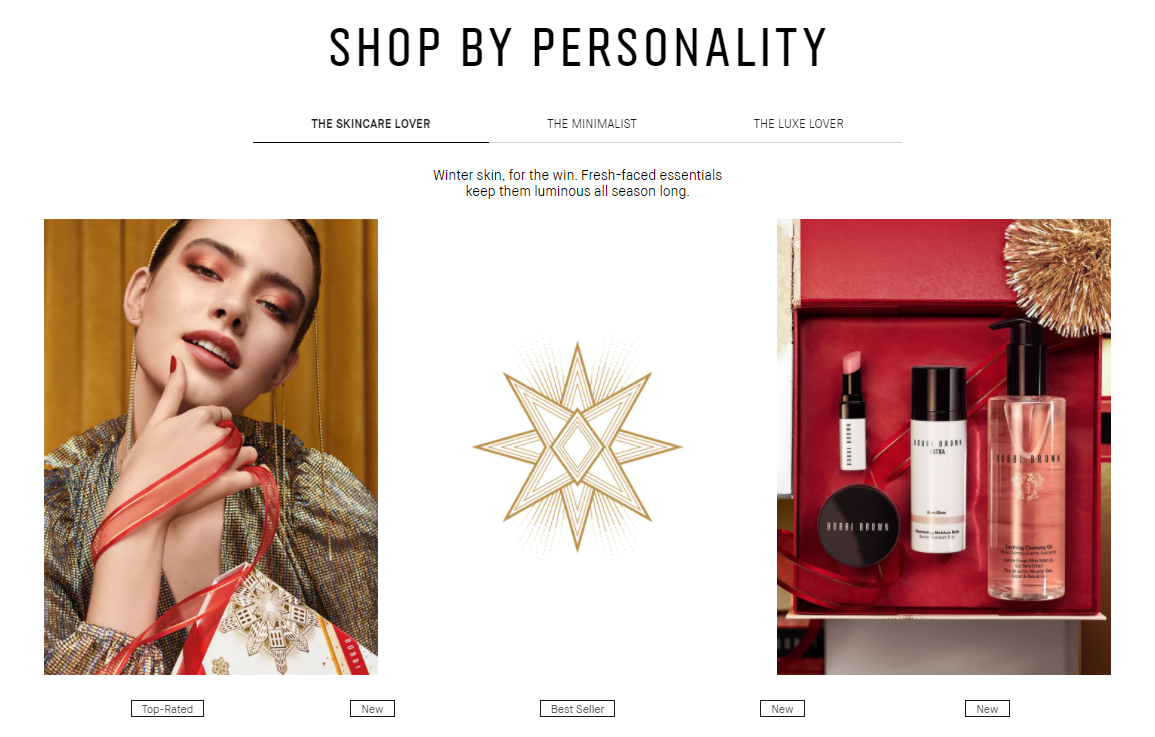
Gift guides
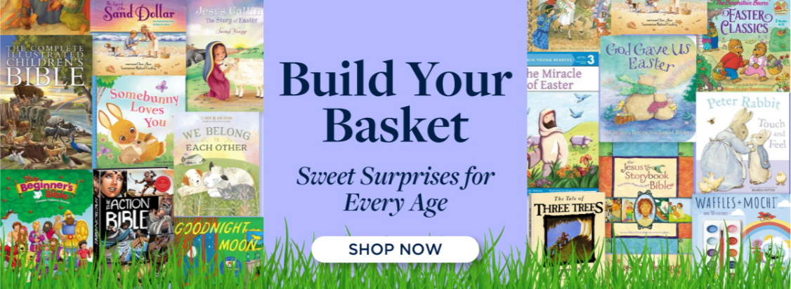
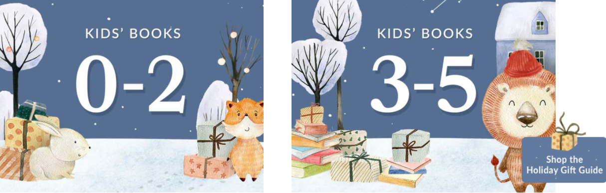
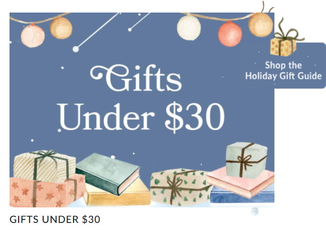
Some holiday seasons are a very good fit for gift guides, like Easter and Christmas. Now, a gift guide should be more than a list of products. It’s very important to segment your gift guides by interest, gender, age,
Take a look at how Barns and Noble tackle the subject of gift guides and segmentation:
Bobbi Brown Cosmetics gives you the option to buy according to your personality.
UX tips and tricks for higher conversion rates
UX refers to the design process that has a sole purpose: providing a seamless experience for users. UX can refer to websites, apps, and even physical goods. It involves the design of the entire process of acquiring, integrating, and using a product, with a focus on function and usability.
In website UX, layouts, visuals, content, navigation, should create both a memorable and useful experience. Good UX should help users find what they need, and even make them come back. Good UX takes into consideration both your business goals and the users’ goals. This means that you really need to know your audience and empathize with it. In the long run, a good website UX will help your brand overall and lead to increased sales and returning visitors.
Now, let’s get to the practical side a bit and talk about website navigation and the checkout process.
How to improve your website’s navigation
Navigation plays a vital role in how users interact with a website in order to achieve a certain goal. Navigation should make it as smooth as possible for the user to get from point A to point B. as smooth as it gets. For this, websites should use:
- Relevant menu,
- Breadcrumbs,
- Filters,
- Sorting options,
- Product categories,
- Search bars.
Besides these, for online stores, you can make it easy for users to come back to previously seen items by allowing them to add an item to a wishlist. The wishlist option should be available not only at the product page level but also from the homepage and category pages as well. This way you avoid users going back and forth to product pages, just to add an item to a wishlist. It can be awfully frustrating.
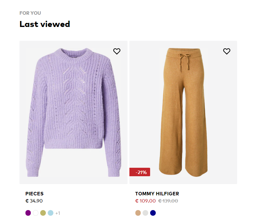
Also, you can add a “Previously seen” section on a product page, like the folks at About You do:
How to improve the checkout experience
The folks at Baymard Institute calculated an average cart abandonment rate based on 46 different studies containing statistics on e-commerce shopping cart abandonment. The result they came up with is 69.82%.
Now, there are some obvious reasons for cart abandonment, such as finding a better product, a cheaper one, or giving up entirely on the product. But, 18% of US shoppers seem to have abandoned orders due to a “too long/complicated checkout process”.
This means that there’s an opportunity here for website owners. And an increase of even 0,5% of the conversion rate can translate into thousands of dollars gained in revenue.
Now, in order to come up with fixes, you need to find out where the friction happens across the checkout process. Events monitoring in Google Analytics can help out, as well as using heatmaps, click maps, and recording sessions. For this, you can employ tools such as Mouseflow or Hotjar.
Here is some advice when the checkout form is too long. You can:
- Chunk the form into several steps to minimize the user’s cognitive load. In this case, cognitive load refers to the amount of mental processing power needed to navigate a site in order to reach an objective.
- Use multi-step forms together with a progress bar to let users know how close they are to the finish line.
- Don’t ask for a ZIP code if the address is required.
- Remove unnecessary steps. Do you really need the user’s date of birth or gender?
- Help users type their email address by suggesting to them the most popular email domains (Gmail, etc).
- Have an option for showing the password during account creation.
- Allow guest shopping and don’t require your visitors to create an account with you.
Wrap up
When it’s time for a seasonal campaign competition grows more fierce than ever. Websites are getting their “new clothes” and getting ready to receive more customers than usual. But how can you deliver a great website experience while maximizing sales?
It’s time to focus more than ever on UX and also to come up with conversion rate optimization ideas.
In the long run, UX, tracking, and measurement should always be a priority for you. Also, user segmentation. If you bring the wrong audience to your website, you won’t be able to improve conversion rates. They all go hand in hand.