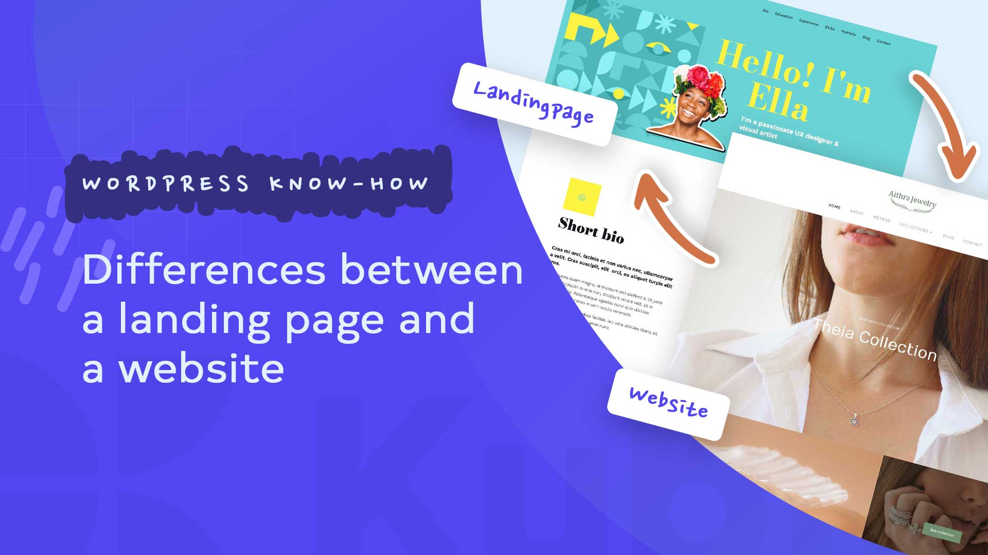
A major problem in online marketing is that it often needs to clarify the difference between a website, a homepage, and a landing page. In this context, questions like these often arise: “What exactly is a landing page, and do I need one if I do have a website?” and “How can I create a landing page?” or “Landing page vs. website, what do I need and why?”
So many questions arise. After reading this article, you will know what a landing page is and the key differences between landing pages and a website/homepage.
A website is the digital presence of you or your company. It is an absolute must-have these days. This website contains all the essential information about you or your company. Among other things, who you are, what you do, what you offer, and preferably also added value in the form of a blog or something similar.
It is structured and usually has several subpages. These are then the individual websites. In addition, the website has a corresponding menu navigation that facilitates orientation and supports surfing behavior.
Different needs – different types of websites
Online shops, which are purely sales tools, have a different structure. They are significantly more extensive. The entire range available to the customer is detailed and presented on the subpages with a product description, photo, and sales price.
Other websites are made for professional bloggers who provide their readers with helpful information about a specific topic and achieve a high reach on the Internet with regular contributions. Some advertise certain products as affiliates and make paid advertising space available on their blog.
What do you need a website for
A search engine-optimized and user-friendly website that always presents up-to-date, high-quality content visually appealingly is a reasonable basis for effective marketing. It is the first port of call for consumers and other visitors who want to find out more about the company, its brand, and its products. And it presents the company as an expert in its field and a professional manufacturer/dealer of high-quality products.
Is it attractively designed, and its content regularly expanded with articles worth reading, it contributes to improving the brand image. Because it and the company’s other advertising media have a uniform design, it has a high recognition value. In the case of an advertising campaign, all advertising materials contain links to the informative website.
What is a landing page?
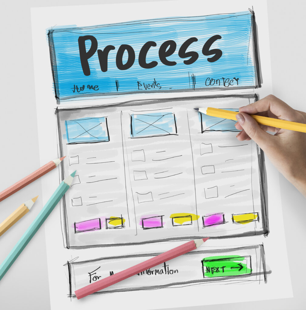
A landing page is a lightweight Internet site specially created for a specific advertising campaign. They are designed without page navigation most of the time. Because it has a different purpose than websites, it is simpler in structure. It contains the most important information about the product advertised on the site, the company logo, some benefits of the product/services, and some customer testimonials.
And it briefly describes the main advantages of the promoted product or service. In order to give the reader a first impression of the high quality and uniqueness of the offer, they can download a free (short) version by clicking on a button.
Anyone who has understood that every page of their website is a potential landing page will soon come up with the idea of creating it in a targeted manner.
For example, you optimize pages for specific search queries that bring visitors via Google. The goal is to offer a landing page for a keyword that Google appreciates and places high in the search results.
Such landing pages are often informative, so the focus is on something other than winning leads or generating sales. Instead, trust should be built first.
The background is that immediate sales or orders are unrealistic in many cases. For example, nobody spontaneously commissions a house construction company or books comprehensive coaching.
For pre-qualified audiences, on the other hand, landing pages can be much more focused on the desired action, such as a purchase, booking, appointment, or order.
These target groups already know the provider and have built up trust. Therefore, you can set up sales pages for them that, for example, do without navigation (no distraction) and transport sales text that is highly psychologically optimized.
The entire content on the landing page is laid out for good readability and leads to a call to action. Then there are two options for the visitor. He either clicks on the visible button, triggers the desired action, or leaves the landing page.
In addition, links lead Internet users from other websites and advertisements placed as part of the campaign to this sales page.

For the conversion work, the landing page must also be search engine optimized. And then, on the first page of Google Search and other search engines stand. In contrast to the standard company website, the landing page usually does not contain any advertising material.
Sales pages are either created to satisfy specific buyer wishes or to arouse and increase visitors’ interest. In the case of the former, the call-to-action encourages purchasing the item described.
Buttons to download are usually clicked by readers who have yet to look for a product explicitly. If the company then has the interested party’s personal name and e-mail address, it can make other exciting offers.
The following things characterize a good landing page:
NO DISTURBING ELEMENTS
Landing pages usually have neither the main menu nor a footer so that visitors can focus entirely on the content and not be distracted by other clickable elements. The links to the imprint and the data protection declaration are usually placed very minimalistically at the bottom of the page.
AN EXCITING/EMOTIONAL HEADLINE
To ensure that the visitor stays on, the heading of the landing page should be highly relevant. This works best by addressing the problem that you are solving with your offer (i.e., your € offer, online course or video training, etc.).
AN EXCITING/EMOTIONAL DESCRIPTION
Again, relevance is vital! Describe in short sentences what is “in it” for your website guest if he registers or carries out your desired action.
This description is usually much shorter with a small freebie than with a large, paid product such as an online course.
Consider the problem it solves when describing your offer for your target audience!
AN ATTRACTIVE GRAPHIC THAT UNDERLINES YOUR OFFER
Pictures and videos will trigger emotions! This is exactly what good landing pages take advantage of by placing suitable graphics / illustrations. These can either be mood pictures or well-presented product pictures:
SOCIAL PROOF – REVIEWS!
Good customer ratings not only have an effect on Amazon but also on your landing page, where they ensure a high conversion rate (= entry rate). So if you have already received some good feedback for your offer, be sure to place it on your landing page to further increase the trust of your visitors.
A CLEAR CTA – CALL TO ACTION
So that your landing page visitors can register or buy your product, you need a so-called CTA – a call to action.
For a product, you can link your CTA button to the payment page.
With an offer, you can use the CTA button to link a popup to the corresponding newsletter form or embed the form directly on the landing page.
It is important to place your CTA not just once but after all the relevant places (e.g., at the top of the page, after the offer description, and again after the customer opinions).
How to create a custom landing page
Kubio Builder is the right solution in order for you to create a custom landing page as you like.
You can create a custom landing page for your needs so that you can increase your sales and generate more leads very easily.
Try it out right now!


