Struggling to customize your WordPress site’s color palette? Your default theme likely only comes with a handful of pre-set colors. In order to truly match your brand and boost your customer experience, you need the ability to customize your color scheme.
The right tool, like an effective website builder, can help you extend your color choices. This guide will explore the importance of color in website design, and introduce Kubio, a solution that can help you easily customize colors for your WordPress site.
Let’s delve into the best techniques to design custom color palettes and the tools that can assist you along the way.
Understanding color psychology in WordPress branding
Color plays a pivotal role in branding, shaping how audiences perceive and engage with a website.
When building WordPress websites with predefined themes, it can be tempting to stick with the default color options. However, the odds are slim that those colors match your branding elsewhere, and if your website doesn’t match the rest of your business’s branding, visitors may not be totally certain they’ve found the right website.
A website’s visual appeal makes a huge impression on visitors’ perception of the site and the business behind it. A study conducted in collaboration with the Expert Journal of Marketing found that 85% of consumers surveyed cited color as a primary factor influencing their purchasing decisions. That’s why the principles of color psychology are essential.
Different colors evoke distinct emotions and associations. For instance, in one study, researchers found that the color combination red and yellow elicited higher positive responses than green and blue.
Consider color psychology – taking into account any cultural color associations that might be present for your target demographic –- when choosing your website’s coloring. The right color combinations can enhance your brand identity and build an emotional connection with your audience.
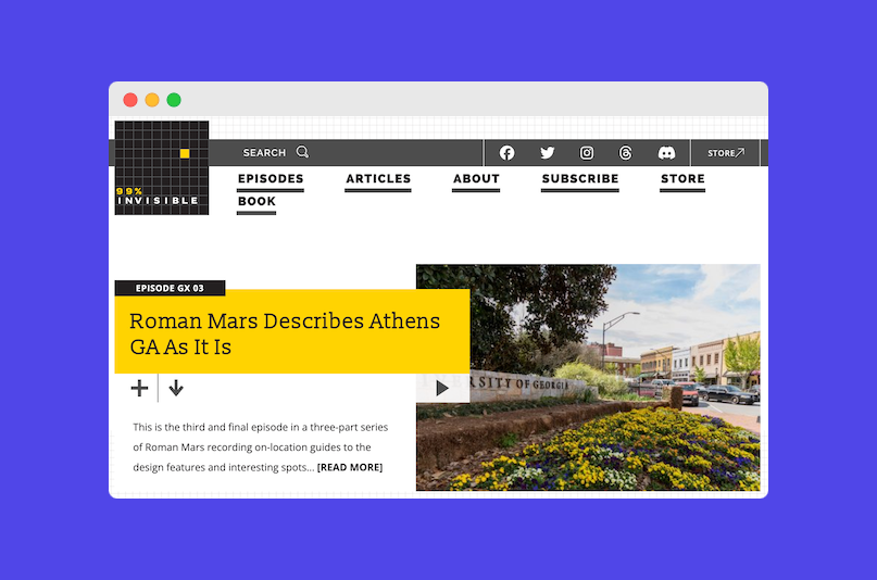
Several WordPress sites out there already illustrate this philosophy in their color schemes. Take, for example, the website for Roman Mars’ architecture and design podcast, “99% Invisible”, which uses bright pops of yellow to inject energy into its design, enticing users to notice things they may not have noticed otherwise – and encouraging them to explore further.
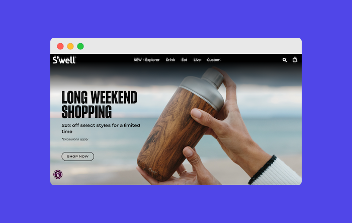
Similarly, the S’well water bottle brand website uses color psychology to its advantage by employing lots of whites, blues, and cool tones. Since these colors and tones are associated with water, this helps to build refreshing and hydrating associations with the S’well brand.
You also want to consider the impact of contrasting and complementary colors when crafting a cohesive color scheme:
- Contrasting colors create a bold effect, ideal for highlighting important elements.
- Complementary colors enhance your brand’s primary colors and create harmony when used together, offering a cohesive color scheme.
Contrasting hues draw attention, while complementary tones build in balance and reinforce branding. Color harmony, the seamless blending of hues to create pleasing aesthetics, can make your website pop. Focus on choosing colors that are brand-oriented, but also pleasing to the eyes. For example, if you are aiming for a minimalist website design, you might decide to go with a monotone or greyscale theme.
Navigating color customization in WordPress
There are many ways to change the colors of your WordPress website. Those with the coding know-how to do so can manually change colors by editing their WordPress files using their hosting providers’ control panel or an SFTP client like FileZilla.
However, this is a techy and involved process, and even users with the know-how to pull it off would likely benefit from a theme- or plugin-assisted color customization process.
Some themes do offer no-code solutions for color customization. However, the specific steps for how to do so – and how much flexibility you’ll have when you try – will vary based on the theme itself.
Many basic and free themes have a handful of built-in color palettes to choose from. They may also include a color selector that allows you to customize each color individually, but not all themes are built to support this. Without a better tool, you might be stuck with choosing colors that are close – but not a perfect match – to your actual brand colors.
However, if your theme is compatible, you can always customize colors using a web-building tool like Kubio. The right web builder will allow you to easily tailor your color scheme to your branding without sacrificing specificity or writing code.
Setting your color scheme with Kubio
Kubio revolutionizes how you select color palettes for your WordPress site with its user-friendly interface and diverse range of features. Take a look at this step-by-step tutorial to change your default color scheme using Kubio. You can:
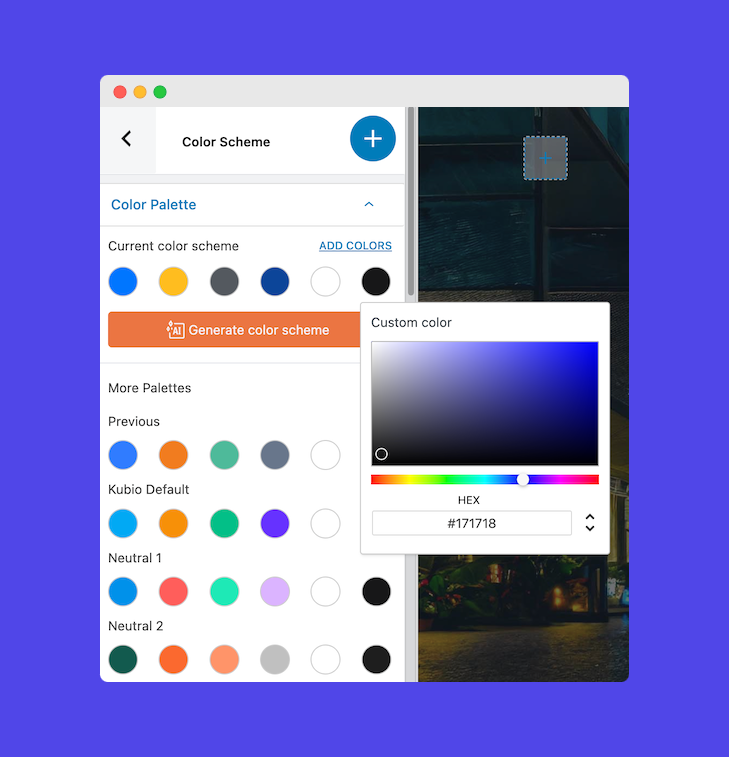
- Modify existing colors by clicking on the respective color block.
- Enhance your palette by seamlessly adding new colors with the “Add Color” button.
- Explore various preset color palettes listed below the current scheme and apply them instantly.
- Click “Generate Color Scheme” for a fresh, AI-generated palette.
Kubio AI also allows you to undo modifications to the current color scheme: So if things go awry, you can easily start over.
Generative AI features for rapid website design
Kubio AI offers a comprehensive suite of features beyond color scheme selection, facilitating swift and high-quality website design:
- Full-site layout generation: With Kubio AI, users can generate entire site layouts effortlessly, eliminating the need for manual HTML, PHP, or any front-end javascript coding.
- Hero image selection: Kubio AI simplifies the process of choosing captivating hero images for your website. By analyzing your brand identity and preferences, Kubio suggests suitable images that enhance visual appeal and engagement.
- First-draft copy creation: Say goodbye to writer’s block with Kubio AI’s first-draft copy creation feature. Kubio generates text and text colors tailored to your brand and audience.
Tools for choosing the right color palette for your site
If you’re not even sure where to start when it comes to your color palette, there are several great tools online you can use. For example, Adobe Color is a completely free online tool that allows users to create color palettes based on a variety of inspirational sources, including extracting colors from an image or using specific color harmony settings. It then provides the hex codes for each color for easy record keeping.
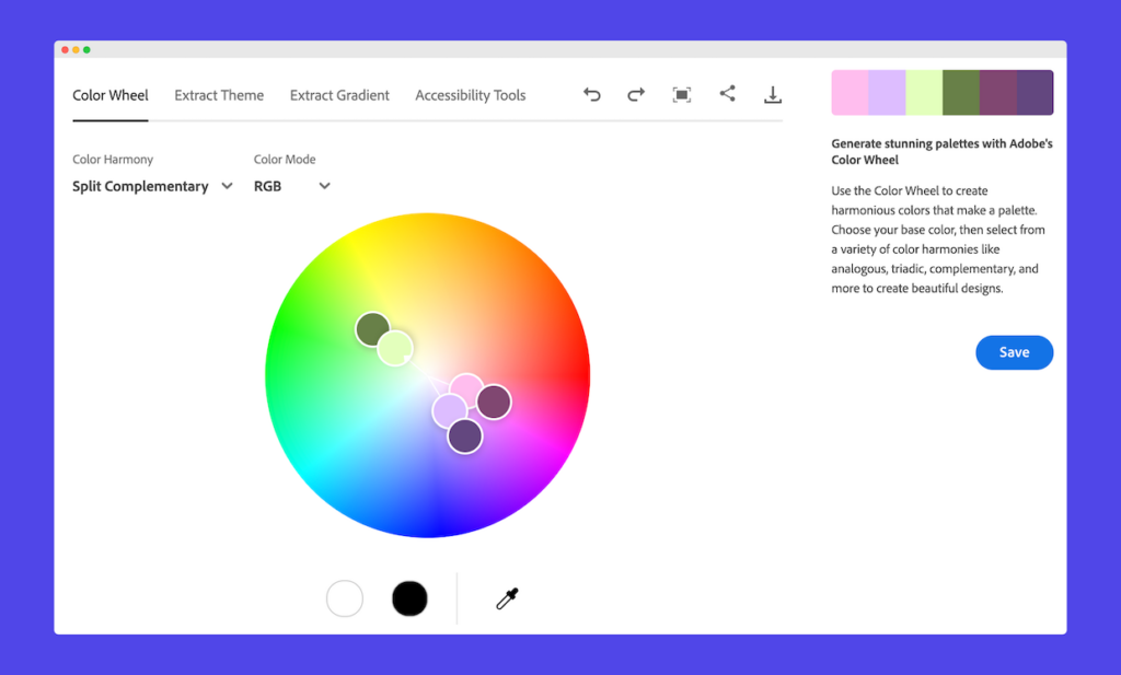
There are some drawbacks to the tool: You can’t save your palettes without an Adobe account, and the interface can be intimidating for newbies to color theory. However, with a little experimenting, many people find they can overcome the tool’s learning curve.
That said, if you’re on the hunt for a simpler tool, Coolors may be a better match. This is a super beginner friendly and intuitive tool. It allows you to generate and lock in color schemes rapidly by just pressing the spacebar so you can gradually build a palette you love.
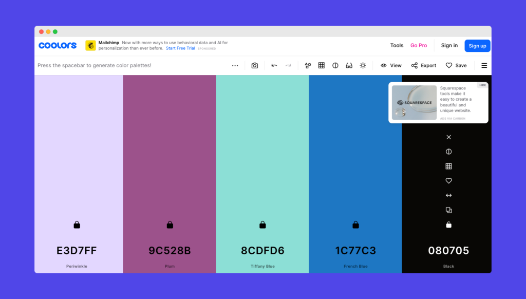
Reviews also note that it’s just downright fun to use. Moreover, the tool has community made and pre-generated palettes to start from and tweak. Lastly, its palette generator tool will automatically generate previews of marketing materials featuring the colors you’ve chosen so you can see the shades in action.
Quick beginner tips for understanding color harmony
Many tools online are designed to simplify or automate the process of choosing a harmonious color palette. Still, it’s useful to have a basic enough understanding of color harmony to be able to identify which tools are – or aren’t – doing this well.
For example, you should familiarize yourself with the color wheel and basic color theory concepts like complementary, analogous, and triadic color schemes. Use analogous colors (colors beside one another on the color wheel) for a harmonious vibe, and contrasting colors (opposite ends of the wheel) for accents.
Start with your brand’s key color or colors, and build the rest of the palette to match. Try to keep saturation relatively consistent across the palette, but use a variety of lighter and darker tones. Take care to ensure sufficient contrast between text and background colors for readability and accessibility.
Create a well-branded website with Kubio
The right color scheme can make a huge difference when it comes to creating a website that makes the right impression for visitors. That’s why it’s so important to be able to easily customize and tailor your website’s colors to match your brand.
Kubio offers a seamless solution for creating visually appealing websites thanks to its robust color selection and customization features. Try Kubio today and experience its exceptional capabilities first hand so you can craft stunning websites with ease!


