The Gutenberg WordPress experience was launched back in 2018. It did not receive a too warm welcome from many WordPress users.
Since then, the new Editor grew like Prince Charming. It managed to move beyond an MVP. It is now a mature product, and it seems that its goal for achieving full-site editing is now closer than ever. The deadline is Jan 25th, 2022.
Let’s see how the Gutenberg Editor grew, and how the future looks like for WordPress.
So, here’s what we’re going to talk about in this article:
- An intro to the Gutenberg Editor
- The Gutenberg Editor vs the Classic Editor vs Page Builders
- How to work with Gutenberg Blocks
- The Kubio Page Builder: Getting the Best Out of Two Worlds
- What’s next for WordPress and Gutenberg?
Sounds like a plan, right? Let’s get going then.
An intro to the Gutenberg Editor
The Gutenberg Editor became the default WordPress Editor. But, WordPress users can always switch back to the Classic Editor, if they install the Classic Editor plugin.
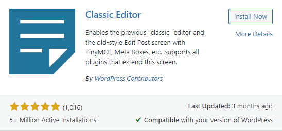
In case you’re wondering which one you’re using now, here’s how the Gutenberg Editor looks like
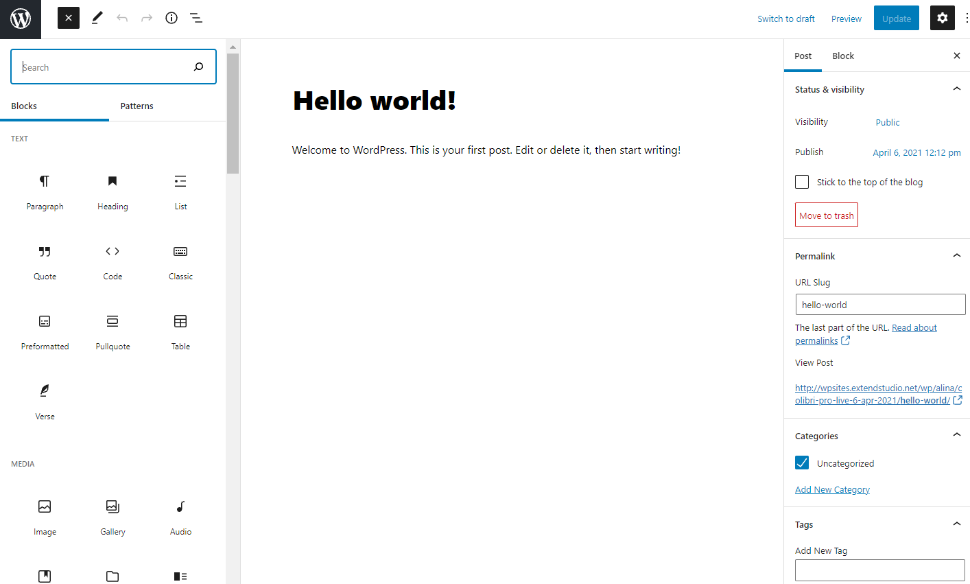
and here’s how the Classic WordPress Editor (TinyMCE) looks like:
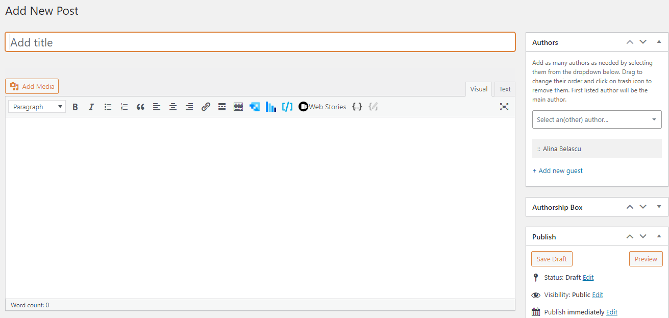
The WordPress Classic Editor is pretty basic and behaves like a simple text editor. It can be easily used to write posts, in a design controlled by the overall chosen theme. On the other hand, if you want to create advanced website pages, well, you’d be facing a mission almost impossible.
You would have to work in the WordPress Customizer. This is how you usually access the Customizer:
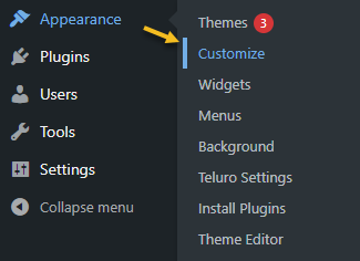
The Customizer’s look and features would depend from theme to theme, and it would allow you to make all sorts of content changes, with no code.
Now, WordPress page builders manage to take the WordPress Customizer to a whole new level. They allow all sorts of customizations that transcend the themes options. Most of them also work by drag and drop, and this makes very intuitive web design tools. Just take a look at the demo below from the Colibri page builder, for example.
The Gutenberg Editor, on the other hand, relies on content types called blocks. This is why it is also called the Block Editor. It allows WordPress users to add various types of blocks to their web page and to stylize them. Each heading is a block, each image is a block, and so on and so forth.
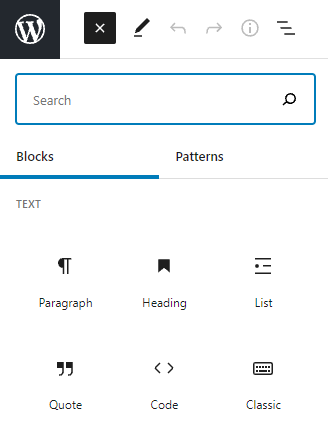
The community has already begun to enrich the Block Editor with new blocks, besides the WordPress default ones. We’ll dive into the blocks topic later in the article.
Now, the Gutenberg Editor wants to be more than a text editor. The long-term plans envision an editor that allows full-site editing, but we’ll talk about this at the end of our story. So stay tuned!
The Gutenberg Editor vs the Classic Editor vs Page Builders
Now, it seems we have the following options for creating a website in WordPress:
- The Classic Editor
- The Gutenberg Editor
- The WordPress Customizer
- Page Builders
Let’s take a look at their pros and cons. I will exclude the WordPress Customizer because it can function differently depending on the theme you choose.
| Pros | Cons | |
| Gutenberg Editor | Because it’s a core WordPress feature, it is compatible with every WordPress theme. Websites built with this editor are faster than the ones built with page builders. If you’re new to WordPress and you need a simple design, go with the Gutenberg Editor. This will be the future of WordPress. | Each paragraph gets its own block, and it can feel odd. Less formatting and styling options than the ones available in Page Builders. |
| Classic Editor | Handles better massive posts compared to the Block editor. | It merely works like a text editor. Your hands are tight when it comes to design, unless you use CSS. |
| Page Builders | Visual editing is managed better inside page builders. Customizations can go as far as pixel-perfection. Many of them work seamlessly by drag and drop. They have pre-designed sections ready to be customized. They offer a lot more design flexibility than the WordPress block editor. | Some of them are not fully compatible with any WordPress theme. |
Now, we might say that the Gutenberg editor is no longer in its infancy. He’s a toddler now. The community is getting involved in creating new blocks, in improving the experience. But there’s still work to be done.
How to work with Gutenberg Blocks
Inside the WordPress Gutenberg Editor, there are default blocks that you can work with. If you use additional WordPress blocks plugins, you’ll be seeing the extra blocks here as well. You can use the blocks on any page or post. If you go to the “+” sign in the upper-left corner, you’ll see all the available Gutenberg blocks.
You will see the “+” sign on your canvas as well. When you’ll click it, you’ll see a list of blocks that you can choose from:
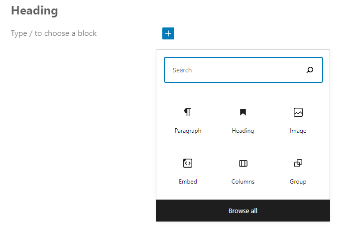
Here are some default blocks: paragraph, heading, image, columns, embed, list, table, gallery, buttons, shortcode, custom HTML, and more.
Let’s play with a block, shall we?
I’m going to add a button.
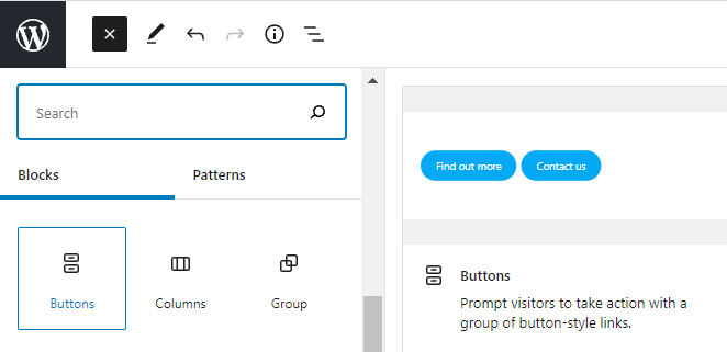
The moment I add the button block, I can add text to it.
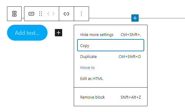
There’s a basic panel that shows up while hovering over the button. This panel allows me to:
- Adjust the position of the button:
Here you have two options. When you select the 6 dots, you will have the option to drag and drop the block where you want. When you select the up and down arrows, you will move the block up and down.
- Add a hyperlink to the button
- Copy the button
- Remove the button
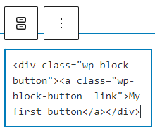
- Edit the block as HTML
At the same time, you can see new styling options on the right (while the block is selected).
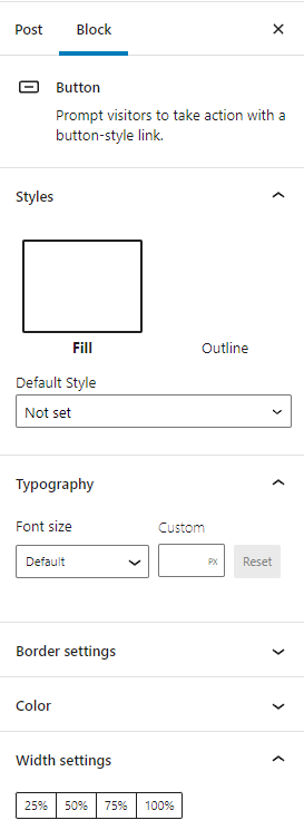
Here you will be able to:
- Make font changes;
- Adjust colors and borders;
- Adjust the size;
- Add CSS classes.
Now, the styling options will differ slightly from block to block. What you need to remember is to hover over your block for some basic editing options, and to check the options on the panel on the right, for advanced customizations.
And that’s about it. Wasn’t that hard, was it?
Here, at Kubio, we went ahead a bit and created a product that is at the crossroads between the Block Editor and Page Builders. We took what was best in the two worlds and created a block-based page builder!
Let’s take a look at how Kubio is taking the Block Editor to a whole new level.
The Kubio Page Builder: Getting the Best Out of Two Worlds
Kubio is a website builder designed on top of the Default WordPress Editor, also called Gutenberg. This means that it’s block-based.
Before launching Kubio, our flagship product was called Colibri, it was a very popular drag and drop WordPress page builder, that had 100,000+ users. Because the user experience in Colibri was very well received, we decided to take that experience on top of Gutenberg. This way we migrated the experience of Colibri to the new WordPress experience, Gutenberg. We think it can’t get any better than this. We replicated a recipe that worked and took it to the future.
Now, Kubio enriches the Default WordPress Editor with new blocks and with multiple styling options, that go far beyond the default ones.
You can access the blocks as shown earlier. If you go to the “+” sign in the upper-left corner, you’ll see all the available Gutenberg blocks. The default WordPress blocks have black icons, while the Kubio ones have blue & green icons. The Kubio blocks are shown first.
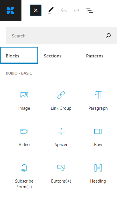
Here are some extra blocks that you’ll definitely enjoy: image gallery, map, carousel, flipbox, tabs, accordion, counter, slider, etc.
The full power of Kubio gets unleashed from the panel on the right. The moment you add any block to the canvas and select it, you’ll be seeing an editing panel on the right with 3 options. Inside these three options, the settings will vary depending on the chosen block:
- Content
- Style
- Advanced
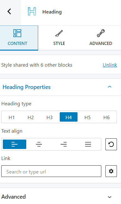
From typography, colors, backgrounds, spacing, to effects, you can literally control the design of all your blocks in this panel.
Besides the possibility to edit any block the way you want it to, Kubio also grants you full control over the website’s general settings. You can redefine your overall website styling, from typography to color schemes and effects.
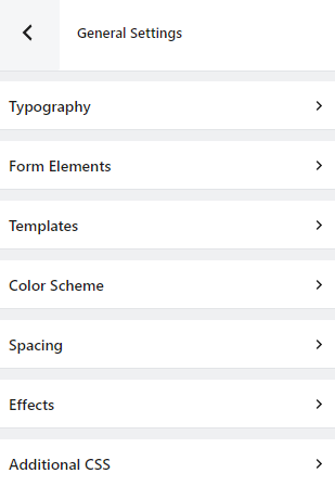
With Kubio we managed to bridge the gap between Gutenberg and WordPress page builders, and also make it up for some features Gutenberg is lacking.
What’s next for WordPress and Gutenberg?
With Gutenberg, the goal is to finally achieve full-site editing, meaning that you’ll be able to edit all parts of your site using the Default editor, from header and footer to sidebars, in a single interface. Right now, the footer and sidebars are managed outside the pages and their content.
Starting Jan 25th, 2022, full-site editing should become the norm, and the Kubio builder will be there to help you bring to life the website you envision, on top of the latest WordPress developments.
If you liked this article, and want to have access to similar content, make sure to subscribe to our YouTube Channel. You can also follow us on Facebook.


