
Before jumping into any web page design you need to figure out how and where to place the content elements (text, visuals, etc.). A popular approach to this is to use a grid system inside a wireframe.
Basically, a wireframe is the skeleton for your design. The purpose of the grid is to help guide the placement, sizing, alignment, order, and responsiveness on your page.
The Website Grid: the Basics
A website grid is a structure composed of a series of lines that divide a page into columns and rows. Basically we’ll end up having a layout made of rectangles and squares.
They can sctretch across the whole width of a screen, making the design full-width, like here:
or you can have the content inside a container that is centered and has a maximum width, like here:
Grids allow for a modular approach in web design.
There are various grid layouts out there, but, at the end of the day, they all revolve around a structure based on columns and rows.
In Kubio there’s another concept we’re working with: sections.
Website sections are wider areas that stretch across the full-width of the screen that can contain various columns, rows, and content blocks. A section can focus on a specific topic related to the business promoted on the site. One section can cover the pricing of a product, another one can present the features of a product, or the portfolio.
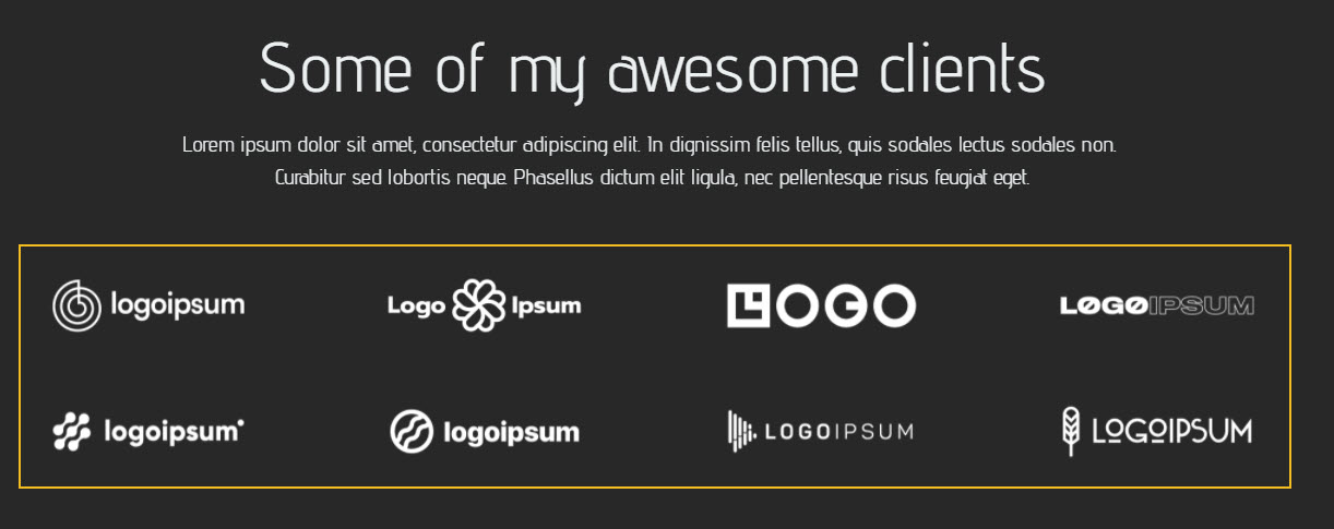
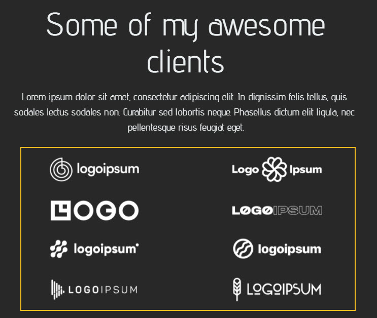
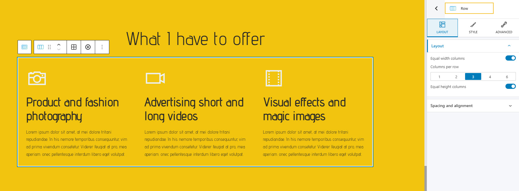
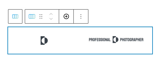
For example, here we have a section that presents the services of a photographer:
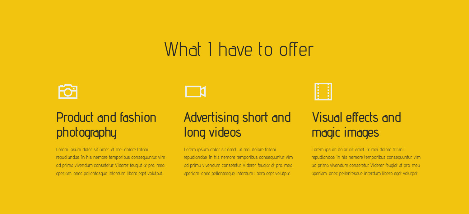
It has three columns, each with its own icon and description, and a section title. You can read more about columns, below.
Sections in Kubio
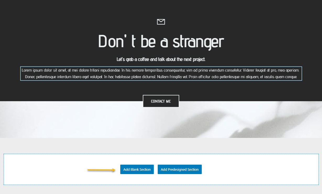
In Kubio you can add both blank and predefined sections to a web page.
You just have to go to the bottom of a page and click on one of the buttons.
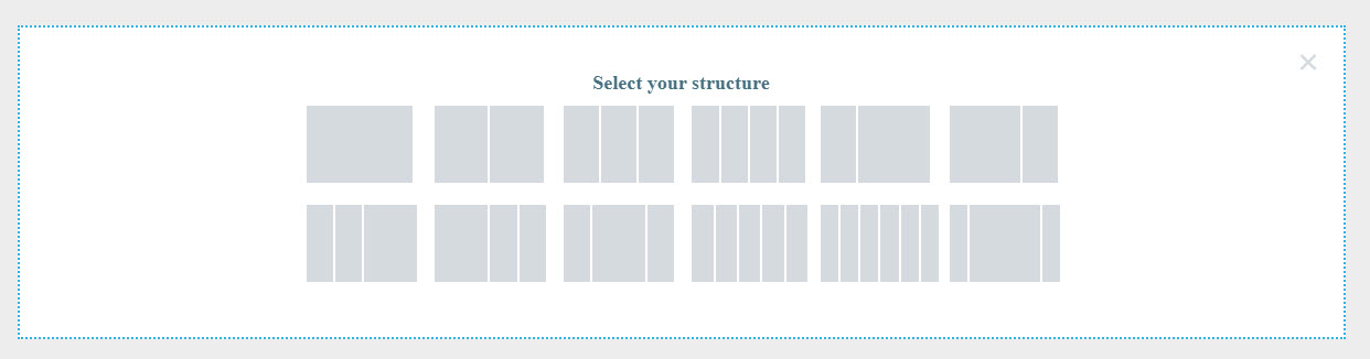
In the case of blank sections you can choose a specific structure.
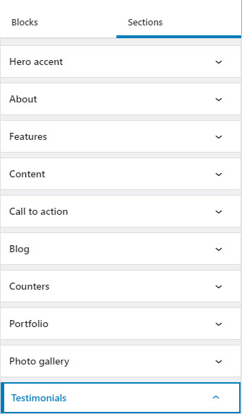
In the case of predefined sections, you can choose a specific topic: hero, team, pricing, features, etc.
Columns
Columns split the height of a web page in vertical sections. According to best case practices, the traditional number of columns is 12 on desktop, 8 on tablet, 4 or less on mobile.
Why 12? Because you can divide it by 2, 3, 4, and 6, this makes it easy to merge certain columns, without ruining the balance of a design.
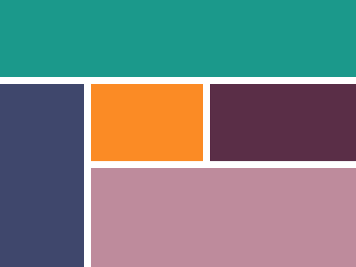
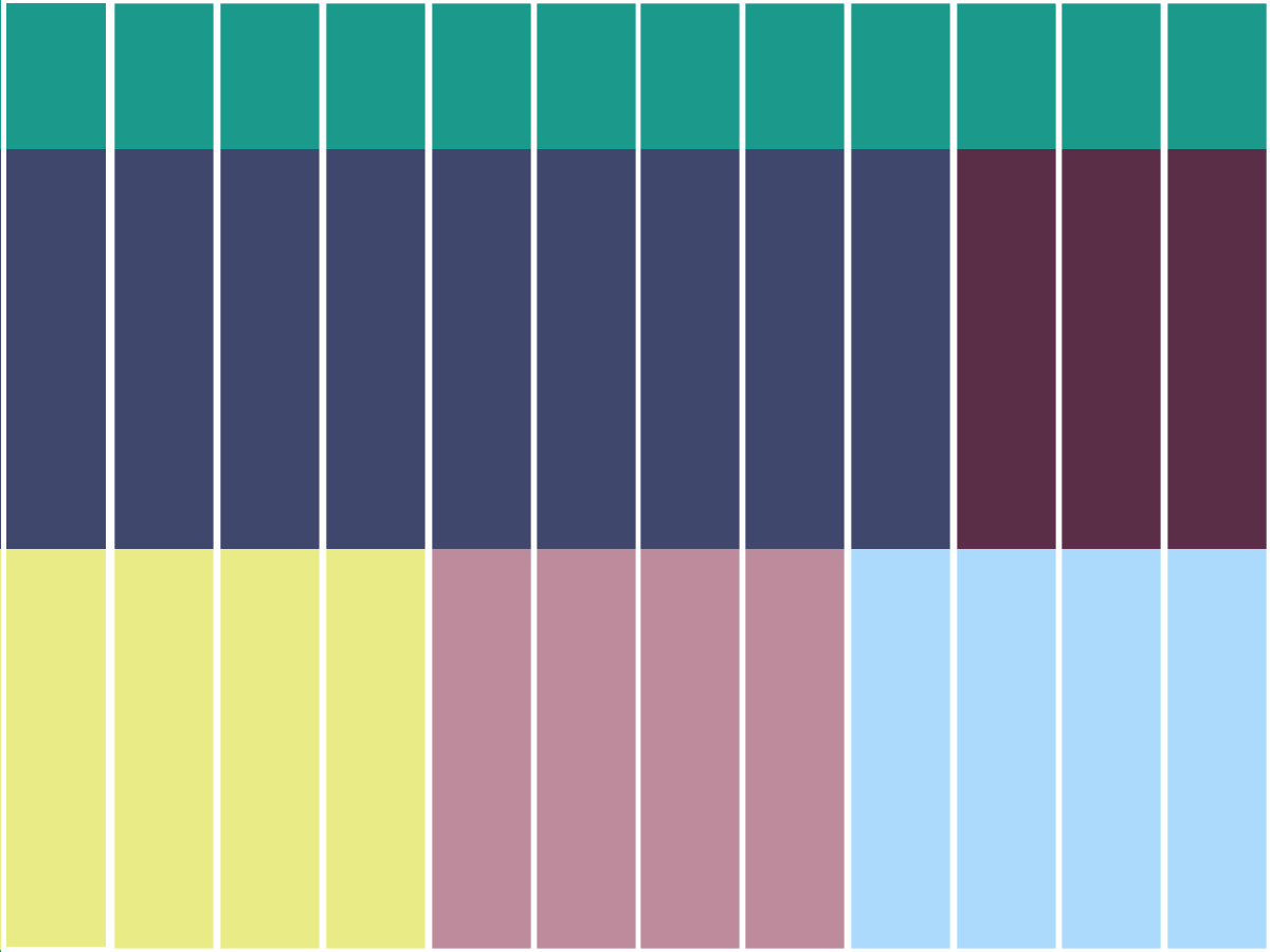
For example, the following 12-column grid has 3 main parts:
- The first part stretches across all the 12 columns
- The second row contains two parts, one stretching across 9 columns, and one across the other 3.
- 3 equal-width sections, each spreading across 4 columns.
Also, the number of columns is important when you want your design to look good on smaller devices as well.
For example, a 6-column design might collapse on a tablet into 2 rows with 3 columns each, or 3 rows with 2 columns each. In the example below, we have 2 rows each with 4 columns, on desktop.
On tablet and mobile , the grid changes to a 2 column design.
This means that the number of columns changes across devices, and their width as well.
Columns in Kubio
In Kubio, the moment you add a new blank section you are asked to select the number of columns.
This is a section that has 4 columns.
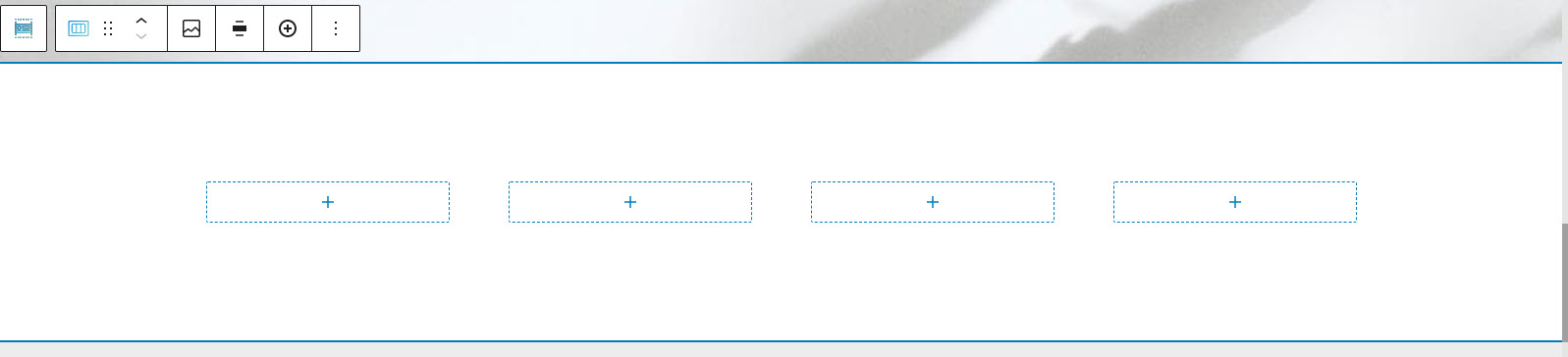
You can use the toolbar above it to add or remove columns.
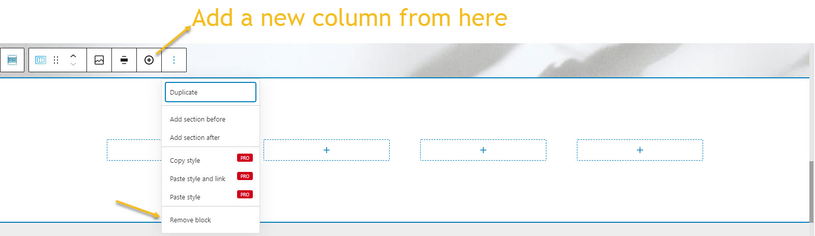
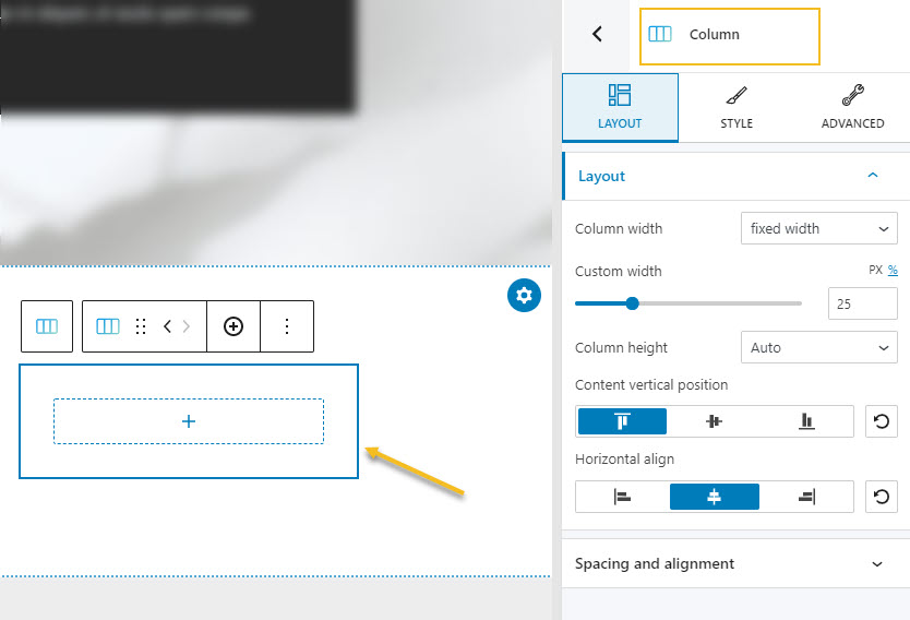
If you want to style a column, you can select it, then use the editor on the right.
.
Rows
You noticed that I mentioned rows above. Rows are used to arrange content horizontally. Their height grows with the height of the elements added to it. But you can also specify a minimum height, if you want.
Rows in Kubio
By default, the moment you add any column in Kubio, a row will automatically be created containing that column. You don’t need to actually add it by yourself. Simply put, this happens behind the scenes.
For example, this is a section to which 3 columns were added. If you look closer, the columns are nested inside a row. This is helpful to know when it comes to column alignment, for example. You won’t need to align each column separately, but go ahead and set this up at the row level. But this is a topic we’ll tackle a bit later in this article, in the chapter about nested elements and parent-children relationships.
Kubio is a block based WordPress website builder, meaning that each type of content goes inside a block, from paragraphs, headings, to icons and image galleries. There is also a row block available.
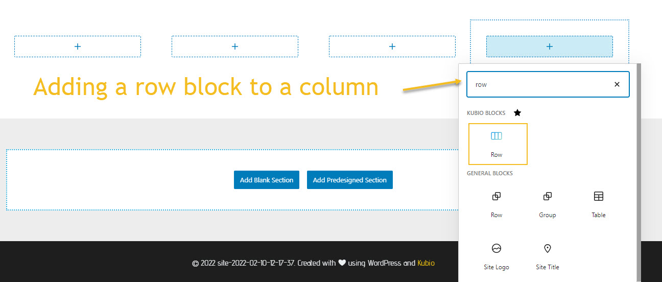
By default, the row will have two columns, but you can add more if you want. You could use it to add the logo images of partners, for example.
Margins and paddings: getting to know each other
As you’ve already noticed, most of the time a website grid has invisible row and column lines. Their underlying structure can guide you with the entire layout of a website, the ratios between elements, and the space between them.
An effective website grid guides the user eye to its most important elements via the right proportions, sizes, and spacing. These are used to create a certain visual hierarchy, and to make it easy for users to scan the content of a page.
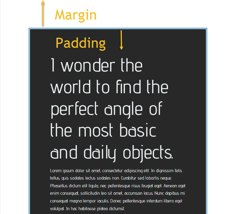
When you add a new section, or you place content inside a section, you need to think about the spacing around and inside the elements.
Margins refer to the outer space beyond the borders of an element, while paddings refer to the inner space of an element.
What you must remember is that you need to be consistent with spacing, across all elements and pages, else you will create visual noise.
This is why, most of the templates and themes out there have predefined spacing, meaning that they are set globally, so that they affect every element in the same way.
This being said, we can now move on to our next topic: global styles and inherited styles.
Nesting and Inherited Styles
I mentioned briefly at the beginning of this article that you can have columns nested inside a row. But what exactly is “nesting”? It refers to placing elements one inside another. Let’s say we are adding a button inside a column, we can say that the button is nested inside the column. The column will behave like a “parent”, while the button is the “child”. Let’s say we want to nest two buttons inside the same column. They would become “siblings”. The “child” element can have “children” as well.
It’s important to understand which element is the parent, the grandparent, or the child in a design, because the hierarchy matters when it comes to font color styling. For example, let’s say a column has certain font colors for headings and paragraphs. All the elements in the column will inherit that styling. Color styling gets passed down to child and grandchild elements, just like genes. These styles can be overridden at child level, but they won’t affect the parent. At the end of the day, the most granular style will win.
Nesting in Kubio
Let’s look at an example and better understand the hierarchy of elements inside a web page. No matter the theme, template, or builder you use, nesting and hierarchy are a common principle in web design.
In Kubio there are two main ways for identifying nested elements:
- The breadcrumb view
- The list view
Let’s take them one by one.
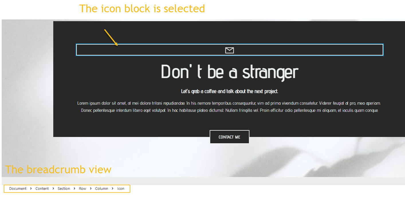
The breadcrumb view
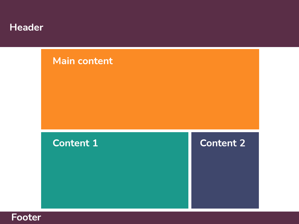
Whenever you select any block on a page, if you look at the bottom of the canvas you’ll notice a breadcrumb bar. For example, the icon below is nested inside a column, the column is nested inside a row. The row is the grandparent of the icon, and the parent of the row.
The hierarchy starts with the Document – the top level element of pages in Kubio. In HTML, this is called “Body”.
What’s missing from this view is the potential siblings. For this you can use the next view.
The list view
You can toggle the list view from the upper-left.

The moment I select an element from the list view, it gets highlighted in the website canvas. For example, let’s head over to the hero in the list view, and select the second heading. In the canvas, the heading (H1) gets highlighted by borders.

Both the headings in the hero block are siblings, having the same column parent. They also have the same indentation. In the breadcrumb view, you can’t visualize the siblings, this is why I like the list view.
In the list view, the indentation guides you to understand which elements are parents to certain elements, or which elements are the children or siblings of another element. The more content blocks are nested inside one another, the more those blocks get indented.
Global styling in Kubio
Each theme comes with some predefined colors, font styles, spacing, and more. This is because design consistency is very important. This way you avoid visual noises.
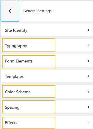
The Kubio setup is done inside “General Settings”.
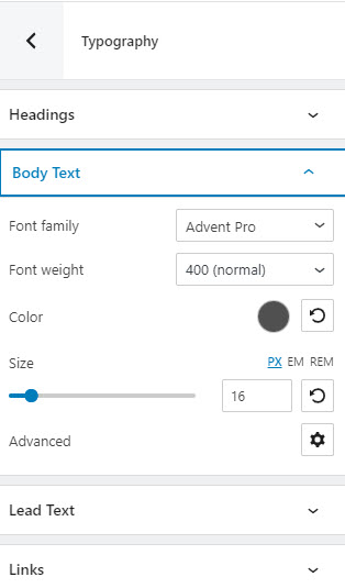
From here you can set up the global styling for typography, colors, spacing, forms, and transition duration for effects.
Let’s say that the default font families are Montserrat and Lora, and you want to change to Montserrat and Roboto. You won’t need to change every single paragraph, headline, or button text individually. You just set them up at the global level, and this change will be reflected across the whole website. You can also adjust the font color, weight, size, and more across paragraphs, headings, links, etc.
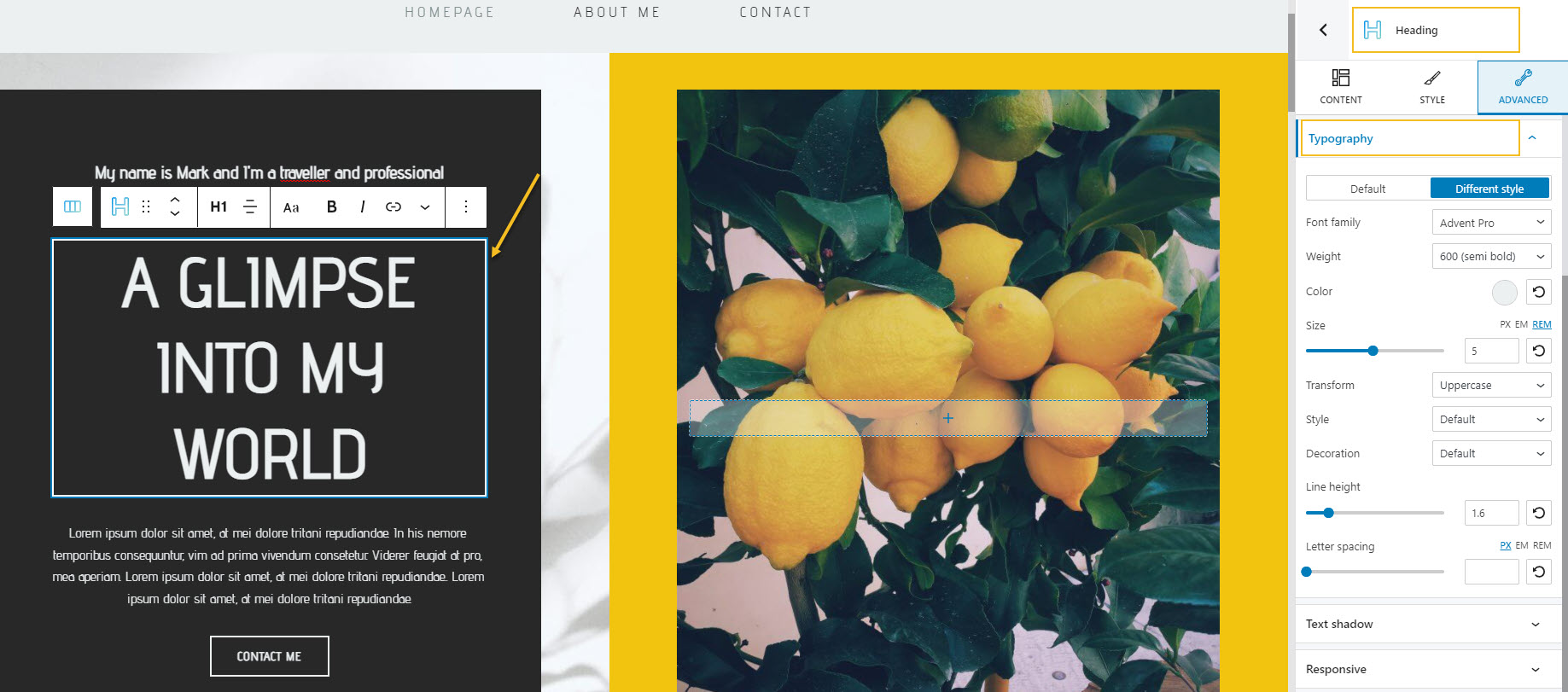
You can always override the global settings. You can do this at an individual heading level. Just select your desired block, and go to Advanced -> Typography, in the block editor on the right. In the example below I selected the main website heading from the canvas. To the right, you can see that I’m making typography changes to the heading block.
Now, ideally, you would rarely need to override the global settings. You can find more information on Kubio global settings here.
Now, let’s take a look at a use case.
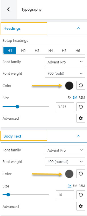
As mentioned earlier, font colors are inherited from parent to child. The moment you add a new section in Kubio, and nest inside it a heading and a paragraph, their font color will be the default one.
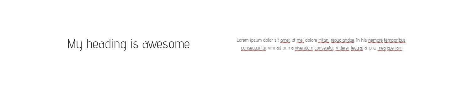
In this example the default heading color is black (for all sizes, from H1 to H6), while the paragraphs are gray.
Here’s how the section looks like:
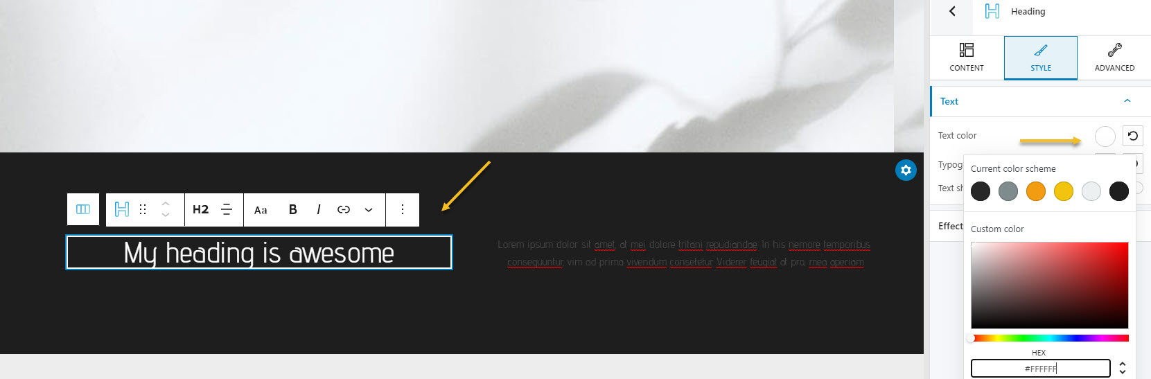
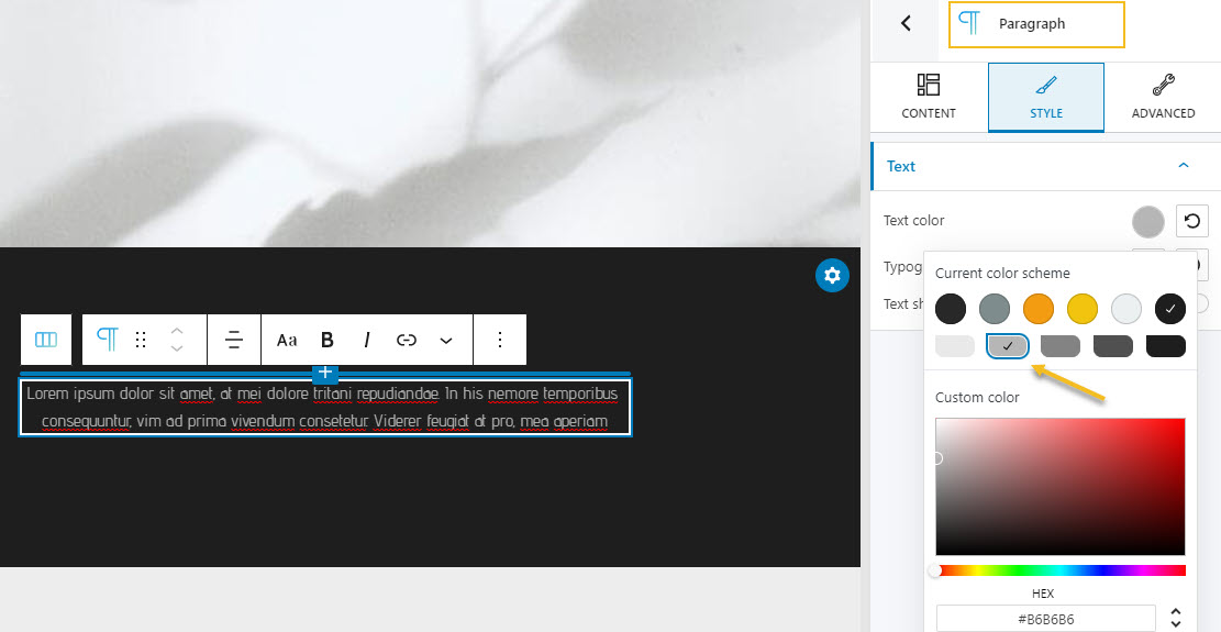
The moment we add a black background color to the section, the heading and paragraph won’t be visible.
We will need to change the color to white, or another color that works with the overall brand color. Let’s go with white for the heading, and a very light gray for the paragraph. This will be done at the block level inside Advanced -> Typography -> Color or Style -> Text Color.
And that was all, folks!
I hope that I managed to shine a light a bit on how elements are structured inside a web page, so that you can better build your layouts.
We also have a video tutorial on the topic:
If you liked this article, and want to have access to similar content, make sure to subscribe to our YouTube Channel. You can also follow us on Facebook.