Minimalism has taken the world by storm in many areas: from interior design, to lifestyle. Many of us are now familiar with Marie Kondo, for example.
So, web design couldn’t escape this trend as well. Minimalism in web design is about removing the clutter and seeking to simplify interfaces by removing unnecessary elements or content that does not support the user experience.
Now, in this article I’m going to introduce you to some WordPress themes that proudly represent the minimalist design. But first, let’s describe the actual characteristics of a minimalist WordPress theme theme.
What makes a WordPress theme minimalist?
The following defining characteristics have been listed by the Nielsen group. So, this is science people!
- Flat patterns and textures does not always equal minimalist design
Flat design refers to removing unnecessary shadows, gradients, and textures. Now, in order to provide a good user experience that embraces minimalism, the folks at Nielsen suggest an approach that combines flat design with a skeuomorphic approach. Skeuomorphic designs refer to graphics that look like real-life objects. This means that interactive components must retain sufficient cues to suggest clickability. Signaling clickability with cues such as color, size, borders, can give interactive components the proper look. Oftentimes, with flat design, this is overlooked. And this is why skeuomorphic design can come to the rescue.
- Limited or monochromatic color palette
Color should be used strategically to create visual interest or direct attention without adding any additional graphics. With less visual information trying to capture the visitor’s attention, the color palettes will be more noticeable and pleasing to the eye. Ideally, the color palette should use only one bold color as an accent, highlighting the most important elements of the site. These accented elements are usually clickable.
- Restricted features and elements
Like I said earlier, minimalist design will remove unnecessary elements. So, you should always ask yourself: Do I need these elements:
- Images
- Links
- Menu items
- Dividers
- Shapes
- Icons
- Textures?
For example, if you’re using a co-working theme, you might opt to keep the essential elements like a clean navigation bar, clear call-to-action buttons, and a straightforward contact form. You may choose to remove excessive icons or shapes that clutter the design, or redundant menu items that could confuse visitors.
- Maximize white space (aka negative space)
White space is actually empty space. It can be used as a tool to direct the visitors’ attention towards certain website elements (thus helping with the overall website hierarchy), or to help them digest content more easily.
- Dramatic use of typography
Bold large typography can be used to compensate for the lack of elements on the page. Variations in font size, font weight, and style will help users understand the hierarchy and relative importance of text. Now, don’t abuse this. Use large fonts when the message is important.
Now, some other trends have developed in parallel with this minimalist approach in web design, like the use of:
- Large background images or videos
- Grids,
- Hidden global navigation,
- Circular graphic elements.
Now, most of the chosen minimalist WordPress themes adhere to the principles stated above.
Let’s check them out.
10+ WordPress Minimal Themes to Inspire You
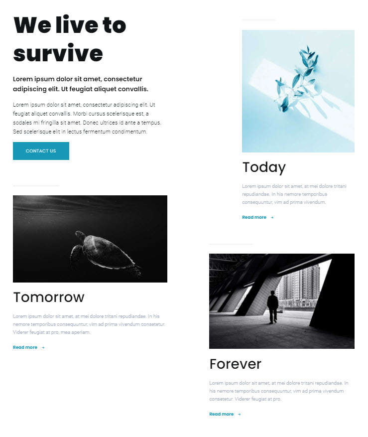
Pathway is a multipurpose WordPress theme. It was created to work perfectly with Kubio builder. Kubio is a new generation WordPress website builder that levels up the Block Editor.
The Pathway – Kubio combo is very powerful, allowing you to design any site by drag and drop, starting from a demo site, or from scratch.
Here’s what we like about Pathway:
- Drag and drop editor,
- 50+ Gutenberg blocks that you can customize however you see fit,
- Full control over fonts and color,
- Predesigned content sections for a variety of purposes: portfolio, contact us, etc.
- Sections can be saved and reused later,
- Full site editing features, meaning that you can create your whole site in a single interface. In the previous WordPress experience, you would need to go back and forth from the Admin area to the Editor, to create a page.
- Mobile responsive design,
- Great customer support.
Now, Pathway comes packed with 30+ starter templates. One of them is called “Multipurpose” and it really represents the minimalist trend.
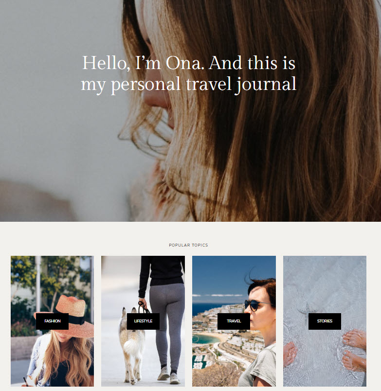
Ona is a free WordPress minimal theme that works on top of the latest WordPress experience, Gutenberg. This means that the theme works with blocks. Now, in order to have more freedom over design when working with Ona, we totally recommend installing Kubio builder as well (for free). It will help you level up the Block Editor, allowing you to transform the Ona theme however you see fit. You will no longer get locked inside a theme with Kubio.
Other Ona features:
- 8 starter sites,
- Fast WordPress theme,
- 75+ patterns,
- Inner pages available: About, Contact, 404.
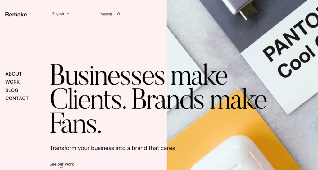
This WordPress minimal theme would be a lovely choice for a creative agency website. Its portfolio options would suit well graphic designers, illustrators, animation pros, architects, digital agencies, etc.
Other Remake features:
- 10+ ready-made templates (aka skins),
- Attention to every detail,
- Beautiful blog layouts,
- Custom-made sliders (layouts) for Portfolio, Photography,
- Smooth animations,
- Flexible grid layouts,
- Parallax effects,
- Pre-installs the most popular and useful plugins out there.
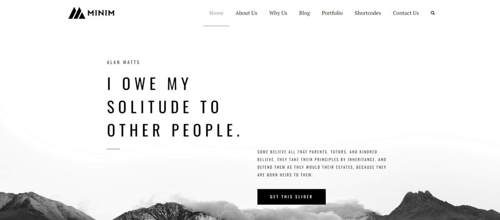
Minim is a minimalist WordPress theme that is great for business, news media, creative portfolios, digital agency and personal websites.
Here’s what we like about Minim:
- Fully responsive theme,
- 150+ shortcode elements,
- 10+ different types of headers,
- 6 different blog types,
- 9 types of portfolios,
- 3 homepage demos.
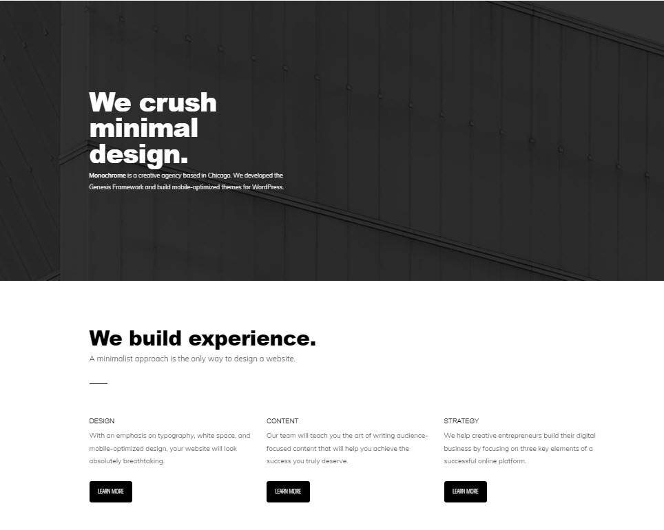
This theme was developed by the folks at Studio Press. It works well with their Genesis Framework.
Here’s what we like about the theme:
- Sleek and minimalist design,
- Mobile-responsive,
- Easy-to-customize WordPress theme.
- Gutenberg-ready. It works on top of the latest WordPress experience,
- WooCommerce-ready, meaning that you can use it to create your own online store,
- Control over colors and fonts in the theme’s Customizer.
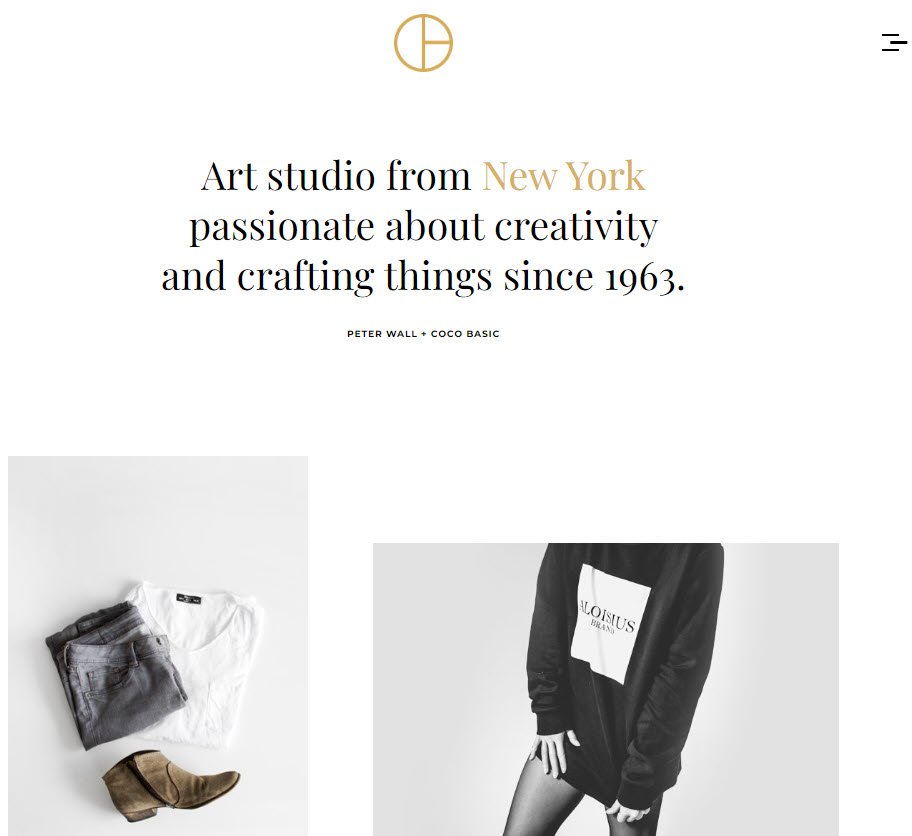
Opta is a minimal and clean WordPress theme that you can use to show off portfolios in an elegant manner.
Here’s what we like about Opta:
- Breezy design,
- Responsive layout to fit any screen size,
- Fully compatible for all major browsers,
- Easy-to-customize,
- Multi-language ready.
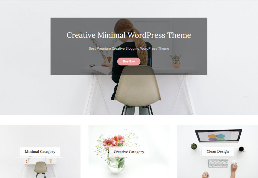
This minimalist WordPress theme is a good choice for bloggers or magazines.
Here’s what we like about WP Diary:
- Light and clean design,
- Demos included,
- Creative blog layouts included,
- Fully responsive theme,
- Lots of customization options that help you create the website you envision,
- Detailed documentation.
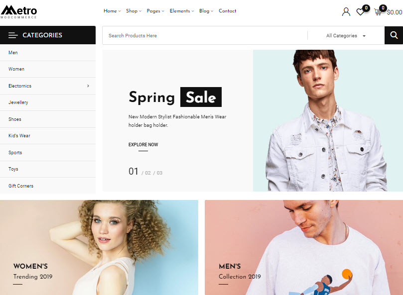
Metro is a refined WooCommerce WordPress theme that proudly represents the minimalist trend. If you want to create an online store, this could be it.
What do we like about this WordPress theme?
- 6+ shop pages,
- 11 home pages,
- 6+ header styles
- 7+ product pages,
- 8+ pre-built homepages,
- Blog and inner pages layouts,
- Very good page speed,
- Fully-responsive,
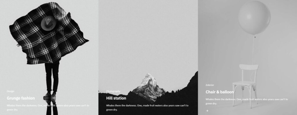
Were you looking for a creative, minimalist and eye-catching minimalist WordPress theme? Well, let me introduce you to Sixten. This theme suits best designers, artists, and creative freelancers.
Here’s what we like about Sixten:
- Functions flawlessly on any device,
- 20 bold and modern-looking homepages,
- Mobile-responsive WordPress theme,
- 8 blog layouts,
- 7 navigation layouts,
- Gutenberg-ready,
- WooCommerce-ready,
- Fast loading WordPress theme.
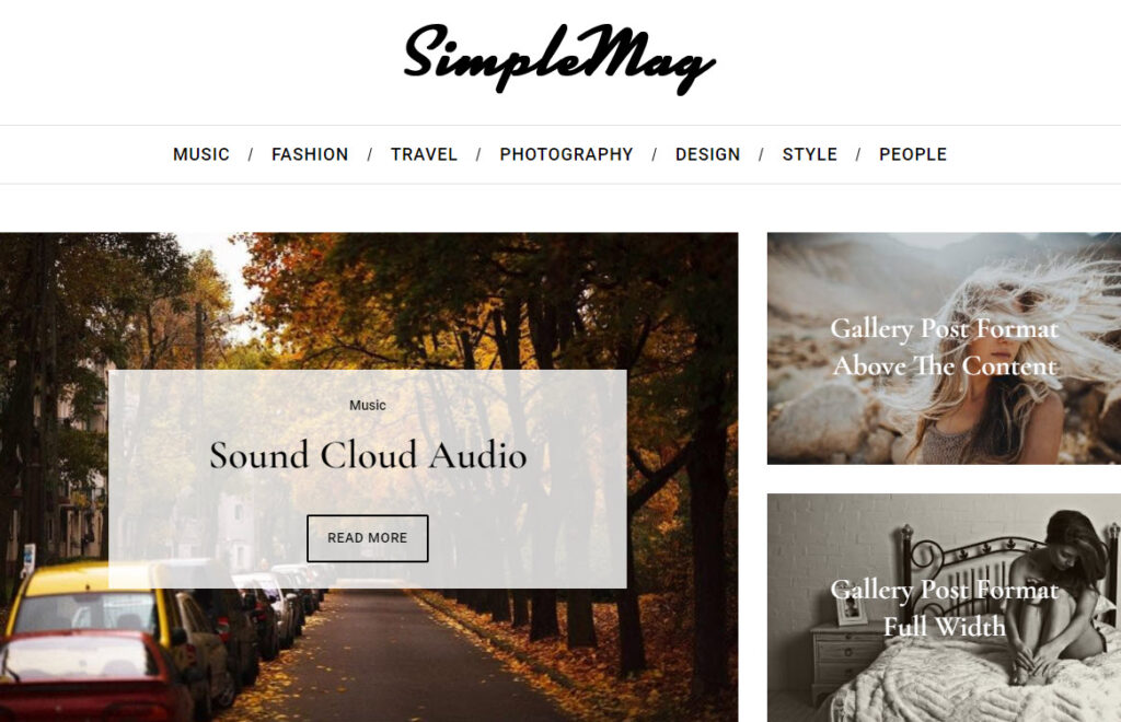
If you want to build a magazine-style website with a minimalist touch, then SimpleMag can do the trick.
Now, here’s what we like about this WordPress theme:
- Various category and homepage layouts,
- Widgetized footer,
- Multilingual-ready,
- Drag and drop page composer,
- Thorough documentation.
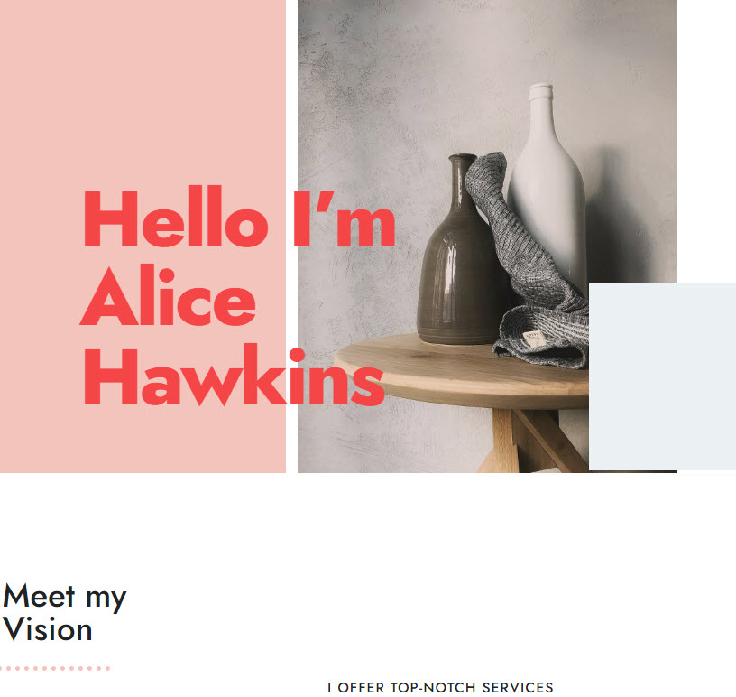
This minimalist and elegant WordPress theme is well-suited for photographers, creators, and portfolio websites.
Here’s what we like about this theme:
- Cool scrolling effects (the name’s no coincidence),
- Control over the color schemes and typography,
- Mobile-responsiveness,
- Modular homepage,
- 7 posts formats,
- Beautiful demos,
- Page templates available: scrolling One Page with dedicated ‘scroll menu’, full-width page, 404, portfolio template, etc.
How to choose the perfect WordPress theme for you?
There are 9.000+ WordPress themes available on wordpress.org only. Others are listed on Envato or ThemeForest.
Yeah, choosing the right theme can be frustrating. But, you already know that you want a minimal WordPress theme. This will help you filter a bit the available themes. What else should you consider?
Here’s a tiny checklist:
- Ask yourself whether the theme’s visual look meets your business goals. Whether you need a blog, an online courses website, an e-commerce website or a website for a SaaS business, each business will have some goals. Goals can range from course enrollments, the purchase of goods or services, newsletter subscriptions, to demo registrations. This means that you kinda need to create a minimum wireframe for your site, before choosing a theme. Yes, the research is on you. And this will make your choice easier, because some themes look better for online stores, lifestyle blogs, magazines, or marketing agencies.
- Do the theme creators offer support? This is really important, because you might encounter situations that you do not know how to fix.
- Is a theme customizable enough to suit your needs? Do you want to use overlays, the parallax effect, certain interactive elements? Can you have full control over colors, typography, spacing, hover effects, etc? If you combine any WordPress theme with the free WordPress builder, Kubio, you will have complete design freedom in a drag and drop interface.
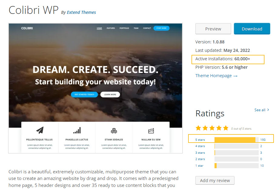
- Was it updated in the last six months?
Updates are very important for WordPress themes because they can introduce new features and solve various problems and bugs. Updates can help with website security and performance. Also, by choosing the up-to-date theme, you’ll ensure that your website is 100% compatible with the latest WordPress releases, all the major plugins, and the newest browser and mobile devices updates.
- What do other theme users say about the theme? What do the reviews look like?
Both the update and reviews info can be found on wordpress.org in the description of each theme.
- Does the theme look well on any device? Make sure that the theme you choose will look well on any device, and has the tools you need to make it look good. Mobile-responsiveness is a must-have, because desktop traffic was surpassed by mobile traffic, and Google has a mobile-first approach when it comes to indexing websites.
FINAL TIP
If we were to choose a WordPress theme, we would definitely choose a block-based, Gutenberg-ready theme or a Block-based builder.
Why so?
Because blocks are the future for WordPress. The other themes are either upgrading the Customizer (which will become obsolete) or have their own custom editors. So, if you don’t wanna get stuck inside an experience that belongs to the old WordPress experience, a block-based WordPress theme should be your choice as well.
In the above-mentioned themes there are several Gutenberg-ready themes. But, clearly, the Pathway-Kubio combo is our winner.
And that’s a wrap, folks!
If you liked this article, and want to have access to similar content, make sure to subscribe to our YouTube Channel. You can also follow us on Facebook. If you want to find out how to customize your WordPress site, here‘s a great resource we’ve compiled to help you out.


