WordPress web design is now built on top of Gutenberg blocks. The TinyMCE Editor is now replaced by a Gutenberg Editor where design happens by dragging and dropping pre-built content blocks.
The TinyMCE was merely a text editor, lacking design options. When a WordPress user wanted to design a web page, it used the theme’s Customizer.
Now, with the recent WordPress developments, web design became a more unified experience in WordPress. Both pages and posts can now be edited via the same editor.
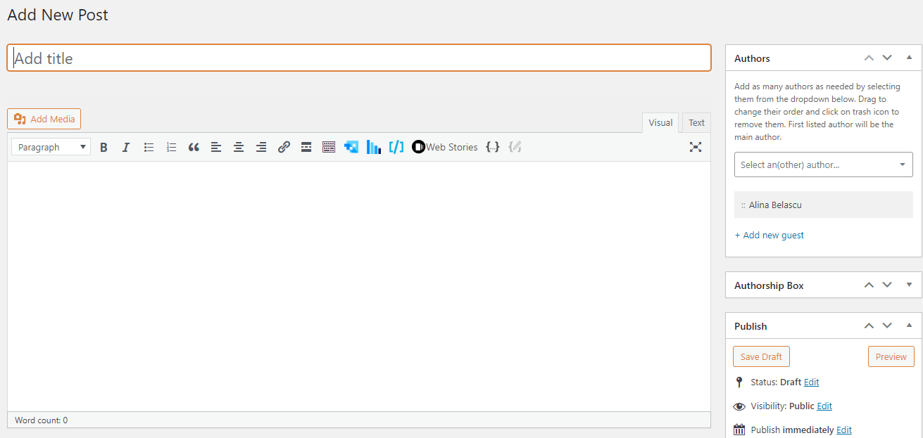
Now, here’s how the TinyMCE looks like:
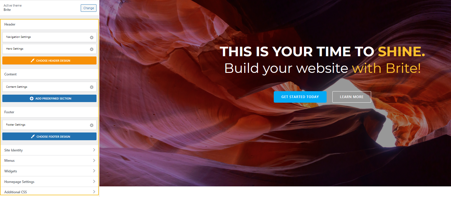
Here’s how the Customizer looks like (I used the Brite theme):
Now, assuming you’ve updated your site to WordPress 5.0, your site should use the new Gutenberg Editor as default. Here’s how the Gutenberg Editor looks like:
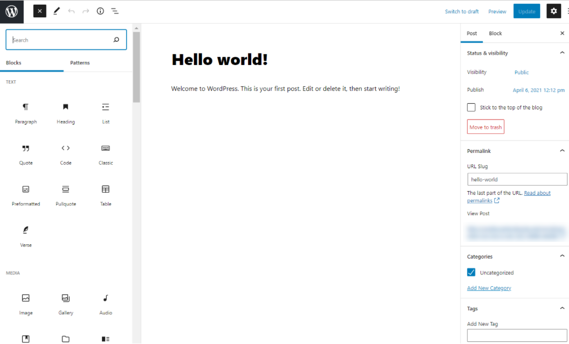
Little by little, the importance of the Customizer is diminishing. Now, the Gutenberg experience is far from perfect, but with help of third-party Gutenberg block developers, things are shaping nicely. The folks at WordPress have even announced that the Customizer is disappearing for some block theme users with the release of WordPress 5.9 in Jan 2022.
By default, WordPress offers a set of basic Gutenberg blocks like a heading, paragraph, image, button, and more. As mentioned earlier, WordPress developers are creating their own blocks and they enrich the new experience.
In this article, we’ll go deeper into the topic of Gutenberg blocks, see how they work, and I’ll show you how you can upgrade the current WordPress block experience.
Shall we?
Introducing the Most Used Default Gutenberg Blocks in WordPress
When you go inside any page or post in the current WordPress experience, you’ll be able to add blocks with different functionality to it.
You can do this when you click on any “+” sign on your page.
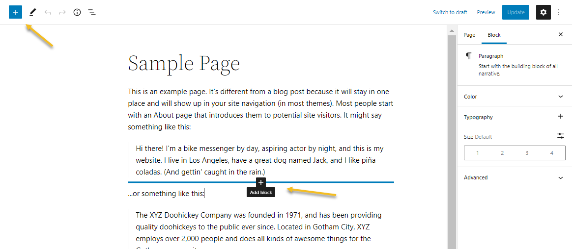
This will open up the block inserter.
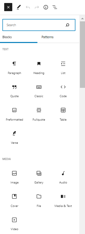
From here you can pick a block and drag it to the website canvas. You can also use the search bar to find a block by name.
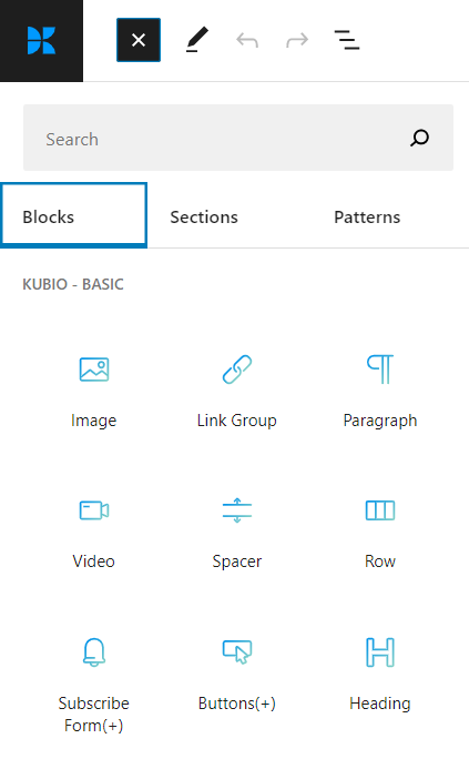
All these blocks with a black icon are the default WordPress Gutenberg blocks. When you add third-party blocks via WordPress plugins, they will also show up here, sometimes with a different color, like in the case of Kubio blocks, for example.
Now, let’s take the most popular default Gutenberg blocks one by one and see what they do.
- Paragraph block. It lets you add plain text to WordPress pages and posts.
- Heading block. It allows you to add headings to chunks of text, in order to better structure information on a page.
- List block. Use this block when you want to better structure and group information.
- Buttons block. Use this block to add call-to-action buttons to your WordPress pages and posts.
- Code block. Use this block when you want to distinguish between regular text and code when writing technical articles.
- Table block. It lets you add a basic table to a page or article. For advanced WordPress tables, you still need to use a WordPress plugin such as wpDataTables.
- Image block. Use this to add images to your web page.
- Audio block. Use this when you want to add audio to a web page.
- Gallery block. This block lets your group images inside a gallery.
- Cover block. This allows you to add an image or video with a text overlay. You can use it for headers.
- File block. This block lets you add a link to a downloadable file. This is useful when you offer resources to your website visitors, as in ebooks and other downloadable files.
- Video block. Use this block when you want to add a video file to a page or post. You can upload a locally hosted file, pick one from your media library, or add one with a URL.
- Embed block. When you use this block you can embed videos, images, tweets, audio, and other external content into your WordPress site, from platforms such as Twitter, Tumblr, and more.
- Columns block. Use this to add new content sections to a page. You can choose between 6 types of sections with various column numbers.
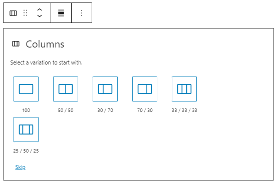
You can add blocks to each column.
- Group block. A group block can house other blocks together inside one container.
- Row block. This allows you to add a new row to which you can add a block.
- Shortcode block. This block allows you to add tiny bits of code to your WordPress posts and pages easily. This means that the block editor is fully compatible with plugins that provide a shortcode. For example, certain gallery and table plugins allow you to create a fancy gallery or table in the plugin itself. Next, each table or gallery will get assigned a shortcode that you just need to paste afterward inside a page or post. This way you work really clean and don’t need to always look for that gallery on multiple pages to make changes to it. You just make one change, that will be reflected across all the pages that have the gallery shortcode.
- Search block. This block allows you to add a search bar to a page, or a blog post, in order to improve website navigation.
Besides these blocks, you also have blocks related to the website identity such as copyright, site title, site logo, or navigation. I won’t talk about all of them, except for navigation.
- Navigation block. This allows you to add a menu inside a page or post with a horizontal or vertical orientation. You can add pages, custom links, blog categories, and more. Now, classic menus can also be created from the WordPress Dashboard, inside Appearance -> Menus. You can also use this block to insert a previously created classic menu.
Inside the block inserter, you can also find some blog-related WordPress Gutenberg blocks, such as featured image block, excerpt, post categories, post tags, post author, and more.
So, now you know which are the most popular default Gutenberg blocks. It’s time to find out how we can use them in web design.
How to Add and Edit the Default WordPress Gutenberg Blocks
As previously mentioned, you can add any block to a page or post from the “+” sign you see in the Default WordPress Editor.

When you’ll click it, you’ll see a block inserter with the list of blocks that you can choose from:
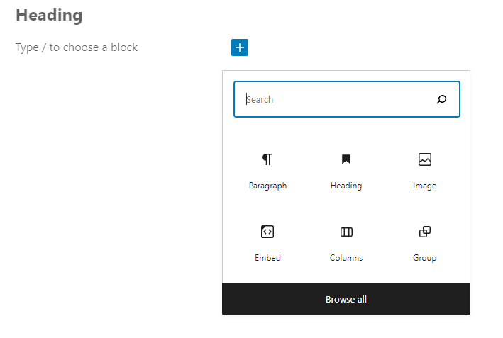
Let’s start by adding a heading block to our page.
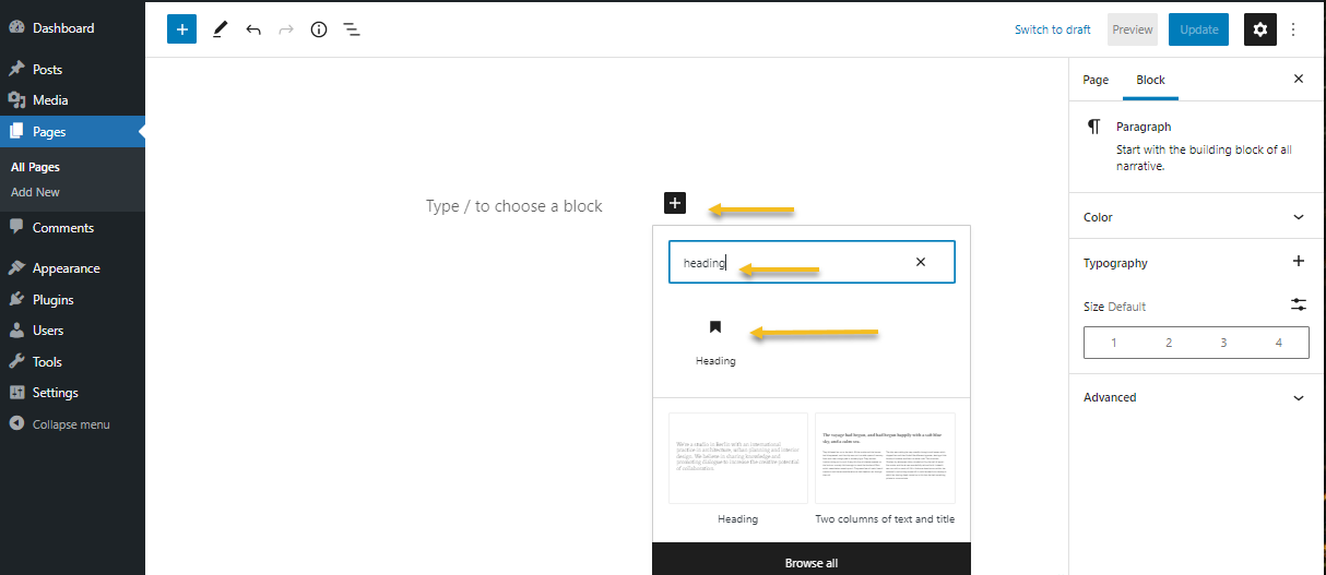
Next, start typing your heading.
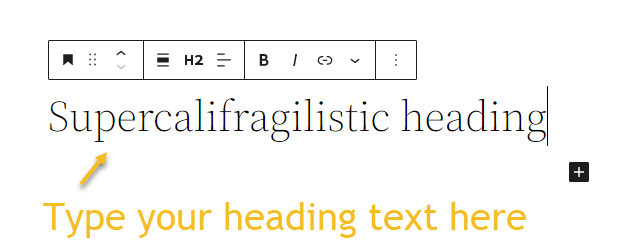
While you are still here, notice the toolbar that shows up on top of the block. This allows you to:
- Adjust the position of the heading. Here you have two options. When you select the 6 dots, you will have the option to drag and drop the block where you want. When you select the up and down arrows, you will move the block up and down.
- Adjust the width of the heading.
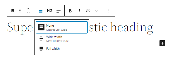
- Specify the type of heading you want, from H1 to H6, based on the importance of each heading, H1 being the most important heading.
- Align the heading
- Make the heading Bold or Italic.
- Add a hyperlink to the heading.
- Add a highlight, strikethrough, and more to the heading block.
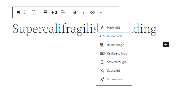
- More options (from the three vertical dots).
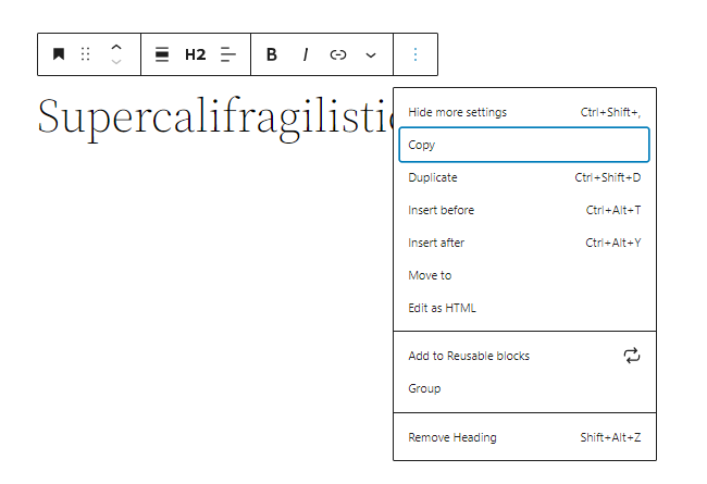
Here you can:
- Copy the heading. This allows you to copy the heading to the clipboard, and to paste it on another page or post.
- Duplicate the heading. This option copies the heading below the current one. After this duplication, you can style both blocks independently.
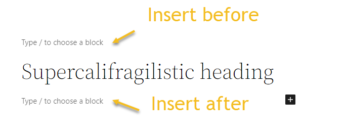
- Insert a new block before or after the current block.
- Move the block. Once you select the “Move to” option you can use the keyboard’s arrow keys to move the block where you want. Just hit enter when you reach your chosen place for the moved block.
- Group the block together with other blocks.
- Remove the block. You can also press delete
- Edit the block as HTML. The moment you select this option you will see the HTML tags that are specific to the block. The HTML tag for this example is the <h2> tag. When you want to get out of the HTML editor, you go back to the options and switch to “Edit visually”.

You can always edit a whole page as HTML. Just head over to the three dots in the upper-right corner of the interface, and collapse the options there. Next, choose the Code Editor. There’s also a keyboard shortcut to this: CTRL+SHIFT+SLT+M (for Windows users).
- The last option, and my favorite one, is the “Save as reusable block” option. The moment you finish styling any block you can save it for reuse on the same page or another one.
Besides this editing toolbar, you have some extra styling options on the right-hand side. To access them, you just have to select any block on the page. On top of the block editor, you can see the type of block you’re making edits to heading, paragraph, table, etc.
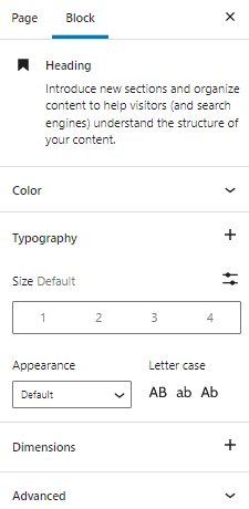
The options here vary slightly from block to block.
In the heading block case, you can:
- Make changes to the text, link, and background color. The options here can vary also according to the theme you’re using. The color options are limited.
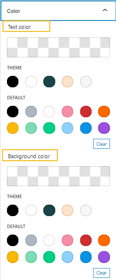
- Adjust the line height and letter spacing of the heading under the “Typography” settings.
- Adjust the size of the heading. You can select a size in pixels, or choose from a list of 4 predefined sizes.
- Adjust the appearance of the text (light, thin, etc) and the letter case.
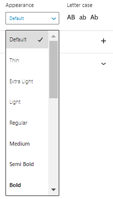
- Set up the margin in pixels for the block heading, underneath the “Dimension” settings.
- Add HTML anchor to this heading that you can link to later on from a menu, or a link on a different page.
- Add a CSS class to the heading – this is useful when you know code, and want to add some extra CSS styling to your page elements.
And that’s about it.
No matter the block you choose, you’ll be seeing the toolbar options on top of it, and you can style it from the block editor on the right.
Now, as you might have already noticed, the styling options are pretty basic. They do not allow you too much freedom, and you can’t get creative at all.
No worries, you can always level up the current block editor while using third-party WordPress block plugins.
How to Level Up the Block Editor via WordPress Plugins
These WordPress block plugins will add their own blocks to the block inserter, but also give you the styling options you need in order to be able to create the website you envision.
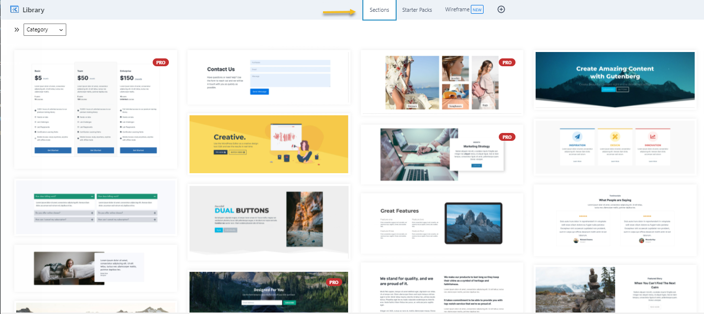
For example, Kadence blocks, adds the following blocks:
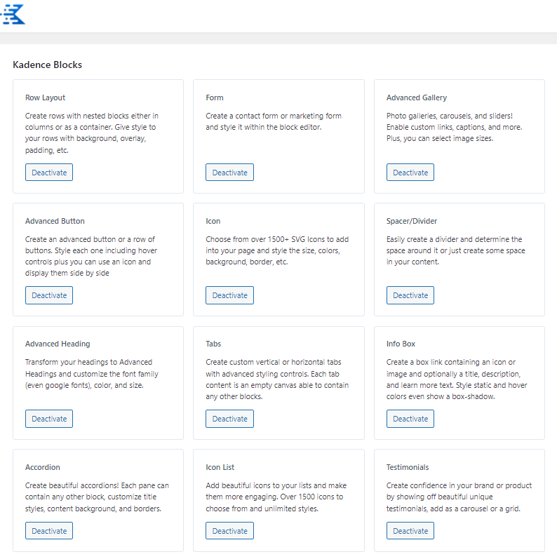
It also allows you to select from a variety of ready-made content sections, and website templates.
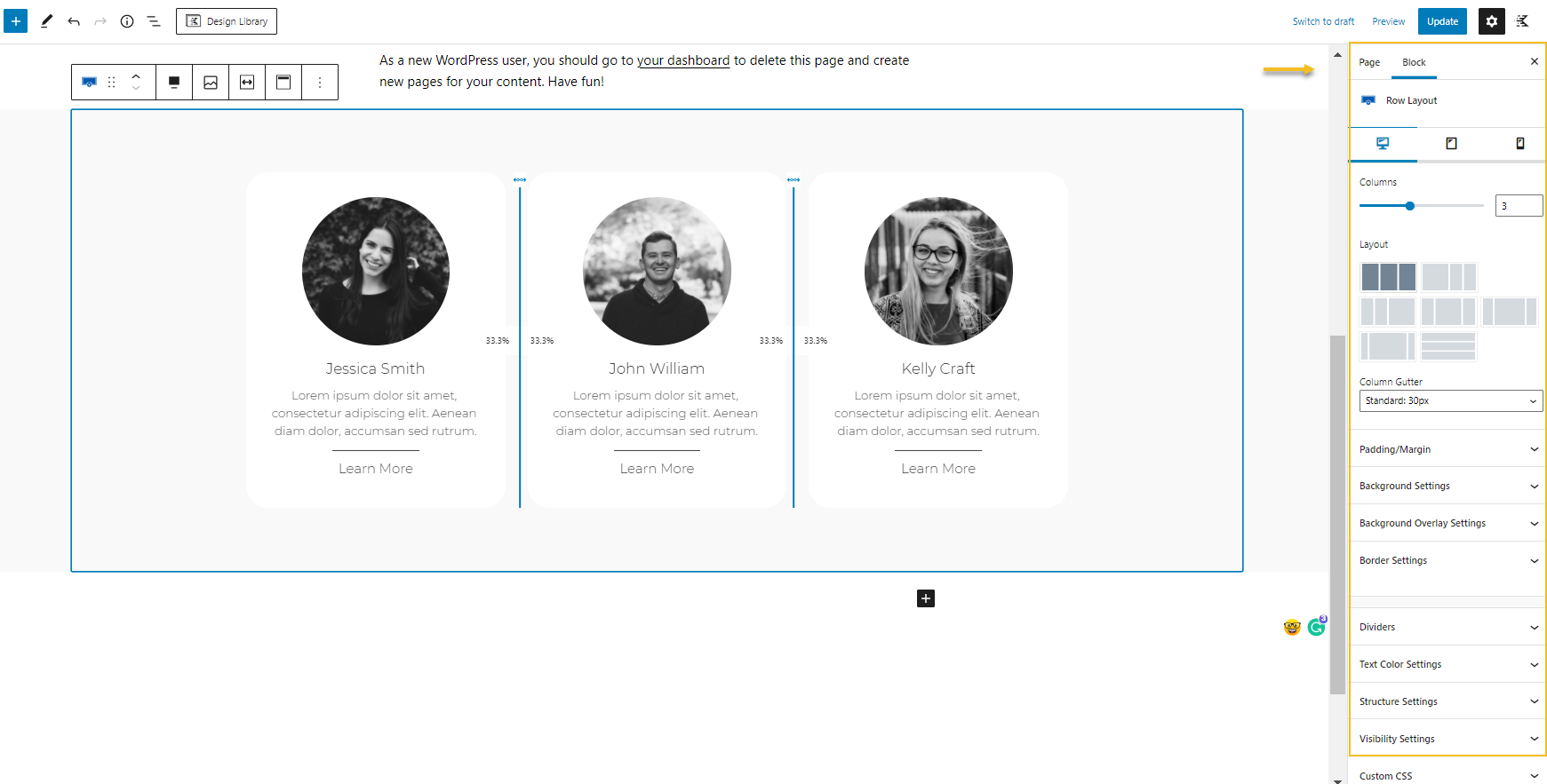
And take a look at the new editing options made available in the block editor, when using Kadence.
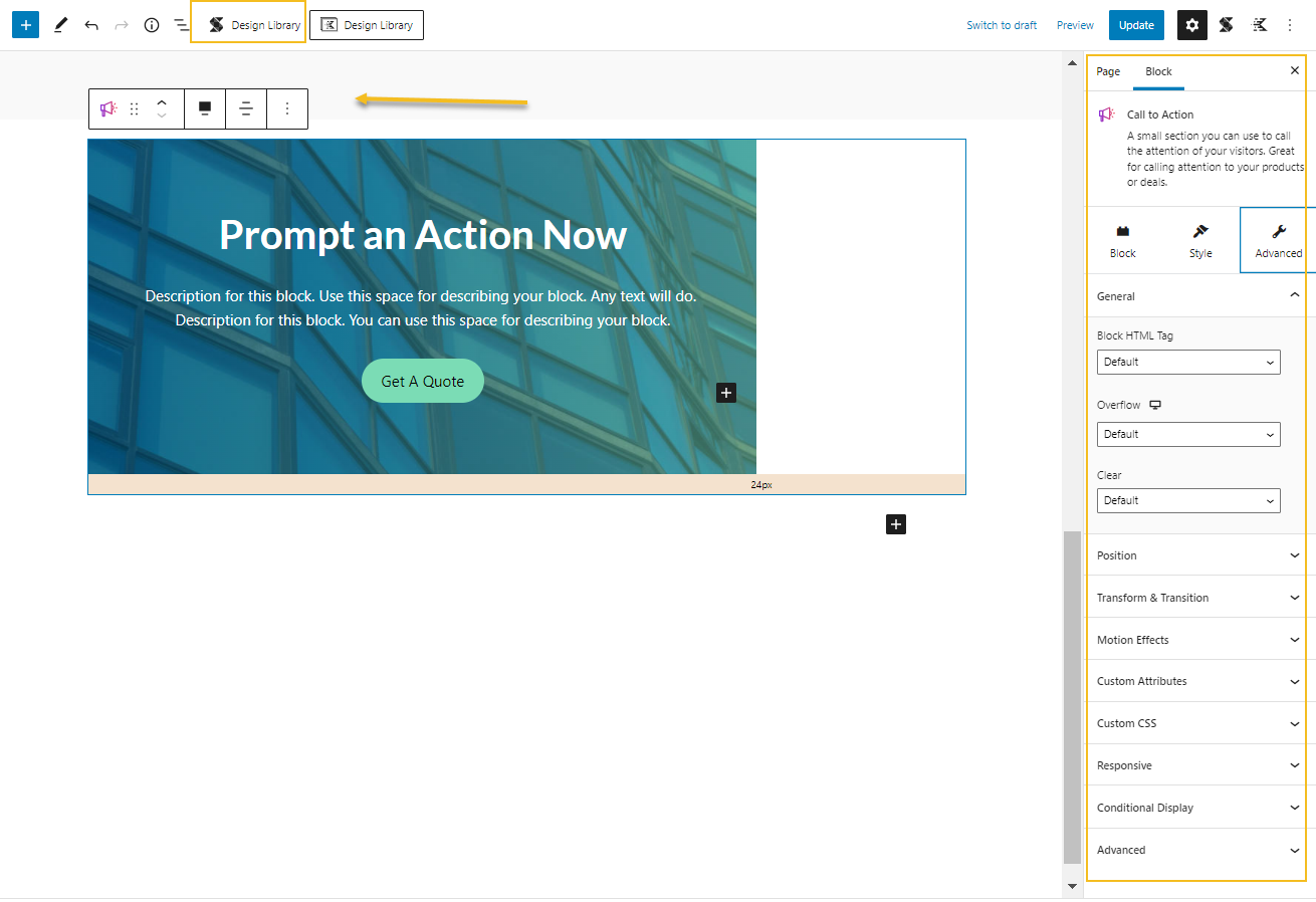
The same goes for Stackable. They have some more advanced sections as well, and more styling options inside the block editor.
Kubio goes even further than this. It puts the default block editor on steroids. Kubio is more than a collection of WordPress blocks. It’s an actual website builder that allows you to drag and drop blocks to build web pages while giving you absolute control over the design through endless styling options.
After installing Kubio, you will see some extra blocks showing up in the block inserter, in a blue-green colored icon.

Kubio adds some extra blocks, besides the default ones, such as tabs, accordion, and more.
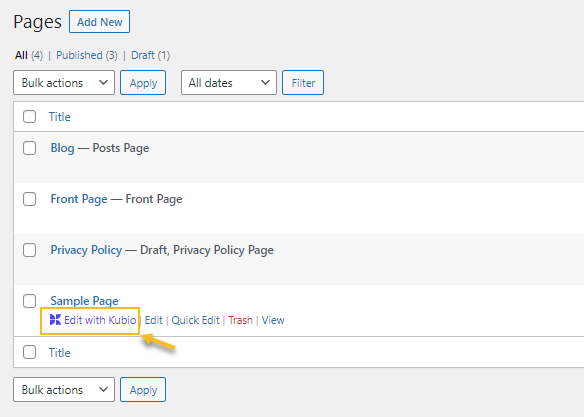
The moment you want to edit a page using Kubio, you will need to select “Edit with Kubio”, instead of “Edit”.
Now, let’s take the heading block example from above, and see how it works when you use Kubio.
When you look for the heading block, make sure you select the Kubio one, not the default one.
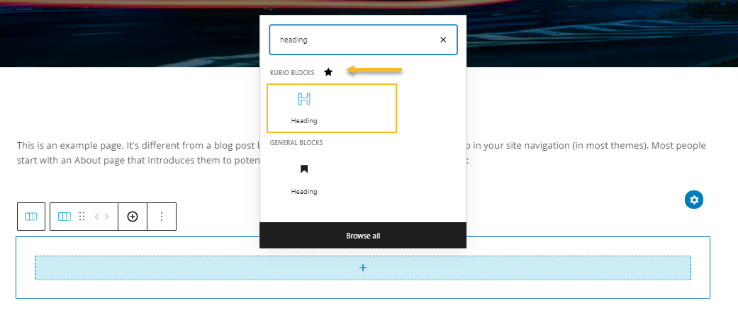
Now, you can see that the toolbar is still there, showing up on top of the heading block.

The full power of Kubio gets unleashed from the panel on the right. Now, the default block editor is no longer like this:

but like this:

Let’s analyze the options available for the three menu layers: content, style, and advanced.
- Content
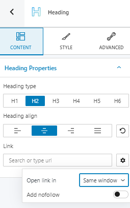
Inside “Content” you can:
- Establish the heading type, from H1 to H6,
- Align the heading,
- Attach a hyperlink to the text. This link can open in the same window or a new tab. Here you can also decide whether the link is do-follow or no-follow. This is important SEO-wise.
- Style
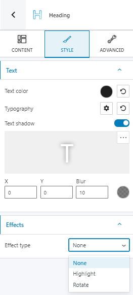
Inside “Style” you can:
- Make text color changes
- Make typography changes: font-family, font-size, font-weigth, letter spacing, line height, decorations, effects, and more.
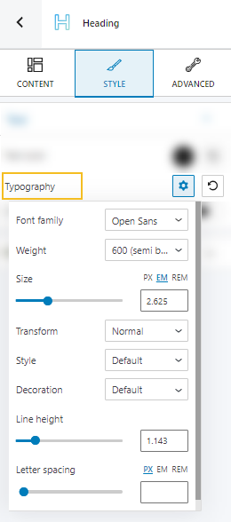
For example, for the heading below I played with the font-family, line height, letter spacing, and I added a rotation effect.
- Add a text shadow
- Advanced

Here you can go even wilder with your designs. Inside “Advanced” you can make changes in the normal and hover states for the following: background, spacing, border and shadows, typography, and text shadow.
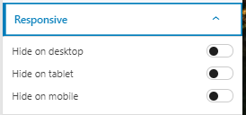
Inside the “Responsive” option you can decide whether a block should show up on all devices or only on several of them (tablet, mobile, or desktop).
Other blocks have some extra options here as well, such as dividers, or transformations.
Here’s more info on how you can easily take any design from scratch to hatch using Kubio page builder:
Conclusion
The WordPress editing experience has gone through major transformations since the release of Gutenberg in 2018. The Customizer will become obsolete in a block-based WordPress world. The community is backing up the recent developments by building block plugins or block-based page builders, such as Kubio.
New WordPress users will enjoy a singular interface where design happens smoothly by drag and drop, in a more unified experience across themes. This is a very much welcomed WordPress evolution, and we’re thrilled to be part of it.
If you liked this article, and want to have access to similar content, make sure to subscribe to our YouTube Channel. You can also follow us on Facebook.


