Lead generation is the process by which an unknown visitor converts to a known visitor. This is not only an advantage for your customer, but also for you. It is therefore all the more important to optimize this process on your website. Think about how to continuously adapt your website to attract more leads. We’ll show you 4 ways to generate more leads from your website.
Deal with your key figures
Before you start evaluating your key figures, define so-called benchmarks in a first step. So start by gathering information about website traffic, conversion rates, and search engine optimization (SEO). Here are some possible questions to ask yourself in this first step:
How much traffic does my website usually generate in a certain period of time?
On average, how many leads does the site generate per month?
Which pages do visitors most often use to get to my website?
Which content, which pages and which keywords are performing well?
How do the conversion options on my website work?
In addition, you should look at the development of your website over the past few months. Has the site gained or lost visitors? What are your conversion rates ? Which topics are most popular with your visitors? It is impossible to evaluate results without defining a starting point. So spend a while with your metrics before making any changes to your site.
An important note in advance: Most of the plugins in this list work with external newsletter services. There are several reasons for this, for example the PHP function mail() is not available in many cheaper hosting packages . Why? Because of hackers and spam! For example, if you program your own contact form and want to send emails directly from WordPress, you have to be very precise. Incomplete PHP contact forms provide a platform for spammers to spread their messages.
This is neither good for you nor for the server operator. Therefore, many web hosts do not even provide this function.
You can solve this problem by either sending your marketing emails via an external service such as Amazon’s SES or a newsletter provider – or at least creating your own email address with a real mailbox in your hosting package and then sending the emails via SMTP or other mail relay servicessent.
However, this feature is severely limited in many hosting packages. Because here, too, there is a lot to consider if you want the e-mails to be delivered successfully (and thus bypass the spam filters). In addition, a new e-mail address very quickly ends up on the filter lists of major e-mail providers such as web.de, Googlemail and Co. if you start sending thousands of e-mails a day overnight.
So always start slowly and work your way up. It is better to opt for an external service and a professional lead generation plugin that has been thoroughly tested and is always kept up to date. This means that you hardly give hackers a chance to misuse your e-mail address.
You can find out more about this in the second part of the series Email Marketing with WordPress, which deals with newsletter plugins!
But the first thing to do is collect the addresses. The following best-of list gives you a comprehensive overview of which plugin could be the best for generating leads and newsletter subscribers for your email marketing campaign.
Optimize outbound links
Your readers would like to be able to tell whether a link is an internal or an outgoing link. Whether external or internal, you should make your links clearly recognizable. It is common practice for better usability to mark links with underlining and colored highlighting.
In order to differentiate the external links from the internal ones, you should insert (or leave) a small icon behind the links. In order not to lose the reader by clicking on external links, it is advisable to have the link automatically opened in a new tab.
The WP External Links plugin lets you set up exactly these things. You can even choose from 20 icons to appear behind the links.
Make sure you have good contrast
Good contrast means something like “make sure that elements stand out from each other and text is easy to read”. Light gray text on a white background would be a negative example of legible text.

Build simple menus
The navigation of your website must be perfect. If the user does not immediately find what he is looking for, he is gone again immediately.
Place the menu in a familiar place to improve usability. At the top or left, an internet user is used to looking for navigation.

Name menu items according to a meaningful scheme and try to avoid unusual or overly specific terms in the menu. Your readers want to know where they land after a click. If they don’t know that, they won’t even click.
Also build a flat hierarchy. Nobody wants to search for a long time, and a menu with 3 levels is often already too much. It is best to stick to a menu with a maximum of one submenu.
In practice, this means you have, for example, the menu item “Categories” with the sub-item “Garden tools”. As a result, the deepest sub-point can be reached with just two clicks.
Optimize your internal linking structure
There are two reasons why internal linking is important to your website.
On the one hand there would be your readers, who can read more information with the help of further links within your articles. On the other hand, search engines can get a better picture of your entire website if meaningful internal links are used.
Name the links sensibly, for example after the title of the target page. As a result, the user knows where the link leads to and the search engines can recognize which pages are more relevant than others based on the frequency of linked pages. So you kill two birds with one stone: Better for the search engines and a better user experience for your readers.
Lighten up your texts
Since your readers spend most of their time reading your articles, you should perfect your blog.
Reading a long text is much easier when it is embellished with lightning elements.
Use bulleted lists and especially images to break up your article. Often an entire section can be replaced with a meaningful image and improve the user experience.
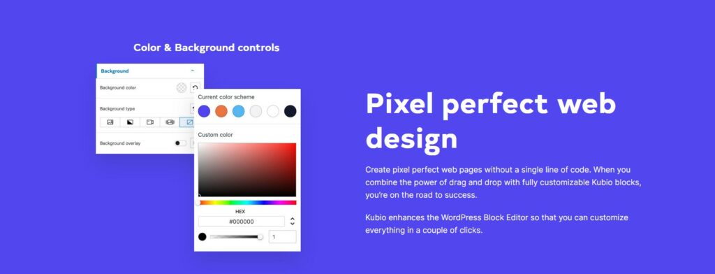
Also apply different types of text formatting. Mark important words or parts of sentences in bold, emphasize quotations in italics and use meaningful subheadings.
Follow through with your design
For companies it is called corporate design and for bloggers it should be given more importance: consistent design.
A consistent design is the most important thing you need to increase website awareness. The same elements must also have the same design on your website. CTA buttons should always look the same, the menu should always be in the same place and links should always have the same color.
Make sure that you always use your design the same way outside of your website. Your social media pages and especially your profile picture should be based on the look of your website and have recognition value.
Move the most important content to the top
Have you ever heard of “above the fold”? This term loosely translated means “above the fold” and describes the part of your blog that is visible without scrolling.
The most important content should be visible there and encourage scrolling or further reading.
Conclusion
Hope this article helps you optimize your website for better conversions and an improve overall user experience.
Feel free to check the rest of our articles on our blog or watch Kubio tutorials on Youtube.


