Did you know that interactive forms increase engagement? One of the best ways to integrate a form is on your Contact Us page on WordPress. We’ve all seen examples of this, and it is a prime spot for viewers and potential customers to directly engage with you.
Many users struggle with knowing exactly where to start or find that their existing contact page isn’t generating quality leads and is causing user issues. This can result in frustration and missed opportunities for engagement (which is the opposite of what we want!).
The good news is, we’re going to give you some practical tips on designing a user-friendly contact form. You’ll be able to create a contact page that looks professional and performs well, turning visitors into valuable connections!
Essential elements of a great WordPress Contact Us page
Almost all professional websites (with few exceptions) have a Contact page, which goes to show how important they are. There are some things all successful Contact Us forms have in common.
For starters, any effective contact page will have a well-designed contact form. This allows visitors to fill out their details and send messages directly to you. Just make sure the form is simple, intuitive, and only asks for the necessary information to encourage more users to complete it!
It’s also important that visitors understand why they should contact you and what they can expect from the process. Keep your copy brief but informative, telling them the benefits of getting in touch. Always try to provide clear instructions to guide users through the form submission.
After a visitor submits the contact form, there should be a confirmation screen or a Thank You page. This acknowledges their submission and reassures them that their message has been received. You might also think about setting up email notifications for both the sender and your team to ensure timely follow-up.
Remember that while the contact form is essential, offering alternative ways to reach you can improve accessibility and user satisfaction. Include an email address or phone number, but be cautious about publicly displaying email addresses due to spam risks. Make sure to use a dedicated business email and monitor it carefully!
Want more, or think your contact page is missing something? There are other things you can add:
- Clearly state your business hours so visitors know when to expect a response.
- If you have a physical location, provide your address and embed a map for easy navigation.
- Address common questions (or FAQs) proactively to reduce the volume of repetitive inquiries.
- Adding a personal touch with team photos or brief bios can create a more welcoming and trustworthy atmosphere.
Best plugins for creating a WordPress contact form
WPForms
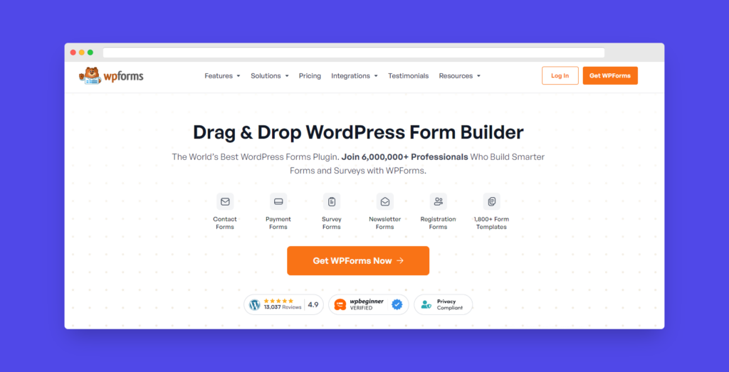
Used by over 6,000,000 professionals who rely on it to build smarter forms and surveys, WPForms is the most popular form builder there is. With its intuitive drag-and-drop interface form creation is easy and accessible, even for those without coding skills. The platform includes a free version with essential features and a Pro version that offers advanced capabilities!
| Pros | Cons |
| WPForms offers a beginner-friendly drag-and-drop form builder, making it easy to create forms without coding experience. | The free version has fewer features compared to the paid plans, which may restrict functionality. |
| Great for both basic and advanced forms, WPForms allows users to build complex forms with ease. | The Pro version can be pricey, particularly for users needing extensive form solutions. |
| WPForms Lite is free. | Features like conversational forms and user registration are only available in higher-tier paid plans. |
| With over 1,800 pre-built form templates, you can quickly set up forms suited to various needs. | Building highly complex forms from scratch may require some learning and experimentation. |
| Built-in tools help prevent spam submissions, keeping your forms clean and functional. | |
| Extensive documentation, tutorials, and responsive customer support are available to assist users. |
Forminator
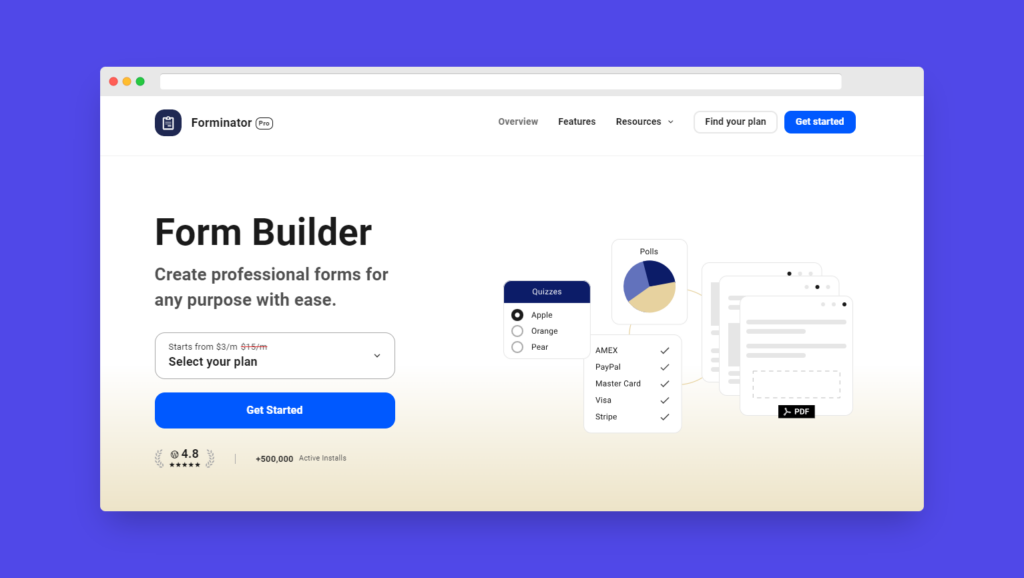
Forminator is a powerful form builder plugin by WPMU DEV, trusted by over 500,000 users to create professional forms. Its user-friendly drag-and-drop interface makes form creation straightforward, even without coding skills. Let’s take a look at its pros and cons:
| Pros | Cons |
| Offers a free version with a substantial set of features, making it one of the best free options for WordPress. | The free version has limitations compared to the paid version, such as e-signatures and PDF forms only available in the Pro version. |
| User-friendly interface with a drag-and-drop form builder that doesn’t require coding. | Some features can be tricky to locate in the interface, which may be frustrating for users. |
| Excellent user support through various channels, backed by WPMU DEV. | Complex forms or multiple forms on a site might impact website loading speed. |
Contact Form 7

Contact Form 7 is one of the most established and widely used contact form plugins for WordPress, with a long history and extensive user base. In fact, it is trusted by over 5 million users. As a free plugin available in the official WordPress plugin directory, it offers users the flexibility to manage multiple forms, customize form and mail content with simple markup, and integrate various features through third-party add-ons.
| Pros | Cons |
| Free plugin available in the official WordPress plugin directory. | Quite a steep learning curve for new users. |
| Users can install it on unlimited sites. | There seems to be limited support and documentation compared to other plugins. |
| Supports several free third-party add-on plugins to extend functionality. | |
| One of the oldest and most downloaded contact form plugins for WordPress. |
Step-by-step: Creating a Contact Us page with Kubio
With Kubio, creating a contact page is straightforward (not to mention the fact it is also packed with powerful features!) Let’s walk through the steps to build one yourself:
Step 1: Get a contact form
Install a contact form plugin from the list above.
Step 2: Create your form
Once your plugin is activated, it’s time to create your contact form. The plugin’s documentation will guide you through this. Keep the form simple and only ask for essential information to maximize completion rates.
Step 3: Add the Contact Form block
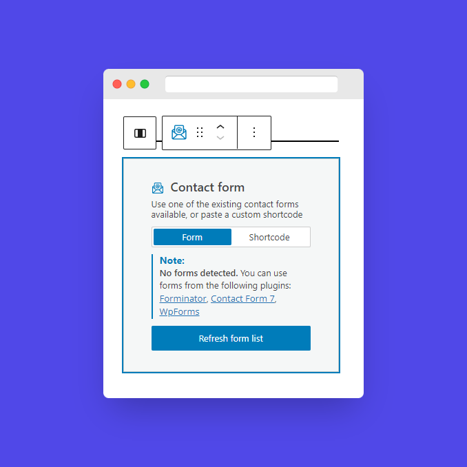
Now, head over to your WordPress dashboard, open the Kubio builder, and go to the page where you want to add the contact form. Click on any + sign on your canvas to add a new block, then search for the Contact Form block. Drag it to your desired section.
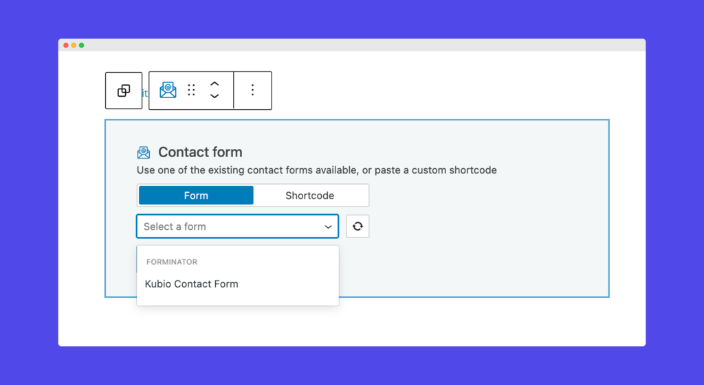
Step 4: Basic edits
Press the contact form block, and a toolbar will appear above it with several editing options:
- Positioning: Move the block around the page.
- Duplicate: Create a copy of the block.
- Insert before/after: Add new blocks before or after the current block.
- Copy/paste style: Duplicate styling from one block to another (available with paid plans).
- Remove Block: Delete the block if needed.
You can also paste a custom shortcode from your form plugin directly into the block.
Step 5: Customize with the Kubio Block Editing Panel
Click on the contact form block to open the block editing panel on the right side. Here, you’ll find three tabs: Content, Style, and Advanced. Let’s take a look at them.
First, the Content tab. Select the form you created earlier. Adjust the horizontal alignment of form elements to fit your design needs. You can choose to use the default styles from your form plugin or customize them further.
If you prefer to customize the look beyond the plugin’s default styles, the Style tab offers extensive options. You can modify the form container’s background color and padding. For labels, adjust the text color, typography, and alignment. Style fields for normal, hover, and focus states, including text, background, and border colors. Customize the submit button for normal and hover states by adjusting colors, typography, margins, and padding. You can style the information, error, and success notices that appear when users interact with the form.
The Advanced tab provides deeper customization:
- Background, spacing, border, and shadows: Adjust these settings for various form elements.
- Typography: Customize font family, size, weight, line height, and letter spacing.
- Responsive design: Decide if the block will display on desktop, tablet, or mobile.
- Miscellaneous: Set the z-index, overflow properties, HTML anchors, and CSS classes.
Step 6: Using premade sections and AI
Kubio also offers premade sections, including contact forms, that can be edited manually or with AI assistance. This can save time and give you a super professional look! To access these, go to the + sign and browse the premade sections library.
Step 7: Adding additional features
There are several ways to enhance your contact page. You can use FAQs, found in the sections area, to address common questions upfront. Add social media buttons from the blocks section, allowing visitors to easily follow your profiles. If you have a physical location, include a map, also in the blocks section, to help visitors find your address. These features will make your contact page more comprehensive and user-friendly!
Simply drag these elements onto your page and customize them to fit your design and brand.
What fields should a contact form include?
Creating your first contact form? Here are the things you are going to want to include:
- First name: Collecting the first name helps personalize communication, which can build a stronger connection with the user. Personalized messages often lead to higher engagement rates, as people are more likely to respond to communications that address them by their first name.
- Last name: Including a last name field adds a touch of professionalism and ensures you can accurately identify the user. This is particularly important in formal or business contexts, as it shows respect and attentiveness.
- Email: The email field is crucial as it serves as the primary means of communication for follow-ups and responses. Ensure this field is clearly labeled and easy to fill out. An accurate email address is essential for maintaining an effective line of communication.
- Phone number (Optional): While this field can be useful for more personalized or urgent communication, it should be optional. This avoids deterring users who may not feel comfortable sharing their phone numbers but still leaves the door open for those who prefer phone contact.
- Message or comment: This field allows users to express their specific needs or inquiries, providing valuable context for your business. Ensure the field is large enough for users to comfortably write their messages. Detailed messages can help your team respond more effectively and efficiently.
Some people choose to collect more information on contact forms, but these should be set as optional (unless specifically necessary!).
- Job title: In B2B contexts, knowing the user’s job title can be very useful. It allows you to tailor your responses more effectively based on the user’s role and responsibilities within their organization.
- Company: For business inquiries, knowing the company can help in providing more personalized and relevant responses. This field is particularly useful for understanding the context of the inquiry and tailoring your approach accordingly.
- Specific inquiry details: Including fields that ask for specific details related to the user’s inquiry can help you provide more accurate and helpful responses. For example, if your business offers multiple services, you might include a dropdown menu asking the user to select the service they’re interested in.
Design and usability tips for contact fields
Here are some more design tips to get you started:
- Place labels above the fields for better readability and user experience.
- Arrange fields in a natural flow to make it easy for users to fill out the form.
- Implement validation to help users correct errors as they fill out the form, improving overall user experience.
- Make sure the contact form looks good on all devices and is mobile-friendly, to accommodate a significant portion of users accessing the form from their mobile devices.
Boost conversions with a Contact Us page on your Kubio website!
Boost conversions with a Contact Us page on your Kubio website! A high-converting contact page is essential for any website. By choosing the right contact form plugin, optimizing the form layout for usability, and ensuring design consistency with your brand, you can create an effective contact page. Additionally, integrating your contact form with email marketing and CRM tools enhances communication and improves lead management.
Don’t miss out on the opportunity to transform your website’s contact page. Start using Kubio today to create a high-converting contact page that drives results!


