
As you probably already know, the WordPress experience changed beginning with 2018. The Default Editor is a block-based one. We talked more about this in a previous article of ours, WordPress in the Gutenberg Era.
Now, pages and posts are made of blocks. Everything is a block, from text and images, to shortcodes and tables. This way content creations got unified across pages and posts.
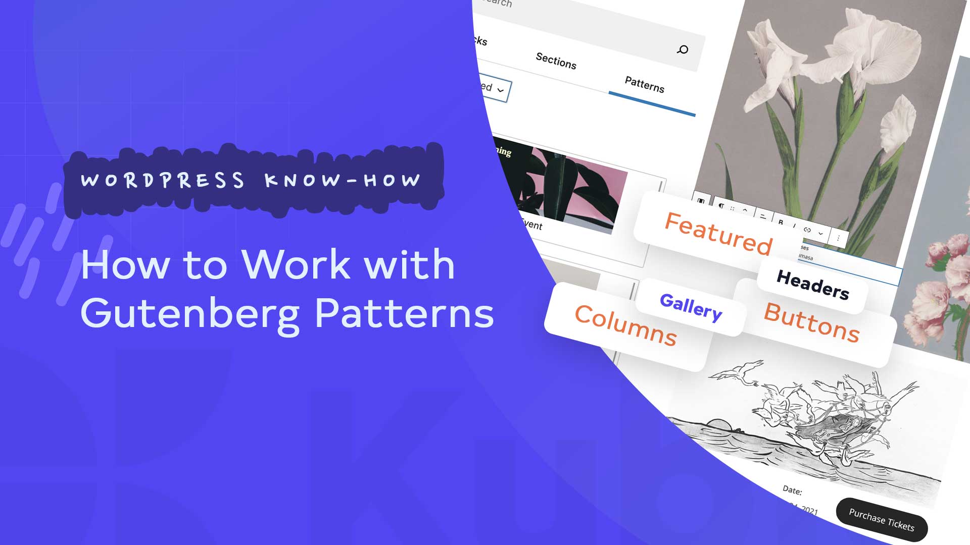
Block Patterns are predefined block layouts, available from the patterns tab of the block inserter.
Once inserted into content, the blocks are ready for additional or modified content and configuration.
Now, in this article you’ll find out:
- How to add patterns to a page or post,
- How to make pattern edits.
Let’s get going!
How to add patterns to a page or post
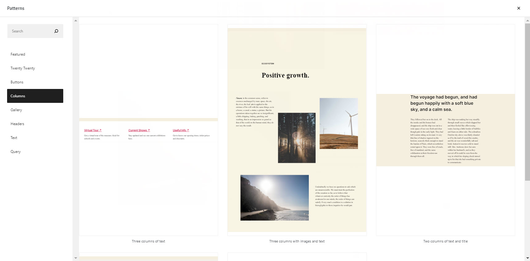
You can see the whole list of patterns inside this library. Here’s one of the patterns I discovered inside this library:
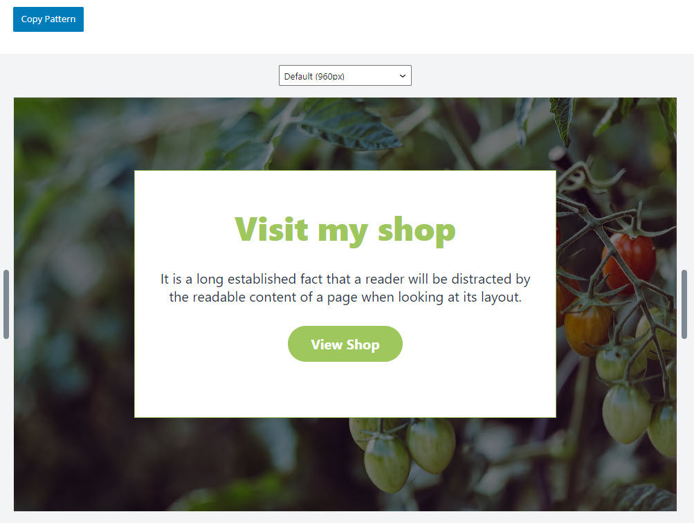
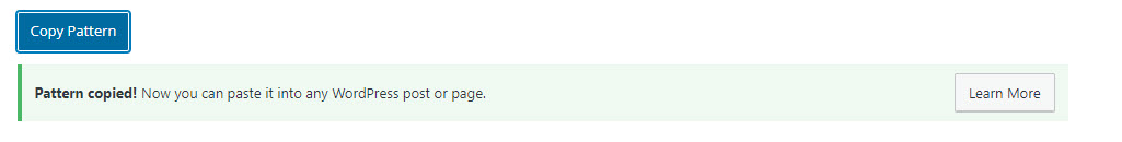
And do you see that “Copy pattern button”? When you click on it you’ll notice the following message: “Now you can paste it onto any WordPress post or page”.
Place your cursor where you want to add the pattern. Paste the contents of your clipboard by holding down ctrl control (Windows) or command (Mac) and pressing the V key, or right-clicking and choosing “Paste” from the menu.
The community is invited to create new patterns, this means that this library is very likely to grow bigger.
Now, you can add a pattern to a page or post in the same way as you add blocks.
Let’s go inside a page.
Now, there are two main ways for adding blocks and patterns:
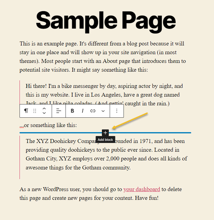
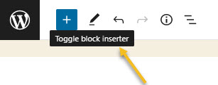
1. Hover over the place where you want to insert the pattern until you discover a “+” sign. Click on it to open the block inserter.
The block inserter will look like this:
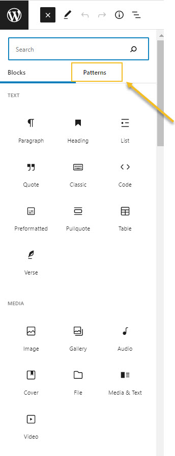
Now, click on “Browse all”.
This will open up the main block inserter on the left-hand side. Let’s select “Patterns” from the menu.
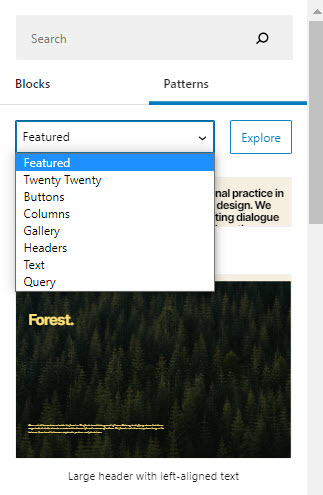
Notice that there are several pattern categories you could choose from?
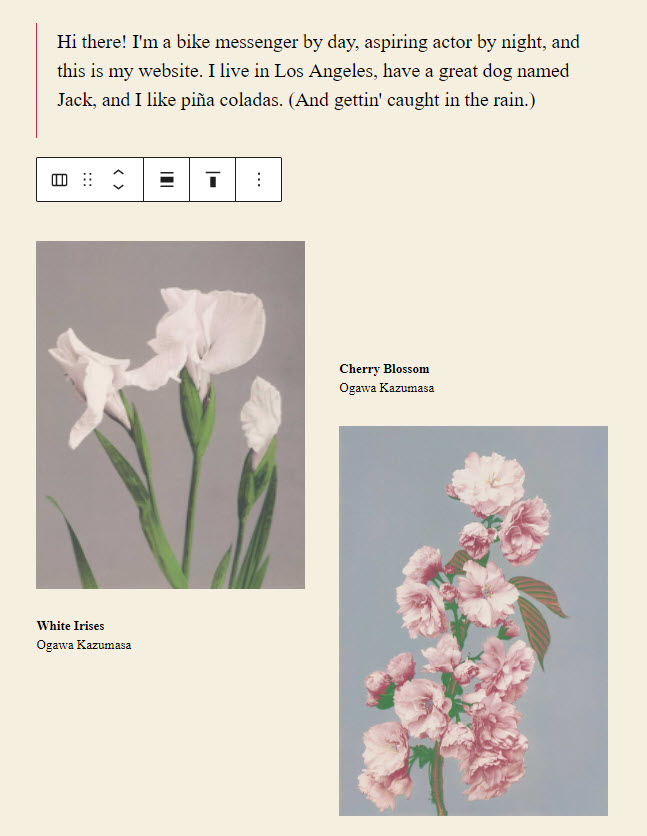
Let’s go inside the gallery option.
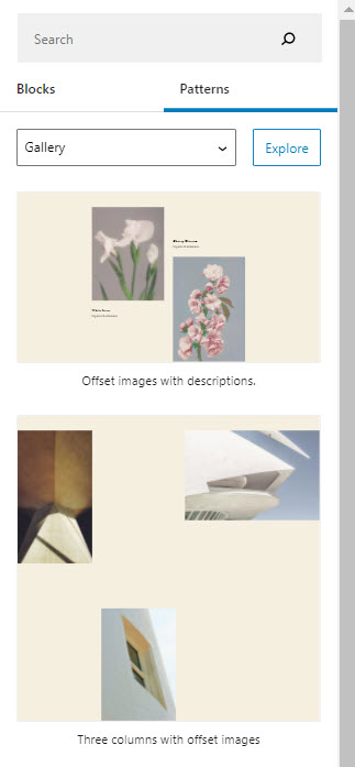
I’m gonna pick one of the galleries there. Now, here’s how the gallery looks inside my page.
2. In the first option I selected the place where I wanted to add the pattern. Now, I’m just gonna go straight to the “+” sign in the upper-left to open tha main block inserter.
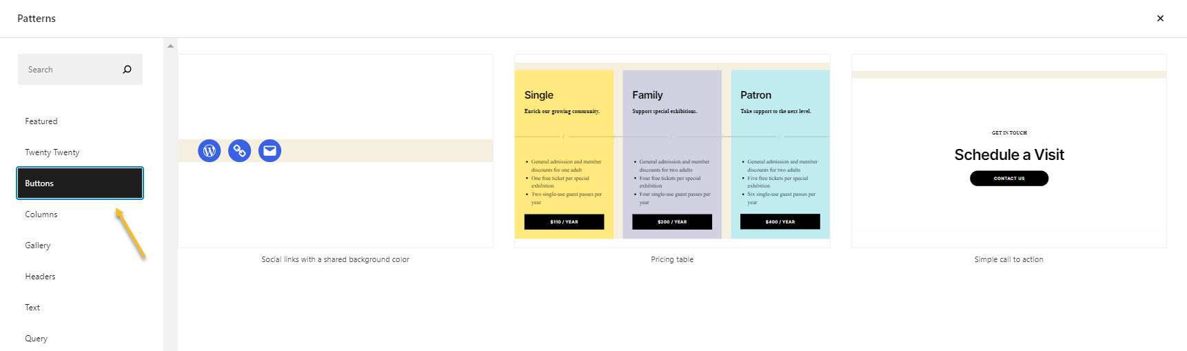
Now, let’s click again on “Patterns”. Let’s go to the column category. If I click on a design, the pattern will be added to the end of the page. But, you can also drag and drop it in a place on the website canvas.
Let’s go back a bit to the block inserter. Notice the “Explore” button next to the pattern categories?
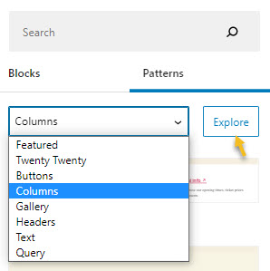
Let’s click on it. It will open a window that allows you to better visualize the Gutenberg patterns.
You can make your pattern selection from here as well.
Let’s go with a button pattern.
Now, because the pattern was added to the end of the page, let’s move it from there to the middle of it.
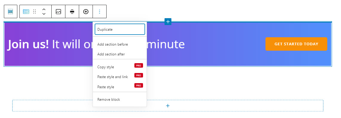
Notice that on top of the patterns there’s a toolbar?
The first icon from such a toolbar will show you the name of the block you’re dealing with. In this case we have a group of blocks.
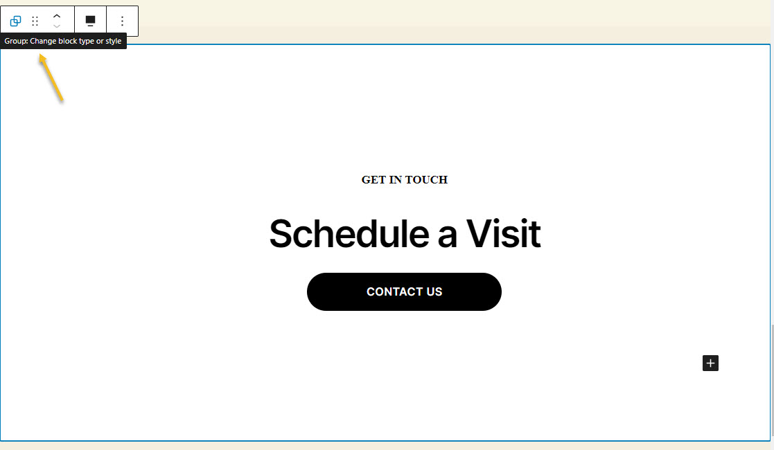
The current button pattern is actually a group of blocks, containing:
- A paragraph – “Get in touch”,
- A heading – “Schedule a Visit”,
- A button – “Contact us”.
If you click on every block separately, you can edit them.
Now, let’s go back to the toolbar. It has several options:
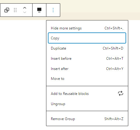
- Position the group block. When you select the 6 dots, you will have the option to drag and drop the block where you want. When you select the up and down arrows, you will move the block up and down.
- Duplicate the block. This allows you to clone your current block. After this duplication, you can style both blocks independently.
- Copy the block. This allows you to copy the block. They copied blocks will be linked, so that every style change done to one of them will reflect on both of them.
- Insert before. This allows you to insert a new block before the current one.
- Insert after. This allows you to insert a new block after the current one.
- Once you select the “Move to” option you can use the keyboard’s arrow keys to move the block where you want. Just hit enter when you reach your chosen place for the moved block.
- Ungroup the block group.
- Remove the group. You can also press delete.
- Add the block to Reusable blocks. This is one of my favorite options because it saves lots of time. Let’s say you styled this button pattern and want to use it across multiple pages, you just have to save it using this option.
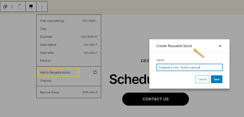
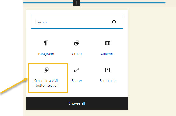
Next, you will be able to see the saved reusable block inside the block inserter.
Lovely, right?
Now, this takes us to the following question:
Why would you use patterns?
Block patterns will reduce the amount of time it takes to create your website. You noticed that a pattern is made of several other blocks. You can have paragraphs, headings, images and other blocks inside. Instead of having to create individual items again and again, you can just use a pattern.
Next, after styling the pattern you can use the “Add to Reusable blocks” option in the toolbar in order to use the pattern across more pages.
This way you save time, you manage to be consistent with design across pages, and you can make design scalable.
How to make pattern edits
I mentioned earlier that a pattern is made of blocks that you can style individually.
Let’s take a look at the “Contact us” button block in the pattern we added. When you click on it you will recognize the toolbar on top, that has almost the same options as the pattern, allowing you to reposition the button, duplicate, or remove it.
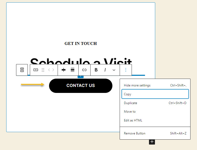
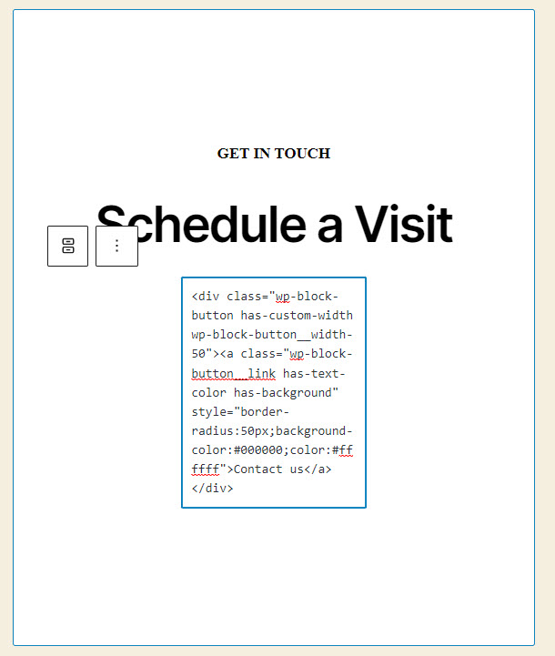
What’s extra is the option to “Edit as HTML”. This means that you can code the block on your own, and even add your own CSS styling.
If you aren’t into coding, don’t worry, there are some basic styling options available in the block editing panel on the right-hand side of the editor.
In here you can:
- Make text and background color changes,
- Adjust the button width,
- Change the size of the text,
- Adjust the border radius.
Now, whenever you select any block, you’ll notice the panel on the right that allows you to make some tiny styling edits. These options vary from block to block.
The problem is that these styling options aren’t enough if you want to create a nicely-designed website.
So, you will need to upgrade the Default Gutenberg Editor.
How so?
Well, you could use the Kubio builder for free.
The builder will enhance the capabilities of the block editing panel allowing you to create truly remarkable websites, without the need of code or a designer.
For example, let’s find out how you can edit the button block using.
How to style blocks in Kubio
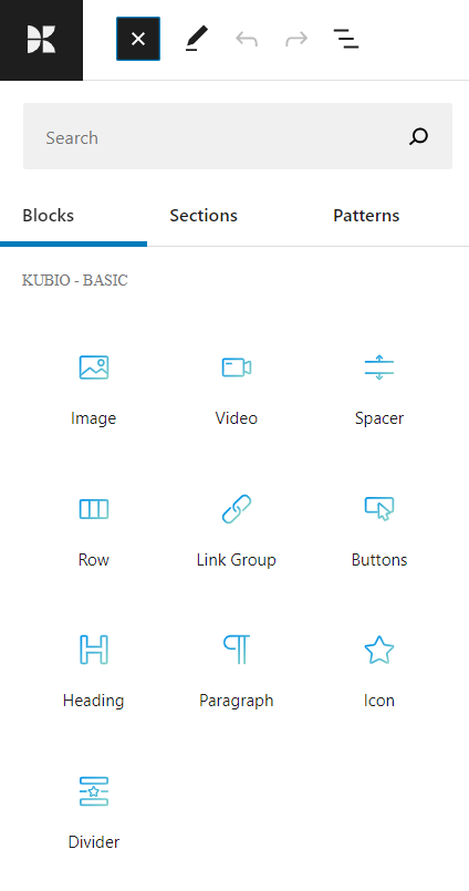
When you install the Kubio builder, you will notice a new set of blocks inside the block inserter. They have a blue-green color.
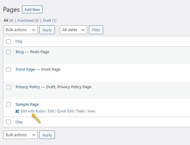
The moment you want to edit a page with Kubio, go to Pages and hover over the page you want to edit. Next, click on “Edit with Kubio”.
Now, patterns are built with Default Gutenberg blocks that have those basic styling options. The designs are basic as well. This is why we recommend you to work with Kubio sections, which go beyond Gutenberg patterns, and have really great designs.
You can discover these sections in the block inserter next to blocks and patterns.
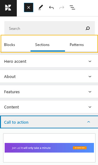
The sections are grouped across categories. Let’s add a “Call to action” section.
The section is very similar to a pattern, only that it’s made of Kubio blocks that can be edited inside an upgraded block editing panel. You can even recognize the toolbar.
Let’s go to the “Get started today” button and see how Kubio is upgrading the default block editing panel on the right.
The moment you select any block, the Kubio block editing panel will open up on the right-hand side. It always has three options: content, style, and advanced. The possibilities inside vary from block to block. In the buttons block case you will be able to make edits to the buttons themselves and their text.
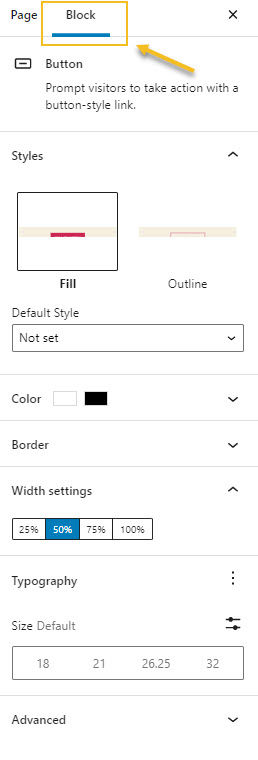
Button block editing – Content level
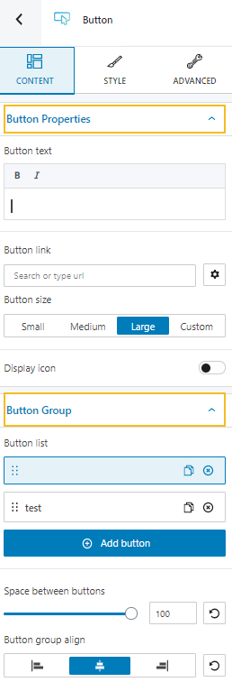
Here we have two main editing categories:
- Button properties. Here you can type your text, but you can also do it live, directly on the canvas. You can make your text bold, or italic, and add a link to it. You can also make size adjustments to the button.
- Button group. Here you can create more buttons inside a group. You can set up the distance between buttons, as well as their alignment.
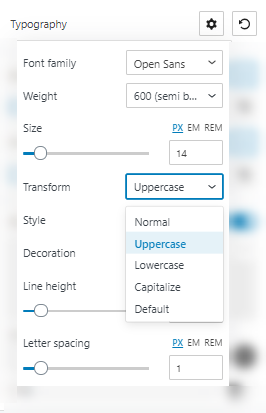
Button block editing – Style level
The moment you select an individual button, you can style it both in a normal and hover state.
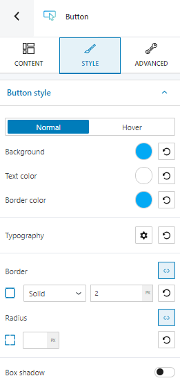
Here’s what you can customize:
- Background, text, and border color.
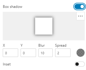
- Box shadows. You can make adjustments to the position, blur, color, and spread radius of the box shadow.
- Typography. You can set up a different font family, font size, and weight for the button text. You can add decorations to text, set up capitalization, and adjust line height and letter spacing.
- Border. There are several border types that you can choose from. You can change the border color and thickness easily.
- Radius. From this option you can round the button’s corners. You can also assign different values for top-right, top-left, bottom-left and bottom-right, if you select the link symbol.
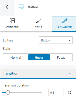
Button block editing – Advanced level
At this level, you can make edits to the button or icon, across three states: normal, hover, and focus.
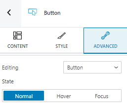
No matter what you choose to edit, you have the same options both in the normal and the focus state, while the hover states bring an extra edit option for transition. Here you will have to set up the duration of the transition.
Here are the available advanced button block edits:
- Background. Here you can make adjustments to background color and type of the Gutenberg button block.
- Spacing. Here you can set up the margins and paddings for your buttons block.
- Border and shadows. Here you can add borders with a different color, radius and thickness to your block. Also, you can add box shadows. You have full control over the position, blur, spread and color of the box shadow.
- Typography. The same typography edits that can be made under the styling options can be found here. There’s also a shortcut that you can take to manage the theme’s defaults.
- Responsive. Here you can decide whether the block will show or not on desktop, tablet or mobile.
- Miscellaneous. At this level you can set up the z-index of your button block (vertically order the elements that overlap), set up if the element overflows or not (displaying the content of the block flowing out of its container into the surrounding area), add HTML anchors and CSS classes.
Do you now see the difference between Gutenberg styling and Kubio styling?
Kubio is indeed upgrading the default Gutenberg editor, it puts it on steroids.
Over and out!
If you want to find out how you can create a WordPress website from scratch, check our guide here.
If you liked this article, and want to have access to similar content, make sure to subscribe to our YouTube Channel. You can also follow us on Facebook.