

The WordPress header is a vital component of your website, often serving as the first touchpoint for visitors. An effective header can captivate visitors, reflect your brand identity, offer effortless site navigation, and even enhance your SEO.
Creating a custom WordPress header helps to create a unique and memorable user experience. WordPress offers some flexibility in header design, allowing you to tailor it to your specific theme, layout, and functional requirements. By using tools like the WordPress editor, child themes, and specialized plugins, you can craft a header that not only looks great, but also boosts usability and aesthetic appeal.
In this guide, we’ll look into the essential elements of a WordPress header and give you some tips and tricks for customization using the WordPress editor and the Kubio builder. Remember, your header is your site’s welcome mat, and making a great first impression can set the tone for a positive user experience. Let’s explore how to make your WordPress header stand out and work effectively for your website.
How to edit your WordPress header
This guide will walk you through the process of editing your WordPress header using two different builders: the built-in Gutenberg builder and the Kubio builder.
Using Gutenberg
To edit your WordPress header using the Gutenberg builder, follow these steps:
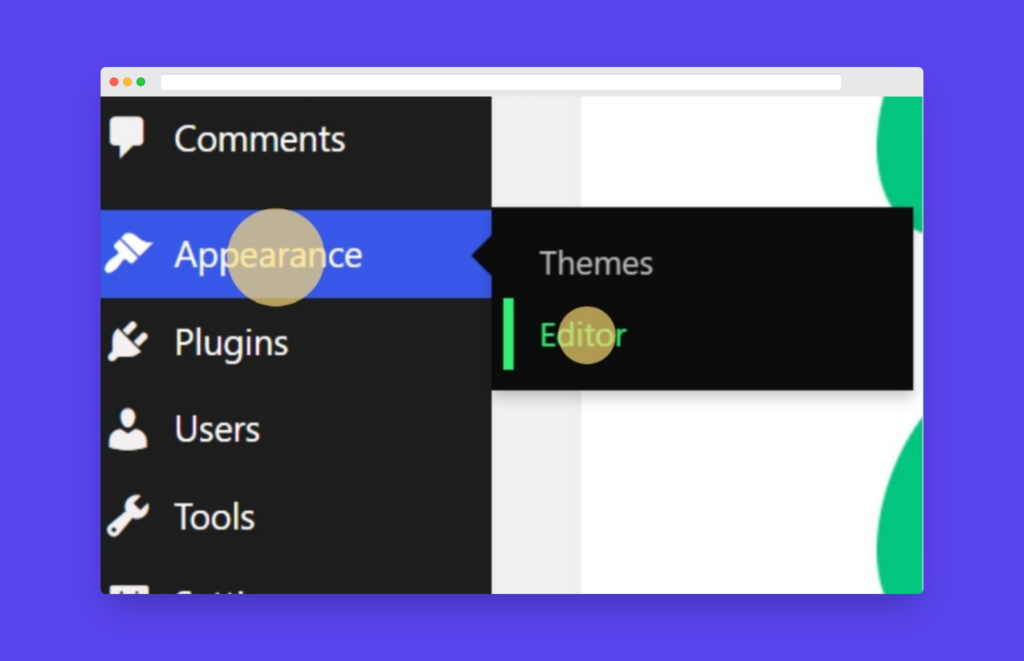
- Go to the WordPress dashboard:
- Log in to your WordPress admin panel.
- Go to Appearance in the sidebar.
- Click Editor.
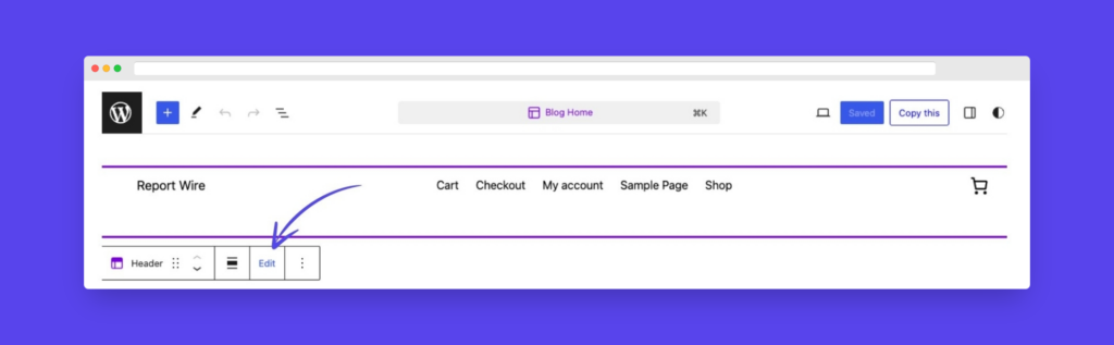
- Edit the header:
- Click on the page header and select “Edit”.
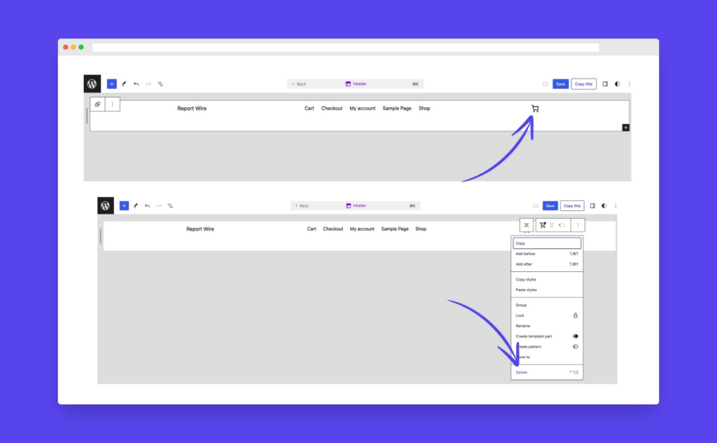
- Choose the elements you want to change. For example, to remove the cart icon and replace it with social media blocks:
- Select and delete the cart icon.
- Add social media blocks from the block library.
- Limitations:
- The options available can be seriously limited based on your WordPress theme.
- The Gutenberg builder may have a significant learning curve for beginners.
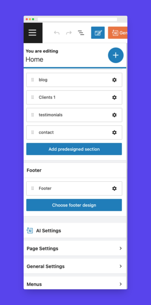
Using the Kubio Builder
For a more user-friendly and feature-rich experience, you can use the Kubio builder. Follow these steps:
- Go to the Kubio editor:
- Go to the WordPress Dashboard.
- Go to Kubio in the sidebar.
- Open the Kubio Editor.
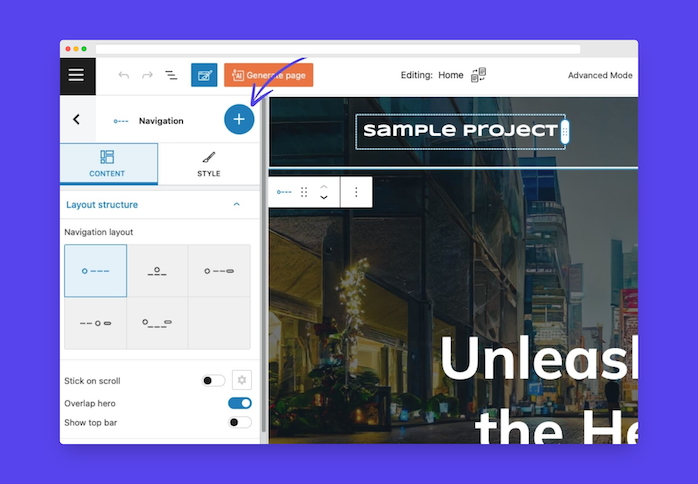
- Customize the header:
- Select the elements of the menu you’d like to change.
- Use the + sign to find blocks for your header. You can choose to change the whole header’s navigational layout and design or customize specific elements individually.
- Edit menu links:
- Scroll down to the Menus section of the editor.
- Select Primary Menu and make changes as desired.
- Mobile preview settings:
- Use the mobile preview settings to view and edit tablet and phone versions of your header.
- Save changes:
- When finished editing, preview the site to confirm the changes.
- Save the changes to apply them to your live site.
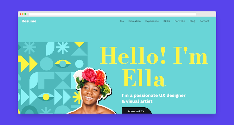
What are the essential elements of a WordPress header?
A WordPress header can be tailored to suit the unique needs of any website. While not all headers will include every possible element, the following are some core components that can significantly enhance a site’s functionality and user experience:
Logo
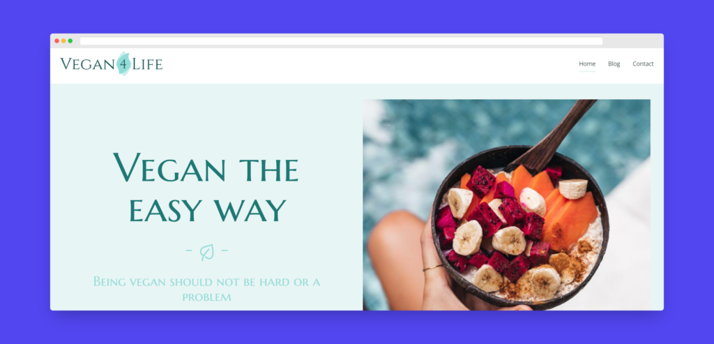
The logo in a WordPress header is important for brand recognition. It leaves a lasting impression on visitors, helping them remember the website. Placed typically in the top-left corner, its position impacts the header’s balance and hierarchy. While the top-left corner is common, alternative placements like centering can create a unique look.
The logo should be easily noticeable and complement the design. It can also act as a home button, enhancing user experience by providing a consistent way to navigate back to the homepage.
Navigation menu
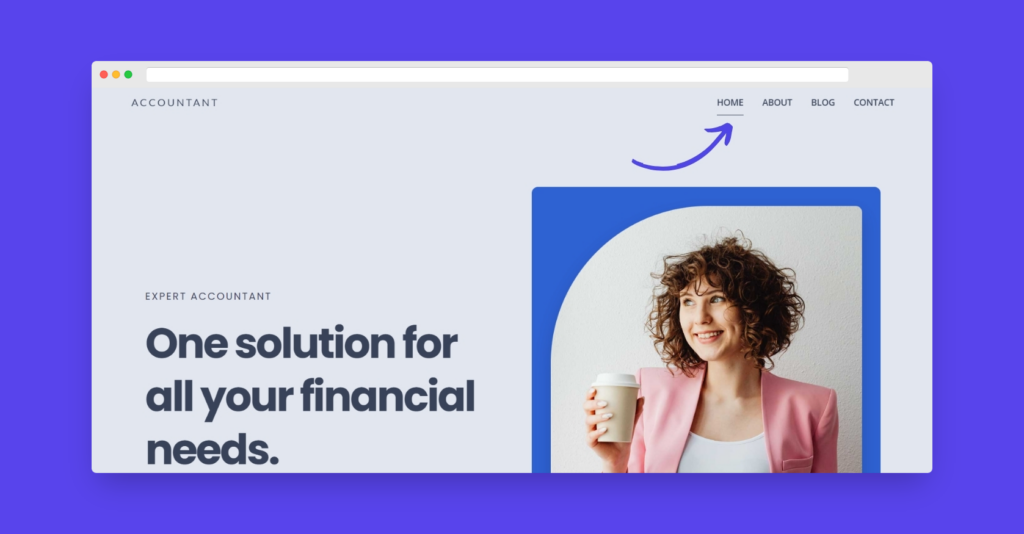
A well-organized navigation menu helps users to find the information they need quickly and easily. When creating a navigation menu, think about:
- Logical organization: Group and order menu items in a way that makes sense to users, with the most important pages being easily accessible.
- Clear labels: Use concise and descriptive labels for menu items, allowing users to understand what each page is about at a glance.
- Responsive design: Ensure that the navigation menu adapts seamlessly to different screen sizes and devices, providing a consistent user experience across platforms.
- Accessibility: Use proper heading structure and ARIA attributes to make the menu accessible to users with disabilities, such as those using screen readers or keyboard navigation.
Call-to-Action (CTA) buttons
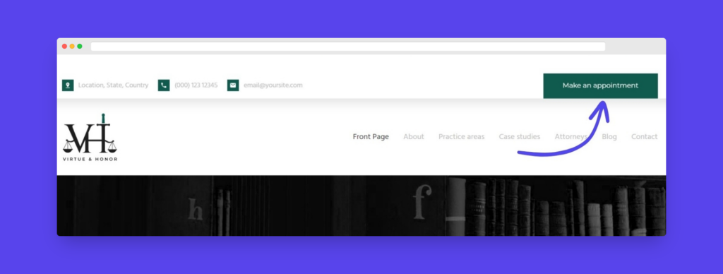
CTA buttons prompt users to take actions like “Sign Up,” “Contact Us,” “Shop Now,” or “Learn More.” By guiding users through the conversion funnel, they significantly impact business growth. The visual design of CTA buttons is key to their effectiveness.
Using contrasting colors, bold typography, and whitespace can help them stand out and grab users’ attention. It’s also important to use clear, action-oriented text to guide users on what to do. When crafting CTAs, persuasive language that highlights the benefits of taking action is essential. Keep the text concise and avoid being overly wordy. Adding a sense of urgency or scarcity, like “Limited Time Offer” or “Only X Spots Left,” can further motivate users to act.
Search bar
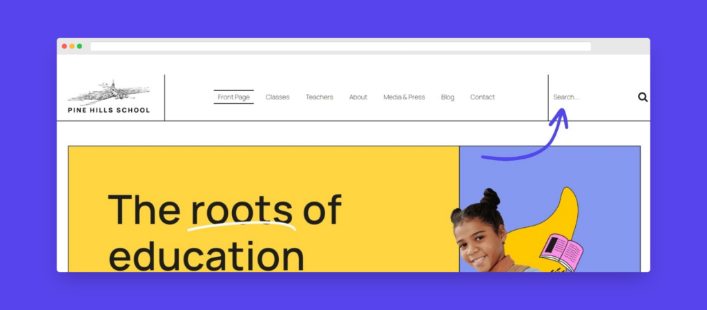
A search bar allows users to quickly find specific content on the website. It is especially useful for larger sites with extensive content. The search bar is often represented by a magnifying glass icon and can be placed prominently in the header. This feature enhances user experience by making it easy to locate information without navigating through multiple pages.
Contact information & social media links
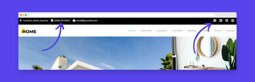
Including contact information such as a phone number, email address, or a link to a contact page can help with user convenience. This information is often placed in the top-right corner of the header. Making contact details easily accessible encourages users to reach out, offering better communication and engagement.
Links to social media profiles help users connect with the brand on various platforms. These links are usually represented by icons and can be placed in the header for easy access. Social media links extend the website’s reach and allow users to engage with the brand in different contexts.
User account links
For websites that require user accounts, links to login or register are commonly included in the header. These links help users quickly access their accounts and related features, improving the overall user experience. This is particularly important for membership sites, forums, and e-commerce platforms.
Shopping cart
For e-commerce websites, a shopping cart or basket icon is essential. It allows users to view and manage their selected items and proceed to checkout. The shopping cart is typically placed in the top-right corner of the header, making it easily accessible and ensuring a smooth shopping experience.
Language switcher
For multilingual websites, a language switcher enables users to select their preferred language. This feature is often represented by a globe icon or a dropdown menu listing available languages. Providing a language switcher enhances accessibility and user experience for a global audience.
Visual elements and white space
Effective use of images, icons, and white space can enhance the visual appeal and usability of the header. These elements help create a clean, uncluttered design that guides the user’s attention to the most important features. By balancing visual elements with ample white space, you can ensure that the header is both attractive and functional.
Best practices in website header design
Although there’s no one-size-fits-all approach to header design, there are some best practices to keep in mind when building your WordPress website header. These guidelines will help you create a functional, visually appealing, and user-friendly header.
Consider page and menu height ratio
The height of your header significantly impacts the overall look and feel of your website, as well as the user’s experience. A header that is too large can overshadow the content, while one that is too small might go unnoticed. Here’s what to consider when choosing the right height:
- Content amount: Make sure the header height accommodates all necessary elements without appearing cluttered.
- Device screen size: Adjust the header height to maintain usability across different devices.
- Website design: Make sure the header height matches the overall design and layout of your website.
Tip: For more precise control, you can add custom CSS to modify the header height.
Consider a sticky menu
A sticky header remains at the top of the page as users scroll down. This feature improves navigation and user engagement by keeping the menu accessible at all times. The benefits of using this includes enhanced navigation, especially on long pages and increased user engagement due to constant visibility of menu options.
To set up sticky menus in Kubio:
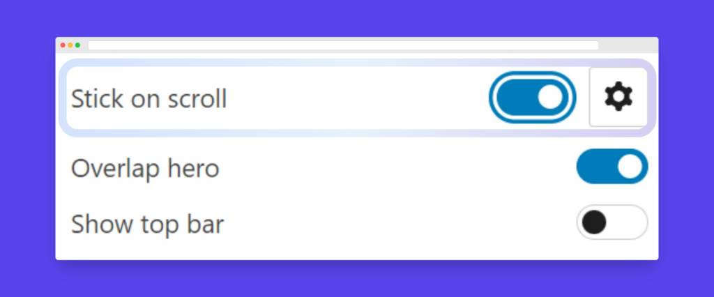
- Select the header.
- Enable “Stick on scroll” from the settings.
The potential downsides of this is that it can take up too much screen space, especially on smaller devices. To mitigate this, ensure the sticky header is compact and does not obscure content.
Build a visual hierarchy
Visual hierarchy in header design guides the user’s attention and improves readability. It involves arranging elements in a way that signifies their importance. Here are some tips on creating visual hierarchy:
- Font sizes: Use larger fonts for more important elements.
- Colors: Utilize contrasting colors to highlight key features.
- Positioning: Place crucial elements like the logo and navigation menu in prominent positions.
“Visual hierarchy is one of the core elements of site design, but it can be hard for amateurs to master.” says Alexandra Nicolae, Kubio’s Lead Designer, “Builders like Kubio help take the guesswork out of these kinds of design principles, since our templates, themes, and AI-generated pages are always built with a strong visual hierarchy.”
Keep your header accessible
Accessibility in web design is important for reaching a wider audience, adhering to ethical standards, and meeting legal requirements. To do this, think about:
- High-contrast colors: Ensure text stands out against the background.
- Clear fonts: Use legible fonts and appropriate sizes.
- Alternative text: Provide alt text for images and icons.
Customize your mobile headers
With more and more users using mobile phones to access the web, mobile optimization is essential. Things to think about when designing a mobile friendly header are:
- Simplify the design: Reduce complexity for a cleaner mobile view.
- Collapsible menus: Use dropdown or hamburger menus to save space.
- Touch-friendly elements: Ensure buttons and links are easy to tap.
Kubio allows device-specific design tweaks, giving you complete control over how your mobile header looks and functions.
Psychology of effective header design
Understanding the psychological principles behind effective header design can significantly influence user behavior and perception.
A well-designed header can immediately convey professionalism, trustworthiness, and relevance, encouraging users to explore further. On the other hand, a poorly designed header can lead to high bounce rates as visitors may quickly leave if they find the design unattractive or confusing.
Placing these CTAs prominently ensures they catch the user’s eye and can increase conversion rates by directing visitors to take desired actions.
Along with this, the strategic use of colors, images, and typography can evoke certain emotions and increase user engagement.
Colors:
- Blue often conveys trust and reliability.
- Red can evoke excitement and urgency.
- Green is associated with growth and tranquility.
Fonts:
- Serif fonts suggest tradition and reliability.
- Sans-serif fonts convey modernity and simplicity.
Choose colors and fonts that align with your brand identity and the emotions you wish to evoke in your visitors.
Maintaining consistency in header design across different pages is important for building trust and familiarity with users. Consistent design elements such as color schemes, font styles, and logo placement help users feel comfortable and confident navigating your site. This consistency also aids with accessibility.
An effective header design can play a vital role in guiding users through a sales funnel. A sales funnel represents the journey a user takes from becoming aware of a product or service to making a purchase. The role of header menu links are:
- Awareness stage: Include links to informative content such as blog posts or educational resources.
- Consideration stage: Feature links to product pages, case studies, or testimonials.
- Decision stage: Highlight links to pricing, contact forms, or trial sign-ups.
Put your new header design skills into action with Kubio
Your website’s header is your first chance to make a good impression, and it acts as a roadmap for visitors navigating your site. Thoughtful design is essential for an effective header.
While you can customize your header using the WordPress built-in site editor, using a builder like Kubio AI offers several advantages, including advanced features and ease of use. With Kubio, you can effortlessly create visually appealing and highly functional headers that enhance user experience and support your site’s goals.
Ready to revamp your WordPress header? Get started with Kubio today!