
Your SaaS website design should give your future SaaS product users a glimpse into the product experience. This means you need to nail the design from start.
But, we have your back.
We are going to present you some best-case SaaS web design practices from some SaaS products we truuuly love, as well as show you how you can kick off with website design for free all by yourself. No coding required.
You’ll probably recognize in our examples SaaS brands like Adobe, Figma, Dropbox, ClickUp, and more.
Spoiler alert: we’re going to design the first two homepage sections for a SaaS product, in less than 9 minutes, using a free website builder that works by drag and drop. And we have a video tutorial as proof.
Do I have your attention now?
SaaS website design best practices [Inspiration from well-known brands included]
In this chapter, we’ll go inside the most important pages of a SaaS website and make design and copy suggestions with the purpose of improving your website’s conversion rate. These best practices will be accompanied by examples from important brands, such as Adobe, Zoom, Dropbox, Mailchimp, and many more.
Let’s get to work!
Homepage design: the Hero
The hero of a website is the first thing a visitor sees when entering the website. If the hero does not convey the proper message, visitors won’t be convinced to scroll through and find out more details about the business.
This means that a bad hero will kill conversion rates, meaning less revenue for your SaaS business. Bummer, right?
To avoid this, you should focus on 3 things when designing your hero:
- Visuals
- Copy
- Call to action
Let’s take them one by one.
Hero visuals
Try to use visuals (image/video) that are relevant to your SaaS product and can give the users a glimpse into the product experience.
For example, the folks at Adobe are using a vibrating video that shows off the capabilities of their photo editing software.
Miro (a successful collaboration whiteboard tool) uses really simple illustrations in the hero to give a sense of how they foster collaboration among teams.

Hero copy
Usually, in the case of SaaS website design, there’s a main heading and a tiny description below, inside the hero.
The heading copy and the description text that complement it should match the expectations of the website visitor and state your unique selling proposition (USP). The USP should also make it clear to the user why you are the best choice and not some other product.
Here’s how Miro covers this.
If I were to come from a remote team, I would definitely feel as if Miro speaks my language and understands my needs. Miro also does an excellent job at stating who the audience should be for the product: remote, hybrid, and distributed teams. At the end of the day, you don’t quite have full control over the audience of a site. Maybe your campaigns also reach audiences that you do not need. By stating clearly who the product is for, you can also filter the audience.
Next, the copy should provide the website visitors with the reason to continue the interaction.
In the case of Miro, the copy “The online collaborative whiteboard platform to
bring teams together, anytime, anywhere”, might do the trick. Miro manages to answer the following question: Why should I care? The answer is clear: because you are working inside a remote team, this tool is for you. It will bring your team together anytime, and anywhere.
Here are some best case practices for writing copy for the hero:
- Don’t use fluff and avoid jargon. Try to speak the visitor’s language;
- Write as if you’re talking to the website visitor face to face;
- Try to answer the visitors’ question: Why should I care?
- Explain how the product will help the visitors achieve a goal or solve a problem. Have a before/after approach. What does the product let the users do, that they couldn’t before?
Here’s a counterexample.
I’m sorry Slack, but this is not how I perceive your product:
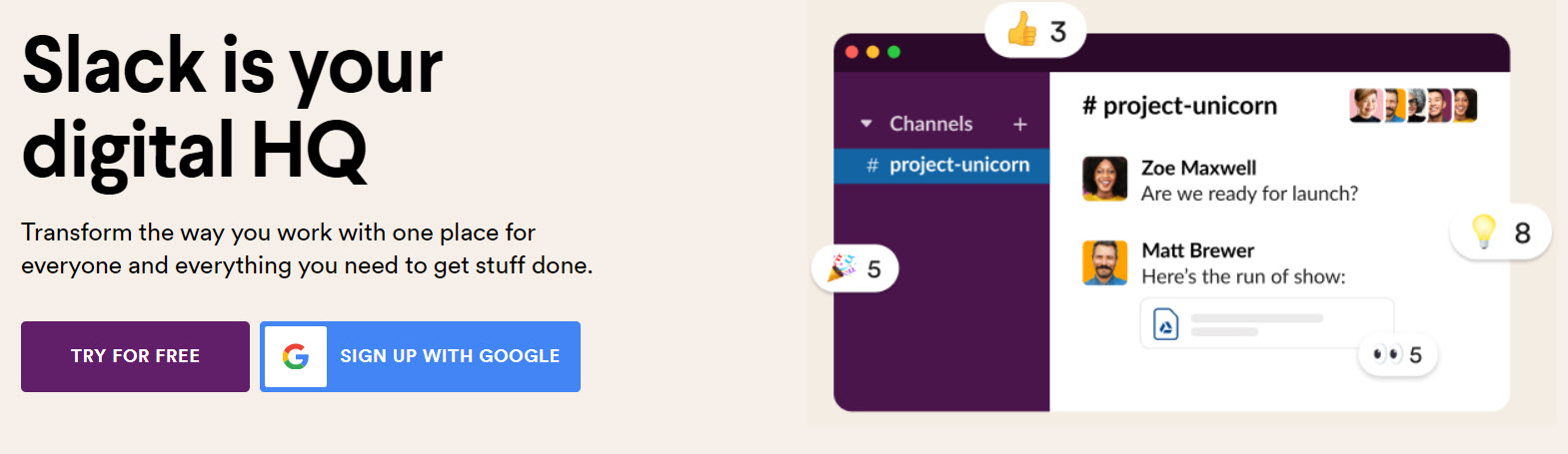
One place for everyone and everything you need to get stuff done?
I mean, can I get a plumber to fix my sink problems with Slack?
This takes us to the following best-case practice:
- Avoid vague and general expressions, such as the “get stuff done” from the Slack example. What stuff are you talking about?
We could conclude that the hero copy should focus on:
- WHAT the product does;
- WHO it addresses to;
- And WHY should the website visitors care.
Bonus:
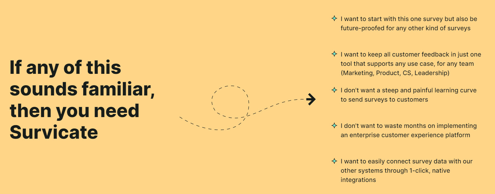
When you really know your audience, and the values it cares about, you can use them across your copy. For example, the folks at Survicate (a feedback tool) identified several scenarios to which the audience can relate to, so that they can better understand how the tool will help them.
Hero call to action
A call-to-action (CTA) button is used on any website, not just SaaS websites, to guide users towards a goal/conversion.
Ideally, a page should have one goal. But in Saas, there’s a common practice to have even two goals, or more, like Sparktoro, a tool for audience research.
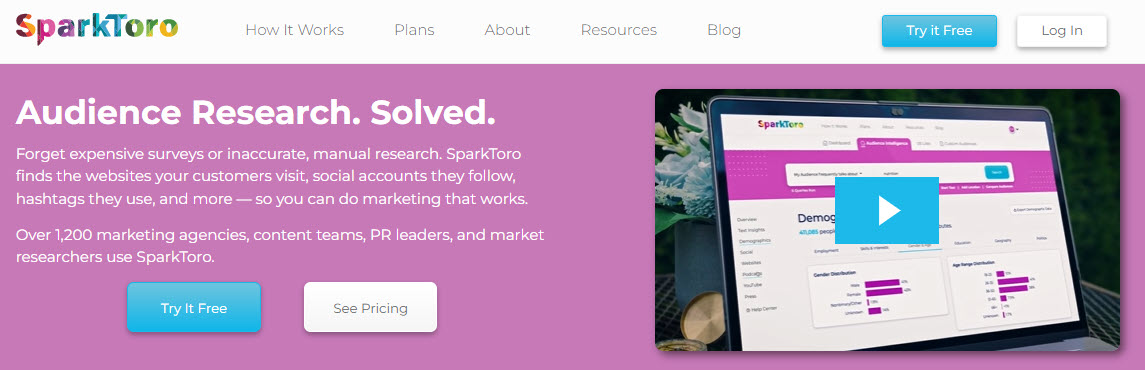
The “Try free” CTA will guide the users to a landing page where they can register.
If they are not willing to register yet, they could try and see Sparktoro in action, by giving it a try and clicking on the “Discover now” CTA. For those that are closer to a purchase, they can click on “See the pricing”.
It seems that the folks in Sparktoro have created a separate call to action for separate steps in the buyers’ journey. And they are probably testing these calls-to-action because they’ve just gone through a website redesign.
You could have a similar approach:
- Have a call to action addressing an audience that is not familiar with the product. You could offer a free trial, a live demo, etc. The folks at Drift even allow you to preview how a chatbot could look like on your website.

Before giving the users access to the chatbot, they require their email address. This way they can collect leads that they can nurture afterward into prospects and customers.
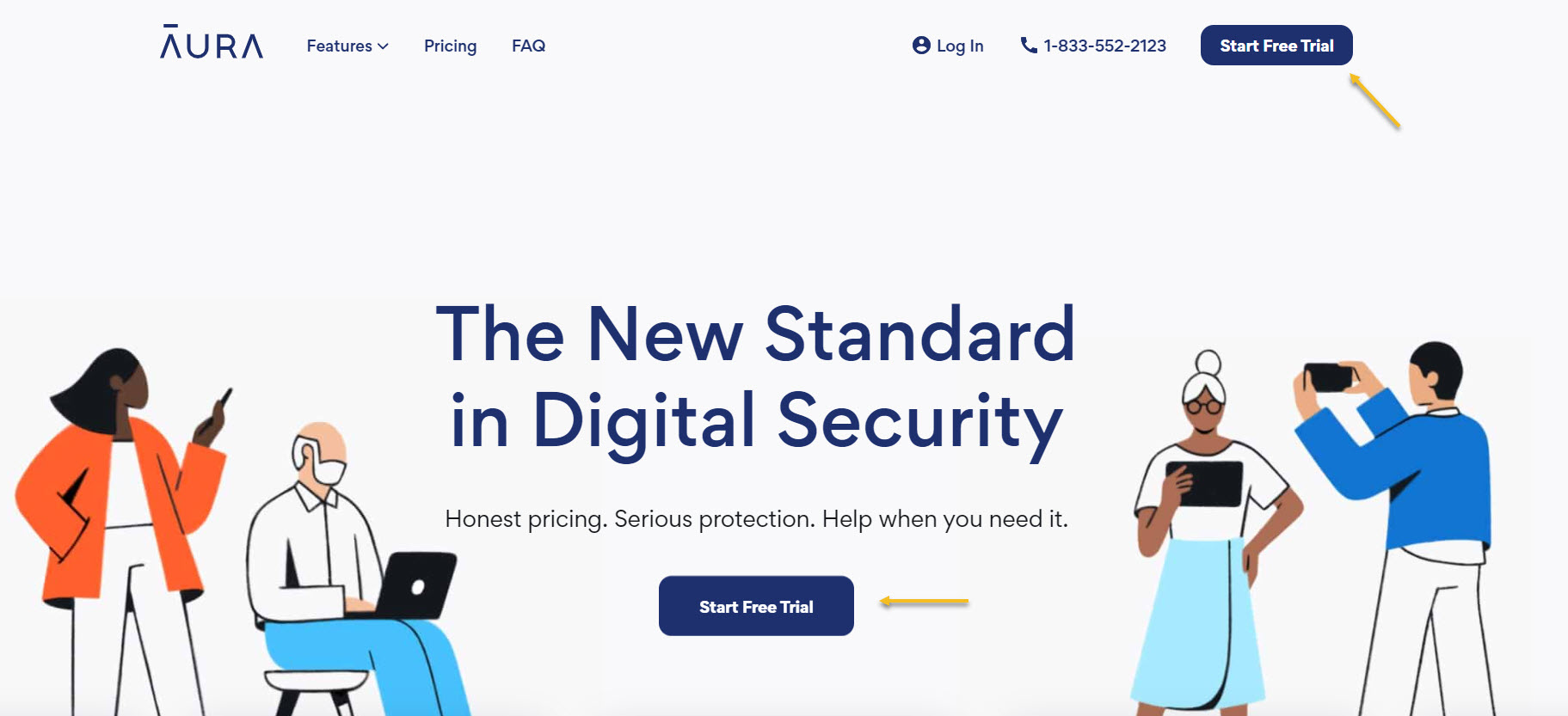
- Have a call to action for those closer to buying, eg: “See pricing”, or “Talk to Sales”. Another excellent example of using a powerful CTA you can find on Aura’s homepage. Compared to the Sparktoro’s above the fold CTA, Aura has a more minimalistic design that helps the CTA “Start Free Trial” stand out. Also, they decided to stick to one CTA only on the homepage as this is one of the key steps in their conversion funnel.
Now, Here are some goal examples:
- Make website visitors register/sign up;
- Get the users enrolled in the free trial;
- Get the users in a demo call;
- The purchase of a product plan.
Homepage SaaS website design: the social proof
So, your website visitors have just seen your hero. What now? How can you hook them and move them closer to your website goals?
You need to reassure the visitors that your business and product are credible. It’s time to build trust.
Robert Cialdini, the author of “Influence: The Psychology of Persuasion”, has defined 6 principles of persuasion. Among them, there’s Consensus or Social Proof. Cialdini defined social proof as people doing what they notice others are doing. Here’s an example I keep on giving: let’s imagine you are at a restaurant and see a message saying that “8 out of 10 people don’t use plastic straws for their smoothie”, and another one saying “Protect the environment by not using plastic straws”. Which is the most powerful? I would wager it’s the first message.
Now, how can you make use of this principle in SaaS website design? Here are some suggestions:
- Use logos of companies you’ve worked with (mostly if they would seem familiar to your audience). Here’s an example from ClickUp.

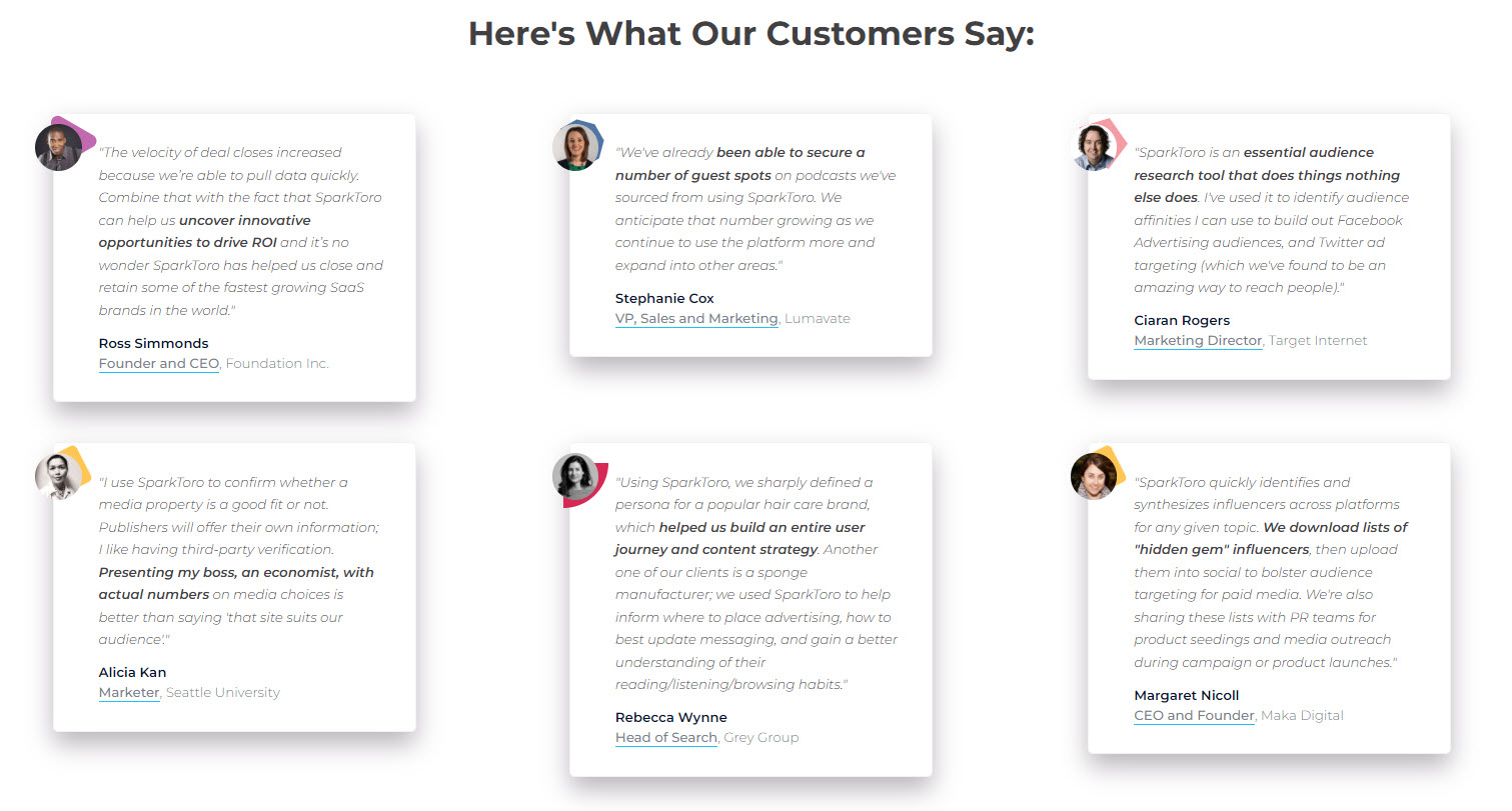
- Use testimonials from former clients. In the case of Sparktoro, they use pictures of the persons giving the review, their function and company are also mentioned. This makes the testimonials genuine. The functions also are helpful because they are proof of authority. You can see there that Founders, CEOs, Managers, and VPs are thrilled with the product.
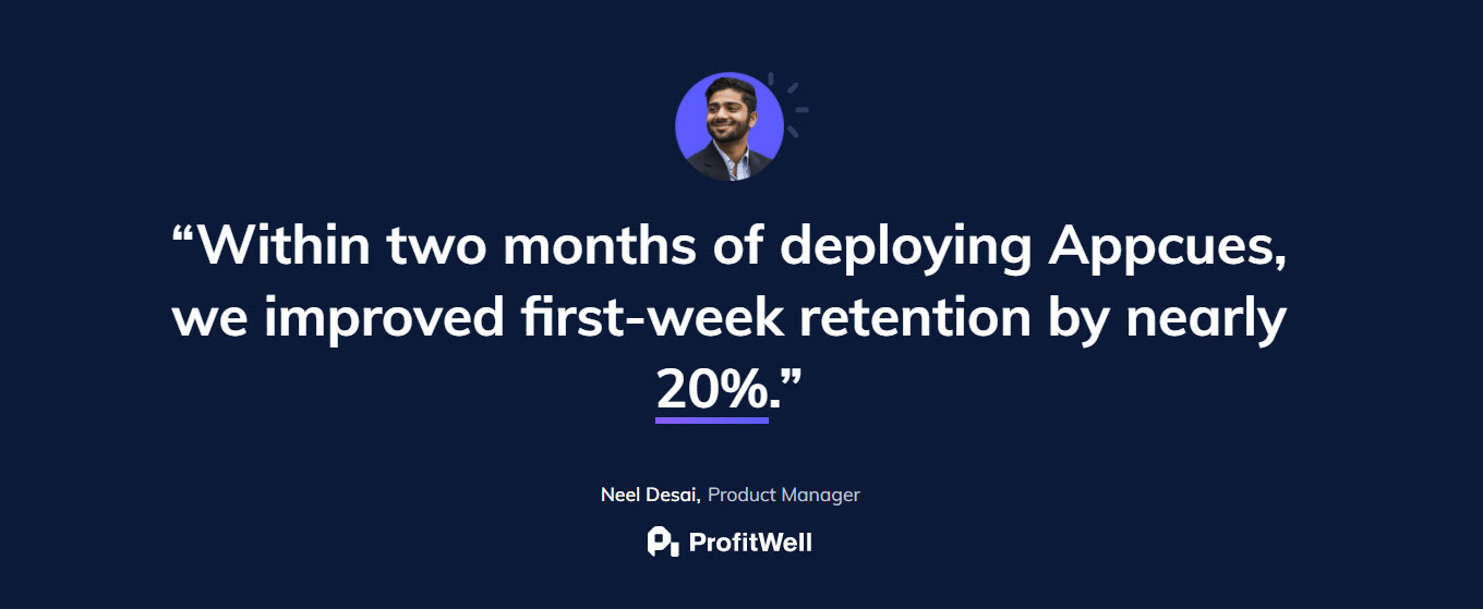
Here’s another great example from AppCues, a great onboarding tool. The focus of the copy is on the result: improved first-week retention by 20%. This is the main goal for any product during the onboarding process: improving retention.
- Show off your reviews on third-party platforms, like in the example below from ClickUp.

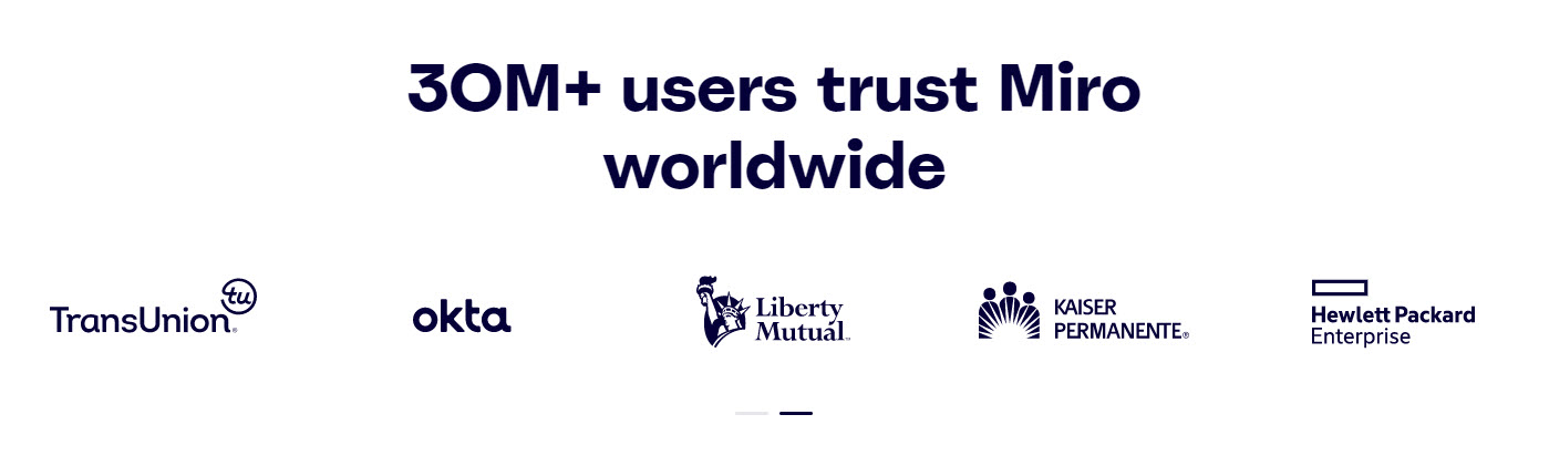
- State how many clients or users you have, like Miro does.
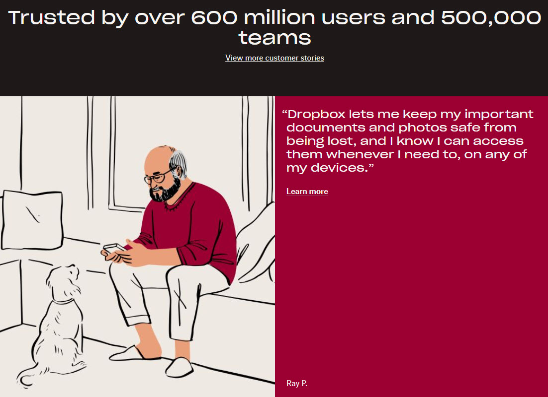
In the following example, Dropbox mixes some amazing product stats, and testimonials to reinforce the fact that their product is top-notch. And the design is just jaw-dropping.
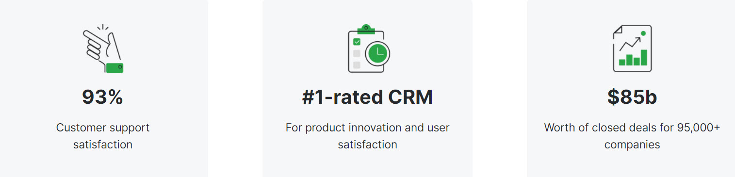
- Show off some other stats your users might care about, such as customer support satisfaction. Below is an example from Pipedrive, a leading CRM.
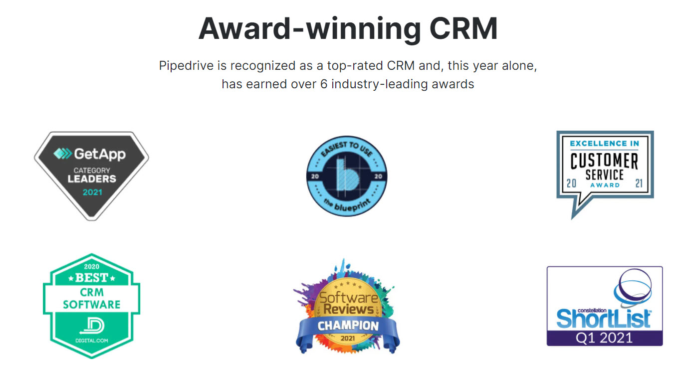
- Show off any awards or badges to make potential product users trust you. This example is also from Pipedrive.
Product features in SaaS website design
Now, you have the website visitor hooked. You seem trustworthy and knowledgeable. It’s time to get further into the product.
You could present some features and their benefits on the homepage, just to give the users a taste of what the product does, but, the more detailed info should have its own page.
There’s a common practice to focus more on the benefits than the actual features. The potential user can better relate to the benefits because they help them envision how he can get from A to B.
Now, another common practice is to present on the homepage the three major benefits of using a SaaS product.
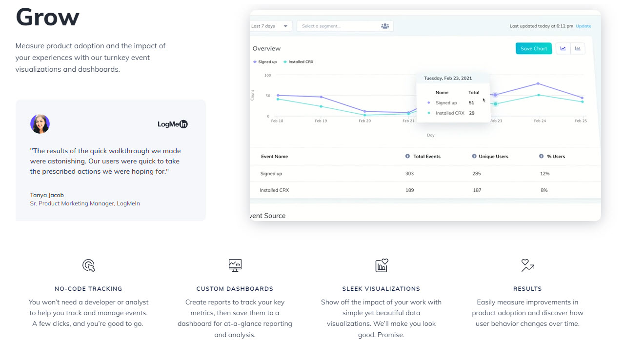
For example, the folks at AppCues, have created 3 main clusters: Create, Target, and Grow.
Each cluster has a relevant testimonial, a video, and 4 other advantages that sustain the cluster.
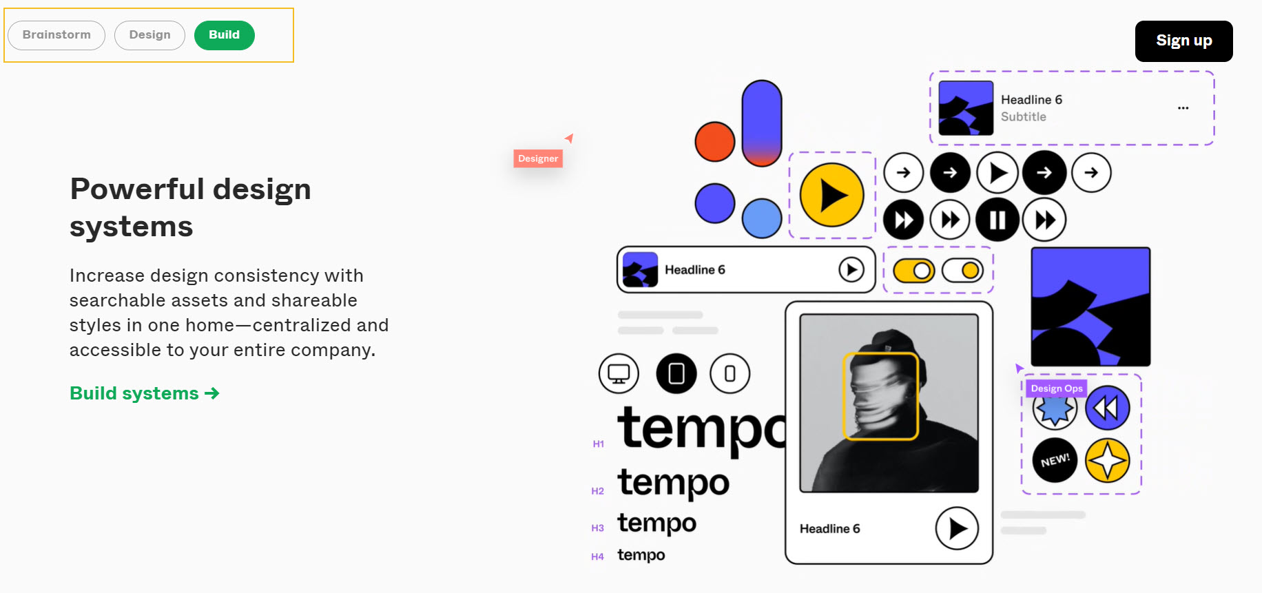
The same approach is used by Figma (a great tool used in the design process), they structured their main benefits across Brainstorm, Design, and Build.
Next, each benefit could lead to a separate page for all the features, or, to a page dedicated only to that particular benefit.
One of the most thorough feature pages we’ve seen across SaaS websites is the one from ClickUp. ClickUp has tons of features that can help teams become more productive, so, coming up with smart ways of grouping those features, was probably a challenge. But I feel they did a good job. You can check the page out here.
Now, another smart way for grouping features is to look at the audience.
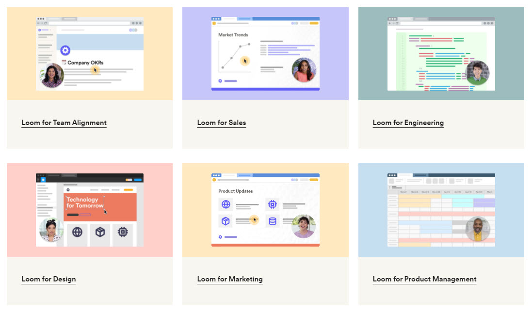
For example, the folks at Loom (a successful screen and video recording tool) have developed pages for various use cases: Loom for Sales, Loom for Design, and so on, where they focus on particular benefits and features for each use case.
Pricing page in SaaS website design
There are several elements that you can include on your pricing page in order to increase your SaaS website conversion rate, besides the product packages. Here they are:
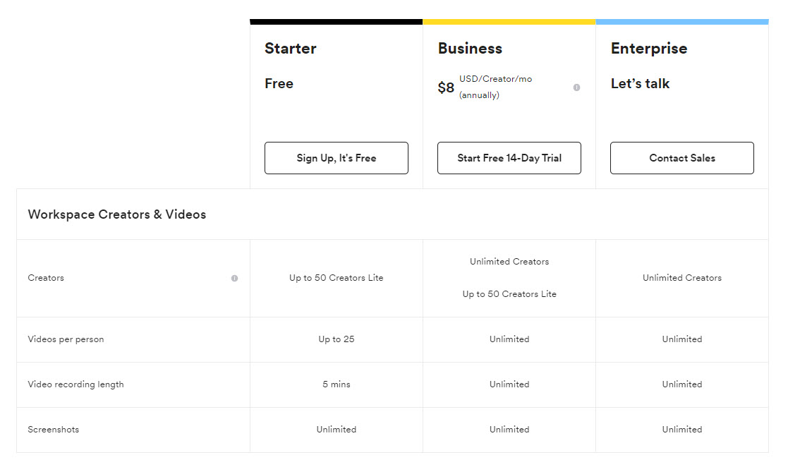
- Plan comparison, with detailed features and benefits across the plans. Here’s an example from Loom:
Make sure to keep your plans’ headers sticky, so that your readers won’t need to scroll back and forth and remember the type of plan. This is what the folks at Dropbox are doing.
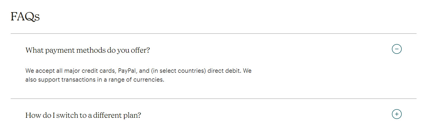
- Frequently Asked Questions list to clear some extra things up, related to the product, support, upgrades, etc. Here’s an example from Mailchimp, a successful marketing platform:
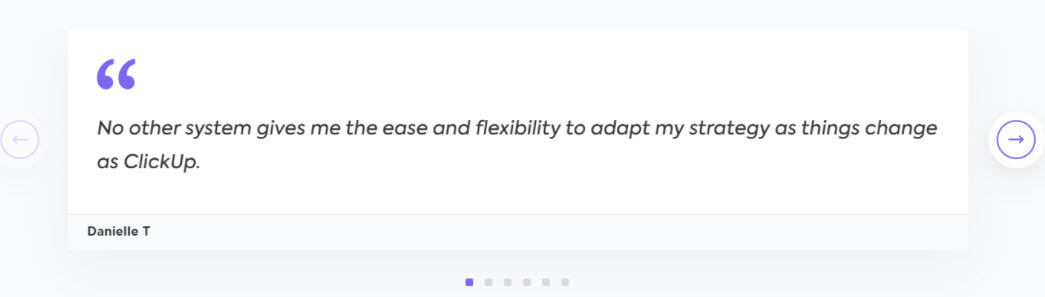
- Social proof in the shape of logos, testimonials, or awards. Here’s a testimonial example from ClickUp:
At the end of the day, you will need to do an AB test and see what works for your users. And which elements will lead to an increase or decrease in the SaaS website conversion rate.
Success stories or Case studies – must-haves for SaaS website design
Case studies are the social proof that rule them all.
Whenever we make a purchase decision, we look for validation from others. This is why social proof is so strong. And case studies are a great way to show off your product’s value to others.
You can mention your case studies on the homepage, on feature pages, or they can have their own standalone page. For example, the folks at Figma have a bunch of successful client stories on a page called “Customers”, like this one done about the Dropbox success story.

Make sure to include KPIs when presenting the case study, like in the example below from Mailchimp. This way you can translate your product’s value into real numbers.

Now, it’s finally time to get to some practical work!
SaaS website design: a tutorial
No matter the web design platform you’re using, the advice above still stands.
Now, from the technical perspective, here’s what you will need to kick start your SaaS website design:
- A domain name
- A hosting provider
- A web design platform such as WordPress, Wix, Webflow, etc.
Now, WordPress powers more than 40% of the websites worldwide and this says a lot.
No matter the platform you use, you will be able to design on top of a predefined theme or template, or just start from scratch. You would start from scratch if the templates available don’t exactly match your vision.
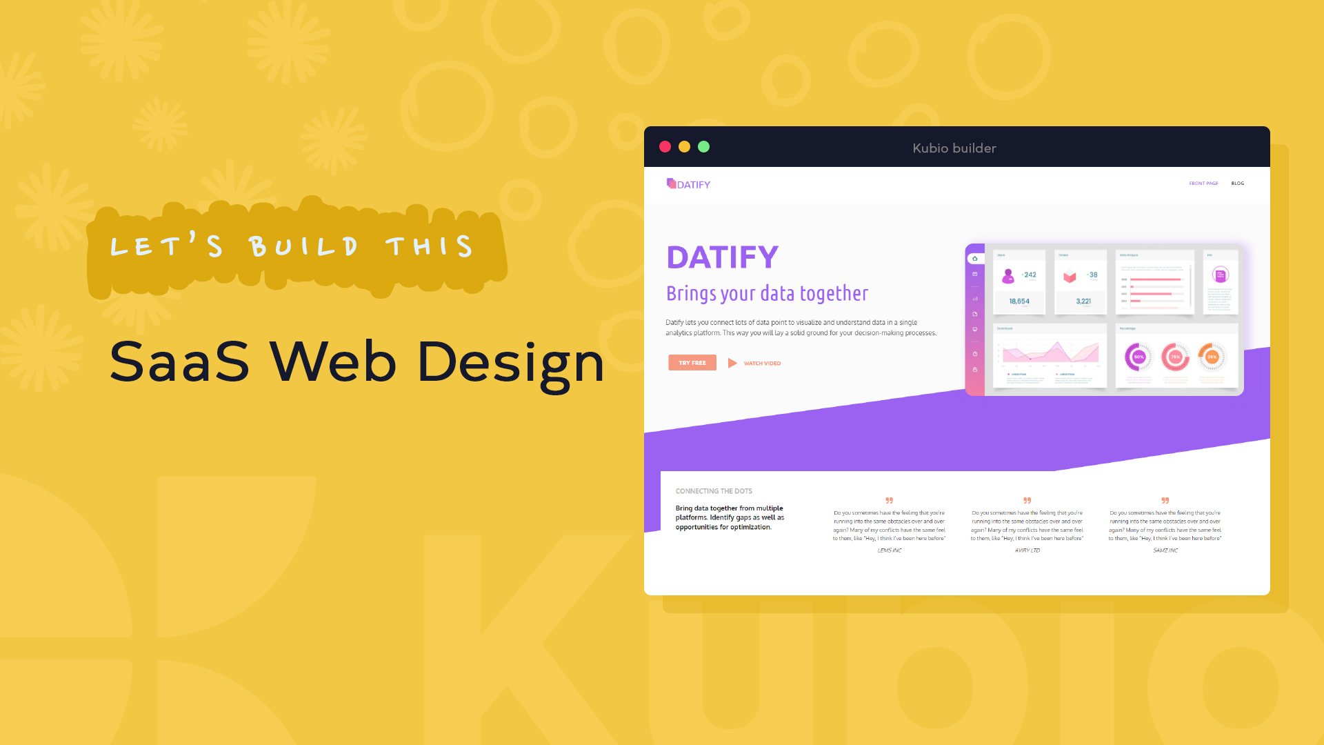
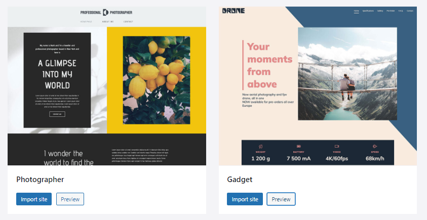
Here are some template examples from Kubio, a WordPress website builder:
Now, I want to show you how you can build these two sections from a homepage, containing a hero and testimonials.
In this exercise I’ll recreate this design from scratch, in less than 9 minutes, using Kubio, a drag and drop WordPress page builder.
Now, the learning curve in WordPress is not long, once you’ve covered the domain and hosting aspects, you can easily install WordPress and start designing your website. Here’s a comprehensive guide on how to do this.
In this exercise, we are using the Elevate WP theme, and the Kubio page builder, which is in fact a WordPress plugin. The chapter in the above-mentioned guide, that details how you can install themes and plugins, is this one. So, I won’t go into further details but jump straight into the design. You will see that everything works smoothly, by drag and drop, inside an intuitive interface.
In the following minutes you’ll find out how to:
- Customize a hero;
- Add navigation to a page;
- Work with typography and color;
- Work with predefined sections;
- Make a design responsive on mobile!
And much more.
And if you’re not in the mood for reading, the whole process can be seen in the video below.
Before jumping right in, you must understand the structure of a webpage in web design. Web pages are structured like a grid, with rows and columns.
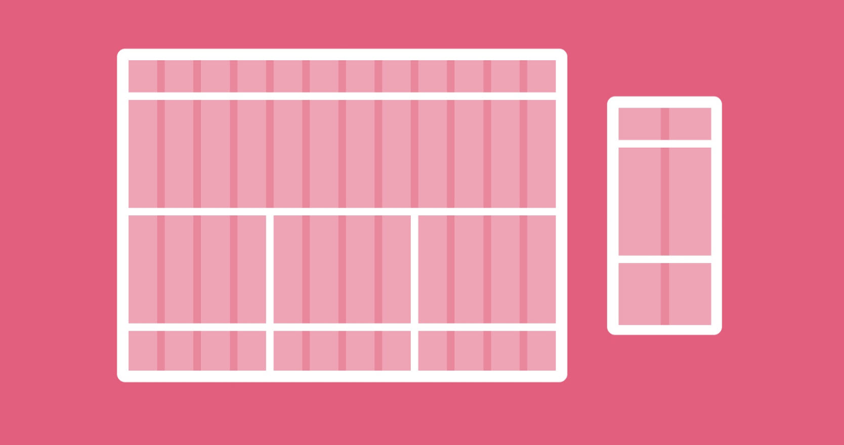
Grids are the skeleton of design, they create alignment, and allow you to organize content. The same goes for print.
Grids also establish a hierarchy for content. You can have a row with two columns, inside a row. The main row can be treated as a parent, while the nested row is a child. This grid structure is later very important when making the design responsive, but we won’t go into these details now.
Whenever you start with designing a page, we advise you to take a pen and paper, draw a grid structure, then place your elements inside. Technically speaking, this would be called a wireframe.

Now, I think we can get to work.
Adding a new page in WordPress
Usually, each theme will come up with at least a front page and a sample page to make it easy for you to start with web design. But we will create a new page for our exercise.
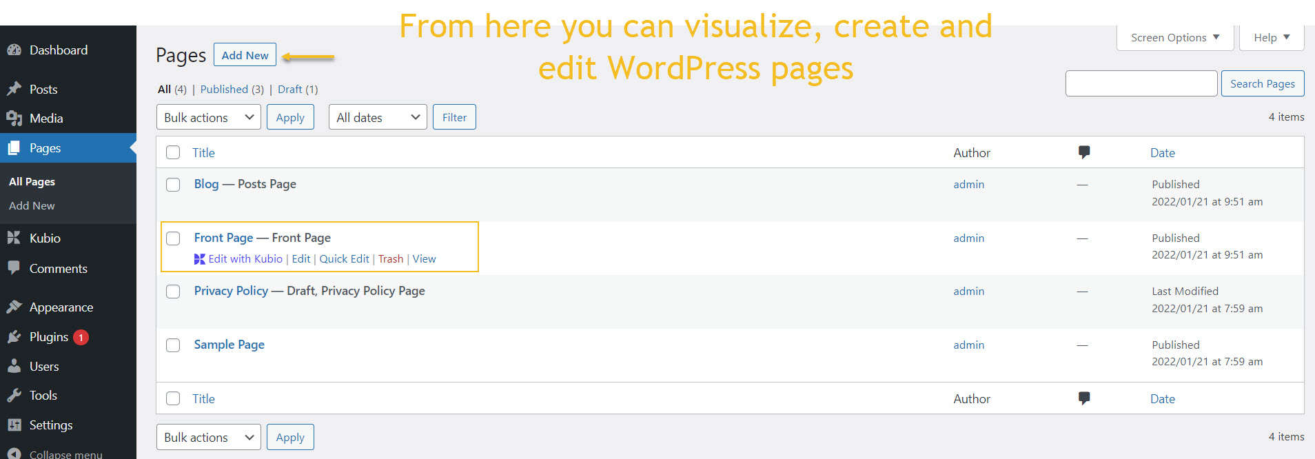
From the WordPress Dashboard, head over to Pages -> Add New.
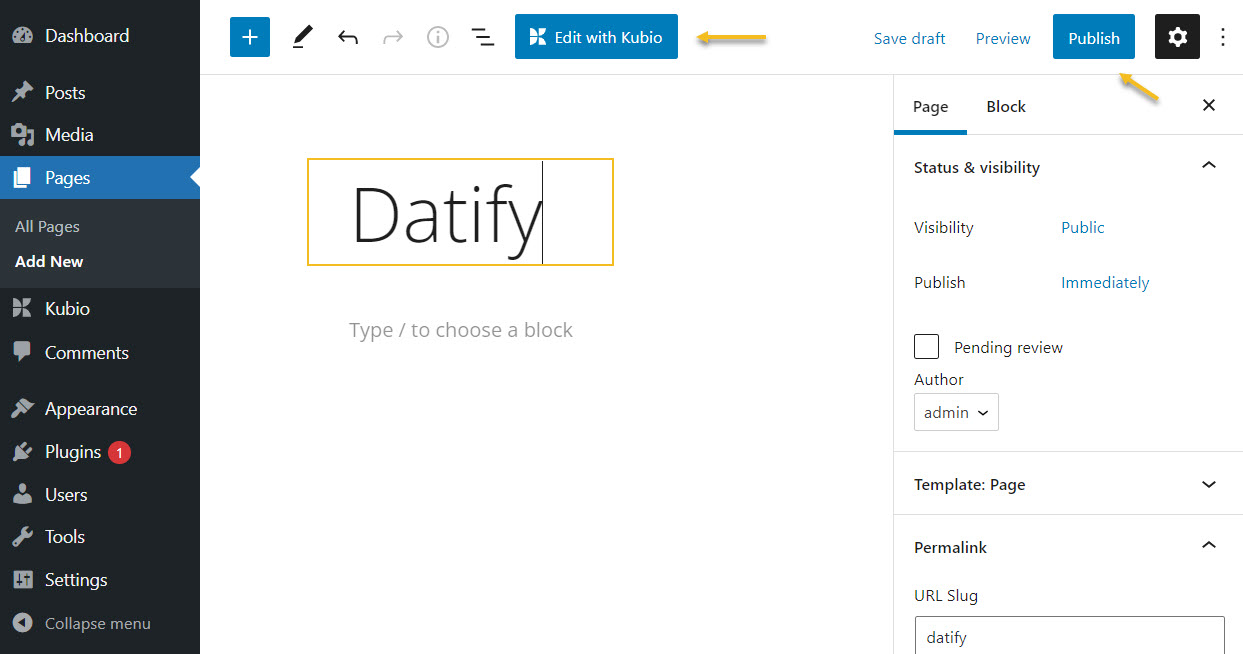
Type in the name of the page then hit “Publish” from the upper-right corner. Next, select “Edit with Kubio”
All new pages will use the theme’s default header and footer. This is why you’ll be seeing this:
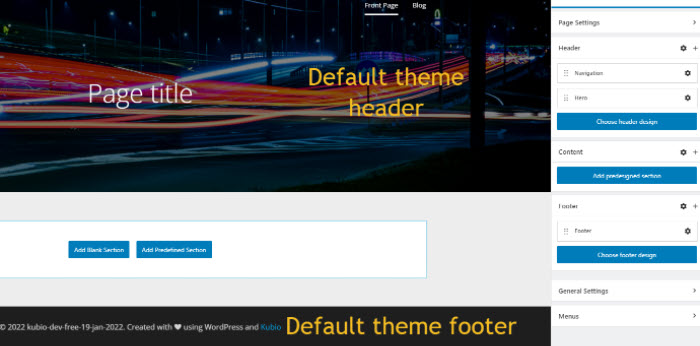
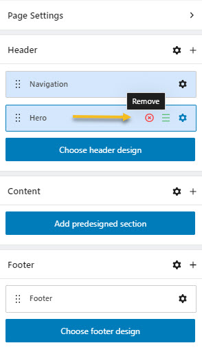
On the right, you will see a page editor, with all its content. That content is split between Header, Content, and Footer. We will delete the Navigation and Hero from the Header, by clicking on the “x” signs, next we shall delete the footer. This way we will have an empty page.
In the middle, we have the actual content of a web page. Any change will be reflected here in real time. No code is needed.
Now, every element that we will add to the design will be a block. Do we need a heading? There are heading blocks. Do we need a button? We need to add the button block. And so on…everything is a block that can be easily stylized to match your vision.
Hero customization
Also…the hero is a block, a more advanced one, that will contain several other blocks. As mentioned in the previous chapter, a hero will contain visuals and texts to make it clear to the website visitors what the product is about.
Adding the hero block
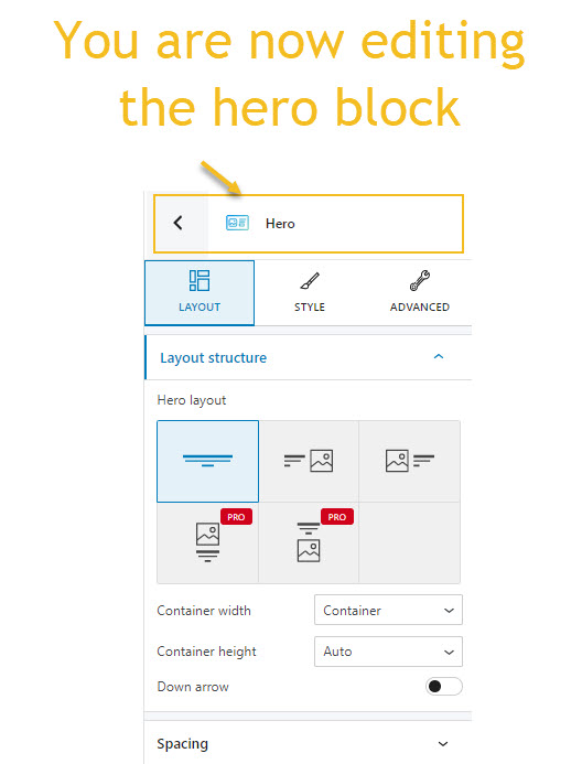
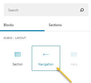
In order to add the hero block, click on the “+” sign as shown below. You will notice a block inserter with three blocks: section, navigation, and hero.
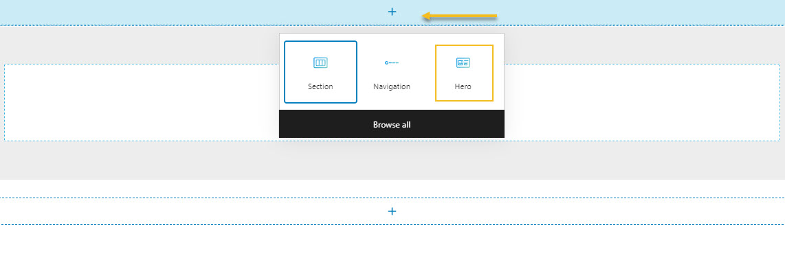
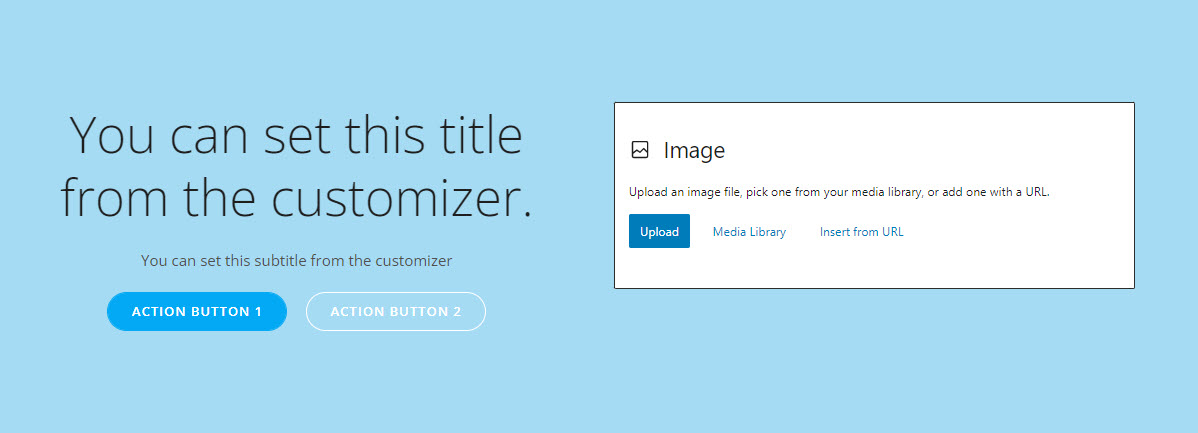
Kubio has some predefined hero blocks, and now it will add a default one, that we shall customize.
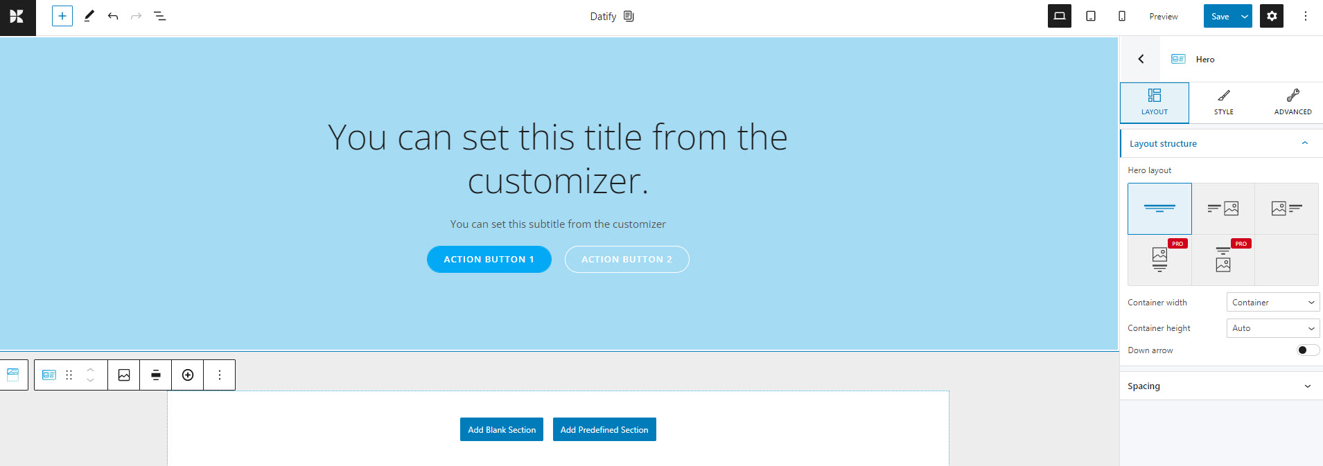
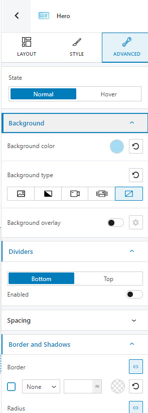
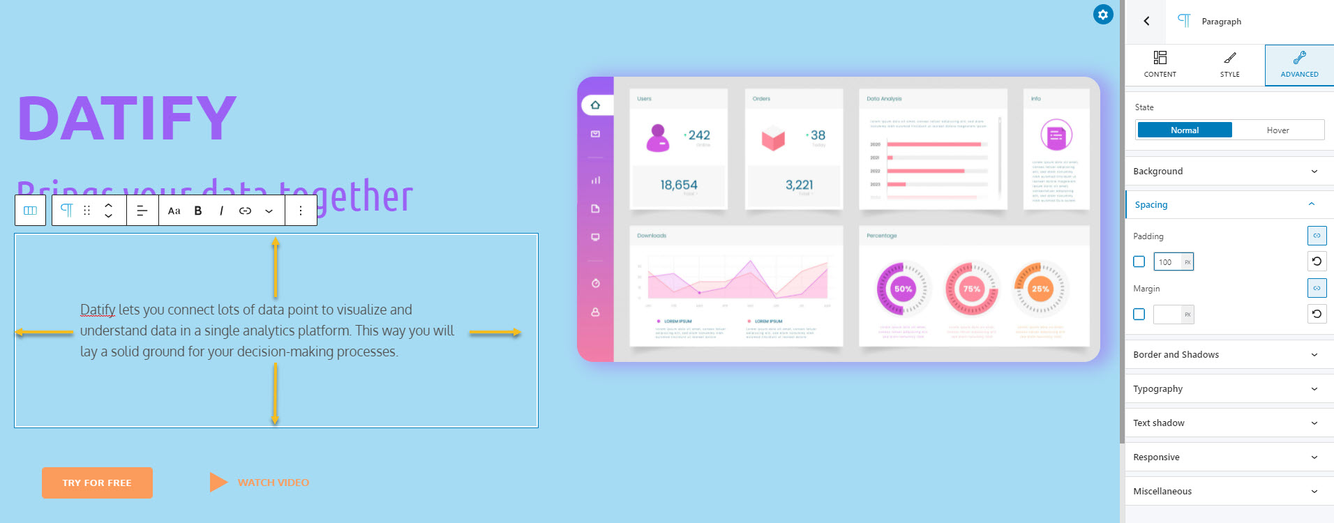
Whenever you click on a block, you will notice several styling options on the right. That’s the block editor. It has three main sections. Content/Layout, Style, and Advanced.
It’s here where all the magic happens.
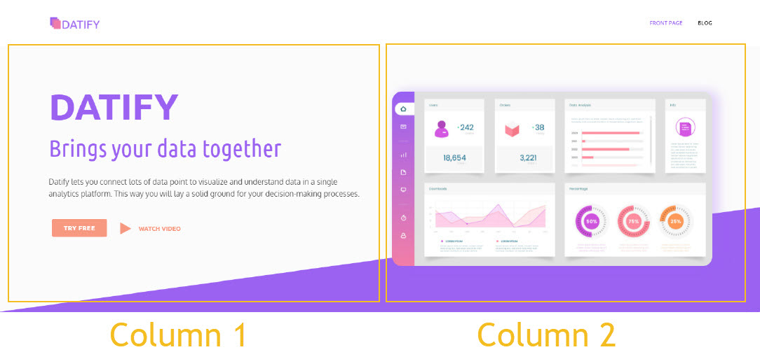
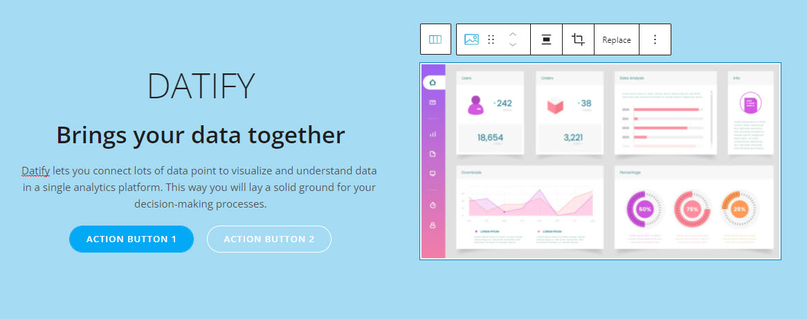
For example, in our design, we have some text on the left and an image on the right. This means that we need to split the hero into two columns, each with its content.
How do we do the split?
Well, while you select the whole hero section (just click in a corner), you will see the following options in the block editor on the right. On top of it, you will see the name of the block. In this case, it’s “Hero”. This way you know if your selection is right.
There’s an option for a hero layout that has text on the left, and an image on the right. That’s what we’re looking for! Let’s click on it. We’ll get this:
Adding text to the hero
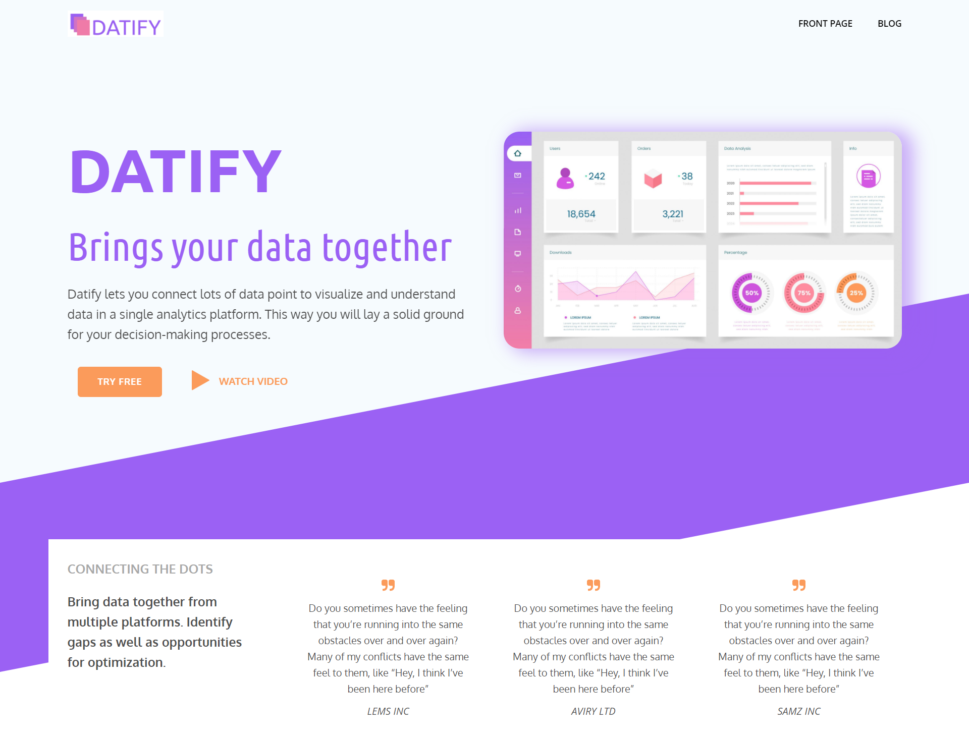
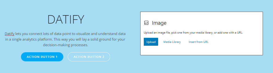
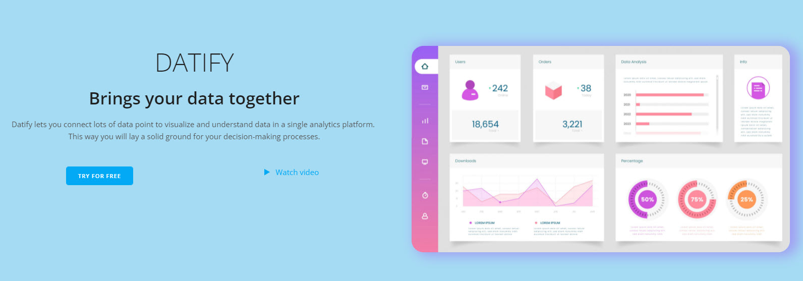
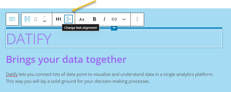
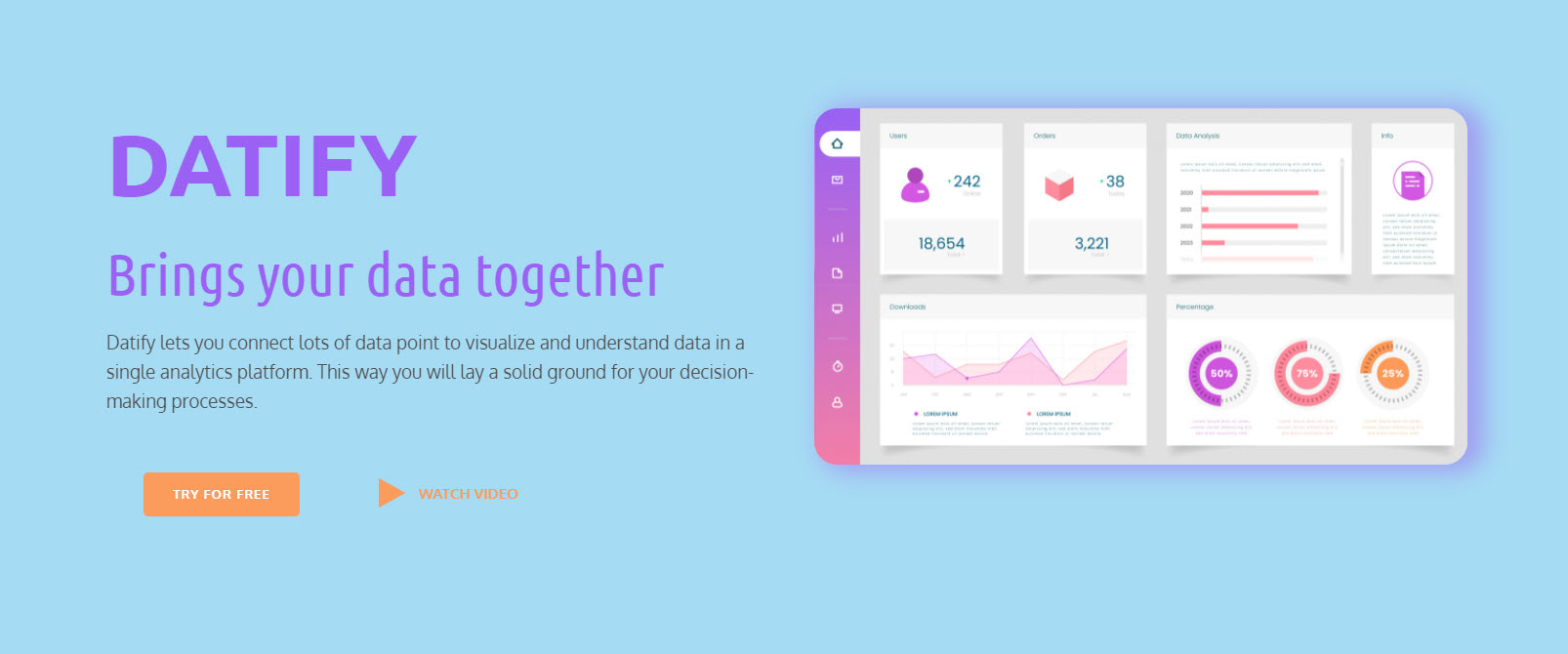
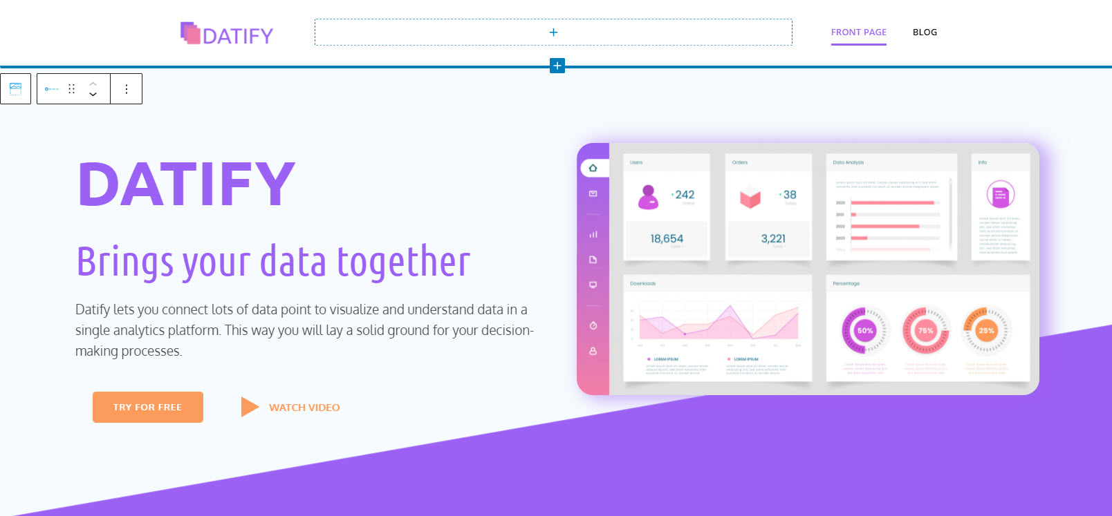
Next, we need to type our text. You can just go ahead and delete the main heading, and start typing, or pasting some text. In this case, it’s “Datify”. Below we will paste the longer description.
We also need another text, to serve as a subheading, or an H2 or H3, in web design terms. The main heading is an H1. This means we need to insert a heading block. We need to hover between the heading and the paragraph block (where we have the description of our product, Datify), and watch out for a “+” sign.
After clicking on the “+” sign you will see a block inserter with all sorts of blocks with different functionalities: paragraph, heading, icons, image gallery, tabs, etc. Let’s add a heading block.
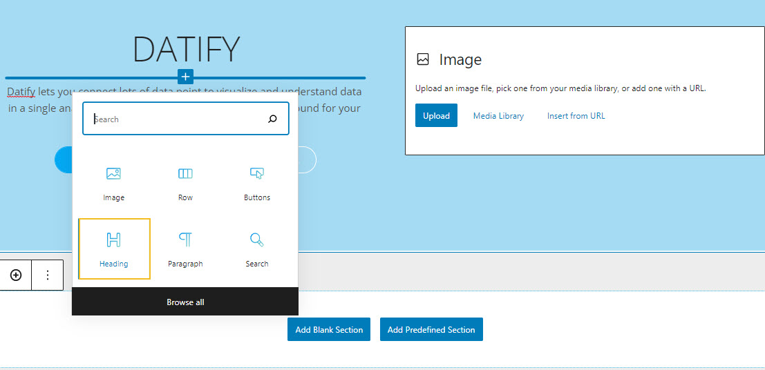
Now, the block has a dummy text, let’s paste there our own text.
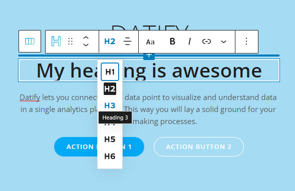
Next, on top of the block, there is a tiny toolbar. This allows us to make some tiny edits in terms of text alignment, hyperlinking, and more. For now, we’ll just select the H3 type of heading.
Adding images to the hero, or any other website section
Let’s now move to the right and upload an image. Just hit upload and choose an image from your device.
This is what we see for now:
We need to save the design from time to time, by clicking on the “Save” button in the upper-right corner!
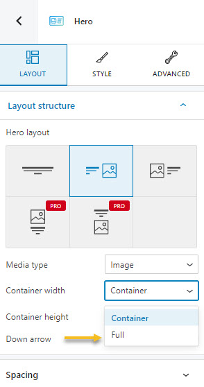
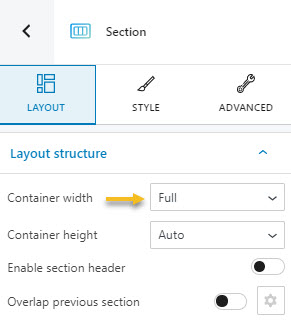
For now, our design is narrower than our objective. Each template or theme that you use will assign a specific width to the content. It might be 940px, it might be 1200px….it depends. The space that our content occupies is called a container, in web design (in a very simplistic definition). We need to make our design go full-width, and stretch from life to right.
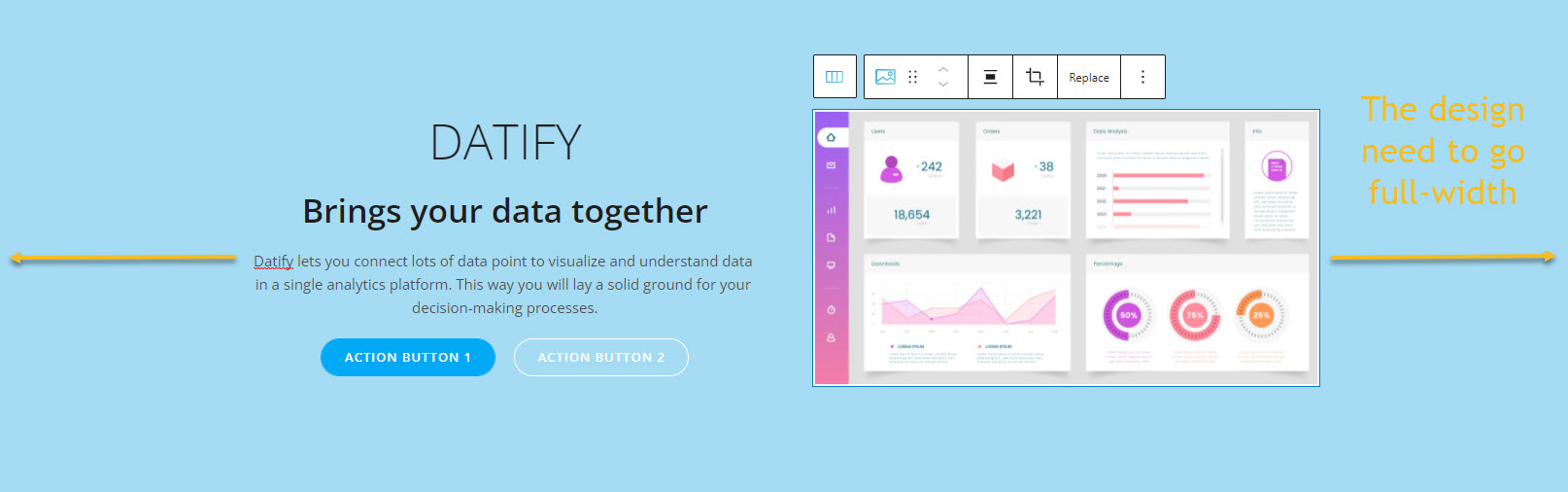
So, while we have our hero selected, from the Layout option, go to Container width, and switch from “Container” to “Full”.
Next, let’s add a box shadow to our image. For this, we need to click on the image block in order to select it.
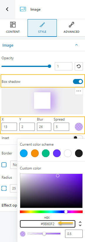
We need to toggle on the box-shadow option. I used the following values:
- 13 for X, meaning that the shadow is applied to the right-hand side of the image. When the value is negative, the shadow is applied to the left-hand side. The larger the value, the larger the shadow. You can even have -100, or +300. It’s up to your vision.
- 2 for Y, meaning that on the vertical level, this shadow has a downward orientation. The larger the value, the larger the size of the shadow on the vertical axis.
- 26 for blur. The smaller the value, the less the blur.
- 5 for the spread. Positive values will cause the shadow to expand and grow bigger, negative values will cause the shadow to shrink.
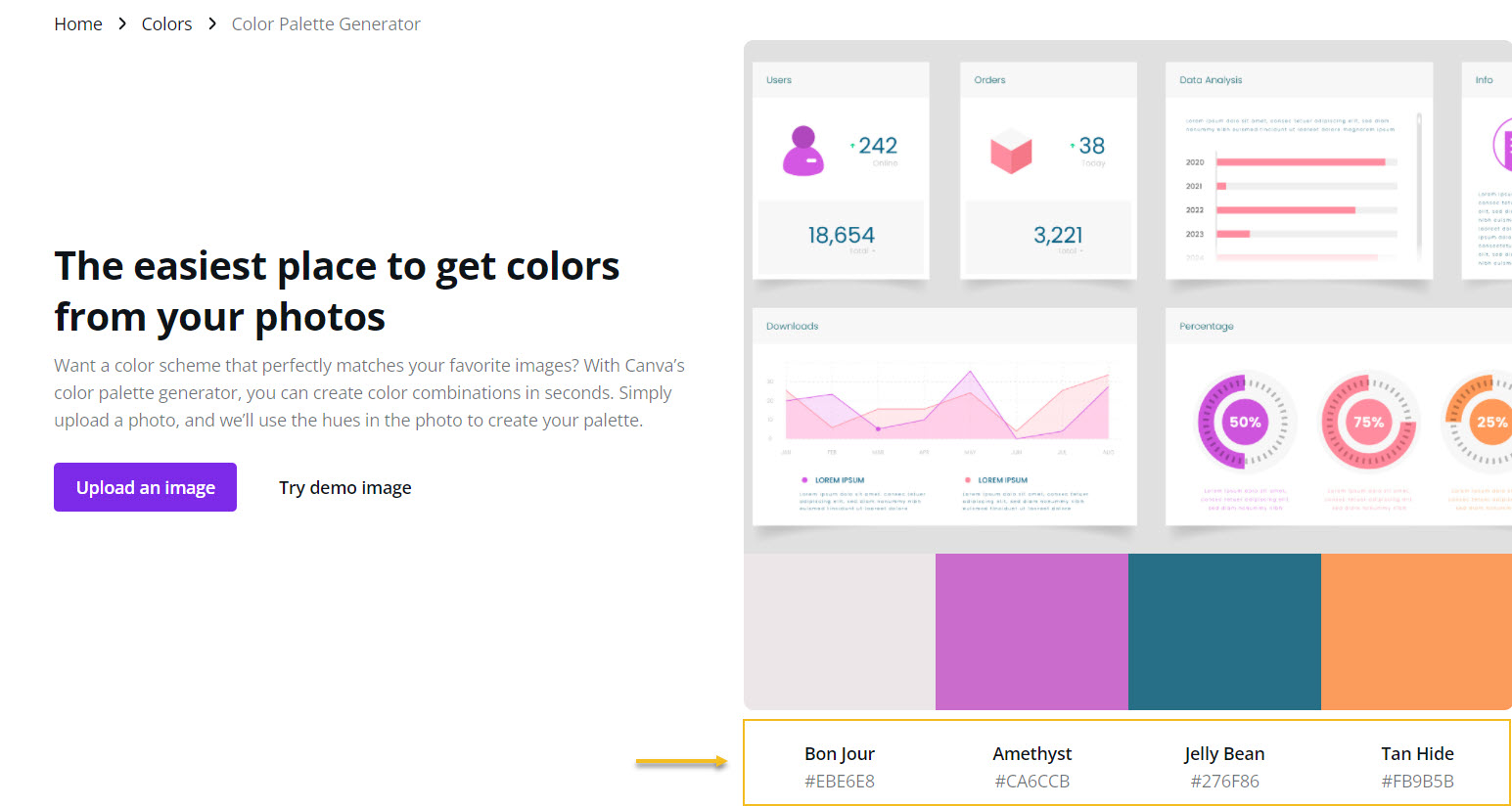
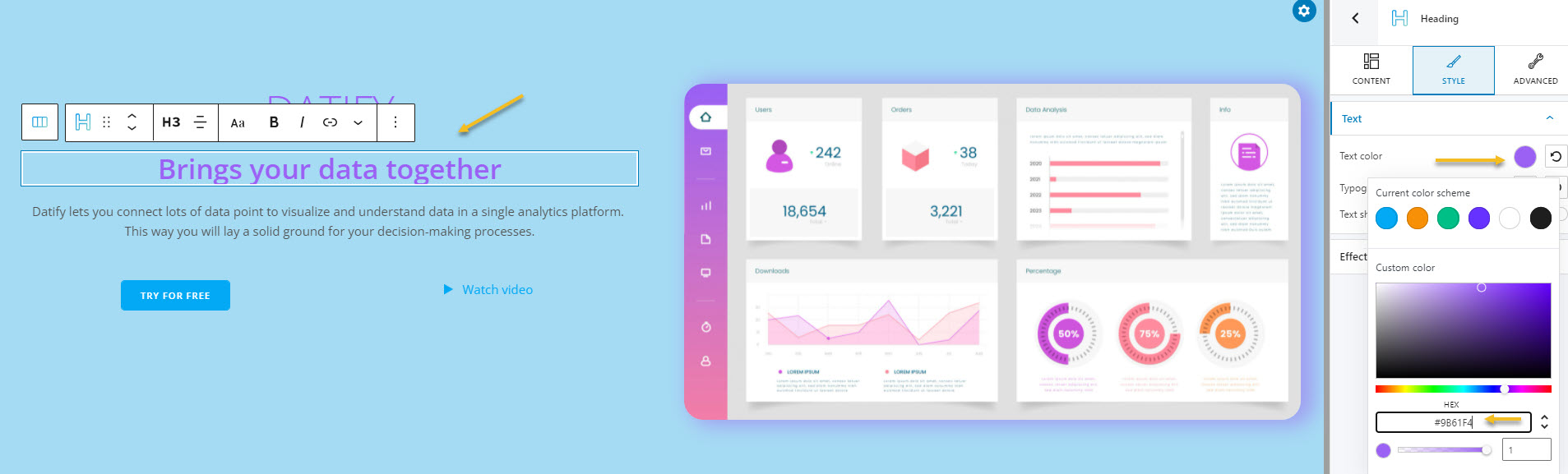
When you click on the colored circle, you will see a small window appearing with a slider with colors, and a color palette. You can select a color from the slider or the palette, or paste the color code you want. In this case, here’s the code for our shade of purple: #9B60F2.
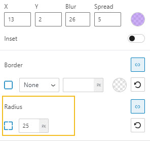
Next, we shall round a bit the corners of the image, by setting up a radius of 25.
Adding calls-to-action to the hero
Right now we have two buttons in the hero that serve as a CTA.
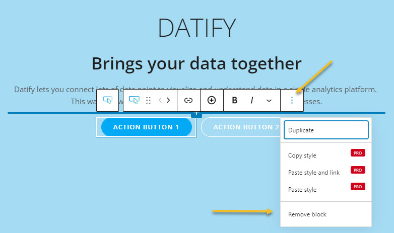
Let’s delete them, and add one button and a link with a “Play” icon beside it.
When you want to delete any block, you just have to click on it to select it, then, from the toolbar that shows up above, go to the three dots on the right. This will open up a new menu with options, go ahead and select “Remove block”.
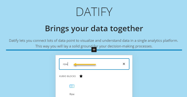
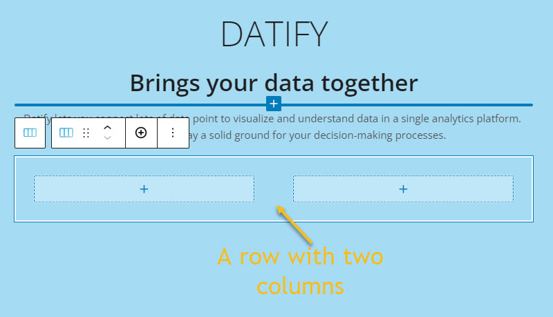
Next, both the new button and the link will have their own column. This means that first, we need to add a row. By default, this row will have two 2 columns. The row is also a block.
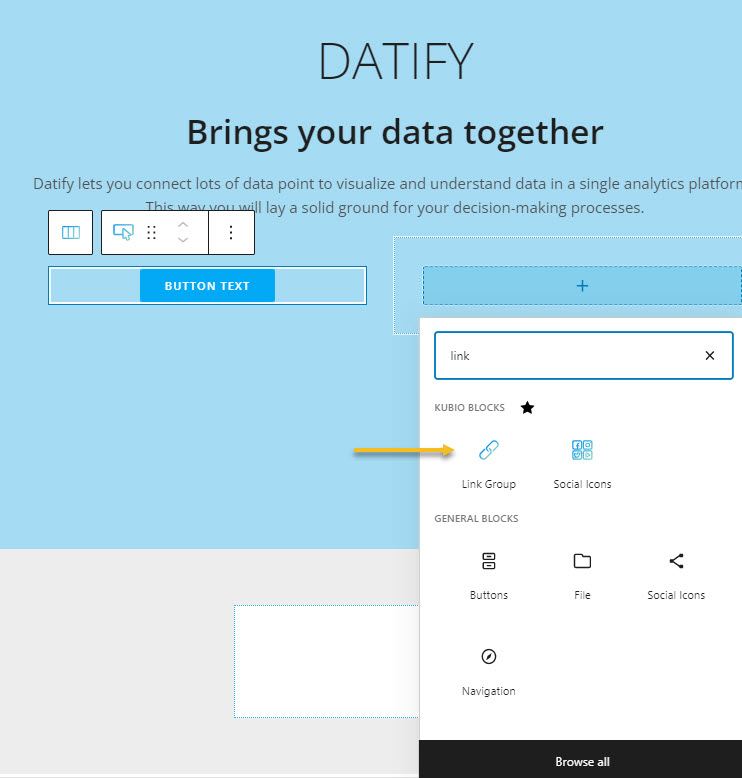
From the plus signs, we will add a buttons block and a link block.
Let’s change the texts. This time, for both the button and the link, the text is changed from the right-hand side. Here we shall also change the button dimension to large.
You can also assign a URL. The button and link will lead to some web pages. Here’s where you will add the hyperlinks to both texts.
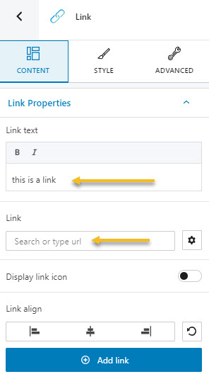
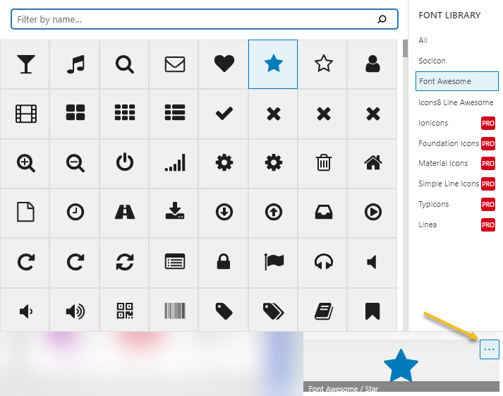
As per the “Play” icon, let’s select the link. From “Content”, head over to “Display link icon” and toggle it. Open up the icon library from the three horizontal dots.
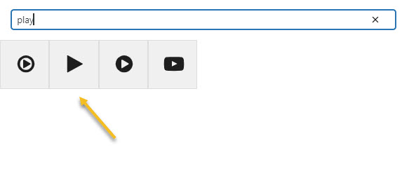
Type “Play” in the search bar to find the icon and select the second icon.
We’re getting closer, don’t you think?
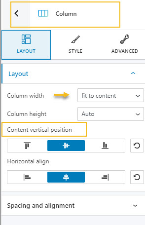
Now, let’s make the columns of these items fit to content. We need to set up the content vertical position to center, so that we align the button and the link.
Next, it’s time for some extra formatting.
Making color and typography changes
Color and typography changes for any text, whether for the paragraph or heading blocks, or for texts inside buttons or lists, the process is the same.
First you need to select the block, then go to Style inside the block editor. Next, locate “Text color” and “Typography.
Here I want to introduce you to two tools I used to discover palettes and proper font pairings.
- The Canva color palette generator allows you to upload an image, and it will generate the color codes from the images.
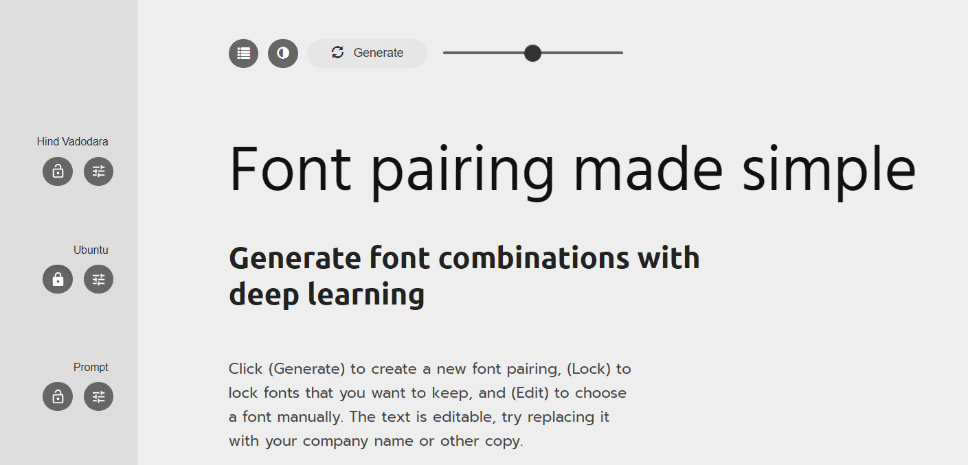
- FontJoy allows you to generate matching fonts. For example, I knew that Ubuntu is a font that works well with business and SaaS website design, and I wanted to find a second font that pairs nicely with Ubuntu. This is how I discovered Oxygen.
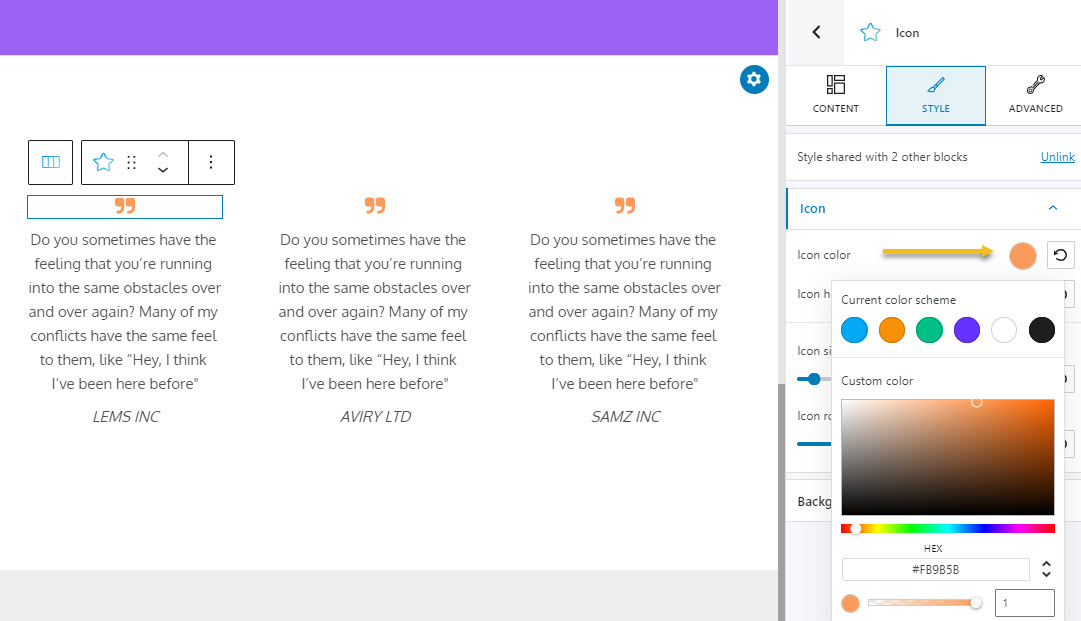
Now, when you want to make any color change, for text, icons, backgrounds, you will always notice a colored circle next to the color options inside Style.
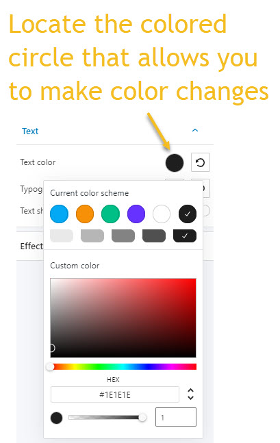
When you click on the colored circle, you will see a small window appearing with a slider with colors, and a color palette. You can select a color from the slider or the palette, or paste the color code you want.
I am going to change the color for the two headings to purple.
Next, let’s align all the text to the left, using the alignment option in the toolbar.
Now, let’s select the button and change its background color to orange. Now, buttons also have borders. We will change the border color to orange as well, to match the button’s background.
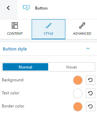
Buttons have a normal state, and a hovered state. The same goes for links, for menu items, tabs, etc. A hover state communicates when a user has placed a cursor above an interactive element. When this happens an element can change its color, or size, etc. From the design point of view, you need to be consistent across elements when they change states.
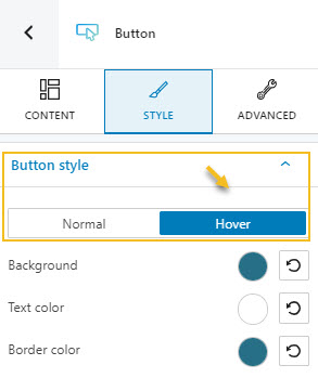
For example, for our current Saas Web design, we chose to change the button color, link color (and its icon) or menu item to dark turquoise, when hovered.
So, let’s switch the state of the button style to “hover”, then change the background and border color to #276F86.
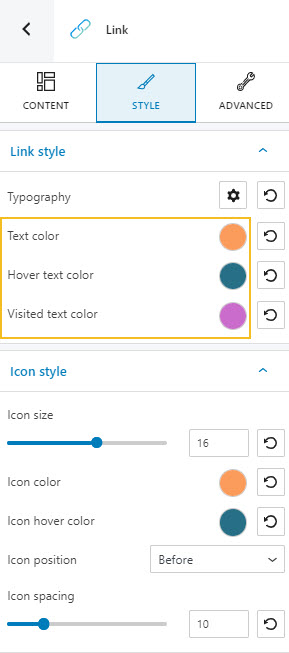
Links, on the other hand, also have a third state: visited.
The folks at Nielsen research point out that “The oldest usability guideline for any type of navigational design is to help users understand where they’ve been, where they are, and where they can go (past, present, and future)”. This means that for a website visitor it’s very important to know which links have already been clicked, so that they won’t revisit the same pages over and over again. The pattern is that when a link gets visited, it will change its color.
This option is easily found in Kubio, in the block editor, inside “Style”.
As for typography, you can go to Style -> Typography in the case of every block that involves text, and make the following changes:
- Font family – there are tons of fonts that you can choose from.
- Font size – the size can be expressed in pixels, ems and rems. Here’s a cool resource about the differences between these sizes.
- Font weight – you can specify here the thickness of the font.
- Font transformation – you can make changes to capitalization here.
- Font styles – this allows you to make your font italic, or transform it back to normal.
- Font decoration – this option allows you to add highlights to the font via underlines, and more.
- Line height and letter spacing. These allow you to enlarge or tighten the space between lines of text, or between characters in the text.
I’m going to change the headings to Ubuntu, and the rest of the text to Oxygen, as the font family, and make the following size and weight adjustments:
- H1: Ubuntu, 700 (bold), 6 ems.
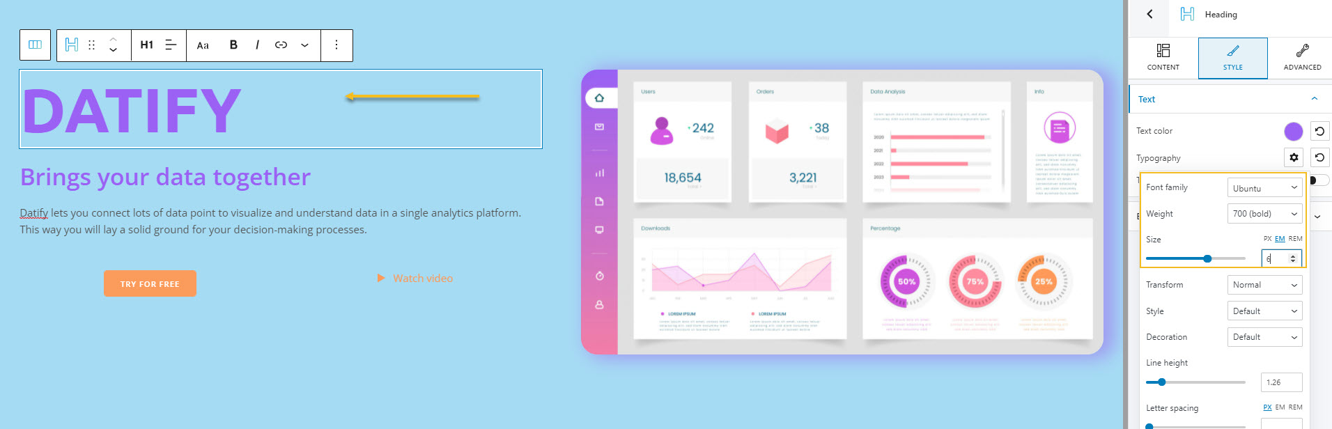
- H3: Ubuntu Condensed, 400 (normal), 4 ems.
- Paragraph: Oxygen 400 (normal), 1.25 ems.
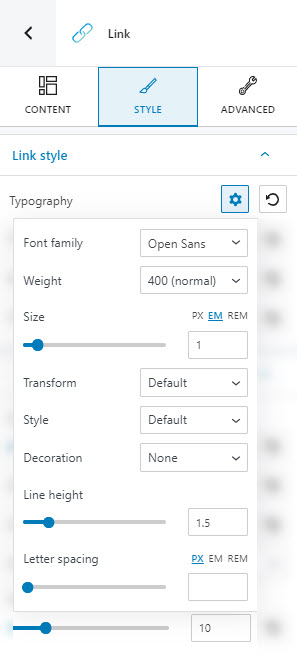
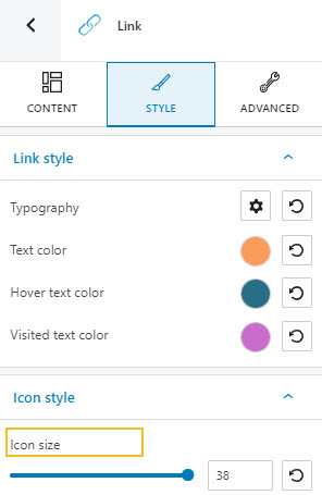
- “Try for free” button: Oxygen, 700 (bold), 1em. Let’s also make the button here, large.This can be done from Content -> Button properties -> Button size.
- “Watch now” link: Oxygen, Oxygen, 700 (bold), 1em. Let’s also make the icon size, 38, from Style -> Icon style -> Icon size.
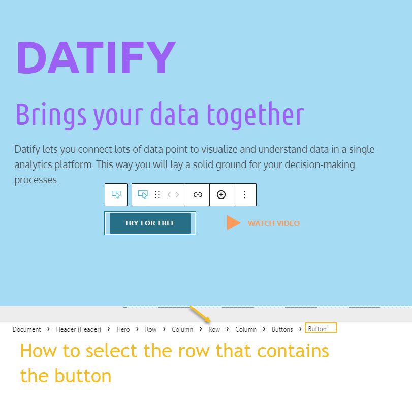
Now, our button and link are now quite properly aligned.
As mentioned a little earlier, behind the design you see now, there’s a grid. The button and the link are placed inside a row with two columns. To properly identify the columns or the row that includes them , you could use the breadcrumb view at the bottom of the canvas.
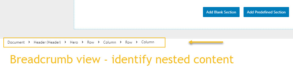
From here, you can select the column block, the row block, or the hero block. The furthest element to the right is nested into the elements to its left.
Now, we will need to make these columns narrower in order for the button and the link to get closer. This means we need to set them as “fit to content”. Also, let’s align the content to vertically-centered.
Making spacing and alignment changes
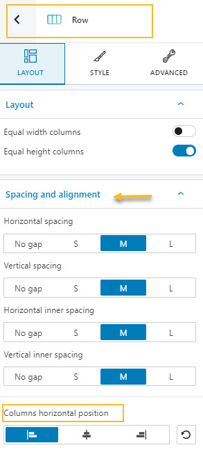
The link and button are centered now. We need to align them. This means we need to select the row, and align its content to the left.
For the row selection we can use the breadcrumb view. Let’s first select the button. Then, from the breadcrumb view, head over to the row.
Now, head over to Layout -> Spacing and alignment -> Columns vertical position and choose Left.
There are several spacing and alignment options available as well under Advanced, for every block.
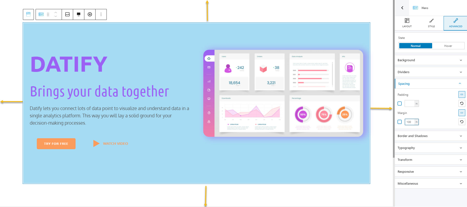
For example, let’s select the whole hero section, and add some space to the left and right, because the text and image are too close to the edges.
Let’s go to Advanced -> Spacing. You will notice here two options: Margin and Padding. What’s the difference between the two?
The outer space of a block, row, column, section meaning refers to the space outside the border.
For example, I set a margin of 100px, for the top, bottom, left, and right of the hero section (but I’ll revert it).
The padding refers to the inner space of an element, eg: the text inside a column, the text inside a button.
For example, the paragraph below has a padding of 100px, as in the space between the text and the its containing column borders are 100px.
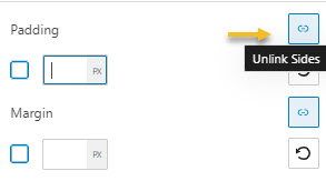
Both the padding and the margin can be set individually, for left, right, bottom, or top. Just click on the icon on the right that unlinks the sides.
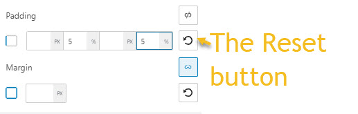
You will get this, with the option to express both the margin and padding in pixels or percentages. Let’s add a 5% left and right padding to our hero. Any change we make can be reverted to the default by using the reset button.
Let’s see what we got:
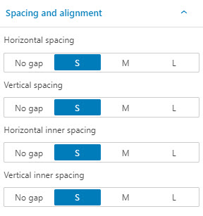
The button is still a bit too far from the left. This is also a spacing setting that can be fixed from the Row -> Layout -> Spacing and alignment level. We just need to make the gap between the button and the border of the column that contains it from M (medium-sized) to S (small-sized).
Working with backgrounds and dividers
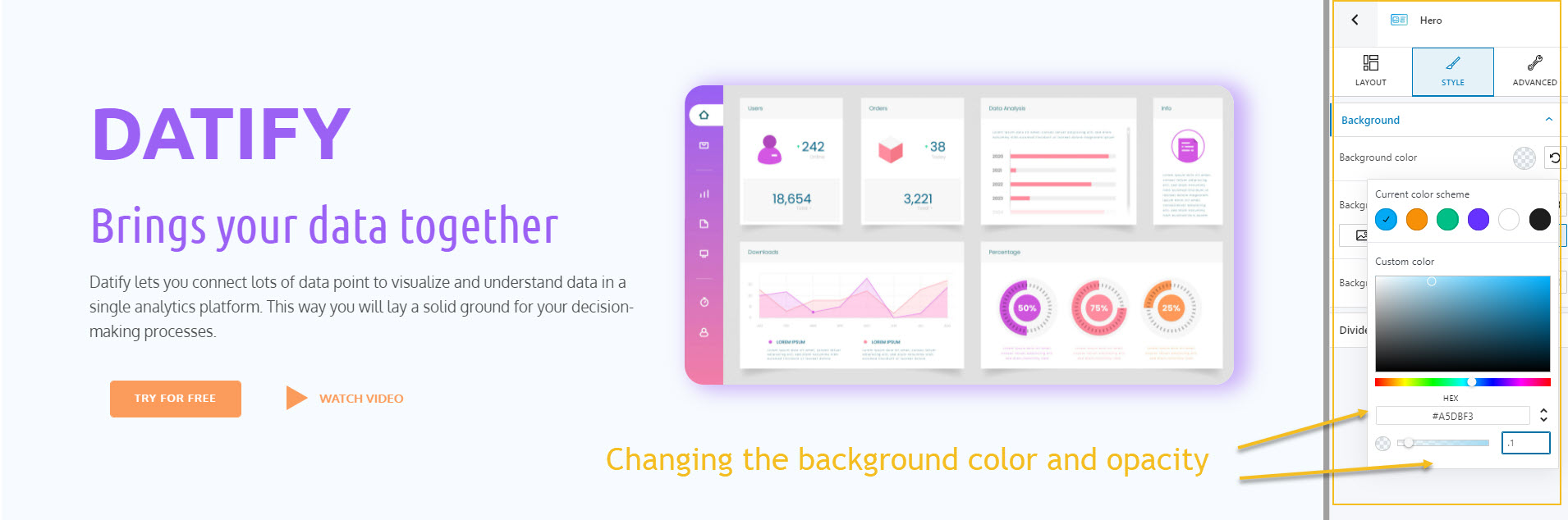
Next, let’s change the background color to the one in our initial design. For this, we need to select the hero, then go to Style -> Background or Advanced-> Background.
With Kubio you can add solid backgrounds to a section, but also gradients, images, or videos.
We can change the color of the background in the same way we change text and border colors, by using the red circle. Let’s also add a 0.1 opacity, because we want our background to be more transparent than solid. This is the result:
Next, we will add a bottom-divider. Dividers are layout elements that help to separate pieces of content into clear parts. Our divider will separate the hero from the testimonials section.
Dividers can be added from Style -> Dividers, or Advanced -> Dividers. Let’s go with the second option, and toggle the bottom divider.
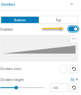
We stick to the current shape, and change its color to purple, and height to 300 px.
Now that we have our hero ready, let’s move on to adding the SaaS website menu!
We’re almost there, guys!
SaaS website design: the navigation
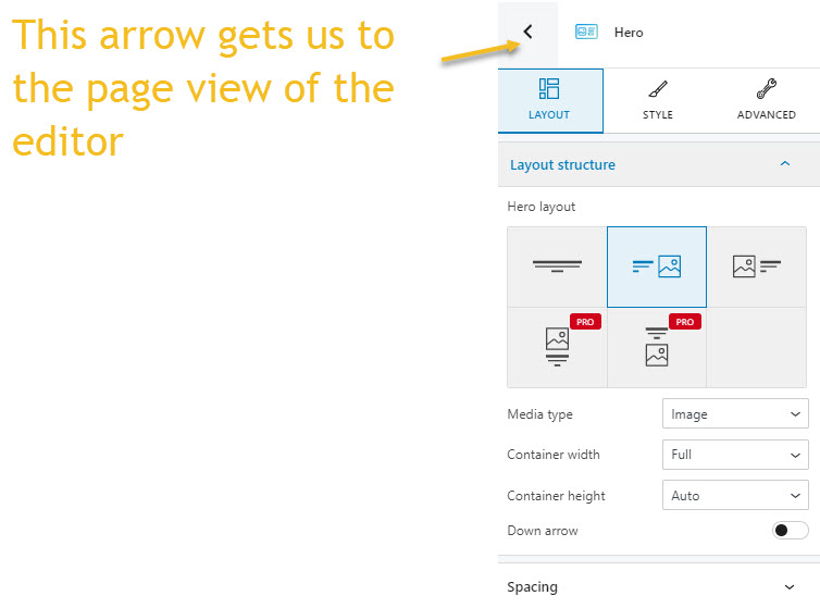
For this let’s go back to the page view of the block editor on the right. Just select any block from the canvas, then, click on the arrow you will see in the block editor next to the block’s name.
Now, navigate to header, and select the “+” sign to the right of the editor.
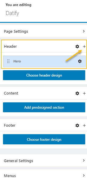
To the right, will see a block inserter that will contain the navigation block. Select it.
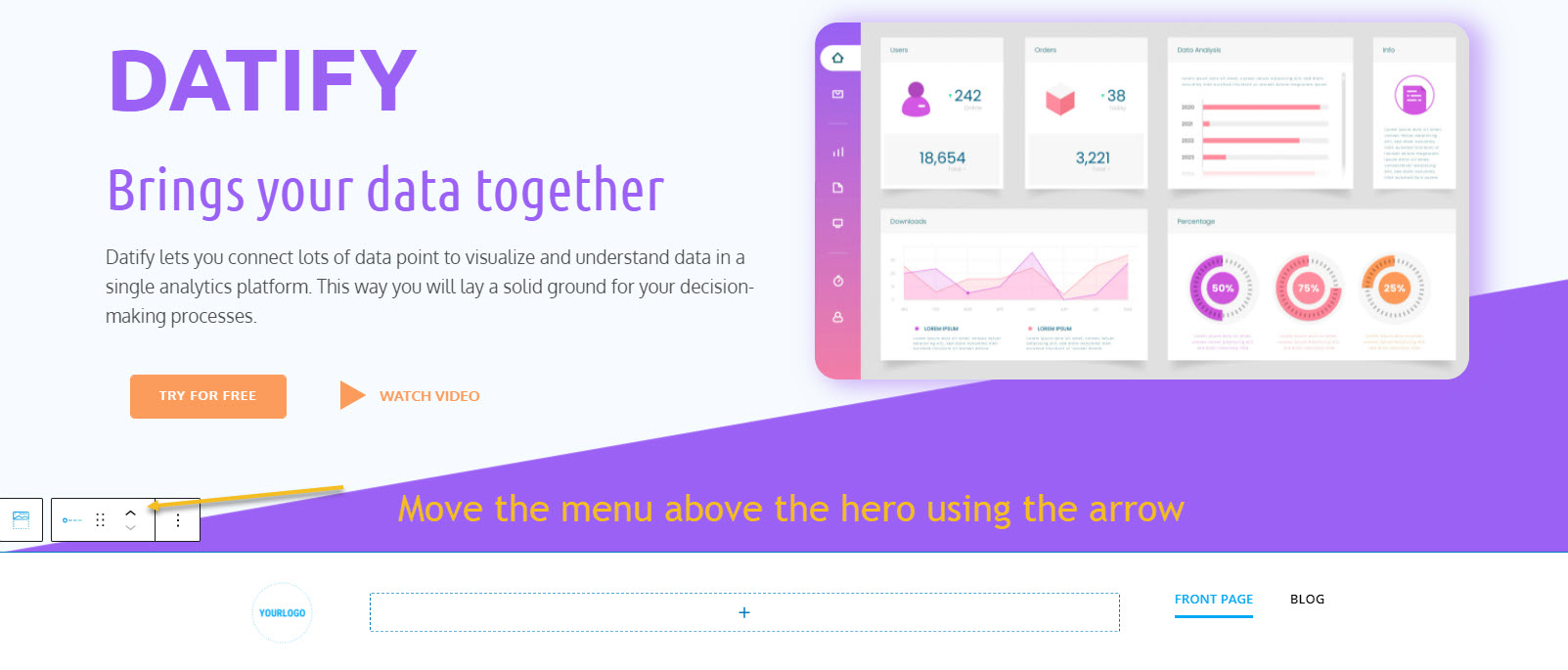
The block will be added below the hero. When you select the navigation block, just head over to the toolbar above it, and click on the upward pointed arrow to move it above the hero.
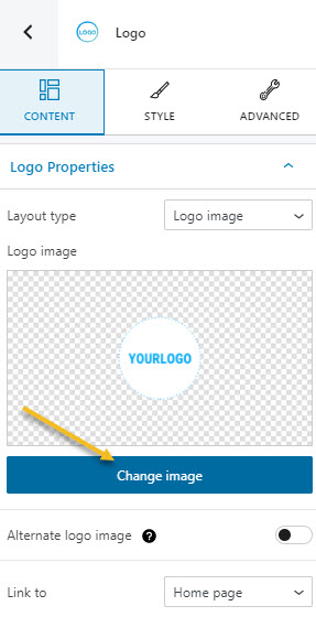
Next, select the logo from the menu. You will notice that you can upload an image to it from the editor on the right if you click on “Change image”.
Next, the image is a bit too tall, we can make it shorter by going to Style -> Logo -> Max image height, and setting it up to 42.
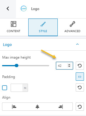
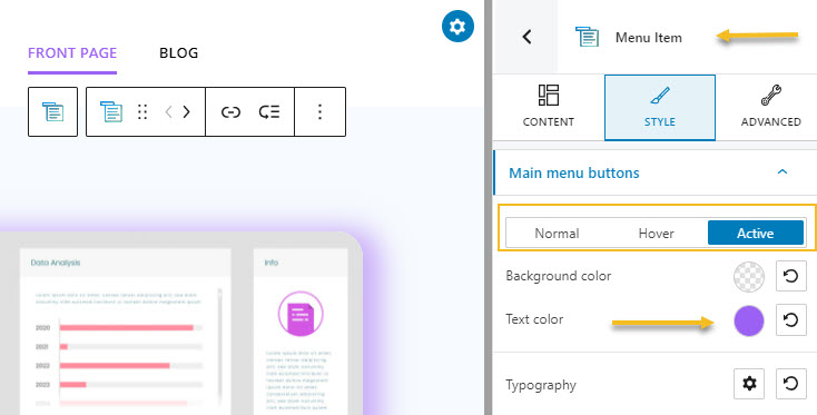
Next, I’m going to adjust the colors and typography of the menu items, like I did for the headings and paragraph. What’s important here for you to know is that menu items also have an active state. When you are inside a page, that page needs to be highlighted in the menu. For example, the current active page menu item will have a purple color, while the other one stays black.
Here’s what we have so far:
Next, we also need to make the menu full width from Layout -> Layout structure -> Container width -> Full. Next, we need to make its alignment to match the hero’s alignment. This means we need to set the padding at 5% for both left and right, from Advanced -> Spacing.
Don’t forget to save the design from time to time!
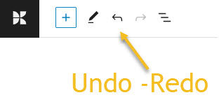
You can also undo and redo change by using the options in the upper left.
SaaS website design: working with predefined sections
We’re getting closer to the end result so bear with me!
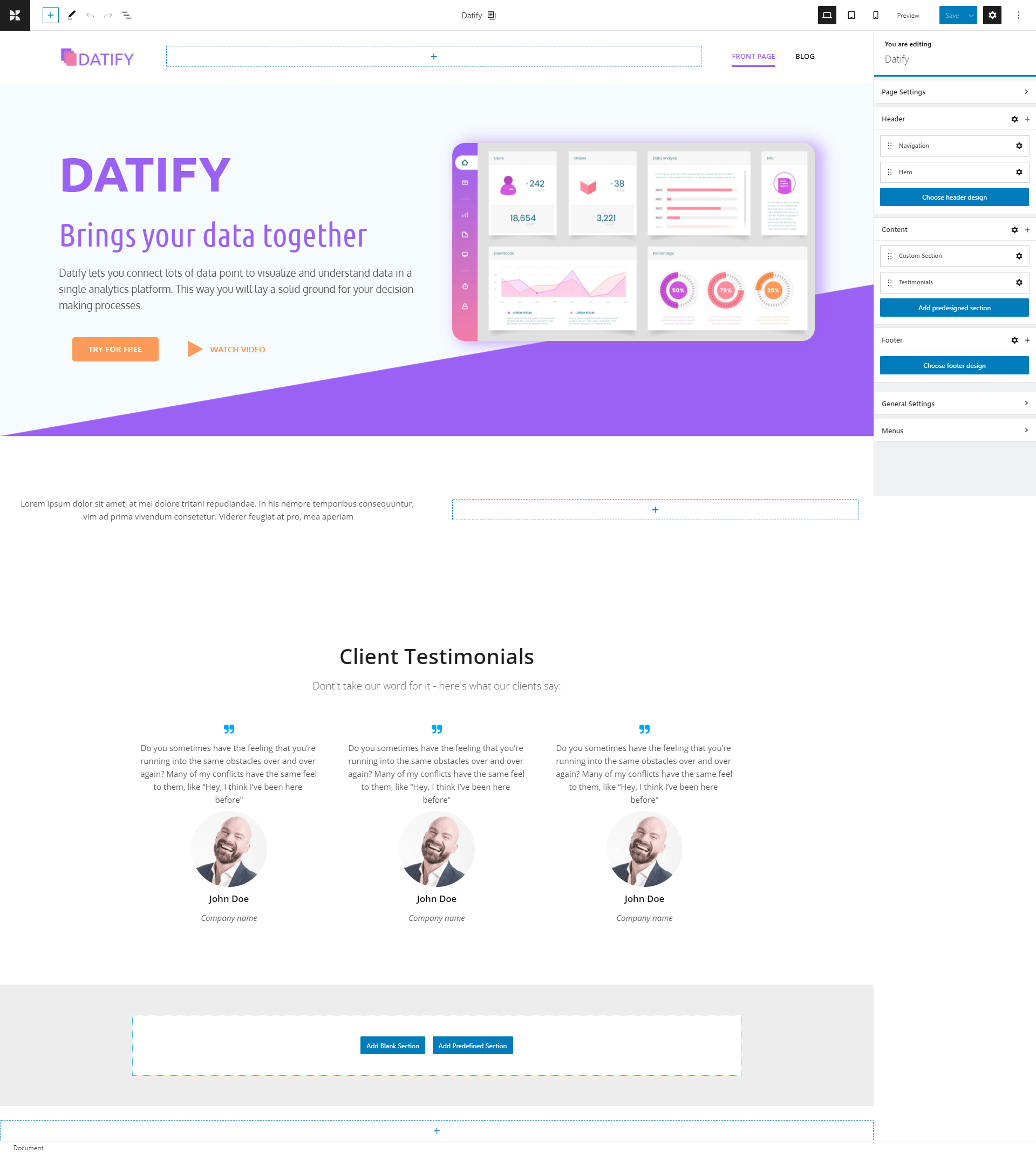
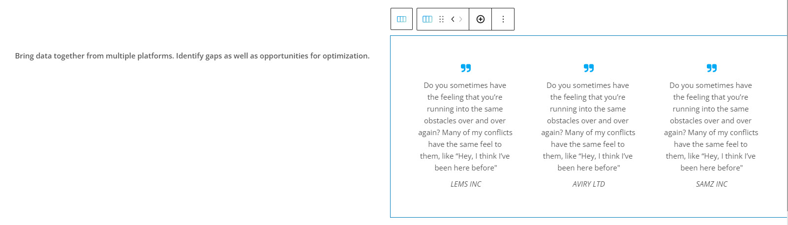
Now, it’s time for our next section, the one with testimonials. You can notice that besides those 3 columns of testimonials, there’s also a column with some text.
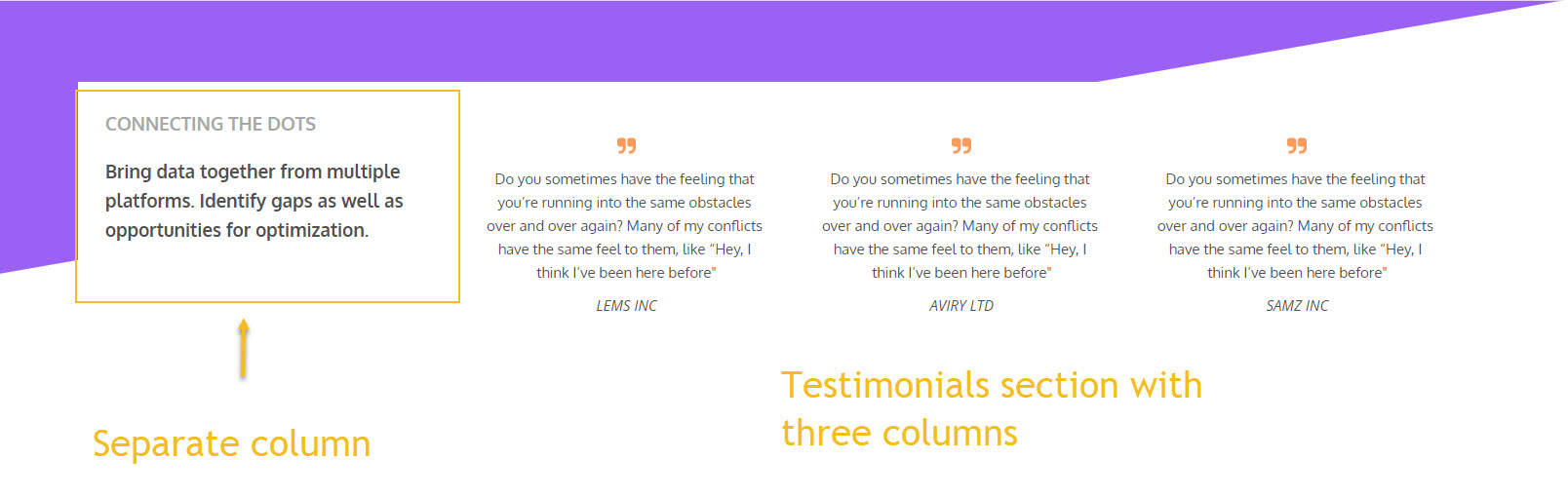
We can approach this two ways: either create a row with four columns, and add each piece of text to a separate column, or combine text blocks with a predefined testimonial content section. I’ll go with the second option.
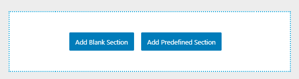
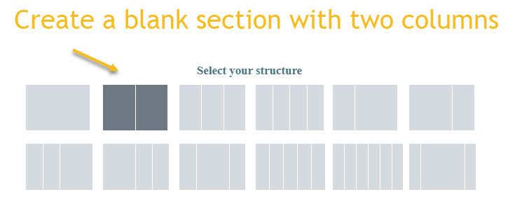
We need to create a section with two columns from the “Add blank section” button at the bottom.
This is what we’ll end up seeing.
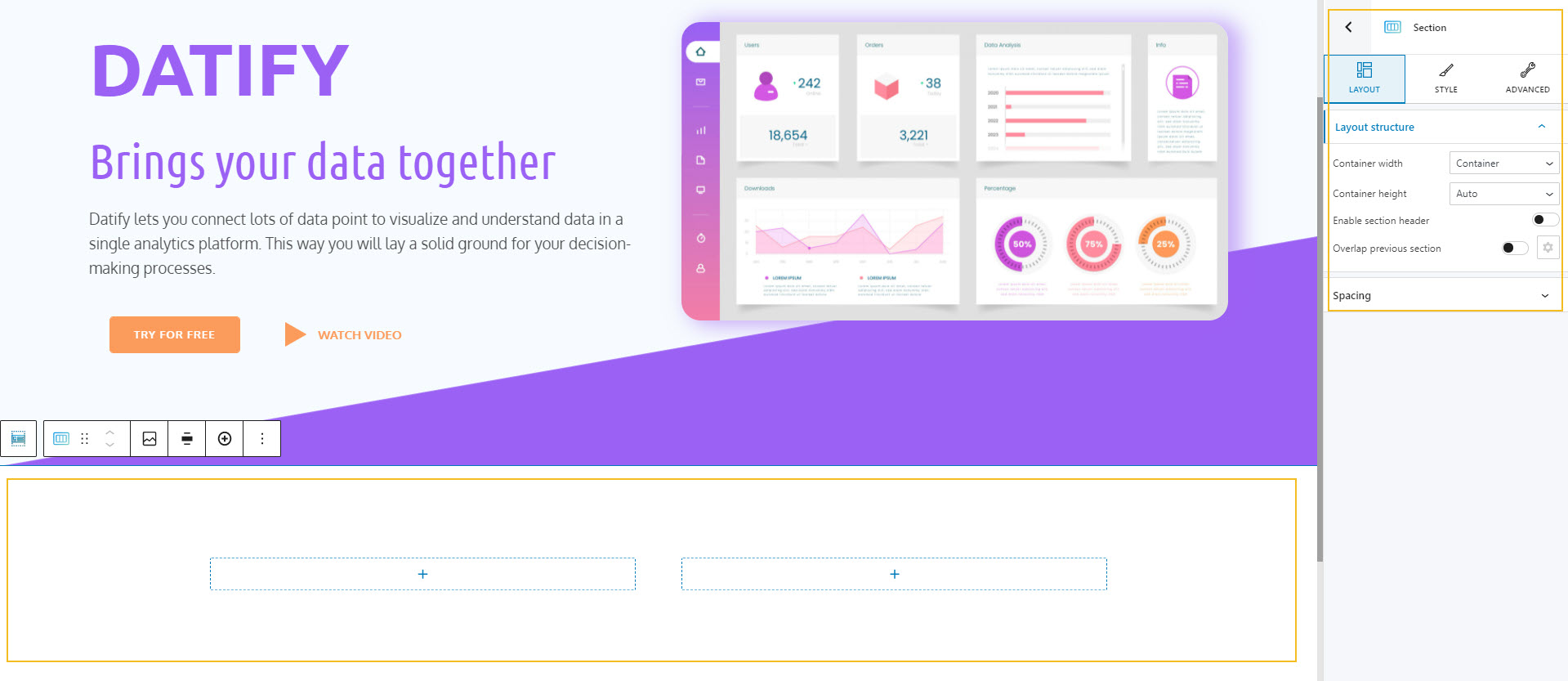
Let’s make it full width. One column will contain the block, and the other one will contain the testimonials.
From the plus sign, let’s add a paragraph.
Next, we need to add a predefined testimonials section. Head over to the bottom, and select “Add predefined section”. This will open up the block inserter, with its predefined sections.
Kubio comes packed with such sections, so that you can save time and streamline website design. Sections are grouped across functions, such as: hero, about, features, team , testimonials, portfolio, and more.
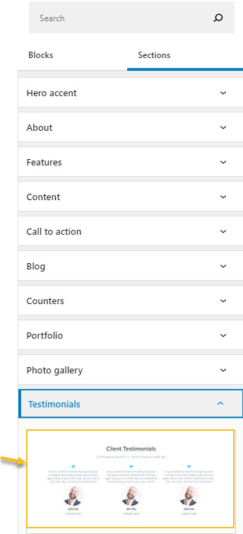
Let’s select the first design underneath Testimonials. Our design will now look like this:
We will need to move the three testimonials to the empty column in the row above. This can be done by dragging and dropping the row that contains the testimonials to the empty column. We can select the row using the breadcrumb view.
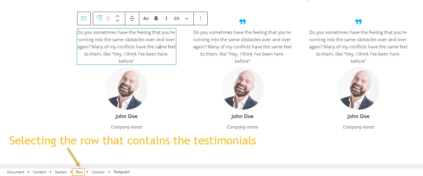
The toolbar that shows up on top of the row will allow you to drag it wherever you want. Let’s drag it inside the empty column.
Now, let’s delete the blocks that we do not need, by using the “Remove block” option from the block toolbar.
After the cleanup, it’s time to paste the text. And this is the result:
To the left, we need to add a new paragraph block, because the initial design looks like this:
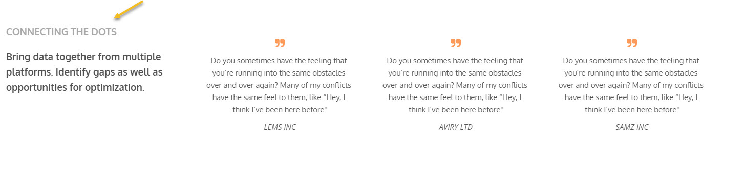
In order to do this we just have to go on top of the current paragraph and hover over at its border, until we see the “+” sign that allows us to add a new paragraph block.
Let’s now style the text, resize it, add thickness to it, and change the font family to Oxygen.

Next, we need to change the icon blocks’ color to orange, from underneath Style.
This is what we have so far:
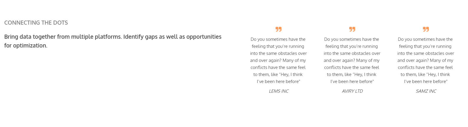
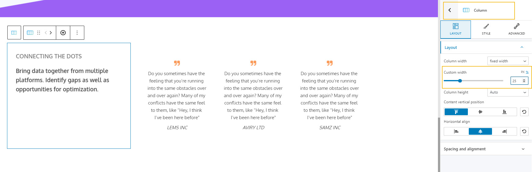
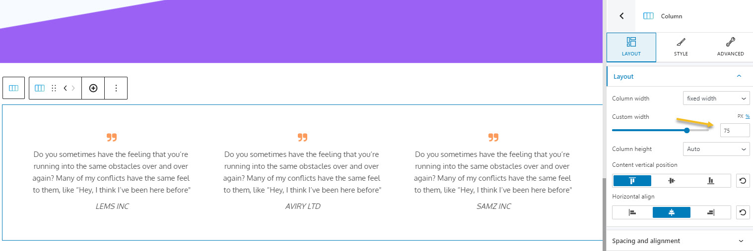
Now, the column on the left should occupy 25% of the space, while the testimonials should occupy 75%. This means we need to adjust the column width.
And because we want to keep design consistent, we need to make the section full width, then set up a 5% padding to both left and right.
Now, we just have to add a new divider, to mirror the existing one, this time on top of the current section. As you might remember, dividers can be toggled on from Advanced -> Dividers. We will set the height to 300, and the color to purple.
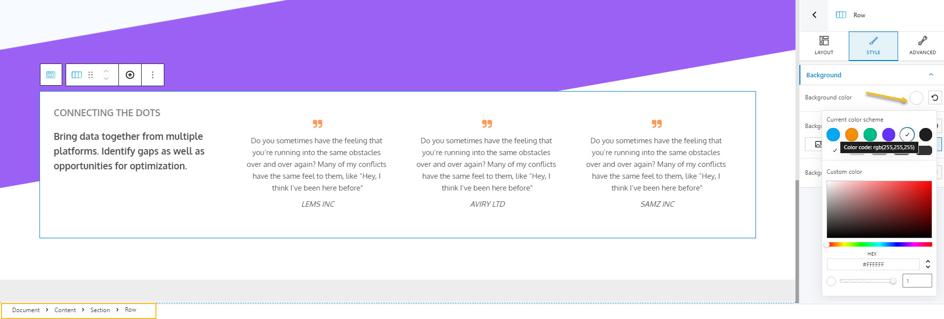
We will need to add a white background to the text, this means we will need to select the row containing all the text. Next, from Style-> Background, we will choose white as a background color.
Let’s take a look at the final result.
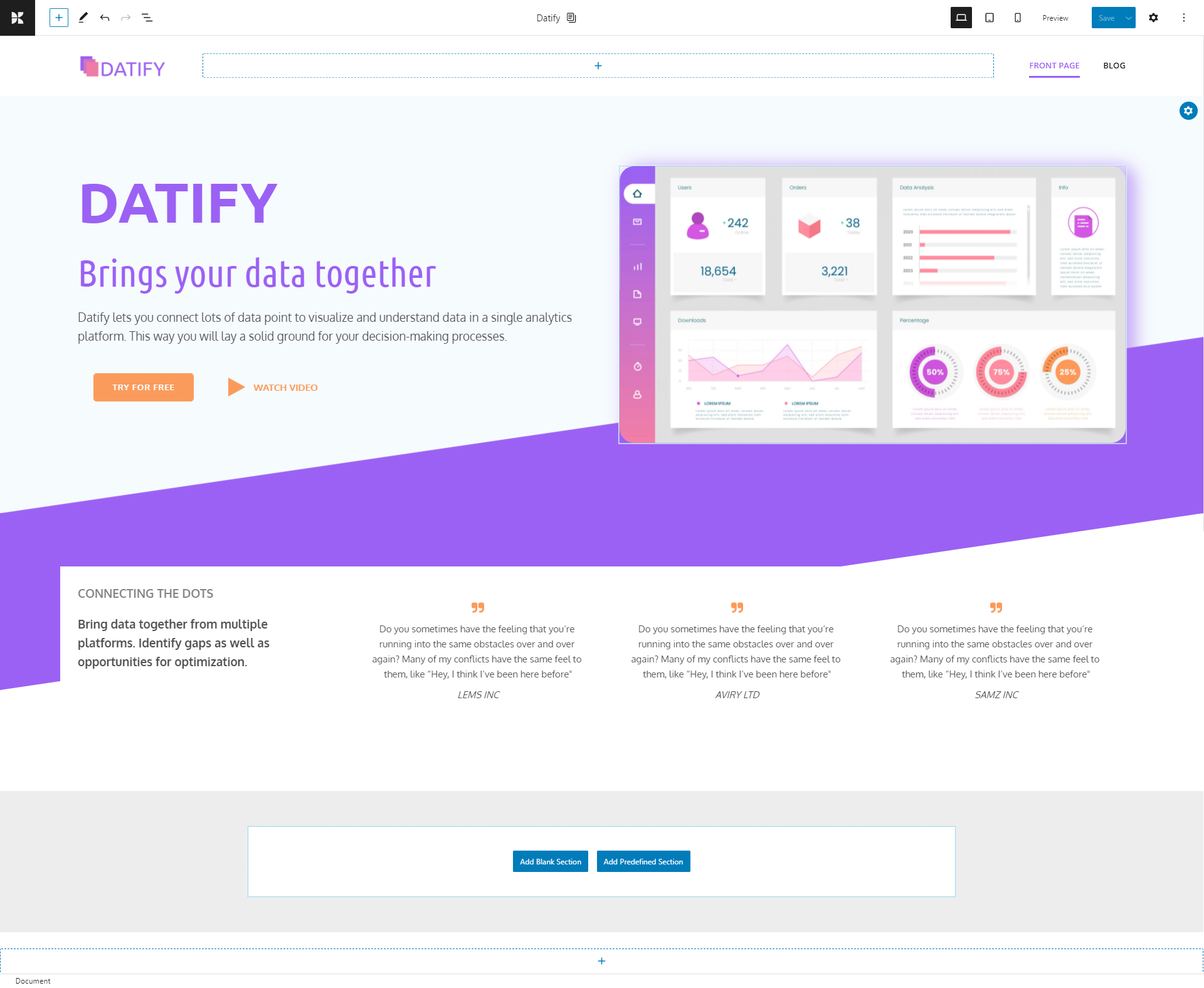
We’re done!
There’s an extra step that I also recommend: making the page responsive.
SaaS website design: mobile responsiveness
Many of the website builders out there have out-of-the-box responsive elements. For example, blocks and sections in Kubio are already responsive. But, from time to time you would need to intervene a bit to make them more visually appealing. For example, you could:
- Decrease the font size, so that the page won’t look too long on mobile, or too cluttered.
- Decrease the margins and spacing for certain elements in order to decrease the scroll.
- Remove some elements if they are not a must, and would just clutter the page.
You can easily preview the page on tablet or mobile devices, from the menu at the top-right.
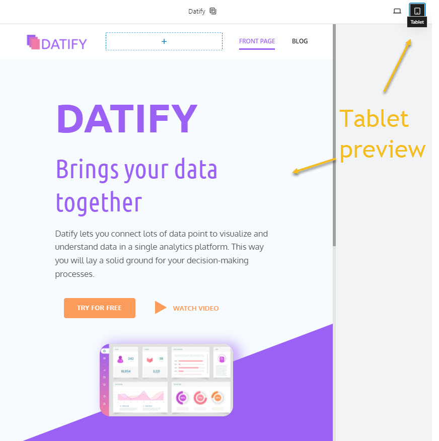
For example, after looking at this tablet preview, you could make the following changes:
- Decrease all the sections’ left and right paddings,
- Make the image larger.
The changes you submit here, won’t show up on desktop and mobile devices.
Make sure you always save your changes.
In the video below you can see the changes I made in order to make the design responsive on mobile.
And that was all.
SaaS website design: the conclusion
When you start working on your SaaS website, you need to focus a lot on the design that shows up top of the fold, meaning the hero and navigation. The hero will need to give a lasting impression to the website visitor and be representative to the business. You should be careful with the following elements:
- Navigation: it should contain links to the most important pages to the website’s visitor journey.
- Logo: it should look professional and consistent with your brand’s message and colors.
- Heading/headline: in less than 30 seconds a user should understand what the product does for him.
- Subheading: should support the message from the heading, and express what was missing from the heading. Usually it should focus on the solution the SaaS product can provide to the end-user.
- Illustration, video or image: it is usually placed to the right or at the center and should be representative to the business or the product experience.
- Call to action/ buttons: it should clearly tell the website visitors what the next step is: buy now, create an account, watch a demo, start a free trial, etc.
- Social proof: logos of previous clients or testimonials that can build up trust around the brand.
In conclusion, effective SaaS website design is crucial for user engagement and business success. For more in-depth strategies and expert advice on SaaS design, consider reading Toptal’s comprehensive guide. It provides valuable insights that can further enhance your design approach.
Lots of inspiration with your own SaaS website design!