
Let’s see a bit of Kubio in action, what do you say?
And we’re going to do this in a very practical way.
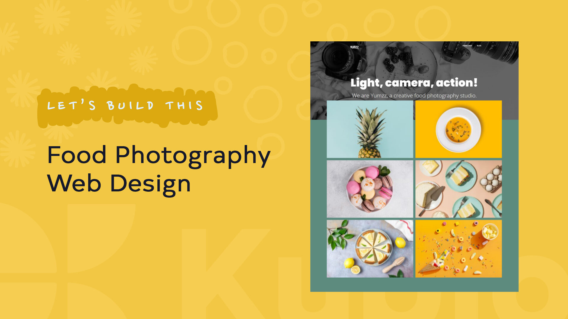
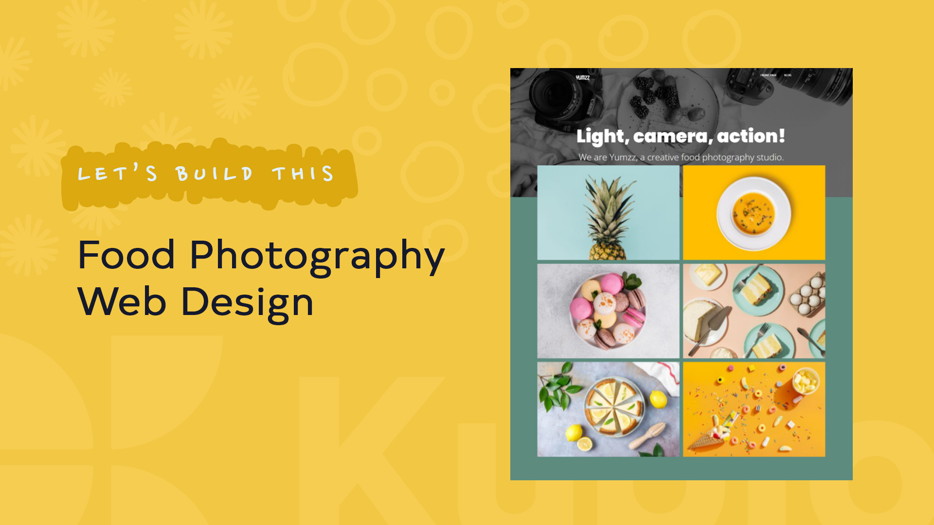
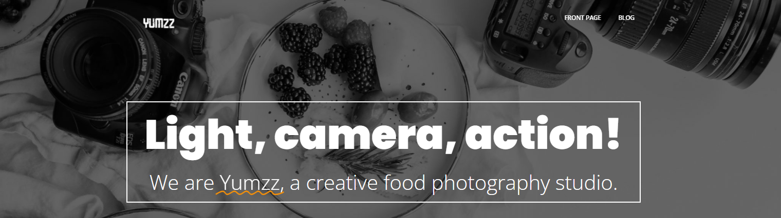
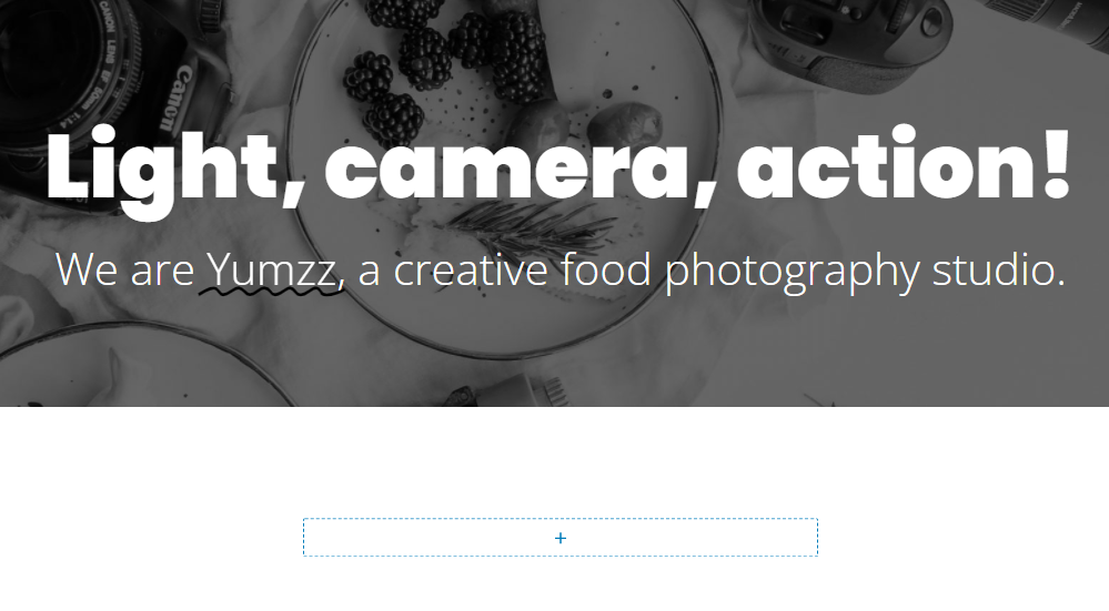
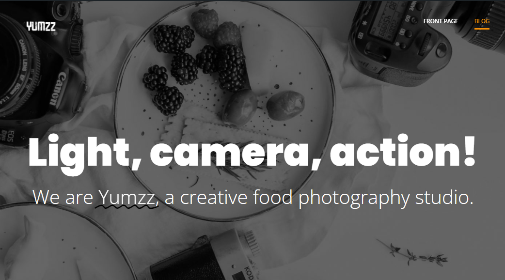
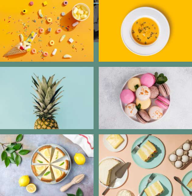
Take a look at this design:
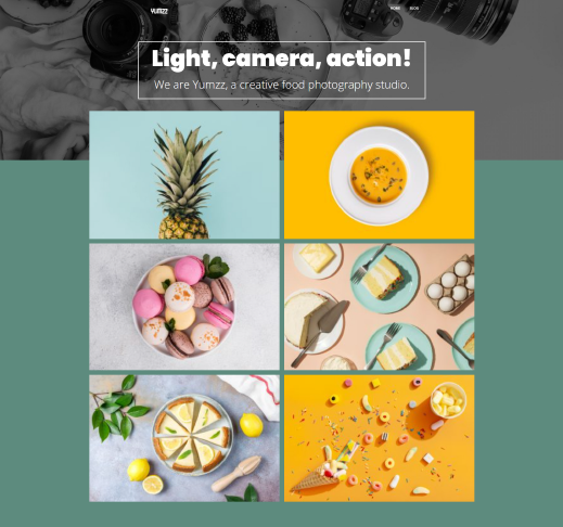
It’s a design for a food photography website containing a hero an image gallery.
We’re going to recreate it using Kubio, using its free features, in less than 7 minutes.
You’ll find out how to:
- Customize a hero;
- Add navigation to a page;
- Work with typography;
- Customize image galleries;
- Make sections overlap;
- Make a design responsive on mobile!
And much more.
Yes, folks, at the end of the exercise, we’re going to make our design responsive. Kubio blocks are responsive by default, but, some tweaks are needed to be done manually, in order to have a more suitable look on other devices as well.
And if you’re not in the mood for reading, the whole process can be seen in the video below.
So, let’s start!
Adding a block hero and customizing heading blocks with Kubio
Usually, each theme will come up with at least a front page and a sample page. All new pages will use the theme’s default header and footer. I deleted them all, in order to work with a blank page.
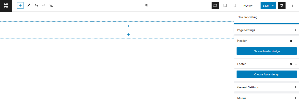
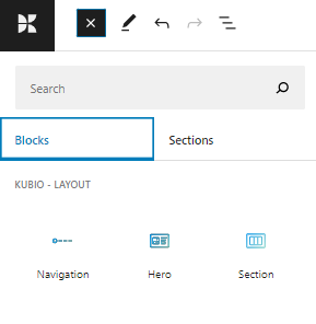
In order to add the hero block, click on the “+” sign as shown below. You will notice a block inserter with three blocks: section, navigation, and hero.
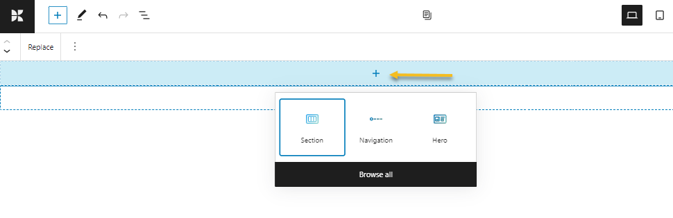
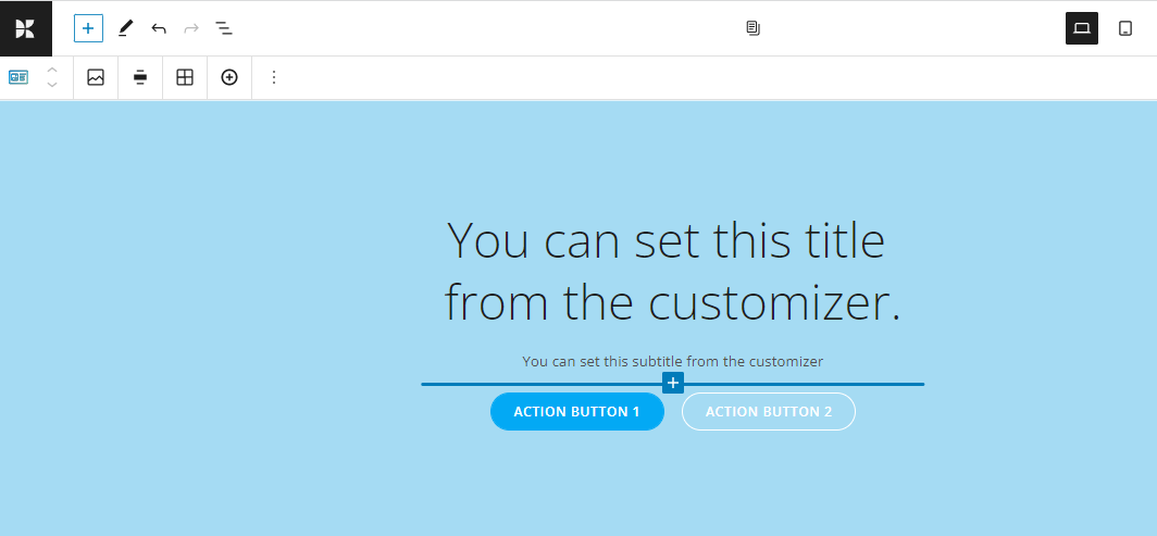
Select the hero block.
It will add the themes’ default hero to the page.
Next, we need to clean it up a bit to look like this:
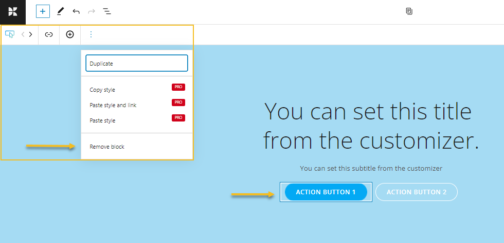
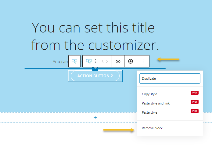
We’ll start by deleting the two buttons. Select the button and select “Remove block” from the toolbar that shows up in the upper left.
You can switch the toolbar and make it show up on top of every block, by deselecting the top toolbar option from the settings in the upper-right corner of the interface.
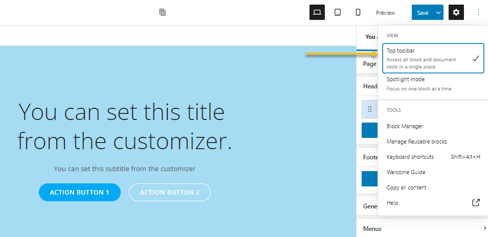
I always like to see the toolbar on top of blocks, like this:
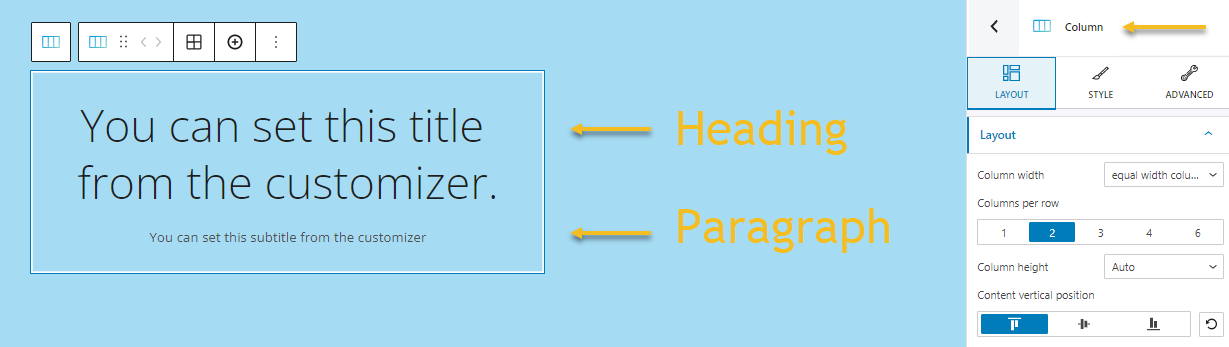
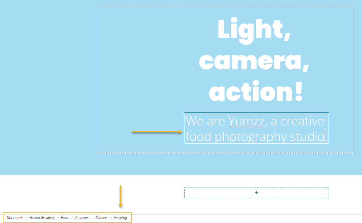
We are now left with a column containing a heading and a paragraph.
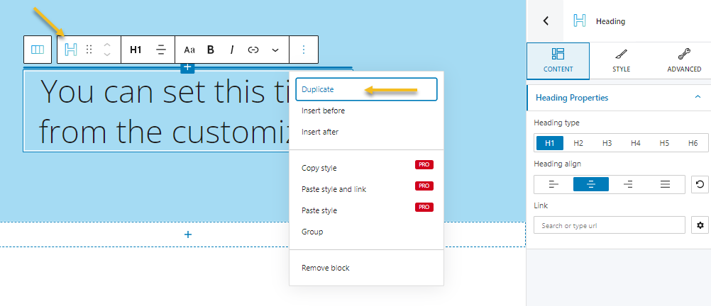
Now, our second text in the hero has a special effect, curly highlight that shows up below the brand name.
This effect is only available for headings, this means we need to have another heading instead of a paragraph. Next, I am going to duplicate the heading.
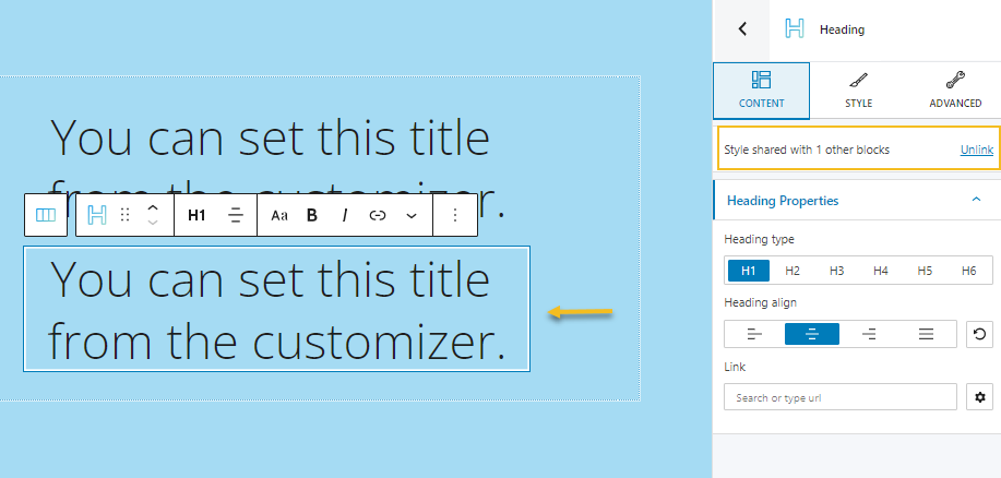
The duplication feature will link two blocks and make them share the same styling. This means that if I am changing the color of the first heading to red, the second heading will turn red as well. And vice versa. To avoid this, let’s unlink the two. While your heading block is selected, go to the block editor on the right. Notice this text inside “Content”: “Style shared with 1 other blocks” and an “Unlink” button. Click on it and you’re done. No more linked blocks.
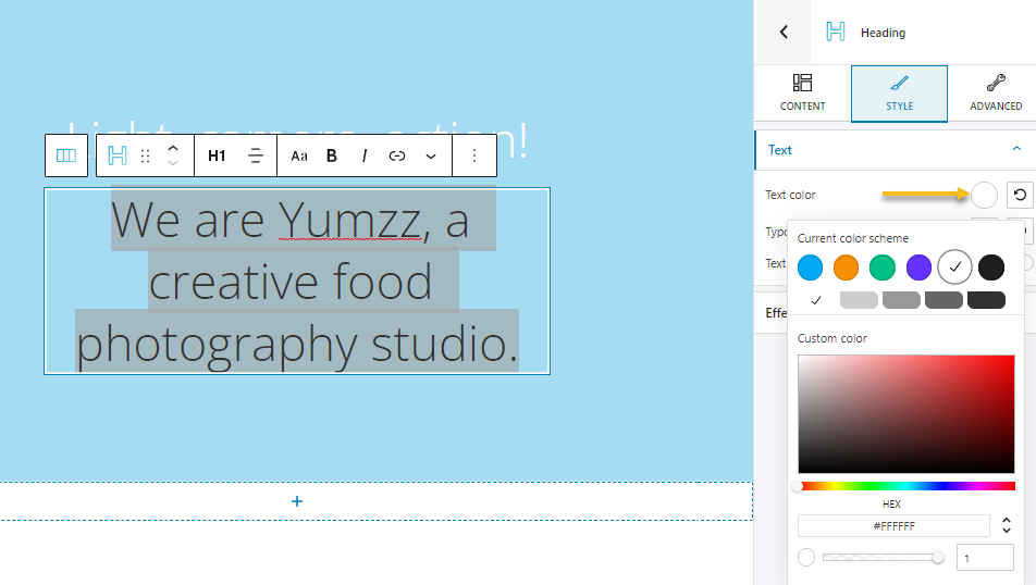
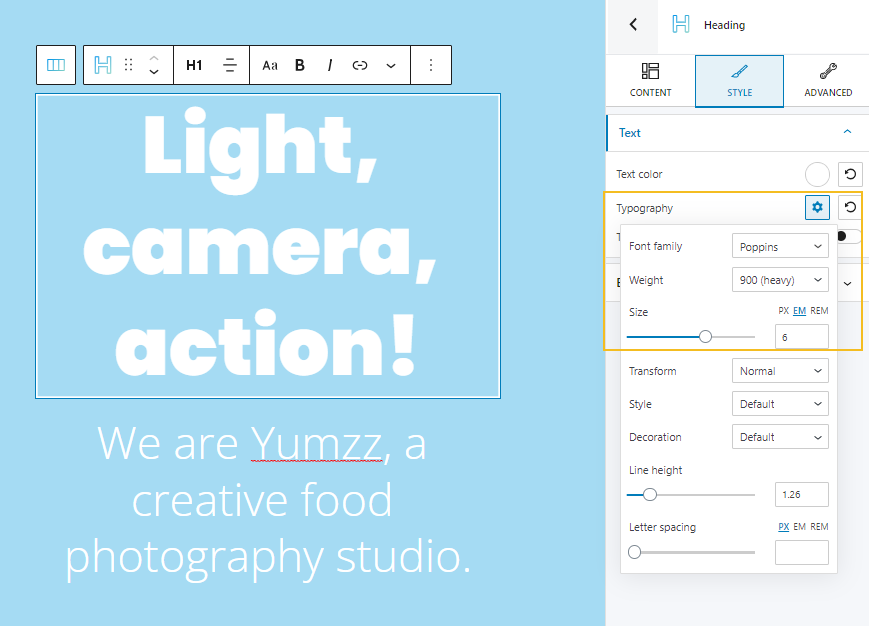
Let’s now paste the texts in the two headings and start adjusting their style. From the style option. Let’s select white as the text color.
Next, from Style -> Typography, we’re going to change the font family to Poppins, a font weight to 900, and a font size of 6 ems, for the first heading (H1).
Font sizes can be expressed in ems, rems, and pixels. Here’s an article that explains the differences between them.
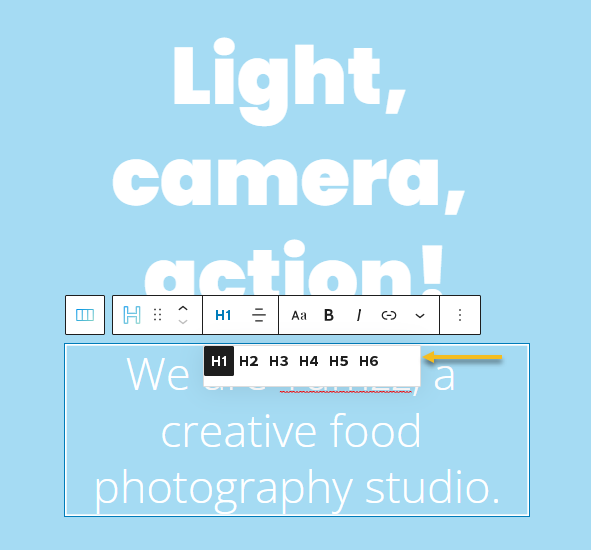
Now, we’ll switch the second heading from H1 to H3, using the toolbar, and then change the font weight to 300 and the font size to 3 ems.
Now, the main heading appears on three rows. Let’s investigate a bit why it does not show up on a single line.
Remember that the initial hero for our food photography website had 2 buttons? Somehow this design is set up to have two columns per row.
In Kubio, content is nested like this: section -> columns -> column -> block. You can notice this when you look at the breadcrumbs at the bottom of the interface.
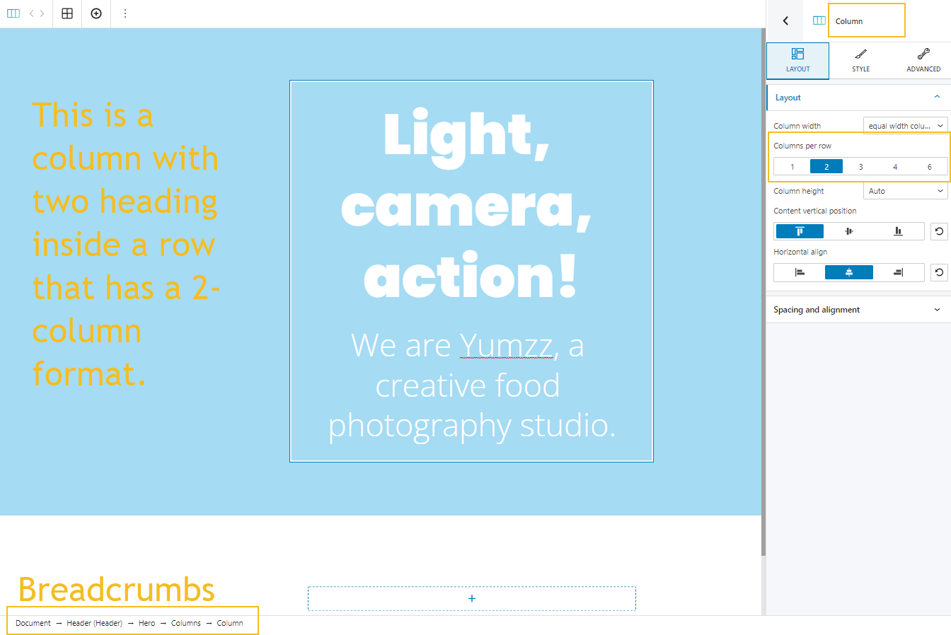
What we need to do now is to change the layout of our column to 1 column per row instead of two, from the block editor on the right.
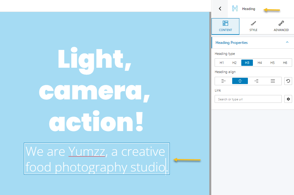
Important: when you select any block, make sure that you made the selection properly, by looking at the name of the block, at the top of the block editor. In the screenshot above you can see that we selected a column block.
In the screenshot below we are selecting a heading block.
We can also validate this while checking the breadcrumbs from down below.
You can use the breadcrumbs to move a layer up or down inside the nested content. Because things can get tricky when you have lots of blocks inside of other blocks. Breadcrumbs help you find your way.
Now, going back to the design, we need to add that curly highlight to the brand name inside our H3. This can be done from Style -> Effects. Select the “Highlight” effect type, and the “Curly” shape.
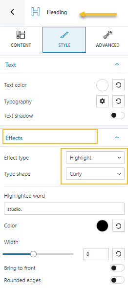
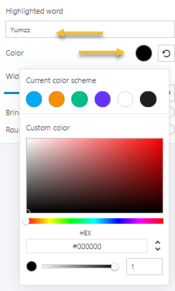
Next, type the word you want to highlight, and choose a color. You can even play with its width and edges.
Our food photography website hero is almost done.
We only have to upload the background image for the whole section. So, select the whole hero section, and then go to Style -> Background, or Advanced -> Background. Next, select the image as the background type. This will add a default image as a background, but you can easily change it from the “change background image” option.
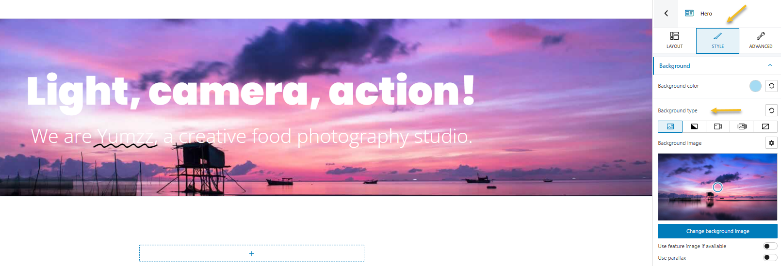
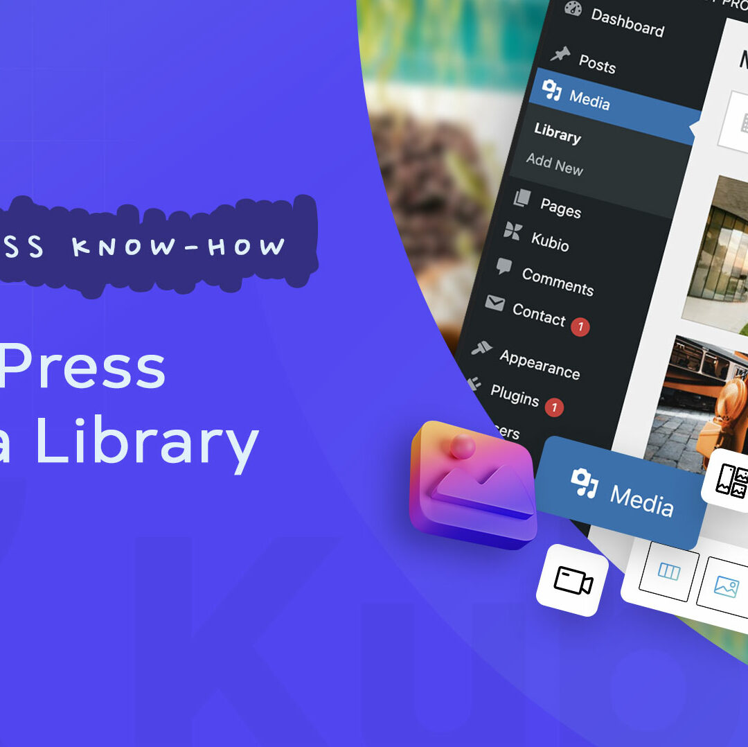
This will open up a window that allows you to upload a locally stored image, or choose one from the Media Library.
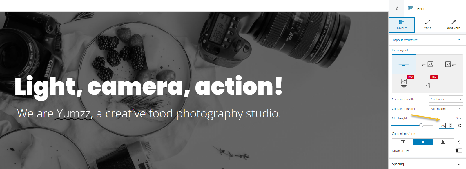
The hero is too tight now,
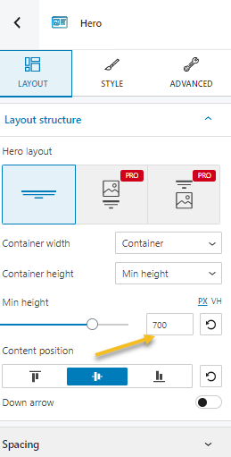
Let’s increase the height from Hero -> Layout -> Container height. Let’s establish a minimum height of 700 px.
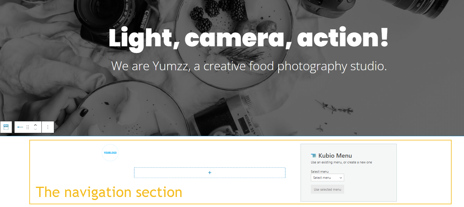
Adding navigation to the page
Now, let’s add navigation on top of the hero. We need to add this section and it’s a different process than adding normal blocks.
You need to go back to the page view on the right. Go to the Header part and click on the “+” sign.
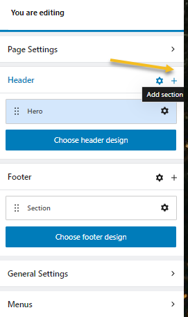
You’ll be now taken to the block inserter on the left. From blocks, choose “Navigation”.
This will add the theme’s default navigation below the hero.
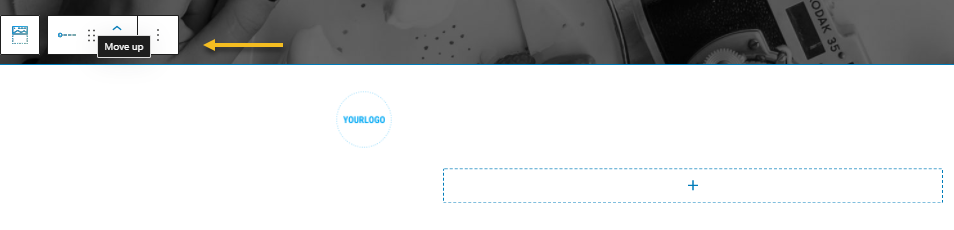
Let’s move the navigation on top of the hero, by using the up arrow in the toolbar.
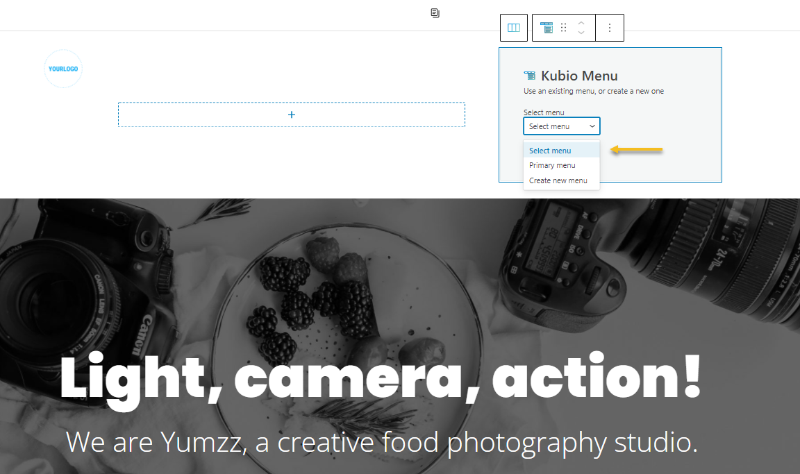
Now, let’s select the primary menu to show up.
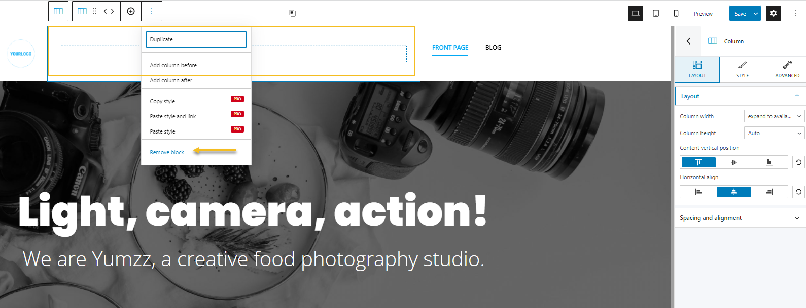
Next, le’ts delete the column in the middle, because we won’t be inserting any block there.
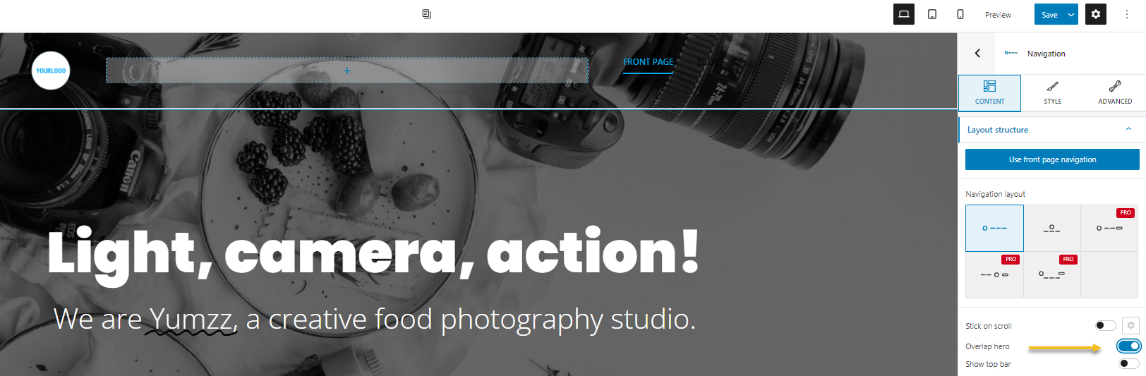
Now, while we selected the navigation section, let’s make toggle the “Overlap hero” option, from the Content settings.
Next, it’s time to change the logo. Select the logo block, and go to the “Change image” option
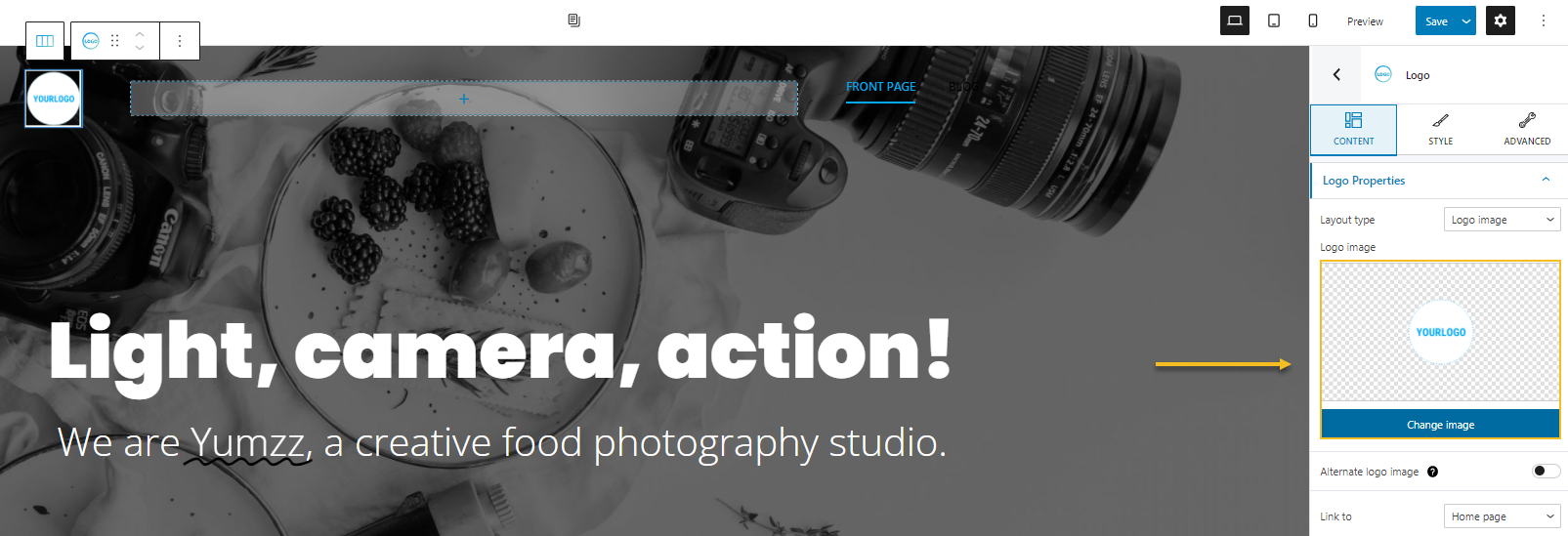
You’ll notice once more the same window that allows you to upload a locally hosted image, or to choose an existing image from the Media Library.
Don’t forget to save your work from time to time, by clicking on the “Save” button in the upper-ritght.
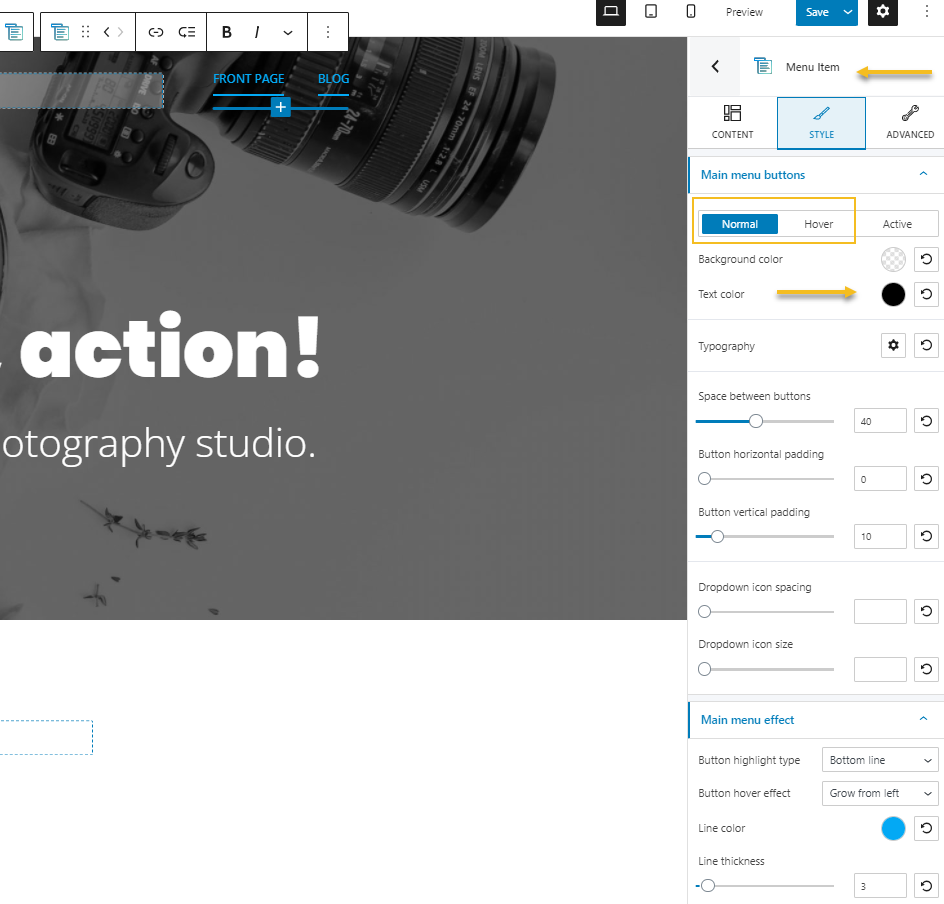
Next, the menu items are black when in the normal state, and blue when hovered. Let’s make them white in the normal state, and orange when hovered. In order to achieve this we need to select the menu items, then go to Style -> Main menu buttons -> Normal (or Hover) -> Text color. The active pages are left blue.
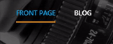
This is the final version of the menu:
And here’s a page preview.
Looking good!
Working with the Kubio image gallery block
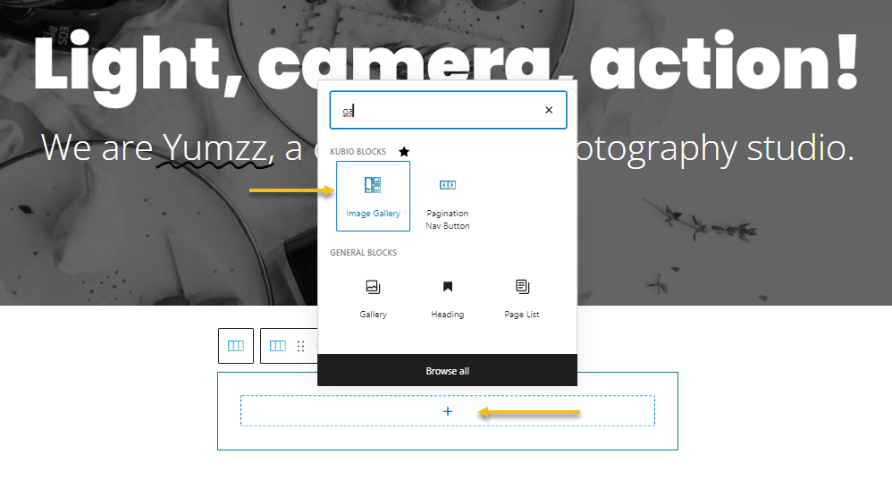
Now that our hero and navigation are case closed, it’s time to add the final section of the design: the gallery block.
From the “+” sign underneath the hero, let’s select the image gallery block.
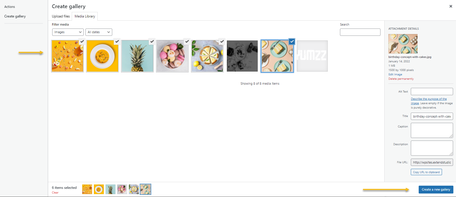
You can now upload some images, or select
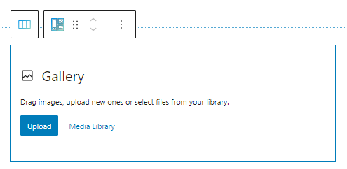
I’ll go with the latter option because I have already uploaded my images to the Media Library.
And this is the result.
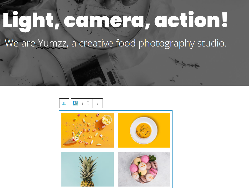
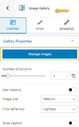
Fear not, cos this is not the final design. While the image gallery block is selected, fo to Content -> Number of columns, and switch from 4 to 2.
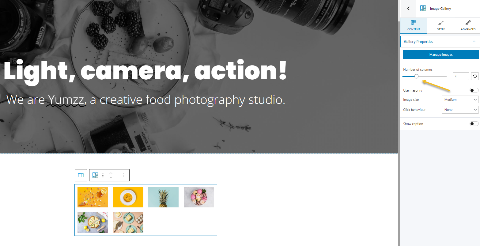
The result is not ideal yet.
We now need to enlarge a bit the gallery. In order to achieve this, let’s select the whole section, then go to Layout -> Container width, and set it to ful
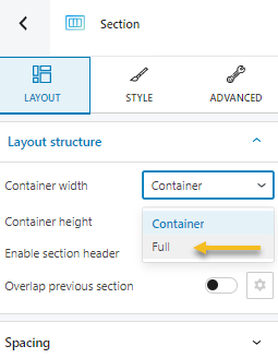
Every theme has a default width for its main content, and if you want to go bigger than that, or even full screen, go with the full-width option. Now, the gallery is still narrow.
When you look at the breadcrumbs, you notice that the gallery is nested inside a column, let’s select the column from the breadcrumbs.
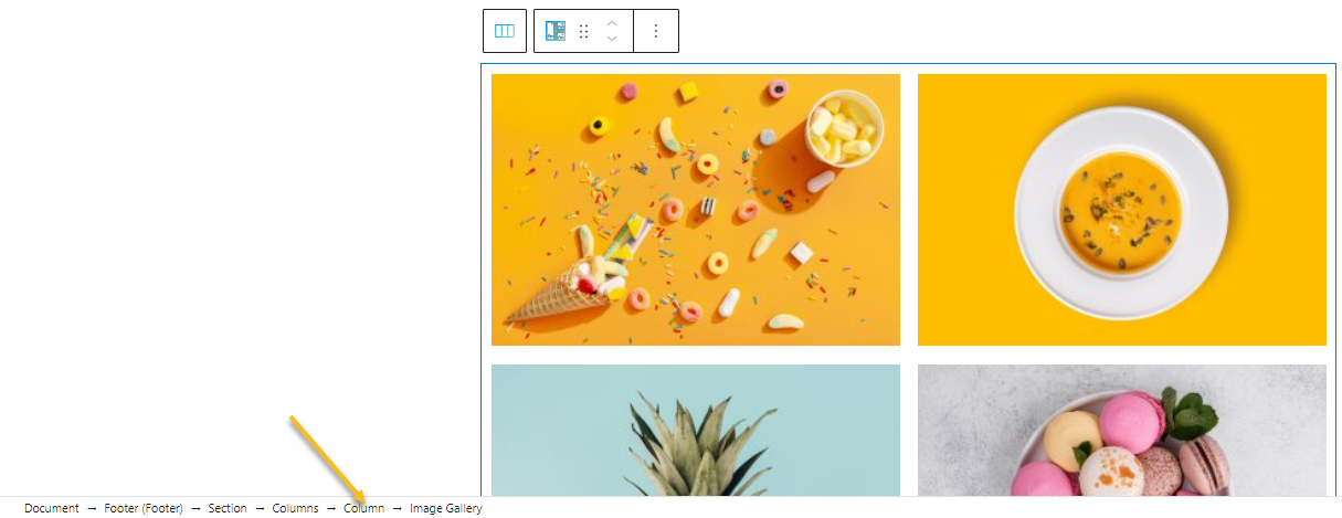
Next, from the editor on the right, inside Layout, change the column width to 70%.
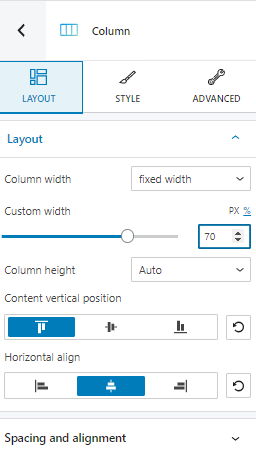
Now we’re talking!
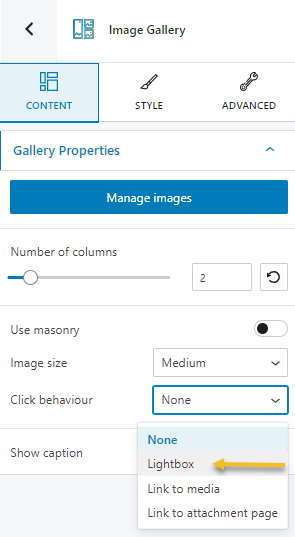
Now, let’s show an image slideshow when the images in the gallery get clicked. For this, we need to add the lightbox click behavior.
We’ll end up seeing this when any image gets clicked.
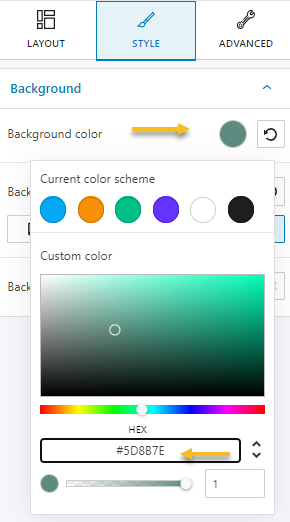
Next, let’s make the section’s background a flat green.
We can do this from Style -> Background, or Advanced -> Background. I am pasting a HEX code color here:
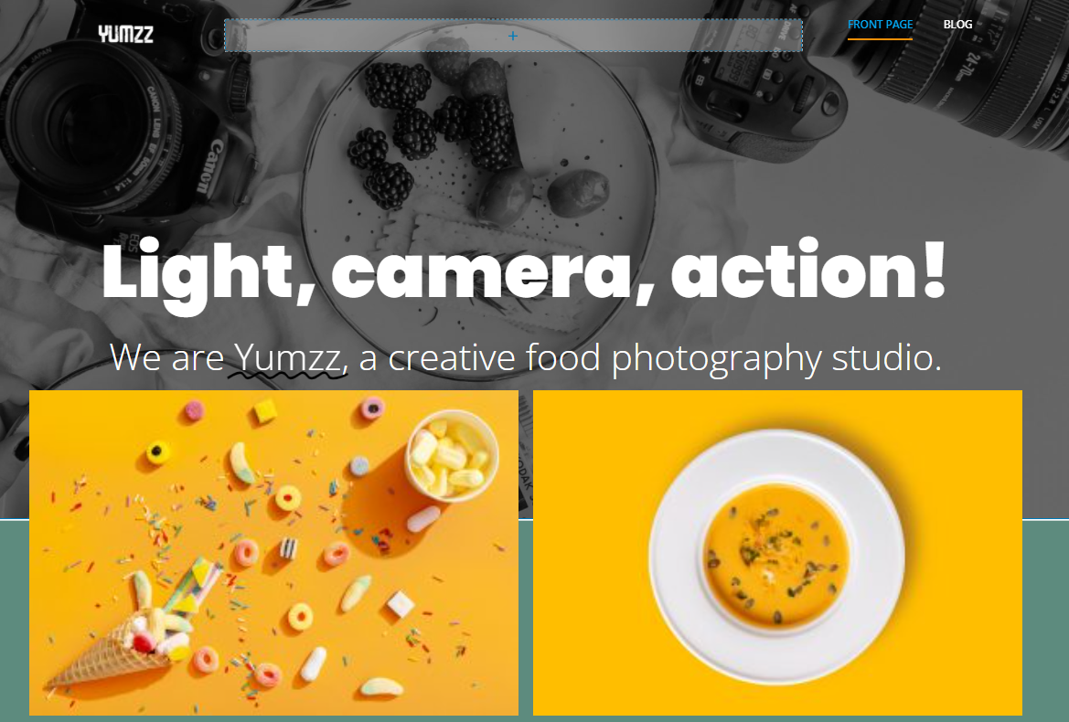
Now, my initial design looked like this:
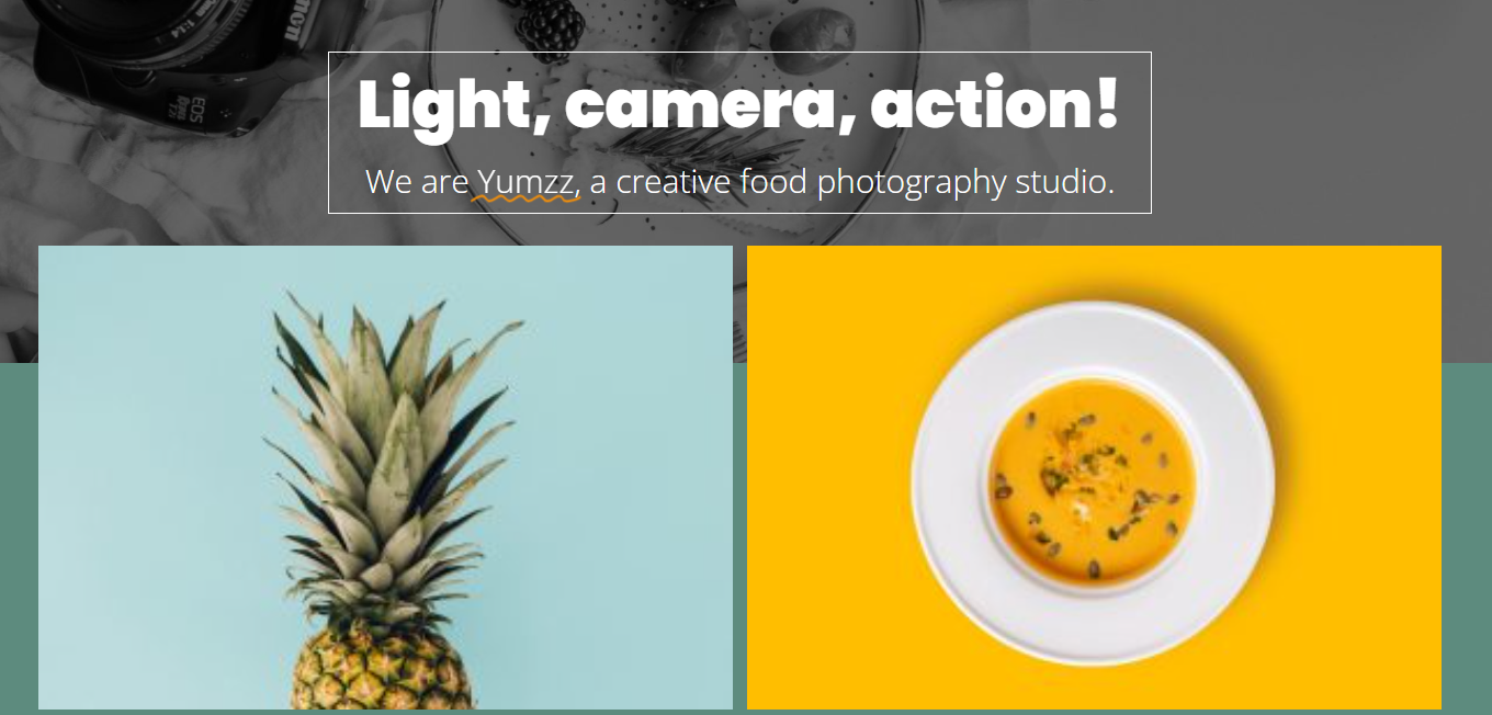
The gallery overlaps the hero section.
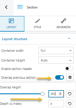
Let’s do this for our design as well. We need to select the section containing the gallery, the toggle on the “Overlap previous section” option inside “Layout”. The overlap height needs to be 300 px.
This is what we get:
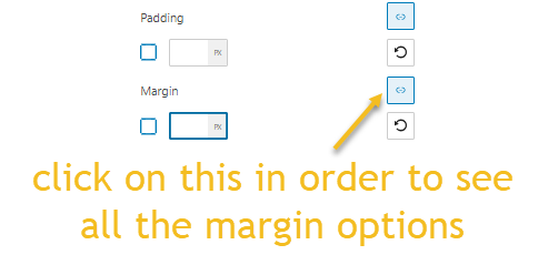
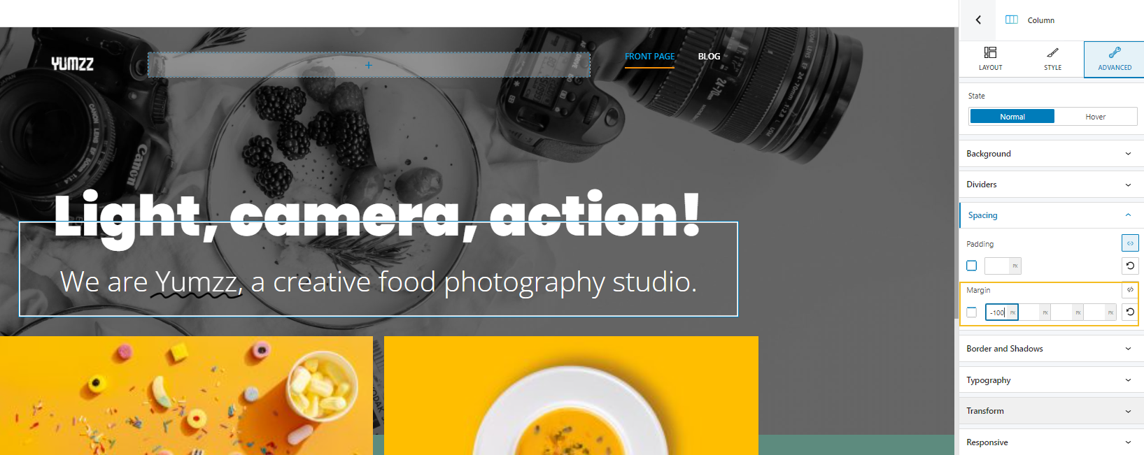
I feel that the H3 is now too close to the image gallery. This means we need to get it a bit closer to the top. This can be achieved by assigning a negative top margin. Make sure to select the column inside which the two headings are nested in, then, go to Advanced -> Spacing. You will see this:
Next set up the top margin to -100.
Next, we need to rearrange the images in the gallery to have the same order as in the initial design.
From this:
We need to get to this:
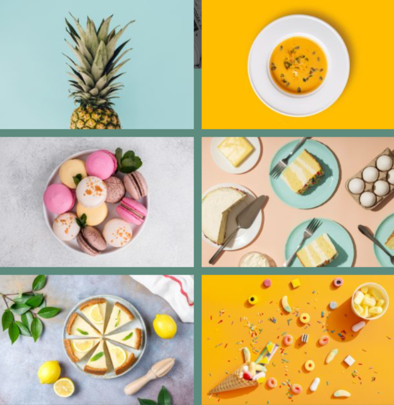
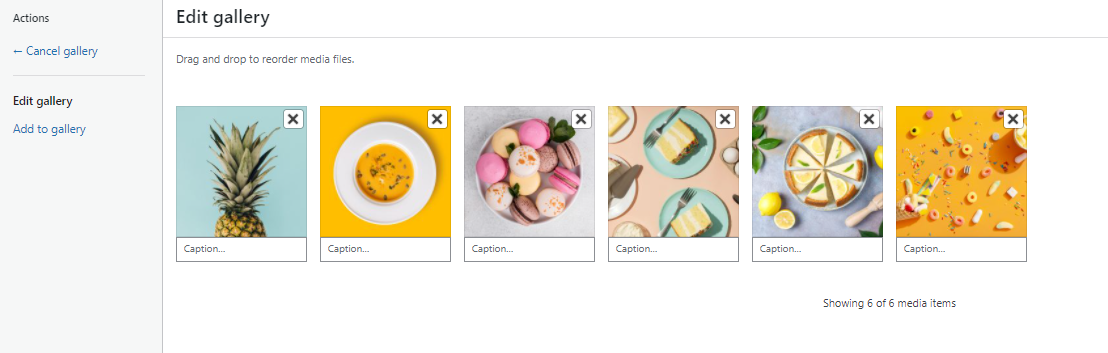
This means we need to select the image gallery block, then go to “Manage images”, inside “Content”.
Now, you just have to drag and drop the images, to reorder them. You can even add more images from the “Add to gallery” option, or delete images that don’t fit, from the “x” symbol.
Hit “Update gallery:”, then save the final design.
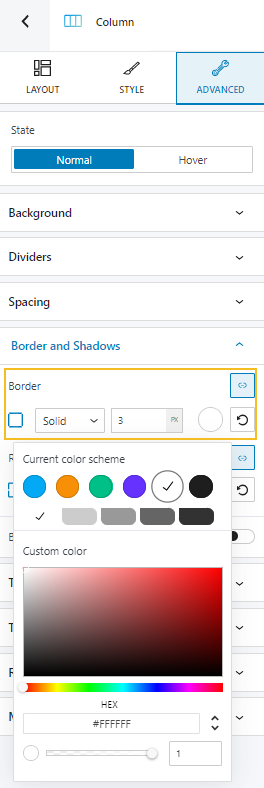
It’s almost mission complete. There’s one thing that was left out. A white border around both headings. This means we don’t need to select the heading block, but the column containing both blocks. Next, go to Advanced -> Border and shadows, and assign a white solid border, of 3px.
There you go:

And here’s the output:
Because nowadays a mobile-optimized website is no longer optional, we need to make sure that this design looks swell on mobile as well.
Making the page mobile-responsive
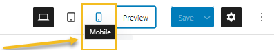
Let’s preview our page on mobile, from the menu at the top.
Houston, we have a tiny problem!
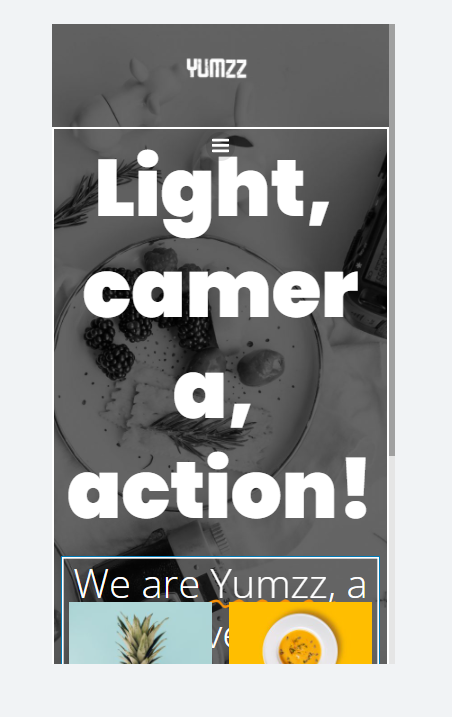
The second heading is overlapped by the gallery. This means we need to enlarge the hero a bit. We’ll raise its minimum height from 700 px to 1200px.
The issue is still there, but if we now move the heading a bit closer to the top, we can solve it.
As mentioned earlier, we can move things closer to the top by using negative margins. We’ll use a -150px top margin for the column containing the two headings. We can now decrease the font size for both headings because they are too large for mobile. Let’s assign to the H1 a font size of 5 ems, and a weight of 800. Let’s switch the H3’s font size to 2 ems.
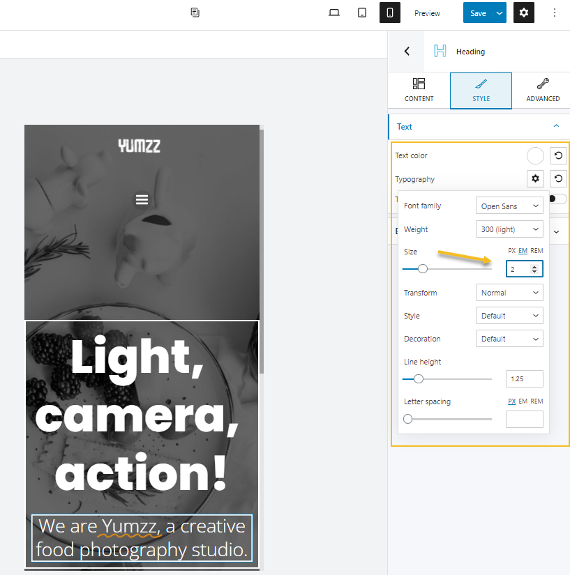
It looks like we’re now back to the issue where the heading is further from the top and the hamburger menu. As you can see, in web design you always need to readjust things. We keep making changes to the top margin for the headings and the hero width until we get it right.
I set up the hero’s width back to 900, and switch the top margin for the columns containing the headings to – 170.
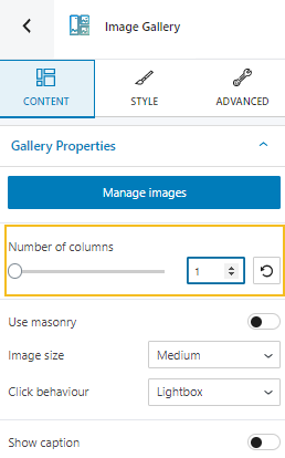
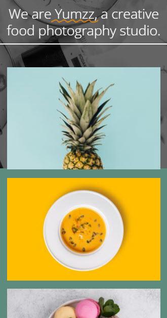
One more thing left to fix, the images are too small on mobile. The solution to this is to have them one per row. Let’s select the image gallery block, and assign 1 as the number of columns.
The result:
And we are…not quite there yet, cos you’ve got homework!
Yeah, you do. What about you try to fix this on tablet?
So far it looks like this:
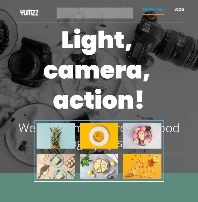
Some hints:
- Decrease the font sizes for the two headings;
- Increase just a little bit the height of the hero;
- Show the images in a single column, instead of three.
Do we have a plan?
Hope you’ve enjoyed this exercise, I’m sure I have 🙂
Happy WordPress-ing, folks!
If you want to stay in touch, and get updates on WordPress, and Kubio, make sure to follow us on Facebook or Youtube. If you want to find out how you can create a WordPress website, from scratch to hatch, we’ve got your back in this guide.