
Websites that can only successfully run on desktops are now out of date, as they cannot compete with the growing demand of mobile users.
By the third quarter of 2023, approximately 60% of users worldwide were primarily using their cell phones to browse the internet. This means it is now more important than ever to have a fully responsive website that can run on both mobile and desktop devices. The sad fact is, not all WordPress users have the know-how to optimize their sites for mobile devices. But don’t worry, that’s where we come in.
Learn how to improve your website’s mobile performance with Kubio page builder and get advice on optimizing for mobile devices.
Optimizing your WordPress mobile view with Kubio
Enhancing your WordPress site for mobile devices is essential nowadays for a good user experience. Fortunately, it’s easy to do with the Kubio builder. Here’s a quick guide to get you started – if you haven’t already, you’ll need to install and activate the Kubio builder on your website first:
- You can access your target page in the Kubio builder in two ways from your WordPress dashboard.
- In the left-hand menu, select Appearance → Edit with Kubio, then use the builder to navigate to the page you’d like to edit.
- You can go to Pages → All Pages, and select “Edit with Kubio” on the page you’d like to edit.
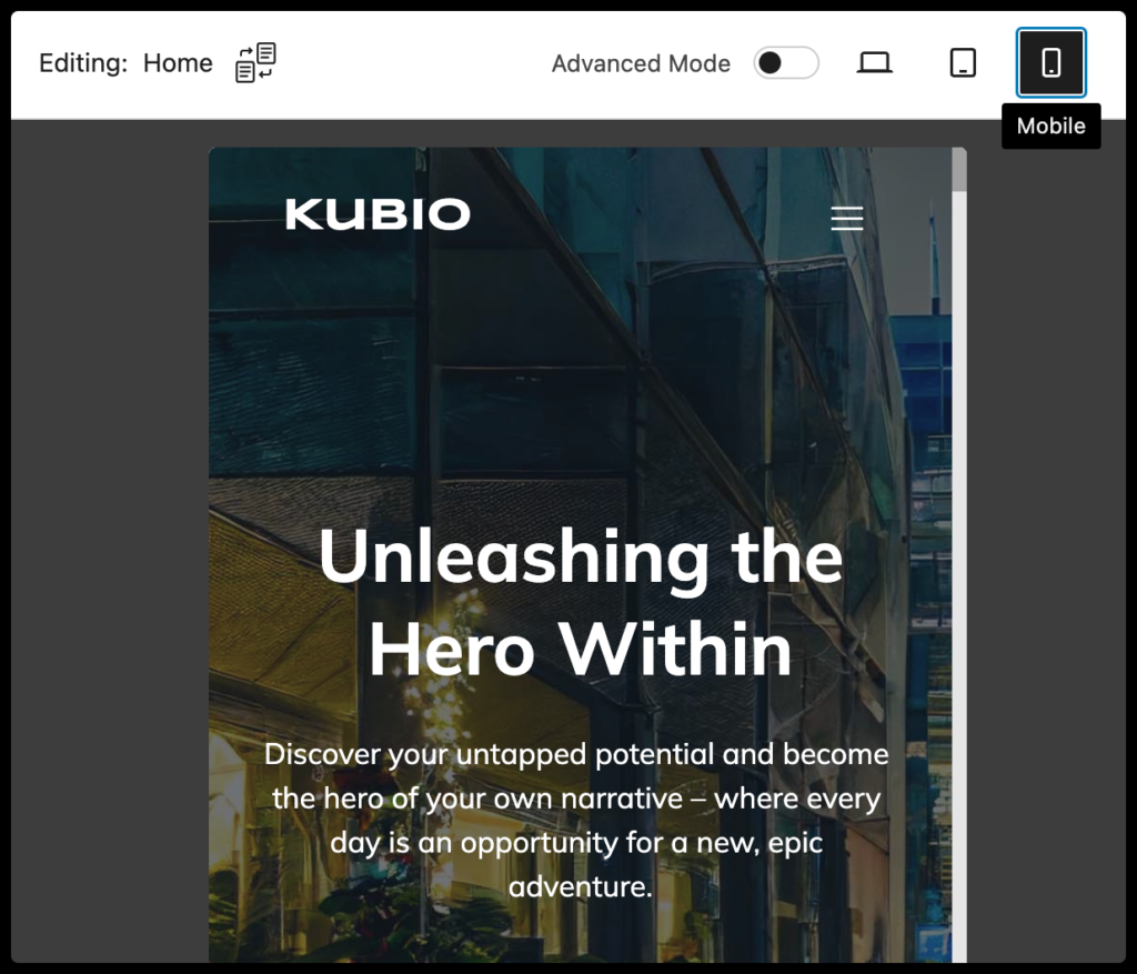
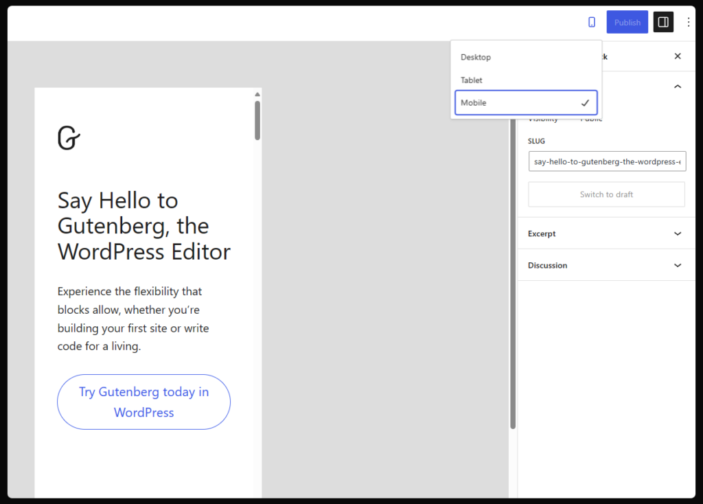
- Once you’re in the builder, use the device icons in the upper menu bar to switch to mobile editing mode.
- You can easily switch between mobile, tablet, and desktop modes.
- Edit your site as desired using the AI assistant tool, drag-and-drop builder, and library of blocks and premade sections.
- When you’re finished, review your work, click save, and preview your site from different devices to confirm everything is working as intended.
Drawbacks of mobile editing in Gutenberg
You can also edit your site’s mobile version with the default Gutenberg block editor, but it comes with limitations. By clicking on the device icon in the top bar, users can switch between browser, tablet, and phone views for a specific page. However, this method is not always flexible enough for effective WordPress mobile optimization.
One drawback to using the Gutenberg editor is the inability to customize blocks per device, meaning any changes made on the desktop site will automatically reflect on the mobile site and vice versa. This lack of flexibility can impact the overall design and function of your mobile site.
In contrast, more advanced site editors like Kubio allow users to make changes specifically tailored to the mobile experience without affecting the desktop version, offering greater customization options.
Another limitation of Gutenberg is that users can only use the default Gutenberg editor blocks and any custom blocks they create. This limits their ability to creatively design and incorporate diverse elements, which could improve the mobile user experience.
But just because Gutenberg can’t do it, doesn’t mean it isn’t possible. Kubio’s page builder has more blocks, sections, and options than the default page builder, empowering you to create the ideal website.
Navigating mobile customization with responsive design tools
As of November 2023, over half of all website traffic originated from mobile devices. By not having a responsive site, you risk losing a significant chunk of potential visitors. It can also lead to slow loading times, unpredictable performance, and usability challenges.
Think about a scenario where a mobile site is not optimized effectively. For instance, it may contain numerous images that are only optimized for desktop browsers. As a result, the site loads slowly on mobile devices, leading to a poor user experience. This is just one example of the kinds of issues that make mobile optimization so necessary, as neglecting it can lead to slow loading times, readability issues, and ultimately, a diminished user experience.
Responsive design ensures that web pages render across all devices, prioritizing usability and user satisfaction. Rather than crafting separate versions tailored for individual devices, responsive design allows the entire site to adapt based on the display it’s rendering for, offering a consistent and engaging experience across devices. Examples of responsive design elements include:
- Fluid grids: Automatically adjust their format based on the display settings of the site. They ensure that content remains well-organized across various screens.
- Condensing features (Hamburger Menus): Imagine a website condensing long stretches of text or information from the browser version into an easy-to-recognize hamburger menu icon on mobile. This enhances navigation by streamlining content and making it more accessible on smaller screens.
- Typography trees: Responsive typography trees consider weights and font sizes based on mobile display requirements. Adjustments prevent issues such as pushing content too far down on the screen.
- Media queries: Websites with media queries built into the code interact with the requesting device, looking for information about its display capabilities. This data guides the generation of a version of the web page that aligns with the specific device, optimizing the content presentation.
Kubio’s responsive design capabilities really focus on enhancing mobile optimization. You can use its built-in responsive design elements to easily customize sites across devices, ensuring a polished and functional appearance. Whether you’re a beginner or an experienced user, Kubio simplifies the process without the need for technical expertise!
Tips for creating effective responsive design
There is more to responsive design than just adapting to different screen sizes. It’s about creating a user experience that resonates across devices, never losing any feature or personalized touch. Here are some tips to elevate your responsive design:
Tip 1: Organize your content strategically
Before diving into design, take a step back to see how your site’s information should be structured. Your website should convey a brand narrative irrespective of the device used for access. Planning the organization of your content beforehand allows you to translate your brand story across different formats, ensuring consistency and clarity.
Tip 2: Design for mobile first
With over half of your site’s traffic originating from mobile devices, designing with a mobile-first approach is often the most logical option. Optimizing for mobile before addressing desktop versions facilitates streamlined decision-making processes, forcing you to prioritize essential content and simplify navigation. This approach often results in more efficient and user-friendly designs across all platforms.
Tip 3: Prioritize performance optimization
Opt for lightweight themes and keep images compressed to minimize load times, especially on mobile devices with potentially slower connections. Beware of resource-intensive plugins that could hinder site performance, particularly in mobile environments, where speed is critical for user engagement.
Tip 4: Simplify page copy
Lengthy paragraphs of text may be okay on desktop browsers, but they can overwhelm mobile users. Make sure your landing page copy is concise, impactful, and easily digestible. Identify essential information and eliminate unnecessary fluff to create a clutter-free and reader-friendly experience across all devices.
Tip 5: Test, test, test
Don’t rely solely on previews to gauge the effectiveness of your design. It’s important to thoroughly test your site across different environments and devices to find any potential issues or inconsistencies. Use performance testing tools to identify design flaws or performance bottlenecks, to guarantee an excellent user experience, no matter the device.
Leveraging AI for effortless mobile site customization
AI (Artificial Intelligence) is a powerful tool that is set to transform the way we build and improve websites. Kubio is leading the way in this AI-driven design revolution, simplifying the creation of responsive websites like never before.
Understanding the AI-infused design process
AI, in the context of website design, refers to the use of intelligent algorithms that can analyze data and make informed decisions to enhance the overall design process. The idea behind an AI-infused design process is to automate certain aspects. This promotes efficiency and elevates the quality of the final product. Kubio does this by introducing an AI feature that generates an initial website draft, allowing users to tailor it according to their preferences.
Kubio’s AI features
There is nothing worse than a blank page. While many site owners attempt to overcome this by searching for suitable themes, Kubio’s AI solves it by providing a solution that kickstarts your website creation process, eliminating the need for starting from scratch and bypassing the time-consuming theme search!
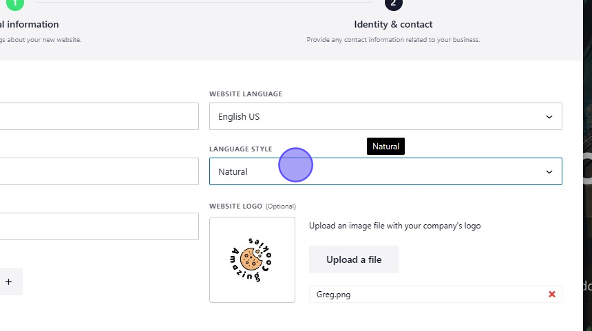
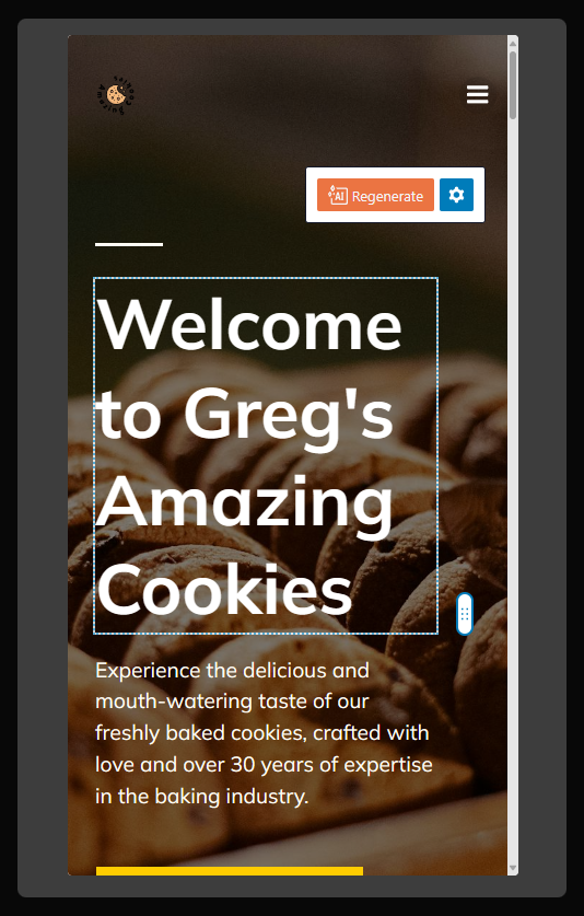
Upon initiating the process, Kubio’s AI asks a number of questions, collecting information about the website. This includes basic details such as address, logo, and a text field where users can describe general information about their site. This input is then used by the AI to generate an initial draft that includes site structure, stock photos, and first-draft site copy.
Users are able to regenerate specific sections or manually replace them based on their preferences. This feature is positioned as a way to automatically generate a more tailored version of Kubio’s starter sites, creating a foundation explicitly customized for the user’s business.
⚠️ While AI offers a great starting point, it’s important for users to view it as an assistant or a first-draft generator, rather than an all-knowing expert or final creator. AI doesn’t always get it right, so checking and double checking your site is important. Kubio’s AI feature allows users to expedite the initial phases of website creation while maintaining the flexibility to shape the site according to their personal brand.
Making the most of Kubio AI’s building tool
Kubio created an AI tool that makes a first website draft, giving users a base to personalize based on their preferences. Who better to ask about it than the experts?
?♂️ Q&A with the Kubio experts
Q: What kinds of information are most useful to give the AI at the site description stage?
A: Think of the site description as a book’s table of contents. Give it a concise summary, including the website’s purpose, main activities, and goods or services offered. Additional details like company history, values, or mission statements can enhance AI-generated content in relevant sections. Feel free to add any important information, such as years of experience, fields of expertise, or notable projects, and the AI will incorporate it appropriately!
Q: Is there any information site owners might consider including that isn’t actually useful?
A: Yes: Avoid including contact information in the site description; there’s a designated section for that. Specific details about website design or mobile versions won’t impact the AI’s process. The focus is on generating content rather than describing design elements. The AI generates a design aligned with the website’s purpose, allowing users to later adjust color schemes, typography, and design details manually.
Q: Is a long or short description better? Is there any value to using full sentences vs bullet points?
A: Bullet points with key details, like the website’s purpose, main activities, and products or services, can have excellent results. However, providing more information in sentence form improves specificity in the generated content, improving overall results.
Q: Can you include specific details about how you’d like the mobile version to look at this stage?
A: Information in the site description currently impacts the website on all devices. Users can make manual customizations specifically on the mobile version after the AI generates the initial content.
Q: Any other tips for making the most of this field?
A: Trust the Kubio AI to work its magic. Provide essential details in the site description, and let the AI generate a draft that you can later refine. The simplicity of the process allows for a hassle-free experience. We recommend having a go, try it out and let it wow you. ?
Take your mobile site to the next level with Kubio
Mobile phone usage for the internet has shot up, so ensuring your website is optimized for smaller screens is non-negotiable. Kubio’s page builder is equipped with a responsive design that elevates your site’s mobile performance.
With an extensive library of blocks, sections, templates, and starter sites, Kubio simplifies the process, offering an easy-to-use, single-page interface. The addition of an AI assistant tool takes your customization journey to the next level, generating bespoke first drafts for all versions of your site.
Don’t let your site fall behind – get started with the Kubio plugin today and optimize your site for the future!