
Responsive design is a fundamental aspect of modern web development. It ensures that a website’s layout, images, and functionalities adapt seamlessly across devices. This means that your site looks good no matter how the user is browsing.
As the world leans more towards mobile browsing, having a website that looks and functions well on a mobile device is a must. In the upcoming sections, we’ll examine how responsive WordPress themes can transform the user experience on mobile devices.
Why is it important to make your WordPress site mobile-friendly?
The importance of having a mobile-friendly WordPress site is crucial, at least in terms of user experience and search-engine optimization. As far back as 2014, Barry Schwartz shared a reply from Google stating:
“Mobile-friendly websites provide a much better user experience for mobile users. According to our studies, 61% of users are unlikely to return to a mobile site that they had trouble accessing from their phone(…) Because at Google we are aiming to provide a great user experience on any device, we’re making a big push to ensure the search results we deliver reflect this principle. We want users to be able to enjoy the web wherever they are.”
Responsive WordPress themes are designed to ensure that your site’s content, including images and functionalities, automatically adjusts to fit any device. This eliminates the need for users to scroll and resize, enhancing the overall user experience.
The Kubio theme is mobile responsive right out of the box, so any site you make with it will automatically satisfy humans and search engine crawlers alike. Incorporating a responsive theme from the start – whether it’s Kubio or one from a list of these recommended mobile-friendly WordPress themes – provides a solid foundation for enhancing user experience and improving your site’s SEO.
Some other themes you might use include:
- Breezy: WordPress mobile theme
- Eclipse:- Multi-Purpose mobile theme for WordPress
- FlatMobile: WordPress mobile theme with responsive design
Google’s mobile-first indexing is a clear indicator of the direction in which the digital world is moving, prioritizing mobile-optimized sites in its search rankings. Websites that fail to adapt to this shift risk losing visibility in search results, potentially alienating a large portion of their audience.
Optimizing for mobile: Plugins and scaling media
There are plenty of plugins and scaling tools out there that can help you more easily create a responsive WordPress site. Let’s take a look at a few of the options:
Kubio
Kubio excels in this field. It’s more than just a plugin; it’s an AI-powered builder that revolutionizes how WordPress sites are designed.
Kubio offers an intuitive, customizable block system that automatically adapts to different devices, ensuring your site is responsive across the board.
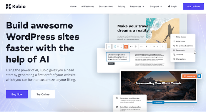
You can also easily add elements like header sections containing hero, navigation layouts, sliders, and carousels. These are all automatically mobile-friendly, requiring zero coding skills. This makes Kubio an ideal choice for those looking to easily redesign their website for mobile without diving into programming know-how.
WPtouch
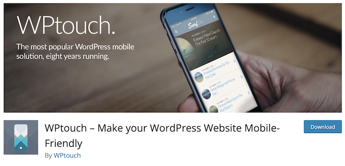
WPtouch WordPress Plugin
WPtouch is another useful tool you might use. This plugin automatically adds a simple and elegant mobile theme for mobile visitors to your WordPress website. This automatic process can be useful if you don’t have time to invest in a full mobile-friendly redesign, but it can cause branding inconsistencies since the plugin offers limited customization.
AMP for WordPress
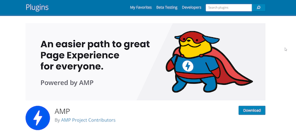
AMP for WordPress enhances the mobile viewing experience by generating accelerated mobile pages that load instantly, thereby improving user experience and SEO. However, this comes with the drawback of having simplified pages and possible complications with analytics tracking.
Optimizing a site for mobile goes beyond just choosing the right plugins. The media content (images, videos, etc.) plays a significant role in your site’s performance and user experience. Properly scaling and optimizing images and other media elements for mobile viewing is imperative to ensure fast load times and improve your site’s overall user experience.
Kubio’s AI-powered functionalities simplify the design process and ensure that every element of your site is optimized for mobile users, eliminating the need for extensive customization or plugin management.
Mobile-friendly testing tools and troubleshooting tips
Ensuring your WordPress site works well on mobile requires continuous testing and improvement. Mobile-friendly testing tools can provide invaluable insights into your site’s compatibility with mobile devices.
One of the foremost tools in this domain is Google’s Mobile-Friendly Test. This tool evaluates URLs to assess if a page is optimized for mobile viewing. It offers clear insights into how mobile users perceive your site and points out specific areas for improvement.
Besides Google’s tool, there are other platforms like GTMetrix and Pingdom, which also test for mobile-friendliness and give insights into performance issues that could affect mobile user experience. These tools analyze everything from site speed to user interaction patterns, providing a comprehensive overview of what works and what doesn’t on mobile devices.
Common challenges often identified during testing include:
- Resolution issues: Make sure your site uses a responsive design that adapts to any screen size.
- Text scaling problems: Text should be easily readable without zooming. CSS properties can help adjust text size based on the screen.
- Slow loading times: Optimize images and leverage caching to improve load times.
Troubleshooting these issues often requires going back to the drawing board and making adjustments based on the tool’s feedback. For instance, compressing images can improve resolution and drastically reduce load times, while tweaking CSS can solve text scaling problems.
Continuously evolving: Best practices for mobile site improvement
Making sure your WordPress site remains mobile-friendly is an ongoing journey. Technologies evolve, user behaviors change, and what was cutting-edge yesterday may become obsolete tomorrow. Below are essential practices for maintaining and improving your site’s mobile friendliness over time:
- Regular testing for mobile friendliness: Consistent testing of your website’s mobile compatibility is important, especially after implementing any significant changes or updates. Tools like Google’s Mobile-Friendly Test offer an easy way to evaluate your site’s performance on mobile devices, highlighting areas for improvement. Regular audits ensure your site continues to provide a superior user experience, adapting to the latest mobile standards and expectations.
- Staying updated with new trends: Engaging with web design communities, following authoritative tech blogs, and participating in webinars can keep you informed about the latest in mobile web design.
- Optimizing speed: Website speed is an important factor in user retention. Mobile users particularly expect quick loading times, and failing to meet these expectations can lead to increased bounce rates. To enhance site speed, focus on optimizing image file sizes, leveraging browser caching, and minimizing server response time. Tools like GTMetrix and Google PageSpeed Insights can provide actionable recommendations to improve your site’s loading speed.
- Adopting a mobile-first approach: Designing with a mobile-first perspective is increasingly becoming the norm. This approach prioritizes the needs and behaviors of mobile users, who may have different expectations than desktop users. Starting the design process from the smallest screen and working your way up ensures a seamless user experience across all devices.
- Utilizing minimal WordPress plugins: While plugins add functionality to your WordPress site, overloading your site with unnecessary plugins can significantly slow it down. Opt for a minimalist approach, keeping only those plugins that are essential for your site’s functionality. Regularly evaluate your plugin needs, and remove any that are no longer useful.
- Regular updates to theme and plugins: Keeping your site’s theme and plugins updated is critical for maintaining mobile compatibility and security. Regular updates guarantee your site runs smoothly on the latest mobile devices and operating systems, providing an uninterrupted user experience.
Create mobile-friendly websites instantly with Kubio AI
With over half of internet traffic now originating from mobile devices, there’s a critical need for websites to be mobile-friendly. Responsive design is no longer optional; it’s imperative for reaching and engaging the widest possible audience.
Kubio AI offers an innovative solution that guarantees mobile responsiveness right from the start. With Kubio AI, websites are automatically crafted with mobile friendliness and adaptivity in mind, ensuring your content looks and functions beautifully on any device. Start creating with Kubio AI today!