Each web page has a header at the top. Headers are the first thing a visitor sees when landing on the page. They need to draw attention and to communicate the brand’s value.
Headers can include:
- The logo
- A website menu
- A large visual
- Copy
- A call to action (a button).
Headers are an important part of the page structure. Besides the header there’s also the content and the footer. They are treated separately because in the back, the HTML code treats them separately. But you don’t need to bother yourself with this.
Now, let’s see how you can customize a header using Kubio, the WordPress page builder.
What you need to know is that in the previous WordPress experience, headers were not created in the same interface as the content. But since Gutenberg came along, and full site editing was released as a feature back on Jan 25th, things are changing in the WordPress ecosystem. Kubio is among the first WordPress block-based page builders that has full site editing (FSE) capabilities.
Now, let’s dig in and see how you can manage headers in Kubio.
Page Settings in Kubio
When you are inside of a web page in Kubio, click on the settings icon in the upper right. It will open up a page editing panel. This panel allows you to visualize your page sections easily.
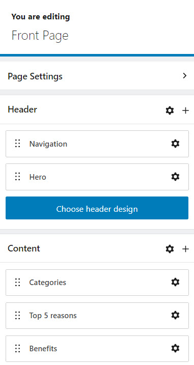
Notice that the header is composed of navigation and hero? Usually, the hero is made of a large visual, text, and a call to action.
The navigation and hero are actually blocks. But you can’t see them inside the block inserter, unless…they get deleted one way or another. We’ll get back to the block inserter a bit later.
Now, if you head over to the “Settings” icon next to “Header” you can choose a different header for the current page. This particular Kubio starter site I’m using has two types of header designs: front page header and inner header. With Kubio PRO you can build more headers. You can jump to this topic, here.
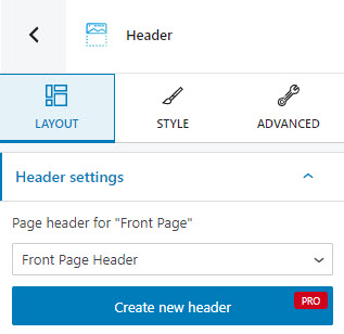
Now, notice that we have 3 levels here in the block editing panel? We’ll go inside a bit later.
Now, let’s go back to page settings. Notice the “+” sign next to Header?
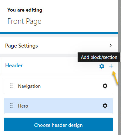
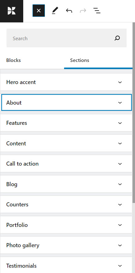
When you click on it, you will open the block inserter on the left hand side. You can choose a predefined section from here to add to the header.
Just click on a section and it will be added.
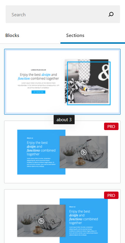
Notice that there are both free and pro sections, grouped per category: About, Team, Portfolio, Clients, Testimonials, and more.
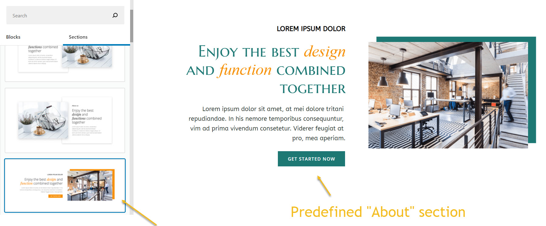
Now, the moment a section is added, it will match the typography and colors of the current theme. You can notice that the orange button and image frame are now green.
Now, this new section is going to show up inside the header:
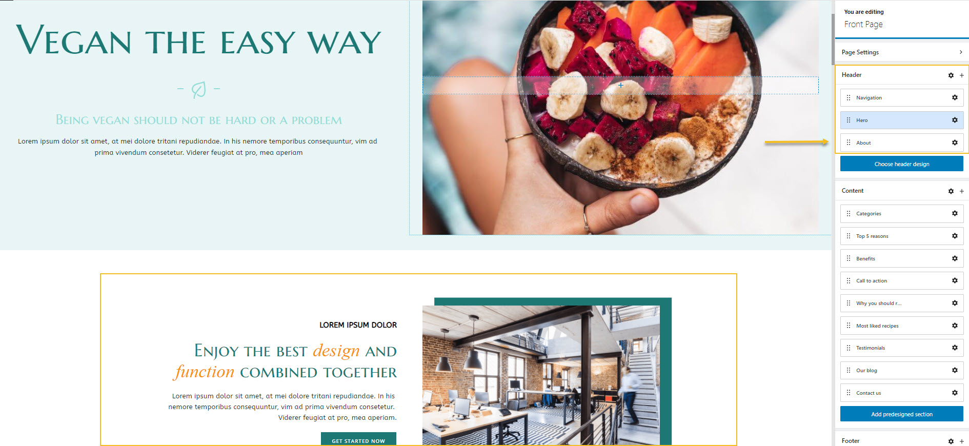
You can use the 6 dots next to the name of each section to move sections by drag and drop.
If you select a section from the header you will notice an “x” sign. Use it when you want to remove the section.
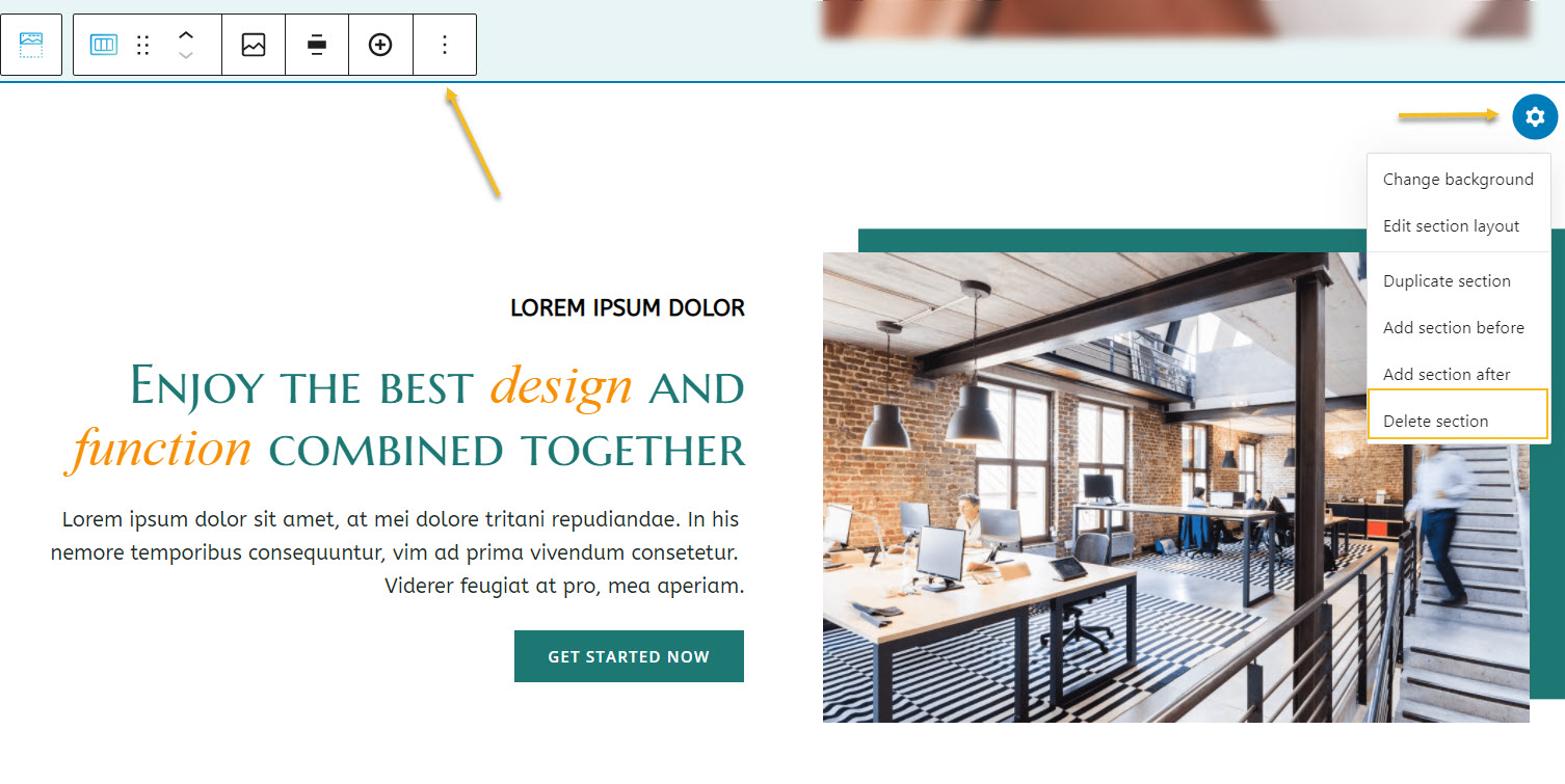
You can also remove the section straight from the canvas. Start by clicking on the section. Now you can delete the section:
- Using the toolbar that shows up on top of the section. Click on the 3 vertical dots to the right of the toolbar. You’ll now see the “Remove block” option.
- Click on the settings icon in the upper right corner of the section. A panel with several options will show up. Click on “Delete section”.
Now, you can easily rename the sections in the header. Just click on the name and type in a different one.
Now, you can also add a specific section to the menu. This is especially useful when you have a one page website.
Header customization inside the block editing panel
Now, you saw that when you click on the settings icon next to the header, inside the page editing panel, the block editing panel will show up. It’s here where you can customize the header the way you want.
Let’s dig in a little bit.
At the”Layout” level I showed you how you can select a different header for your page.
The “Style” level
Here you can change the background color for the header.
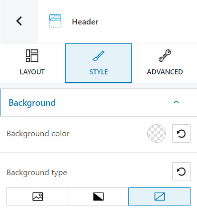
Click on the colored circle. A panel will open up that allows you to pick a color from the current color scheme or gradient from a color, pick a color from a slider, or just type in a desired color code in the “HEX” field. You can also switch to the RGB color mode if it suits you better from the dropdown arrow.
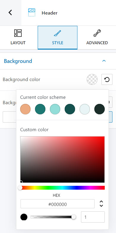
You can also adjust the opacity of your color. The slider offers you values from 0 to 1, 1, meaning there’s no transparency. You can always reset the color to transparent when you select the reset button.
Now, you can also change the background type. You can go with a background image or a gradient.
After selecting the image background type, you will see a default image showing up. You can easily change it after clicking on the “Change background image” button. You can upload your desired image or pick one from the Media Library.
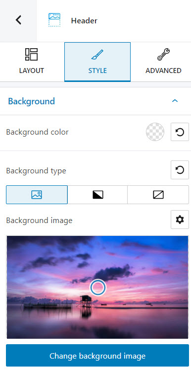
The PRO users can enable the parallax scrolling option as well. Parallax scrolling is a technique in which the website background moves at a slower pace than the foreground.
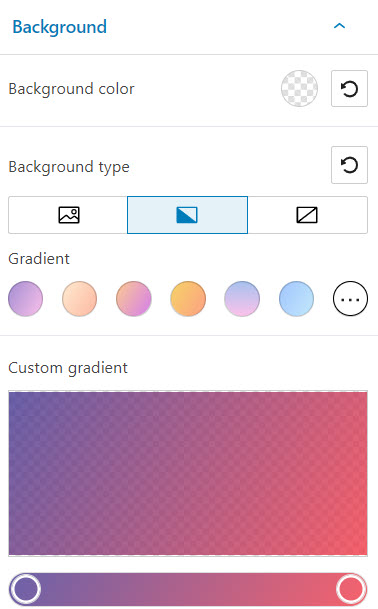
If you prefer a gradient as a background, select the gradient icon. You will have 5 free gradients available, and more than 100 in the PRO plans.
There are two types of gradients that you can use: linear or radial. You can adjust your gradient by using the slider (for both the linear and radial gradients) or the angle (in the case of linear gradients).
When you click on the slider, you will be able to add more color points to the gradient. Just choose its color and set up its opacity.
The “Advanced” level
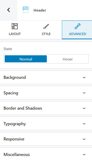
Here you can customize the header both in the normal and hover states.
You can customize the background, spacing, typography, border and shadow. You can also decide whether the block will show or not on desktop, tablet or mobile. Inside the “Miscellaneous” option you can set up the z-index of your block (vertically order the elements that overlap), set up if the element overflows or not (displaying the content of the block flowing out of its container into the surrounding area), add HTML anchors and CSS classes.
Now, what you should know is that there are some priorities to be respected when it comes to styling. Let’s say you set up a certain background color for the hero. The hero lies inside the header. Now, when you go and set up a background image for the border, it will not apply to the hero. Why so? Because the most granular background setting will overwrite it. This is a topic related to nested elements, parent-child relationships and inherited styles. We talked about this in a previous article.
How to customize the elements inside the header
Now, as I mentioned earlier, a header has certain elements. With Kubio you can easily edit them. All the elements are in fact blocks. We have the logo block, image block, menu block, heading block, button block…Ok, I’ll stop now. You got the point.
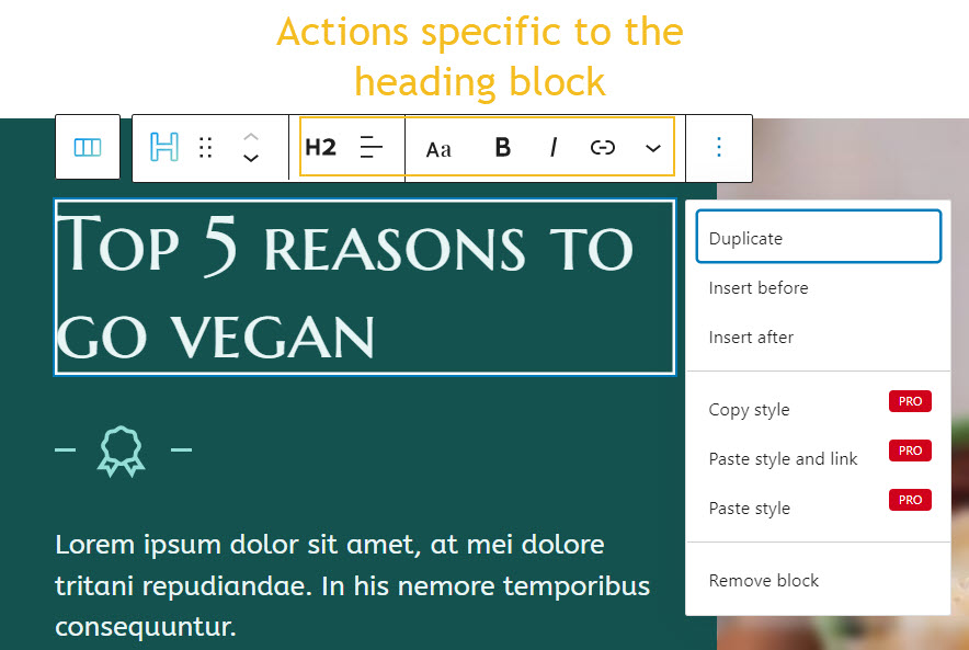
The moment you select any block, you’ll notice a toolbar on top of it with several options. Most of the options are common.
- Positioning. When you select the 6 dots, you will have the option to drag and drop the block where you want. When you select the up and down arrows, you will move the block up and down.
- Options. Inside options, there are several actions that you can take:
- Duplicate. This allows you to clone your current block. After this duplication, you can style both blocks independently.
- Insert before. This allows you to insert a new block before the current one.
- Insert after. This allows you to insert a new block after the current one.
- Copy style (PRO only) – use this option when you want to copy the style from a block to another. This will copy text color, background color, font size, font family, borders and their styling, to another block. This option is used together with the paste style. You can copy and paste styles across the same type of block, from paragraphs to sliders. Now, you should know that in the case of advanced blocks, they have multiple blocks inside (buttons, images, text, etc), the styling won’t be copied for the elements on the inside as well.
- Paste style and link (PRO only) – after copying the style from another block, use this option to paste the style. When the styles are linked it means that any style change happening on a block, it will be reflected on the other one as well.
- Paste style (PRO only) – after copying the style from another block, use this option to paste the style. This option won’t link the styles of the blocks, meaning that a styling change done to a block, won’t affect the other.
- Remove block. This is how you delete the block you’re currently on.
Now, you might uncover some other options as well, depending on the block. Take the heading block for example. The toolbar allows you to change the type of heading, change its alignment, add a link to it, make the text bold, italic, with underline, etc.
There are also advanced editing options available for blocks and sections. The moment a block is selected, a block editing panel will be available on the right with the following options: content, style, and advanced. Inside these options, the settings will vary depending on the chosen block.
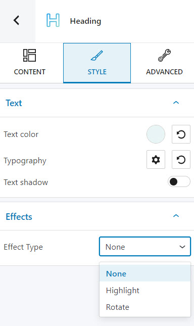
Let’s go back to our heading. Here’s what you can edit in the block editing panel:
- At the “Content” level you can change the heading type, align it, or assign a URL to it.
- Inside “Style” you can customize: heading text color, typography, and shadow, and heading effects..
- Most of the options inside the “Advanced” level are met across most of the Kubio blocks. You will probably recognize the options I presented for the header block above. In the case of heading you can customize the background, spacing, typography, border and shadow. You can also decide whether the block will show or not on desktop, tablet or mobile. Inside the “Miscellaneous” option you can set up the z-index of your block (vertically order the elements that overlap), set up if the element overflows or not (displaying the content of the block flowing out of its container into the surrounding area), add HTML anchors and CSS classes.
Now you know how to remove or customize a block inside the header. But how can you add a new block?
Well. start by hovering over the elements inside the header, until you notice a “+” sign.
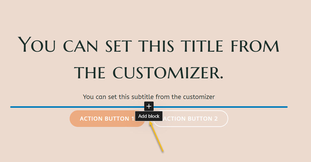
When you click the “+” sign, a tiny block inserter will show up. You can choose a block from here, or even look for one by typing its name. Let’s search for the icon block.
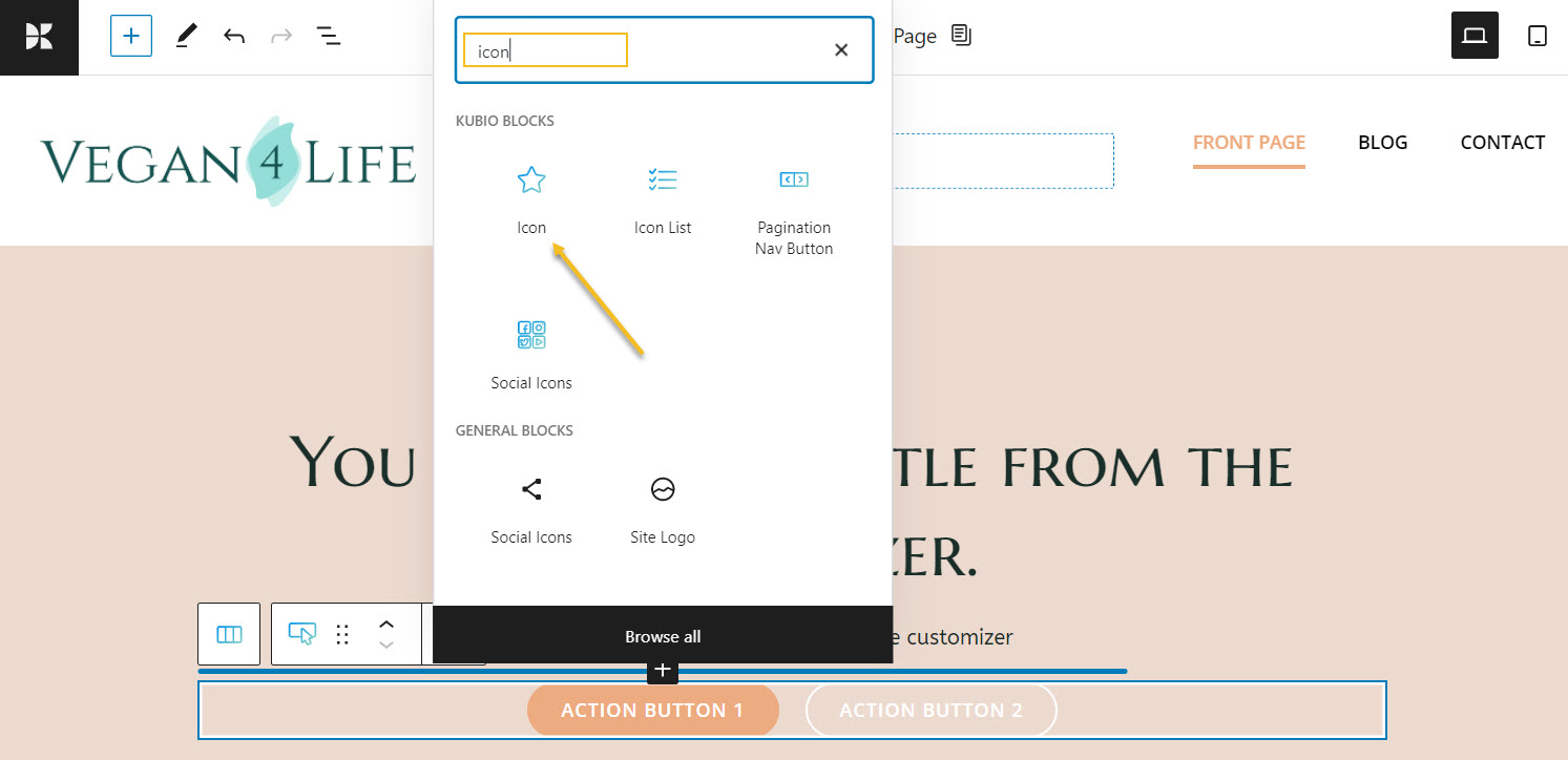
Now, you can use the block editing panel on the right to further customize the icon.
Adding the hero and navigation blocks to the header
Let’s say you deleted by mistake the navigation or hero sections, and now you’re left with this: an empty header.
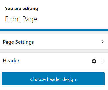
You could choose a header design from the predefined sections, or add a navigation and hero block.
How would you do this?
From the “+” sign. It will open up the block inserter. And take a look at that: we have both a hero and navigation block.
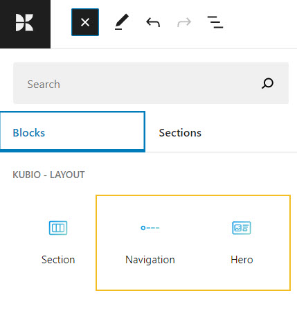
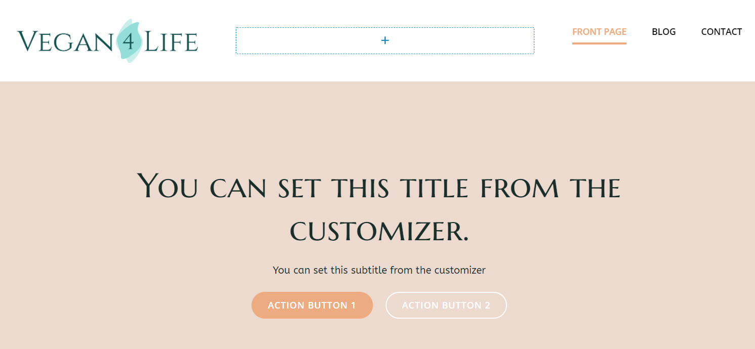
Let’s add them one by one. These are the starter site’s default blocks. They need to be customized according to your vision and taste.
Creating headers using Kubio PRO
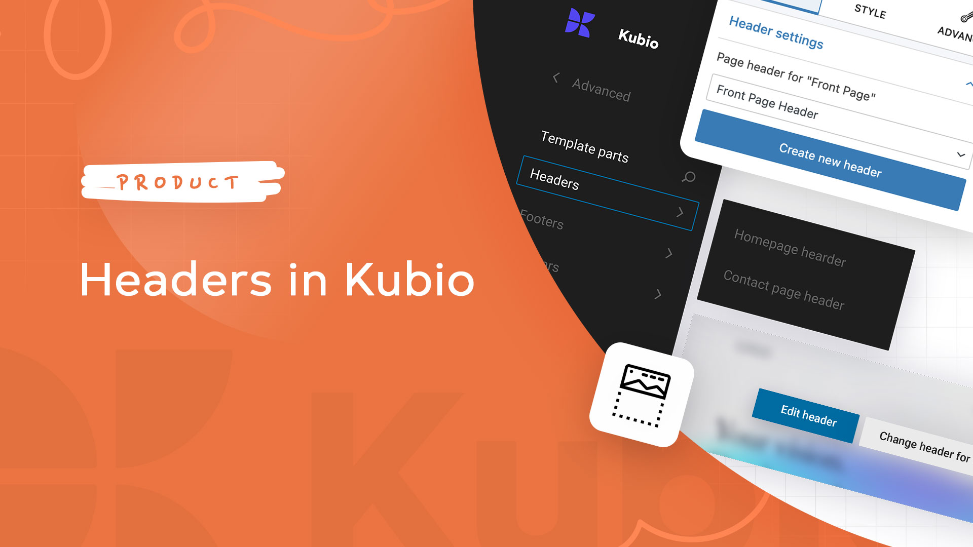
Now, my current starter site has two types of headers: the front page and inner page headers. When using Kubio PRO I can create other headers as well. Let’s say I want a separate header for the contact page. Right now the contact page uses the inner page header.
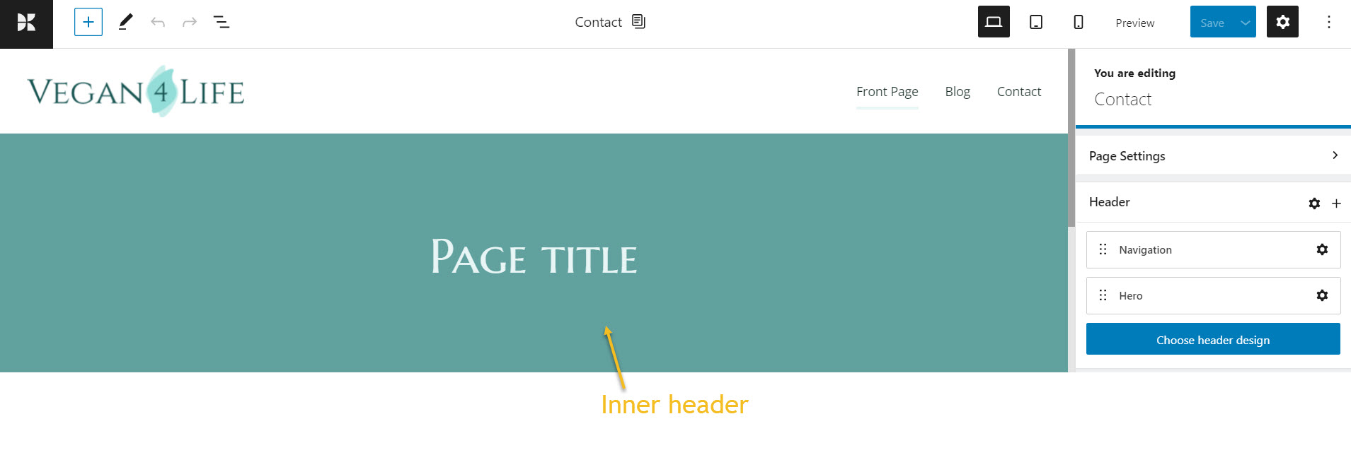
First I need to click on the settings icon next to Header. You’ll notice a pop-up asking you whether you want to change the header for the current page, or for all the pages using the current template..
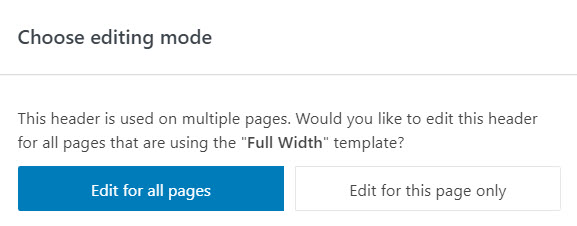
Let’s go with “Edit for this page only”.
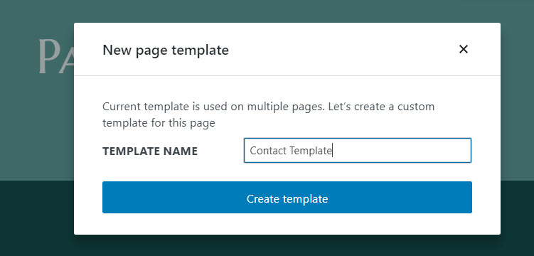
Let’s now name the header template, then hit “Create template”.
Next, let’s choose a header design.
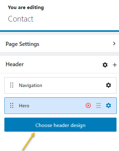
This will open up the block inserter to the left hand side with some predefined headers.
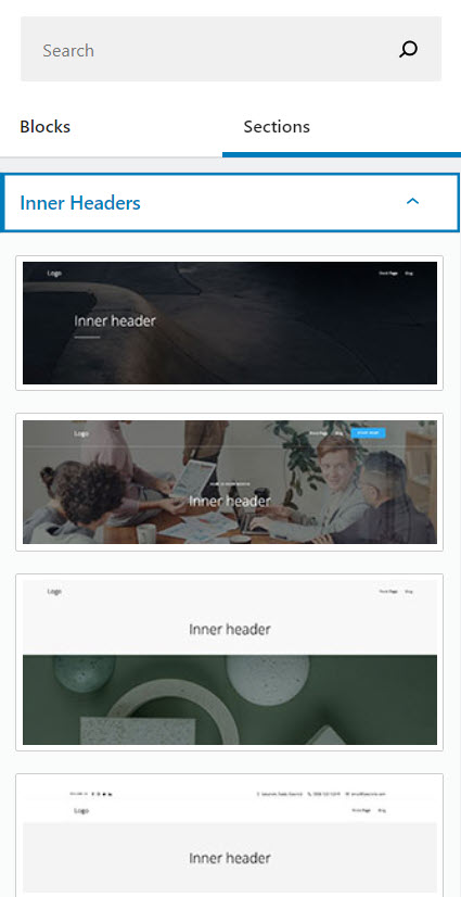
Let’s select the second inner header template.
From now on we can remove or add blocks to the hero, or navigation, as well as customize them the way we see fit.

But where can you find all the header you create?
Well, start by clicking on the Kubio logo in the upper left corner. It will open a panel. Locate the template parts.
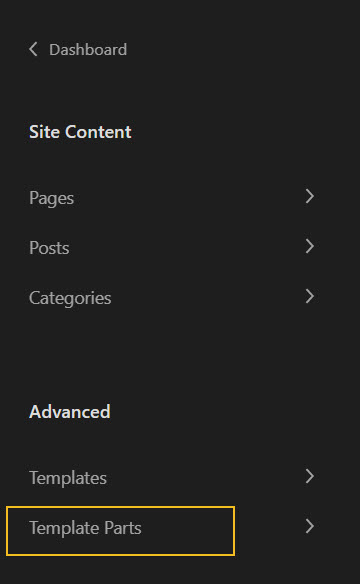
When you click on “Template parts” you’ll notice headers, footers, and sidebars.
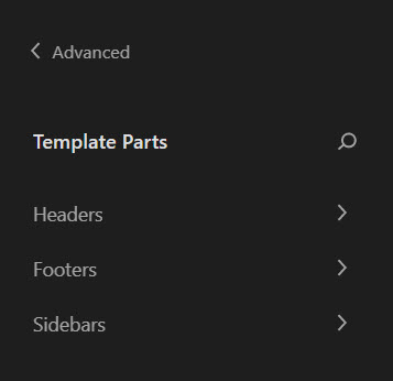
Each of them will contain the default template parts, as well as the ones you built. Let’s head over to headers. Notice the header I have just created?
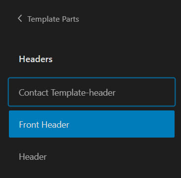
Let’s click on it. Now, we can make further edits to this header. So, if the header is being used across multiple pages, the changes we make here will be reflected in all those pages as well. This way Kubio makes design scalable.

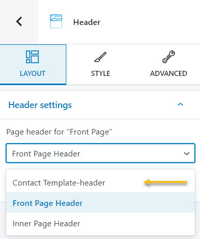
Now, let’s go back to the front page. Let’s click on the settings icon to enter the header’s block editing panel. From the header settings we can assign the newly created header to the front page.
Wrap up
In this tutorial we talked about:
- How to style the header section inside the block editing panel,
- How to customize the blocks inside the header,
- How to create new headers inside Kubio PRO,
- How to work with the hero and navigation blocks.
Now, we’ve also prepared a video tutorial on the topic for you. Check it out:
If you liked this article, and want to have access to similar content, make sure to subscribe to our YouTube Channel. You can also follow us on Facebook.


