When it comes to web design, small details can have a significant impact on the success of your online business. One such little detail is the color of your hyperlinks. While it may seem trivial at first glance, the hyperlink color can serve as a unique reflection of your brand identity. This little tweak can catapult your site into a realm of individuality and reinforce your brand persona.
However, changing a link color is not as straightforward as it seems. One might think it’s as simple as selecting a color code, but the process requires a delicate balance between creativity and usability.
In this guide, we’ll simplify the process of hyperlink color customization in WordPress, delve into the advantages, and provide a step-by-step tutorial on how to do it right. We’ll also go through the potential challenges that may surface along the way and how to overcome them.
Let’s get started!
Understanding the importance of link color customization
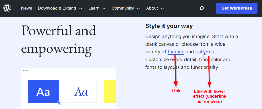
The way hyperlinks look can greatly affect how visitors use your website. Websites often make hyperlinks stand out from regular text by changing their color and appearance. Without these changes, users might have trouble figuring out which words they can click on to go to other web pages.
Traditionally, links are underlined to indicate that they are clickable. However, this convention has evolved over time, and many modern websites opt to remove the underlines and rely on color alone to denote links.
They are often displayed in a different color from regular text to make them stand out. Blue is a commonly used default color for links, but it’s not a strict rule. Visited links often change color (commonly to purple) to indicate that the user has already clicked on them.
The color you choose for your links can have a big impact on how people see your brand and remember your website. If you make a poor choice, it can confuse users and make it hard for them to navigate your site, hurting your Search Engine Optimization (SEO) ranking in the process.
If your site, for instance, uses a blue background, having blue font links could hamper visibility and make them hard to distinguish.
On the flip side, moving away from link formatting conventions could lend a unique charm to your site, setting it apart from the competition and attracting more visitors.
So, when you start a new web design project or think about updating an existing one, take some time to think about how the color of your hyperlinks affects communication with your visitors.
Does the current color scheme work well, or is there room for improvement? The answer doesn’t just lie in making things look good but also in making it easy for your users to get around.
The role of link color in branding and user experience
Each link traverses through different states: visited, unvisited, and active. It’s, therefore, important to select a color scheme that takes into account these variations to guarantee a seamless transition and coherent visual presentation across all stages.
Here are a few key considerations to keep in mind:
- Hyperlink colors should adhere to accessibility guidelines to ensure that all users, including those with visual impairments, can easily distinguish and interact with links. Choose colors that provide sufficient contrast against the background to meet accessibility standards, such as the WCAG (Web Content Accessibility Guidelines).
- Pick colors that can guide users through your site’s hierarchy and information architecture. For example, you may use one color for primary navigation links and a different color for secondary or tertiary links to signify their importance.
- It’s worth noting that colors evoke emotions and associations. The choice of link color can influence how users feel about a brand or website. For example, warm colors like red or orange may convey excitement or urgency, while cool colors like blue or green may convey trust and calmness.
How to change link color: Exploring built-in WordPress features
WordPress provides readily available capabilities for hyperlink formatting. You can modify single links or your entire website’s link color scheme through a few options: the theme customizer, the WordPress default block editor, or implementing custom CSS.
Method 1: Using the WordPress theme customizer
Note that the customizer interfaces may differ slightly from one another depending on the theme you’re using. Nonetheless, here is an overview of the steps:
- From your WordPress admin dashboard, navigate to Appearance > Customize.
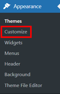
- Once you’re in the theme customizer, scroll down in the navigation bar on the left-hand side and click on Colors.
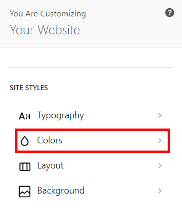
- Again, scroll down till you find the link color options and change them to the hues you want.

Your results should look something like this:
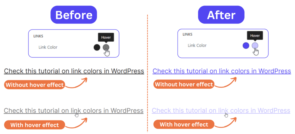
Note that this method works best for changing link colors for your entire website. You won’t have the flexibility to add bespoke customization to your hyperlinks.
Method 2: Using the default WordPress block editor
Gutenberg is the default block-based editor for WordPress. It utilizes individual blocks of content to create layouts and other customizations for your site. This makes it easy to add, move, and remove content without having to worry about HTML or CSS.
It also enables the alteration of an individual link color on your site – here’s how:
- From your WordPress admin dashboard, navigate to Post > All Posts and click on Edit under the post you want to customize its link colors.

- Find the link you want to alter and click on it to show the edit options on the right-hand side.
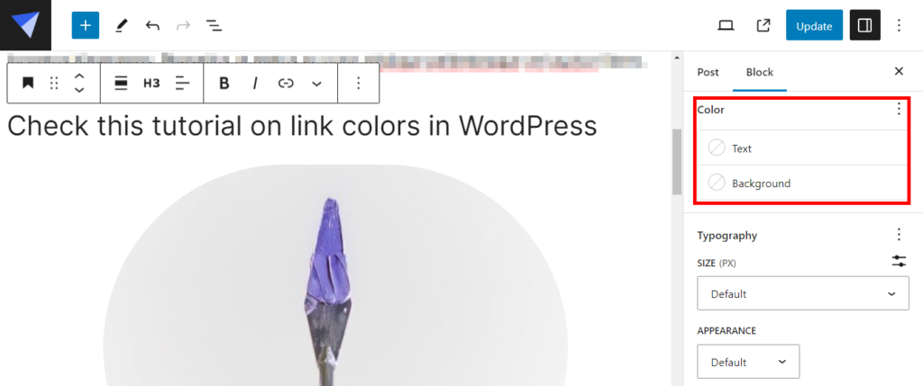
- In the Color section, click on Text and select the color that you want or enter its code.
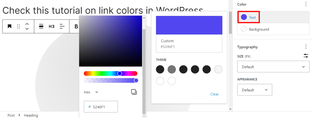
- Once you’re done with the changes, click on the Update button at the top right corner.
Be aware that this method won’t apply the changes to all of your site’s hyperlinks, and it won’t give you customization control over the link hover color. Sometimes, it might not implement your changes at all due to conflicts with the main themes you’re using.
To combat this obstacle, WordPress has recently come out with a new capability: Full Site Editing (FSE). It provides a new set of features that gives users more control over the design and layout of their websites using blocks.
The only caveat is that you’ll need to be using a block theme in order for FSE to be accessible in your WordPress backend. If you’re already using a block-based theme that is compatible with FSE, you can go along with the following tutorial to see how you can change link colors using FSE. If not, and you want to find a block theme for your website, you can check the FSE WordPress theme repository.
- From your WordPress dashboard, go to Appearance > Editor.

- In the Full Site Editor, click on Styles, then click on the pencil icon to start editing.
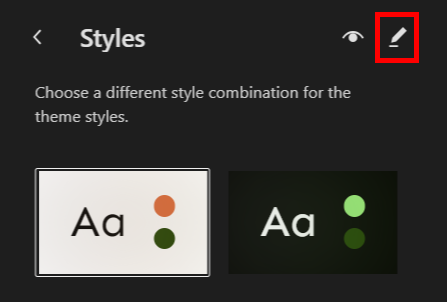
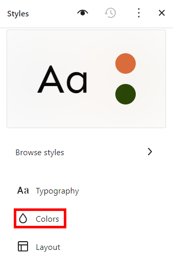
- Similar to the theme customizer, scroll down in the sidebar and select Color.
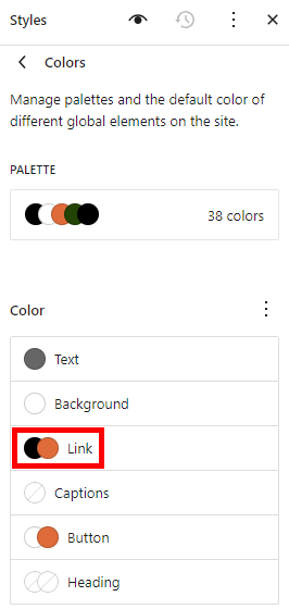
- Click on Link and choose the colors you want.
- Once you’re satisfied with the changes, click Save.
Method 3: Using custom CSS
If your WordPress theme doesn’t provide built-in options for link color customization and you don’t want to go through the hassle of switching to a block theme to use FSE, you can add custom CSS to style your links. To do this:
- From your WordPress admin panel, go to Appearance > Customize, scroll down to the Additional CSS option, then click on it to open the CSS editor and add your custom code.
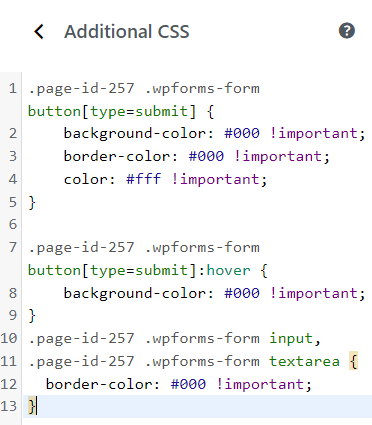
- To change the link colors for the entire website, you’ll need to use the a tag instead of a specific class or ID. For example:
a {color: #5246F1;text-decoration: underline;} |
This CSS code specifies that, by default, all links on your website will be underlined and have the color #5246F1, which is a shade of blue. When hovered over, the links will turn a lighter shade (#B4AFFF), and the underline will be removed.
This is what your results should look like:
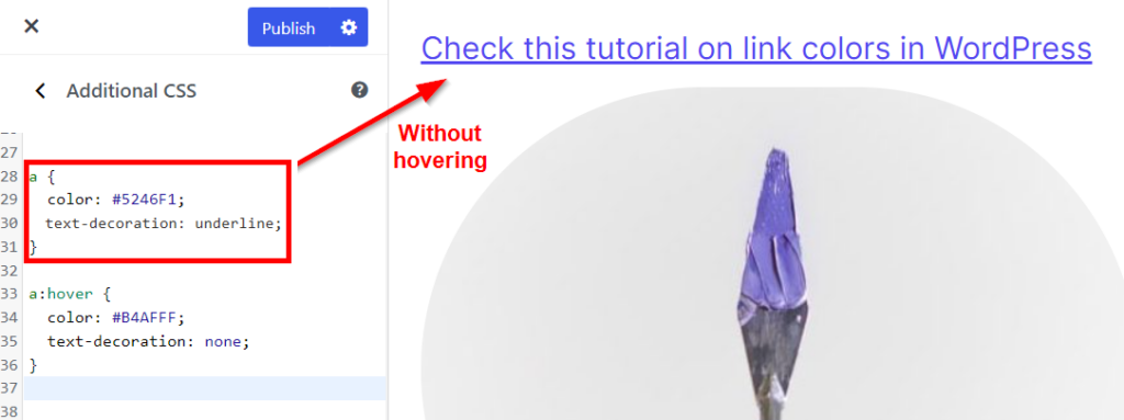
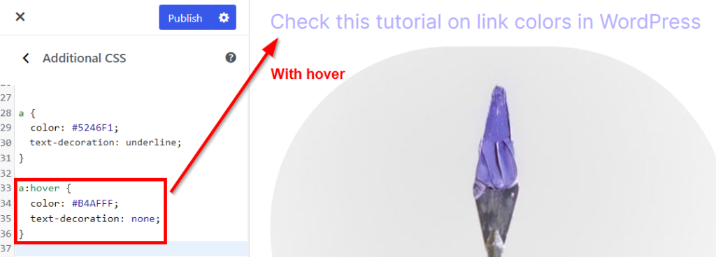
- If you wish to change the color of one specific link, you’ll have to use your browser’s inspection tool to check the class or ID of the link you want to alter. Right-click on the link then select Inspect.

- Use the unique identification name of the link when adding your custom CSS code like so:
a.customize-unpreviewable {color: #5246F1; text-decoration: underline;} |
Although adding custom CSS code is effective, it requires considerable effort and a sequence of steps. Don’t opt for this option if you lack the know-how so you don’t break your site’s aesthetics or functionality accidentally.
If none of these options seem like the right fit for your needs, we have the ideal solution: Kubio!
Introducing Kubio: Your ultimate solution for modifying link colors in WordPress
Kubio, a straightforward what-you-see-is-what-you-get site editor, empowers you to customize every element of your WordPress site, forming a cohesive and attractive visual experience.
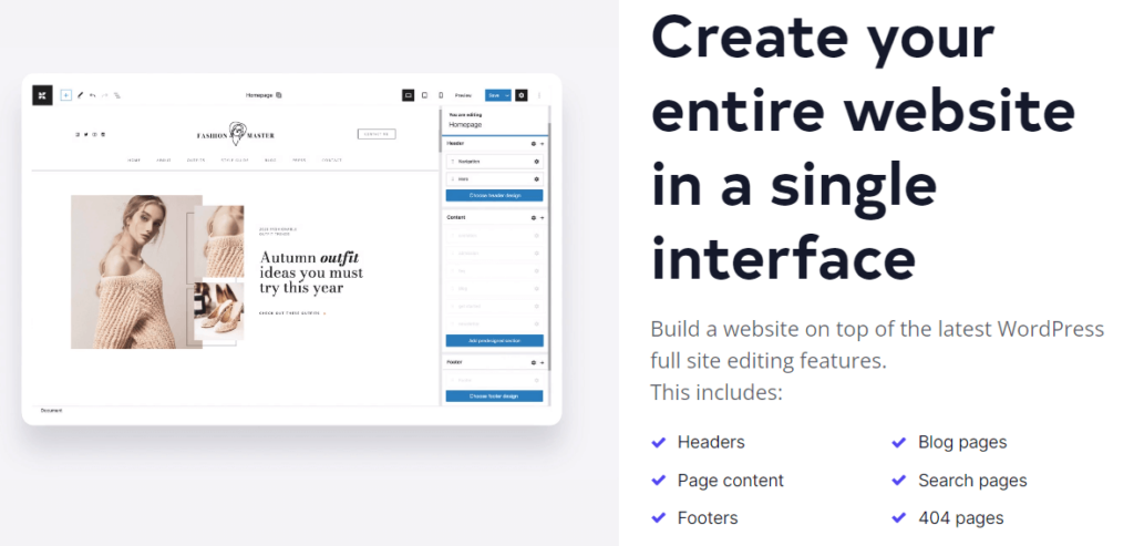
Even better, Kubio offers an extensive collection of pre-built starter sites, themes, and templates that are all highly responsive out-of-the-box and customizable. It simplifies the editing process by offering a single interface for all your site design needs, saving you precious time and effort.
With Kubio, every minute detail, including the color of your hyperlinks, isn’t just adjustable – it’s also an opportunity for a myriad of design possibilities!
How Kubio empowers you with complete creative freedom
Kubio offers a comprehensive set of tools and features to empower users to design and build WordPress websites with ease and flexibility. Some of the key characteristics that make it stand out from other page builders include:
- AI-powered website creation: Save loads of time and mental energy when you build a full first-draft of your website with just a few lines of text. Instantly generate a bespoke site template based specifically on your business’s brand and purpose. This will include the automatic generation of a color scheme (including link colors) which you can then tweak if needed.
- 340+ ready-made (and customizable) sections for various functionalities, such as hero sections, about pages, testimonials, clients, and more.
- Over 50 fully customizable blocks that allow for precise control over design elements like headers, tabs, accordions, sliders, and carousels.
- Complete design freedom with elements like hero sections, navigation layouts, shape dividers, overlays, section overlaps, and parallax.
- Full control over color, background, typography, space, alignment, border, and shadow details to fine-tune your website’s appearance.
- Mobile responsiveness can be easily achieved via the customization of styles across different devices within the Kubio interface.
- Designer-made starter sites are readily available to help users quickly get started, whether they’re freelancers, startups, businesses, portfolio creators, or bloggers.
The best part is that you can create pages without needing to write any code; simply drag and drop blocks and ready-made sections and add your content. In the context of hyperlink colors, this can mean crafting bespoke, vivid, and easy-to-spot links without complicated steps.
Step-by-step guide on modifying link colors using Kubio
- Purchase, download, install, and activate the Kubio web builder.
- Once installed and activated, you should see the Kubio icon in the left panel of your WordPress dashboard. Navigate to Kubio > Editor.
- In the Kubio editor, scroll down in the navigation bar on the left, click on General Settings, then Typography.
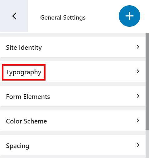
- Expand the Links option and make your desired changes. You can:
- Change the font family and size of the links.
- Choose the colors of your links for default and hover states.
- Choose decorations such as underlining your links.
- Adjust letter spacing.
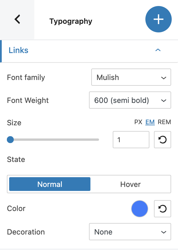
And that’s it – that’s how easy it is to customize your website links with Kubio!
Dealing with potential challenges
Choosing the wrong color scheme for hyperlinks can lead to several issues:
- Poor visibility: When the color of your new links isn’t easily distinguishable against the site’s background, visibility is hindered. This can decrease user interaction and engagement, as users struggle to identify link texts.
- Color consistency: A lack of consistency in your link color across the site could lead to user confusion. Uniformity in link colors throughout your website is crucial for enhancing the user experience.
- Browser compatibility issues: Colors that look ideal in one browser might not display as well in others. This could lead to an unattractive or unclear visualization for some users. Therefore, selected colors should be compatible across all browsers.
- Mobile compatibility: With a lot of users accessing the internet via mobile devices, your links must be properly formatted on mobile versions of your site. Failure to do this risks alienating a significant chunk of your audience. Ensure your custom link colors are optimized for mobile viewing.
- Accessibility: Certain design choices can inadvertently make the website harder to navigate for users with disabilities. For instance, if there is insufficient contrast between your link colors and the background, visually impaired users may struggle to identify the links. Always reference the Web Content Accessibility Guidelines (WCAG) when considering visual accessibility during link color customization.
- SEO implications: Search engines prioritize user experience; this includes how users interact with links on your site. For example, unusable or confusing links resulting from poor link color choices could harm your site’s search engine rankings.
The key to overcoming these hurdles lies in understanding your audience’s needs and conducting regular tests to ensure your custom link colors are enhancing (not impairing) your site’s user experience.
Additionally, consistency is a vital factor that heightens your website’s visual appeal. One way to ensure consistency is to use Kubio. It allows you to set site-wide rules for link colors, which means that you can specify a color for all hyperlinks across your website, ensuring a consistent theme and improving user navigation.
Take your WordPress customization to the next level with Kubio
Link color customization is integral to a well-crafted website experience. It’s more than just an aesthetic choice – it’s a key component of user experience and brand identity. Making subtle changes like these can help you stand out in an online crowd.
However, a strong website isn’t just about individuality, it should be navigable and reader-friendly. Choosing colors wisely and maintaining consistent link coloring across your web pages is essential to creating an intuitive and user-friendly online platform.
That’s where Kubio steps in!
Kubio is a game-changer for those seeking an efficient platform not only for link color adjustments but also for a variety of other website details. It gives you control over your website’s look through its all-encompassing and user-friendly interface.
Kubio empowers you to customize every aspect of your site, allowing it to reflect your vision and brand genuinely.
So, don’t allow the nuances of modifying link colors to hinder your website development process. Get started with Kubio’s web builder today to bring your website vision to life!


