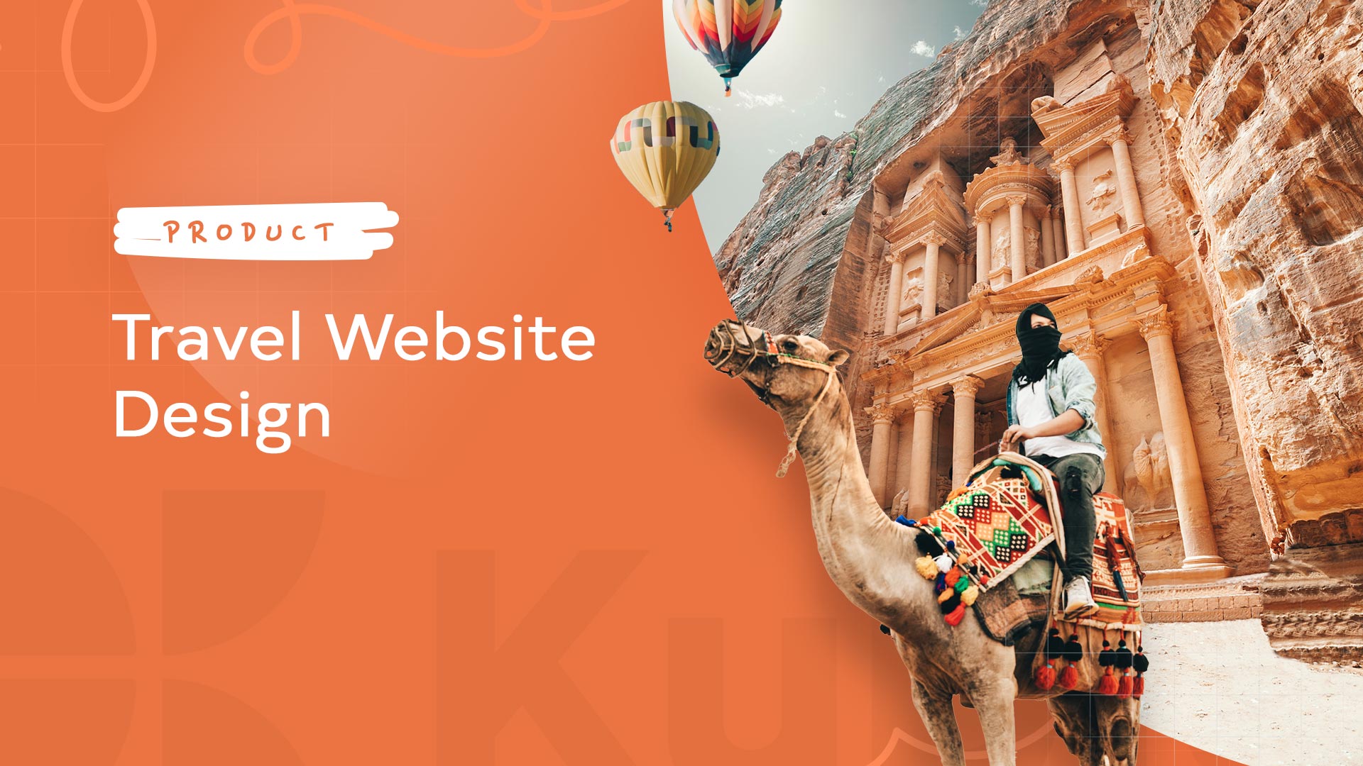

Welcome to our series on website design for various niches.
Today’s topic: travel website design.
What we covered before:
More topics are cooking as we speak: because we understand that every website niche has its own needs and particularities.
Now, here’s the plan for today:
10+ Travel Website Design Do’s and Don’ts
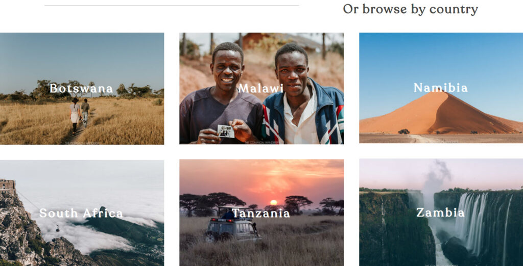
Now, travel websites also have their niches. You can have a travel blog, a tour booking site, a house rental, etc. Each of these websites can have its own needs. One will need great gallery options, the other one will need to allow user registration and reservations, you get the point. We’re gonna try to cover most of the needs here with proper examples.
When you start a travel website you will need to answer to main questions:
- Who’s the audience?
- Which is the end goal? Is it a newsletter subscription, is it a booking, is it a payment, or just plain information? You need to make it clear for the reader whether the information you present is informational or commercial.
Let’s say you are in the cruise business. Who are you selling your services to? Is it affluent American people with an age between 50 and 70?
What if you have free city tours? Who’s going to participate?
Your website audience, along with their needs and preferences, will impact the design and copy for your travel site. Knowing your audience will help you identify the key features your site must include, from layout and type of photos to fonts.
Now, let’s get to the point. Here are our observations when it comes to good travel website design:
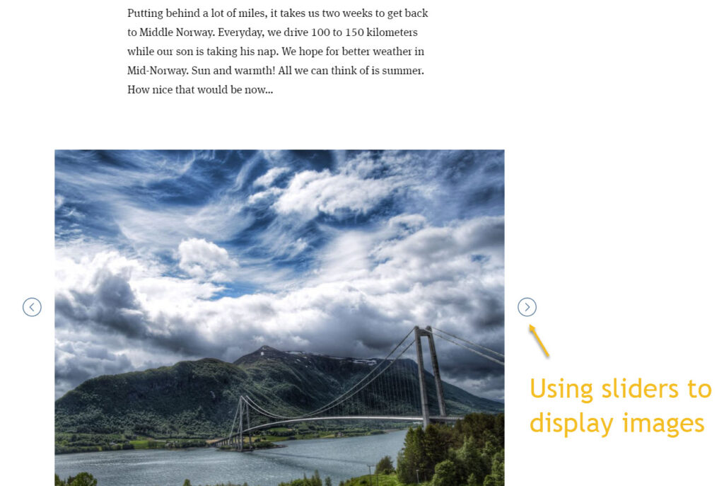
- Use a flexible blog layout. Most of the time, the blog is one of the most important pages of a travel site. You should use a tool that allows you to customize it easily.
- Use high-quality photography
I couldn’t believe my eyes when I discovered this travel blog article. Is it possible to have such poor photos in 2022?
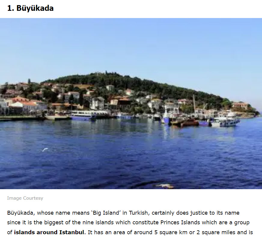
Now, what else went wrong here? For starters, the clickbait title: “10 Exotic Islands Near Istanbul One Must Visit For A Paradisiacal Vacation In 2022!” Looking at the photos I couldn’t see the paradise in them, or the exotic scenery. The point is: don’t disappoint, don’t over promise with your copy.
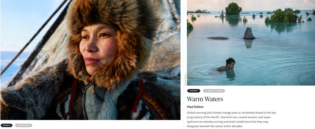
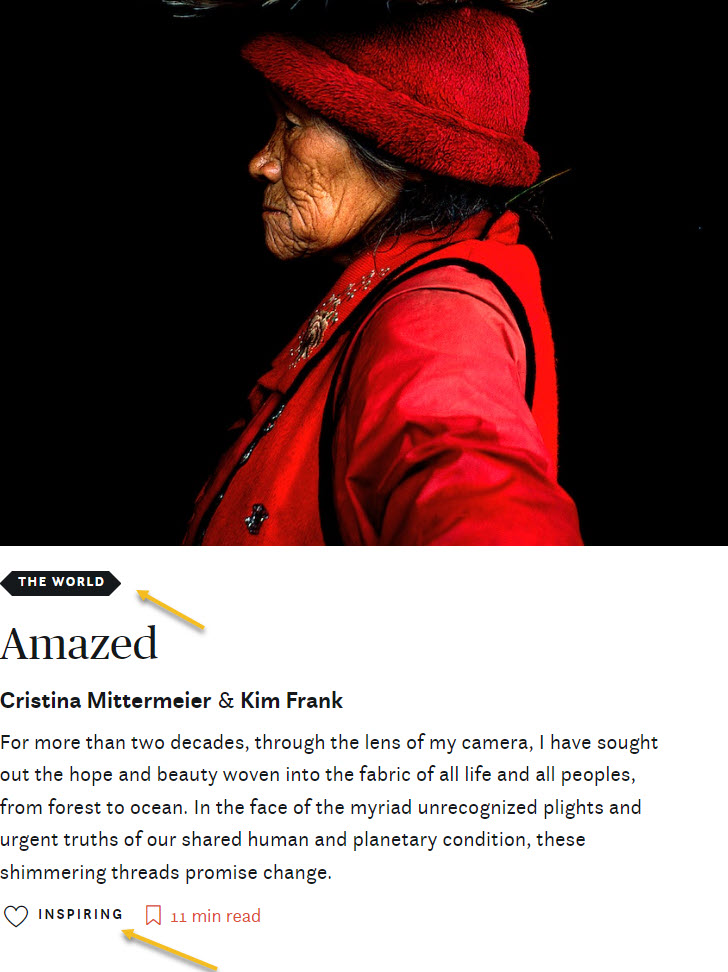
Now, I’m totally bedazzled by the images used on the Maptia site. They really make me wanna pack something quickly and just take the first plane at the local airport. The images don’t only speak about places around the world, but also about the people inhabiting those places, about the diversity that surrounds us and makes this world utterly amazing.
.
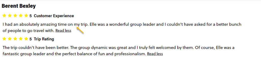
Use reviews and testimonials for tours, services, etc. These are really powerful and really prove the value of your services. I mean, wouldn’t you feel more secure if you were to book this Vietnam trip knowing that:
- Include filtering options and categories in the website’s navigation
Make sure that the services you offer or the blog you’re creating has categories. You can include them in the website navigation. This way website visitors may find their way easily through the website.
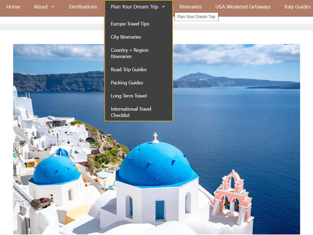
- Make use of a search bar and filtering and sorting options in order to improve website usability and navigation. This is valid if you offer a large range of tours, bookings, etc.
Try to group the search options into chunks: type of accommodations, type of experience, facilities, etc.
Allow your users to select locations and distance ranges on a map. Include there prices, and even several photos of the destination.
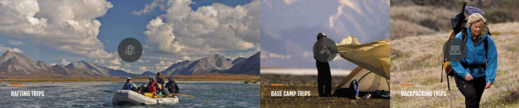
I love how this map from Arctic Wild feels:
- Don’t underestimate the Hero of your travel site. When a user first lands on your website, he/she will want to know as quickly as possible that they’ve come to the right place. Now, no matter if they discover a blog article of yours, or a services page, they will most probably want to visit the homepage as well, to better understand what the site is all about. You could also be investing in paid campaigns and draw people to the homepage. The first thing the users will see on the homepage will be the Hero.
A website Hero is the introductory image in the upper part of a website page. It usually consists of an image, or video, as well as some text, and maybe a call-to-action. It’s necessary for the hero to clearly state what the website is about, and convince the reader to stick around more.
The visuals used here are essential. And travel websites shouldn’t lack in dynamic and eye-catching visuals.
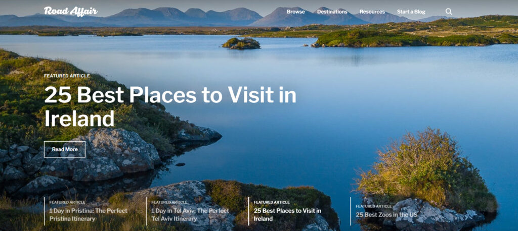
For example, the folks at Road Affair are displaying 4 images from 4 featured articles inside a slider, in their hero.
- Combine powerful imagery with powerful stories.
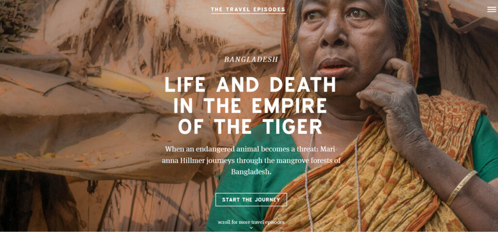
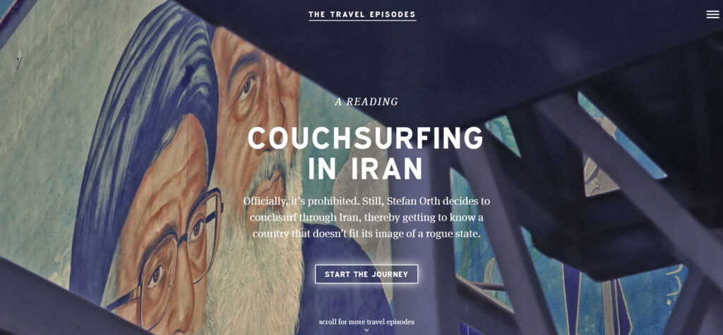
The folks at Travel Episodes manage to really nail this. They combine amazing copy and visuals to really teleport you to the places they describe. Their stories are truly immersive. And they use a website layout that really stands out. Because, at the end of the day, you can notice that most of the travel websites out there end up having similar layouts. Their featured stories are shown on the homepage using powerful images and text, one below the other.
It’s like they have multiple Hero images. Here’s their travel story from Bangladesh:
If you scroll down, you get to the Iran story.
- Don’t overpack your travel site with information. Keep it simple, minimalist, and clean.
The folks at Travel Episodes manage to do this as well: they combine video footage, interactive elements, sliders, and images in a way that doesn’t seem to be overwhelming to the eye. There’s also lots of white space, which manages to balance out the visuals and texts.
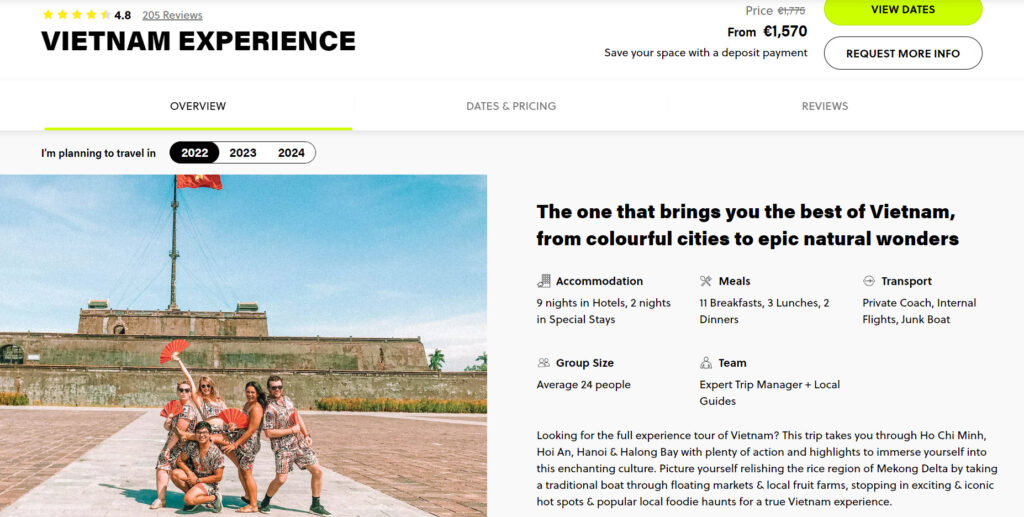
- Leave no stone unturned when it comes to describing the services you’re offering.
The folks at Contiki use really thorough descriptions for their tours with info referring to: prices, tour length, accomodations, overall review, testimonials, meal and transportation info, map and itinerary, tour highlights, images from previous tours, and so much more.
As I said before, there are multiple niches for the travel market. Choose the recommendations that match your own website profile.
- If you’re selling services (bookings, car rentals, travel insurance, etc), make sure you implement safe payment gateways.
- Include user-generated content. Let’s say you offer cruises or tours. What about making use of content from clients’ social media? You could be creating boards with Instagram or Facebook photos to demonstrate real-life experiences and build trust. This would serve as a strong social proof for your services.
- Make sure you offer smooth user registration. Make sure not to ask for too much information, just keep it simple and focus on the most important details. The folks at airbnb have two options: registration using the phone number, or with email or social login.

- Use a reservation system that manages dates, locations, room and bed types, facilities, tour packages, and more. Make sure that the unavailable options are clear.
In travel, where users have strict time and financial limitations, it’s crucial to disclose any information that can affect a user’s choice. Avoid hidden fees and taxes. Transparency is key when it comes to building long lasting brand loyalty.
- If you want to use website chat or popups, make sure you don’t ruin the users’ experience on your site. Use proper targeting and placement.
For example, I have just entered the Travel Triangle site and there’s a chat popping up on the right hand side of the screen asking me what kind of trip I’m planning. Next, a website popup shows up in the middle of the screen asking me the same thing.
It’s like they’re asking for a kiss before a first date. It’s too soon guys! I discovered your site 2 seconds ago. Let me browse it a bit, and don’t attack me with your popups.

When I browse other pages, the same popups show up. I don’t need them, I just closed them 20 seconds ago! So, this is a big: don’t!
These 10 Travel Websites Are Sure to Inspire You
Now, it’s easy to get carried away with some fancy website designs, but don’t forget that proper information and usability are crucial for a site.
Next, we’ve compiled a list of 10 beautiful travel website designs, across various niches, to inspire your own travel site.
Let’s hit the road!
This is a lovely personal travel blog that makes you wanna pack your bags and leave asap. This travel blog is an awarded one, as stated on the homepage: “The Common Wanderer is an award-winning responsible travel blog for travelers seeking authentic, real life experiences in exciting destinations all over the world”.
The design and layout make for a calm and truly relaxing space. Unlike most of the travel blogs out there, The common Wanderer doesn’t overwhelm its visitors with crowded information.
The white space, the chill color scheme, combined with large images in autumnal tones, help create an artsy and chic look.
The images used use the same presets, giving them a consistent style across the whole blog.
The blog articles are grouped by continent. When inside a continent, the travels are grouped by country.
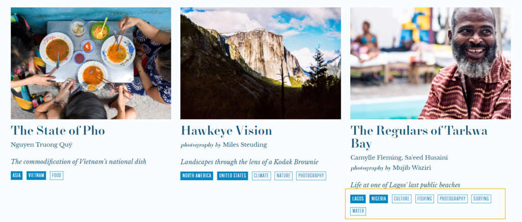
Stranger’s Guide is a travel publication that explores the power of place-based journalism to break down stereotypes and foster global citizenship. The website presents powerful intimate stories, but also sells beautiful print guides.
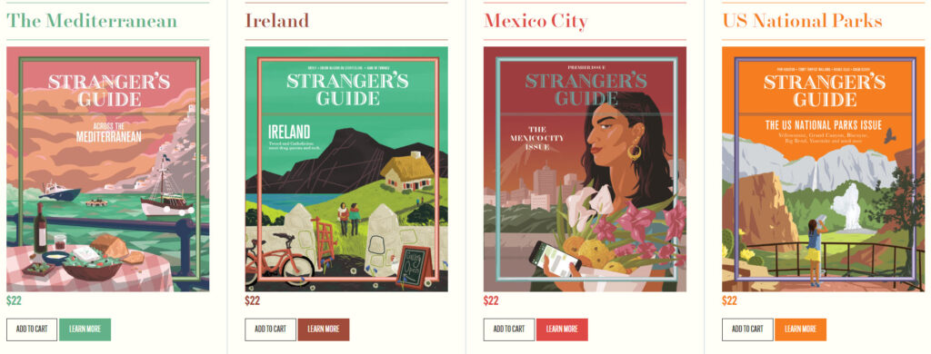
Stranger’s Guide can inspire you with its amazing storytelling.
They also make use of tags underneath their featured stories in order to better help the visitors navigate the website.
What we also like is the white and blue color palette combined with the “New Paris Headline” font.
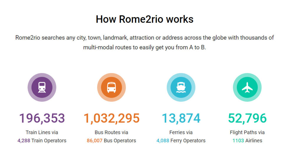
Rome2rio is an Australian online multimodal transport journey planner helping travelers get to and from any location in the world.
They respect the hero standard design used in the industry: a search bar on top of the hero image.
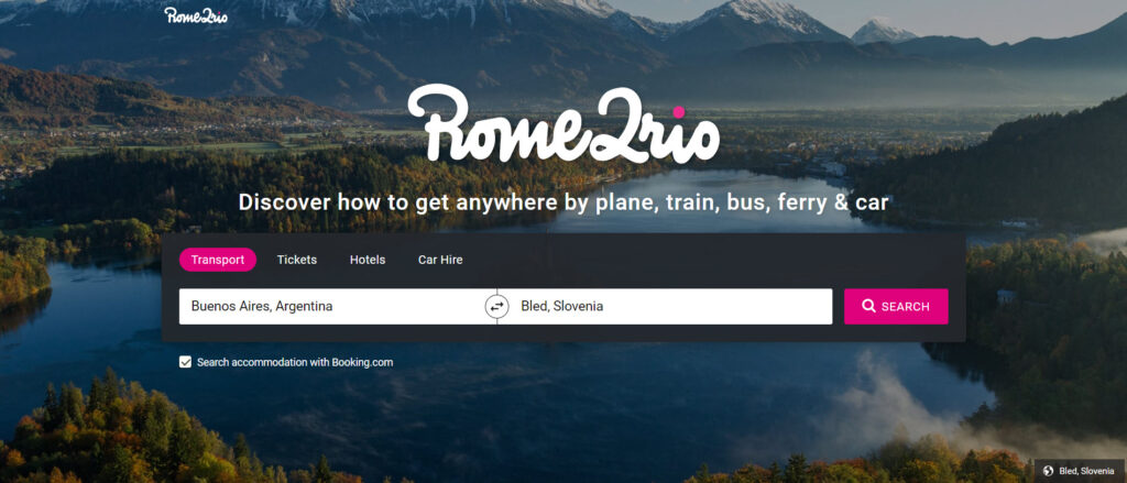
Below this, there’s some social proof consisting in stats about the travels booked via Rome2rio.
Next, on the homepage there are some featured trips and cities listed.
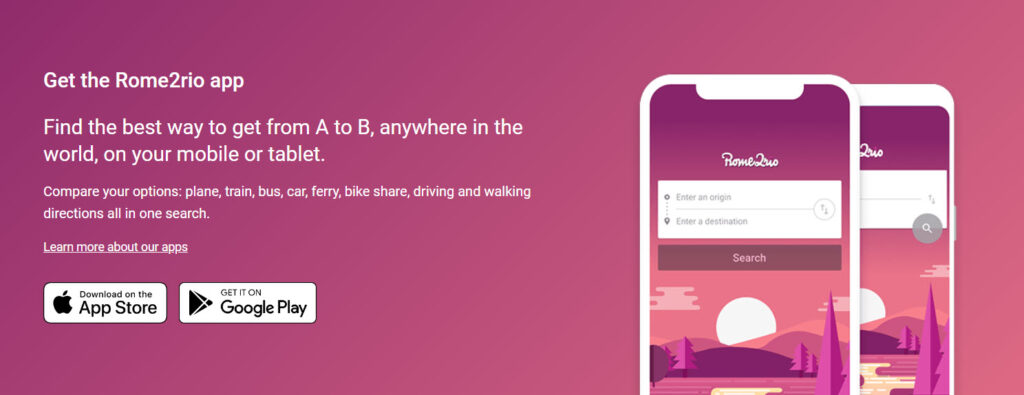
At the bottom of the page they present their mobile app, with the possibility of installing it from the Android and iOS marketplaces. That not to be neglected!
After performing a search you will be taken to a results page showing flying routes grouped by time length. I like the user experience of this page (except for the ads).
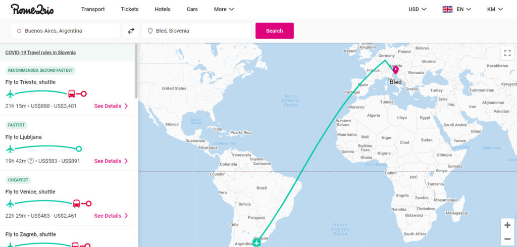
When you click on “See details”, you will get more info about the means of transportation needed for that particular voyage.
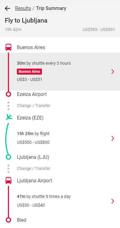
You can dig some more into the trip details by clicking on the arrows. There’s more info on timetables, pricing, operators.
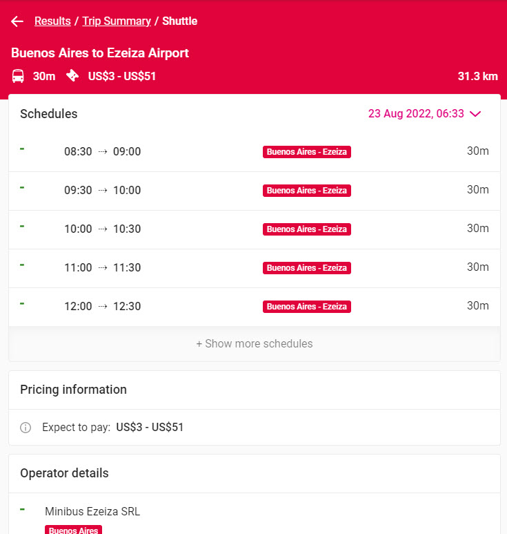
Below the flight options you can access info on accommodation, car hiring, and airport shuttle services.
The actual bookings aren’t performed on the Rom2rio site, but on the partners’ websites.
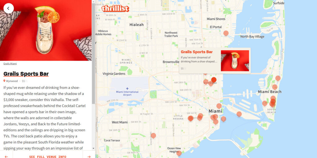
On the Grid is a collection of 534 neighborhood guides curated by local creatives in 114 cities around the world.
This site is no other travel site we’ve seen.
Each city has a map with landmarks grouped by category: food, drinks, accommodation, and more.
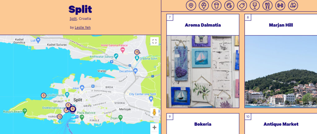
You can even click on a landmark from the map to see details and images on the right-hand side.
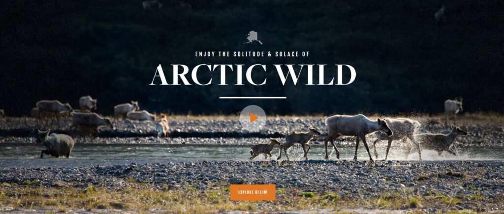
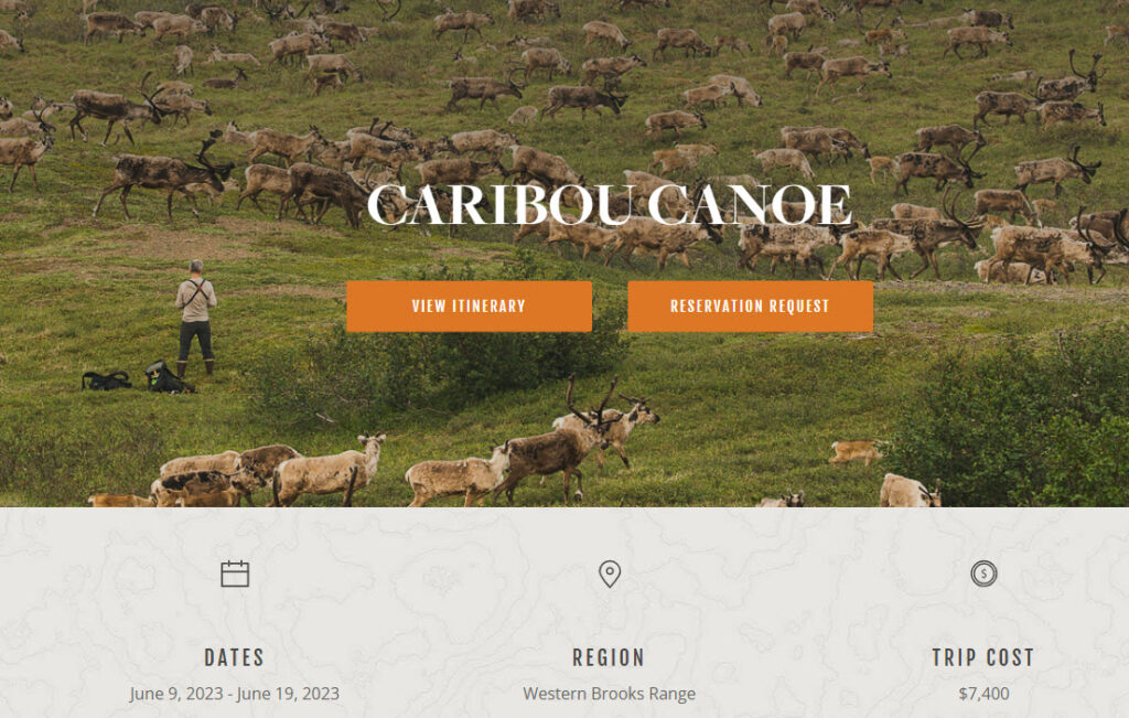
Arctic Wild is a travel website that showcases Alaska wilderness and adventure tours: from river rafting and canoeing to bird watching and fishing.
I’m not a fan of cold, and cold places, but when I look at the images on this website, I feel that such adventures are worthwhile. Mission accomplished, Arctic Wild!
Now, the tours are grouped by category, making it easy for the visitor to find the experience that better suits their specific needs.
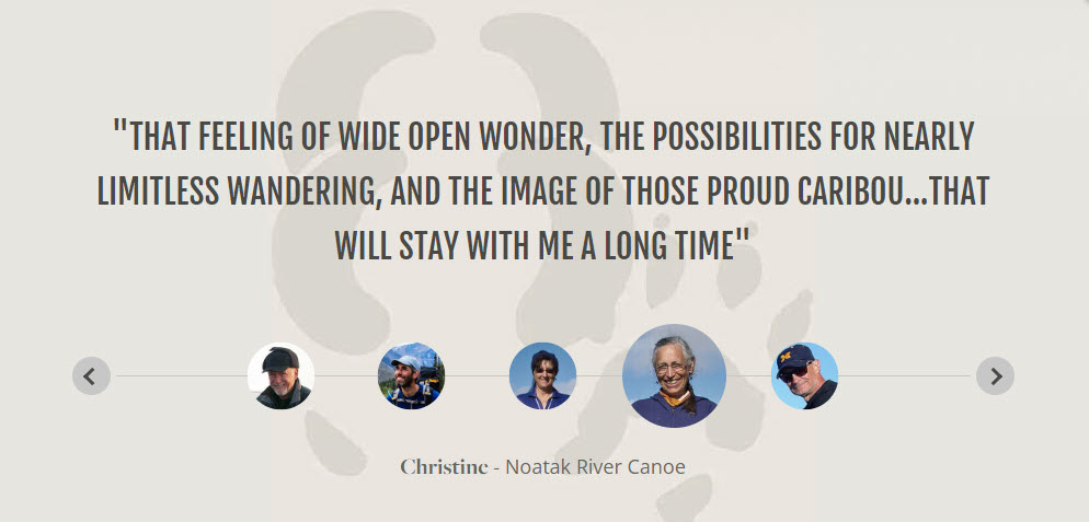
I love that the website includes reviews from previous customers that also present the picture of the customer, making it genuine.
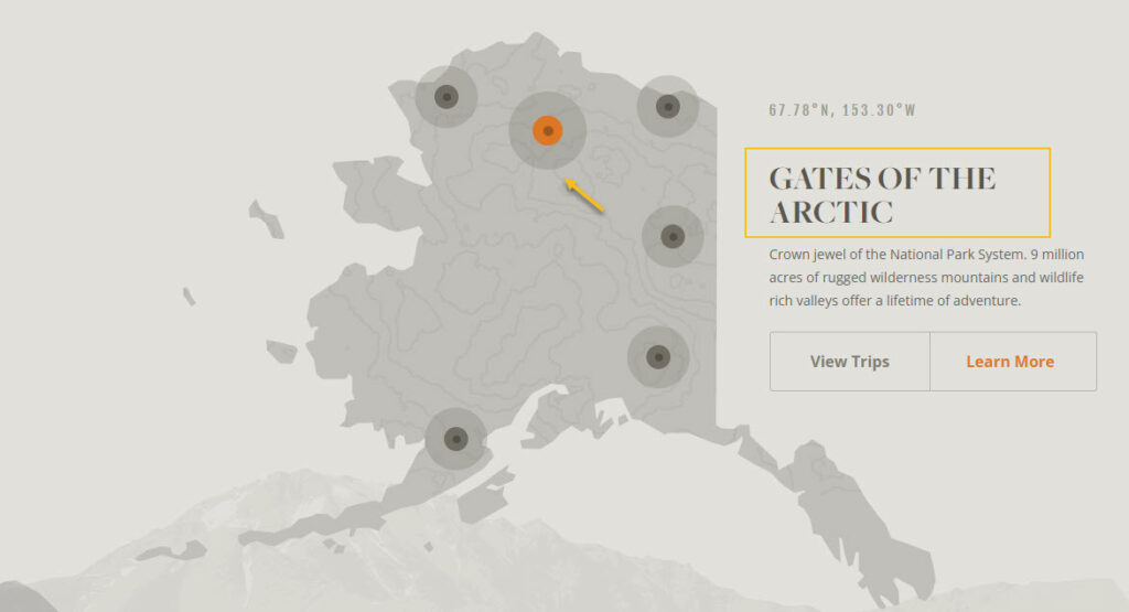
There’s also a map of Alaska available, with clickable landmarks.
The trip details are really clear. The itinerary is established day by day. And there’s a real review available for each trip. The trip date and the cost are made available right from the beginning of the trip’s description. Proper images aren’t missing as well.
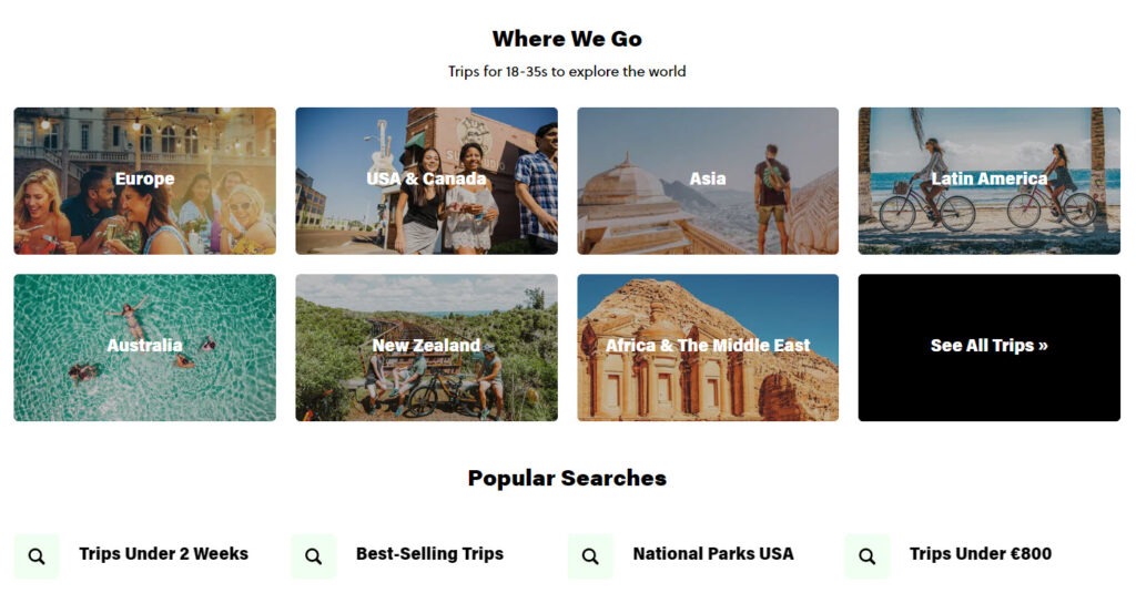
The folks at Contiki are crafting culturally immersive tours led by expert guides, for people with ages between 18 and 35.
Contiki has an interesting section, that is often encountered in e-commerce: recently viewed. Now, I really love the way trips are summarized in these cards. The info on pricing, duration, the number of countries and places visited, is really clear and concise.
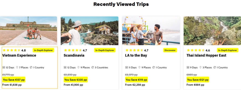
Trips are grouped by country, as well as, by other criteria such as budget, duration, and more.
I also love brands that commit themselves to a social or environmental goal. Contiki choses to guide itself by practices for sustainable travel.
They’re determined to travel sustainably and consciously, and that’s they’ve put together a 2025 sustainability strategy, to reduce food waste, source electricity from renewable sources, eliminate single use plastics and ultimately achieve carbon neutrality. There are 11 goals at the heart of this strategy, developed to address both the environmental footprint and the community impact of the Contiki business and operations.
The travel industry is the most promising and prosperous, yet most competitive. Relevant customer experience helps to distinguish your brand from others in the market.
I’ve mentioned The Travel Episodes earlier in the article, saying that they really manage to combine amazing storytelling and visuals to really teleport you to the places they describe. The website layout really stands out in a sea of travel websites that look alike.
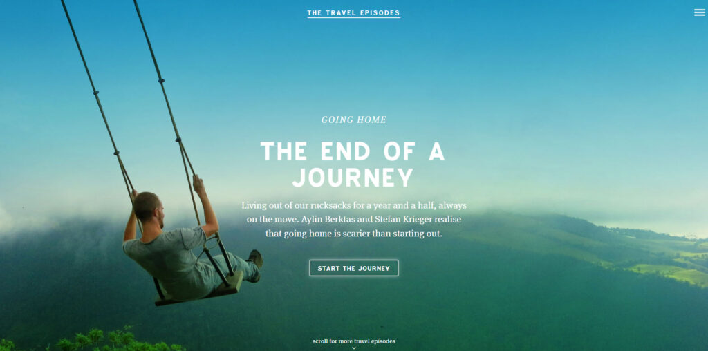
Full width images, immersive videos, lots of white space, they all create a breathable website.
Thrillist is an online US travel website covering food, drink, and entertainment. Their articles are fun and engaging.
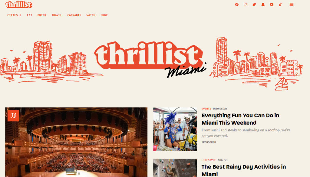
Thrillist uses images, videos, interactive maps, and even audio media, to raise our inner traveler.
The article categories are few, and easy to find. The information does seem crowded.
The social media profiles are easily found straight in the website’s top navigation:
No, this has nothing to do with the El Camino walk in Spain (or Camino de Santiago).
El Camino Travel is a tour booking agency. Their trips are spread across Europe, South America, and Africa.
I love the website’s color scheme that uses blue and brown, reminding me of the colors of the skyi and desert.
The Prata font combines nicely with the chosen color scheme.
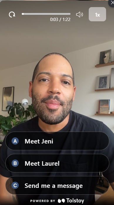
What’s great about this site is that they use video reviews powered by Tolstoy, from former customers.
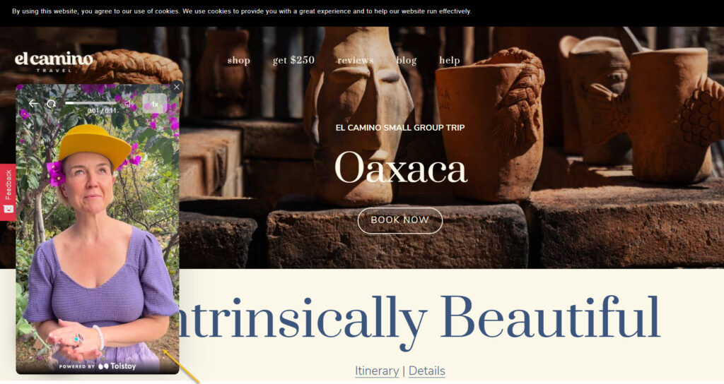
Such reviews can make the interaction with the site really personal and engaging.
You are also being greeted by the co-founder of El Camino, and you can even send him a message.
The trip information is clear and supported by beautiful imagery.
There’s also an FAQ available, and the travel experts are presented as well.
Maptia is a collaborative project with a diverse group of photographers, writers, adventurers, and conservationists. Together they bring readers a world of inspiring and thought-provoking stories and imagery.
Such websites make you feel the wonder around you, appreciate the diversity, and understand that there are more things that unite us, than divide us.
The immersive imagery and amazing stories of Maptia are just breathtaking. And the chosen website layout manages to create a unified design feel, not overcrowding the information, but letting it breathe.
The stories are grouped together by continent, as well as by tags: inspiring, indigenous, climate change, oceans, and so on.
Pfew, so this was the travel websites shortlist. I really need a vacation after this :)). I don’t know which was harder to do, researching travel websites, or restaurant websites.
Next, on Baywatch: how to kick off your own travel website!
Travel Website Design: a Tutorial
From the technical perspective, here’s what you will need to jumpstart with the travel website design: buy the domain name, choose a hosting provider (we recommend Bluehost), then pick a web design platform such as WordPress, Wix, Webflow, etc.
Now, WordPress is the market leader, powering more than 40% of the websites worldwide and this kinda says it all. Now, no matter which platform you choose, there will be many common design elements. For example, content will most probably go inside sections, rows, and columns.
You will need to use text, images, videos, sliders, buttons, icons, and so on. You will need to manage colors and backgrounds, and adjust fonts. All the platforms will allow you to manage these. The main difference will consist in the overall user interface.
Now, you will be able to design on top of a predefined template (aka demo site, or starter site), or just start from scratch, from a blank canvas.
For example, here’s the Kubio builder travel starter site.
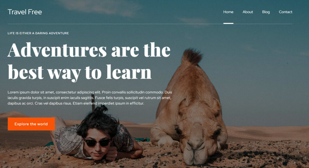
Kubio is a WordPres page builder that allows you to create a site by drag and drop using content blocks: all in a clear and intuitive interface, without the need of any prior knowledge of web design or coding.
In WordPress there are two main ways for creating a website:
- Use a WordPress theme
- Use a page builder (such as Kubio). This is the option that gives you more design freedom.
Now, in this exercise I’m going to work inside WordPress, specifically with the Kubio builder. But, most of the know-how you’ll gain from here can be replicated across other web design tools. Once you know how to work inside a tool, the learning curve will be shorter when it comes to working with another one, because you already know the basics.
There are four main milestones here:
- Start from a ready-made travel website,
- Make copy and image changes. You can easily delete the existing texts and add your own content instead. Just place your cursor on some text and start deleting or writing.
- Add new elements on the site (blocks and sections),
- Style the website elements however you want.
Let’s get going!
Meet the WordPress dashboard
After acquiring a hosting plan, you will need to install WordPress. The process differs from among hosting providers, but it should be straightforward.
When this is done, you will see an interface looking like this:
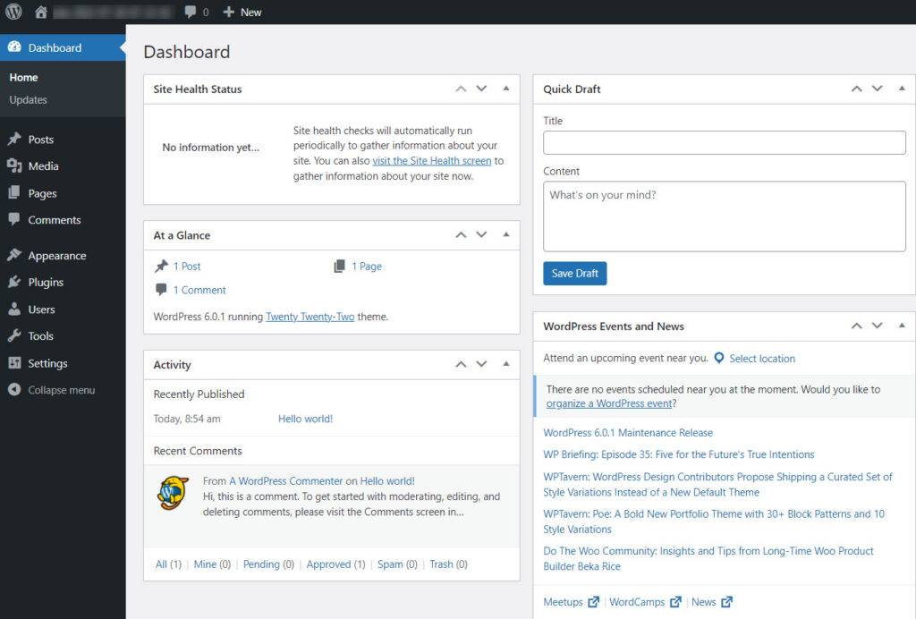
If you look at the menu on the left you will see several options. I’m going to describe some of them briefly below.
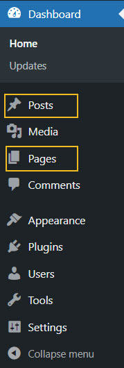
- Appearance -> Themes. You will come here to install a WordPress theme. I mentioned a bit earlier that you can use a theme or a builder when creating a site. There’s also a third way: combining the two. A theme will dictate the overall layout and look of your site. Every WordPress site technically needs to have a theme installed and activated, but this doesn’t mean you need to use your theme’s design. If you use a builder such as Kubio, you can replace the theme’s layout with custom designs. Page builders give you more freedom over design, than themes, everything in a drag and drop visual interface.
When you use WordPress for the first time, you will notice that a default theme is already activated: Twenty Twenty Two. We’ll keep it for now.
- Posts and Pages in WordPress
Pages and posts have different functionalities in website design. Pages are used for static content, whereas posts are for more timely content that can get regular updates. For your travel website design here are some page ideas: homepage, destinations, activities, about us page, etc.
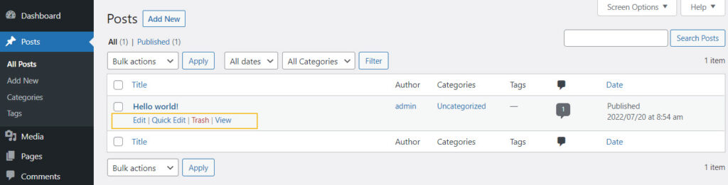
Use the “Add new” button inside “Posts” or “Pages” to add a new post or page.
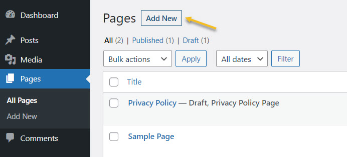
You can always come back here to make edits to previously created pages, as well as to delete them. Just hover over the name of a page or post, to unveil the edit and delete (trash) options.
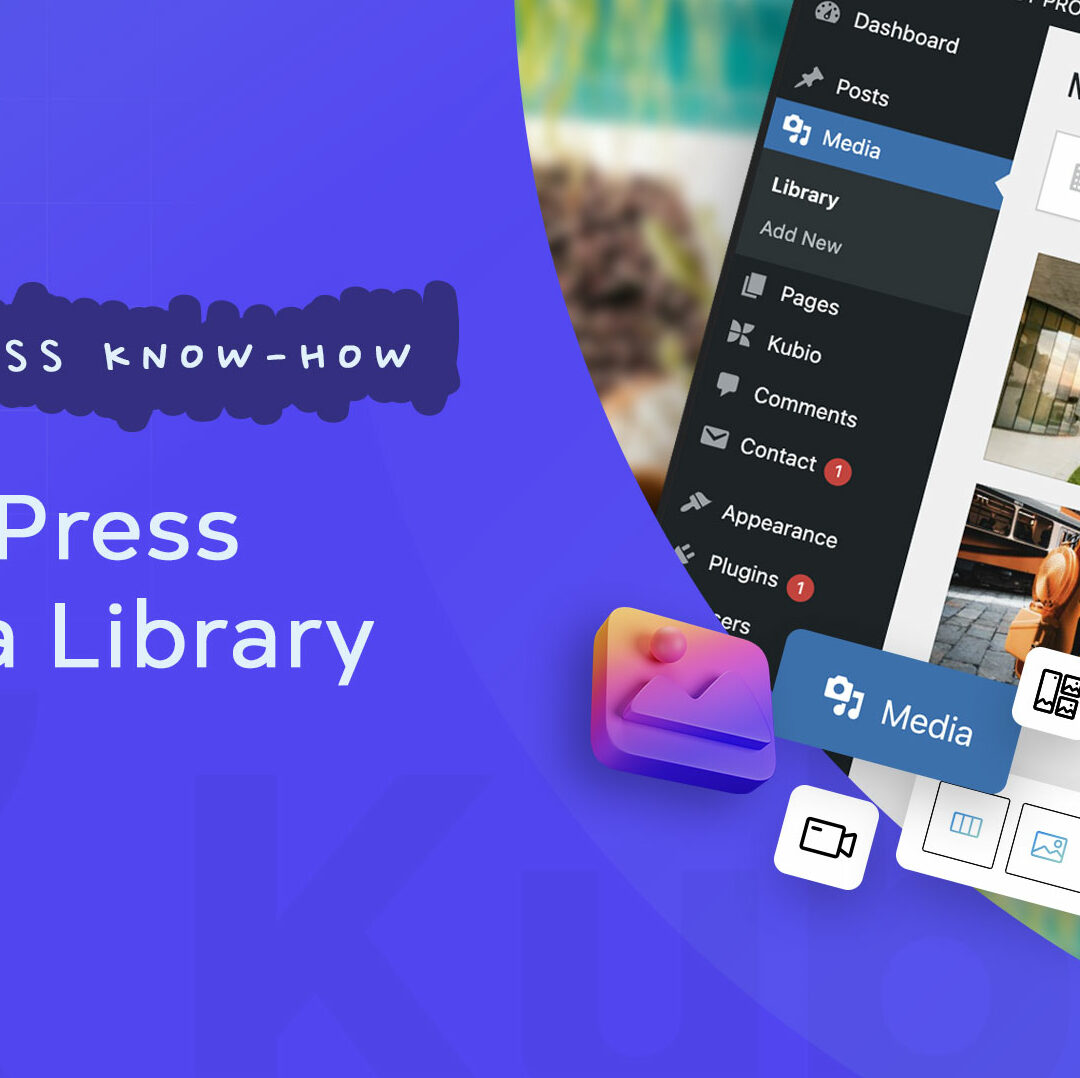
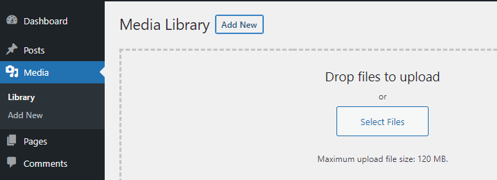
- Media – here you will upload the media you will use inside pages and posts. You could have images of destinations, people traveling, dishes, videos with people enjoying an activity, etc. Use the “Add New” button to add new media items to the library.
- Plugins – here you will add new functionalities to your site. Maybe you need a contact form, or a booking system, an interactive map, etc. This is where you will find them.
In this case I am going to install the Kubio page builder. Now, what’s the difference between a WordPress theme and a WordPress page builder?
WordPress themes and their features vary from one to another. They can have free plans and paid one, with distinct features inside. Now, in general, here are some basic elements that you can customize with most themes out there: text and visuals, color scheme, typography, layout, menus.
Now, some features are pre-built, and you can’t make changes without any coding knowledge. This means that themes don’t allow much flexibility. You can get locked inside.
This is where page builders have the upper hand. Most page builders work by drag and drop giving you complete freedom over the website design. A WordPress page builder goes beyond a WordPress theme, and it’s the best option if you really want to create a beautifully-designed website.
For this particular exercise I’m going to go with Kubio builder. Let’s install it.
- Let’s go to Plugins -> Add New.
- Start looking for “Kubio” in the search bar on the right-hand side of the dashboard.
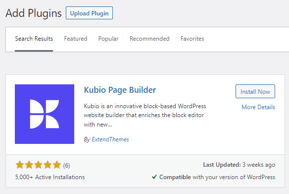
- Go to the Kubio Page Builder card and click on “Install now”
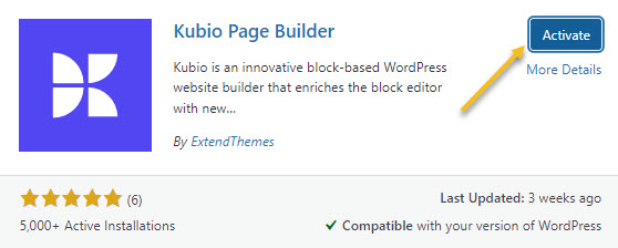
- Click on “Activate”.
Kubio is a free builder, but there are some features and website templates (or starter sites) that are included in the paid plan. The travel starter site is included in the paid plan, because it uses some PRO elements (sliders, carousels, etc). But don’t panic! 90% of it can be replicated using free elements. Also, I’m using this starter site with the purpose of proving Kubio’s capabilities.
Now, the moment you activate Kubio, you will notice that a Kubio menu will show up inside the menu on the left hand side of the WordPress dashboard.
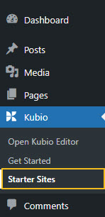
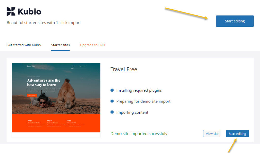
I’ll just go to the travel starter site then click on the “Import site” button.
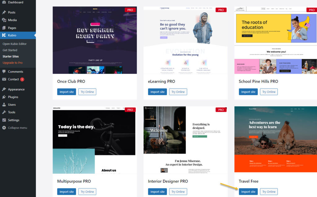
If you want to play a bit with the starter site, you can pick the “Try online” option as well.
After the import, click on “Start Editing”.
Here’s how the homepage looks like inside the Kubio Editor:
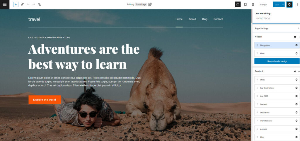
On the right hand side you will notice the page editing panel. Here’s what you can do here:
- Make page settings. Here you’ll be able to assign a featured image or enable comments.
- Visualize and rearrange page content sections. This panel allows you to visualize your page sections easily. The structure is made of header, content, and footer. Inside “Content” you can easily rearrange your content sections by dragging and dropping them. You can click the six dots near the name of each section and reposition that specific section.
- Make general site/page changes. You can change the global color scheme, typography, spacing, and more.
- Set up the website menu.
Block-based design in WordPress
The WordPress design experience began to change back in 2018. Now, everything in WordPress is a block: from paragraphs and images, to tabs and carousels. So, each block serves a purpose and can be edited separately. In the Block Editor you just drag and drop such blocks onto the website canvas, then start to style them.
In order to add a block go to the “+” sign in the upper left corner of the interface.
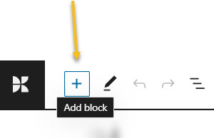
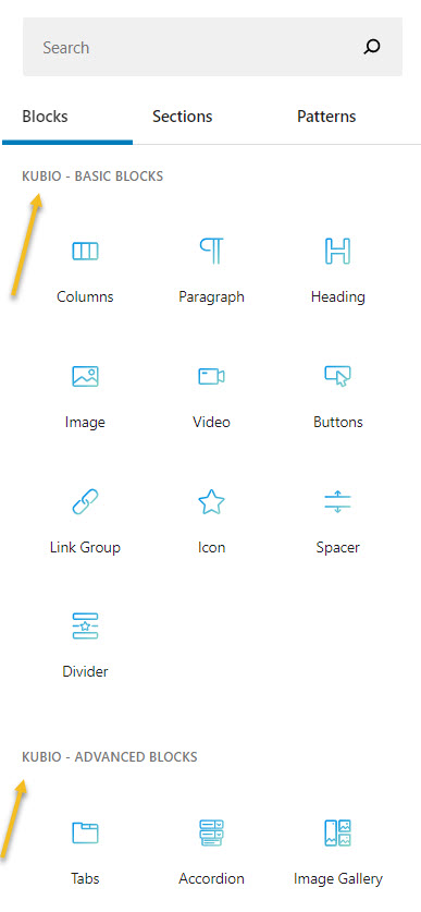
This will open up a block inserter. There are some default WordPress blocks inside with black icons. If you use Kubio builder you will notice some extra blocks as well, with blue-green icons. The Kubio blocks are shown first.
You can easily drag and drop them onto the canvas then style them the way you see fit.
You can locate the “+” sign inside the canvas as well. Just hover between various elements on the site to uncover them. I’ll show you in the next subchapter how this is done.
Now, it’s important that you use only Kubio blocks, because they will have advanced editing options available.
How to customize WordPress blocks
Now, let’s play a bit.
Before proceeding, please watch this short video on the basics of Kubio: how to make work with text and images.
- Adding a block to a page
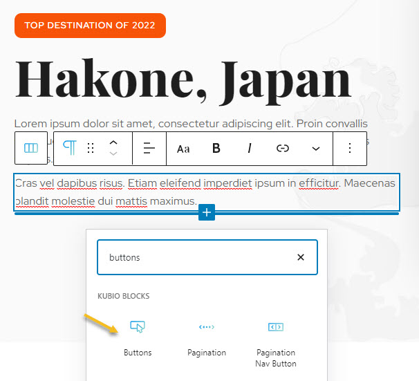
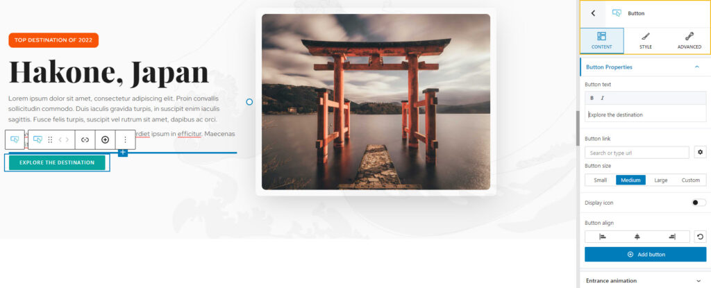
Now, let’s go to the section about the top destination of 2022 and add a button after the description text. Like I said before, let’s hover near the heading until we uncover a “+” sign, in order to open up the block inserter.
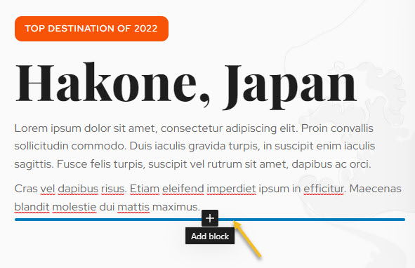
Next, let’s look for the Kubio buttons block (the one in a blue-green shade) and click on it.
Here’s the result:
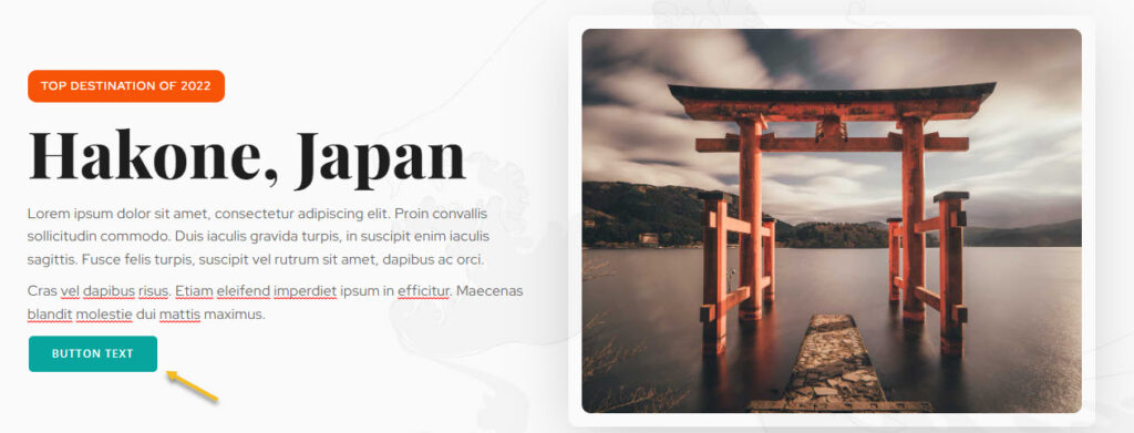
The added block has a style matching the existing color palette and that’s great.
The text can be changed straight from the button. I’m gonna delete the existing text and type “Explore the destination”.
- Customizing a block inside the editing panel
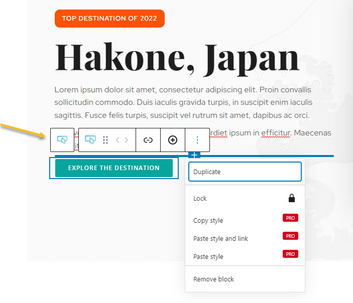
Now, let’s see how we can style further the button we’ve just added.
When you select the button, you will see a toolbar on top of it, with several basic editing options: positioning, insert before, insert after, duplicate, copy style, paste style, paste style and link, lock, and remove block. The copy and paste styling options are available with the PRO plans.
Now, the block editing panel has three sections: Content, Style, and Advanced. This is true no matter the block you are editing. Most of the blocks share the same editing options inside “Advanced”: background, spacing, typography, borders and shadows. This is why the moment you customize a block, you’ll know how to edit the second one.
Now, let’s roll up our sleeves and play a bit with the editing options. We will be making changes to color, typography and spacing.
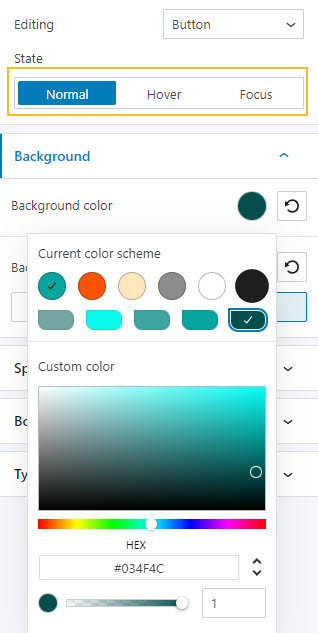
- How to change the background color of a button or any other block
This can be done inside Style -> Background or Advanced – Background.
Let’s go with the second option. Click on the colored circle next to the background option to choose another color.
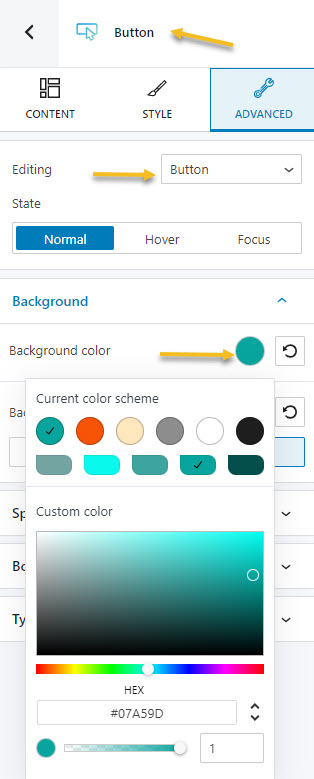
A panel will open up that allows you to pick a color from the current color scheme or gradient from a color, pick a color from a slider, or just type in a desired color code in the “HEX” field. You can also switch to the RGB color mode if it suits you better from the dropdown arrow.
You can also adjust the opacity of your color. The slider offers you values from 0 to 1, 1, meaning there’s no transparency.
I’m gonna go with a darker shade of turquoise. I can even select a different color for the background when the button gets hovered or gets in focus.
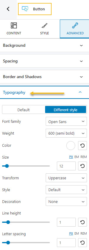
- How to make typography changes
This time we’ll go to Advanced -> Typography. Here you can customize the following:
- Font Family. Tons of Google fonts are available for you to choose from. You can even host them locally, and this would be advisable. When this option is turned on the Google Fonts used in your site will be downloaded and served from your server instead of the Google server. This will minimize the DNS requests, and serve your Google Fonts in a 100% GDPR compliant way.
If you have a PRO plan you can retrieve Adobe Fonts using an API token. Now, if scrolling isn’t your thing, and you already know the font you want to use, you can type its name in the search box.
- Font Color.
- Font Weight. This refers to the relative thickness of a font’s stroke. In this case, 300 is the thinnest font-weight, while 800 is the thickest one.
- Font Size. You can use the slider to make the font size smaller or higher. You can use PX, EM, and REM for font sizes.
- Transform. This option allows you to make letter capitalization changes.
- Style. This is where you can make your font italic or bold.
- Decoration. Here you can add underlines, overlines, or line throughs.
- Line height. This is where you can control the amount of space between baselines in a block of text. A text’s line height is proportional to its type size. In this case, the default is 1.6x the actual font size. You can decrease it or increase it if you want. Just make sure that your text doesn’t look too crowded or too loose.
- Line height. This is commonly used to set the distance between lines of text.
- Letter spacing. This refers to the space between letters in a piece of text. In the case of headlines, to improve readability, it is advised to use tighter letter-spacing. For smaller type sizes, looser letter spacing can improve readability.
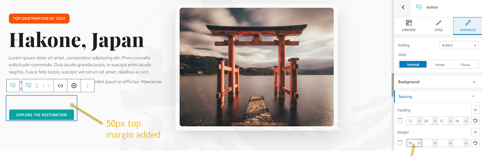
- How to manage spacing
Spacing is also managed inside the Advanced options. The feature is called “Spacing”.
Now, there are two concepts here we need to be aware of: margins and paddings. Paddings control the space inside an element, while the margins control the area outside a component.
You can set up the same padding or margin for top, bottom, left, and right in pixels (PX), or you can assign different values if you select the link symbol.
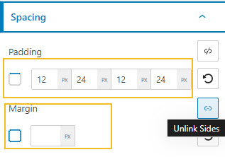
Next, let’s add a top margin to our button, because it is too close to the text above.
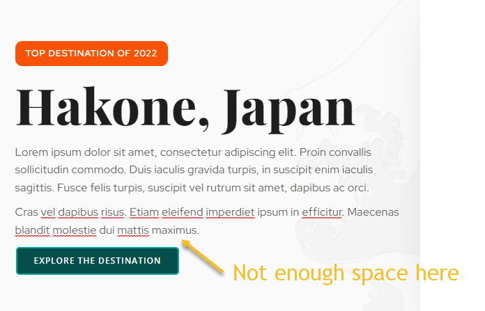
This can be fixed by setting a top-margin of 50px.
- Working with media
As I said a bit earlier, everything is a block inside the latest WordPress experience. Images or videos are also blocks.
Now, all the images, videos, and other files reside in the Media Library. I mentioned it earlier when I presented theWordPress Dashboard. You can easily upload your media here, straight from the admin area. But you can do this as well from a page or post as well.
So, let’s go ahead and add the image block.
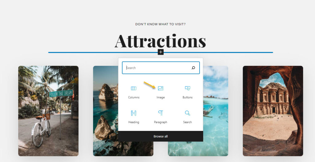
Next, you can upload the file you want. It will show up in your Media Library after the upload and pick it from there. Or you can choose an existing image from the Library or paste an URL.
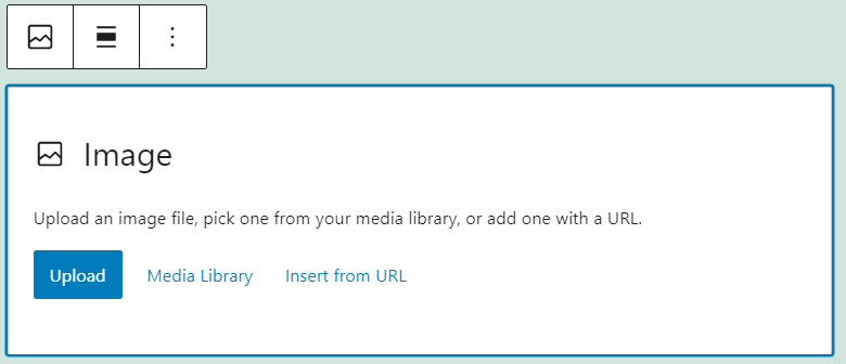
Now, be careful with this. Ideally you should host your own assets.
You can use the “change image” feature inside the “Content” option from the block editing panel, if you want to replace it. It will open up the Media Library. You can pick a different image, or upload another one.
- Adding new sections to a page
Every web page in Kubio is made up of sections that can be split into columns. In addition, you can add blocks to your sections and columns. Sections can be edited like any other block, inside the block editing panel. There’s one tiny change there, there’s “Layout” instead of “Content”.
There are 2 main ways for adding sections to a page or post using Kubio. After adding a section, the editing and styling options are the same.
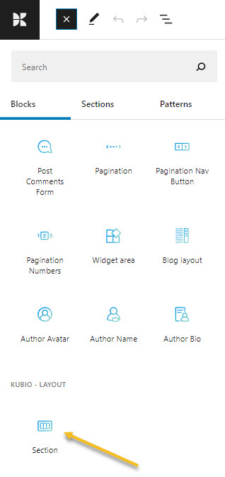
- You can add sections as blocks, from the block inserter. Just open up the block inserter using the “+” sign in the upper-left, and look for “Section”. Now, drag the section block to your page.
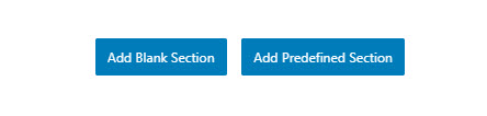
- Go to the bottom of the page, and click on the “Add blank section” button.
When the section gets added to the page, you will be asked to select a type of layout.
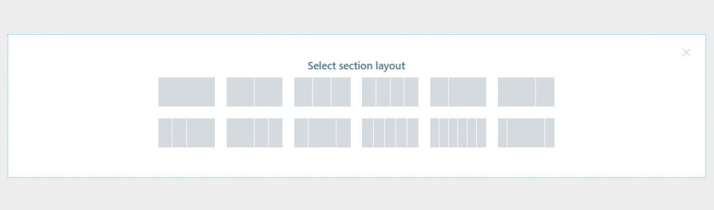
Click on the one that matches your vision for the section. I’m gonna choose a layout with 3 columns with unequal widths. Now, I’m using the “+” signs to add blocks to the columns. I’m adding a search block, a button, and a logo. Notice how each block adapted to the current color scheme?
You can make any content and styling change you want to these three new blocks.
Now, did you notice there was another button next to the one saying “Add blank section”? It said “Add predesigned section”. This is a great Kubio feature! With Kubio you have access to predesigned website sections that can serve various purposes: from team sections to features. They are fully customizable.
When you click on the “Add predesigned section” button you will open up the block inserter on the left-hand side, at the “Sections” level.
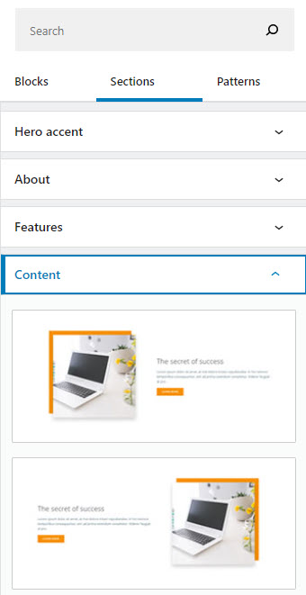
Click on a section to add it to the page, then use the toolbar to move it wherever you want.
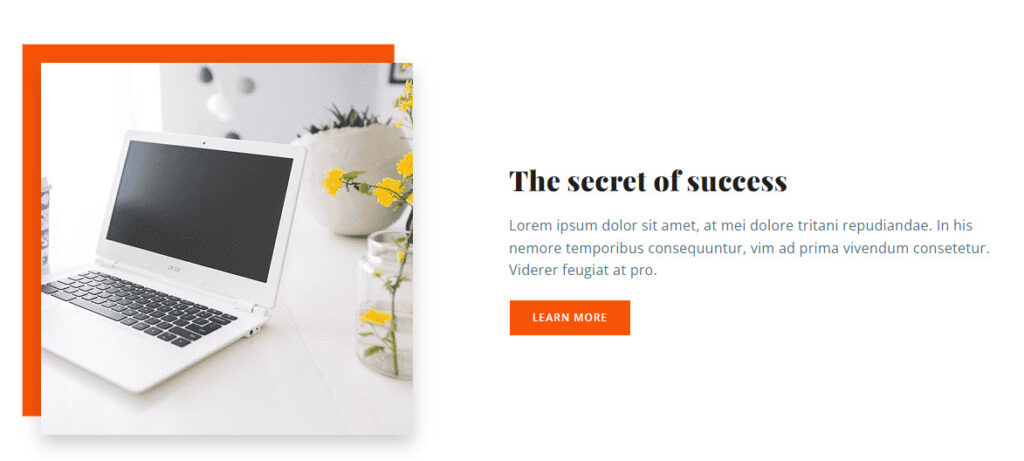
Now, notice that the colors and typography have changed? The newly-added predefined content section just adjusted to the overall color scheme and typography. Isn’t that great?
You can now replace the text and add your visuals. You do not reinvent the wheel with Kubio. This way you can save time and focus on what’s more important: finding the right visuals, preparing the copy, etc.
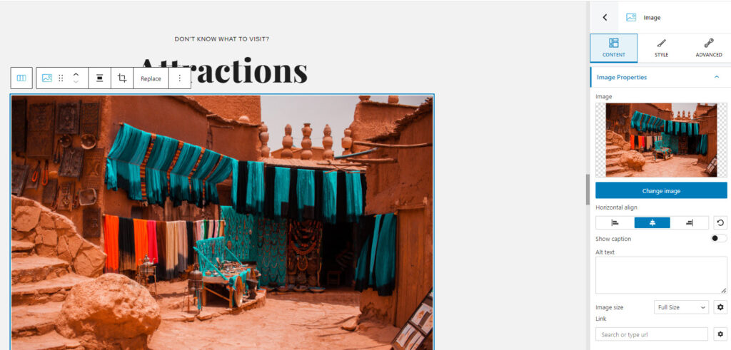
I’m going to change the image.
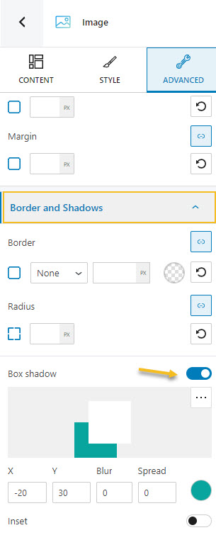
Now, notice that rectangle behind the image? That’s called a frame. This is a pro feature. But, you can add a similar effect to your own images with the free plan as well, by using the “Border and shadows” option under “Advanced”. Just enable the box shadow and play with the options there.
Now, these sections are made of blocks. You can edit them separately in the block editing panel.
This particular section that I’ve just added has an image, a heading, a paragraph, and a button. All of the elements can be edited separately.
And that’s about it. You are now ready for your own travel website design.
If you into video tutorials, we’ve covered the topic here:
If you liked this article, and want to have access to similar content, make sure to subscribe to our YouTube Channel. You can also follow us on Facebook. If you want to find out how to customize your WordPress site, here‘s a great resource we’ve compiled to help you out.