Do you have a font type?
I have several. What’s certain is that Times New Roman and Arial are not on the list.
Fonts are an essential aspect of WordPress website design. Fonts should help emphasize the copy on a website. They should help readers to perceive information from the text. This means that, at the end of the day, they have both an aesthetic and a practical role.
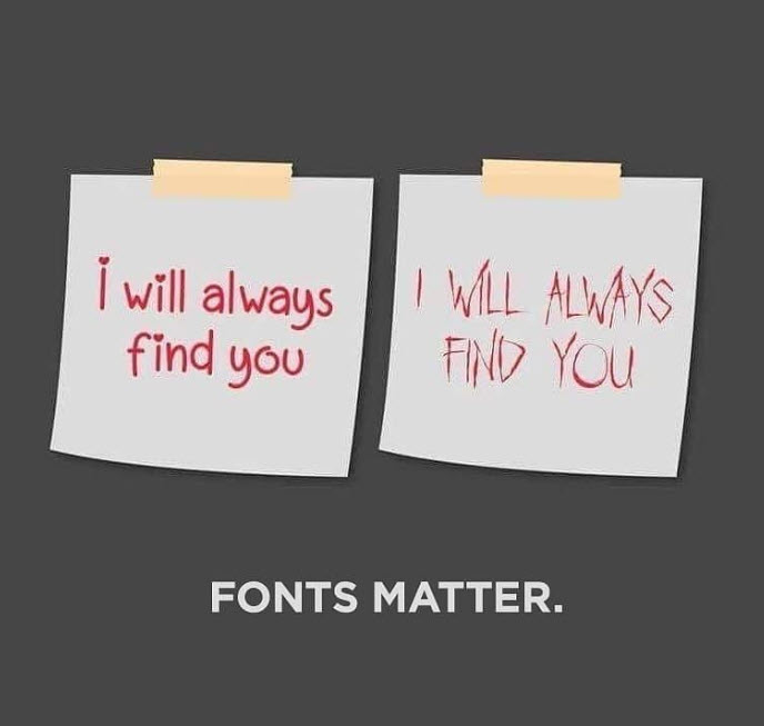
And when there’s the proper font-size, font-weight, color, background, paragraph and letter spacing, then your mission is done.
Now, in this article we’ll dive into all these concepts, then go to practical stuff and play a bit with font changes both in the WordPress theme Customizer and the Default Editor.
Picking the Right Font for Your Brand
There are so many fonts out there, so choosing the right font to represent your brand is not quite easy peasy.
The combination of fonts you choose will tell website visitors and potential customers a lot about your brand.
Now, there are two main types of fonts: serif and sans-serif. There’s a never-ending debate around them, and their legibility. No clear winner has arised yet.
Serif fonts are those that include a small line at the end of a stroke or letter, like the Vogue font below.
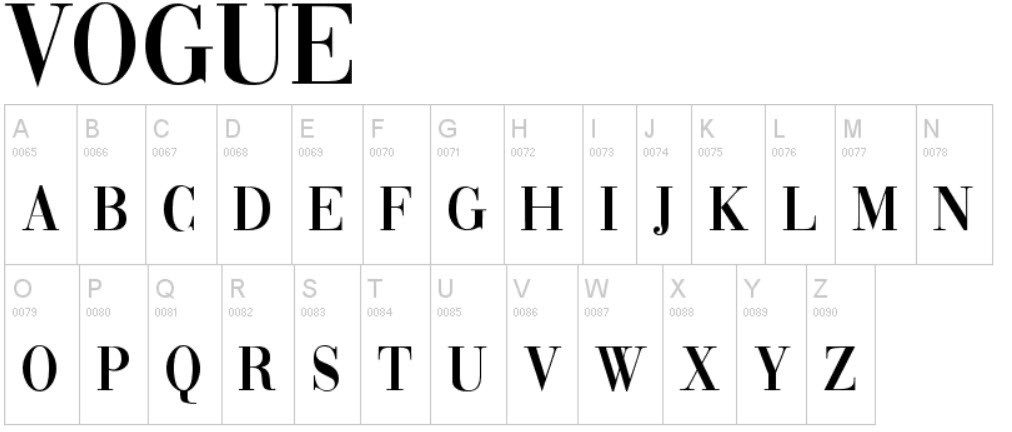
Non-serif fonts are those that do not include the extra line.
So, what should you take into consideration when choosing a font? Well, here are some useful tips:
- What’s your brand’s personality? Which are the main qualities of your brand? What does your business stand for?
After you answer these questions, you will need to find a font that matches the character of your brand. Is it playful? Is it formal?
Take a look at Kiwico. They use a combination of Centra, Arial, and Helvetica to suggest playfulness. They don’t want to get too playful, because, at the end of the day, they sell science kits for kids.

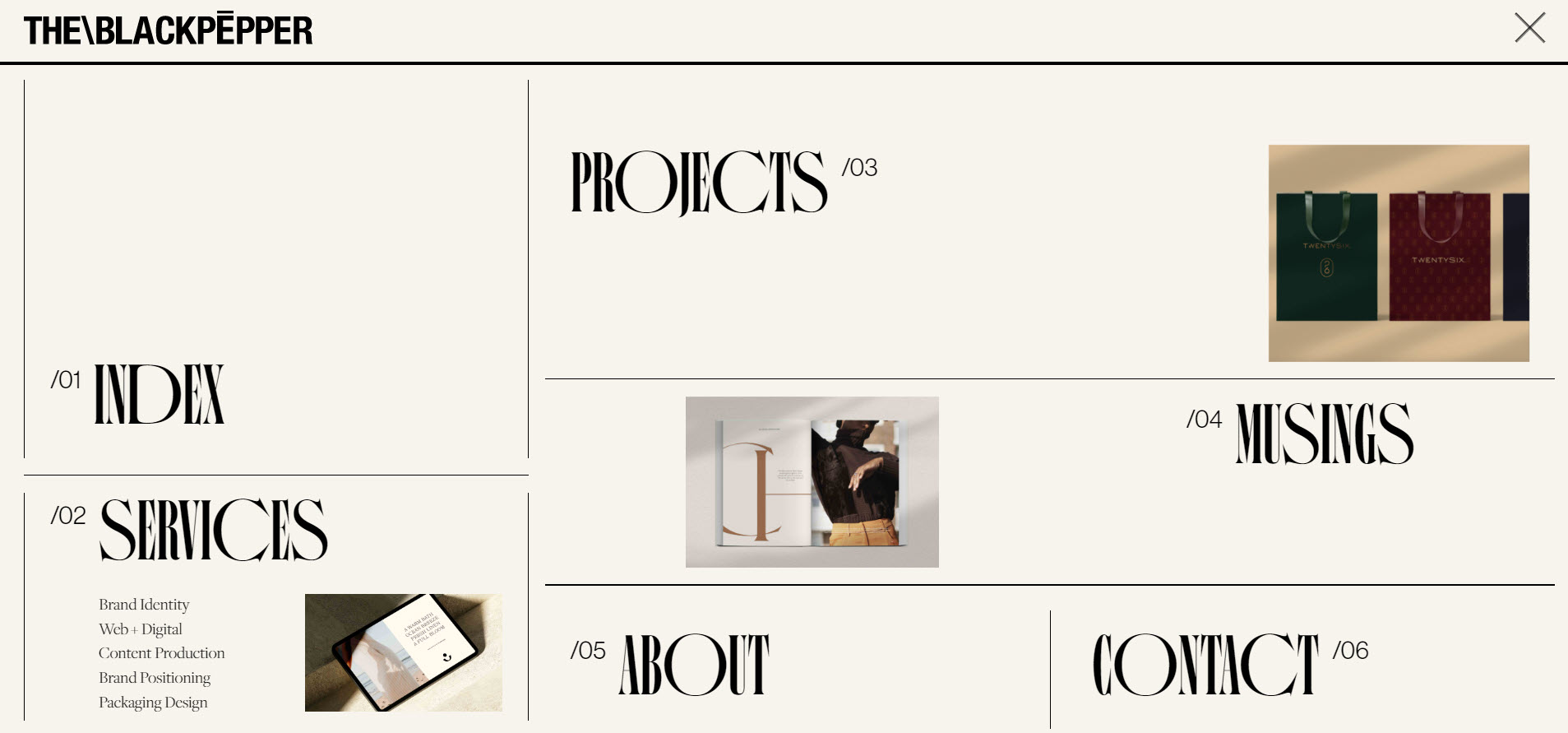
In the case of The Black Pepper Studio, the chosen fonts are bold and creative. And they want to make a point: they are a design agency that doesn’t fall for the ordinary.
- Make sure your fonts are readable. This one’s very important, folks! Have you ever taken an “l” for a”1”? I have.
Some fonts have letters and/or numbers that aren’t too distinguishable. This will confuse readers, and you definitely don’t want that . Play a bit with the fonts, experiment with words and numbers, before making your choice.
- Go with web-safe fonts if possible. Web-safe fonts are fonts that can adapt to any browser on any device. By using these types of fonts, web designers and developers ensure that the intended font will always be displayed properly on a web page, even if these fonts aren’t installed on the user’s computer.
Here are some safe fonts that are easy to read, and don’t distract reader’s attention:
- Arial (sans-serif) – the most popular font out there. Like I said, I don’t find it very pleasing, but it’s all over the place.
- Verdana (sans-serif). Verdana is easily readable even for small font sizes.
- Helvetica (sans-serif). This is the font choice for a lot of designers, and it is suitable for a variety of businesses.
- Tahoma (sans-serif). It has less space between the characters.
- Trebuchet MS (sans-serif). This font was designed by Microsoft, but is not supported by all devices.
- Times New Roman (serif). This is the default font for Windows devices and applications.
- Georgia (serif)
- Garamond (serif)
- Courier New (monospace). Monospaced fonts date back to the typewriter days. All the individual characters or letters of a word have the same spacing horizontally.

- Brush Script MT (cursive). Cursive fonts mimic the style of human penmanship.

Concepts You Should Be Aware of When Dealing with Fonts
Here are some concepts you should get familiar with before jumping into the technical side of WordPress typography.
- Font-family. Font families have two approaches.
There are generic font-families. I’ve already mentioned 2 of them: serif and sans-serif. And I gave you an example of a cursive and a monospace font. The fifth one is called “Fantasy. The generic font family name will specify the attribute that all fonts within that family share.
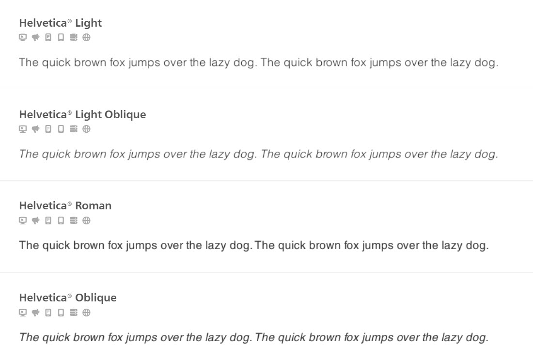
We also have specific font-families. They refer to fonts with different styles within the same font-family.
For example, Helvetica can have 36 style combinations.
- Font-size (or text size) in web design refers to how large are the characters displayed on a screen.
Font sizes can be calculated in pixels (“px”), “rem”, or “em”.
Pixels are static values, that are telling the browsers to render the letters at exactly the number of pixels in height that you specified.
“Em” and “rem” values are scalable or relative values. In the end, both “em” and “rem” values will be translated by the browser into pixel values. While a browser will always recognize 10 pixels as being 10 pixels, “rem” and “em” dimensions can vary. When using “em” units, the pixel value you end up with is a multiplication of the font size on the element being styled.
- Font-weight is a value showing how bold a font should be.
There are 8 values that you can use, ranging from 100 to 900.
- 100, 200, and 300 are light fonts,
- 400 is the normal font-weight,
- 500 and 600 are semi-bold,
- 700 is the value used for bold font-weights,
- 800 and 900 are very bold font-weights.
- Line height is a value that shows the distance between lines of text.
- Letter spacing refers to the horizontal spacing behavior between text characters.
Now that we went a bit through typography theory, let’s put all this knowledge to practice in WordPress web design.
WordPress Typography: Customizing Global Fonts
When you start designing a website, you would, ideally, set up global fonts.
What does this mean? It means that you shouldn’t set up the font-family, font-weight and font size for every paragraph or headline on a page, individually.
WordPress themes already have this set up. But I’m going to show you how you can change the default typography.
Now, some themes allow you to make these changes if you use a free plan, others only if you use a paid one.
How to make changes to global fonts in the WordPress theme Customizer
Most of the themes out there will make changes to the WordPress Customizer. The experience can differ from theme to theme. For my example I’m using the Mesmerize theme, the PRO plan. But the logic will be similar if you use a different theme.
Here are the steps for making global font changes:
- Enter the WordPress Admin Dashboard,
- Hover over “Appearance”,
- Select “Customize”,
- Go to “General Settings”,
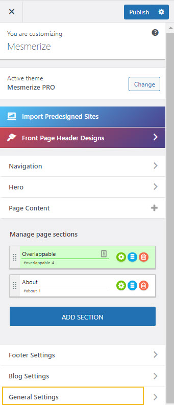
- Select “Typography”.
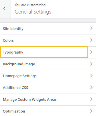
- Set up the fonts.
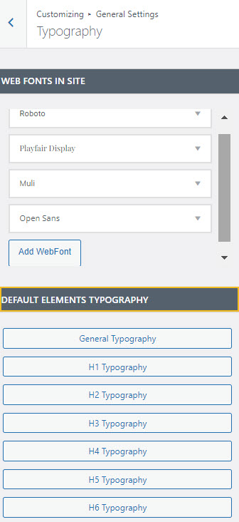
Here you can:
- Add a new font. Maybe you downloaded a font from dafont.com and want to use it here.
- Choose the default font, its size and color inside General Typography.
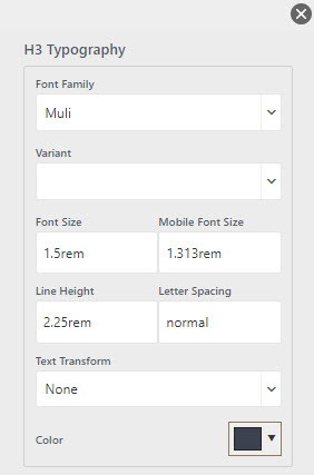
- Set up the typography for the headings. There are 6 types of headings in web design. H1 is the most important, H6 is the least important one. At this level, you can change the font-family, default size both on desktop and mobile, line height, letter spacing, color, and text transform. The text transform feature refers to letter capitalization options. Now, because here you will make global changes, it means that tThe moment you change the color of your H3s, for example, all the H3 headings from your site will change color the moment you publish the change. The same goes for every font change.
How to make changes to global fonts in the Block Editor
If you’re using the Block Editor, meaning that your canvas is looking like this:
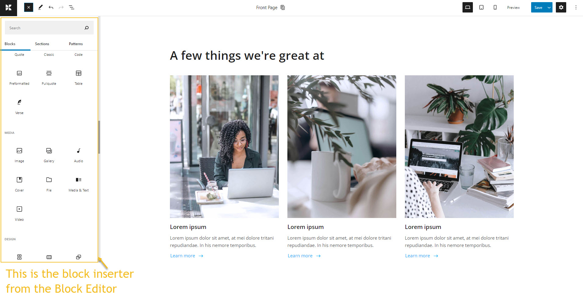
the approach is different.
Here are the steps for making global WordPress typography changes when using the Block Editor.
- From the WordPress dashboard, go to Appearance -> Editor,
- In the top right corner, click on the Styles icon (the half-filled circle),
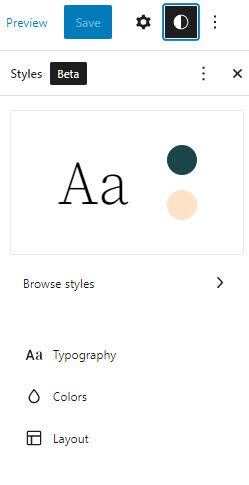
- Click on “Typography”.
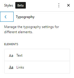
- Select the “Text” option from “Typography”. Here you will be able to choose a different font-family, adjust the font-size, the font-weight (under “Appearance”) and line height.

Now, depending on the theme you’re using, the font-family options can differ. In the case of the Twenty Twenty Two default WordPress theme, there are only two font options available.
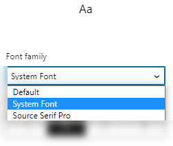
Other themes might feel more generous about their font options.
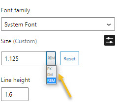
In terms of font-sizes there are 4 sizes available, from 1 to 4, or you could set up a custom size if you click on the “Set custom font size” icon.
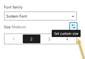
You can go with font sizes expressed in pixels, REM, or EM.
- If you go back to “Typography” and select the “Links” option, you will be able to make changes to the links’ font-family, size, weight, and line height.
- When it comes to making text-color changes, let’s click again on the “Style” option, and go with “Colors” instead of “Typography”.
- You can notice the color palette for the Twenty Twenty Two theme.
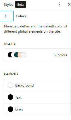
You can now make color changes to both text and links. Let’s click on text. Let’s now select the foreground color. It will open up a window with some sliders. Play there until you find the color you desire.
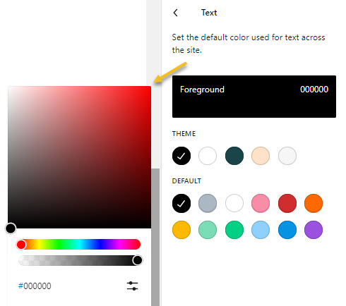
The gray slider is used for setting up the color opacity. The darker options are more opaque colors, why the lighter ones are less opaque.
You can even paste your own HEX, HSL, or RGB color code. Click on the “Show detailed” inputs icon to toggle this option on.
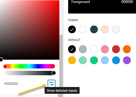
Use the dropdown arrow to choose between HEX, HSL, and RGB.
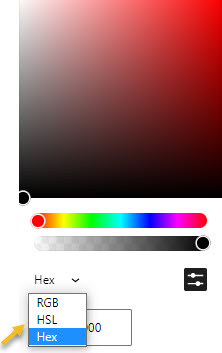
The same options are available in the case of link color customization.
Now, depending on the theme or the additional plugins you use, the global styling options can be richer. You noticed how in the case of the Mesmerize theme, above, inside the Customizer, you could set up headings individually. In the Default Block Editor we couldn’t see such an option.
But let me show you can level up the Block Editor and access richer features. All you need to do is install the Kubio builder for free. Ideally you would combine it with the Elevate or Pathway themes, but the builder is compatible with any other WordPress theme.
I’m gonna stick with the Twenty Twenty Two Default theme for now.
Just head over to Plugins -> Add New from the WordPress Dashboard. Type Kubio in the search bar and click on “Install now”.
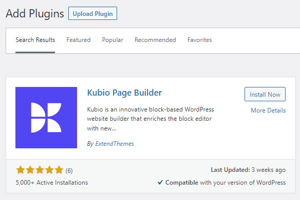
Next, click on “Activate” and you’re all set.
You will be taken to this screen where you can watch a short video on how Kubio works.

How to make global WordPress typography changes in the Block Editor using Kubio free page builder
The moment you want to edit any page, you will need to go with the “Edit with Kubio” option. Let’s take a look at the steps you need to take in order to make WordPress global typography adjustments.
- While inside the page, head over to “General Settings” in the panel on the right-hand side.
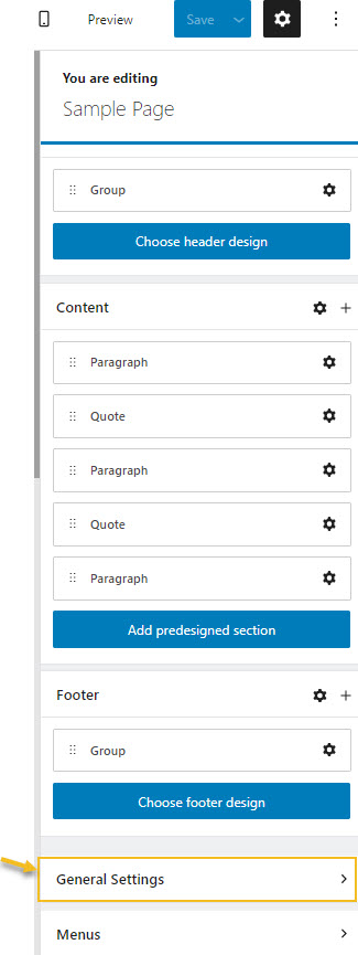
- Now, click on “Typography”.
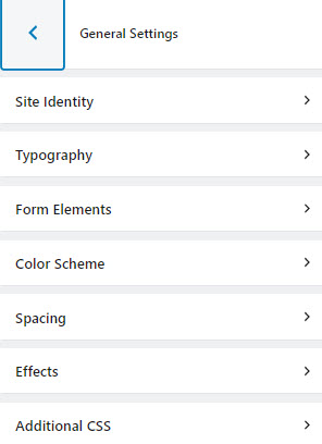
- Here you can redefine your global typography for headings, body text, lead text, and links.
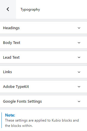
No matter what you choose, a heading, a link, etc, you can customize the following:
- Font-family. Tons of Google fonts are available for you to choose from. If you have a PRO plan you can retrieve Adobe Fonts using an API token. If scrolling isn’t your thing, and you already know the font you want to use, you can type its name in the search box.
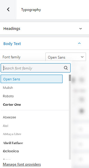
- Font-weight. This refers to the relative thickness of a font’s stroke. In this case, 300 is the thinnest font-weight, while 800 is the thickest one.
- Font color. You can pick a color from there, use the slider, or just type in your desired color code in the “HEX” field. Then, you can switch to the RGB color mode if it suits you better from the dropdown arrow.
You can also adjust the opacity. The slider offers you values from 0 to 1, 1, meaning there’s no transparency.
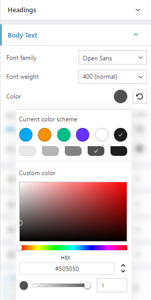
- Font size. You can use the slider to make the font size smaller or higher. You can use PX, EM, and REM for font sizes.
- Advanced. This will open up a new panel with several other editing options.
- Transform. This option allows you to make letter capitalization changes.
- Decoration. Here you can add underlines, overlines, or line throughs.
- Style. This is where you can make your font italic or bold.
- Line height. This is where you can control the amount of space between baselines in a block of text. A text’s line height is proportional to its type size. In this case, the default is 1.6x the actual font size. You can decrease it or increase it if you want. Just make sure that your text doesn’t look too crowded or too loose.
- Letter spacing. For smaller type sizes, looser letter spacing can improve readability.
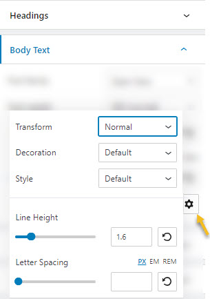
You can see the changes happening in real time. But don’t forget to save them!
As you can see, the Kubio builder literally levels up the Default Editor, giving you complete control over your font choices.
But, what if you want to make some tiny font changes here and there, on a heading, or a paragraph?
This means you will need to make some individual typography changes.
WordPress Typography: Customizing Individual Elements
We’ll talk again about how to make these changes both in the theme Customizer, and the Block Editor. These are two different experiences.
How to make typography changes to individual elements in the WordPress theme Customizer
We’re still working with the Mesmerize theme as an example.
No matter if you want to make typography changes for a heading or a paragraph, these are the steps you need to follow:
- Click on the text.
- Use the toolbar that shows up on top of the text to make typography changes.

- Here you can:
- Change the font-family,
- Make changes to the font-weight,
- Make the text italic, or add underlines or strikethroughs,
- Add a superscript or subscript,
- Change the text color.

You can pick a color from the window that shows up, or use the sliders on the right to identify new colors. Use the gray slider to set up the color opacity. You can even paste RGB codes.
Neat, right?
How to make typography changes to individual elements in the Block Editor
Now, let’s select a paragraph block from a page created with the Twenty Twenty Two theme.
You can notice a block editing panel on the right saying “Paragraph”.
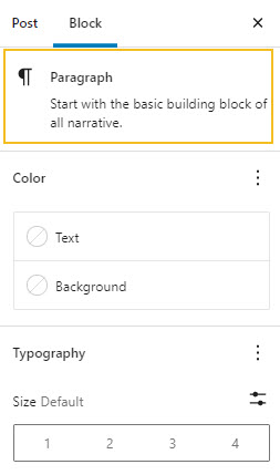
You can recognize the options from the global typography styling here.
You can make changes to:
- Text-color. The color options inside the Twenty Twenty Two theme are pretty scarce, and you don’t have lots of freedom over your font color choices.
- Font-size. There are 4 sizes available, from 1 to 4, or you could set up a custom size if you click on the “Set custom font size” icon. You can go with font sizes expressed in pixels, REM, or EM.
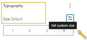
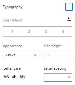
- Under “Typography” you can customize:
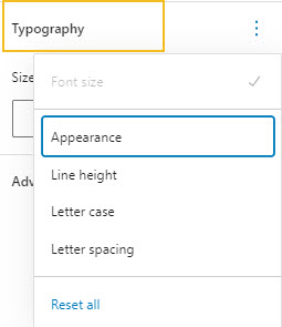
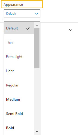
- The appearance of the font, meaning the font-weight.
- The line-height. This is set relative to the font-size.
- Letter casing.
- Letter spacing.
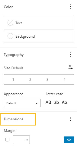
- Dimensions. Here you can set up the margins for the text. You can have the same margin, or set up individual ones for top, bottom, left and/or right.
Now, let’s see how this is done when using Kubio page builder.
How to make individual block WordPress typography changes using Kubio free page builder
Like I said before, Kubio levels up the block editor, giving you more control over your design. But, in order to achieve this design freedom you will need to use the Kubio blocks instead of the default ones.
When inside any page or post, you can open up the block inserter using the “+” sign in the upper-left corner of the screen, or by clicking on any “+” sign you notice on the website canvas.
The default WordPress blocks have black icons, while the Kubio ones have blue & green icons. The Kubio blocks are shown first.
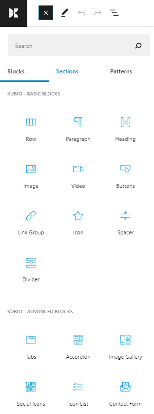
No matter what block you choose to edit, you will notice that the block editing panel on the right-hand side has 3 layers: Content, Style, and Advanced. This is an upgrade from the default block editing panel. It’s here where all the Kubio magic happens. Typography editing happens at the “Style” and “Advanced” level, depending on the block.
Let’s take the Kubio paragraph block as an example. If you understand the options here, you’ll be able to apply the same logic across other blocks with text as well.
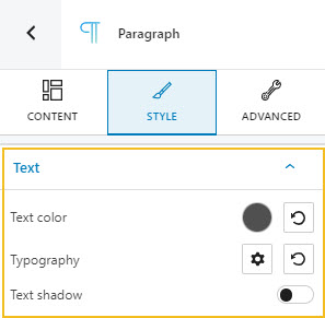
Here you can:
- Change the text color. Wherever you notice a colored circle inside Kubio, it will allow you to make color changes (for either text, backgrounds, borders, shadows, icons, etc).
Let’s click on the colored circle next to “Text color”.
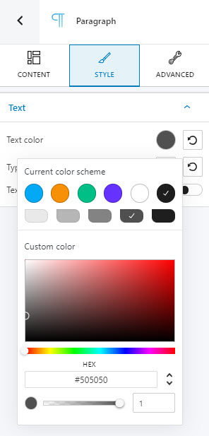
You can pick a color from there, use the slider, or just type in your desired color code in the “HEX” field. Then, you can switch to the RGB color mode if it suits you better from the dropdown arrow.
You can also adjust the opacity of the text’s color. The slider offers you values from 0 to 1, 1, meaning there’s no transparency.
- Add a text shadow. When you enable the text shadow option, you’ll recognize the same colored circle from above. It will allow you to change the color for the text shadow. Text shadows are described by X and Y offsets relative to the element, blur, and color.
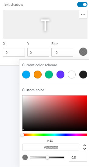
A positive horizontal offset (X) of the shadow means the shadow will be on the right of the box; a negative offset will put the shadow on the left of the box. A negative vertical offset (Y) of the shadow means that the box-shadow will be above the box, a positive one means the shadow will be below the box.
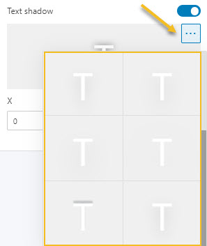
If you don’t wanna play with offsets, you can choose a type of shadow from the 3 horizontal dots, shown below:
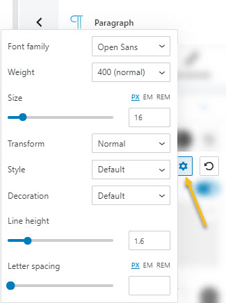
- Make typography adjustments. Here you have several options available. You can customize the following:
- Font Family. Tons of Google fonts are available for you to choose from. If you have a PRO plan you can retrieve Adobe Fonts using an API token. Now, if scrolling isn’t your thing, and you already know the font you want to use, you can type its name in the search box.
- Font Weight. 300 is the thinnest font-weight, while 800 is the thickest one.
- Font Size. You can use the slider to make the font size smaller or higher. You can use PX, EM, and REM for font sizes.
- Transform. This option allows you to make letter capitalization changes.
- Style. This is where you can make your font italic or bold.
- Decoration. Here you can add underlines, overlines, or line throughs.
- Line height.
- Letter spacing.
At the “Advanced” level you can notice more customization options. Depending on the block, you can make style changes across several states, such as: normal, hover, or focus.
Let’s say you want to customize all the text inside a column on a web page. You can have here simple text, headings, and even links.
At the column level you can make changes both in the normal and hover states.
Let’s click on the dropdwon arrow next to typography and check the options inside.
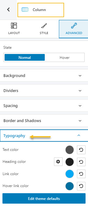
At this level you can make changes to text, heading, link, and hover link color.
Inside heading color, if you click on the settings icon you can make color changes from H1 to H6.
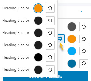
As shown earlier, the colored circle indicates the current color for each element. Click on it if you want to select another color.
You can pick a color from there, use the slider, or just type in your desired color code in the “HEX” field. Then, you can switch to the RGB color mode if it suits you better from the dropdown arrow.
You can also adjust the opacity of the text’s color. The slider offers you values from 0 to 1, 1, meaning there’s no transparency.
Under typography, you also have the option to make changes to the themes’ global typography. You will be taken to General Settings where you can make the changes. I’ve explained how this is done in a previous chapter.
And that was all. You now know how to make WordPress typography changes using both the theme Customizer and the Block Editor.
How to Identify Fonts Used on a Website
Let’s say you navigate a site and you fall in love with the font it uses?
How can you identify the name of the font?
I always like to use the developer tools for this. It goes like this:
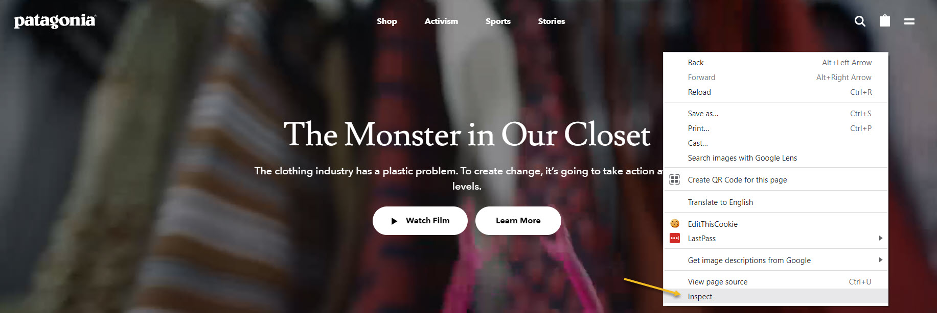
- When you are on a web page, right click on it and go to “Inspect” if you’re using the chrome browsers. The name differs slightly between browsers.
It will open up a window containing the code behind the website.
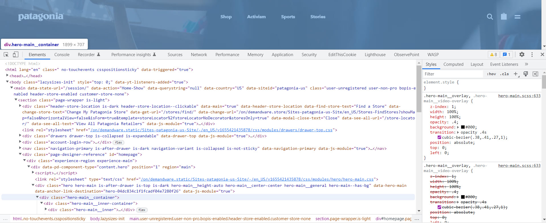
Don’t panic, you won’t need to get lost in what you see.
- Click on the arrow shown below in order to select an element from the web page.

- I’m clicking on the main heading. A window pop-ups showing me some properties of the heading. And there’s the main font used: Lusitana.
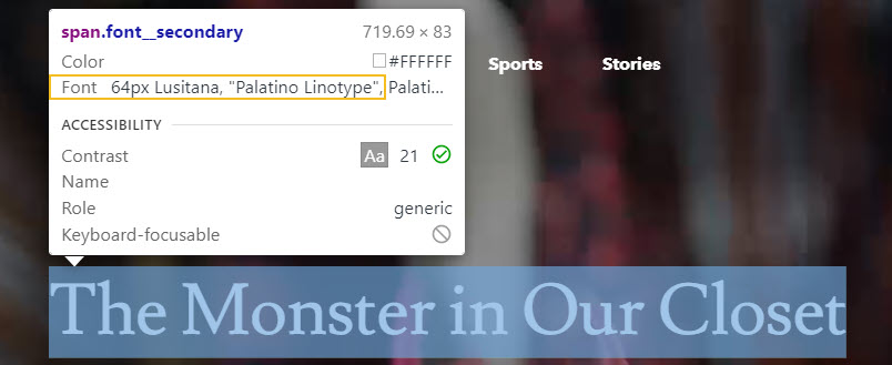
There’s a downside to this option. It shows the font set up inside the code, but not the font that was actually rendered by the browser.
But there’s another solution that you can use to uncover fonts.
Enter the WhatFont Chrome extension.

First you need to install the extension, then to head over to the page you’re interested in.
Click on the extension in your extensions list, then hover over some text. It will show the name of the font. In this case we have Lusitana paired with Avenir Next.
If it doesn’t work, try refreshing the page. It always does the trick.
What next? You can start looking for the font.
I like to use dafont.com or myfonts.com.
But, don’t forget one of the advice I gave you earlier in the article: web-safe fonts…are safer to use.
Now, if you want to see which font pair well together, there’s FontJoy.
You can type the name of a font you like, then generate fonts that work together with it. In this case I’m using Lusitana.
I’m locking the font, and then I hit “Generate” in order to discover new fonts that pair well with Lusitana. The moment I find one that I like, I can lock it as well, then generate another font that works well with both my locked fonts. It’s such a brilliant tool!
If you liked this article, and want to have access to similar content, make sure to subscribe to our YouTube Channel. You can also follow us on Facebook.


