
Not all websites are created equal. Their structure can vary according to their topic: from education and healthcare, to online stores.
This is why we wrote about gym website design, SaaS website design, school website design, and today we’re diving into restaurant website design. More similar topics are in progress as well.
So, let’s see what’s special about restaurant web design.
So, here’s the plan for today:
Restaurant web design: time to get inspired from these 9 mouth-watering websites
Now, it’s easy to get carried away with some fancy website designs, but don’t forget that the usefulness should come to mind first. Your restaurant website should be easy to navigate, it should allow visitors to easily discover the menu, restaurant location, hours of operation, reviews, photo gallery, and then book a table.
Now, we’ve compiled a list of 9 beautiful restaurant websites that will definitely inspire you with your own website design.
Let’s roll!
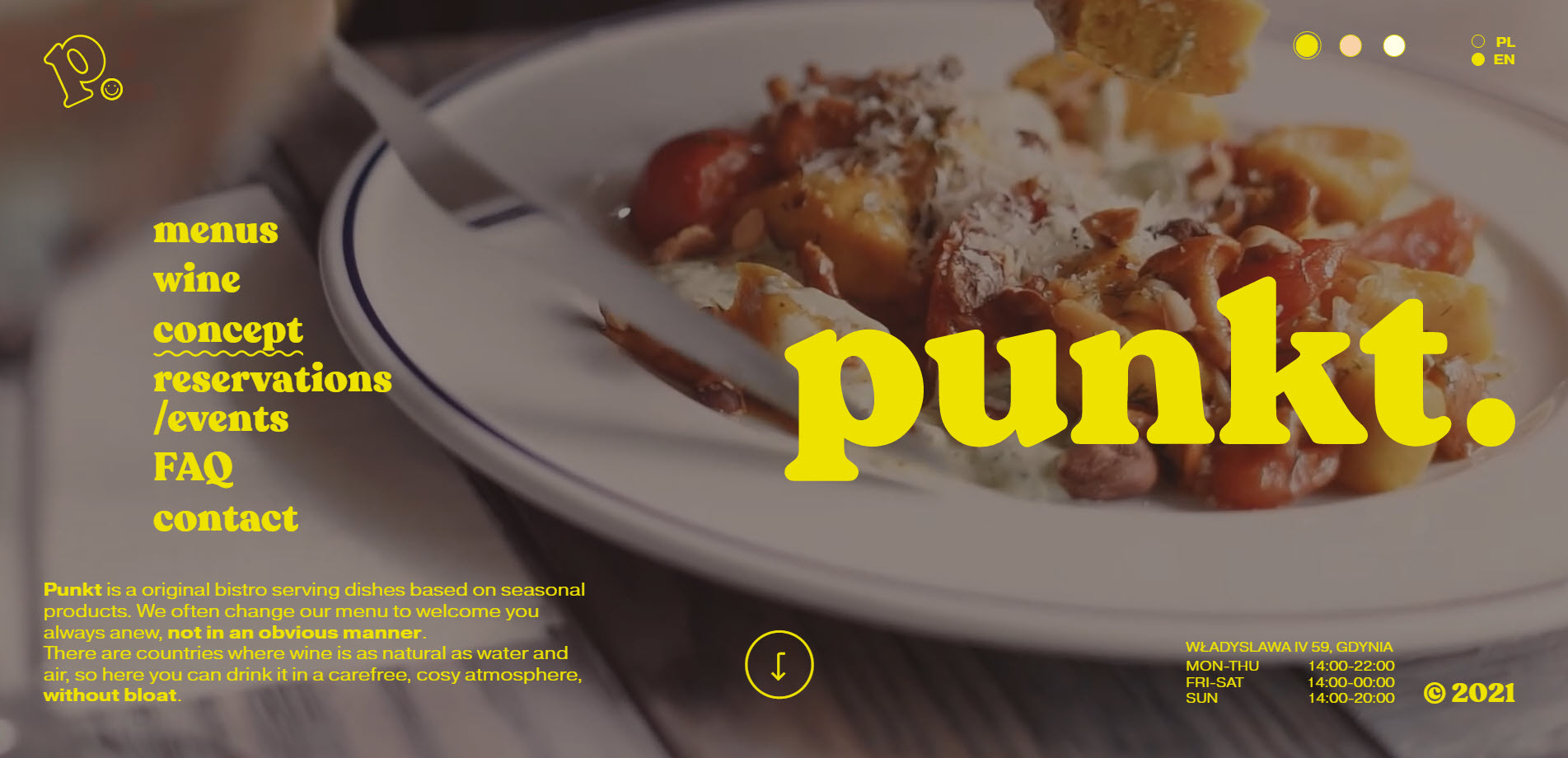
- Punkt – Gdynia
Punkt is a bistro in Gdynia (Poland) that serves seasonal dishes. Punkt’s mantra is “we eat with our eyes first”, this is why they focus a lot on the appearance of dishes.
Now, here’s what we like about Punkt’s website:
- The folks at Punkt, wanted to create a place that pleases the eye, nose and mouth. And the website reflects that through cozy videos and images depicting a casual atmosphere and mouth-watering food.

- The website’s navigation menu is very visible. Interestingly, it does not apply the norms of placing a navigation bar on top of the hero. This one is placed on the left-hand side, and it really manages to catch the eye.
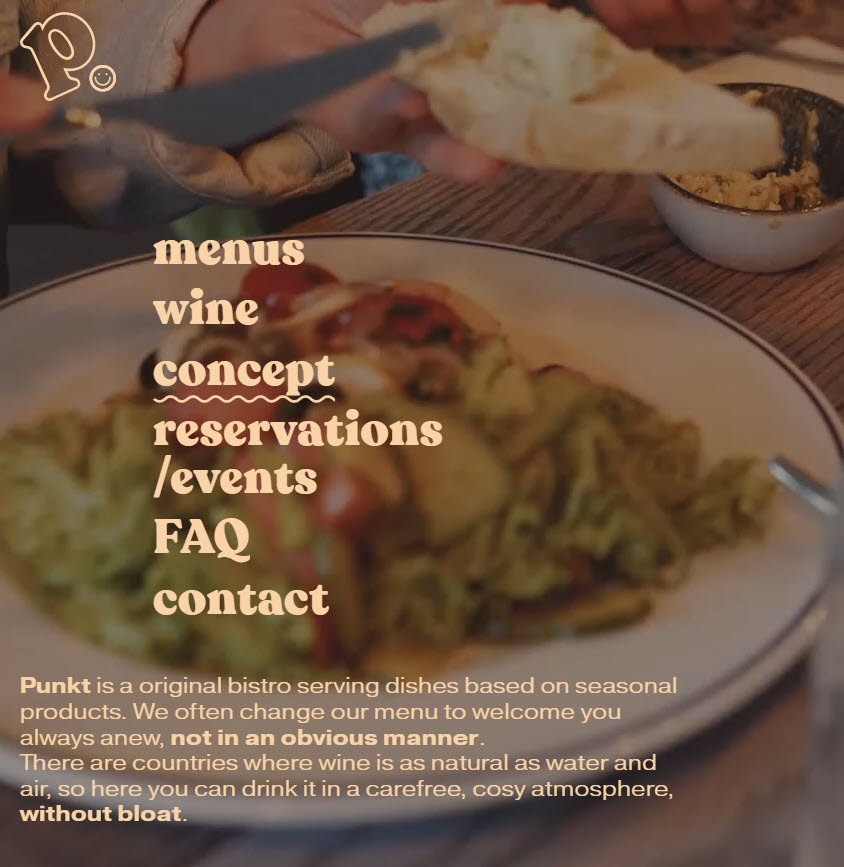
- The website is not cluttered with information.
- The website is both in English and Polish.
- AMASS – Copenhagen
Amass is an environment-conscious restaurant in Copenhagen, Denmark.
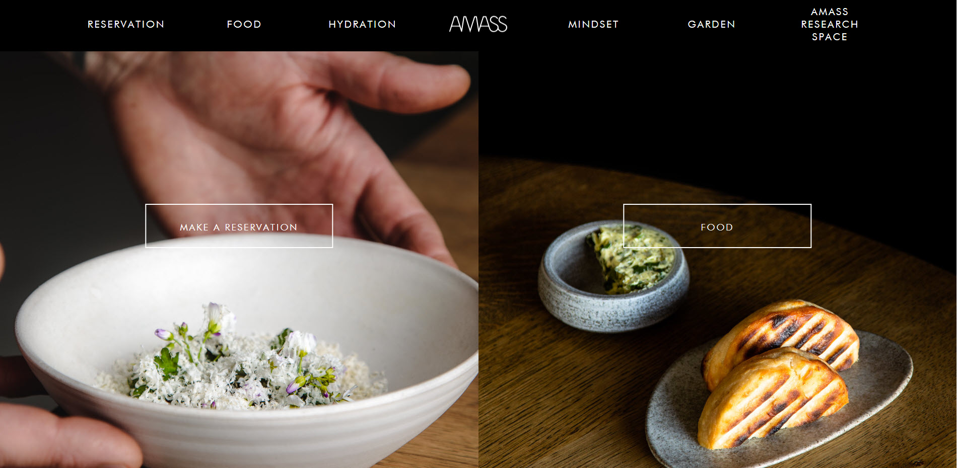
Now, here’s what we like about the website:
- Clear website navigation bar. You can access the reservation info, food and drinks menus straight from the website nav bar.

- The restaurant’s story can make people connect around the same values: saying “no” to food waste, reducing the carbon footprint, reducing water waste, etc. Having a brand story and sticking to it is more important than ever when it comes to businesses. Our buying behavior moved on from looking at product features to caring about how a product, a brand, make us feel, and how we share similar values.
- Amass uses a booking system. When using such a system, you can easily manage table seats. It makes it easier for clients to choose a proper day for dinner or lunch. It also prevents human errors, because errors can happen when you only go with phone or email bookings.
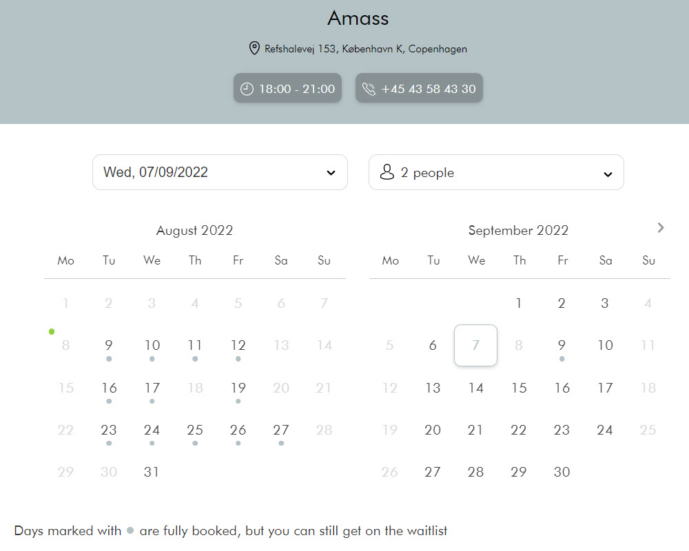
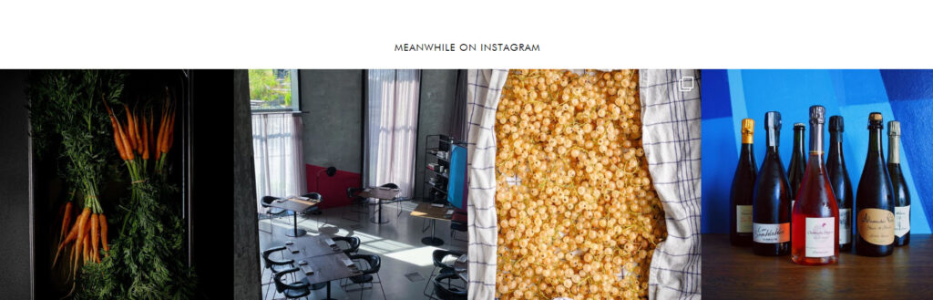
- Amass embedded their Instagram feed into the website. The photos there match the look and feel of the website, so the feed looks really good on the page.
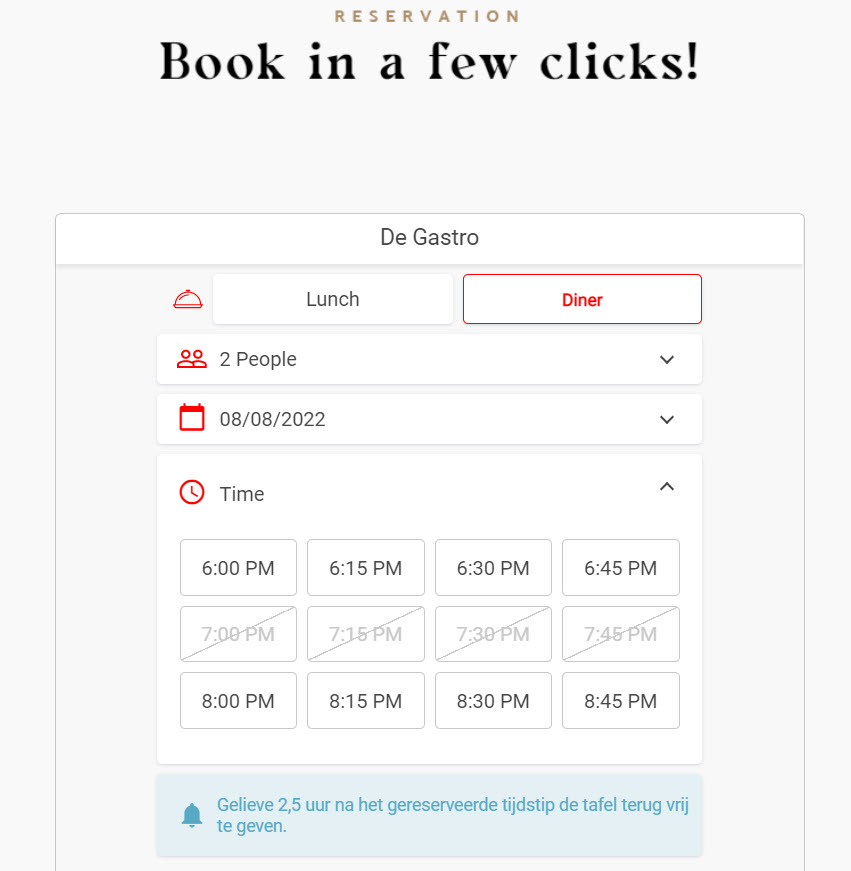
- De Gastro – Bruges
De Gastro is a family-owned restaurant in the heart of historic Bruges, Belgium, serving classic French and Belgian cuisine.
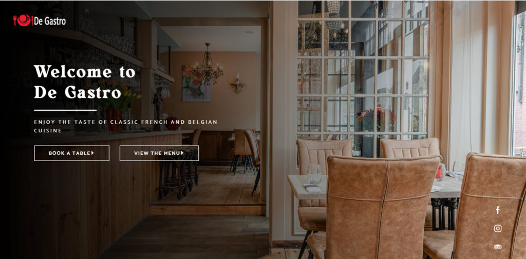
What we love about the website’s design:
- There are two main calls-to-action visible in the hero image: “Book a table” and “View the menu”. It’s plain and simple.
- A restaurant website doesn’t have to be complex, and with lots of web pages. If what you have to say can fit into a one-page website, do that. It’s the case for De Gastro. They keep their info short and sweet. Even if they have a one-page website, you feel that nothing is missing.
- A review can sometimes say it all. De Gastro doesn’t need more reviews than this one:
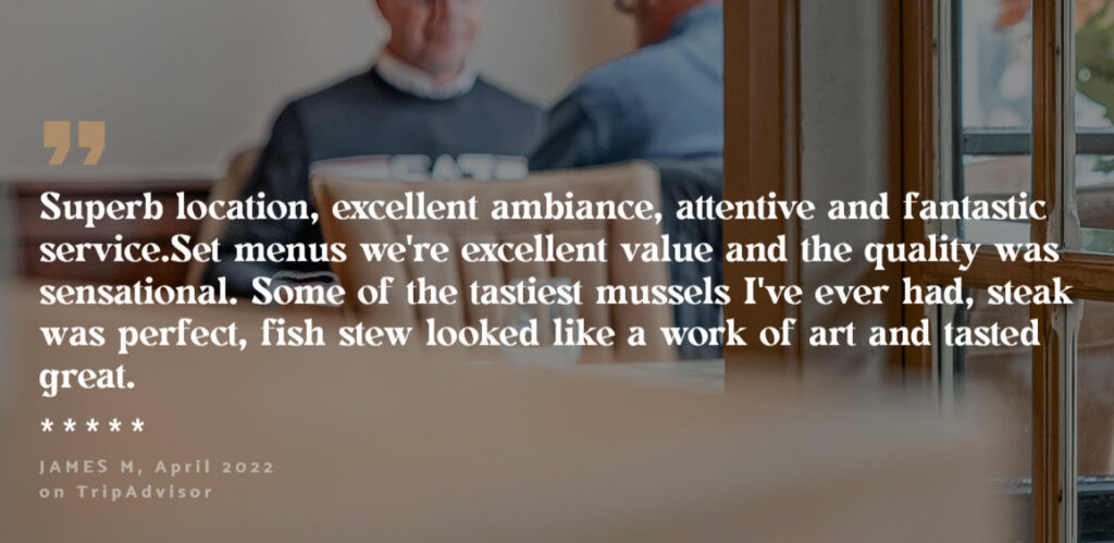
Reviews are more valuable than your own copy on a website. When someone else praises your dishes, it brings more value than you praising them.
- There’s a booking system in place.
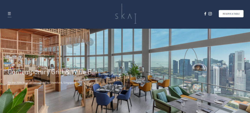
- SKAI – Singapore
SKAI is a refined grill restaurant with an iconic view, situated on the 70th floor of Singapore’s Swissôtel The Stamford.
- The restaurant has a virtual tour available on the website.
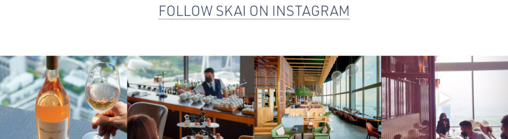
- SKAI has embedded their Instagram feed into the website. The photos published on the Instagram profile there match the look and feel of the website, so the feed looks really good on the page.
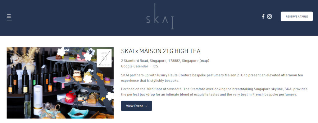
- They organize events that are well-presented on the site.
- The photo-gallery is just mouth-watering.
- The color scheme works really well with the chosen font. Together they create a sense of classic, chic, and elegant.
- A table booking system is being used.
- Mavericks – Cracow
This cool, casual, and full of surfer spirit restaurant in Cracow is a tribute to California’s well-known surf spot: The Mavericks.
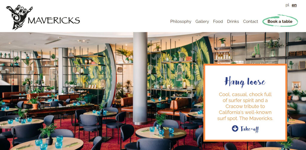
Let’s see what we like about the web design:
- The call to action is clear in the upper right corner of the website: “Book a table”. Now, the problem is that this doesn’t work. So, here’s your tip here: make sure all the links on your site work!
- The visuals and font are nicely combined creating a playful ambiance.
- Compact website design in a one-page layout.
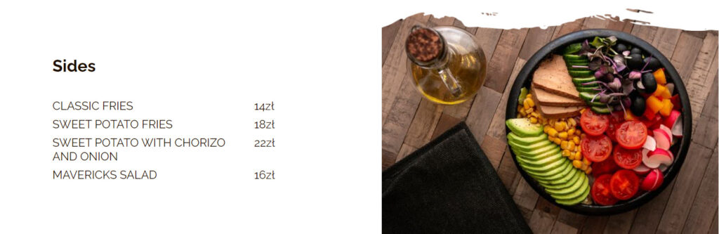
- The dishes and drinks in the menu are made clear, together with the ingredients and prices. A category representative image accompanies each category in the menu.
- The site has both an English and Polish version.
One advice though, for the Mavericks team: the photo gallery could be richer, guys!
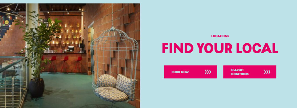
- Wahaca – Mexican restaurant chain in the UK
Wahaca is the first UK’s carbon neutral restaurant group. Awesome, right?
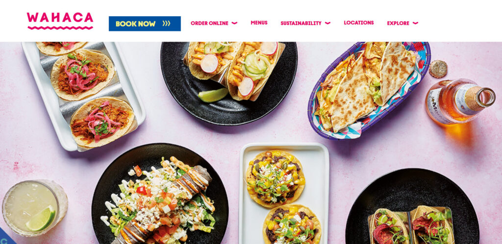
What we like about the Wahaca restaurant web design:
- It has a clear navigation bar and you can easily spot the call to action : “book” now, as well as the ordering options, the menus, and locations. All the information you’d expect to find is just a click or two away.
- Large and inviting images and videos manage to make us sense how one might feel at Wahaca.
- A playful and vivid color palette is well-combined with the Wahaca font (no pun intended), managing to make the info can calls to action stand out.
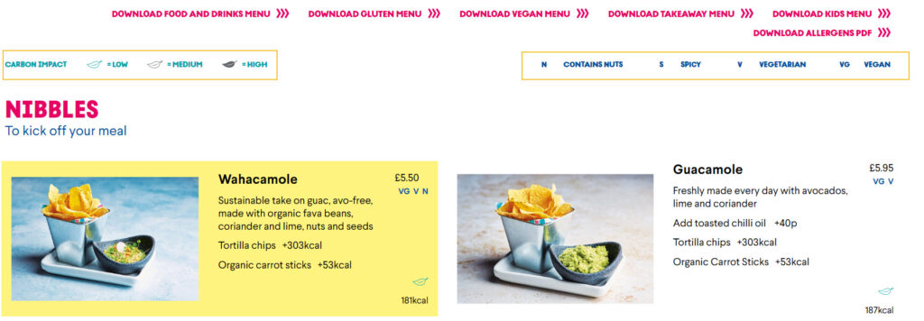
- We just love brands and businesses that join a cause. From day 1, Wahaca wanted to minimize their environmental impact. You can even see in the Wahaca menus which dishes have a low, medium or high carbon impact.
- Wahaca can inspire its clients through a powerful and very relatable story. Like I said earlier, stories can bond us together.
- Wahaca has great menus, with lots of info, and dishes images as well. Take a look at that: you can filter by carbon impact, vegan and vegetarian, spicy food, gluten free, kids, and more. Dishes even mention the number of calories.
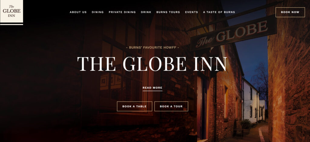
- The Globe Inn – Scotland
Centuries old (born in 1610), the Globe Inn is full of history. The inn is famous for “the Burns Room”. It’s here where the famous poet Robert Burns spent lots of time. Fro example, you can sit in the famous Poets Chair (if you can recite a verse of his poetry), visit his bedchamber, kitchen and dining room, read the verses scribed on the windowpane by Burns’ very own hand, and marvel at the various rare artifacts proudly displayed.
Here’s what we like about this restaurant website design:
- The hero image has two clear calls-to-action: “Book a table” or “Book a tour” (for history buffs). I love the contrast between the white and brown, it really makes those buttons stand out.
- It really manages to create an atmosphere that combines the old and the new in a timely fashion, through the color palette, and images.
- The website has a page dedicated to their chefs. I love it when the people behind the dishes are not anonymous. Somehow, this is how you connect better with a brand, when you become familiar with the faces behind it.
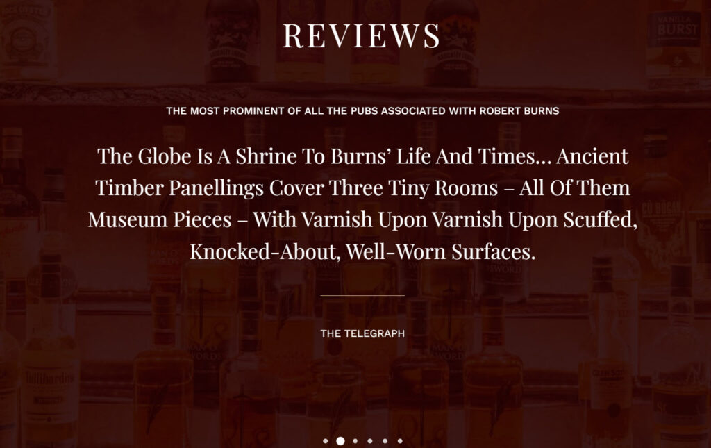
- The website’s homepage includes reviews from famous newspapers (The Telegraph) as well as customers.
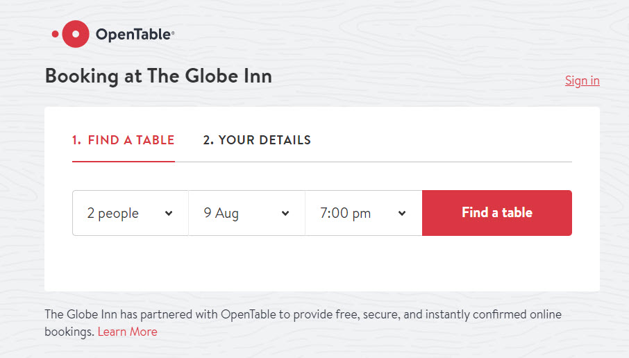
- There’s a table booking system available.
- They have a page dedicated to events, where you can see the schedule of future events, as well as past events.
- Umami – Tbilisi
Umami is an Asian fusion restaurant, in Georgia’s capital city, Tbilisi.
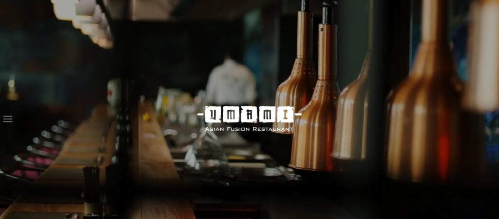
Here’s what we like about the design:
- The dark layout that is perfectly matched by the chosen images.
- This is a one-page website layout. Like I said a bit earlier, a restaurant website doesn’t have to be complex. Oftentimes a one-page design is more than enough.
- The image gallery manages to depict a lovely-looking restaurant. What I feel is missing here is images with actual people enjoying lunch.
- The contact details are clear and easy to find.
- The navigation bar has links to the social media profiles. This way people won’t have to scroll through all the homepage to find them in the footer.
- The dishes menu is built based on categories, included in a navigation bar. This is a good thing, because scrolling back and forth would not be a nice user experience.
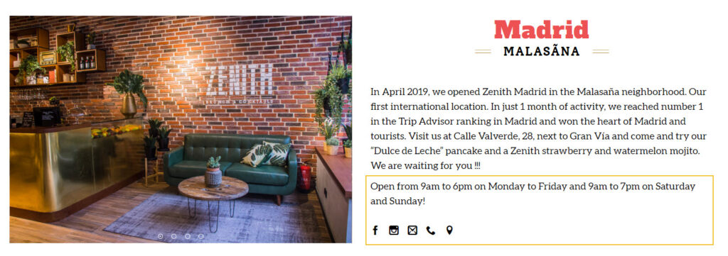
- Zenith Caffe – brunch and cocktails chain in Spain and Portugal
Zenith Caffe has 4 locations across Barcelona, Madrid, Porto, and Lisbon. It seems that Tripadvisor nominated Zenith as being one of the most instagrammable restaurants in the world.
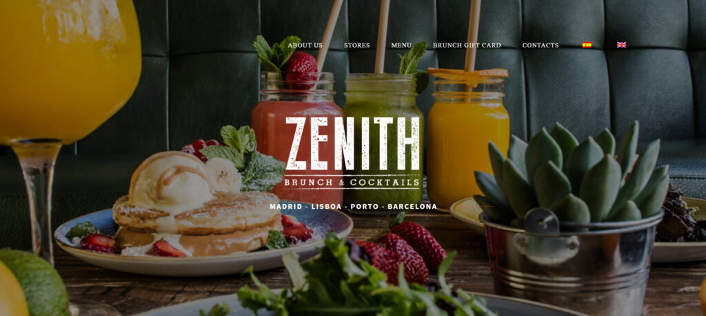
Here’s what we like about the website:
- It uses the parallax effect, giving the whole design a boost.
- All four locations are clearly represented on the homepage, with their own contact details, program, and social media profiles.
- The restaurant’s reviews manage to depict a great reputation for Zenith.
- This is another website that proves the one-page layouts can do the trick, as long as you have a navigation bar that can help minimize scrolling and direct readers to specific sections on the page.
- The website has both an English and Spanish version.
To find the perfect cafe theme for your website, check out our guide: the top 10 coffee themes to try.
The do’s and don’ts of restaurant website design
Now, let’s recap a bit and take a look at some best case practices when it comes to restaurant website design:
- Make contact details and reservation info clear and easy to find.
- Make your site easy to navigate. The website’s navigation bar should be clear and should lead to the most important parts of the site: booking info, gallery, menus, contact details and program.
- Add your story. How was the restaurant born? What’s the concept and how did it start? Is there something interesting to say about the dishes and their ingredients? This will help your potential customers connect better with you. Maybe you share common beliefs. The folks at Punkt or Amass can serve as inspiration.
- Don’t hide your restaurant’s menu! Ideally, you should accompany the names of dishes with proper images. Don’t use a PDF for your menu. PDFs don’t create a good user experience on mobile. Users will need to zoom in and out, and it will be awful.
- If you allow private events, make this info clear and easy to find.
- Don’t underestimate the font and color choices.
- Add reviews and testimonials to your website.
- Use powerful visuals (images and videos) to show off your food and the atmosphere inside the restaurant. Go with real pictures, not stock photos.
- Make your special offers stand out on the homepage.
- If your restaurant is often fully booked, try to use a booking system.
- Make sure your website is mobile responsive. Mobile traffic has surpassed desktop traffic. And in certain niches, the difference is huge. And when it comes to tourists, they are definitely browsing restaurant websites via their mobile.
- Place the social media profile icons in a visible place. Your website may help you gain more followers. You can also integrate your site with Instagram and Facebook.
Restaurant website design: a 30 minutes tutorial
From the technical perspective, here’s what you will need to jumpstart with the restaurant website design: buy the domain name, choose a hosting provider (we recommend Bluehost), then pick a web design platform such as WordPress, Wix, Webflow, etc.
Now, WordPress is the market leader, powering more than 40% of the websites worldwide and this kinda says it all. No matter the platform you use, you will be able to design on top of a predefined template (aka demo site, or starter site), or just start from scratch.
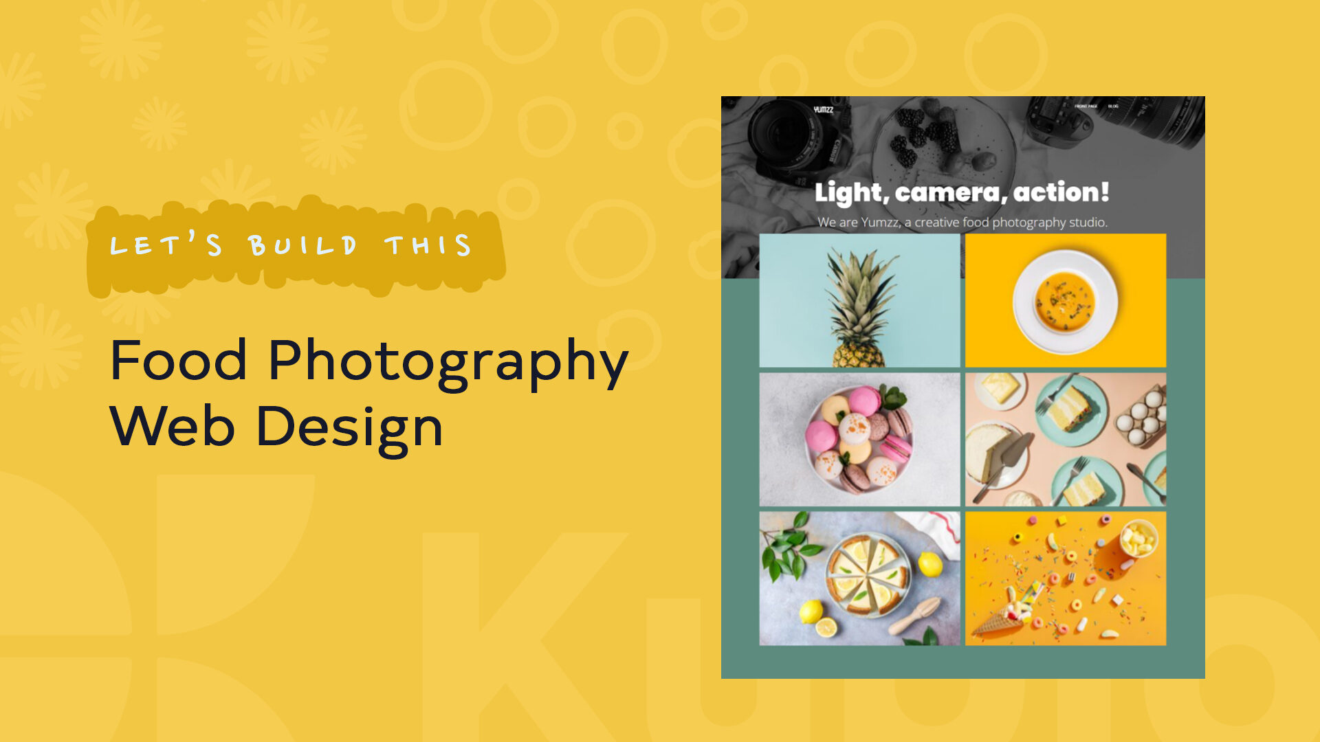
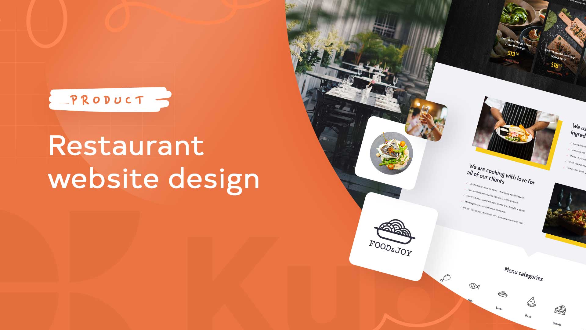
For example, here’s the Kubio builder restaurant website template:
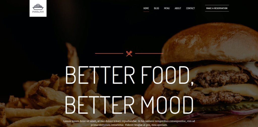
Here’s the whole preview.
You can see all the Kubio starter sites here. There are two restaurant website designs available. You can hover over any of them, then click on the TRY ONLINE option and start making edits to the template using the Kubio page builder. Kubio is a WordPres page builder that allows you to create a site by drag and drop using content blocks. All in a clear and intuitive interface, without the need of any prior knowledge of web design or coding.
In WordPress there are two main ways for creating a website:
- Use a WordPress theme
- Use a page builder (such as Kubio). This is the option that gives you more design freedom.
Now, in this exercise I’m going to work inside WordPress, specifically with the Kubio builder. But, most of the know-how you’ll gain from here can be replicated across other web design tools. Once you know how to work inside a tool, the learning curve will be shorter when it comes to working with another one, because you already know the basics.
There are four main steps here:
- Start from a ready-made restaurant website,
- Make copy and image changes. You can easily delete the existing texts and add your own content instead. Just place your cursor on some text and start deleting or writing.
- Add new elements on the site (blocks and sections),
- Style the elements however you want.
Sounds like a plan?
Drum rolls, please!
Let’s start!
Meet the WordPress dashboard
After acquiring a hosting plan, you will need to install WordPress. The process differs from among hosting providers, but it should be straightforward.
When this is done, you will see an interface looking like this:
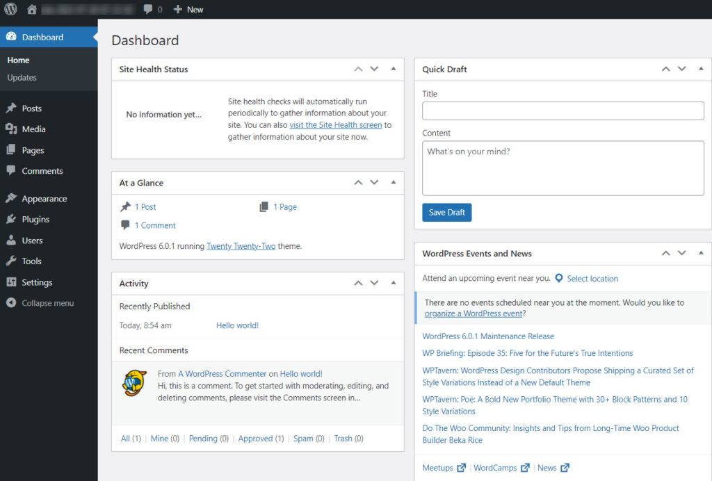
If you look at the menu on the left you will see several options. I’m going to describe some of them briefly below.
- Appearance -> Themes. You will come here to install a WordPress theme. I mentioned a bit earlier that you can use a theme or a builder when creating a site. There’s also a third way: combining the two. A theme will dictate the overall layout and look of your site. Every WordPress site technically needs to have a theme installed and activated, but this doesn’t mean you need to use your theme’s design. If you use a builder such as Kubio, you can replace the theme’s layout with custom designs. Page builders give you more freedom over design, than themes, everything in a drag and drop visual interface.
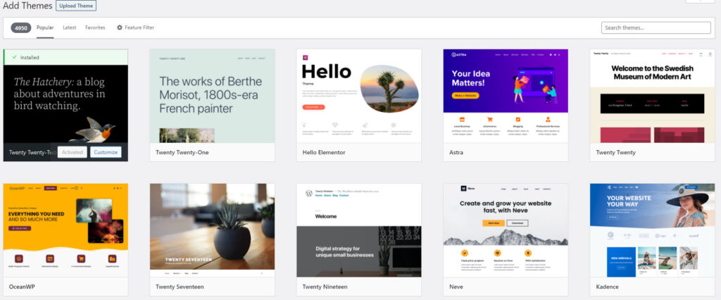
When you use WordPress for the first time, you will notice that a default theme is already activated: Twenty Twenty Two. We’ll keep it for now.
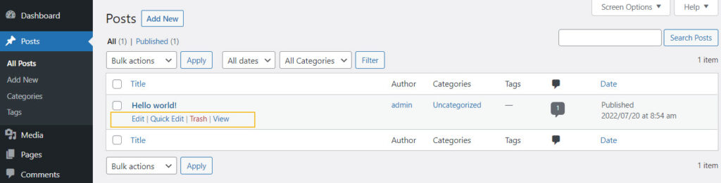
- Posts and Pages in WordPress
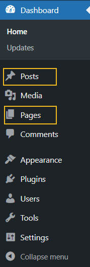
Pages and posts have different functionalities in website design. Pages are used for static content, whereas posts are for more timely content that can get regular updates. For your restaurant website design here are some page ideas: homepage, menu, gallery, contact us page, etc.
Use the “Add new” button inside “Posts” or “Pages” to add a new post or page.
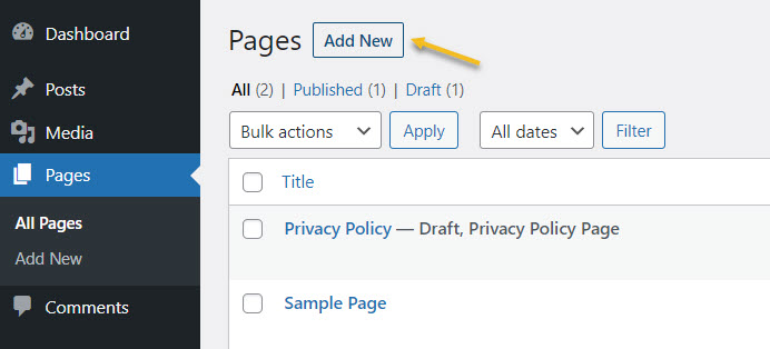
You can always come back here to make edits to previously created pages, as well as to delete them. Just hover over the name of a page or post, to unveil the edit and delete (trash) options.
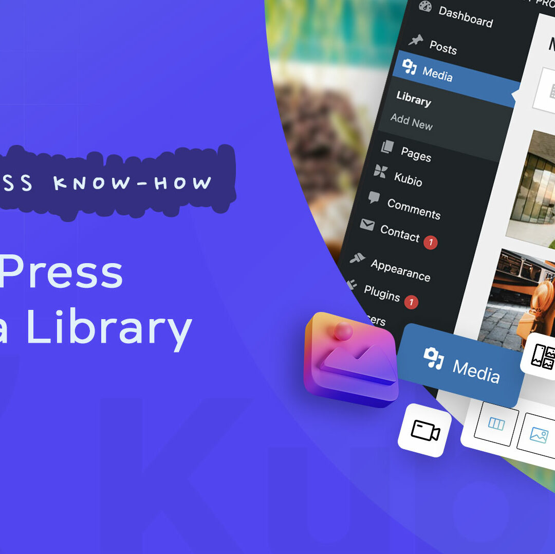
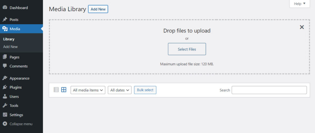
- Media – here you will upload the media you will use inside pages and posts. You could have images with dishes, videos with people enjoying a meal at your restaurant, the menu in pdf version, etc. Use the “Add New” button to add new media items to the library.
- Plugins – here you will add new functionalities to your site. Maybe you need a contact form, or a table booking system, or some takeaway functionalities, etc. This is where you will find them.
In this case I am going to install the Kubio page builder. Now, what’s the difference between a WordPress theme and a WordPress page builder?
WordPress themes and their features vary from one to another. They can have free plans and paid one, with distinct features inside. Now, in general, here are some basic elements that you can customize with most themes out there:
- Text and visuals,
- Color scheme,
- Typography,
- Layout,
- Menus.
Now, some features are pre-built, and you can’t make changes without any coding knowledge. This means that themes don’t allow much flexibility. You can get locked inside.
This is where page builders come in handy. Most page builders work by drag and drop giving you complete freedom over the website design. A WordPress page builder goes beyond a WordPress theme, and it’s the best option if you really want to create a beautifully-designed website.
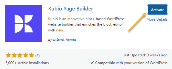
For this particular exercise I’m going to go with Kubio builder. Let’s install it.
- Let’s head to Plugins -> Add New.
- Type “Kubio” in the search bar on the right-hand side of the dashboard.
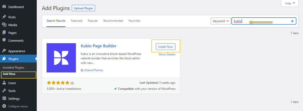
- Go to the Kubio Page Builder card and click on “Install now”
- Activate the plugin.
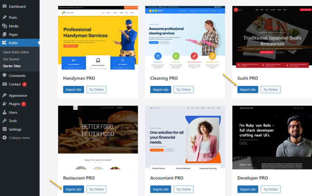
Kubio is a free builder, but there are some features and website templates (or starter sites) that are included in the paid plan. The restaurant starter sites are PRO, because they use some PRO elements (sliders, carousels, etc). But don’t panic! I’m using it as an example to show you the capabilities of Kubio. You can easily replicate most of the sections in these starter sites on your own to create a restaurant website, with the free plan as well.
Now, the moment you activate Kubio, you will notice that a Kubio menu will show up inside the menu on the left hand side of the WordPress dashboard.
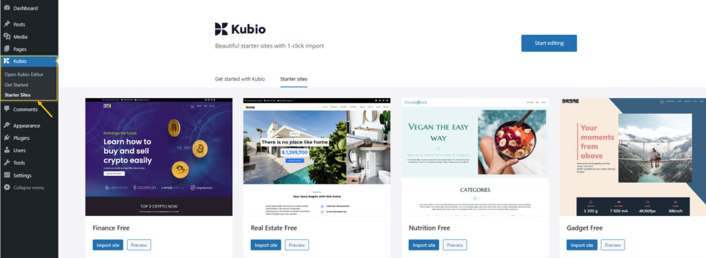
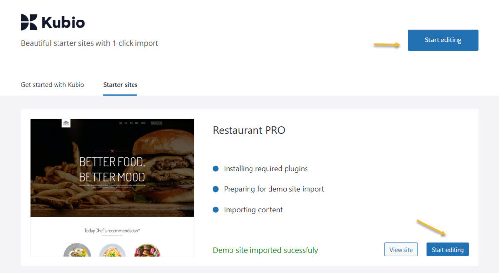
I’ll just go to the restaurant starter site then click on the “Import site” button.
Next, click on “Start Editing”.
Here’s how the homepage looks like inside the Kubio Editor:
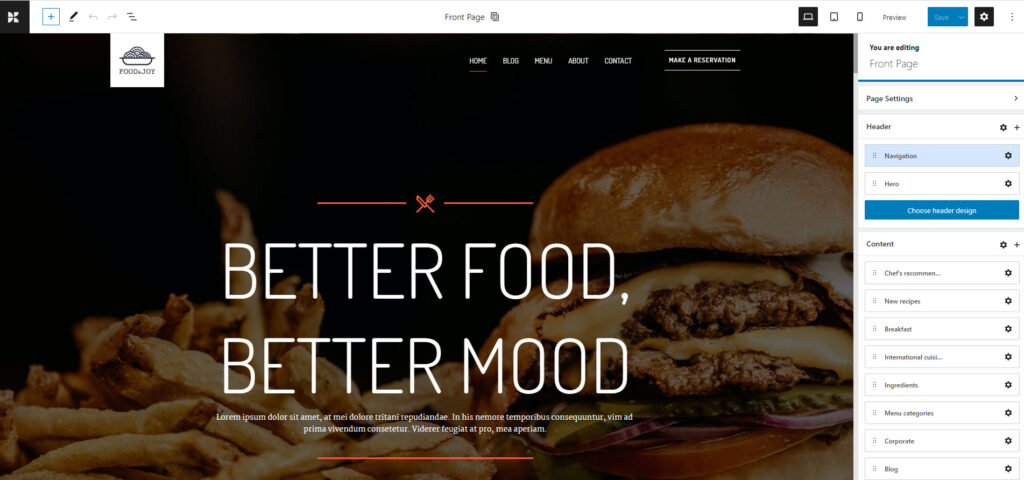
Block-based design in WordPress
The WordPress design experience began to change back in 2018. Now, everything in WordPress is a block: from paragraphs and images, to tabs and carousels. There’s also a recipe block developed by WPZoom. This would work perfectly for food blogs.
So, each block serves a purpose and can be edited separately. In the Block Editor you just drag and drop such blocks onto the website canvas, then start to style them.
In order to add a block go to the “+” sign in the upper left corner of the interface.
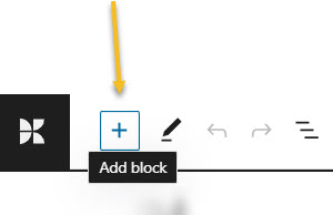
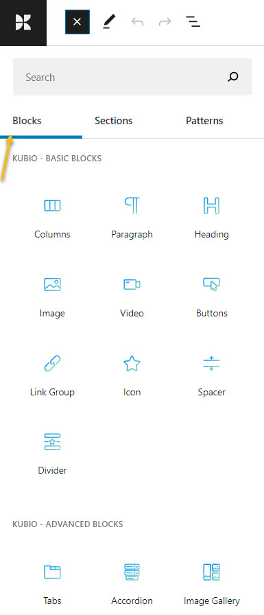
This will open up a block inserter. There are some default WordPress blocks inside with black icons. If you use Kubio builder you will notice some extra blocks as well, with blue-green icons. The Kubio blocks are shown first.
You can easily drag and drop them onto the canvas then style them the way you see fit.
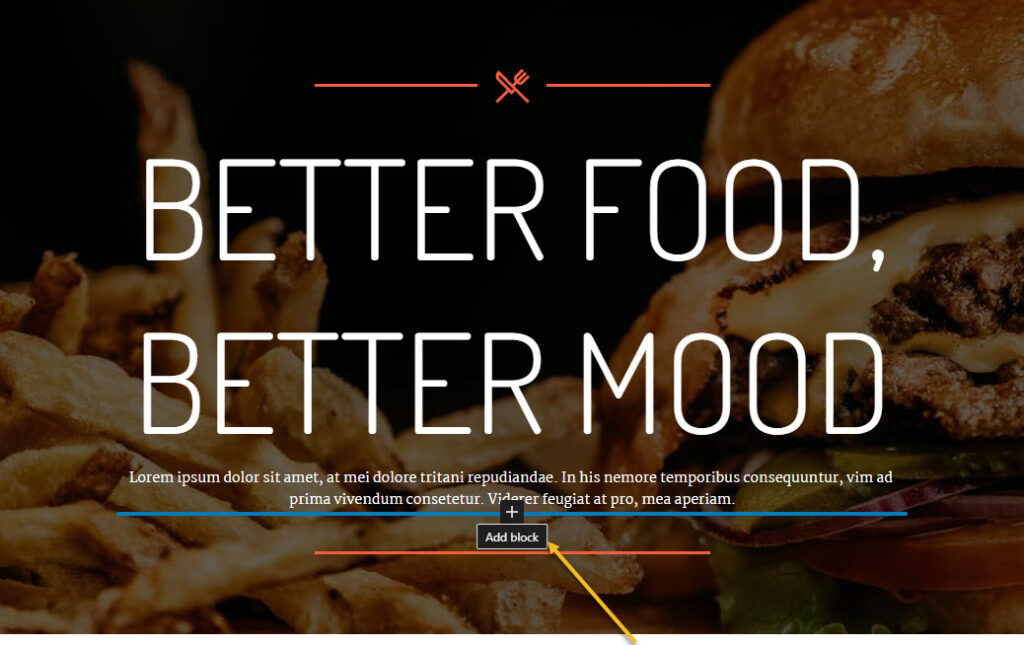
You can locate the “+” sign inside the canvas as well. Just hover between various elements on the site to uncover them. I’ll show you in the next subchapter how this is done.
Now, it’s important that you use only Kubio blocks, because they will have advanced editing options available.
How to customize WordPress blocks
Now, let’s play a bit.
Before proceeding, please watch this short video on the basics of Kubio: how to make work with text and images.
- Adding a block to a page
Now, let’s go and add a button between the paragraph and divider, as shown below.
Like I said before, let’s hover near the heading until we uncover a “+” sign, in order to open up the block inserter.
Then, let’s look for the Kubio buttons block (the one in a blue-green shade) and click on it.
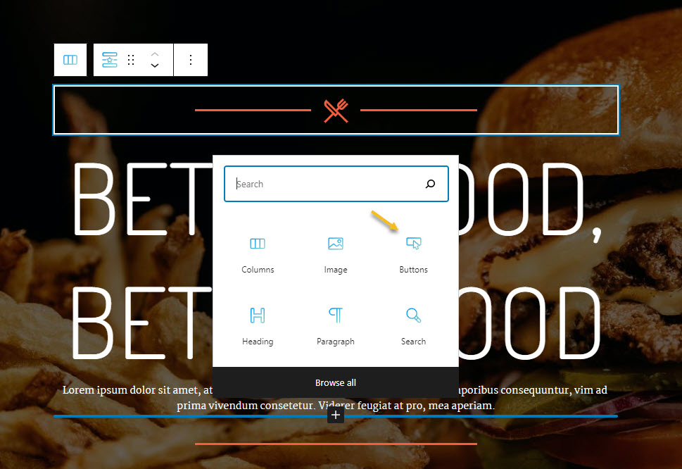
Here’s the result:
The added block has a style matching the existing color palette and that’s great.
The text can be changed straight from the button. I’m gonna delete the existing text and type “Book a table”.
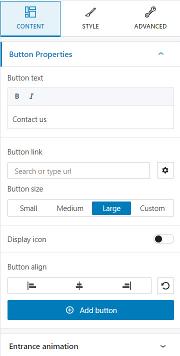
- Customizing a block inside the editing panel
Now, let’s see how we can style further the button we’ve just added.
When you select the button, you will see a toolbar on top of it, with several basic editing options: positioning, insert before, insert after, duplicate, copy style, paste style, paste style and link, lock, and remove block. The copy and paste styling options are available with the PRO plans.
Now, the block editing panel has three sections: Content, Style, and Advanced. This is true no matter the block you are editing. Most of the blocks share the same editing options inside “Advanced”: background, spacing, typography, borders and shadows. This is why the moment you customize a block, you’ll know how to edit the second one.
Now, let’s roll up our sleeves and play a bit with the editing options. We will be making changes to color, typography and spacing.
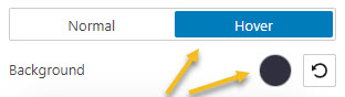
- How to change the background color of a button or any other block
This can be done inside Style -> Background or Advanced – Background.
Let’s go with the first option. Click on the colored circle next to the background option to choose another color.
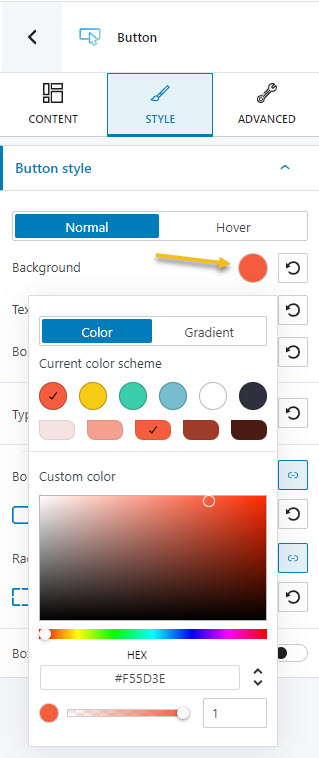
A panel will open up that allows you to pick a color from the current color scheme or gradient from a color, pick a color from a slider, or just type in a desired color code in the “HEX” field. You can also switch to the RGB color mode if it suits you better from the dropdown arrow.
You can also adjust the opacity of your color. The slider offers you values from 0 to 1, 1, meaning there’s no transparency.
I’m gonna go with a darker shade of orange. I can even select a different color for the background when the button gets hovered.
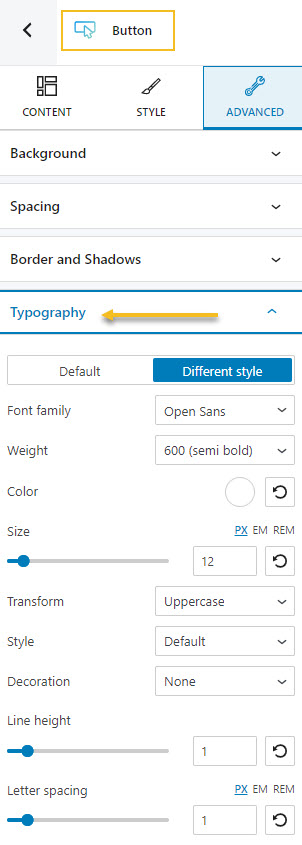
- How to make typography changes
This time we’ll go to Advanced -> Typography. Here you can customize the following:
- Font Family. Tons of Google fonts are available for you to choose from. You can even host them locally. When this option is turned on the Google Fonts used in your site will be downloaded and served from your server instead of the Google server. This will minimize the DNS requests, and serve your Google Fonts in a 100% GDPR compliant way.
If you have a PRO plan you can retrieve Adobe Fonts using an API token. Now, if scrolling isn’t your thing, and you already know the font you want to use, you can type its name in the search box.
- Font Color.
- Font Weight. This refers to the relative thickness of a font’s stroke. In this case, 300 is the thinnest font-weight, while 800 is the thickest one.
- Font Size. You can use the slider to make the font size smaller or higher. You can use PX, EM, and REM for font sizes.
- Transform. This option allows you to make letter capitalization changes.
- Style. This is where you can make your font italic or bold.
- Decoration. Here you can add underlines, overlines, or line throughs.
- Line height. This is where you can control the amount of space between baselines in a block of text. A text’s line height is proportional to its type size. In this case, the default is 1.6x the actual font size. You can decrease it or increase it if you want. Just make sure that your text doesn’t look too crowded or too loose.
- Line height. This is commonly used to set the distance between lines of text.
- Letter spacing. This refers to the space between letters in a piece of text. In the case of headlines, to improve readability, it is advised to use tighter letter-spacing. For smaller type sizes, looser letter spacing can improve readability.
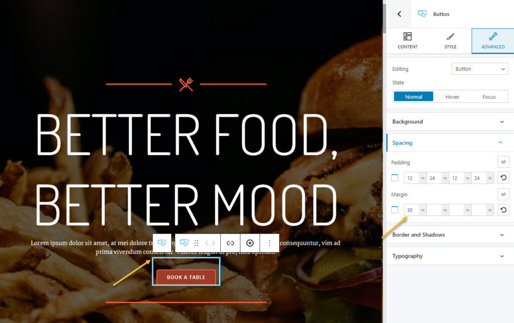
- How to manage spacing
Spacing is also managed inside the Advanced options. The feature is called “Spacing”.
Now, there are two concepts here we need to be aware of: margins and paddings. Paddings control the space inside an element, while the margins control the area outside a component.
You can set up the same padding or margin for top, bottom, left, and right in pixels (PX), or you can assign different values if you select the link symbol.
Now, our button is way too close to the paragraph above it.
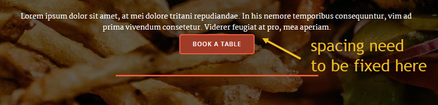
This can be fixed by setting a top-margin of 30px.
- Working with media
As I said a bit earlier, everything is a block inside the latest WordPress experience. Images or videos are also blocks.
Now, all the images, videos, and other files reside in the Media Library. I mentioned it earlier when I presented theWordPress Dashboard. You can easily upload your media here, straight from the admin area. But you can do this as well from a page or post as well.
So, let’s go ahead and add the image block.
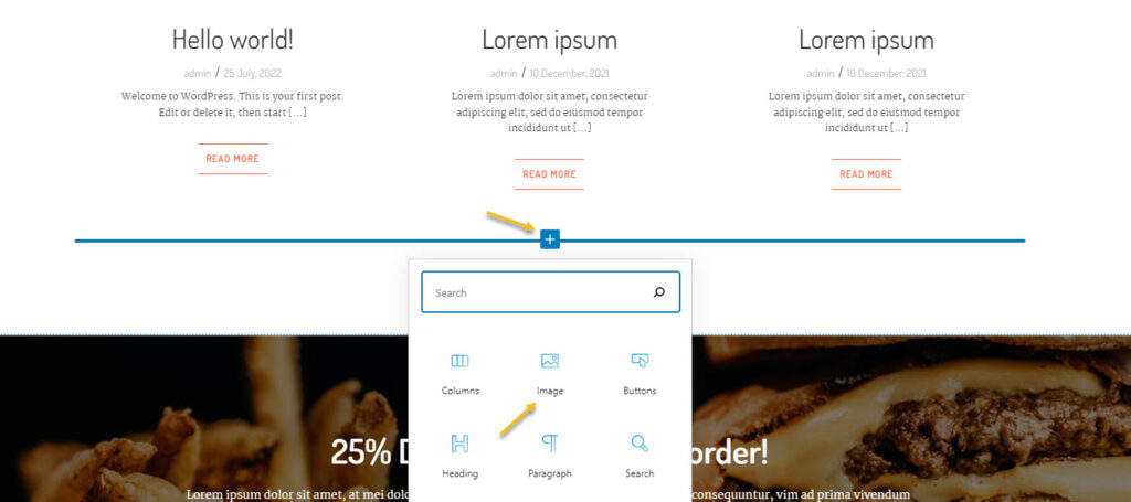
Next, you can upload the file you want. It will show up in your Media Library after the upload and pick it from there. Or you can choose an existing image from the Library or paste an URL. I’m going to paste a URL from Unsplash.
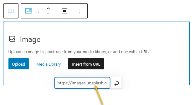
Now, be careful with this. Ideally you should host your own assets.
Next, you can style the image in the block editing panel on the right hand side.
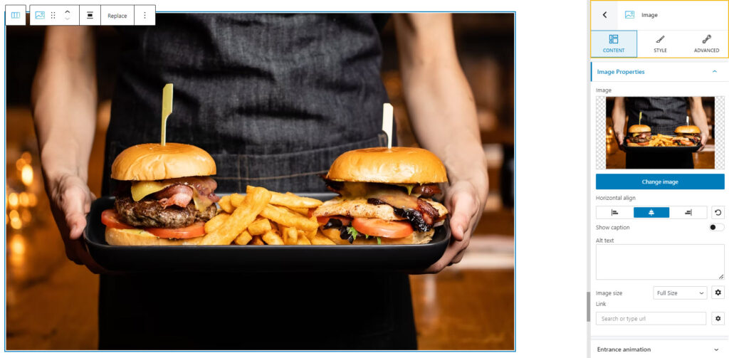
You can use the “change image” feature inside the “Content” option from the block editing panel, if you want to replace it. It will open up the Media Library. You can pick a different image, or upload another one.
- Adding new sections to a page
Every web page in Kubio is made up of sections that can be split into columns. In addition, you can add blocks to your sections and columns. Sections can be edited like any other block, inside the block editing panel. There’s one tiny change there, there’s “Layout” instead of “Content”.
There are 2 main ways for adding sections to a page or post using Kubio. After adding a section, the editing and styling options are the same.
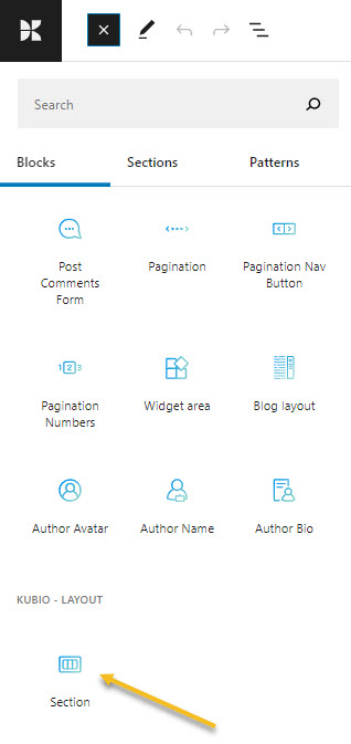
- You can add sections as blocks, from the block inserter. Just open up the block inserter using the “+” sign in the upper-left, and look for “Section”. Now, drag the section block to your page.
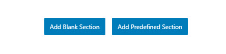
- Go to the bottom of the page, and click on the “Add blank section” button.
When the section gets added to the page, you will be asked to select a type of layout.
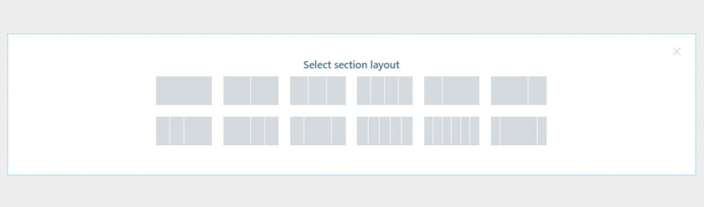
Click on the one that matches your vision for the section. I’m gonna choose a layout with 3 columns with unequal widths. Now, I’m using the “+” signs to add blocks to the columns. I’m adding a search block, a button, and a logo. Notice how each block adapted to the current color scheme?
You can make any content and styling change you want to these three new blocks.
Now, did you notice there was another button next to the one saying “Add blank section”? It said “Add predesigned section”. This is a great Kubio feature! With Kubio you have access to predesigned website sections that can serve various purposes: from team sections to features. They are fully customizable.
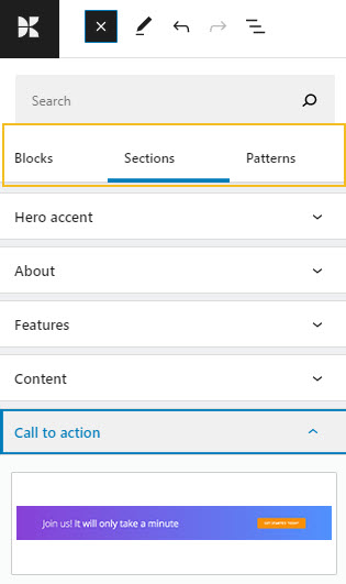
When you click on the “Add predesigned section” button you will open up the block inserter on the left-hand side, at the “Sections” level. Click on a section to add it to the page, then use the toolbar to move it wherever you want.
You can now replace the text and add your visuals. You do not reinvent the wheel with Kubio. This way you can save time and focus on what’s more important: finding the right visuals, preparing the copy, etc.
These sections are made of blocks. You can edit them separately in the block editing panel.
Here’s an example of an “Testimonials” website section. It has a carousel, headings, paragraphs, social icons, and images. All of the elements can be edited separately.

The moment you add it to the page, it will adjust to the current color scheme. Isn’t that great?
And that’s about it. You are now ready for your own restaurant website design.
If you liked this article, and want to have access to similar content, make sure to subscribe to our YouTube Channel. You can also follow us on Facebook. If you want to find out how to customize your WordPress site, here‘s a great resource we’ve compiled to help you out.