
Website design can have its particularities across various niches, from education and B2B to online stores.
This is why we wrote about gym website design, SaaS website design, school website design, and today we’re diving into wellness website design. More similar topics are in progress as well.
These websites might have some special requirements, from special galleries, members access, booking options, and more. So, it’s time to take a look at what makes wellness website design special.
So, here’s the plan for today:
Wellness web design: time to get inspired from these 8 fabulous websites
If you have your own health or wellness business it’s very important to have a professional looking website. If your site looks sloppy and has poor visuals and hierarchy, bad copy, or inaccurate information, your website visitors will assume your business is run the same way.
Luckily, there’s so much inspiration out there. We’ve made a shortlist for you, so that you won’t need to go down the rabbit hole.
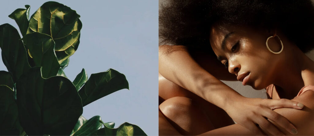
Wellness refers to nourishing a healthy body through exercise, nutrition, sleep, meditation, good habits, and more. And because wellness is multidimensional, these sites are pretty different. There’s one big thing they must have in common: with the help of copy and visuals, they need to create a safe space.
So, here we go: 8 fabulous wellness websites that can inspire yours.
- Headspace: stunning website design with bulletproof copy
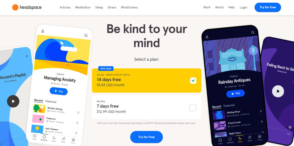
Headspace is the leading meditation app on the market today. People go to the Headspace site to find confort, self-care advice, sleep and anxiety help, and so much more.
Here’s what we like about Headspace’s web design:
- Joyful color scheme and cartoonish visuals that induce calm and create a multidimensional feel (just like the mind, right?).
- The website’s content was created to offer answers to the visitors’ most burning questions:
- How can I relieve my anxiety?
- How can I focus better?
- How can I improve my sleep?
- How can I get more energetic?
It’s important to know your audience and its struggles. This is easier said than done, we know. But once you nail this, you will need to create the content that resonates with the audience. This way you will prove your knowledge, you will build trust and long-lasting relationships.
- Clear website navigation. There are four main website categories: Meditation, Sleep, Stress, and Mindfulness. These cover a lot of subtopics that manage to position Headspace as a true mindfulness educator.
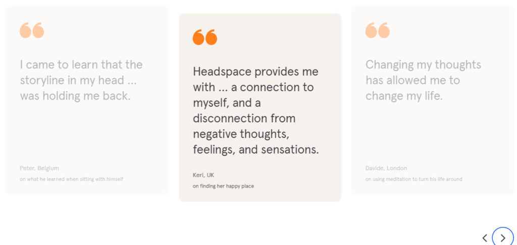
- Product testimonials. The selected testimonials reveal the sensations, the calm, and the change Headspace is bringing to people’s lives. They are really convincing and prove that the Headspace way works.
- Wellness journey – clean and minimalist wellness and lifestyle website
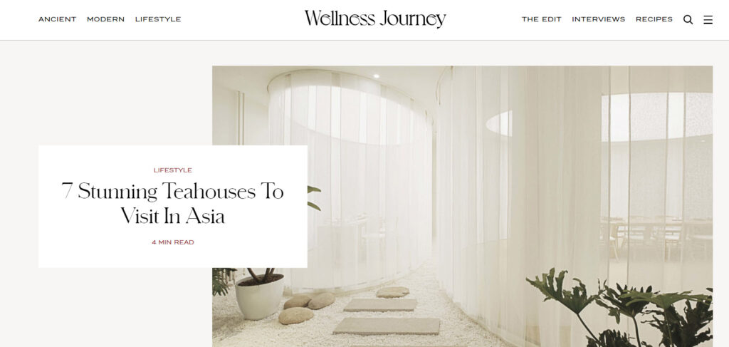
Wellness journey is a website that explores ancient and modern wellness modalities, through masterclass courses, interviews, and a podcast. Their guests are leading health and wellness experts.
What we like about the website:
- The color scheme and font choice. They mix together creating an atmospheric design.
- The choice of visuals that complements the color scheme nicely.
- Clear navigation. It is structured like this: ancient, modern, lifestyle, the edit, interviews, and recipes. All cleal, right?
- The blog posts are nicely structured. There’s a left sidebar with the title, post category, time to read, and social media icons. The sidebar on the right sidebar has other related blog articles. When the current article ends, you will notice another article starting. It’s exactly the next one from the list in the right sidebar.
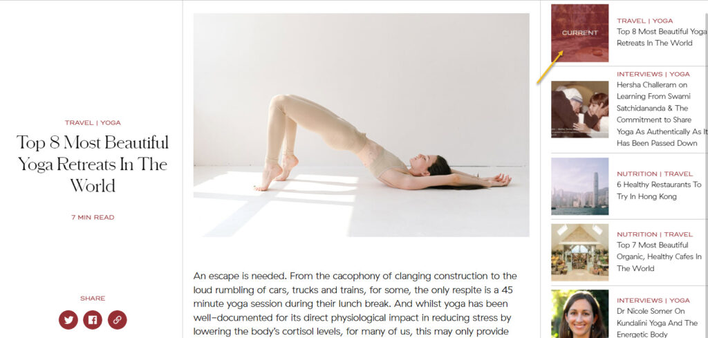
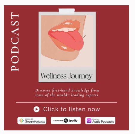
Each article ends with a banner inviting people to listen to the Wellness journey podcast.
Now, here’s what’s missing from the site: information on masterclasses.
They have a top bar announcing that they have some masterclasses available. But they can’t be found anywhere. You will need to subscribe in order to access the information. Now, there’s nothing clickable in the bar, pointing you to a subscription page. You’ll need to discover it on your own.
This is clearly a no-no both in copy and web design.

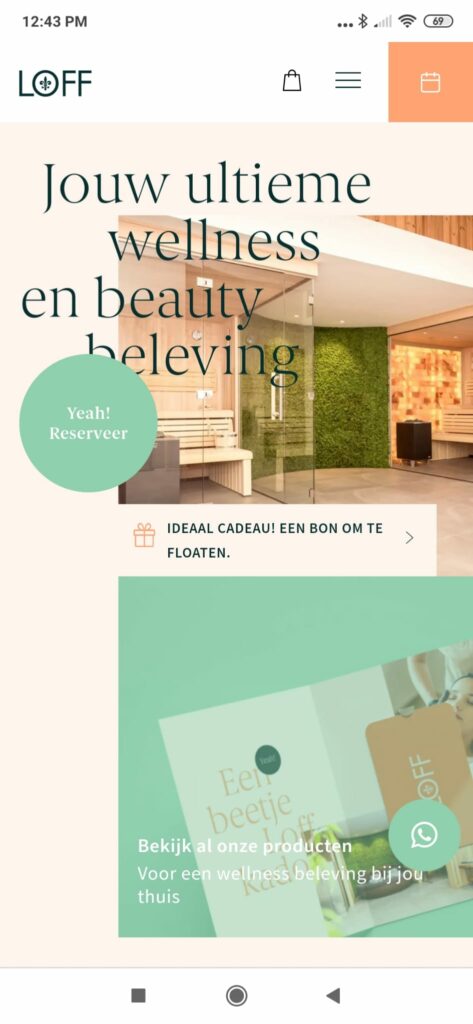
- Loff Wellness – playful web design
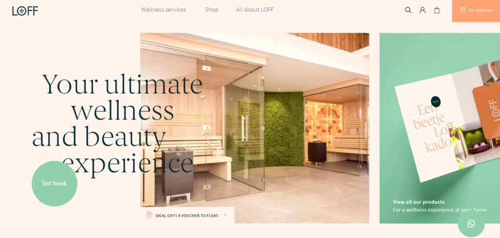
Loff is a digital platform focused on creating luxurious and playful wellness experiences. They sell both products and wellness experiences in two locations in Assen (The Netherlands).
What we like about the website’s design:
- The choice of colors and fonts. They are flat, relaxing, and playful. They really create the much needed safe space.
- Clear website navigation. They have a menu that focuses on services, products, and other Loff information.
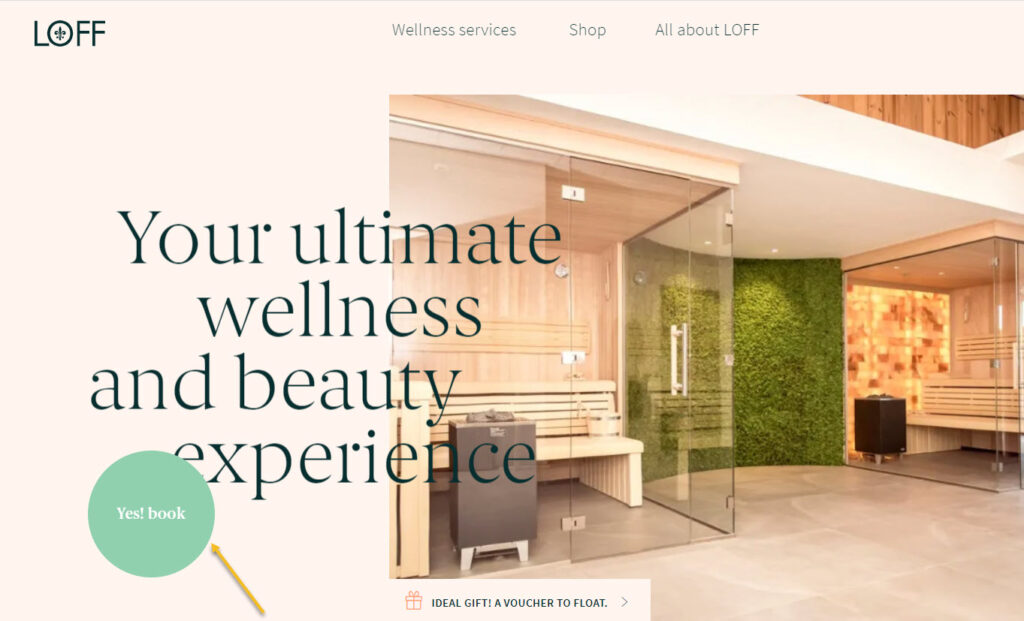
- The call to action is clear: book an experience. There’s a secondary call to action urging you to buy a gift card.
This is the Google translated website version
- The visuals are clean and complement the choice of colors nicely.
- The layout is just clean and breathable. There’s a great use of white space.
- Testimonials aren’t missing from the homepage. They provide the social proof a website visitor might need.
- The website looks swell on mobile devices.
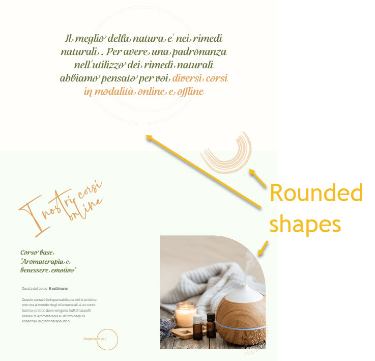
- Olivia Health Academy Italy – keeping design simple
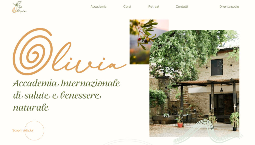
Olivia is an Italian International Academy of health and natural wellness. Let’s see what we like about its website:
- Simple website with few pages. Who said you need to have a complex site, with lots of pages? If your business isn’t too complex, you can definitely keep your website design short and sweet.
- The academy has several courses available. Each course has its own dedicated page. What I feel it’s missing it’s adding those courses to a dropdown menu, here:

It would definitely help with website navigation.
Their courses can be found in the footer as well. That’s good.
- The choice of colors is a beautiful one. The olive green color represents peace, empathy, and harmony. When combined with dusty orange it creates a sense of balance and elegance.
- The use of rounded shapes. We’ve seen them in the case of Headspace as well. Rounded shapes tend to create a feeling of community, hence ‘circle of friends’ or ‘social circle’. Circles can also indicate protection, like being inside a safe bubble. Even the chosen font is rounded.
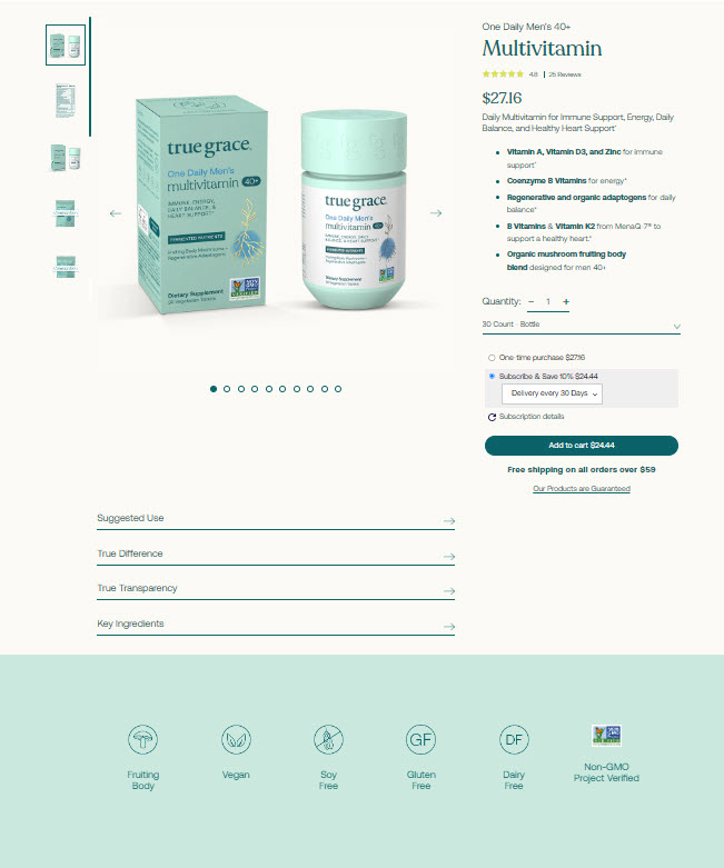
- True grace – organic supplements online store
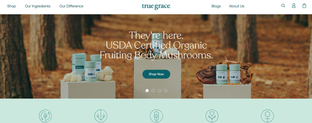
True Grace is an online store that sells nutrient-dense supplements, including men and women’s probiotics, multivitamins, and omega-3 oils.
Let’s take a look a bit at its design:
- You’ve probably noticed by now that green is a color often associated with wellness. It’s the case of True Grace as well. And it makes sense, green is universally associated with nature, also symbolizing growth and renewal.
- The lovely minimalist illustrations complement beautifully the color choice.

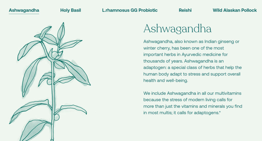
- The Recoleta font looks great among the illustrations and the green shades. And guess what? This font has rounded shapes.
- Storytelling. The way the ingredients are presented, the founder’s story, it all paints a picture that we can all relate to and empathize with. Stories are powerful, and can help create attachments with brands.
- Good looking product pages and optimized for higher conversions. They pages have:
- Clear product description,
- Beautiful visuals,
- Product reviews,
- User-generated content,
- Usage suggestions,
- Section with the tests they use for their products,
- Other product recommendations,
- The possibility for customers to refill their bottles, thus saving plastic.
- Soma Byron Bay – yoga retreat website
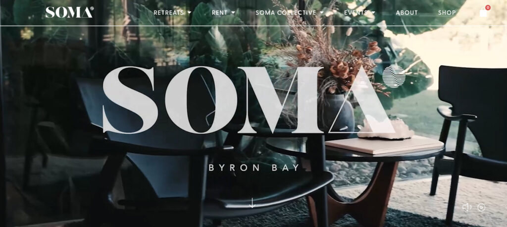
Soma is an immerise retreat space run by Gary Gorrow (Vedic Meditation practitioner, Ayurvedic health coach, and mindfulness expert) and Peter Ostick (entrepreneur and mindfulness expert).
Let’s see what caught our eyes in terms Soma’s website design:
- The use of powerful videos to let website visitors get a glimpse of the retreat experience.
- Large visuals (images and videos) that create a feeling of immersiveness.
- The use of powerful words in copywriting – meant to make visitors want to engage and…but the services.
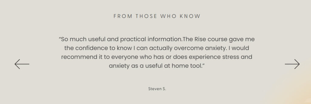
- The testimonials section is used to prove the value people get at the retreats or other events organized by Soma.
- The site is built in WordPress 😀
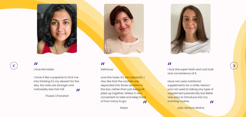
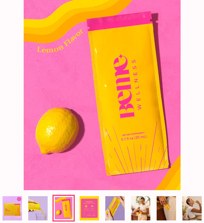
- BeMe Wellness – skin supplements website
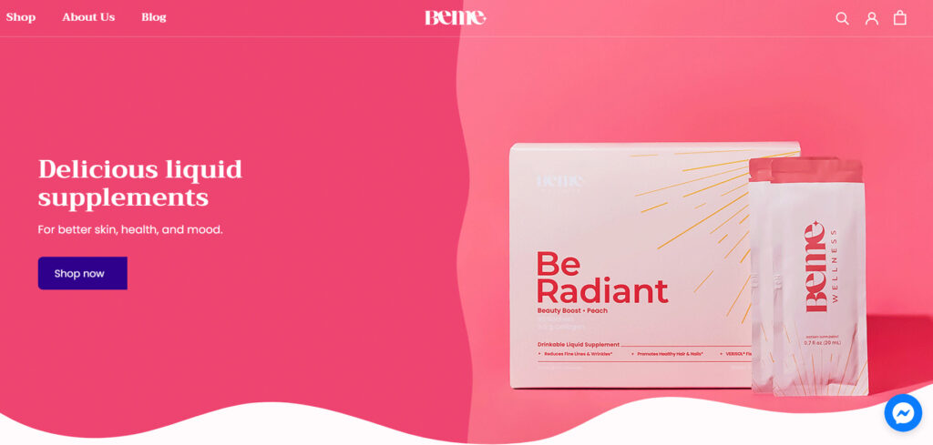
BeMe is an online store selling liquid supplements for better skin, health, and mood.
Here’s what we like about the website design:
- The color scheme matches the products names: radiant and strong. It uses the three primary colors: red, blue, and yellow.
- Strong homepage hero images.
- The products reviews are accompanied by photos and names of real people, thus being more convincing.
- Radiant product images that manage to incentivize website visitors into buying.
- They have integrated Facebook Messenger into the website so that you can get in touch with them easily.
- Cure Nails – interactive design and beautiful imagery
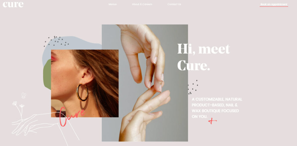
Cure is a nail and wax boutique that is creating its own natural and organic skincare products.
Here’s what we like about the Cure Nails website design:
- The use of delightful and large images.
- A calming color scheme.
- Lovely font pairing.
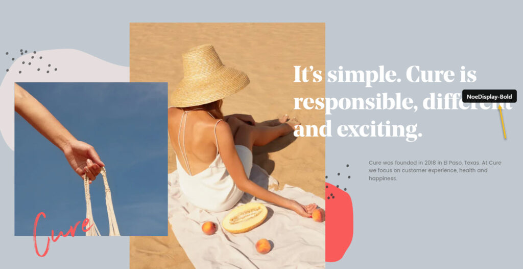
- Tiny shapes and illustrations that contribute to website cohesion.
- Interactive design elements that create a sense of immersion.
Best case practices for wellness website design
Now that we’ve analyzed the website design of 8 wellness websites, let’s wrap up a bit the good practices to follow when it comes to wellness website design:
- Choose a color scheme that works well with the chosen font and visuals (images, videos, illustrations). Keep in mind that pale green and blue are the colors that can make you think of nature, balance. Strong and radiant colors can be used as well, when you want to create a vibrant and powerful website.
- Have a clear website menu that allows visitors to easily find your services or products.
- Use testimonials or product reviews to appear trustworthy.
- Make contact information clear. A live chat option would be great as well.
- Make use of white space. Wellness is about balance. White space can help with balance on a site.
- Make use of storytelling. People react to them and they help form connections.
- Use rounded shapes, and fonts, if you can. Rounded shapes can create that safe space, that “inner circle”.
Wellness website design: a 30 minutes tutorial
Now, from the technical perspective, here’s what you will need to jumpstart with the wellness website design:
- Buy the domain name,
- Choose a hosting provider,
- Pick a web design platform such as WordPress, Wix, Webflow, etc.
Now, WordPress is the market leader, powering more than 40% of the websites worldwide and this kinda says it all.
No matter the platform you use, you will be able to design on top of a predefined template (aka demo sites, starter site), or just start from scratch.
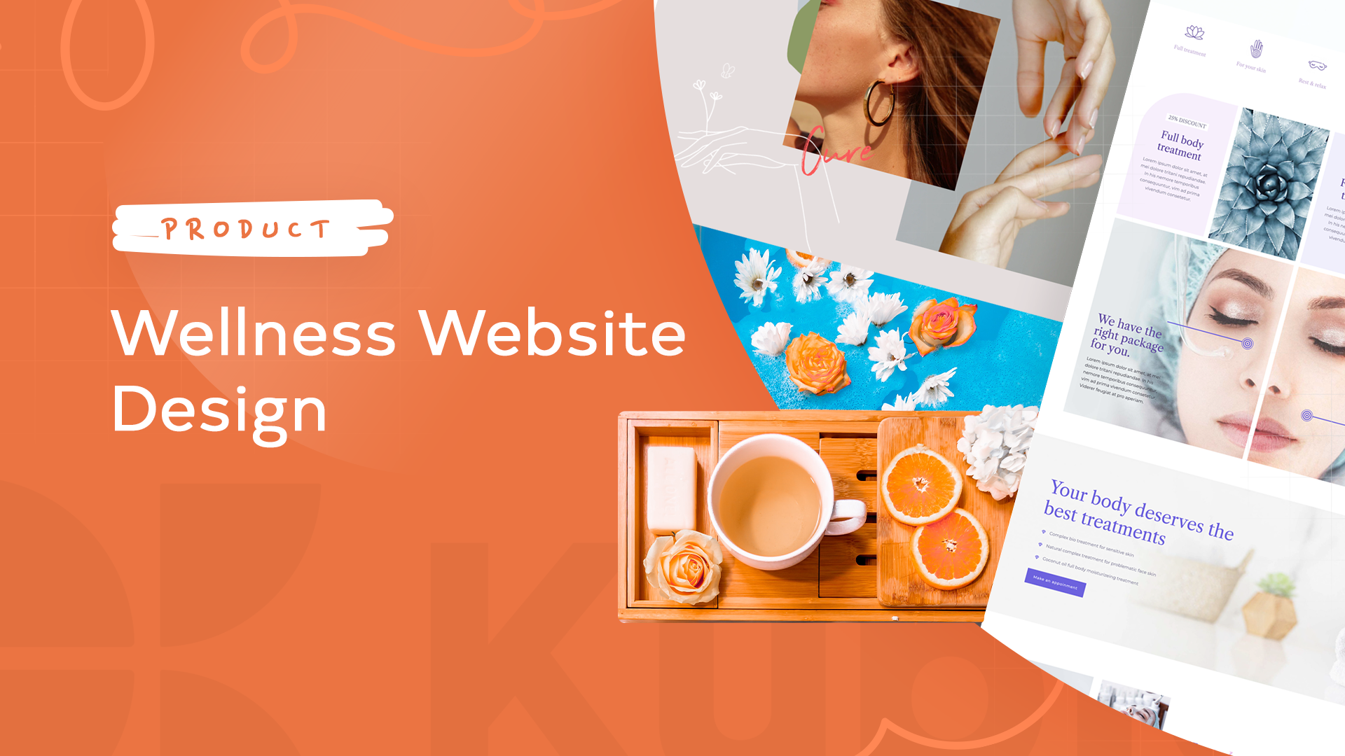
For example, here’s the Kubio builder wellness website template:
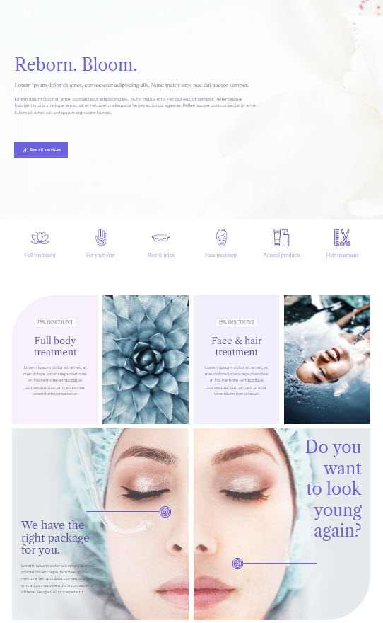
Here’s the whole preview.
You can even go here, hover over the starter site, then click on the TRY ONLINE option and start making edits to the template using the Kubio page builder. Kubio is a WordPres page builder that allows you to create a site by drag and drop using content blocks. All in a clear and intuitive interface, without the need of any prior knowledge of web design or coding.
Now, in this exercise I’m going to work inside WordPress, specifically with the Kubio builder. But, most of the know-how you’ll gain from here can be replicated across other web design tools. Once you know how to work inside a tool, the learning curve will be shorter when it comes to working with another one, because you already know the basics.
So, let’s roll.
Meet the WordPress dashboard
After buying a domain name and acquiring a hosting plan, you will need to install WordPress. The process differs from among hosting providers, but it should be straightforward.
When this is done, you will see an interface looking like this:
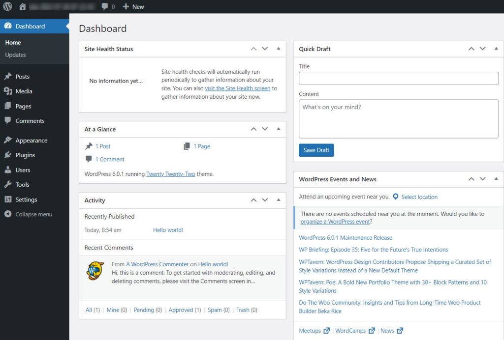
If you look at the menu on the left you will see several options. I’m going to describe some of them briefly below.
- Appearance -> Themes. You will come here to install a WordPress theme. A theme will dictate the overall layout and look of your site. Every WordPress site technically needs to have a theme installed and activated, but this doesn’t mean you need to use your theme’s design. If you use a builder such as Kubio, you can replace the theme’s layout with custom designs. Page builders give you more freedom over design, than themes, everything in a drag and drop visual interface.
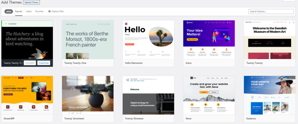
When you use WordPress for the first time, you will notice that a default theme is already activated: Twenty Twenty Two. We’ll keep it for now.
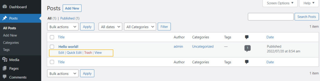
- Posts and Pages in WordPress
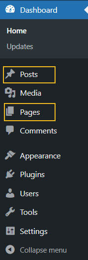
Pages and posts have different functionalities in website design. Pages are used for static content, whereas posts are for more timely content that can get regular updates. For your wellness website design here are some page ideas: homepage, contact us page, about us page, services page, etc.
Use the “Add new” button inside “Posts” or “Pages” to add a new post or page.
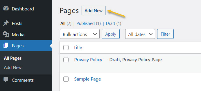
You can always come back here to make edits to previously created pages, as well as to delete them. Just hover over the name of a page or post, to unveil the edit and delete (trash) options.
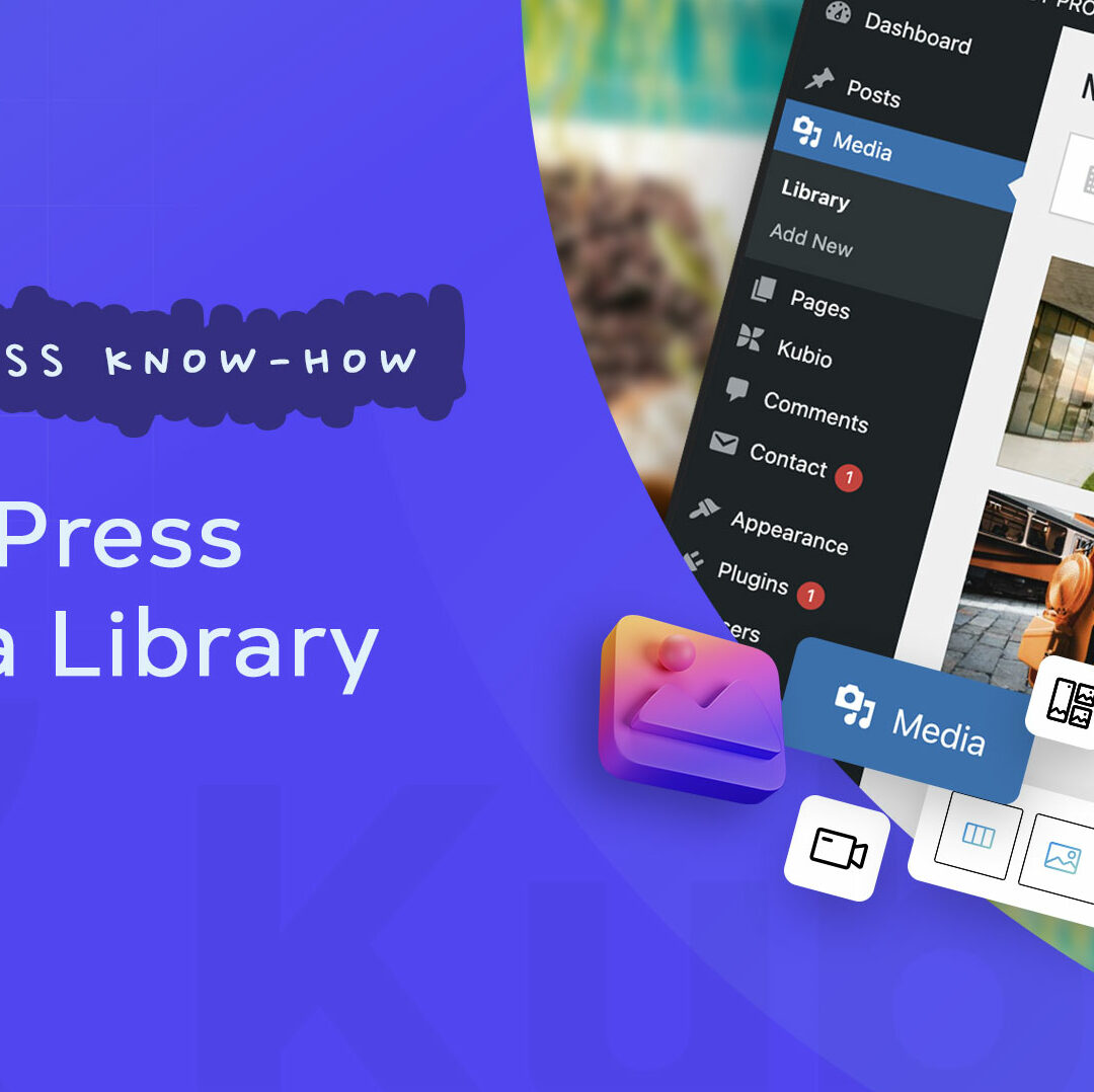
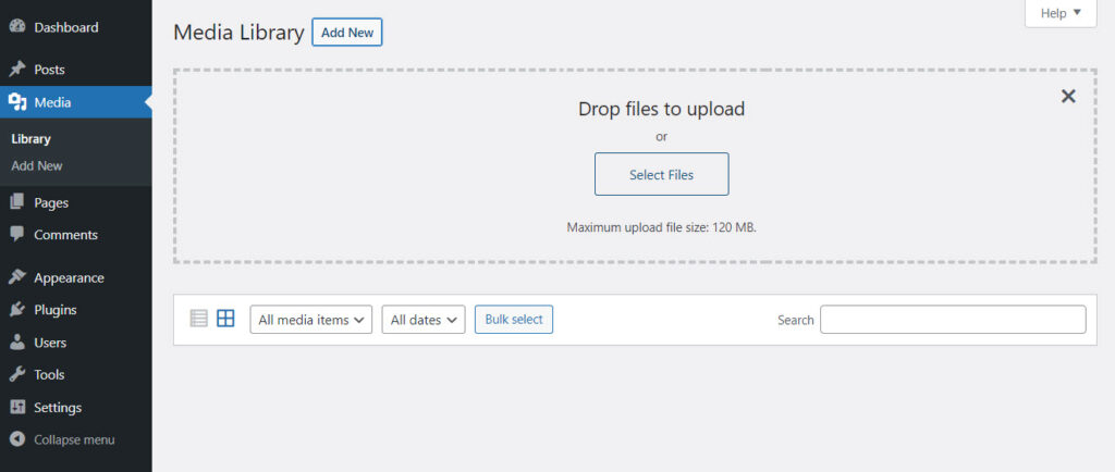
- Media – here you will upload the media you will use inside pages and posts, from images and videos to audio and other files. Use the “Add New” button to add new media items to the library.
- Plugins – here you will add new functionalities to your site. Maybe you need a contact form, or eCommerce functionalities, etc. This is where you will find them.
In this case I am going to install the Kubio page builder. Now, what’s the difference between a WordPress theme and a WordPress page builder?
WordPress themes and their features vary from one to another. They can have free plans and paid one, with distinct features inside. Now, in general, here are some basic elements that you can customize with most themes out there:
- Text and visuals,
- Color scheme,
- Typography,
- Layout,
- Menus.
Now, some features are pre-built, and you can’t make changes without any coding knowledge. This means that themes don’t allow much flexibility. You can get locked inside.
This is where page builders come in handy. Most page builders work by drag and drop giving you complete freedom over the website design. A WordPress page builder goes beyond a WordPress theme, and it’s the best option if you really want to create a beautifully-designed website.
For this particular exercise I’m going to go with Kubio builder. Let’s install it.
- Let’s head to Plugins -> Add New.
- Type “Kubio” in the search bar on the right-hand side of the dashboard.
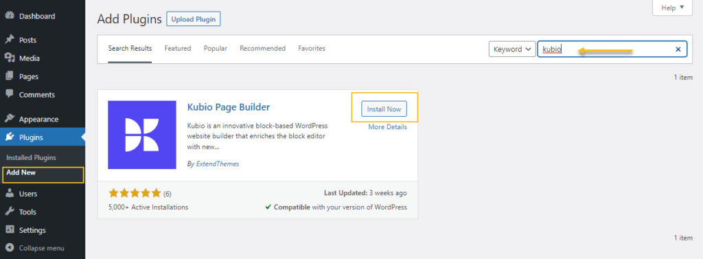
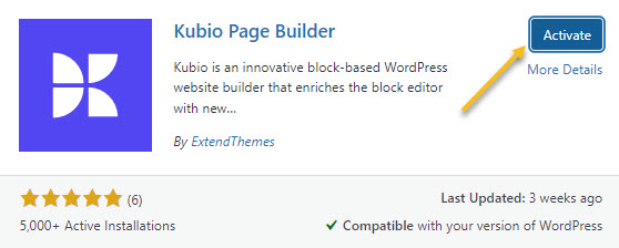
- Go to the Kubio Page Builder card and click on “Install now”
- Activate the plugin.
Kubio is a free builder, but there are some features and website templates (or starter sites) that are included in the paid plan. The wellness starter site is a PRO one. But don’t panic! I’m using it as an example to show you the capabilities of Kubio. You can create a wellness website with the free plan as well. The Kubio free plan has tons of features that allow you to create a stunning website as well.
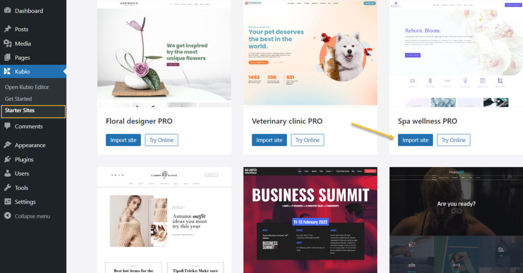
Now, the moment you activate Kubio, you will notice that a Kubio menu will show up inside the menu on the left hand side of the WordPress dashboard. From the menu you can open the Editor, access info to help you get started with Kubio, select a site to start with.
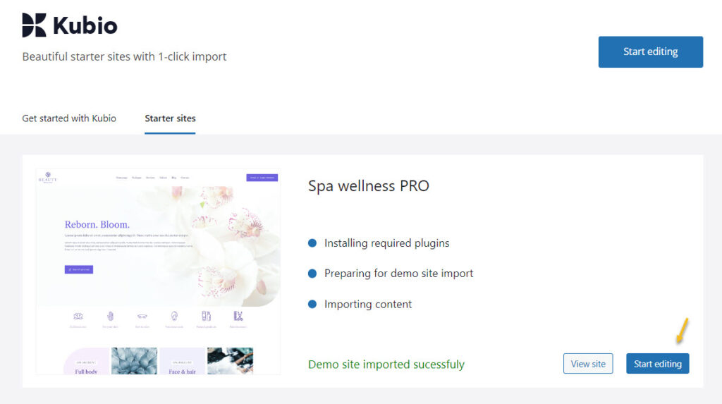
I’ll just go to the spa wellness starter site then click on the “Import site” button.
Next, click on “Start Editing”.
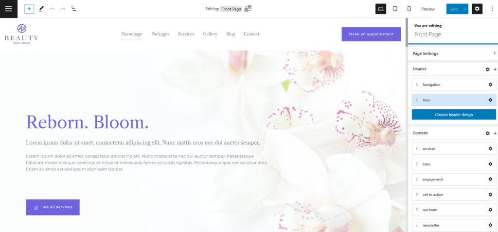
Here’s how the homepage looks like inside the Kubio Editor:
Block-based design in WordPress
The WordPress design experience began to change back in 2018. Now, everything in WordPress is a block: from paragraphs and images, to tabs and accordions. So, each block serves a purpose and can be edited separately. In the Block Editor you just drag and drop such blocks onto the website canvas, then start to style them.
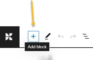
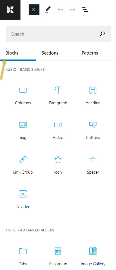
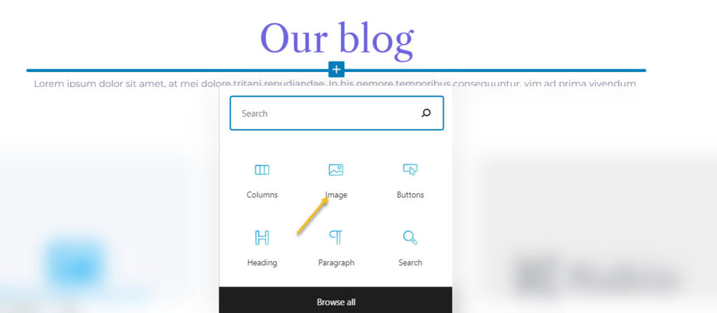
In order to add a block go to the “+” sign in the upper left corner of the interface.
This will open up a block inserter. There are some default WordPress blocks inside with black icons. If you use Kubio builder you will notice some extra blocks as well, with blue-green icons. The Kubio blocks are shown first.
You can easily drag and drop them onto the canvas then style them the way you see fit.
You can locate the “+” sign inside the canvas as well. Just hover between various elements on the site to uncover them. I’ll show you in the next subchapter how this is done.
Now, it’s important that you use only Kubio blocks, because they will have advanced editing options available.
How to customize WordPress blocks
Now, let’s play a bit.
Before proceeding, please watch this short video on the basics of Kubio: how to make work with text and images.
- Adding a block to a page
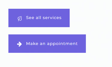
Now, let’s go and add another button below the existing one.
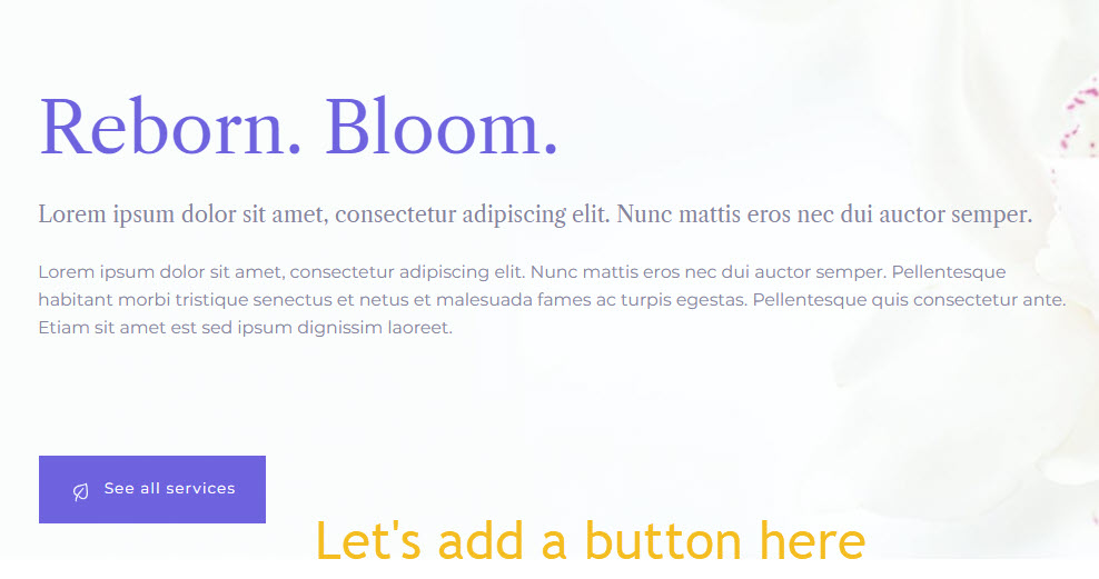
Like I said before, let’s hover near the heading until we uncover a “+” sign, in order to open up the block inserter.
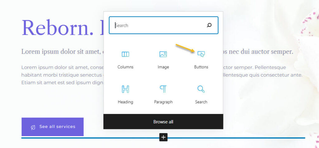
Then, let’s look for the Kubio buttons block (the one in a blue-green shade).
Here’s what we have so far:
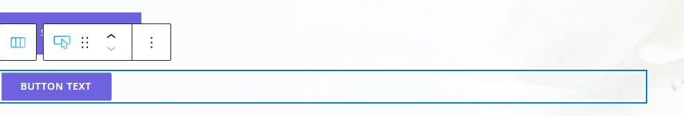
Let’s click on the text inside the button and change it.
- Customizing a block inside the editing panel
Now, the texts have different font families, font size, and the second one uses letters in caps. The first button also has an icon on it. Let’s use the same style for the second button. We could do this manually, by making each change individually. We could use the block editing panel on the left to identify the font family, size, and so on.
Now, the block editing panel has three sections: Content, Style, and Advanced. This is true no matter the block you are editing. Most of the blocks share the same editing options inside “Advanced”: background, spacing, typography, borders and shadows. This is why the moment you customize a block, you’ll know how to edit the second one.
Next, just click the first button to see the block editing panel options. Then go to Style -> Typography feature.
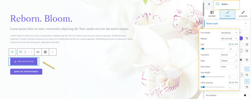
Now that you know the font family, weight, size, you can select the second button and go to the typography settings and make the necessary changes.
But, there’s an easier way. In the PRO plan there’s the option to copy and paste styles!
Just go ahead and select the first button. From the toolbar that shows up on top of it fo to “Copy style”.
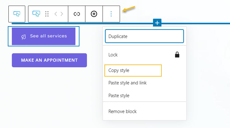
Next, go to the second button’s toolbar and select “Paste style”.
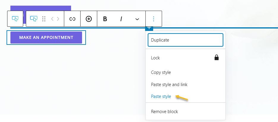
Et voilà!
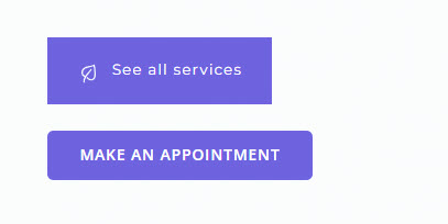
Now we have the same font family, weight, size, capitalization, and even an icon on the button. Now, let’s change the background color of the second button. We can do this from the block editing panel, from Style -> Background.
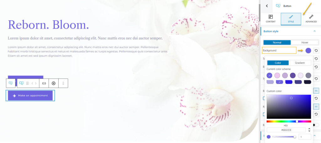
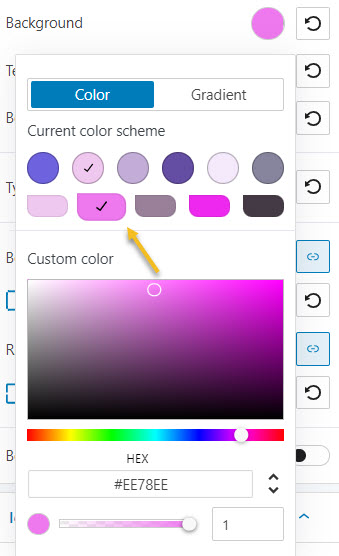
Click on the colored circle next to the background option to choose another color.
A panel will open up that allows you to pick a color from the current color scheme or gradient from a color, pick a color from a slider, or just type in a desired color code in the “HEX” field. You can also switch to the RGB color mode if it suits you better from the dropdown arrow.
You can also adjust the opacity of your color. The slider offers you values from 0 to 1, 1, meaning there’s no transparency. You can always reset the color to the default value when you select the reset button.
I’m gonna go with a dark shade of pink.
Here’s the result:
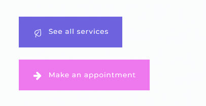
Now, here’s an advanced resource on making more advanced background changes in Kubio. Next, we can go even further and make the second button icon smaller and thinner, and make the buttons’ widths equal.
- Working with media
As I said a bit earlier, everything is a block inside the latest WordPress experience. Images or videos are also blocks.
Now, all the images, videos, and other files reside in the Media Library. I mentioned it earlier when I presented theWordPress Dashboard. You can easily upload your media here, straight from the admin area. But you can do this as well from a page or post as well.
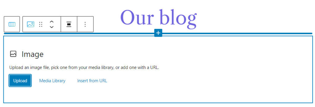
So, let’s go ahead and add the image block.
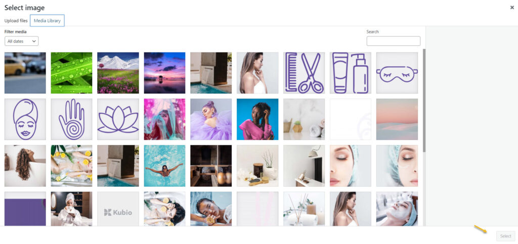
Next, you can upload the file you want. It will show up in your Media Library after the upload and pick it from there. Or you can choose an existing image from the Library or paste an URL.
Let’s go with the second option. Click on the desired image then hit the “select” button.
Next, you can style the image in the block editing panel on the right hand side.
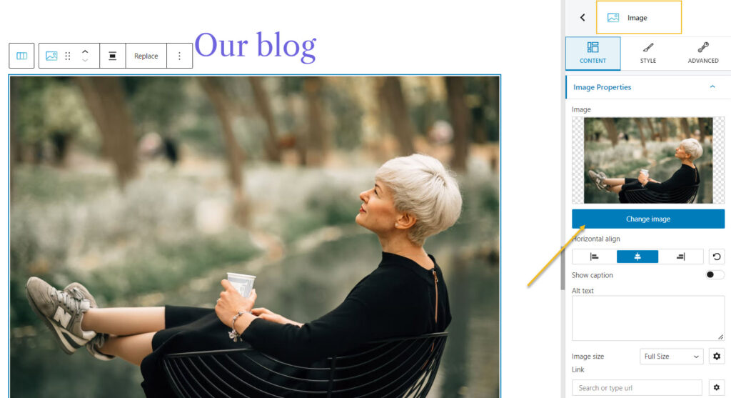
Wasn’t that hard, was it?
- Adding new sections to a page
Every web page in Kubio is made up of sections that can be split into columns. In addition, you can add blocks to your sections and columns. Sections can be edited like any other block, inside the block editing panel. There’s one tiny change there, there’s “Layout” instead of “Content”.
There are 2 main ways for adding sections to a page or post using Kubio. After adding a section, the editing and styling options are the same.
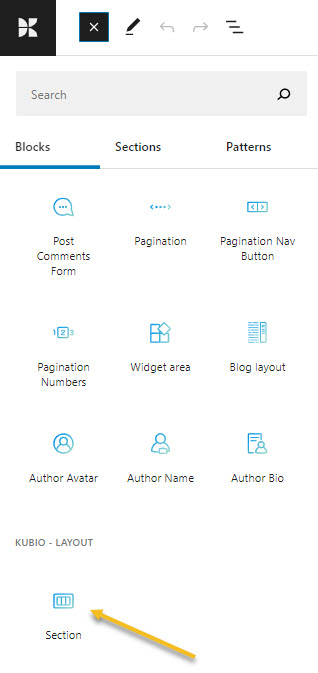
- You can add sections as blocks, from the block inserter. Just open up the block inserter using the “+” sign in the upper-left, and look for “Section”. Now, drag the section block to your page.
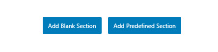
- Go to the bottom of the page, and click on the “Add blank section” button.
When the section gets added to the page, you will be asked to select a type of layout.
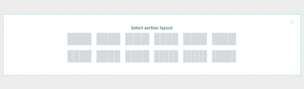
Click on the one that matches your vision for the section. I’m gonna choose a layout with 3 columns with unequal widths. Now, I’m using the “+” signs to add blocks to the columns. I’m adding a search block, a button, and a logo. Notice how each block adapted to the current color scheme?

Now, you can make any content and styling change you want to these three new blocks.
Next on Baywatch. Did you notice there was another button next to the one saying “Add blank section”? It said “Add predesigned section”. This is a great Kubio feature! With Kubio you have access to predesigned website sections that can serve various purposes: from team sections to features. They are fully customizable.
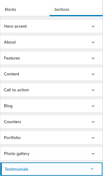
When you click on the “Add predesigned section” button you will open up the block inserter on the left-hand side, at the “Sections” level. Click on a section to add it to the page, then use the toolbar to move it wherever you want.
You can now replace the text and add your visuals. You do not reinvent the wheel with Kubio. This way you can save time and focus on what’s more important: finding the right visuals, preparing the copy, etc.
These sections are made of blocks. You can edit them separately in the block editing panel.
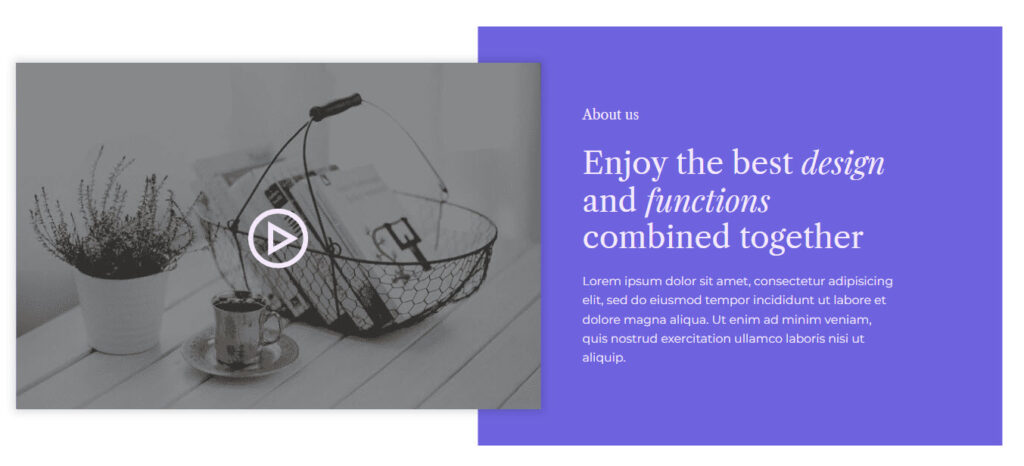
Here’s an example of an “About” website section. It has two headings, a paragraph, and a video, that can be edited separately.
The moment you add it to the page, it will adjust to the current color scheme. Isn’t that great?
And that’s about it. You are now ready for your own wellness website design.
If you liked this article, and want to have access to similar content, make sure to subscribe to our YouTube Channel. You can also follow us on Facebook. If you want to find out how to customize your WordPress site, here‘s a great resource we’ve compiled to help you out.