
Not all websites are created equal. This is why we began a journey where we want to present your web design best practices and inspiration across various niches: from restaurants and gyms to schools and music.
So, let’s start with some inspiration, then dive into what’s unique about music website design and how musicians should approach this topic better.
Five Music Website Designs: Inspiration You’ll Love
So, let’s go ahead with our five music website design shortlist!
Ludovico Einaudi
I fell in love with Ludovico Einaudi’s music while watching “Les Intouchables,” a great movie based on a true story. “Una Mattina” is one of his masterpieces. Einaudi is a minimalist composer. He uses lots of repeating patterns to create introspection. Yet, he manages to make the listeners stop and feel. And there are lots of feelings to feel while listening to his music, I’m telling ya!
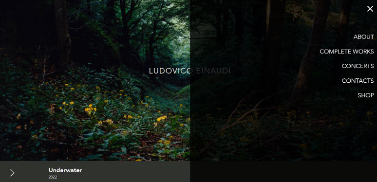
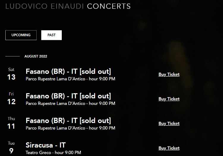
His website is atmospheric as well. The hero has a beautiful image of nature with a straightforward headline: Ludovico Einaudi.
His albums are presented using an according, right below the hero. Each album has the cover, the music list, a video, and links to Apple Music and Spotify. You can access past and future concerts straight from the menu. Buying tickets is easy.
Vladimir Nikolov
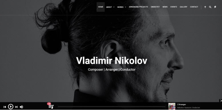
Vladimir Nikolov is a composer whose works cover various musical languages and genres. His starting points are classical music and jazz. He arranged many orchestral projects worldwide while frequently performing as conductor and guitarist with renowned soloists and ensembles.
His website catches our eye straight from the hero, which uses a robust black-and-white portrait of Vladimir.
Below the hero, you will see several testimonials. This is a nice welcoming touch.
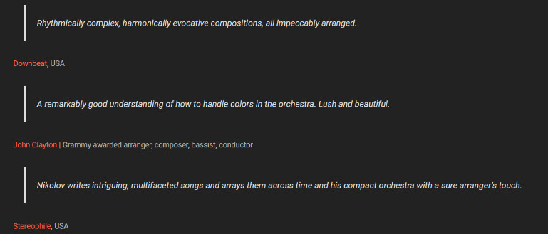
There’s a composition that you can easily play while browsing the website.
The website menu is straightforward, allowing you to discover a gallery of pictures, events, works, news, awards, and more.
Sigur Rós
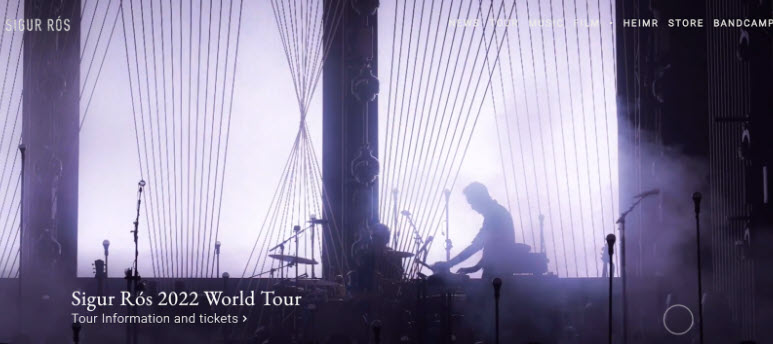
Sigur Rós is an Icelandic post-rock band from Reykjavík, turning 20 in 2022. The band is known for its ethereal sound and classical and minimal aesthetic elements.
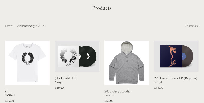
The website’s hero presents a looped slider with videos from concerts. Their tour dates, ticket information, and album details are readily available.
They also have a merch store. Again, the checkout flow is short and clear.
First Aid Kit
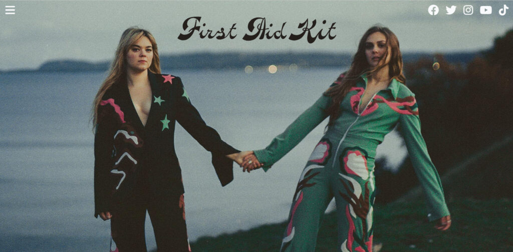
I just love the voices of these two! They are a Swedish indie folk duo famous for this musical gem: “My silver lining.”
They use the parallax effect on their website and do it well. Parallax graphics are ideal for telling stories. Communication is at the heart of good design. When we design websites, we want to communicate with our visitors while telling a compelling story about our product, service, or brand.
Womad Festival
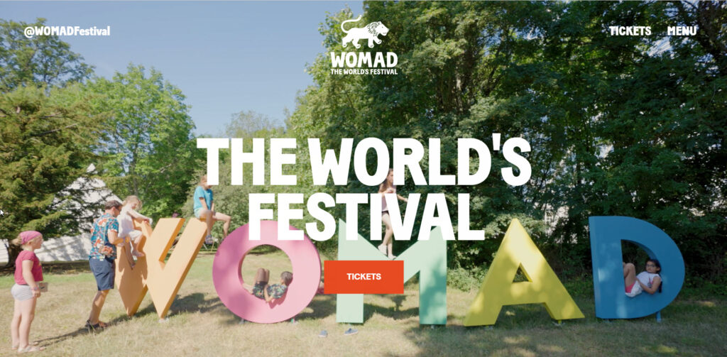
This is a prime example of why video content never goes out of style, especially in web design. If the eyes are the windows to the soul, then the music website’s homepage is the window to your business. So, how do you design it, so visitors want to explore the rest of your site? By leveraging video.
The dynamic quality of video backgrounds immediately captivates visitors and distinguishes your website. Video conveys emotion and communicates messages in ways text and images cannot.
Now that you have a taste of inspiration let’s see some actionable best practices when designing your music website.
Music Website Design Best Case Practices
So, before jumping straight into website design, you want to determine the website’s purpose. Specifically, you will want to find the answer to this question: how will this website help the music business grow?
Because most artists have their own Bandcamp, Soundcloud, or Facebook profiles, do they really need a website?
Sure thing!
Because a website will manage better to express their music, creativity, and story, artists can better showcase their work, as well as concerts and tours. And the primary goal of a music website design is to see albums and get people to buy concert tickets.
Now, here are our recommendations for a stunning mush website:
1. Use a visually-stunning hero image or video.
You only have a few seconds to make an excellent first impression when someone visits your website. A striking header image is the quickest way to capture their attention. A header image is arguably as important as the music because it gives your visitors a reason to click the play button.
A powerful main image sets the tone for your entire website. It should communicate your brand, vibe, and sound all at once. If this seems like a tall order, choose an image of you in your element, whether it’s performing, co-writing, or simply posing with your bandmates naturally.
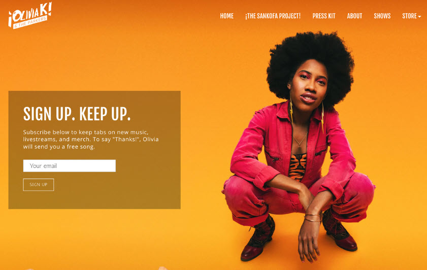
The colors of your main image can influence your website’s colors. Using a visual representation of their soul, jazz, gospel, and art rock fusion, Olivia K & The Parkers achieve this. Afterward, they incorporate the vibe and colors of the main image into the rest of the website’s design.
2. A compelling call to action.
A call-to-action is an excellent way to draw attention to an upcoming single release, album pre-order, new video, or fan subscription service. A call-to-action can also be used to build your mailing list without being too intrusive.
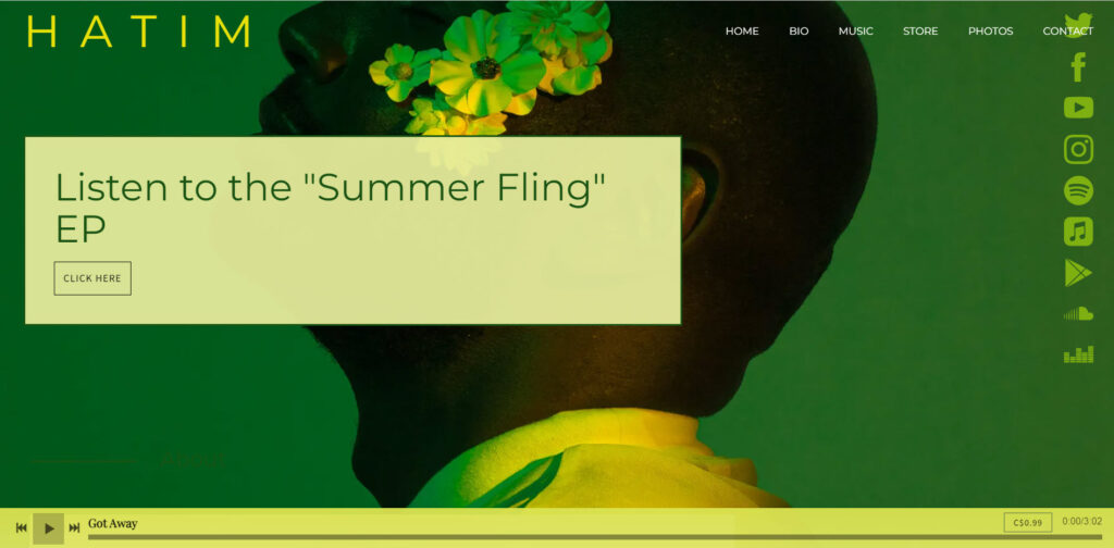
The call-to-action adds interest to the header image as a design element by connecting your artist’s name or logo and menu. R&B singer-songwriter Hatim is an excellent example of a great website design with a compelling call to action. He regularly changes the text of his call-to-action, and it stands out with a burst of fresh color over his coordinated header image.
A website’s purpose is to attract visitors by providing them with an inside look at your music and the ability to explore your content. Make the most of every visitor who lands on your homepage by adding an exciting call to action.
3. An explicit and transparent website menu.
As part of your music marketing strategy, your music website should attract fans to your online space. Therefore, your website menu should be clear and easy to read so visitors can easily navigate your content.
Your website menu can be an attractive addition to the design of your website, balancing out your social media icons, band name, and imagery as the page loads. Use an animated loading effect on your menu to give your music website design a modern look.
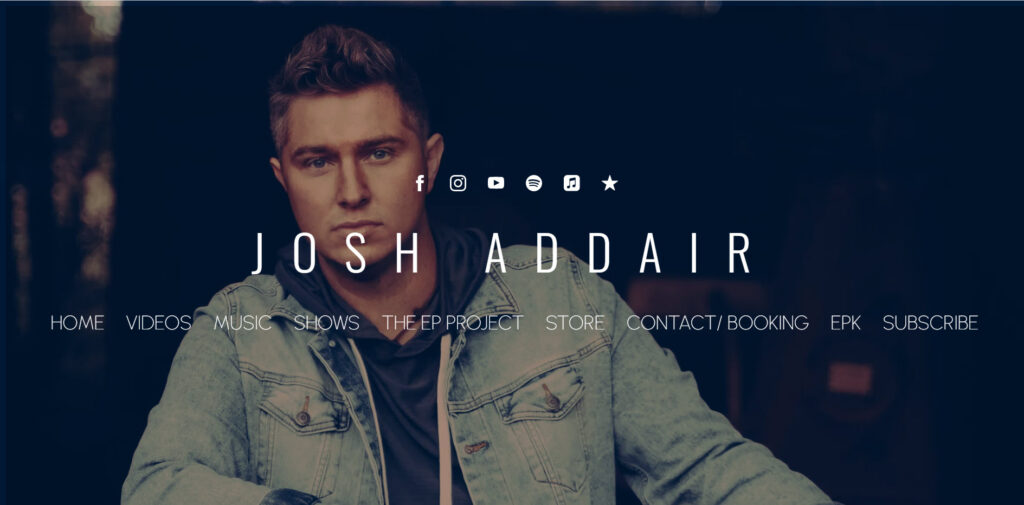
The menu on country singer Josh Addair’s artist website is crucial to inform fans about all the content they can access, from his EPK to his fan subscription service. The menu font mimics the typography used for his artist’s name, creating a visually pleasing effect.
4. A cool sidebar menu.
Consider using a sidebar menu if your website has multiple pages. There are various options for sidebar menus that cascade down the page, support an image behind the menu, or float above a full background image, depending on the music website template you choose.
A sidebar menu’s structured nature makes it compatible with section-based website designs. To draw attention to each element, divide your content into blocks, and style each section with its background image or color, font, and button colors.
Lady J, a soulful singer, does an excellent job designing her music website.
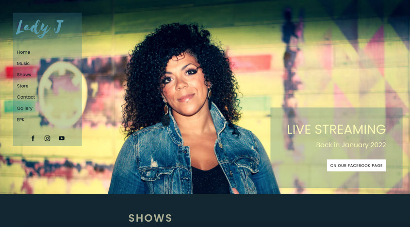
She’s created a sidebar menu that floats over her main image and stays put as visitors scroll through her website’s content. She’s also made an EPK for her music, using different background colors in separate sections to make the elements stand out in other blocks on the page.
5. A flashy video header.
There is something exciting about any website that has motion. It can evoke an emotion or arouse the imagination. A video header at the top of your design will set the tone for the rest of your music website. Ensure the video header isn’t too long, and then overlay your title, social media icons, and menu. Your website visitors will stop and take notice if you combine static text with a moving video.
Alianna, a musician and vocalist, uses a simple video to draw attention to her clean and professional website design.
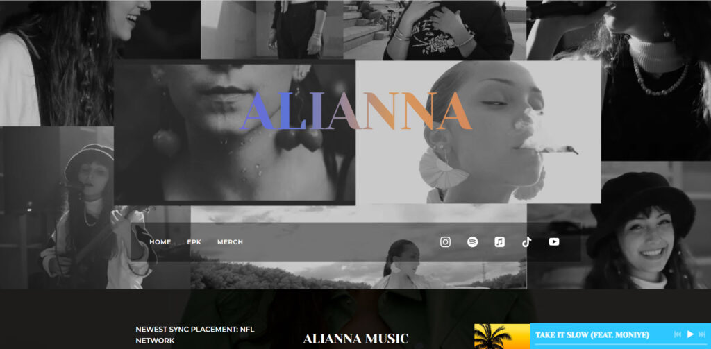
The items sitting over the footage are easier to read in white font. Likewise, her call-to-action and social media icons pick up on the video’s bright blue hue, making them visually stand out while tying everything together nicely.
6. Section backgrounds with visuals.
You can create a music website design that uses styled sections to keep your visitors’ attention by using a consistent color scheme and a few stellar images. A section is a horizontal block of content that allows you to structure and style your content.
A website design with sections is an excellent way to generate visual interest, making it ideal for songwriters, high-energy bands, and DJs. Set the sections to fix,’ which means the content will scroll, but your imagery will remain in place to make your website design look even more modern.
Take, for example, Basset.
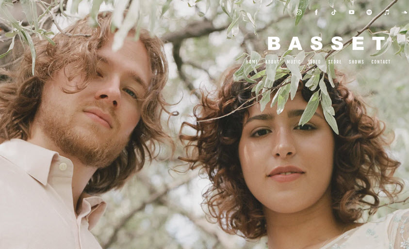
Basset’s website design incorporates fixed sections and color blocks and uses several similar images to evoke the sound of their music. This gives their site a modern, quirky look that works particularly well on their About page, and it creates a warm, friendly vibe throughout their pages.
7. A stylish logo.
Nothing brings music website branding together like a logo. You can easily create a text logo by selecting a font that complements the rest of your content. However, if you have a logo designed for you, use it consistently throughout your branding, including your artist’s website.
If you don’t have a full-width main image to use, a band logo will help you get started with your website design. Use your logo to inspire the colors of your section titles, play buttons, and song titles.
Nola Cherri’s stylized logo adds a unique touch to her crisp, couture-style music website.
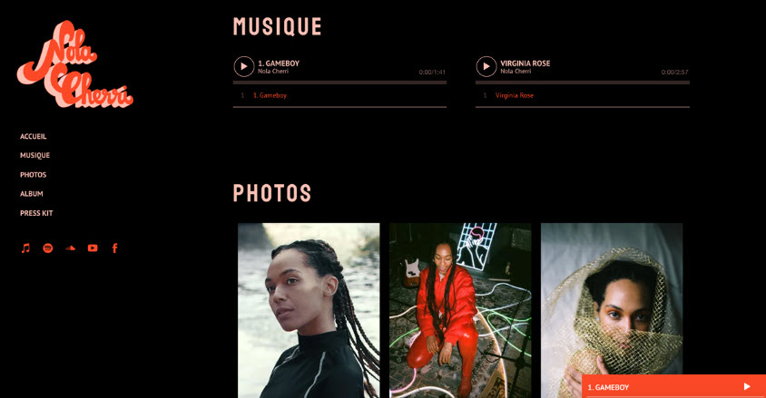
The colors in her logo define the text, menu, and buttons on her website. Because she uses a music website template with a fixed menu, her logo remains in place as the page scrolls, making it an essential part of her design.
8. A fixed background.
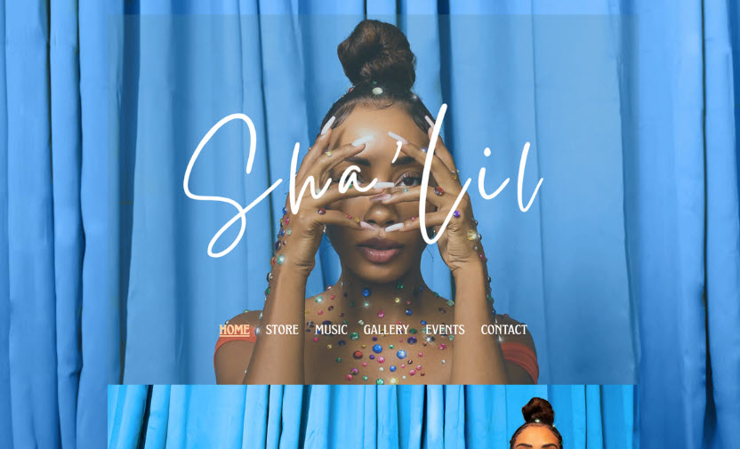
If you have a fantastic promotional image that sums up your artistry at a glance and creates a complete impression of your sound, use it as the focal point of a modern website design for your music.
Using your image at full-width opens up several design options, such as using it as the background. This means your content will scroll over, keeping your brand at the forefront of your website.
It also works well for a one-page website, with sections separating content above the main image. Again, Sha’Lil excels at this, utilizing her fantastic imagery to create a music website that scrolls smoothly.
9. One-page design.
The key to creating a one-page website is to ensure that your menu is clear and well-organized. Then, when visitors click on a page name, they will be taken directly to that section of your website.
Because of the linear structure of one-page websites, they are ideal for containing snippets of your music career. You can also use a one-page website to promote a new release, including album or single details, your artist bio, press, and a music player in your page sections.
Choose one color as your focus to create a one-page website with a stunning design. A second color can be used for text, and a third accent color can be used for buttons and links. This will help to keep things simple and your content navigable.
Attaboy, an energetic band with a playful website, is an excellent example of a one-page design.
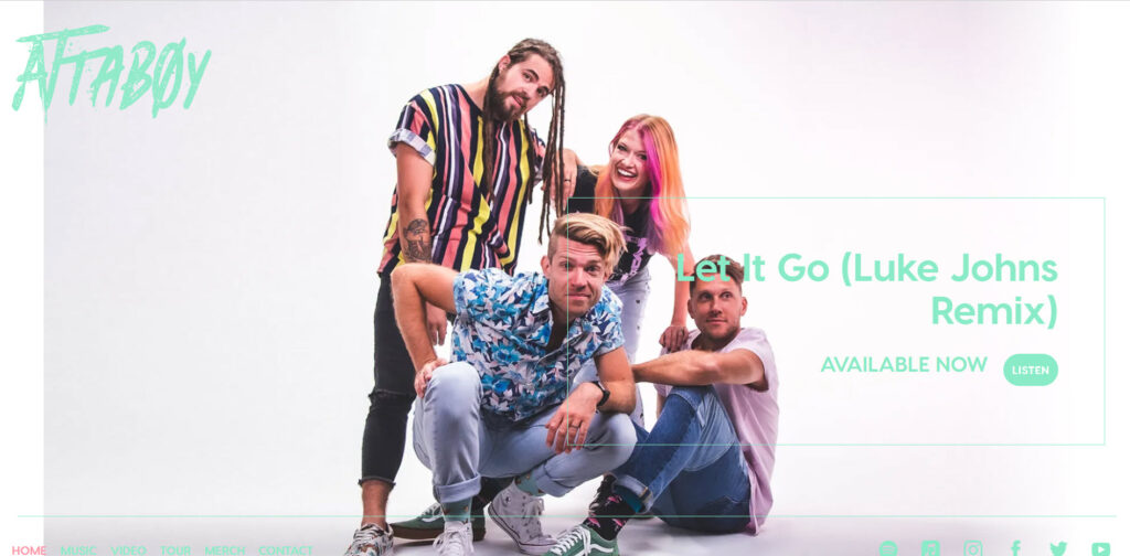
They’ve designed most of the content on their main page in blocks. Then they’ve created a dedicated Store page to allow them to sell band merchandise online via their website.
10. A neutral color scheme.
Choosing colors for your website’s design can be a difficult task. However, a neutral palette can be a great way to showcase your imagery while also creating a mood to match your songs if you’re a folk musician or building a singer-songwriter website.
Consider your typography if you’re using neutral colors to complement your band imagery. It should complement the mood you’re aiming for, whether that’s stylized section header text or more specific content fonts.
Indie singer-songwriter Jacob Rose has designed his website using neutral colors to match his heartfelt music.
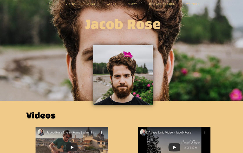
His one-page site design uses cream, black, and white sections with contrasting font colors to make each area stand out.
11. A timeless black-and-white look.
A music website that is black and white looks more professional. You can add as much content as possible, and it will not look cluttered. So, if you play in multiple projects, have a lot of musician bios, or want to sell a lot of music and merch on your website, use this classic combination as a foundation.
If you’re unsure what look you want – perhaps you only have some demo songs and videos – a black-and-white website is simple to create and then embellish with a few pops of color for a professional appearance.
Indigenous indie rock band Twin Flames has a standout website with a black-and-white color scheme. As their website loads, they show a unique collage illustration video.
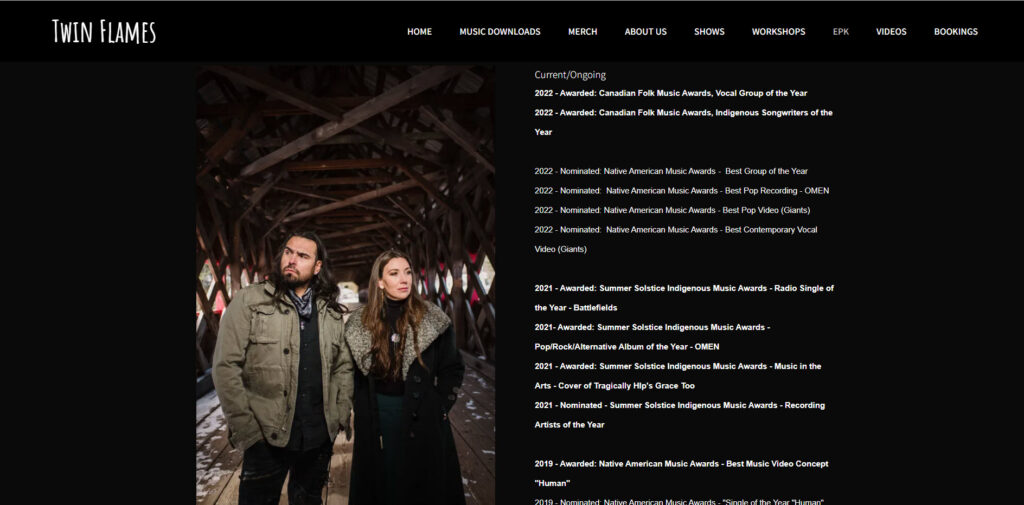
In addition, they’ve designed a simple black-and-white webpage containing a wealth of information, from new releases to accolades and available workshops. Their press kit is also well-organized, with everything a band should include in a press kit, from press snippets to various high-resolution photos.
12. A classic retro look.
When designing a music website, you’ll want to make it look unique. Take your cues from your music to determine the best way to accomplish this. Once you’ve decided on a theme for your site, start with large images, text, a logo, or a specific color palette.
A retro look is one way to determine your design and figure out a color palette to match if it suits your music. You can also use image filters to add vintage graininess or subdued color to your images to give them a retro look.
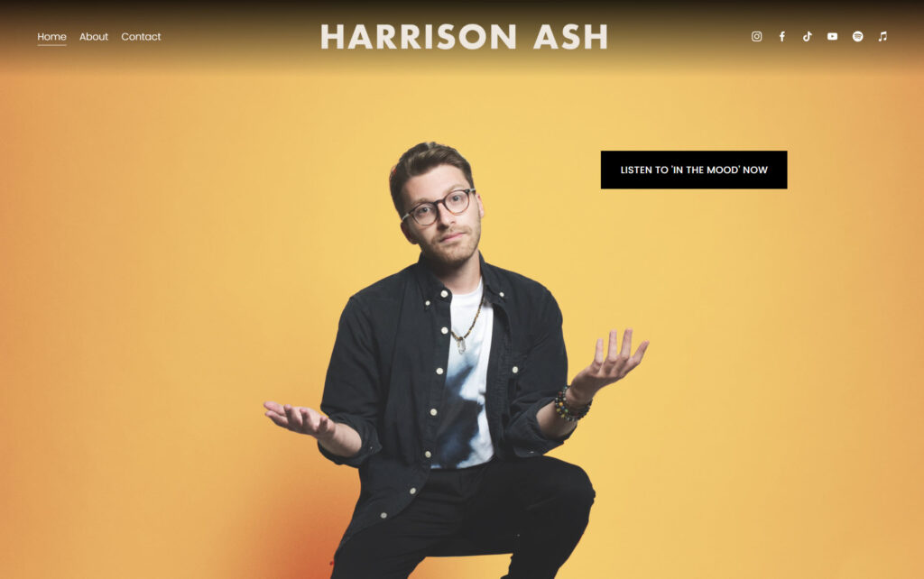
Harison Ash, a musician, has done so subtly, using images with a command of color that set a retro tone for all his website pages.
13. Minimalism for breathable website content.
Minimalism is a current web design trend that shows no signs of abating, and music websites are no exception. Making a website from a primarily white space template allows plenty of videos, photos, and media to bring your band’s sound to life across your pages.
When you use whitespace, you allow padding, or space, around all of your sections and content to allow it to ‘breath.’ It gives your website a professional appearance – even if you have a lot of content, the extra space makes the pages appear uncluttered.
White Noise Maker, a producer/artist, demonstrates using whitespace to create a minimal yet engaging website.
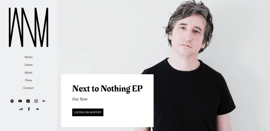
They’ve used a blank white slate with a sidebar to add music, a musician bio, and more. Despite this, the content area does not appear cluttered; without other design distractions, it is simple to navigate their pages.
14. Upcoming album design.
Creating an entire website around an upcoming album is an excellent way to instill a sense of branding and familiarity across your online profiles and presence. Furthermore, the advantages of making your album artwork the focal point of your website are numerous.
Rebranding is a breeze if you’re releasing a new album. First, change your website template to one with enough room for your artwork. This could be a template with a square image layout or one with a more structured feel to enclose your imagery.
Second, it’s an excellent way to promote new music. If your website is based on that artwork, your album will be at the forefront of your visitors’ minds as they explore your content.
Car Park Social’s album artwork is an anchor in the background of their website design. It’s also used front and center on their stylish band website Homepage and Press Kit to draw attention to their new release.
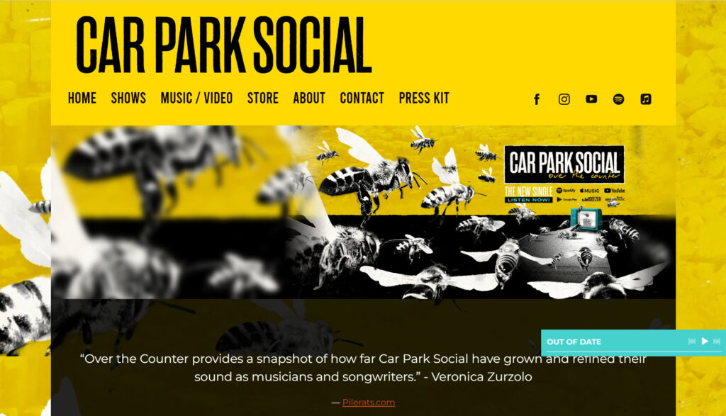
As a result, they can regularly change the look and feel of their website to coincide with new album promotions.
15. A sleek website structure.
When you choose a website template with a clean structure, using multiple images to tell a story becomes second nature. Using boxes and columns no longer marks a website as outdated; instead, it allows you to create a space that includes all the options you need to build an online fan community.
You can use structure to define your design for blogs, fan subscriptions, online stores with merch, and even record label websites to make them easy to navigate and encourage visitors to return. Include some loading animation to add a little pizazz to an otherwise simple design.
Among the best website design examples is that of Dan Smith and Monika Suder, a contemporary classical music duo from Germany.
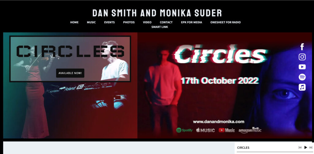
They’ve used a structured template with delineated sections and imagery that evokes a peaceful feeling.
Wrapping Up
The point is that a pretty website is useless if it does not serve and grow your music business. So, if you’ve been discouraged about achieving that perfect, professional look, hopefully, these designs will inspire you to do some customization – or start from scratch to match your sound.
If you liked this article, and want access to similar content, subscribe to our YouTube Channel. You can also follow us on Facebook. Finally, if you want to find out how to customize your WordPress site, here‘s a great resource we’ve compiled to help you.