CTAs (Calls to Action) are pivotal in driving performance and conversion rates on WordPress sites, making them essential components in web design and digital marketing. At its core, a CTA is a prompt designed to encourage users to take specific actions, such as subscribing to a newsletter, purchasing a product, or downloading a resource. Common examples include “Buy Now,” “Sign Up,” and “Learn More.”
Effectively designed CTAs can significantly boost user engagement and conversion rates. For instance, a well-placed “Buy Now” button can increase sales. Research demonstrates that optimized CTAs can lead to substantial improvements in conversion rates. For example, personalized CTAs convert 202% better than default versions.
CTAs are also integral in guiding users through your website and enhancing the overall user experience (UX). By providing clear and compelling directions, CTAs help users navigate your site more effectively, ultimately achieving your business goals.
In this article, we will discuss both the technical and creative aspects of designing CTAs in WordPress. We will explore the use of the Kubio button block for greater personalization, cover best practices for CTA placement and design, and the importance of A/B testing.
Comprehensive guidelines, including step-by-step instructions and plugin recommendations, will help you enhance the effectiveness of your WordPress site. Whether you’re a beginner or an intermediate user, this article will equip you with the knowledge and tools to create powerful CTAs that drive results.
Two paths to powerful CTAs in WordPress
Creating effective CTAs for your sales pages can be approached in multiple ways. You can either manually code your CTAs for complete customization and control or use user-friendly tools like Kubio for efficiency and ease of design. Each method has advantages, and choosing the right path depends on your technical skills, time availability, and design requirements.
The DIY route: Manually coding your own CTAs
If you prefer full customization and have the necessary technical skills, manually coding your CTAs using basic HTML and CSS can be a great option. Here’s a brief overview of how to create custom CTA buttons with code examples.
HTML Structure
Basic HTML button: Use the <a> tag to create a clickable button. Assign a class for styling.
<a href="https://example.com"
class="cta-button">Click Here</a>
CSS Styling
Basic button styling: Style your button with CSS to make it visually appealing and noticeable.
.cta-button {
    background-color: #4CAF50; /* Green background */
    color: white; /* White text */
    padding: 14px 25px; /* Top and bottom 14px, left and right 25px */
    text-align: center; /* Center-aligned text */
    font-size: 20px; /* Larger text size */
    border: none; /* No border */
    border-radius: 5px; /* Rounded corners */
    display: inline-block; /* Necessary for dimensions to work */
    text-decoration: none; /* No underline */
}
.cta-button a {
    color: inherit; /* Inherit the white color */
    text-decoration: none; /* No underline */
    display: block; /* Ensure link covers the entire button area */
    width: 100%; /* Full width */
    height: 100%; /* Full height */
}

Hover Effect: Add a hover effect to improve user interaction.
.cta-button:hover { background-color: #45a049; /* Darker shade of green */ }
Advanced Styling Options
Box Shadow:
Add a shadow to make the button stand out. Note you add this code to the CSS above rather than adding separate classes for each:
.cta-button { box-shadow: 2px 2px 5px grey; /* Horizontal offset, vertical offset, blur radius, and color */ }
Transition Effects: Smooth the color transition on hover.
.cta-button { transition: background-color 0.3s; /* Smooth transition for background color */ }These examples provide a foundation for creating a basic CTA button using HTML and CSS. You can customize the styles further to match your specific design requirements.
Addressing common challenges
Designing for cross-browser compatibility and writing clean code to maintain responsiveness is important. Ensure your CTAs are responsive and mobile-friendly, as a significant portion of website traffic comes from mobile devices. This requires using media queries and flexible design practices to adapt the button’s appearance based on screen size.
Manual coding requires a certain level of technical skill and a considerable time investment. While it offers maximum customization, it also risks damaging your site if you’re not careful. To mitigate risks, always take the following precautions:
- Before making any changes, backup your site to prevent data loss.
- Use a staging or testing site to experiment with your code changes before implementing them on your live site.
- Write clean, well-documented code to make future updates and troubleshooting easier.
The simple solution: Designing CTAs visually with Kubio
For those who prefer an easier approach to creating CTAs, Kubio offers a powerful and intuitive solution. Kubio’s user-friendly interface simplifies the process of designing effective CTAs without any need for coding knowledge. This makes it an ideal choice for users looking to save time while achieving professional-looking results. The main advantages of using Kubio include:
- No coding required: Kubio eliminates the need for HTML or CSS knowledge. You can create visually appealing CTAs using drag-and-drop functionality.
- Time-saving features: With premade sections and customizable blocks, you can quickly design and implement CTAs that fit seamlessly into your website’s design.
- Flexibility in design: Kubio offers a wide range of customization options, allowing you to personalize your CTAs to match your brand’s aesthetics and goals.
The Kubio AI assistant is a distinguishing feature that provides intelligent suggestions and automates repetitive tasks. This feature streamlines the design process, helping you create high-converting CTAs effortlessly. For more information, check out this detailed article.
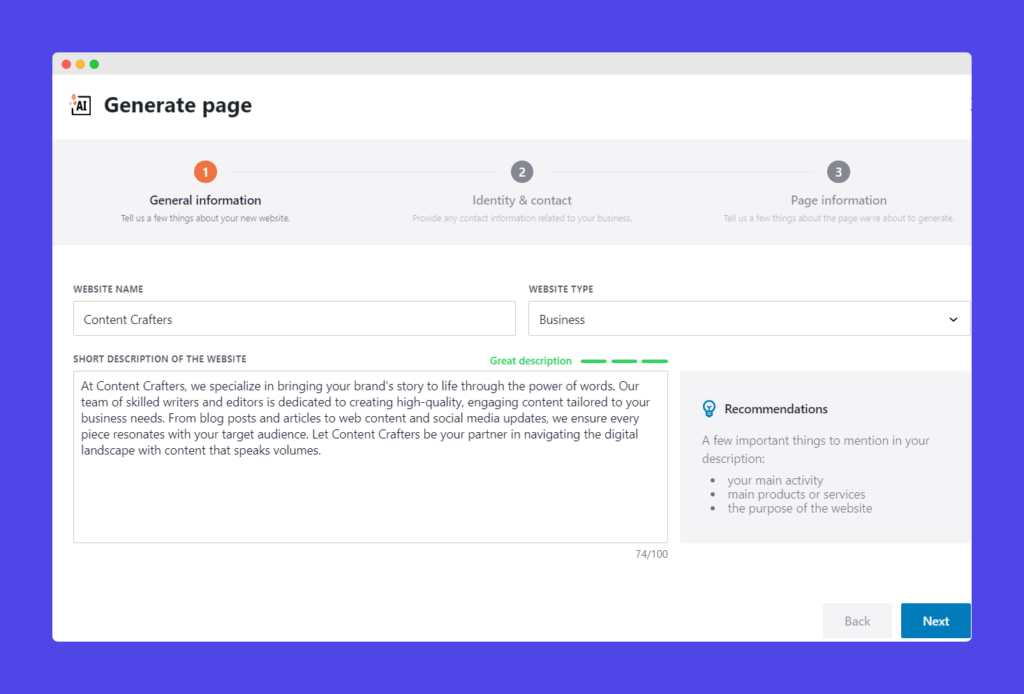
Creating a CTA using Kubio
Here’s how to create a CTA using Kubio’s blocks and premade sections:
1. Log in to your WordPress dashboard and navigate to the Kubio Builder.
2. To add a block or premade section, open the Kubio Builder for the desired page and click the plus button next to ‘You are editing: Name of page’ in the top left-hand corner.
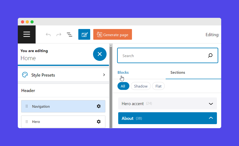
Using blocks
- In the Kubio editor, click on the “Blocks” tab and select the “Buttons” block.
- Drag and drop the button block onto your page where you want the CTA to appear.
- Edit and customize the button by adjusting the text, color, size, and shape.
- Add a link to the button to direct users to the desired action.
- Save the transaction.
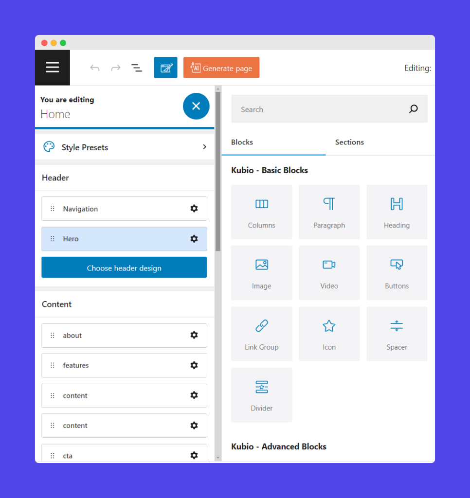
For a detailed guide on creating custom CTAs with the button block, refer to this documentation.
Choosing premade sections:
- Go to the Kubio editor and click on the “Sections” tab.
- Browse through the premade sections and select a CTA section that fits your needs.
- Click on the section to drag it to your page.
- Edit or customize the section by changing the text, colors, and images to match your brand.
- Save the transaction.
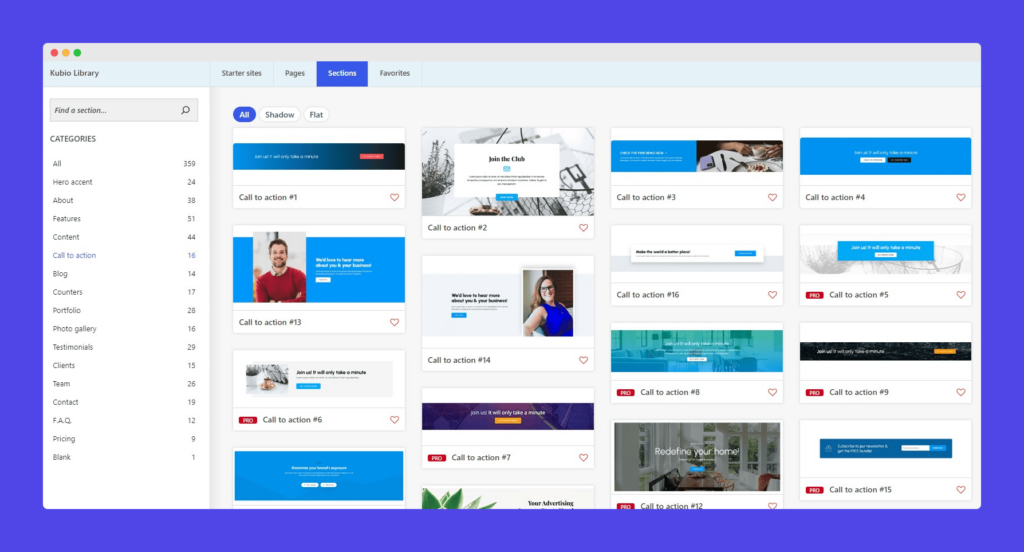
You can find more details on using Kubio’s premade sections in this documentation.
Mastering the art and science of irresistible CTA design
Designing CTAs that capture attention and drive user action involves a blend of visual and strategic elements. Let’s explore the critical design principles and best practices for creating compelling CTAs on WordPress sites.
Key design principles
- Different website colors can evoke specific emotions and actions. For example, red may evoke a sense of urgency and prompt quick action, while blue can instill a sense of trust and reliability. Choose colors that align with the desired emotional response from your audience.
- Opt for contrasting colors to ensure your CTA stands out. A CTA button that blends in with the background can easily be overlooked.
- Utilize whitespace to draw attention to the CTA by reducing clutter around it. This helps to focus the user’s gaze on the action you want them to take.
- The readability of your CTA text is crucial. Use a clear and legible font in a size and weight that makes the text stand out.
Best practices for CTA placement and size
- Place CTAs where they are most likely to be seen and acted upon. Common locations include above the fold for immediate visibility and at the end of content to capture engaged users. For example, moving a CTA above the fold significantly increased engagement for Artsy Editor.
- The size of a CTA can greatly affect its noticeability. Ensure the button is large enough to stand out but not so large that it overwhelms the rest of the design.
- Position CTAs near content that naturally leads to an action. This enhances the flow and increases the likelihood of clicks. For instance, place a “Sign Up” button after a compelling description of your newsletter.
Mobile-responsive design considerations
- Design CTAs that are easily clickable on mobile devices ensuring buttons adjust well to different screen sizes.
- To ensure ease of interaction on touch devices, follow guidelines for minimum touch target sizes, such as 48×48 pixels.
- Test your CTAs on various devices to ensure a consistent and effective user experience. This helps to identify any issues that may arise on different screen sizes.
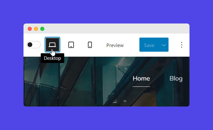
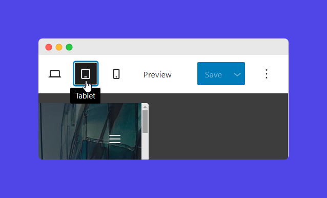
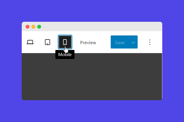
In Kubio, you can easily switch between desktop, tablet, and mobile views to see how your CTA will appear on different devices.
- At the top right corner of the home page, you will find icons indicating different device views: Desktop, Tablet, and Mobile.
- Clicking on respective icons will enable that view, as shown.
Writing CTAs that click: Proven formulas for persuasive microcopy
Creating compelling CTA copy drives user engagement and conversions on your WordPress site. Effective CTA copy must be clear, concise, and persuasive, resonating with the audience and prompting them to take action. For example, “Download Now” is clear and concise, telling users precisely what to do and what they will get.
Aspiration Marketing’s case study highlights the importance of optimizing CTA copy through A/B testing. By refining their CTAs, they tripled their visitor-to-contact conversion rate.
Initially, the “Get Started” CTA had about twice the number of clicks compared to “Contact Us”. However, focusing solely on clicks was misleading as it did not necessarily translate to higher conversions.
In an A/B/C/D test:
- Variant A: “Get started” in white on red had a click rate of 9.76% and a submission rate of 2.50%.
- Variant B: “Get started” in white on blue had a click rate of 3.71% and a submission rate of 6.18%.
- Variant C: “Contact Us” in white on blue had a click rate of 0.72% and a submission rate of 16.67%.
- Variant D: “Contact Us” in white on red had a click rate of 2.69% and a submission rate of 28.57%.
Although the “Get Started” CTAs had higher click rates, the red “Contact Us” CTA (Variant D) had the highest submission rate. This highlights the importance of aligning your CTA with the end goal, such as form submissions, rather than just focusing on clicks.
Time-tested CTA formulas that have shown success across various industries include:
- “Start Your Free Trial”
- “Get Your Free Ebook”
- “Join Us Today and Save”
- “Subscribe Now for Updates”
- “Download Your Guide”
These formulas cater to different stages of the buyer’s journey, from awareness to decision, and use action-oriented, urgent, and benefit-focused words to drive user action.
That said, ensuring your CTA’s tone matches your overall brand voice for consistency across all marketing materials is important. For instance, a playful brand might use “Dive In Now,” while a professional brand might use “Learn More.”
Tailor your CTA copy to appeal to specific demographic segments of your target audience. For example, a tech-savvy audience might respond better to “Get Started with Our Free Trial,” while a general audience might prefer “Try it Free Today.”
What’s more, tweaking word choice and style can enhance relevance and effectiveness for different audience groups:
- For a younger audience: “Join the Fun” vs. a more formal “Become a Member”
- For a discount offer: “Save Big Today” vs. “Get Your Discount Now”
The power of A/B testing to optimize your CTAs
A/B testing, or split testing, is a powerful method for optimizing CTA elements on WordPress sites, enhancing user engagement and conversion rates. It evaluates two versions of a webpage or CTA to determine which one yields better results. Its benefits include:
- Improved user engagement: By testing different elements, you can identify which versions capture more attention and encourage more interactions.
- Higher conversion rates: A/B testing helps pinpoint the most effective elements, leading to increased conversions.
- Data-driven decisions: This scientific approach allows for decisions based on real data rather than assumptions, ensuring more reliable results.
- Better ROI: By optimizing CTAs to perform better, you can achieve higher returns on your marketing investments.
Key elements to A/B test
- Design elements:
- Color: Test different button colors to see which catches the eye and prompts clicks.
- Size: Compare larger versus smaller buttons to determine the optimal size for visibility and usability.
- Animation: Evaluate the impact of animated buttons versus static ones.
- Copy variations: Test different wording, such as “Sign Up Now” versus “Join Us Today,” to see which resonates more with your audience.
- Placement: Experiment with placing CTAs above the fold (visible without scrolling) versus below the fold to determine the most effective position.
- Timing and frequency: Test when the CTA appears (e.g., immediately vs. after delay) and how often it appears to find the most engaging approach.
Tools and techniques for conducting A/B tests on WordPress
It’s crucial to only change one element (text, color, size, etc.) at a time during A/B testing. This ensures you can accurately attribute any changes in performance to the specific element being tested.
Some popular WordPress plugins and tools that facilitate A/B testing include Nelio A/B Testing and Thrive Optimize. You can also manually A/B test by creating two versions of a page or CTA, directing traffic to both, and using Google Analytics to compare the results.
Most A/B testing tools provide tutorials and documentation to guide you through the setup process. These tools can be integrated with WordPress and used alongside Kubio to design and test CTAs effectively.
Interpreting and optimizing A/B test results
Once you’ve run your A/B tests, analyze the data to determine which version performed better. Look at metrics like click-through rates, conversion rates, and user engagement. Use the insights from your A/B tests to make informed decisions about which CTA elements to implement permanently.
Continuously test and refine your CTAs to keep improving their performance. Use the data from each test to inform future experiments and further optimize your CTA strategies.
Elevate your WordPress site with Kubio’s CTA tools
A well-designed CTA is essential for boosting user engagement and conversion rates on your WordPress site.
Kubio Builder is an invaluable tool for creating and optimizing CTAs easily and efficiently. Its intuitive drag-and-drop interface allows even those without coding knowledge to design compelling CTAs, and its advanced customization options enable precise control over every aspect of your CTA, from color schemes to animations. Moreover, Kubio provides unique features like AI-generated design suggestions and the capability to conduct A/B testing directly within the platform, making it easier to deploy effective CTAs and adapt them based on real data.
To take your WordPress site to the next level, explore Kubio’s full range of features through the official documentation or product pages. Ready to enhance your website’s performance? Get started with Kubio today and transform your CTAs into powerful conversion tools.


