The buttons block allows you to add calls to action to your website sections. Buttons are used to urge website visitors to take a specific website action: to buy, subscribe, download or read something, etc. You can drag the buttons block to the section you want on your page, or add the block from any “+” sign on your canvas.
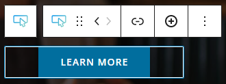
When you select the buttons block, you will see a toolbar on top of it, with several basic editing options. In the previous chapter, we explained the common editing options for all blocks. In the case of the button block, here are the ones that apply: positioning, duplicate, copy style, paste style, paste style and link, and remove block. The copy and paste styling options are available with the PRO plans.
Now, here are the specific editing options for the buttons block:
- Insert link. You can use this option to add a link to the button block. When you add the link, you can toggle the option for opening the link in a new tab.
- Add a new button. You can do this from the “+” sign.
Buttons block: customizations within the block editing panel
Now, let’s select the button inside the buttons block. The moment you select any block, the Kubio block editing panel will open up on the right-hand side. It always has three options: Content, Style, and Advanced. The possibilities inside vary from block to block. Now, in the case of this block, the styling options aren’t avaialble. But, don’t panic. Once you make an individual button selection, you will be able to style them.
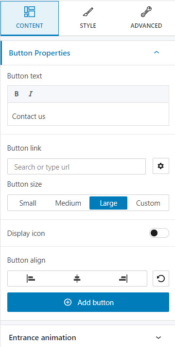
The buttons block – Content options
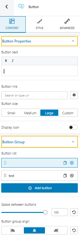
Here we have two main editing categories:
- Button properties. Here you can type your text, but you can also do it live, directly on the canvas. You can make your text bold, or italic, and add a link to it. You can also make size adjustments to the button.
- Button group. Here you can create more buttons inside a group. You can set up the distance between buttons, as well as their alignment.
The buttons block – Advanced options
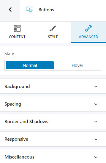
Here are the available advanced buttons block edits, for both the normal and hover states.
- Background. Here you can make adjustments to background color and type of the Gutenberg button block.
- Spacing. Here you can set up the margins and paddings for your buttons block.
- Border and shadows. Here you can add borders with a different color, radius and thickness to your block. Also, you can add box shadows. You have full control over the position, blur, spread and color of the box shadow.
- Responsive. Here you can decide whether the block will show or not on desktop, tablet or mobile.
- Miscellaneous. At this level you can set up the z-index of your button block (vertically order the elements that overlap), set up if the element overflows or not (displaying the content of the block flowing out of its container into the surrounding area), add HTML anchors and CSS classes.
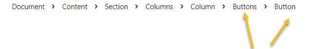
Now, let’s take a look at the individual button block, and see the available options inside the editing panel. Now, you can always use the breadcrumb view at the bottom of the page, for the blocks selection. Notice how a button is nested inside the buttons block? You can click on any of them in order to make further edits and styling.
The button block – Content options
At this level you can:
- Make changes to the button text. You can do this from the web page preview as well.
- Add a URL to the button. This can be done from the button toolbar as well.
- Change the button size.
- Add an icon to the button.
- Align the button.
- Add a new button.
- Add an entrance animation.
The button block – Style options
The moment you select an individual button, you can style it both in a normal and hover state.
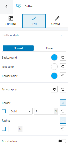
Here’s what you can customize:
- Background, text, and border color.
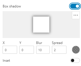
- Box shadows. You can make adjustments to the position, blur, color, and spread radius of the box shadow.
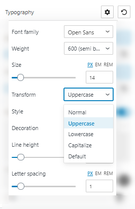
- Typography. You can set up a different font family, font size, and weight for the button text. You can add decorations to text, set up capitalization, and adjust line height and letter spacing. Here‘s more info on how to set up typography in Kubio.
- Border. There are several border types that you can choose from. You can change the border color and thickness easily.
- Border radius. From this option you can round the border’s corners. You can also assign different values for top-right, top-left, bottom-left and bottom-right, if you select the link symbol.
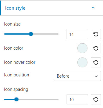
- Icon styling. If you have enabled the icon at the Content level, it’s here where you can customize it. You can make color, size, position, and spacing changes.
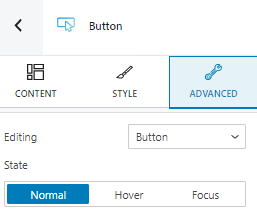
The button block – Advanced options
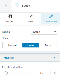
At this level, you can make edits to the button or icon, across three states: normal, hover, and focus.
No matter what you choose to edit, you have the same options both in the normal and the focus state, while the hover states bring an extra edit option for transition. Here you will have to set up the duration of the transition.
Here are the available advanced button block edits:
- Background. Here you can make adjustments to background color and type of the Gutenberg button block.
- Spacing. Here you can set up the margins and paddings for your buttons block.
- Border and shadows. Here you can add borders with a different color, radius and thickness to your block. Also, you can add box shadows. You have full control over the position, blur, spread and color of the box shadow.
- Typography. The same typography edits that can be made under the styling options can be found here. There’s also a shortcut that you can take to manage the theme’s defaults.
- Responsive. Here you can decide whether the block will show or not on desktop, tablet or mobile.
- Miscellaneous. At this level you can set up the z-index of your button block (vertically order the elements that overlap), set up if the element overflows or not (displaying the content of the block flowing out of its container into the surrounding area), add HTML anchors and CSS classes.