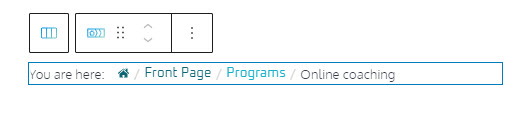
A breadcrumb is a row of internal links inside a page (usually top or bottom) that allows visitors to quickly navigate back to a previous page, until the root page. In general, the root page link is the first, leftmost link, while the current page is the last link, the furthest one to the right, like here:
In order to create such a sequence of links, you should declare some parent relationships across pages in WordPress.
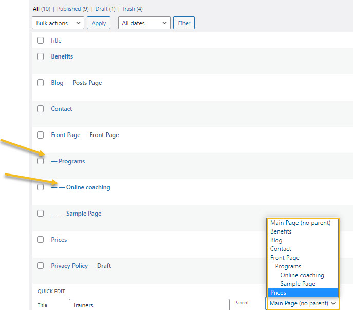
Let’s see how we created the breadcrumb above. The template we use now has 10 pages. From the dashboard, we head over to Pages -> All Pages. When hovering over any page, you’ll notice some options. Let’s choose “Quick Edit”. We can now assign a parent page for any page.
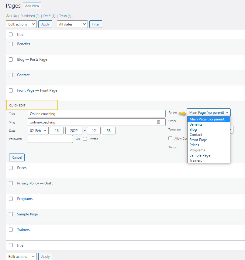
We’ll have the Front Page as the Main Page. Then, “Programs” will have the Front Page as a parent, then, the “Online coaching” will have “Programs” as a parent.
Hit “Update” in order to make the changes.
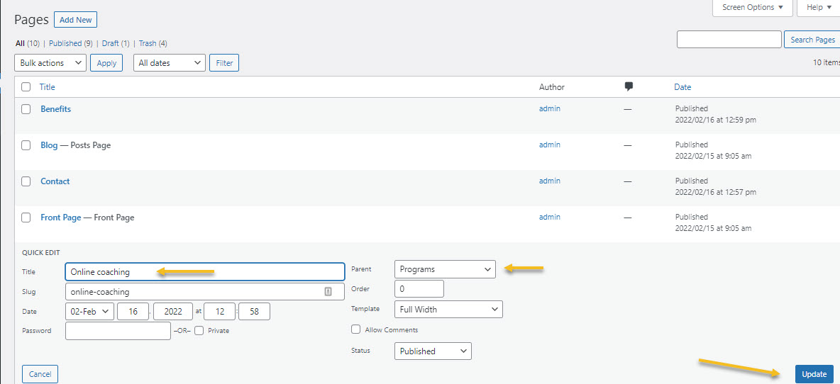
If you now take a look at all the pages, you can easily notice which pages get nested, and their level of nesting, judging by the indentation.
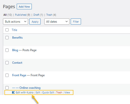
Now, let’s go inside the “Online coaching” page using the “Edit with Kubio” option.
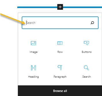
Now, let’s add the breadcrumb block. For this, you need to click on a “+” sign. This will open up a block inserter. Type in the name of the block and add it to the page.
The block will look like this:
When you select the breadcrumb block you will see a toolbar on top of it, with several basic editing options. In a previous chapter, we explained the common editing options for all the Kubio blocks. In the case of the slider block, here are the ones that apply: positioning, duplicate, insert before, insert after, copy style, paste style, paste style and link, and remove block.
Breadcrumb block: customizations within the block editing panel
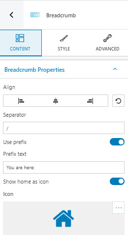
The moment you select any block, besides the toolbar you will also notice a block editing panel on the right-hand side. It always has three options: content, style, and advanced. The possibilities inside vary from block to block. Let’s take them one by one.
Content
At this level you can:
- Align the content of the breadcrumb to the left, center, or right,
- Change the page separator. The default is this one “/”,
- Enable or disable the prefix text,
- Type the prefix text, if the feature is enabled,
- Enable or disable the home icon,
- Choose a home icon. There are 9 libraries available for icon selection.
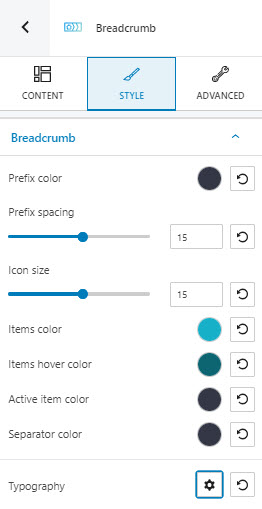
Style
At this level you can:
- Choose a prefix color,
- Adjust the prefix spacing,
- Adjust the icon size,
- Customize the items color, items hover color, active item color, and separator color. Find out here how you can make color changes.
- Make typography adjustments. Find out here how you can make typography changes.
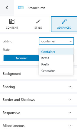
Advanced
At this level, you can make edits for the normal and hover states across the container, the breadcrumb items, the prefix, and the separator. Here are the available customizations:
- Background. Here you can make adjustments to background color and type, as well as add overlays.
- Spacing. Here you can set up the margins and paddings for the slider block.
- Border and shadows. Here you can add borders with a different color, radius and thickness to your block. Also, you can add box shadows. You have full control over the position, blur, spread, and color of the box shadow.
- Responsive. Here you can decide whether the block will show or not on desktop, tablet, or mobile.
- Miscellaneous. At this level, you can set up the z-index of your block (vertically order the elements that overlap), set up if the element overflows or not (displaying the content of the block flowing out of its container into the surrounding area), add HTML anchors and CSS classes.
At the hover level you can notice an extra setting: transition. Let’s say you set the transition to 5 seconds, and that you have a separate background set up for the normal and hover states of the breadcrumb. This means that the transition from a background to the other will take 5 seconds, under hovering.