Blocks in WordPress, also called Gutenberg blocks are website items that can serve various purposes: headings, images, lists, tables, etc.
Inside the WordPress editor, there are some already existing blocks. You can use them from any page or post level. Kubio will add some extra Gutenberg blocks in the blocks panel. If you go to the “+” sign in the upper-left corner, you’ll see the block inserter. The default WordPress blocks have black icons, while the Kubio ones have blue & green icons. The Kubio blocks are shown first.
The Kubio Gutenberg blocks are structured like this:
Kubio – Basic Blocks
Here you’ll find the following Gutenberg blocks: image, video, spacer, row, link group, buttons, heading, paragraph, icon, and divider. All the basic blocks are included in Kubio free.
Kubio – Advanced Blocks
The advanced blocks are split between free and pro blocks.
Here are the free blocks: image gallery, shortcode, map, posts list, social icons, icon lists, dropdown menu, tabs, accordion, dropdown menu, and accordion menu.
Here are the pro blocks: carousel, slider, counter, breadcrumb, pricing, pricing table, image collage, flipbox, and subscribe form.
Kubio – Site Data Blocks
These are the elements that shape your identity or allow users to browse your site for specific content: Copyright, Search, Logo, Page title, and Home Button.
Kubio – Blog blocks
Older WordPress users might recognize some of these blocks as the former WordPress widgets: Widget Area, Pagination, Pagination Nav Button, Pagination numbers, Post title, Post summary, Post featured image, Post tags, Post categories, Post metadata, Post comments, Post comment form, Posts list, Author avatar, Author name, Author bio, and Read more button.
Kubio – Layout
You can add a new section using the Section block. If, by any chance, you have deleted the navigation or hero, you can add them back from here.
Template Parts
Template parts are modules that have a specific role such as header, footer, or sidebar, that can be added to a page. Usually headers, footers and sidebars are used in several places across a site, and by defining them as a separate template part design becomes more scalable. You will avoid creating the same design over and over again.
Now, you can drag your desired block from the block inserter and drop it wherever you want on a page or post. You can also find the “+” sign inside your page content, after clicking on certain elements.
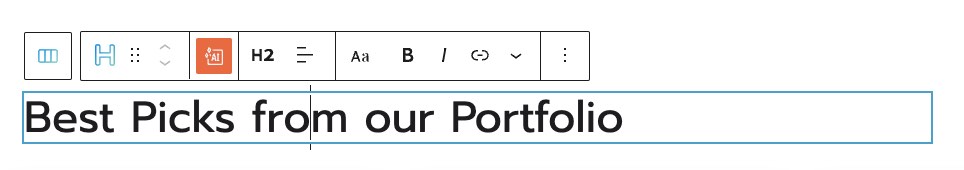
Every block has some basic editing options in a toolbar. They show up when you select the block on the page you’re working on. The options in the toolbar vary slightly from block to block. All blocks share the following basic editing options:
- Positioning
When you select the 6 dots, you will have the option to drag and drop the block where you want;
When you select the up and down arrows, you will move the block up and down.
Some blocks (eg: buttons block) have left and right allows, that allow you to move the block to the left or right.
- Options. Inside options, there are several actions that you can take:
Duplicate. This allows you to clone your current block. After this duplication, you can style both blocks independently.
Insert before. This allows you to insert a new block before the current one.
Insert after. This allows you to insert a new block after the current one.
Lock. You can use this feature to block certain attributes in the toolbar. You ca restrict block moving or block removal, or both of them.
Copy style (PRO only) – use this option when you want to copy the style from a block to another. This will copy text color, background color, font size, font family, borders and their styling, to another block. This option is used together with the paste style. You can copy and paste styles across the same type of block, from paragraphs to sliders. Now, you should know that in the case of advanced blocks, they have multiple blocks inside (buttons, images, text, etc), the styling won’t be copied for the elements on the inside as well.
Paste style and link (PRO only) – after copying the style from another block, use this option to paste the style. When the styles are linked it means that any style change happening on a block, it will be reflected to the other one as well.
Paste style (PRO only) – after copying the style from another block, use this option to paste the style. This option won’t link the styles of the blocks, meaning that a styling change done to a block, won’t affect the other.
Remove block. This is how you delete the block you’re currently on.
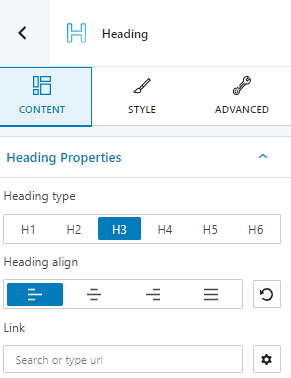
There are also advanced editing options available for every block, like the ones you could notice when editing sections or columns. The moment a Gutenberg block is selected, a block editing panel will be available on the right with the following options: content, style, and advanced. Inside these options, the settings will vary depending on the chosen block. We’ll explain all the options at the level of each block.
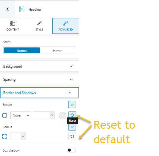
Important! You can always use the undo option from the upper-left to undo changes. Also, most of the content and styling settings in the block editing panel can be reset to default, if you click on the options shown below: