When inside Kubio, from the editor on the left, go to General Settings -> Typography.
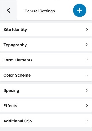
Here you can redefine your global typography for headings, body text, lead text, and links.
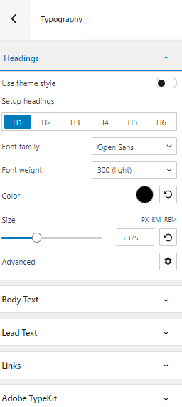
No matter what you choose, a heading, a link, etc, you can customize the following:
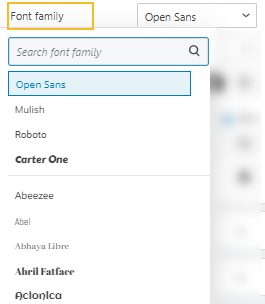
- Font Family. Tons of Google fonts are available for you to choose from. If you have a PRO plan you can retrieve Adobe Fonts using an API token. If scrolling isn’t your thing, and you already know the font you want to use, you can type its name in the search box.
- Font Weight. This refers to the relative thickness of a font’s stroke. In this case, 300 is the thinnest font-weight, while 800 is the thickest one.
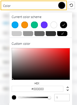
- Font Color. You can pick a color from there, use the slider, or just type in your desired color code in the “HEX” field. Then, you can switch to the RGB color mode if it suits you better from the dropdown arrow.
You can also adjust the opacity. The slider offers you values from 0 to 1, 1, meaning there’s no transparency.
- Font Size. You can use the slider to make the font size smaller or higher. You can use PX, EM, and REM for font sizes.
Pixels (PX) are considered absolute units that adjust to the resolution of the viewing device. EM and REM sizes are a better match to responsive design. They are relative units that scale up and down according to another element’s size. They are very versatile because the moment you change the size of your primary factor, the rest of the sizes will adapt. This saves you a lot of work when you decide to make adjustments to your font sizes.
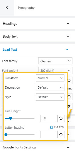
- Advanced. This will open up a new panel with several other editing options.
- Transform. This option allows you to make letter capitalization changes.
- Decoration. Here you can add underlines, overlines, or line throughs.
- Style. This is where you can make your font italic or bold.
- Line height. This is where you can control the amount of space between baselines in a block of text. A text’s line height is proportional to its type size. In this case, the default is 1.6x the actual font size. You can decrease it or increase it if you want. Just make sure that your text doesn’t look too crowded or too loose.
- Letter spacing. This refers to the space between letters in a piece of text. In the case of headlines, to improve readability, it is advised to use tighter letter-spacing. For smaller type sizes, looser letter spacing can improve readability.