No website should miss having a contact form. It’s an effective way to be in touch with prospects, customers, and others. Now, forms are not native to WordPress. This is why you need to use a form plugin. Our recommendations are: Contact Form 7, Forminator, and WPForms.
Before using the contact form block, you will need to create a form with one of these plugins. Next, you can drag the contact form block to the section you want on your page, or add the block from any “+” sign on your canvas.
Contact form block: basic edits
When you select the contact form block, you will see a toolbar showing up on top of it, with several basic editing options. In a previous chapter, we explained the common editing options for all blocks. In the case of the contact form block, here are the ones that apply: positioning, duplicate, insert before, insert after, copy style, paste style, paste style and link, and remove block. The copy and paste styling options are available with the PRO plans.
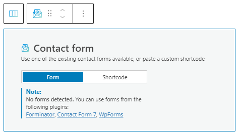
Now, the contact form block can recognize any forms you’ve built, but you can also paste a custom shortcode.
Contact form block: customizations with the Kubio block editing panel
The moment you select any block, a block editing panel will open up on the right-hand side. It always has three options: content, style, and advanced. The possibilities inside vary from block to block. Let’s look at what distinguishes the contact form block from the rest of the blocks.
Content
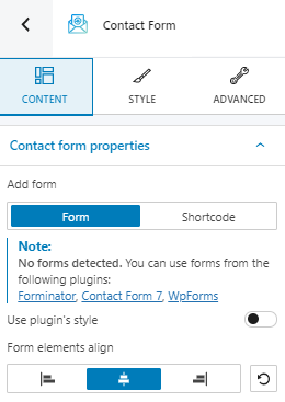
At the “Content” level you can:
- Add forms.
- Align horizontally the form elements.
- Choose to use the plugin’s style.
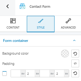
Style
If you choose to go with a different style than the one in your form plugin, you can do this inside the “Style” and “Advanced” options.
A form is made of:
- A form container
- Fields
- Labels
- Submit buttons
- Notices
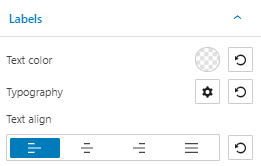
Inside “Style” you can make custom edits to all the above. Let’s take them one by one:
Form container edits: background color and padding.
Label edits: text color, typography, and text alignment.
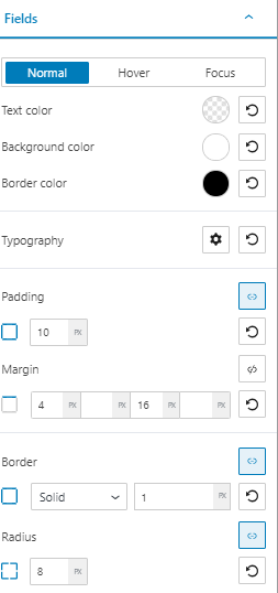
Field edits: you can style the fields in the normal, hover, or focus states. You can customize text, background and border colors, typography, margins, and paddings.
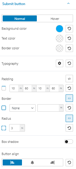
Button edits are allowed for the normal and hover states. You can customize text, background and border colors, typography, margins, paddings, box shadow, and button alignment.
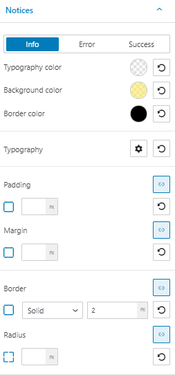
Notice edits: when the user fills in the form fields, you can guide him with notices. Also, the moment a form gets submitted, you can notify the user that the submission was successful or had errors. This is why we have defined three types of notices: info, error, and success. By default, the info notices have a yellow background color, the errors are red, while the success messages are on a green background. We suggest that they stay like this because it’s a pattern recognizable across all websites.
Now, here are the other customization options available: typography color, border color, typography, margin, and padding.
Advanced
At this level, you can make edits for the normal and hover states across the:
- Form container,
- Labels,
- Fields,
- Submit button,
- Error notice,
- Info notice,
- Success notice.
All the below customizations are available for all of the above:
- Background. Here you can make adjustments to background color and type.
- Spacing. Here you can set up the margins and paddings for the contact form block items.
- Border and shadows. Here you can add borders with a different color, radius and thickness to your block. Also, you can add box shadows. You have full control over the position, blur, spread, and color of the box shadow.
- Typography. You can set up a different font family, font size, and weight for the text. You can add decorations to text, set up capitalization, and adjust line height and letter spacing. When you select the “default” option you’ll be taken to the General Settings, where you can change defaults (color scheme, typography, etc.).
- Responsive. Here you can decide whether the block will show or not on desktop, tablet, or mobile.
- Miscellaneous. At this level, you can set up the z-index of your block (vertically order the elements that overlap), set up if the element overflows or not (displaying the content of the block flowing out of its container into the surrounding area), add HTML anchors and CSS classes.