Lists are used to structure information and make it more accessible. You can accompany lists with icons, to give a fresh air to your design.
You can drag the icon list block to the section you want on your page from the block inserter, or add the block from any “+” sign on your canvas.
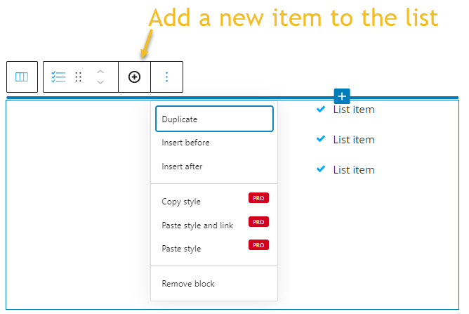
When you select the icon list block, you will see a toolbar on top of it, with several basic editing options, explained here. In the case of the icon list block, here are the ones that apply: positioning, duplicate, insert before, insert after, copy style, paste style, paste style and link, and remove block. The copy and paste styling options are available with the PRO plans. All these options were explained in this previous chapter of the documentation.
What’s specific to this block is the “+” sign that allows you to add more list items.
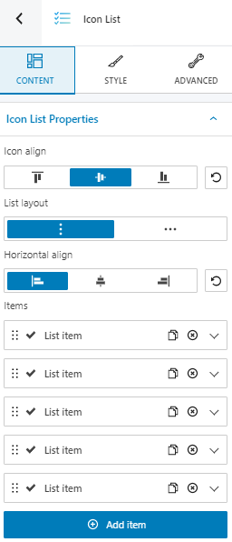
Icon list block: customizations within the block editing panel
The moment you select any block, a block editing panel will open up on the right-hand side. It always has three options: content, style, and advanced. The possibilities inside vary from block to block. Let’s now check what’s specific to the icon list across the “Content” and “Style” edits.
Content
At the “Content” level you can:
- Align your icons top, center, or bottom.
- Choose a horizontal alignment. You can go with left, center, or right.
- Choose between a vertical or horizontal list layout.
- Add new list items.
Style
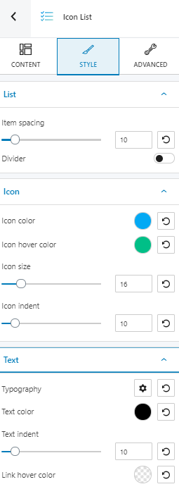
Here you can style the list, its icons, and text. Let’s take them one by one.
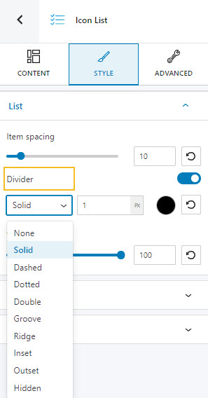
At the list level you can customize item spacing, and you can also apply a divider. There are several shapes that you can choose from.
At the icons level, here’s what you can style:
- Icon color and hover color. More info on how to deal with colors in Kubio, here.
- Icon size,
- Icon ident.
Advanced
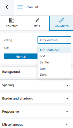
At this level, you can make edits for the normal and hover states across the list container, text, list item, icon, and links. Here are the available customizations:
- Background. Here you can make adjustments to background color and type.
- Spacing. Here you can set up the margins and paddings for the icon list block items.
- Border and shadows. Here you can add borders with a different color, radius and thickness to your block. Also, you can add box shadows. You have full control over the position, blur, spread, and color of the box shadow.
- Typography. You can set up a different font family, font size, and weight for the text. You can add decorations to text, set up capitalization, and adjust line height and letter spacing. When you select the “default” option you’ll be taken to the General Settings, where you can change defaults (color scheme, typography, etc.).
- Responsive. Here you can decide whether the block will show or not on desktop, tablet, or mobile.
- Miscellaneous. At this level, you can set up the z-index of your block (vertically order the elements that overlap), set up if the element overflows or not (displaying the content of the block flowing out of its container into the surrounding area), add HTML anchors and CSS classes.