This Gutenberg block allows you to add and customize links or groups of links on your website. You can drag the WordPress image block to the section you want on your page, or add the block from any “+” sign on your canvas.
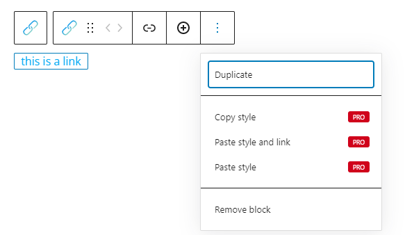
When you select the link block, you will see a toolbar showing up on top of it, with several basic editing options that are common across other Gutenberg blocks as well: positioning, duplicate, copy style, paste style, paste style and link, and remove block. The copy and paste styling options are available with the PRO plans.
Here are the specific editing options for the link group block:
- Link. Use this option to paste your desired URL. Also, you can specify whether the link will open up in a new window or not, or whether the link will be do-follow or not.
- Add more links to the group.
Link Group block: customizations within the block editing panel
The moment you select any block, a block editing panel will open up on the right-hand side. It always has three options: content, style, and advanced.
Content
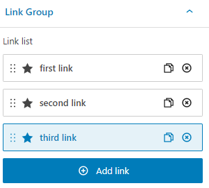
Here you should pay attention to the way you make your block selection. If you select the whole group, you’ll see some edits available. If you select links inside the group, you’ll have some additional options per link.
When you select the whole group of links, you’ll be seeing this panel on the right:
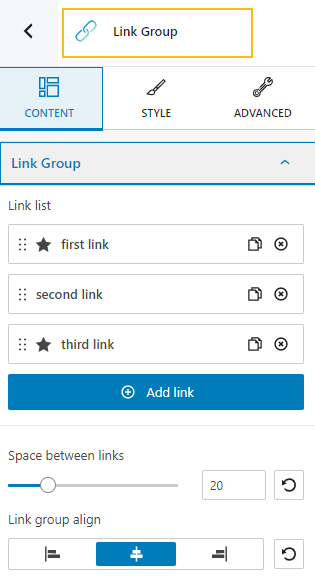
At the link group content level you can:
- Add new links to the group and the possibility to rearrange them by drag and drop;
- Manage the space between the links;
- Align the link group to left, center, or right.
When you select individual links, you’ll be seeing this panel on the right:
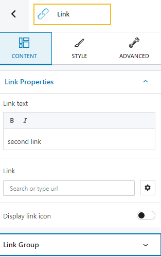
At the link content level you can:
- Change the link text;
- Make the link text italic or bold;
- Add a URL;
- Add an icon to the URL;
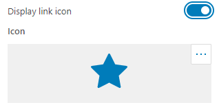
- Add new links to the group and the possibility to rearrange them by drag and drop;
- Manage the space between the links;
- Align the links to left, center, or right.
Style
When you select the link group, there are no styling options available, but when you select individual links, you’ll have the following options:
- Link style. You can make adjustments to: typography, text color, hover and visited text color.
- Icon style. You can make adjustments to the icon size, color, position, spacing, and hover color.
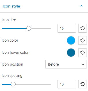
Here you can find more info on dealing with typography.
Here you can find more info on customizing colors and backgrounds.
Advanced
With the whole link group, you’ll be able to make customizations in the normal and hover states. In the case of individual links, you can also decide what happens with links in the visited state.
Now, let’s look at the customization options.
- Background. Here you can make adjustments to background color and type.
- Spacing. Here you can set up the margins and paddings for your link block.
- Border and shadows. Here you can add borders with a different color, radius and thickness to your block. Also, you can add box shadows. You have full control over the position, blur, spread and color of the box shadow.
- Responsive. Here you can decide whether the block will show or not on desktop, tablet or mobile.
- Miscellaneous. At this level you can set up the z-index of your block (vertically order the elements that overlap), set up if the element overflows or not (displaying the content of the block flowing out of its container into the surrounding area), add HTML anchors and CSS classes.