The counter block allows you to show various numbers on your website, to suggest:
- Clients,
- Projects,
- Reviews,
- Countries where the business operates,
- Years of experience,
- and more.
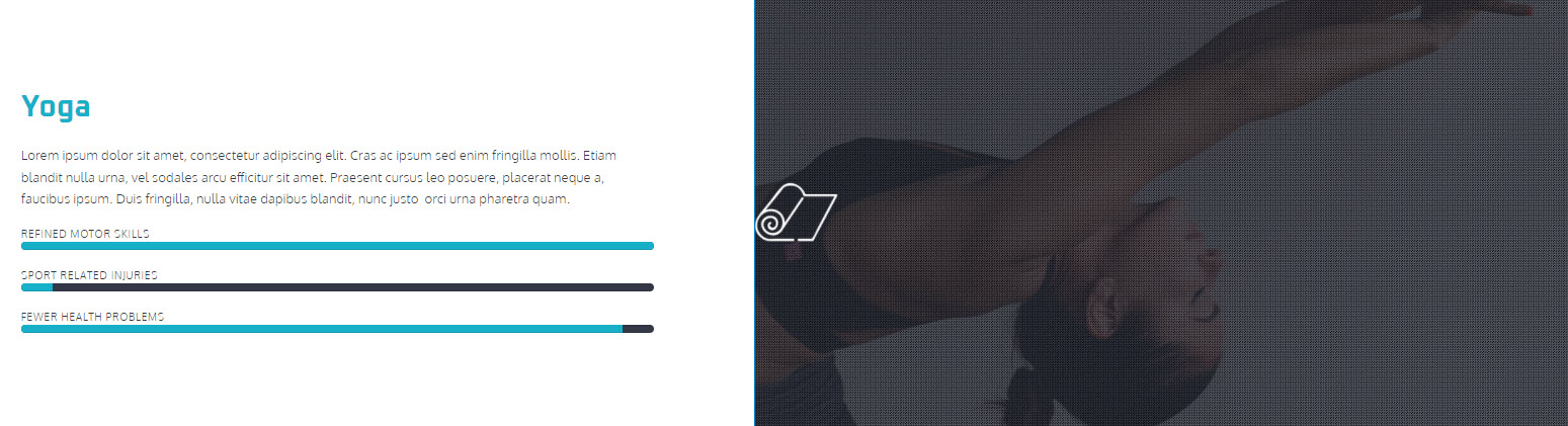
You can even track progress, or show off benefits like in the example below. This is a website section, from a Kubio gym starter template, that uses three counters to show the benefits of Yoga across 3 areas.
The counter block is available inside Kubio PRO.
You can drag the block to the section you want directly from the block inserter, or add the block from any “+” sign on your canvas.
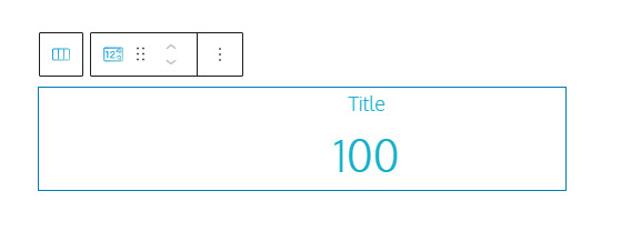
This is how the default counter block looks in Kubio:
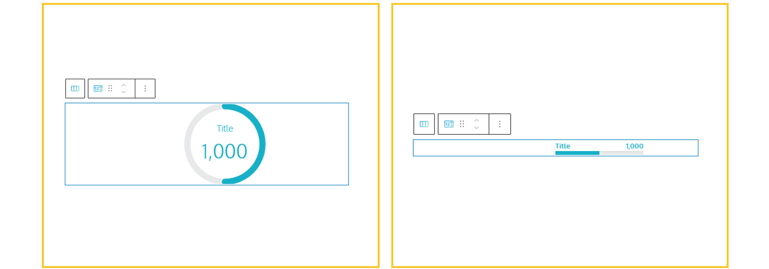
But you can easily switch to circle or bar-shaped counters.
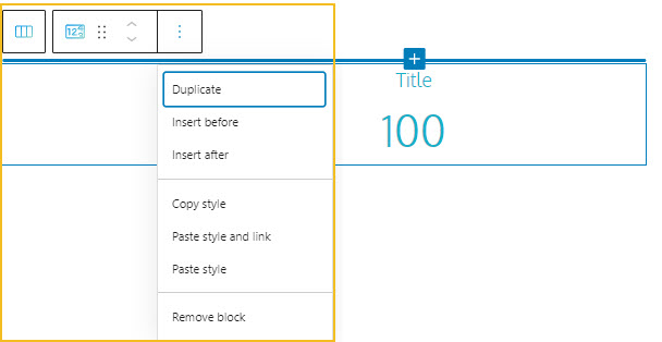
Now, when the counter block is selected, a toolbar shows up on top of it, with several basic editing options. In a previous chapter, we explained the common editing options for all the Kubio blocks. In the case of the current block, here are the ones that apply: positioning, duplicate, add column before, add column after, copy style, paste style, paste style and link, and remove block.
Now, let’s see how we can customize the counter block using the block editor. The moment the block gets selected, you’ll notice a panel on the right with these menu items: Content, Style, and Advanced. Here you can transform the block anyway you see fit. Let’s go inside.
Content
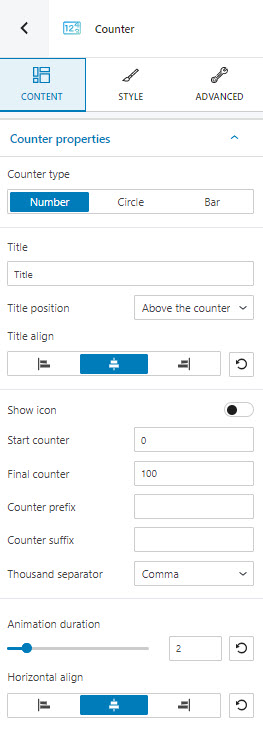
At this level you can:
- Select the counter type. You can choose between text, circle, and bar,
- Title: here you can type the counter’s title,
- Title position: you can choose between above the counter and under the counter.
- Title align: align the text to the left, center or right, inside de counter,
- Show icon: you can choose whether to show or not an icon next to your counter. When the option is enabled, you will be able to choose an icon from 8 icon libraries,
- Start counter value: type the number from where the counter will start counting,
- Final counter value: type the final value that will be displayed inside the counter,
- Counter prefix: let’s say you want your counter to go from 1910 to 1999. 19 can be set as a prefix, while the counter can count from 10 to 99 . You can set up a counter suffix, in a similar fashion,
- Thousand separators: here you can choose from comma, dot, space, none
- Animation duration: here you can choose a duration between 1 and 10 seconds for the counter,
- Horizontal align: choose between a left, center or right alignment for the counter.
If you switch the counter to “circle”, there is some additional setup that you can do:
- Amount – instead of start and final value, you need to set up an amount value,
- Progress value – you can setup a percentage value from the total to show progress.
If you switch to row, you can set up the progress value and you can decide whether to show the counter in the same rows as the title, inside the bar, or not show it at all.
Style
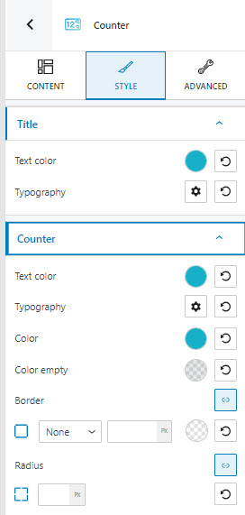
At this level, you can:
- Set up the title text color,
- Set up the title typography,
- Customize the counter text color,
- Customize the counter’s typography,
- Customize the counter’s color, as well as the color of its empty part,
- Add a counter border.
Read more here about color changes.
Read more here about typography changes.
Read more here about border changes.
Advanced
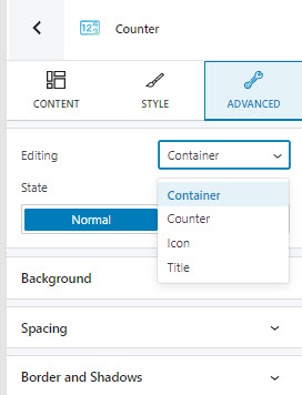
At this level, you can make edits for the container, counter, icon, and tile, across the normal and hover states. Here are the available customizations:
- Background. Here you can make adjustments to background color and type.
- Spacing. Here you can set up the margins and paddings for the pricing block.
- Border and shadows. Here you can add borders with a different color, radius and thickness to your block. Also, you can add box shadows. You have full control over the position, blur, spread, and color of the box shadow.
- Typography. You can set up a different font family, font size, and weight for the text. You can add decorations to text, set up capitalization, and adjust line height and letter spacing. When you select the “default” option you’ll be taken to the General Settings, where you can change defaults (color scheme, typography, etc.).
- Responsive. Here you can decide whether the block will show or not on desktop, tablet, or mobile.
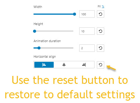
Important! You can always revert any setting to its defaults using the reset button.