A website slider is a succession of images and/or text, buttons, and more that come onto the screen one after another. Their purpose is to structure information in a visual, engaging, more appealing way, as well as to minimize website scrolling.
The slider block is available inside Kubio PRO.
You can drag the block to the section you want on your page from the block inserter, or add the block from any “+” sign on your canvas. This is the default slider that will show up:

Slide 3 Heading
Praesent scelerisque blandit elit, nec accumsan metus vulputate sit amet. Pellentesque quis consectetur libero. Mauris sit amet nunc sit amet scelerisque.
Slide 4 Heading
Praesent scelerisque blandit elit, nec accumsan metus vulputate sit amet. Pellentesque quis consectetur libero. Mauris sit amet nunc sit amet scelerisque.
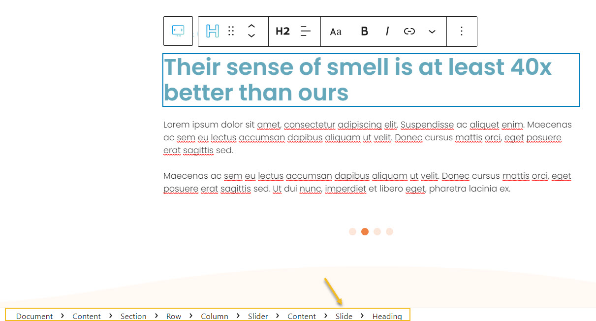
A slider has two main components:
- Navigational cues that can come in the shape of dots or arrows. Notice the arrows in the example above.
- Slides. Inside a slide you can nest image blocks, headings, paragraphs, buttons, and more. Each block inside the slider can be edited individually. For example, this slider item has 2 headings and two paragraphs:
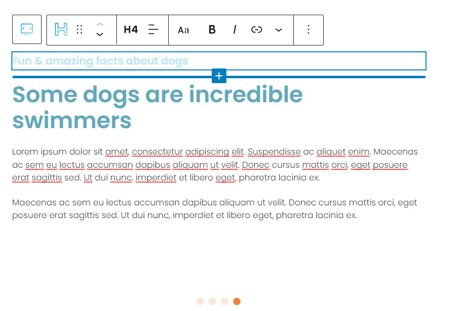
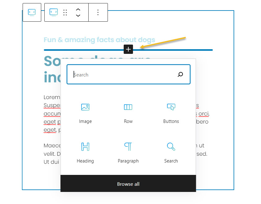
When you hover over any block inside a slide you can notice a “+” sign. In the image above there’s a “+” sign between the two headings. You can click on it to open up the block inserter in order to add new blocks to the slide.
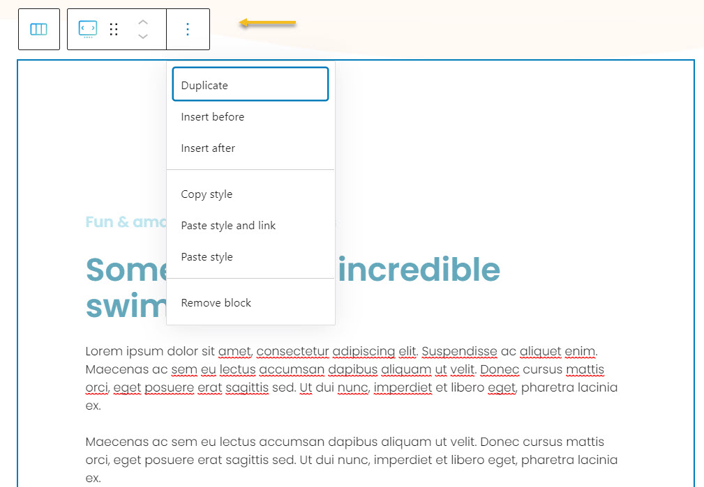
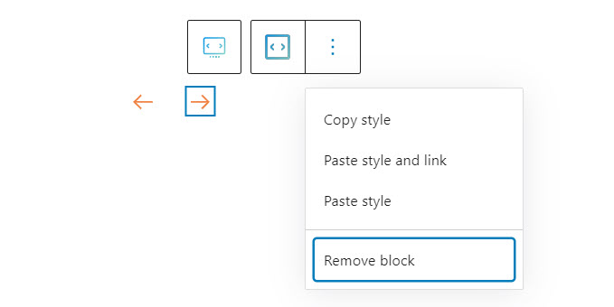
When you select the slider block, you will see a toolbar on top of it, with several basic editing options. In a previous chapter, we explained the common editing options for all the Kubio blocks. In the case of the slider block, here are the ones that apply: positioning, duplicate, insert before, insert after, copy style, paste style, paste style and link, and remove block.
Slider block: customizations within the block editing panel
The moment you select any block, besides the toolbar you will also notice a block editing panel on the right-hand side. It always has three options: content, style, and advanced. The possibilities inside vary from block to block.
Let’s now check what’s specific to the slider block across the “Content” and “Style” edits.
Content
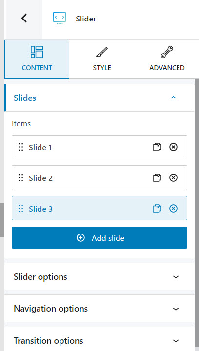
Inside “Content” there are 5 main types of changes that you can do:
- Slides level
- Enter any slide in order to style it. Go here to find out more about slides styling.
- Add new slides to the slider using the “Add slide” button,
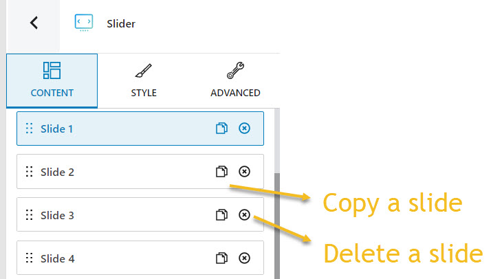
- Reorder slides. After selecting the 6 dots in the slide’s name, you can drag and drop your slide wherever you want.
- Remove or duplicate slides.
- Slider options
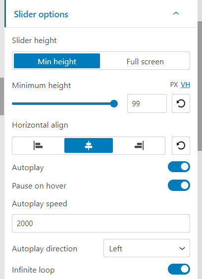
- Assign a slider minimum height or set it to full screen. The height can be set up in pixels (PX) or relative to 1% of the width of the viewport (VH). The viewport refers to the browser window size. For example, if you set up VH as 100, the slider will be as high as the browser window size, aka 100×1%=100%. If you want to have a slider that has 50% of the height of the browser window size, you have to set up the VH to 50.
- Align the slider’s content horizontally,
- Toggle off the autoplay option,
- Choose whether the autoplay should stop or not on hover,
- Set up the autoplay speed (in milliseconds),
- Set up the autoplay direction to left or right,
- Toggle off the infinite loop option.
Important: the infinite loop and autoplay are visible only outside the Editor. Save the page and hit the “Preview” button for this.
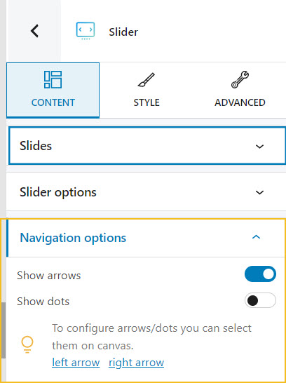
- Navigation options. Here you can choose between arrows or dots in order to move left and/or right across slides. You can select the arrows or dots directly from the slider for further styling. Find out how to style arrows and dots here.
- Transition options:
- Select between 5 types of transition effects (slide, fade, cube, coverflow, flip). The effect is visible in the preview and live modes, available in the upper-right of the interface.
- Establish the transition speed (in milliseconds),
- Add a Ken Burns effect to the slider’s background images. The Ken Burns effect is a type of panning and zooming effect on still photos. The effect is visible in the preview and live modes.
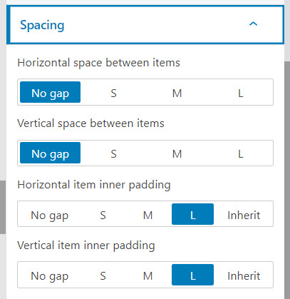
- Spacing options. Here you can establish a horizontal or vertical spacing between slides, or inside the slides. The spacing can be set to small, medium, or large.
Style
Inside the Kubio block editing panel, you can make the following slider styling adjustments:
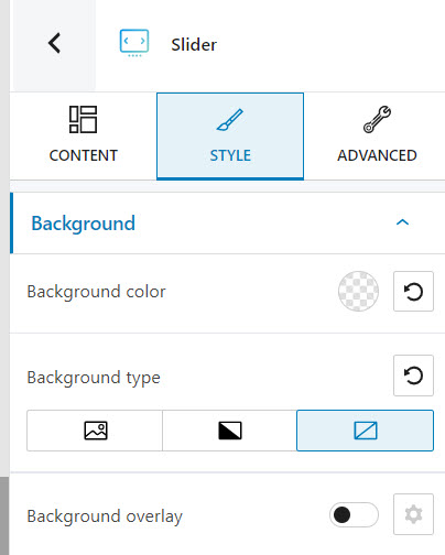
- Select the background type,
- Set up the slider background color,
- Add a background overlay.
More info on how to make these changes, here.
Advanced
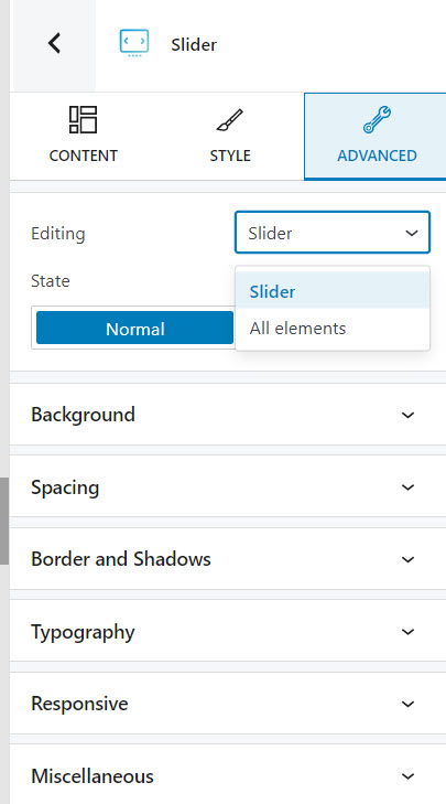
At this level, you can make edits for the normal and hover states across the slider and all elements. Here are the available customizations:
- Background. Here you can make adjustments to background color and type, as well as add overlays.
- Spacing. Here you can set up the margins and paddings for the slider block.
- Border and shadows. Here you can add borders with a different color, radius and thickness to your block. Also, you can add box shadows. You have full control over the position, blur, spread, and color of the box shadow.
- Typography. You can set up different text, heading, link, and hover link color. For other typography edits, you will need to head over to “Edit theme defaults”. This option will lead you to the General Settings, where you can change defaults (font family, font size, font weight, decorations, line height, letter spacing, etc.).
- Responsive. Here you can decide whether the block will show or not on desktop, tablet, or mobile.
- Miscellaneous. At this level, you can set up the z-index of your block (vertically order the elements that overlap), set up if the element overflows or not (displaying the content of the block flowing out of its container into the surrounding area), add HTML anchors and CSS classes.
How to select slides in order to style them
There are two main ways for selecting the slides in your slider:
- Select the Slider and head over to “Content” inside the block editing panel. Click on the slide you want to further edit.
- Go to the canvas and select any item inside the slider. Next, head over to the breadcrumb view at the bottom of the canvas. Click on “Slide” to open up the slide block editing panel to the right.
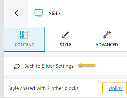
After selecting the slide, you will notice:
- a toolbar with several options that allow you to move, duplicate, remove, and copy and paste styles.
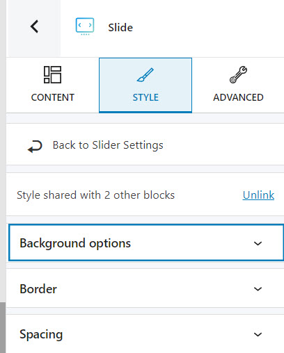
- 3 menu options inside the block editing panel: Content, Style, and Advanced. All the slides share the same styling by default. If you do not want to have the same styling pattern across them, click on “Unlink”. You can also return easily to slider settings if you want.
Now, let’s take the block editing panel options one by one.
Content
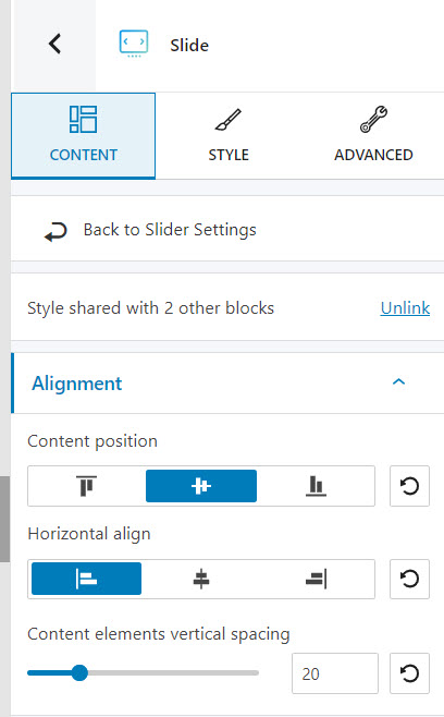
Here you can adjust the slide’s content alignment.
Style
At this level you can:
- Make slide background changes: add a background color, or another background types, or add an overlay. More details on how to do this, here.
- Add and style a slide border. More details on how to customize borders, here.
- Make margin and paddings adjustments inside the spacing option. More details on how to deal with block spacing, here.
Advanced
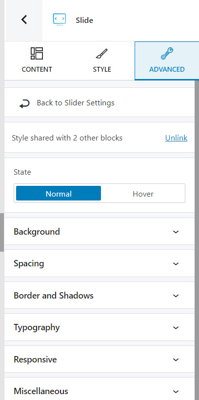
At this level, you can make slide edits for the normal and hover states. Here are the available customizations:
- Background. Here you can make adjustments to background color and type, as well as add overlays.
- Spacing. Here you can set up the margins and paddings for the slide.
- Border and shadows. Here you can add borders with a different color, radius and thickness to your block. Also, you can add box shadows. You have full control over the position, blur, spread, and color of the box shadow.
- Typography. You can set up different text, heading, link, and hover link color. For other typography edits, you will need to head over to “Edit theme defaults”. Here you can change the global typography options for the whole website.
- Responsive. Here you can decide whether the block will show or not on desktop, tablet, or mobile.
- Miscellaneous. At this level, you can set up the z-index of your block (vertically order the elements that overlap), set up if the element overflows or not (displaying the content of the block flowing out of its container into the surrounding area), add HTML anchors and CSS classes.
How to customize the slider arrows and dots
As mentioned earlier, when you edit the slider in the block editing panel, at the Content level you can switch the navigation from arrows to dots and vice versa.
You can easily select the arrows or dots from the slider in order to style them. When you select any of them you will notice a toolbar on top allowing you to copy, paste and link styles, as well as to remove the block.
The panel on the right allows you to make extra customizations, inside its “Content”, “Style”, and “Advanced” options.
Content options for the slider’s dots
At this level you can set the horizontal and vertical position of the dots.
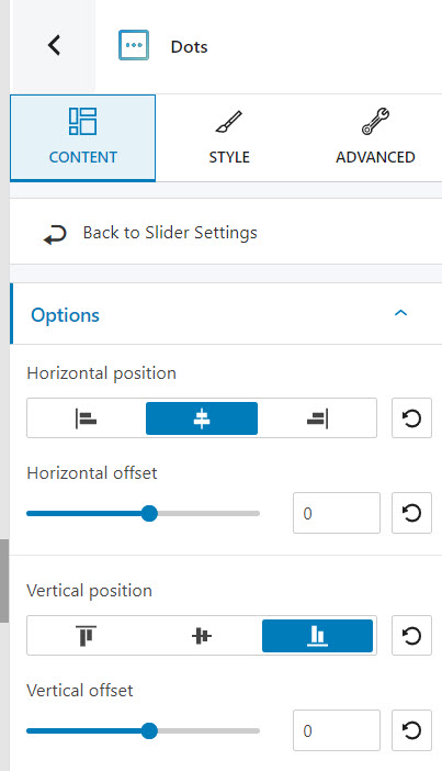
You can also set up the horizontal and vertical offset. The offsets can have both positive and negative values. Let’s say that you selected a centered horizontal position. If you set a positive horizontal offset, it will move the dots to the right, relative to the centered position. The higher the offset, the further the dots will move to the right. A negative vertical offset will move the dots upper on the Y axis, while a positive value will move it down, relative to the initial position.
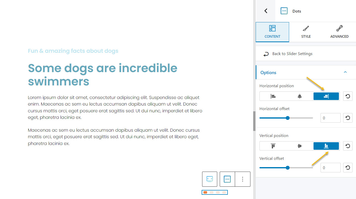
In the example below the dots are aligned to the right, and at the bottom of the block slider.
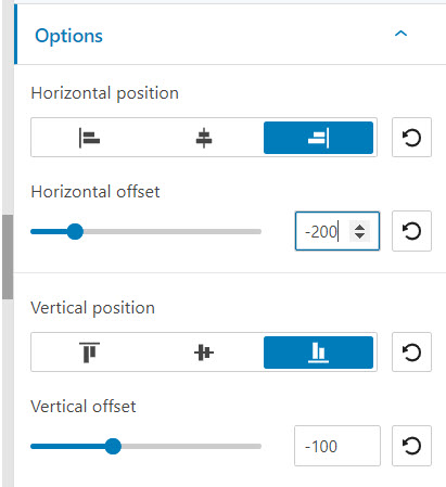
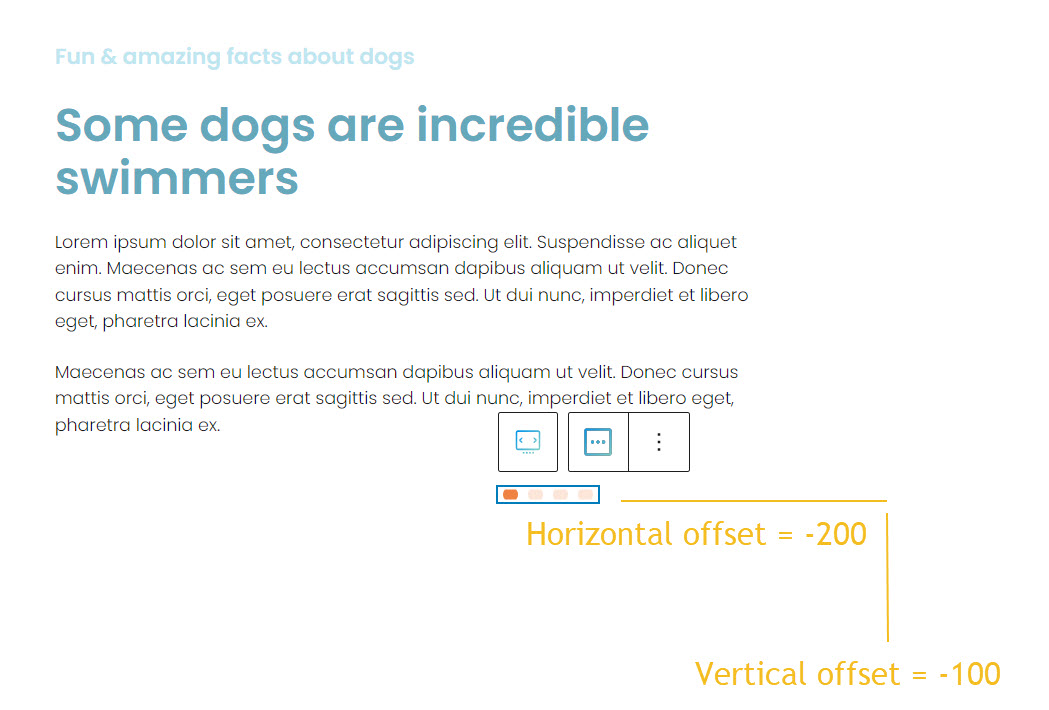
If we set up a negative vertical offset, the dots will move up on the Y axis. Let’s set it to -100. Next, let’s move the dots to the center, on the X axis. We can set up a horizontal offset of -200.
If you compare now the previous dots position with the current one, you notice how it moved closer to the text due to the vertical offset.
Content options for the slider’s arrows
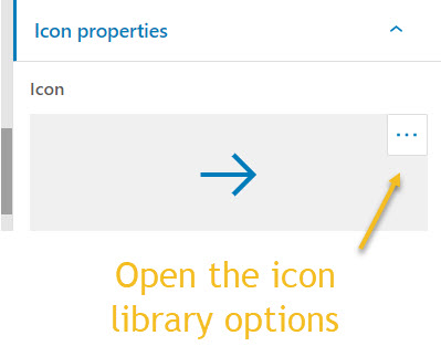
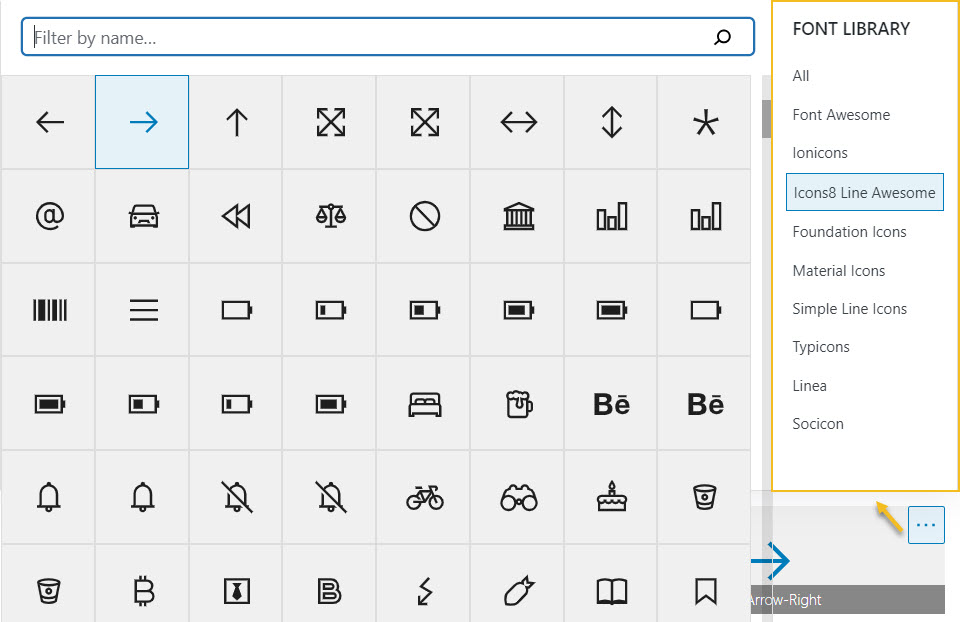
At this level you can select the type of icon you want to use for navigating between slides. There are 8 icon libraries available. For this you need to select the left or right arrow and head over to Icon Properties -> Icon, and open the icon libraries.
At this level you can also set the horizontal and vertical position of the arrows, as well as their offsets. Like in the case of the dots, the offsets can have both positive and negative values. Let’s say that you selected a centered horizontal position. If you set a positive horizontal offset, it will move an arrow to the right, relative to the centered position. The higher the offset, the further the arrow will move to the right. A negative vertical offset will move the arrow upper on the Y axis, while a positive value will move it down, relative to the initial position. This means that each arrow gets positioned individually.
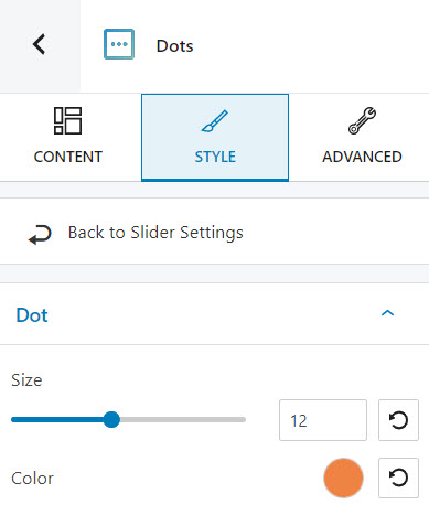
Styling options for the dots
At this level you can change the size of the dots. The maximum size is 30. You can also pick a different dot color.
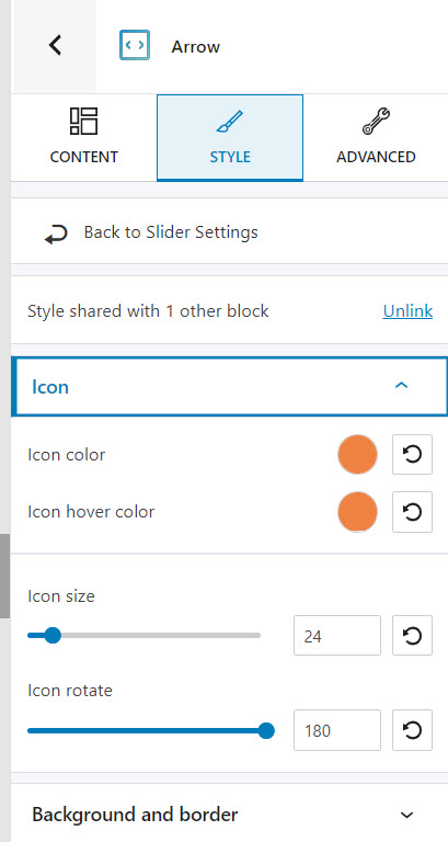
Styling options for the arrows
At this level you ca:
- Set up the icon and icon hover colors,
- Customize the icon size,
- Rotate the icon. You can select between -180 and 180 degrees,
- Customize the icon background and border color both in the normal and hover states,
- Set up a border style, thickness, and radius,
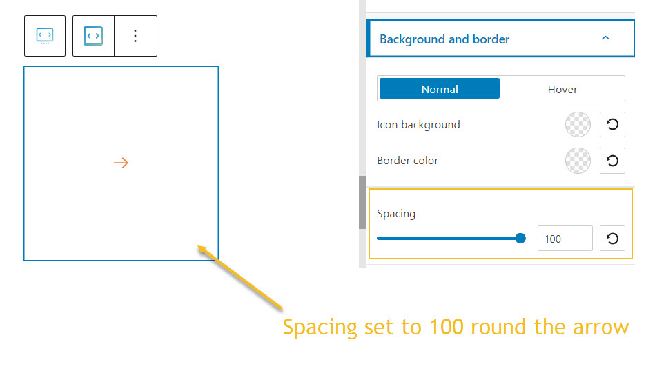
- Set up spacing round the arrow.
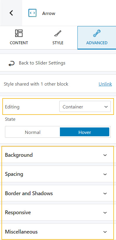
Advanced customizations in the block editing panel for slider dots or arrows
In the case of both dots and arrows you can make changes for the normal and hover states as below:
- Icon: background, spacing, border and shadows.
- Container: background, spacing, border and shadows, responsive, and miscellaneous.
Let’s talk about these options a bit:
- Background. Here you can make adjustments to background color and type, as well as add overlays.
- Spacing. Here you can set up the margins and paddings for the slider block.
- Border and shadows. Here you can add borders with a different color, radius and thickness to your block. Also, you can add box shadows. You have full control over the position, blur, spread, and color of the box shadow.
- Responsive. Here you can decide whether the block will show or not on desktop, tablet, or mobile.
- Miscellaneous. At this level, you can set up the z-index of your block (vertically order the elements that overlap), set up if the element overflows or not (displaying the content of the block flowing out of its container into the surrounding area), add HTML anchors and CSS classes.