With this Gutenberg block you can add images to galleries. You can drag the WordPress image block to the section you want on your page, or add the block from any “+” sign on your canvas.
When you select the image gallery block, you will see a toolbar showing up on top of it, with several basic editing options that are common to most of the Kubio blocks: positioning, duplicate, insert before, insert after, copy style, paste style, paste style and link, and remove block. The copy and paste styling options are available with the PRO plans.
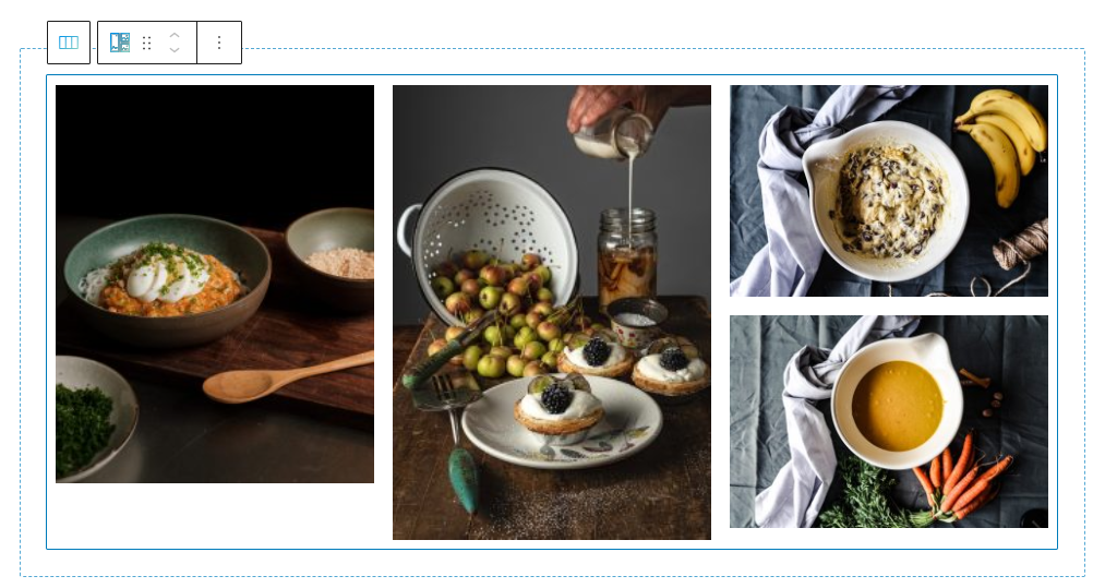
Image gallery block: customizations within the block editing panel
The moment you select any block, the block editing panel will open up on the right-hand side. It always has three options: content, style, and advanced. The possibilities inside vary from block to block.
Content
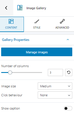
Here you can:
- Add and remove images from your gallery;
- Change the number of columns for the gallery;
- Choose an image size;
- Choose a click behavior for the gallery. The options here are: lightbox, link to media, link to attachment page.
- Show or hide the image caption;
- Attach a link to the image and choose whether to open it in a new window or not, or if you want it to be no-follow or not;
- Change the size of the image;
Style
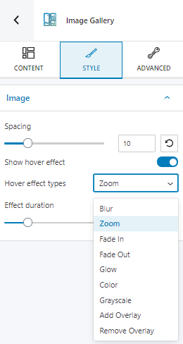
Here you can make changes to:
- Image spacing .
- Image hover effects. There are several predefined effects that you can choose from.
- Effect duration.
Advanced
At this level you can make edits to the gallery, images in the gallery, the image container (the space the image occupies), and captions. The gallery has only a normal state available for editing, while the rest also have a hover state. The edits available in the normal state are identical to those in the hover one.
The following edits are available for the gallery, image, and image container:
- Background.
- Spacing.
- Border and shadows.
- Responsive.
- Miscellaneous.
The same edits are also available for caption, with an added “Typography” layer.
Let’s take these options one by one:
- Background. Here you can make adjustments to the background color and type of the image gallery block.
- Spacing. Here you can set up the margins and paddings for the gallery block and its content.
- Border and shadows. Here you can add borders with a different color, radius and thickness to your block. Also, you can add box shadows. You have full control over the position, blur, spread and color of the box shadow.
- Typography. You can set up a different font family, font size, and weight for the caption text. You can add decorations to text, set up capitalization, and adjust line height and letter spacing.
- Responsive. Here you can decide whether the block will show or not on desktop, tablet or mobile.
- Miscellaneous. At this level you can set up the z-index of your block (vertically order the elements that overlap), set up if the element overflows or not (displaying the content of the block flowing out of its container into the surrounding area), add HTML anchors and CSS classes.