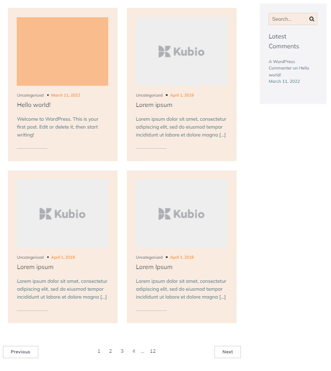
The default blog layout block contains:
- A post list block
- Pagination block
- Pagination nav buttons block
- Blog sidebar (this is a template part)
All the above items can be edited separately.
You can drag the blog layout block to the section you want on your page from the block inserter, or add the block from any “+” sign on your canvas.
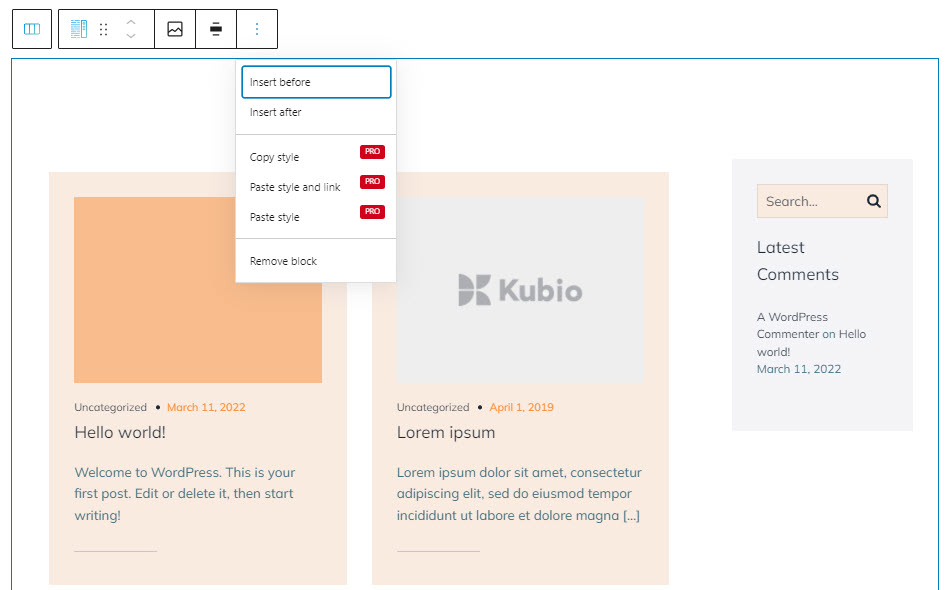
When you select the block, you will see a toolbar on top of it, with several basic editing options. In a previous chapter, we explained the common editing options for all the Kubio blocks. In the case of the blog layout block, here are the ones that apply: positioning, duplicate, insert before, insert after, copy style, paste style, paste style and link, and remove block. The copy paste style options are available only with a PRO plan.
There are two specific edits in the toolbar: change background color and change width.
Blog layout block: customizations within the block editing panel
The moment you select any block, besides the toolbar you will also notice a block editing panel on the right-hand side. This panel has 3 main levels. The possibilities inside vary from block to block.
Let’s take them one by one.
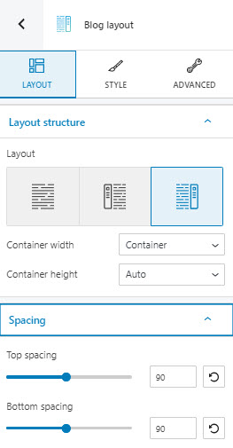
Layout
At this level you can:
- Choose a different type of layout for the blog: no sidebar, with left or right sidebar,
- Switch from container width to full width,
- Switch from container height to minimum height or full screen.
If you want to set up a minimum height, you can use pixels (maximum 1000 px) or relative to 1% of the width of the viewport (VH). The viewport refers to the browser window size. For example, if you set up VH as 100, the blog layout height will be as high as the browser window size, aka 100×1%=100%. If you want to have a block that has 50% of the height of the browser window size, you have to set the VH to 50.
If you select the full screen option, you can choose where to place the content of the blog layout: is it top, center, or bottom?
- Set up the top and bottom spacing for the content inside the blog layout block.
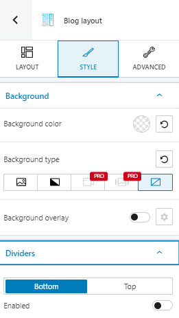
Style
Here you can:
- Select the background type. The video and slideshow backgrounds are available as a PRO feature.
- Set up the background color.
- Add a background overlay (PRO feature).
- Add a top or bottom divider.
Find out more about setting up backgrounds, here.
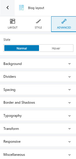
Advanced
At this level, you can make edits for the normal and hover states for the blog layout block. Here are the available customizations:
- Background. Here you can make adjustments to background color and type.
- Spacing. Here you can set up the margins and paddings for the block.
- Dividers. Here you can add a top or bottom divider, in order to better highlight the transition from a section to the next.
- Border and shadows. Here you can add borders with a different color, radius and thickness to your block. Also, you can add box shadows. You have full control over the position, blur, spread, and color of the box shadow.
- Typography. You can set up a different font family, font size, and weight for the text. You can add decorations to text, set up capitalization, and adjust line height and letter spacing. When you select the “default” option you’ll be taken to the General Settings, where you can change defaults (color scheme, typography, etc.).
- Transform. This option will help you shift the perspective of your block across the X, Y, and Z axes.
- Responsive. Here you can decide whether the block will show or not on desktop, tablet, or mobile.
- Miscellaneous. At this level, you can set up the z-index of your block (vertically order the elements that overlap), set up if the element overflows or not (displaying the content of the block flowing out of its container into the surrounding area), add HTML anchors and CSS classes.