Every web page in Kubio is made up of sections that can be split into columns. In addition, you can add blocks to your sections and columns. The blocks have different scopes, from paragraphs and images to logo and social icons.
How to work with sections in Kubio
How to add a new website section
There are 2 main ways for adding empty sections to a page or post using Kubio. After adding a section, the editing and styling options are the same. You can read all about them starting here.
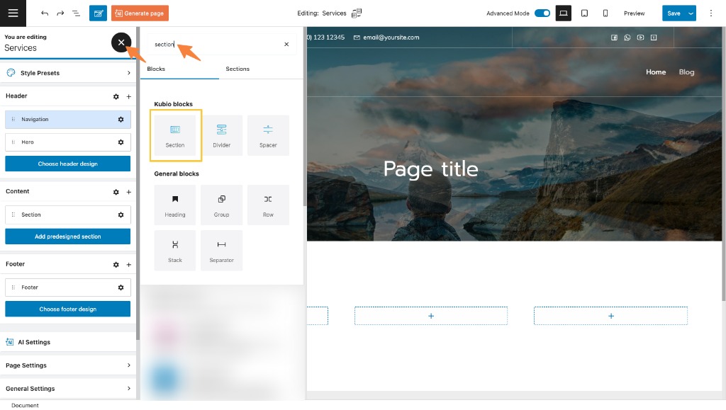
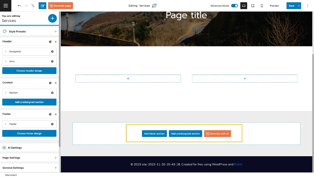
- Adding sections using the section block. Just open up the block inserter using the “+” sign in the upper-left, and look for “Section”.
Now, drag it to a place on the page. It will look like below. The two rectangles are actually columns inside which other blocks can get placed.
If you click on the settings icon in the upper right of the section you’ll notice several options that allow you to change the section’s background, edit the section’s layout, duplicate or delete the section and many more.
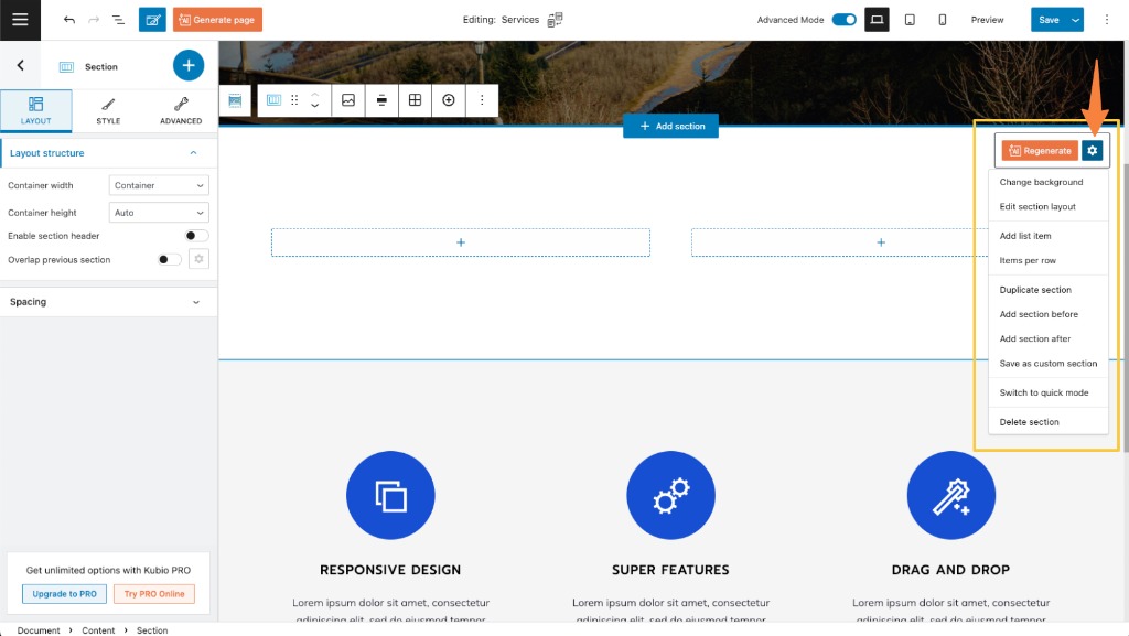
The first two options will guide you to the block editing panel where you will be able to make the changes. More info on the topic, below.
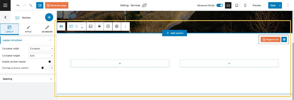
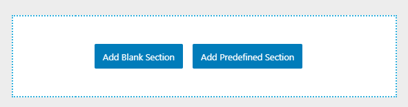
- Adding a section by clicking on “Add Blank Section” at the bottom of any page or post. There’s also the option to “Add Predefined Section”. Find out more about this, here.
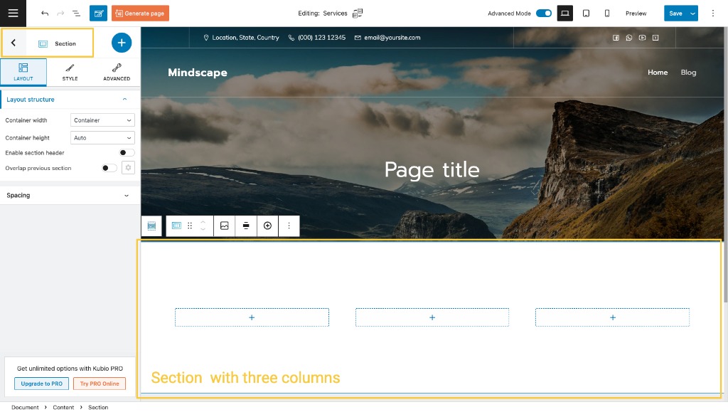
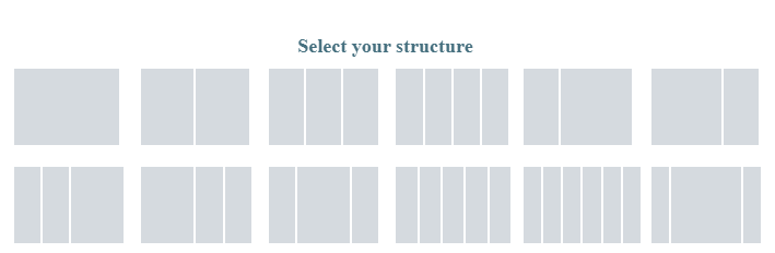
Select “Add Blank Section” and choose the number of columns you want to have.
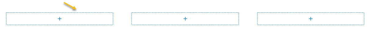
Now, let’s say you’re adding a structure of 3 columns to your section. You’ll end up having three rectangles with a “+” sign inside of them. Those are your columns that need some content added, meaning blocks. This means that you can add blocks by selecting the “+” sign.
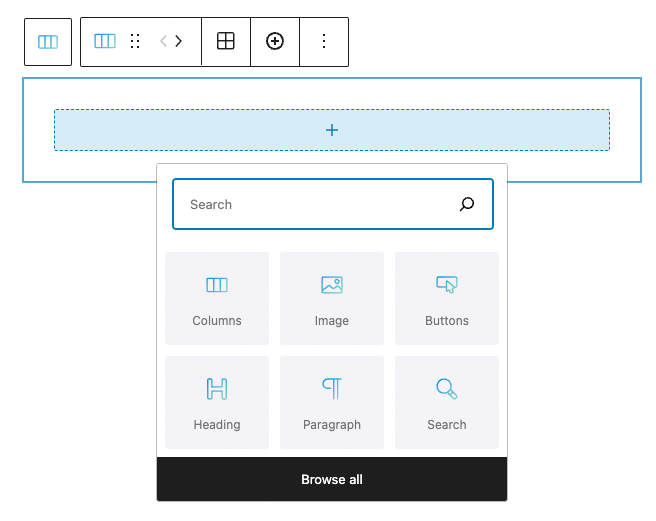
When you click on any “+” sign on the canvas, you will open up a quick block inserter, where you can start looking for a block.
How to customize a section in the toolbar
When you select a section, you will notice a toolbar on top of it.
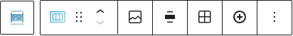
Let’s go through the options a bit:
- Positioning.
Here you have two options:
When you select the 6 dots, you will have the option to drag and drop the section where you want;
When you choose the up and down arrows, you will move the section up and down.
- Background. This is a shortcut to the Style options in the block editing panel on the left, where you can assign a background to your section.
- Set the content of your section as full-width or inside a container.
- Add more columns from the “+” icon.
- Options.
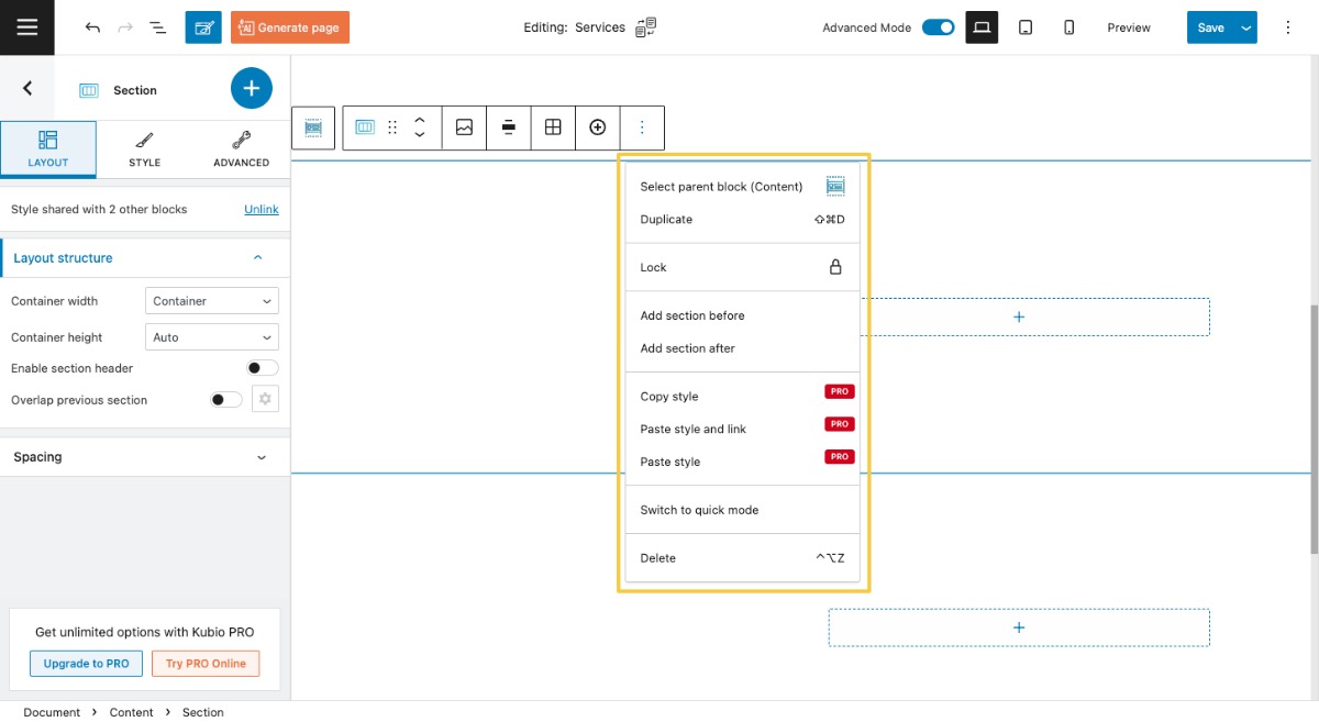
Inside options, there are several actions that you can take:
- Select parent block (Content). This option allows you to select the content area of the page.
- Duplicate. This option allows you to clone the current section.
- Lock. This option allows you to lock moving or removing the section.
- Add section before. This gives you the option to insert section before the current section.
- Add section after. This gives you the option to insert a new section after the current section.
- Copy style (PRO only). This allows you to copy the style of the current section to another one.
- Paste style and link (PRO only). This allows you to paste the previously copied style and to keep it linked. This means that the moment the style changes for one of the linked sections, the changes will be reflected to all the sections sharing the same copied style.
- Paste style (PRO only). This allows you to paste the previously copied style and not to keep it linked. This means that the moment the style changes for one of the sections, the changes won’t be reflected to all the sections sharing the same copied style.
- Switch to quick mode / advanced mode. This is how you toggle between the advanced and quick mode of the editor
- Delete. This is how you delete the section you’re currently on.
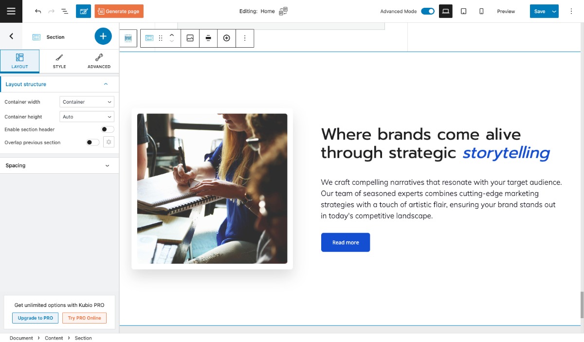
How to customize a section in the Kubio block editing panel
As previously mentioned, the moment you select your section, there’s a panel that will show up on the left-hand side of your screen. This is the Kubio editing panel.
You can notice that the title of the panel is “Section.” This means that you’re editing the right thing. If it said “Paragraph” or “Icons”, well, it would mean that you were editing the paragraph block or the icons block.
Now, there are three main editing options in this panel:
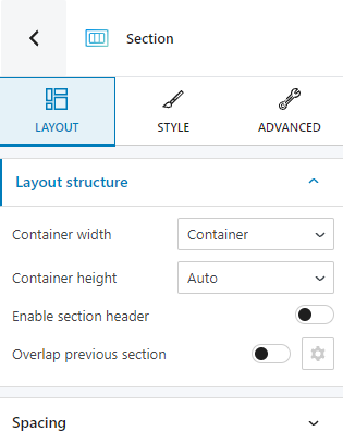
Layout
At the “Layout” level you can:
- Switch from container width to full width.
- Switch from auto container height to minimum height or full screen. When you choose full screen you will need to specify the content position. Will it be top, bottom, or center?
- Enable section header.
- Enable the section overlap feature, in order or the current section to overlap the previous one. You will need to specify the height and depth of the overlap.
- Specify the top and bottom spacing.
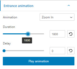
- Add a section entrance animation. This feature allows the section to appear on scroll with an animation. There are 10 categories of animations available, with several subtypes. The “Fading” category is available in the free plan, while the rest are included only in the Kubio PRO plans. Here they are: fading, zooming, back, bouncing, sliding, rotating, attention seekers, light speed, specials, flippers.
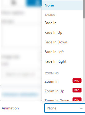
Click on any animation in order to see it in action. When you decided on the final one, you will need to set up the animation duration and speed.
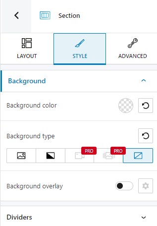
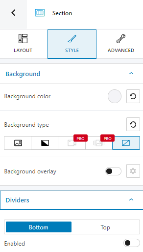
Style
Here you can make changes to your section’s background and dividers.
Advanced
This tab will be visible only when you enable the Advanced Mode view of the editor. At this level, you can make additional section edits, both in the normal state and the hovering one.
Here are the available advanced section edits for both states.
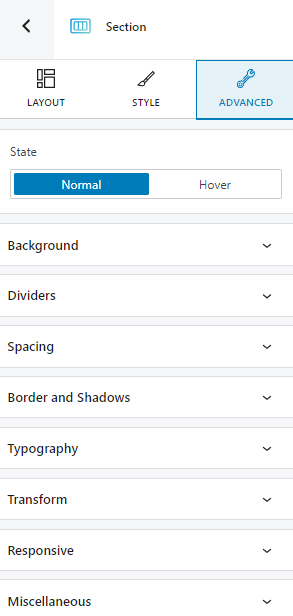
- Background. Here you can make adjustments to background color and type.
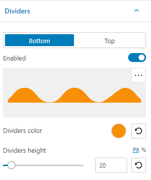
- Dividers. Here you can customize the top or bottom divider. You can choose from several ready-made divider designs. You have full control over the color and height of the dividers.
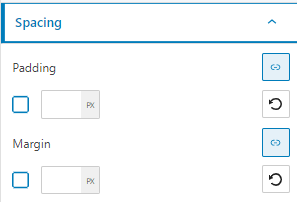
- Spacing. Here you can set up the margins and paddings for your section.
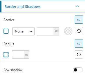
- Border and shadows. Here you can add borders with a different color, radius and thickness to your section. Also, you can add box shadows. You have full control over the position, blur, spread and color of the box shadow.
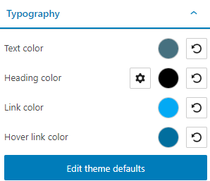
- Typography. Here you can make changes to text, heading (from H1 to H6), link, and hover link color. You also have a shortcut to editing themes defaults.
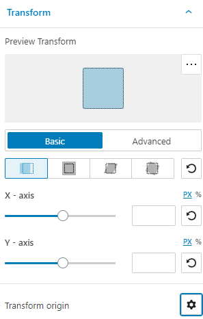
- Transform. At this level you can get creative with the looks of your section. You can apply several transformations, across the X, Y, and/or Z axes, starting from center, left, right, or even a custom point.
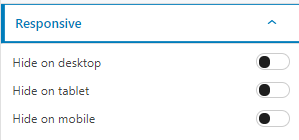
- Responsive. Here you can decide whether the section will show or hide on desktop, tablet or mobile.
- Miscellaneous.
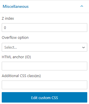
At this level you can:
- Set up the z-index of your section. The z-index allows you to order vertically elements that overlap.
- Set up if the element overflows or not. This refers to displaying the content of the block flowing out of its container into the surrounding area.
- Add HTML anchors.
- Add CSS classes.
In the “Hover” state there’s an extra customization option: transition. When enabled, you can set up the duration of the transition.
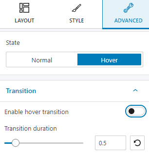
What does transition refer to? Let’s say that you have a different background for the section in the normal mode, and a different one when hovered. When the background gets switched, a transition happens, and it can take up to 5 seconds.
How to save and reuse sections
The moment you are happy with the design of a section, and you realize that you want to use it on another page as well, you can save it and reuse it. Here are the steps for this:
- Select the section you want to save as a custom section
- Click on the settings icon in the upper-right of the section.
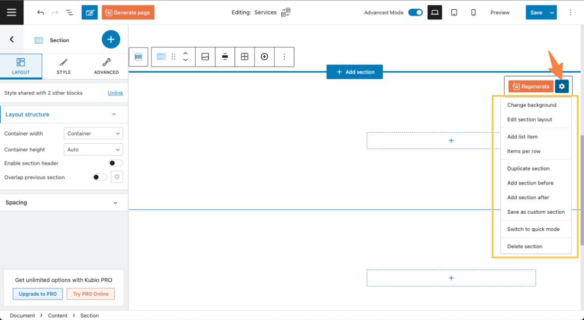
Here you have some shortcuts that will sent you to the block editing panel, as well as some options that are common with the toolbar. But, the feature we care about is this one: “Save as custom section”.
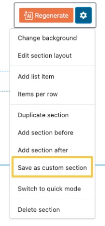
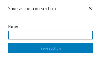
Click on the option. a window will pop up. Use it to give the section a name then hit the “Save section” button.
If you want to use the newly created section on another page, open the block inserter using the “+” sign in the upper-left. Next, go to Section > Custom sections.
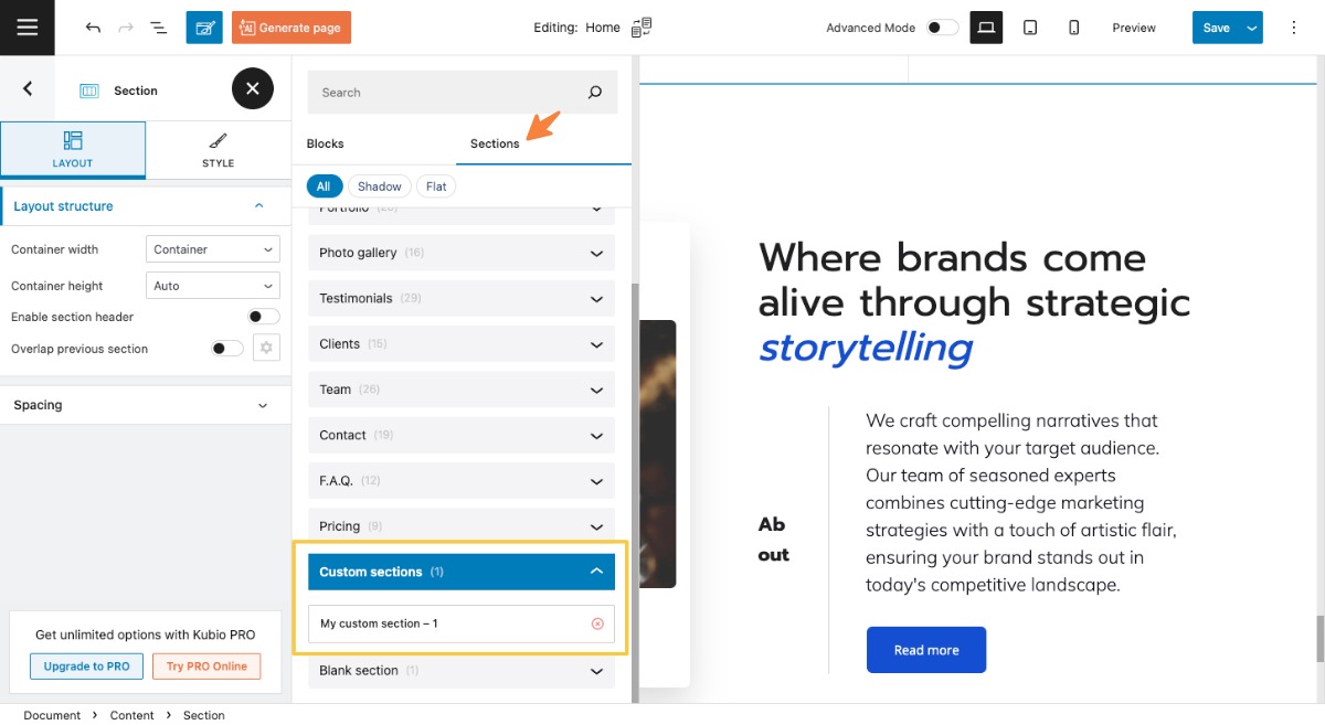
Use the dropdown to see all the saved sections. Click on the one you want to add on the page. You can also click on the “x” icon on the right to remove it from the list, if you no longer need it. The section will be added at the bottom of the page. You can use the block toolbar to move it anywhere you want.
How to work with columns in Kubio
Columns are usually nested inside website sections in Kubio.
So, whenever you add a new blank section to your page by going to the canvas’ bottom and selecting “Add Blank Section”, you can select a certain number of columns for your section.
You can always change your mind and add or remove columns to the section.
Now, let’s say you’re adding a structure of 3 columns to your section. You’ll end up having three rectangles with a “+” sign inside of them. Those are your columns that need some content added, meaning blocks. This means that you can add blocks by selecting the “+” sign—more on this topic in the next chapter.
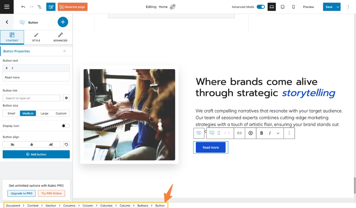
Let’s look at this design:
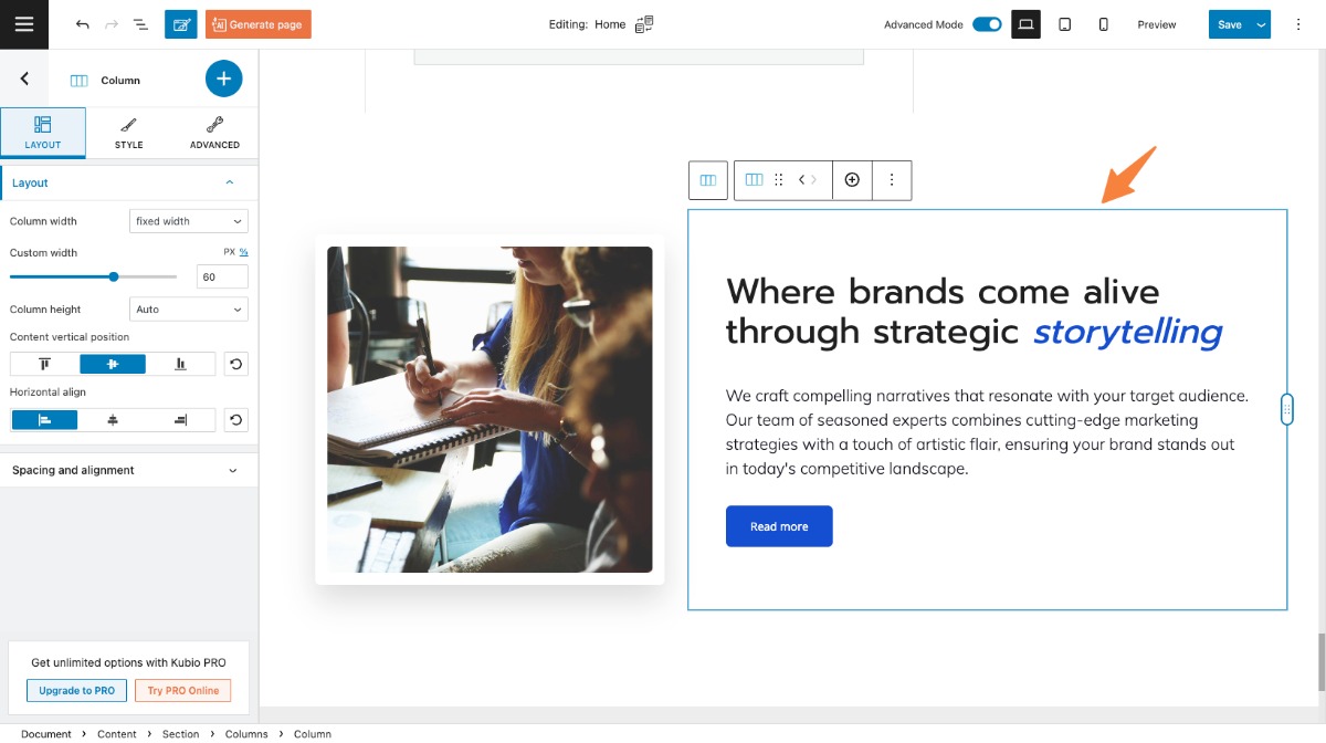
It has sections and columns. But how can you know which is which? Let’s start by clicking on an element. Let’s go with the “Read more” button. Now, let’s take a look at the bottom of the page. You will notice a breadcrumb view. This view shows you how blocks lie inside one another, and inside columns, and sections.
If you click on the column inside the breadcrumb view, you can start making edits to it inside the block editing panel. Notice that a rectangle is used to allow you to identify the size of the column. From now on you can style the column the way you see fit.
How to customize columns in the block toolbar
When you select a column, on top of it, you will notice a toolbar.
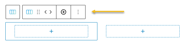
Let’s go through the options a bit:
- Positioning.
Here you have two options:
When you select the 6 dots, you will have the option to drag and drop the column where you want;
When you choose the left and right arrows, you will move the column to left or right.
- Add more columns from the “+” icon.
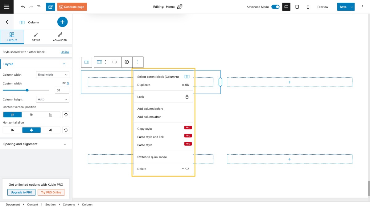
- Options. Inside options, there are several actions that you can take:
- Select parent block (Content). This option allows you to select the content area of the page.
- Duplicate. This option allows you to clone the current section.
- Lock. This option allows you to lock moving or removing the column.
- Add column before. This gives you the option to insert a new column before the current column.
- Add column after. This gives you the option to insert a new section after the current section.
- Remove block. This is how you delete the column you’re currently on.
- Copy style (PRO only). This allows you to copy the style of the current column to another one.
- Paste style and link (PRO only). This allows you to paste the previously copied style and to keep it linked. This means that the moment the style changes for one of the columns sharing the style, the changes will be reflected to all the columns sharing the same copied style.
- Paste style (PRO only). This allows you to paste the previously copied style and not to keep it linked. This means that the moment the style changes for one of the columns sharing the style, the changes will not be reflected to all the columns sharing the same copied style.
- Switch to quick mode / advanced mode. This is how you toggle between the advanced and quick mode of the editor
- Delete. This is how you delete the column you’re currently on
How to customize a column in the Kubio block editing panel
The moment you select your column, there’s a panel that will show up on the left-hand side of your screen. This is the Kubio block editing panel.
You can notice that the title of the panel is “Column.” This means that you’re editing the right thing. If it said “Section” or “Image”, well, it would mean that you were editing the section or the image block.
Now, there are three main editing options in this panel.
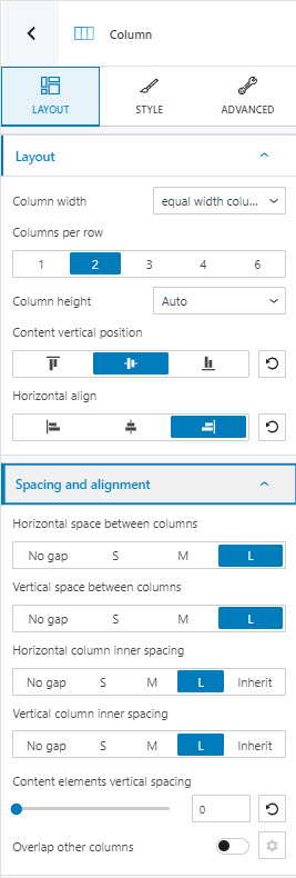
Layout
Here you can:
- Adjust the column width. You can have equal-width columns, fixed width column, columns that fit to content, or columns that expand to the available space.
- Select the number of columns per row. Find out more about rows, here.
- Adjust the column height. You can select between auto, minimum height, and full screen.
- Customize the content position. Will it be top, bottom, or center?
- Align the column’s content horizontally. Will it be left, center, or right?
- Make spacing and alignment adjustments. Find out about horizontal, vertical and inner spacings, here.
- Decide on the content element vertical spacing,
- Enable the column overlap option. Here you can setup the horizontal and vertical overlap level, as well as its depth.
- Enable entrance animations. This feature allows the column to appear on scroll with an animation. There are 10 categories of animations available, with several subtypes. The “Fading” category is available in the free plan, while the rest are included only in the Kubio PRO plans. Here they are: fading, zooming, back, bouncing, sliding, rotating, attention seekers, light speed, specials, flippers.
Click on any animation in order to see it in action. When you decided on the final one, you will need to set up the animation duration and speed.
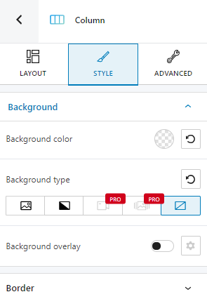
Style
Here you can make changes to your column’s background and borders.
Advanced
At this level, you can make additional column edits, both in the normal state and the hovering one. Here are the available advanced column edits for both states.
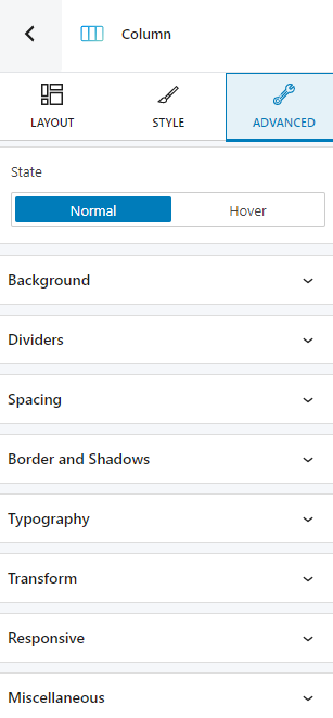
- Background. Here you can make adjustments to background color and type.
- Dividers. Here you can customize the top or bottom divider. You can choose from several ready-made divider designs. You have full control over the color and height of the dividers.
- Spacing. Here you can set up the margins and paddings for your column.
- Border and shadows. Here you can add borders with a different color, radius and thickness to your column. Also, you can add box shadows. You have full control over the position, blur, spread and color of the box shadow.
- Typography. Here you can make changes to text, heading (from H1 to H6), link, and hover link color. You also have a shortcut to editing themes defaults.
- Transform. At this level you can get creative with the looks of your column. You can apply several transformations, across the X, Y, and/or Z axes, starting from center, left, right, or even a custom point.
- Responsive. Here you can decide whether the column will show or not on desktop, tablet or mobile.
- Miscellaneous.
At this level you can:
- Set up the z-index of your column. The z-index allows you to order vertically elements that overlap.
- Set up if the element overflows or not. This refers to displaying the content of the block flowing out of its container into the surrounding area.
- Add HTML anchors.
- Add CSS classes.
In the “Hover” state there’s an extra customization option: transition. When enabled, you can set up the duration of the transition. What does transition refer to? Let’s say that you have a different background for the section in the normal mode, and a different one when hovered. When the background gets switched, a transition happens, and it can take up to 5 seconds.