A flip box is a box that flips over when you hover over it. You can add this hover animation effect to particular portions of your website, such as text boxes or photos.
The flip box block is available inside Kubio PRO.
You can drag the flip box block to the section you want on your page from the block inserter, or add the block from any “+” sign on your canvas. This is the default flip box that will show up:
You can easily drag new blocks to the flip box.
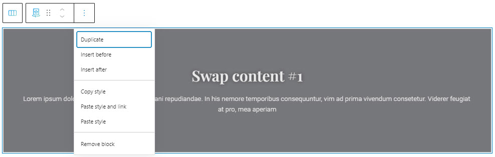
When you select the flip box block, you will see a toolbar on top of it, with several basic editing options. In a previous chapter, we explained the common editing options for all the Kubio blocks. In the case of the flip box block, here are the ones that apply: positioning, duplicate, insert before, insert after, copy style, paste style, paste style and link, and remove block.
Flip box block: customizations within the block editing panel
The moment you select any block, besides the toolbar you will also notice a block editing panel on the right-hand side. It always has three options: content, style, and advanced. The possibilities inside vary from block to block.
Let’s get to know them a bit better.
Content
Important! As we’ve mentioned in the beginning, a flip box has two sides that flip during hover. This means that we will need to make edits across the normal and hover states.
Flip box content editing in the normal mode
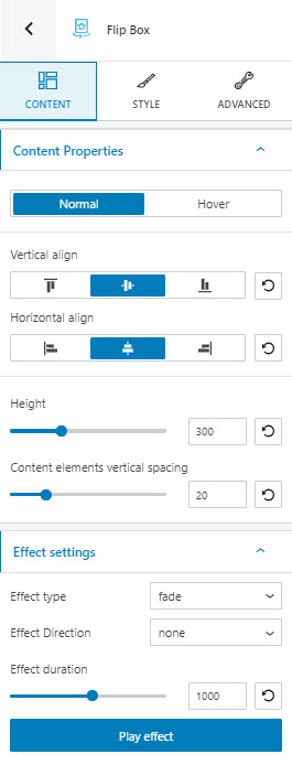
Here’s what you’ll see at the “Content” level in the normal mode of the flip box:
- Vertical alignment: choose how you want the content of your flip box to be positioned vertically. Is it top, bottom or centered?
- Horizontal alignment: choose how you want the content of your flip box to be positioned horizontally. Is it left, right, or centered?
- Height: choose the height you want for your flip box,
- Content elements vertical spacing: choose the spacing between the elements inside the flip box.
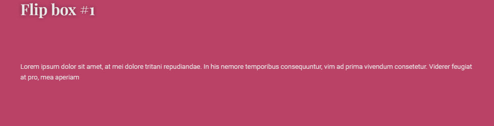
For example, this flip box has a height of 300, the vertical spacing is set to 100, this means that the distance between the header and the paragraph is 100. The content is vertically aligned to the top. You can notice that the heading is close to the top edge of the flip box. The content is horizontally aligned to the left.
- Effect type: choose between 6 types of effects:, bounce, flip, fade, rotate, slide, and zoom.
- Effect direction: choose between none, down, left, right, up.
- Effect duration: choose for how long you want your effect to last.
Use the “Play effect” button in order to preview the effect.
Flip box content editing in the hover mode
This is how our default flip box looks like in hover mode:
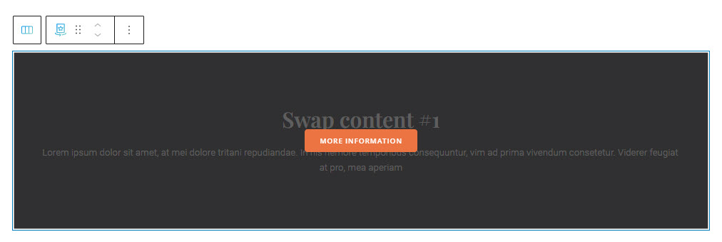
You notice that the background gets another color and a new button block is placed on top of the original flip boc content.
At this level you can add several other blocks, if you want. Inside Style you can even adjust the opacity of the background so that you don’t need to see the flip box in the normal mode.
Now, here’s what you’ll see at the “Content” level in the hover mode of the flip box:
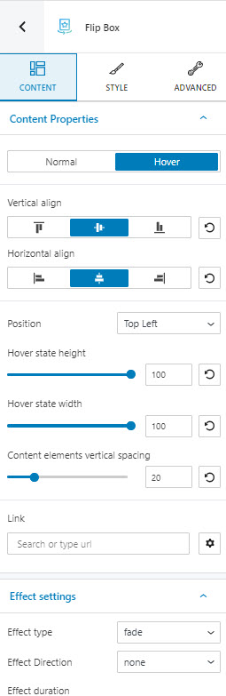
- Vertical alignment: choose how you want the content of your flip box to be positioned vertically. Is it top, bottom or centered?
- Horizontal alignment: choose how you want the content of your flip box to be positioned horizontally. Is it left, right, or centered?
- Content elements vertical spacing: choose the spacing between the elements inside the flip box.
- Hover state height: choose the height you want for your flip box in the hover mode. The default is 100 (as in percent), but you can make it smaller.
- Hover state width: choose the width you want for your flip box in the hover mode. The default is 100 (as in percent), but you can make it smaller.
- Position: if the hover height and/or width are smaller than a 100, you can position the flip box in hover mode. There are 9 available positions: top left, top center, top right, center left, center center, center right, bottom left, bottom center, and bottom right.
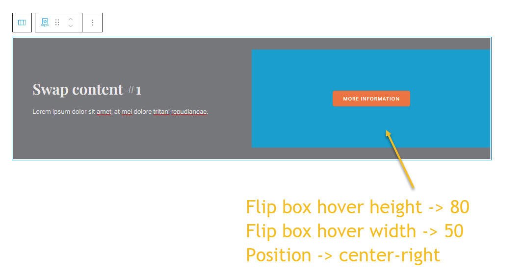
For example, this flip box hover height is 80, the width being 50. We’ve changed its background to blue in order for the position to be more clear. When the position is set to center-right, here’s how it looks:
Now, let’s switch to the bottom left position, and shorten its height to 30. We even added a slide effect to it.
- Effect type: choose between 6 types of effects:, bounce, flip, fade, rotate, slide, and zoom.
- Effect direction: choose between none, down, left, right, up.
- Effect duration: choose for how long you want your effect to last.
Use the “Play effect” button in order to preview the effect.
Style
Under style you can customize the flip box in both the normal and hover states, as well as its container.
Here are the styling options for the normal and hovered flip box:
- Change the background color,
- Choose a different background type. You can find out more info about working with backgrounds, here.
- Change the inner padding. Use the slider (it has values between 0 and 100) to distance the inside content of the flip box from the edges.
- Make typography edits.
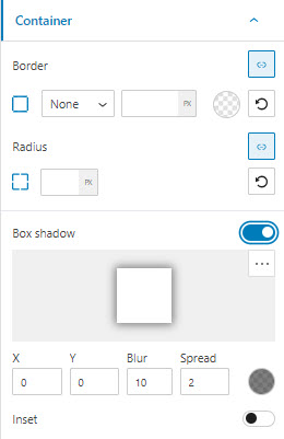
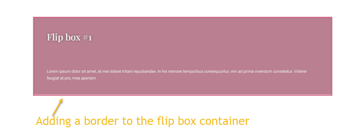
Now, the flipbox lies inside a container. Inside style we can add a border and box shadow to the container.
In the example below we added a border to the container:
Advanced
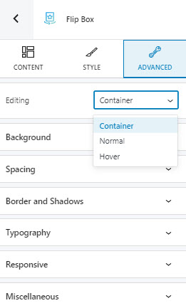
At this level, you can make edits at the container, normal flip box, and hover flip box levels. Here are the available customizations:
- Background. Here you can make adjustments to background color and type.
- Spacing. Here you can set up the margins and paddings for the block.
- Border and shadows. Here you can add borders with a different color, radius and thickness to your block. Also, you can add box shadows. You have full control over the position, blur, spread, and color of the box shadow.
- Typography. You can set up a different font family, font size, and weight for the text. You can add decorations to text, set up capitalization, and adjust line height and letter spacing. When you select the “default” option you’ll be taken to the General Settings, where you can change defaults (color scheme, typography, etc.).
- Responsive. Here you can decide whether the block will show or not on desktop, tablet, or mobile.
- Miscellaneous. At this level, you can set up the z-index of your block (vertically order the elements that overlap), set up if the element overflows or not (displaying the