When you are inside of a web page in Kubio, click on the settings icon in the upper right. It will open up a page editing panel.
This panel allows you to visualize your page sections easily. The structure is made of header, content, and footer. The header is made of two blocks: hero and navigation. These blocks aren’t found among the blocks listed inside the block inserter. But, the moment you delete the navigation, hero, or footer. They will show up in the block inserter.
But what’s the thing with the hero?
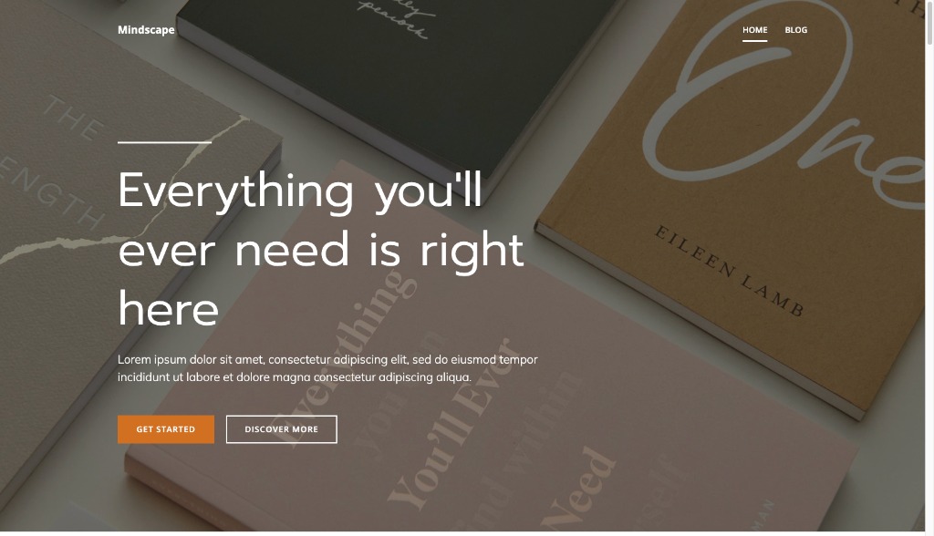
In web design, the hero is the first thing users see when they land on a website. It is usually made of an oversized banner image at the top of a website that usually extends full-width. It should present the website’s offer in a clear and attractive way.
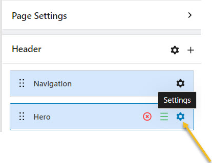
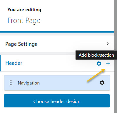
Now, if you select the settings icon next to “Hero” you will be prompted to the block editing panel where you can customize the hero.
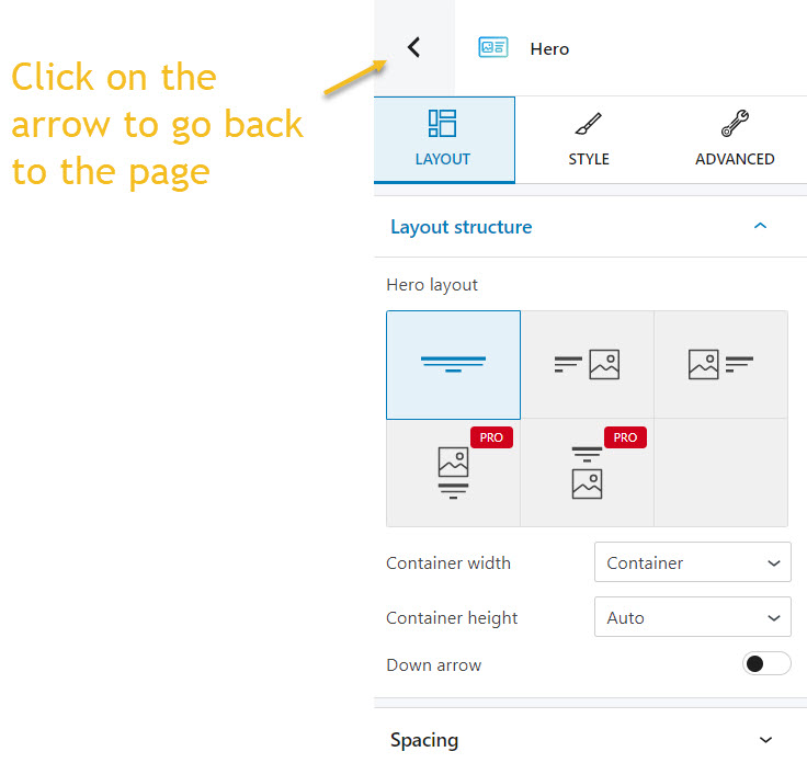
It will look like as shown below. You can use the left-pointed arrow to go back to the page editing panel.
We’ll come back to this block editing panel a bit later on.
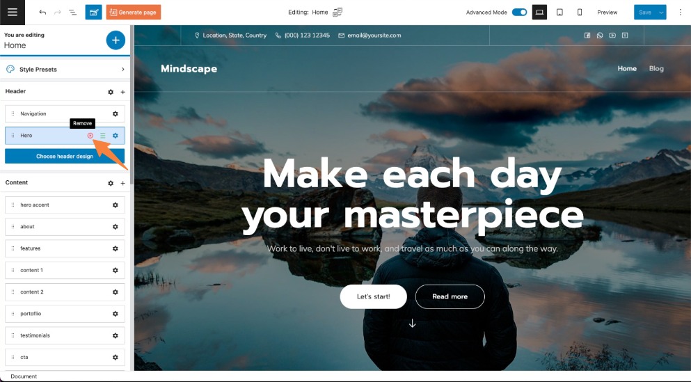
Now, let’s delete the hero block using the “x” sign.
This is what we now have:
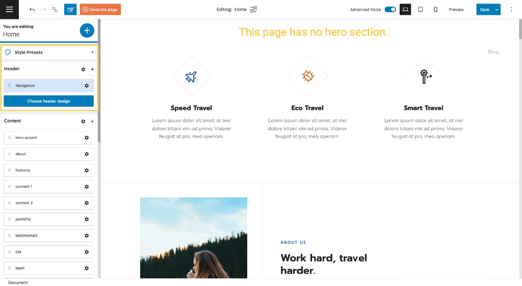
Now, in order to add a hero, we have two options:
- Use a predesigned header design
- Add the default hero block
Let’s take these options one by one.
- Use a predesigned header design
Let’s click on the “Choose header design” button. A list of predesigned headers will appear on the right side of the panel.
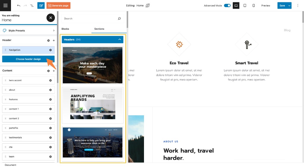
Some of them will have a PRO badge, meaning that they are available only for the paid Kubio plans. Wanna find out more about Kubio’s predefined sections? Read on, here.
Now, let’s select a header design.
This is the result:
Next, you can make further changes using the block editing panel on the right. We’ll talk about this a bit later on.
- Add the default hero block.
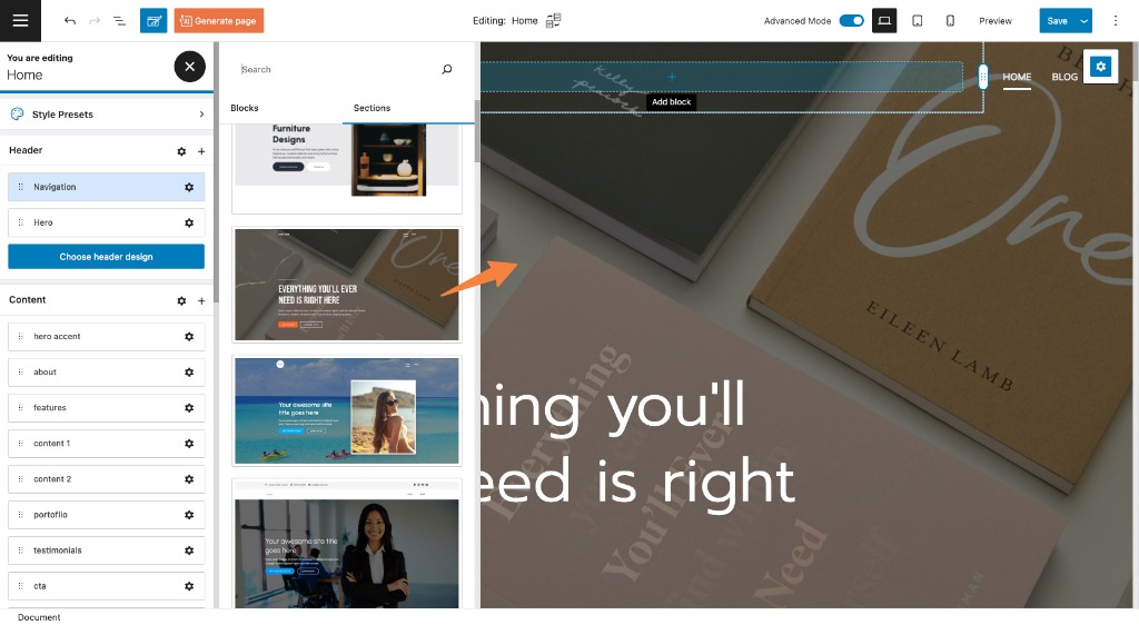
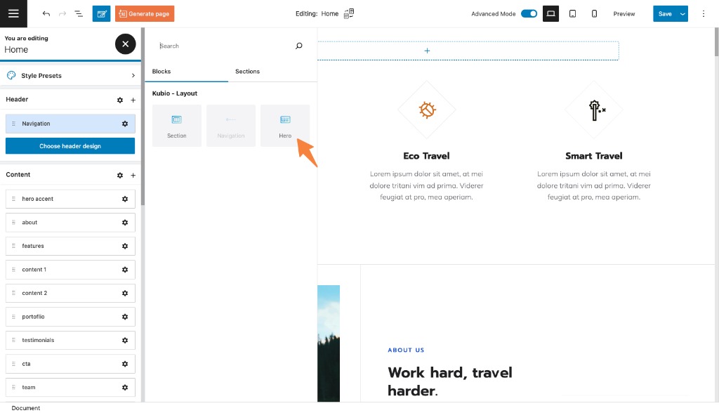
Let’s add the hero block to this header. Let’s head over to the page editing panel on the right, and click on the “+” sign next to the header item.
This will open up the block inserter to the left-hand side of the editor. Now, select the hero block.
Here’s the result:
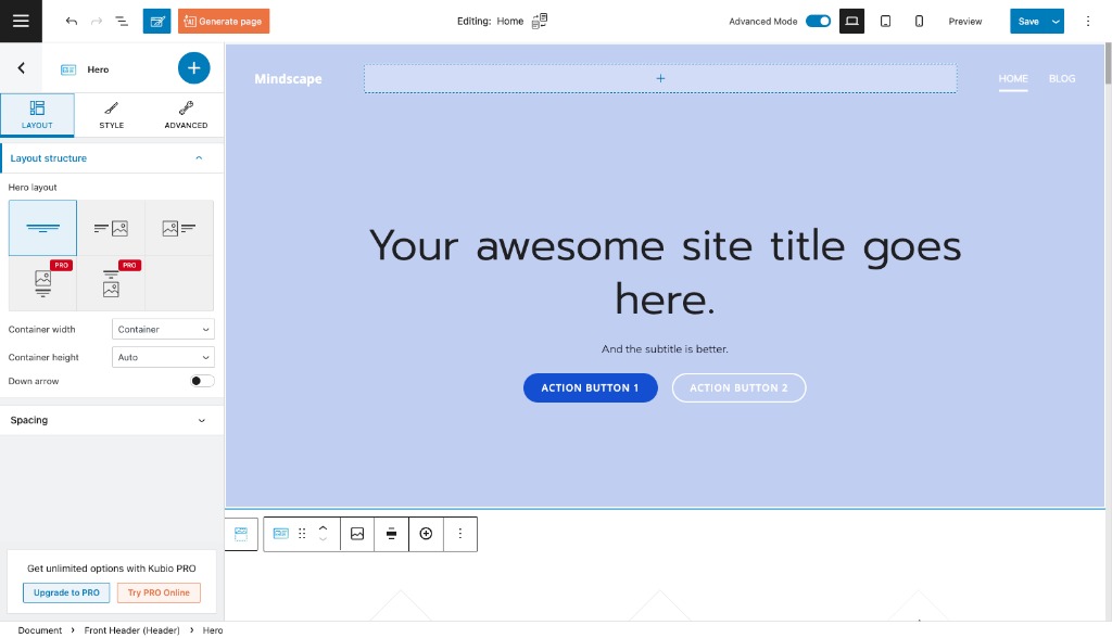
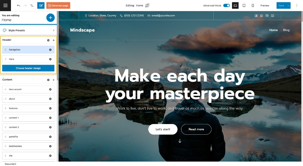
This is the default hero block for the starter site we’re using in this example.
The hero toolbar
No matter the method you used in order to add a hero to the page, when you select the hero section, a toolbar will show up on top of it (or under it if the navigation section is overlapping the hero section, like in the image below, read more about navigation here).
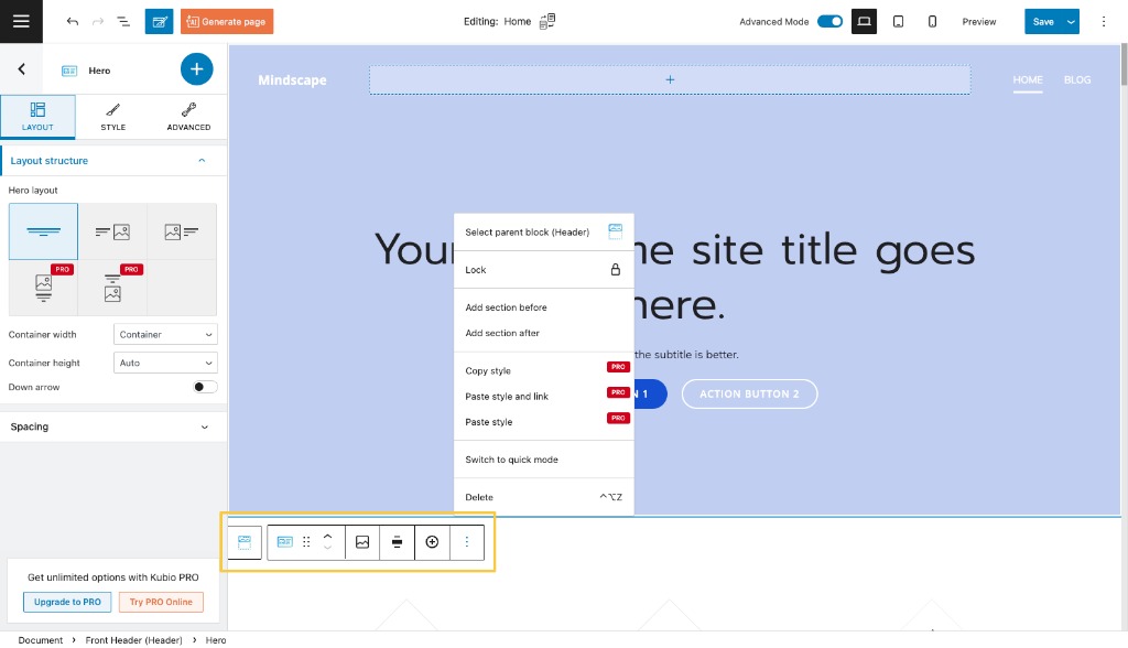
The toolbar allows you to:
- Drag and drop the section. When you select the 6 dots, you will have the option to drag and drop the block where you want.
- Move the section up and down. When you select the up and down arrows, you will move the block up and down.
- Change the hero’s background. When you click on the option, you’ll notice to the right the block editing panel opening at the “Style” level. It’s here where you can make background changes.
- Change the width of the hero from container to full width and vice versa.
- Add new columns to the hero using the “+” sign.
- Add a section before.
- Add a section after.
- Copy style (PRO only) – use this option when you want to copy the style from a block or section to another. This will copy text color, background color, font size, font family, borders and their styling, to another block or section. This option is used together with the paste style.
- Paste style and link (PRO only) – after copying the style from another section, use this option to paste the style. When the styles are linked it means that any style change happening on a section, it will be reflected on the other one as well.
- Paste style (PRO only) – after copying the style from another section, use this option to paste the style. This option won’t link the styles of the sections, meaning that a styling change done to a section, won’t affect the other.
- Remove the section.
Now, while the hero section is still selected, you can notice the block editing panel on the right. Let’s go inside.
Hero block: customization inside the block editing panel
Now, there are three main editing options in this panel. Let’s take them one by one:
Layout
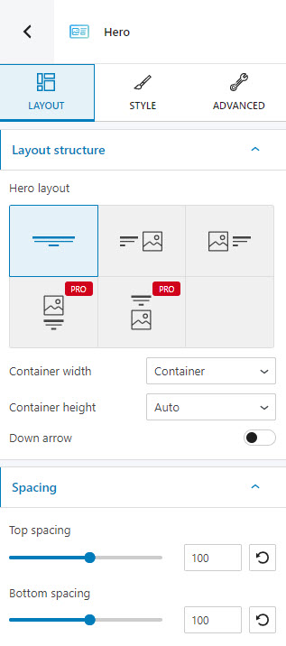
At this level you can:
- Choose a layout for the hero. There are 5 types of layouts available, out of which 3 are included in the Kubio free plan. These layouts rearrange the text and images in the hero.
- Switch from container width to full width and vice versa.
- Set up the container height. You can go with full screen, auto, or minimum height. The minimum height can be set up in pixels (PX) or relative to 1% of the width of the viewport (VH). The viewport refers to the browser window size. For example, if you set up VH as 100, the hero will be as high as the browser window size, aka 100×1%=100%. If you want to have a hero that has 50% of the height of the browser window size, you have to set up the VH to 50. If you choose the full screen option, you will need to choose the content’s position. There are three options available: top, center, or bottom.
- Set up the top and bottom spacing. The spacing refers to the distance between the content of the hero block, and the top and bottom edges of the block.
Style
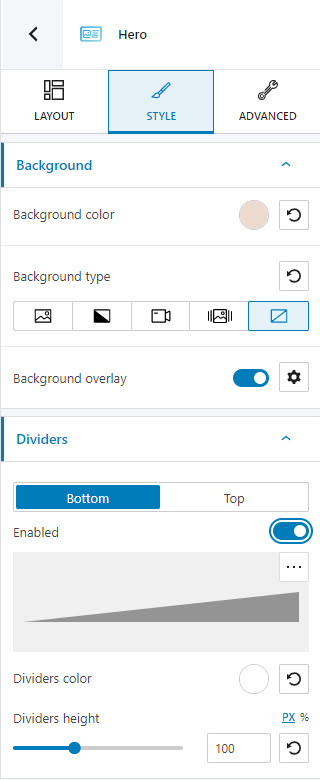
At this level you can:
- Select the background type for the hero. Usually, the video and slideshow background types are available in PRO plans. In the case of the hero block, this feature is a free one.
- Set up the background color. Here you can find out more information about how to work with backgrounds.
- Apply a background overlay. Overlays are usually a PRO feature, but the hero is the only exception.
- Enable a top or bottom section divider. Here’s more information on styling dividers.
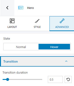
Advanced
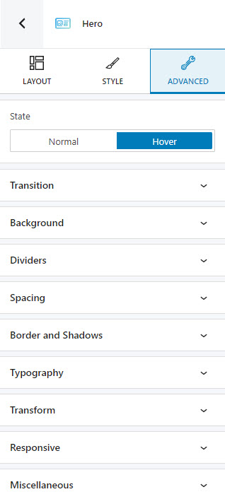
At this level, you can make edits for the normal and hover states of the hero block. Here are the available customizations:
- Background. Here you can make adjustments to background color and type.
- Spacing. Here you can set up values for margins and paddings.
- Border and shadows. Here you can add borders with a different color, radius and thickness to your block. Also, you can add box shadows. You have full control over the position, blur, spread, and color of the box shadow.
- Dividers. Here you can add and style a top or bottom section divider.
- Typography. You can set up a different font family, font size, and weight for the text. You can add decorations to text, set up capitalization, and adjust line height and letter spacing. When you select the “default” option you’ll be taken to the General Settings, where you can change defaults (color scheme, typography, etc.).
- Transformation. Here you can make changes to the perspective of the section across the x, Y, and Z axes.
- Responsive. Here you can decide whether the block will show or not on desktop, tablet, or mobile.
- Miscellaneous. At this level, you can set up the z-index of your block (vertically order the elements that overlap), set up if the element overflows or not (displaying the content of the block flowing out of its container into the surrounding area), add HTML anchors and CSS classes.
Now, let’s say you want a certain background image when the hero is in the normal state, and a different background one, when hovered. This means that a transition will take place when switching between states. You can set up a duration for the transition inside Advanced – > Hover -> Transition -> Transition duration. You can choose a value between 0 and 5 seconds, from the slider.