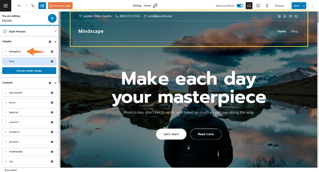
When you are inside of a web page in Kubio, click on the settings icon in the upper right. It will open up a page editing panel. This panel allows you to visualize your page sections easily. The structure is made of header, content, and footer. The header is made of two blocks: hero and navigation. These blocks aren’t found among the blocks listed inside the block inserter, unless they get deleted. When the page is missing the navigation or header, you can add them back as blocks. But we’ll talk about this a bit later.
But, the moment you delete the navigation, hero, or footer, they will show up in the block inserter.
Now, notice that the current navigation contains a logo and a menu.
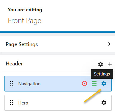
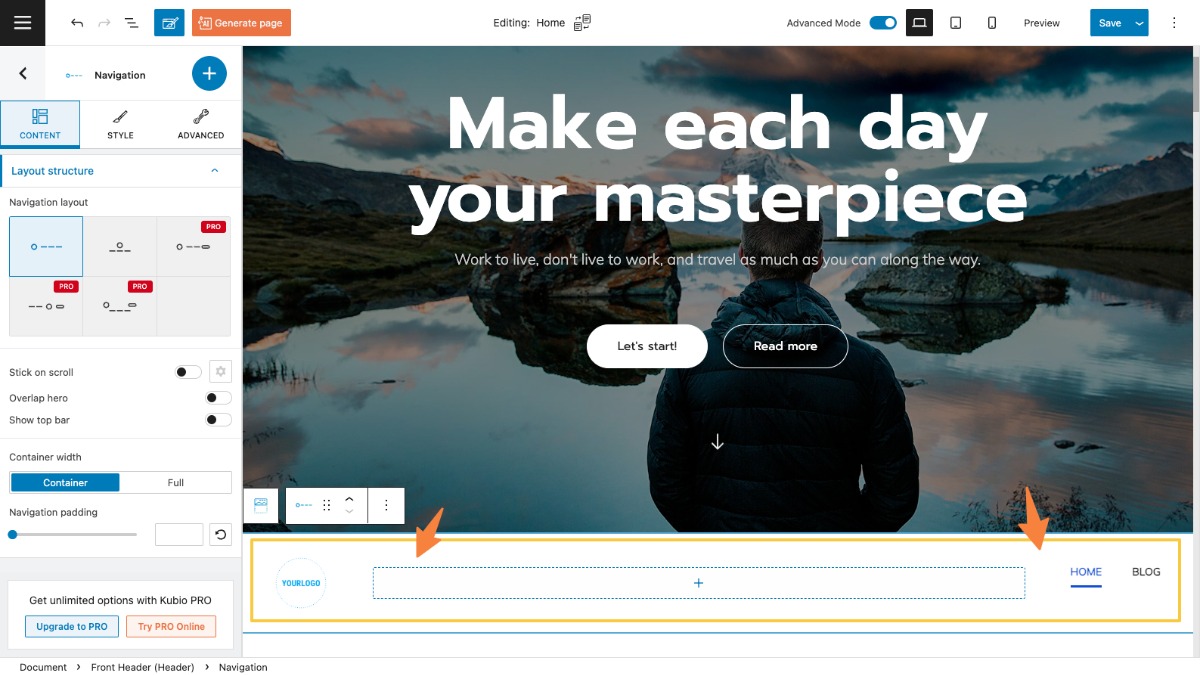
Going back to the page editing panel, if you select the settings icon next to “Navigation” you will be prompted to the block editing panel inside the navigation block.
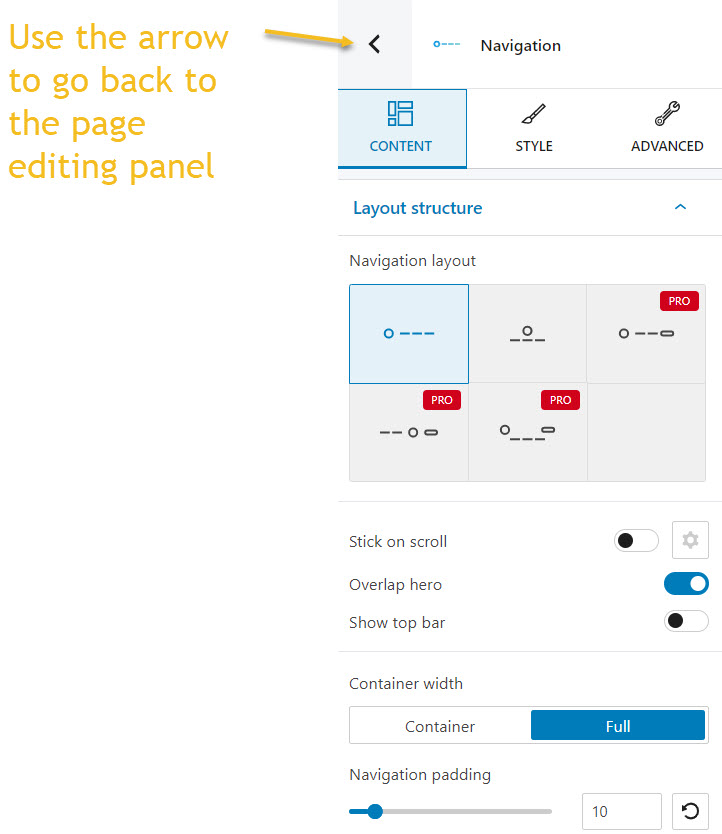
It will look like as shown below. You can use the left-pointed arrow to go back to the page editing panel.
We’ll come back to this block editing panel a bit later on.
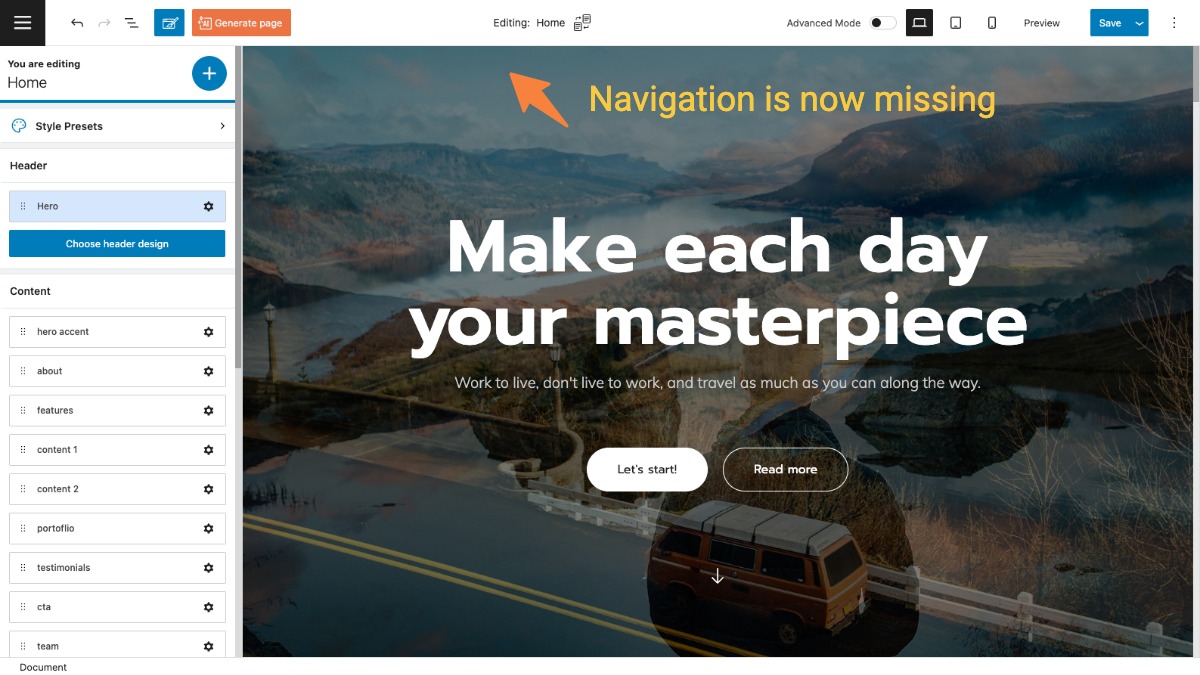
Now, let’s delete the navigation block using the “x” sign.
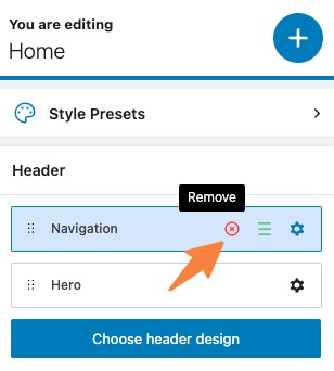
Navigation is now missing.
Let’s add navigation to this header. Head over to the page editing panel on the left, and click on the “+” sign next to the header item. If the “+” sign is not visible, be sure that you’ve enabled the “Advanced Mode” of the editor (toggle button in the top right corner of the screen).
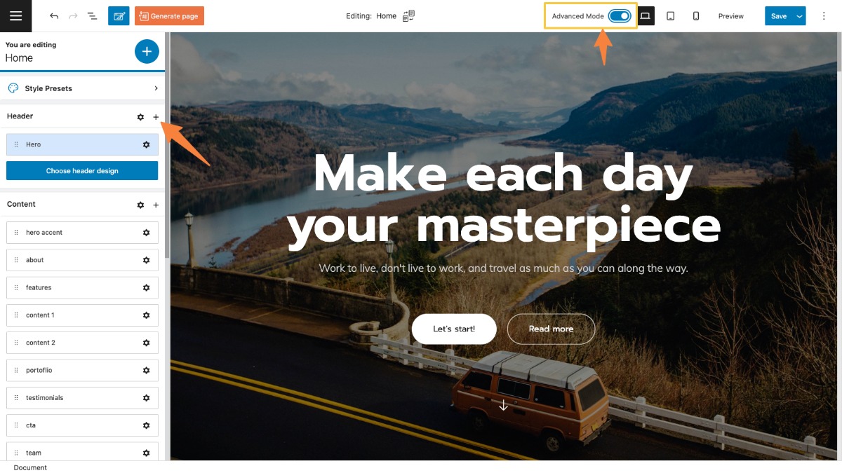
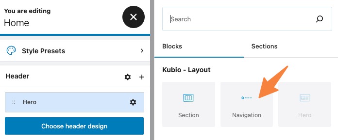
This will open up the block inserter to the right-hand side of the editor. Now, select the navigation block.
Below the hero you’ll notice the site’s default navigation block. It needs to be styled.
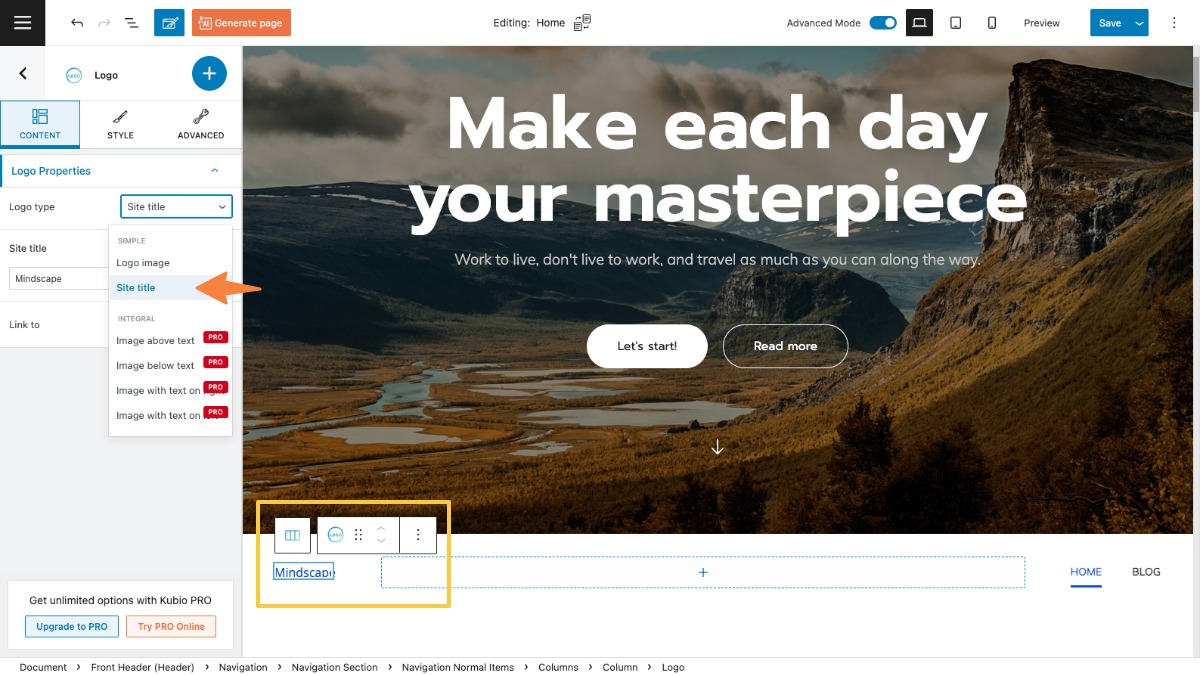
The logo seems different, it should be “Mindscape” as seen below. The thing is that the current logo type is set as “logo image” and we need to set it as “Site title” in order to look like the on below. To do that, select the logo block, and in the content tab of the editor, choose “Site title” for the “Logo type”.
Let’s select the navigation block. Because this block has several other blocks inside (logo, and menu), the selection can be tricky.
Let’s see how we can do this.
Start by clicking on an element inside the navigation, let’s say a menu item. Now, head over to the bottom of the canvas. You’ll notice some breadcrumbs, they show you how content gets placed inside other content.
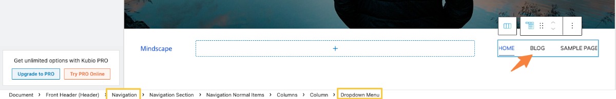
You can notice that the dropdown menu lies inside a column, and all lie inside navigation. Navigation also is part of the header. This is called “nesting”. The most granular item is the furthest to the right, while the least granular items are placed further to the left. Now, click on navigation. Your selection is now done.
Now you can notice a toolbar on top of the selection. Use the up and down arrows to move it.
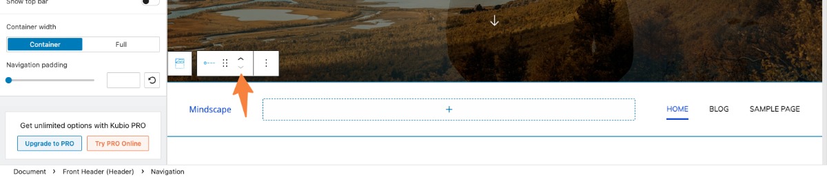
Let’s use the arrow pointing upward to move the navigation on top of the hero.
Next, the toolbar also has some other options. You can remove the block, or copy and paste the style of the block, to another one. This is a PRO feature.
Now, while the navigation is still selected, you can notice the block editing panel on the right. Let’s go inside.
Navigation block: customization inside the block editing panel
Now, there are three main editing options in this panel. Let’s take them one by one:
Layout
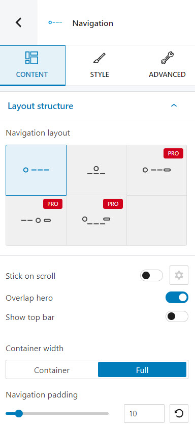
At this level you can:
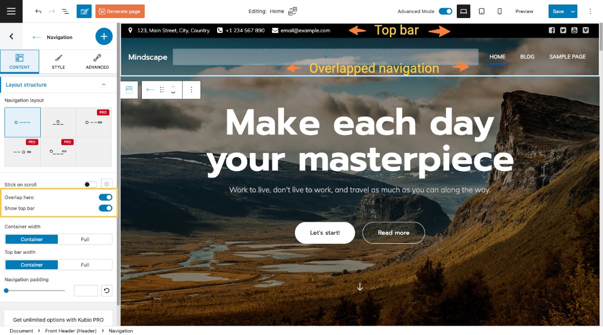
- Choose a layout for the navigation. There are 5 types of layouts available, out of which 2 are included in the Kubio free plan. These layouts rearrange the logo and the menu.
- Enable the stick on scroll option (only for PRO plans).
- Enable the overlap hero option,
- Switch from container width to full width and vice versa.
- Customize the navigation padding. This refers to top and bottom padding, meaning the distance between the items inside the navigation and the block’s top and bottom edges.
- Display a top bar with several items inside. The default in this case will show business locations and social media profiles. But you can remove blocks or add new ones.
Notice that the logo is fine now? Now that the logo is overlapping the hero, the white part of the logo is now visible because of the dark background.
Now, each and every block inside the navigation can be edited separately. For example, those menu items need a text color change. Read more about menu styling, here.
Style
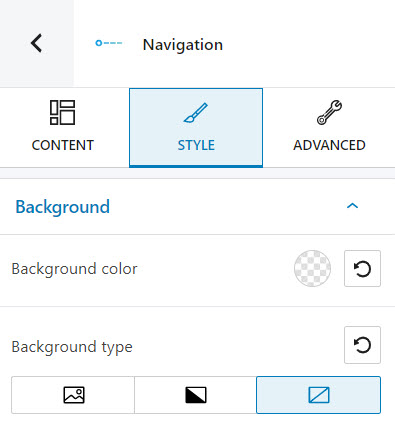
At this level you can select the background type and set up the background color. Here you can find out more information about how to work with backgrounds.
Advanced
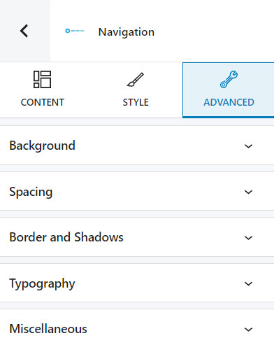
At this level, you can make edits for the normal and hover states of the navigation block. Here are the available customizations:
- Background. Here you can make adjustments to background color and type.
- Spacing. Here you can set up values for margins and paddings.
- Border and shadows. Here you can add borders with a different color, radius and thickness to your block. Also, you can add box shadows. You have full control over the position, blur, spread, and color of the box shadow.
- Typography. You can set up a different font family, font size, and weight for the text. You can add decorations to text, set up capitalization, and adjust line height and letter spacing. When you select the “default” option you’ll be taken to the General Settings, where you can change defaults (color scheme, typography, etc.).
- Responsive. Here you can decide whether the block will show or not on desktop, tablet, or mobile.
- Miscellaneous. At this level, you can set up the z-index of your block (vertically order the elements that overlap), set up if the element overflows or not (displaying the content of the block flowing out of its container into the surrounding area), add HTML anchors and CSS classes.