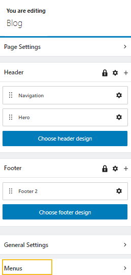
Menus can be created in Kubio from Menus -> Create Menu. Once your menu is created you can place it where you want using the dropdown menu block.
You can drag the dropdown menu Gutenberg block to the section you want on your page, or add the block from any “+” sign on your canvas.
Like in the case of the rest of Kubio blocks, the moment you select the dropdown menu block, a toolbar with options will show up on top of the block. In our chapter on “How to work with blocks” we have explained how these options work: positioning, duplicate, insert before, insert after, copy style, paste style, paste style and link, and remove block. The copy and paste styling options are available with the PRO plans.
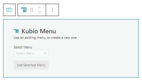
The block allows you to use an existing menu or start creating a new one.
Dropdown menu block: customizations within the block editing panel
The moment you select any block, the Kubio block editing panel will open up on the right-hand side. It always has three options: content, style, and advanced. The possibilities inside vary from block to block.
Let’s now check what’s specific to the dropdown menu block across the “Content” and “Style” edits.
Content
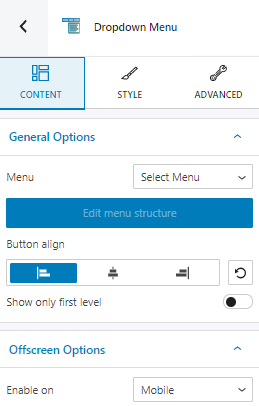
At the “Content” level you can:
- Select a previously created menu.
- Align the buttons in the menu.
- Choose whether to show only the first level of the menu or not.
- Enable the menu on various devices.
Style
Menus are made of buttons that can have three states: normal, hover, and active. The styling options available for all of the states.
In the Kubio block editing panel you can stylize the main menu buttons, main menu effects, and submenu buttons.
In the case of the main menu and submenu buttons, here are the available styling options:
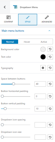
- Background color,
- Text color,
- Typography,
- Space between buttons,
- Button horizontal and vertical padding,
- Dropdown icon spacing and size.
Find out how to deal with colors and backgrounds, here. There’s more info about typography customizations, here.
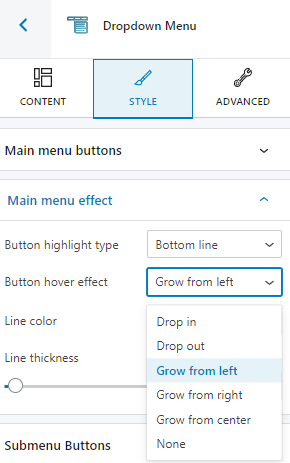
Regarding the effects, here are the options:
- Button highlight type,
- Button hover effect. You can choose between: drop in, drop out, grow from left, grow from right, and grow from center.
Advanced
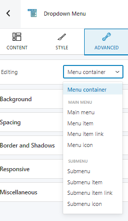
At this level, you can make edits for the normal and hover states across the: menu container, main menu / submenu items, links, and icons. Here are the available customizations:
- Background. Here you can make adjustments to background color and type.
- Spacing. Here you can set up the margins and paddings for the dropdown menu block items.
- Border and shadows. Here you can add borders with a different color, radius and thickness to your block. Also, you can add box shadows. You have full control over the position, blur, spread, and color of the box shadow.
- Typography. You can set up a different font family, font size, and weight for the text. You can add decorations to text, set up capitalization, and adjust line height and letter spacing. When you select the “default” option you’ll be taken to the General Settings, where you can change defaults (color scheme, typography, etc.).
- Responsive. Here you can decide whether the block will show or not on desktop, tablet, or mobile.
- Miscellaneous. At this level, you can set up the z-index of your block (vertically order the elements that overlap), set up if the element overflows or not (displaying the content of the block flowing out of its container into the surrounding area), add HTML anchors and CSS classes.