This is a PRO Kubio block.
You can use the subscribe form block to run a newsletter subscription for your site. This block integrates well with the Mailchimp for WordPress plugin (MC4WP). This is a free plugin that integrates a WordPress website with Mailchimp, one of the biggest email marketing services out there.
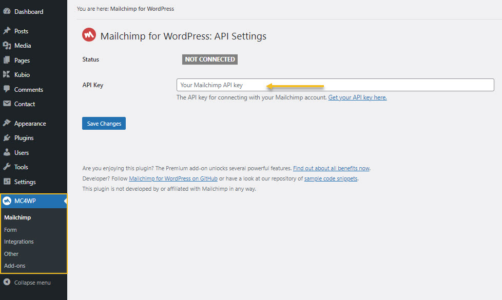
Now, in order for the form to communicate with Mailchimp, you will need to create a Mailchimp account, and to connect it via an API key with Kubio. Paste the API key to MC4WP -> Mailchimp.
Important! The Kubio starter sites that use the subscribe form will preinstall the plugin and will create a dummy form for you to customize. If MC4WP is not installed, please install it and create a form from the WordPress dashboard, MC4WP -> Form.
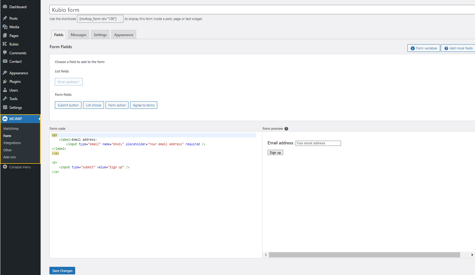
You can select the form fields you want, then you need to go to “Messages” and “Settings” to make further form settings. Styling will be handled inside the Kubio block editing panel. We’ll discuss this a bit later on.
Important! If you don’t want to use Mailchimp for WordPress you can still use any other WordPress plugin that uses form shortcodes.
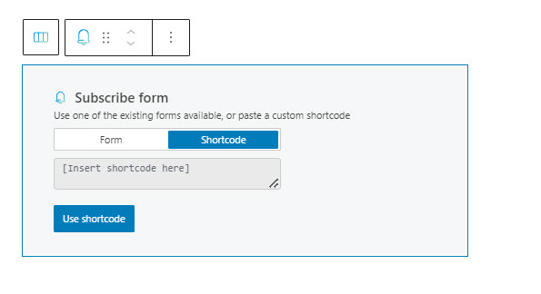
Now, you can drag the subscribe form block to the section you want directly from the block inserter, or add the block from any “+” sign on your canvas. The moment you add the subscribe form block to a page, you will be seeing this:
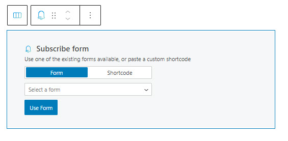
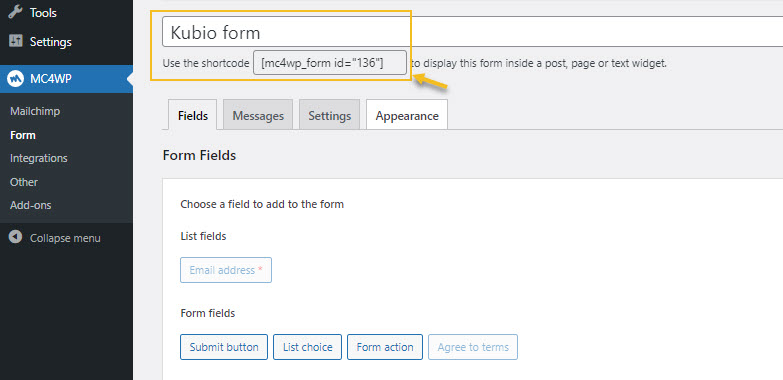
You can select a previously created form or paste the shortcode of your form (if you’re not using MC4WP). Here’s how you can identify the shortcode in the case of forms built with MC4WP. Just look out after a tiny piece of code inside square brackets.
If you go with the shortcode options, you’ll just have to paste it, then hit the “Use shortcode” button.
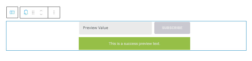
Now, the default Kubio subscribe form (built with MC4WP) looks like this:
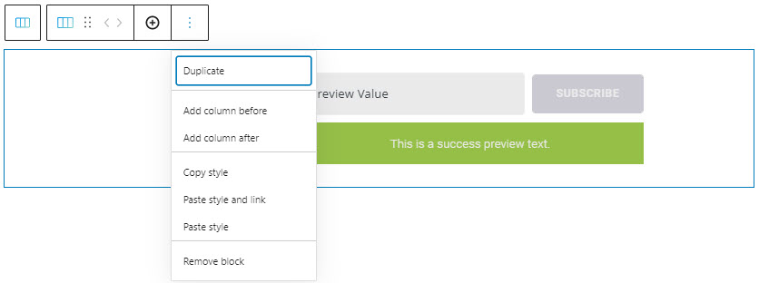
Now, when the pricing block is selected, a toolbar shows up on top of it, with several basic editing options. In a previous chapter, we explained the common editing options for all the Kubio blocks. In the case of the current block, here are the ones that apply: positioning, duplicate, add column before, add column after, copy style, paste style, paste style and link, and remove block.
Now, let’s see how we can customize the pricing block using the block editing panel. The moment the block gets selected, you’ll notice a panel on the right with these menu items: Content, Style, and Advanced. Here you can transform the pricing block anyway you see fit. Let’s go inside.
Content
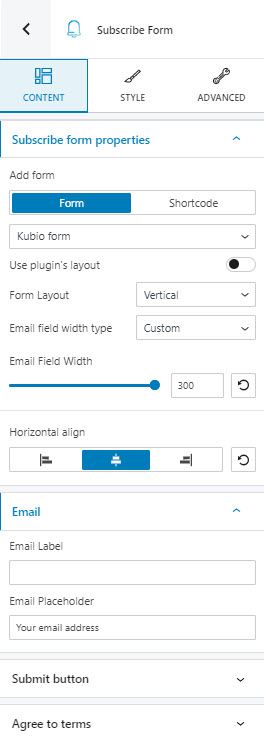
Here we have 4 types of content editing:
Subscribe form properties. Here you can make the following form adjustments:
- Choose a different form,
- Select a form layout: you can choose between the following options: inline and vertical. The default Kubio form has an inline layout. In a vertical layout all the form fields and buttons will go one beneath the other, like below:
- Choose the email field width type: custom or auto. If you go with auto, the email field will stretch across the whole form container,
- Set up the email field width: if the email field type is set to custom, you can use the email field width option and choose a width between 0 and 300px,
- Align the form horizontally. You can align the form to the left, center, or right,
- Enable the plugin’s layout. Each form plugin that you use has a default layout, you can use this option to enable it. If you enable this, you will be able to set up the form items spacing. The slider values are between 10 and 100. When this option is selected you no longer can adjust the email form field width. Also, the below options will not be available.
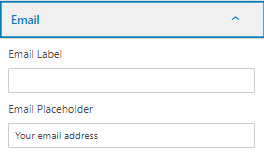
- Email field options. Here you can decide on an email label and placeholder.
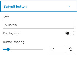
Submit button options. Here you can decide on a call to action text, set up the button spacing (the distance between the button field and the previous one), or enable the display of an icon.
When you enable the icon display, you will be able to choose an icon from the 9 libraries available.
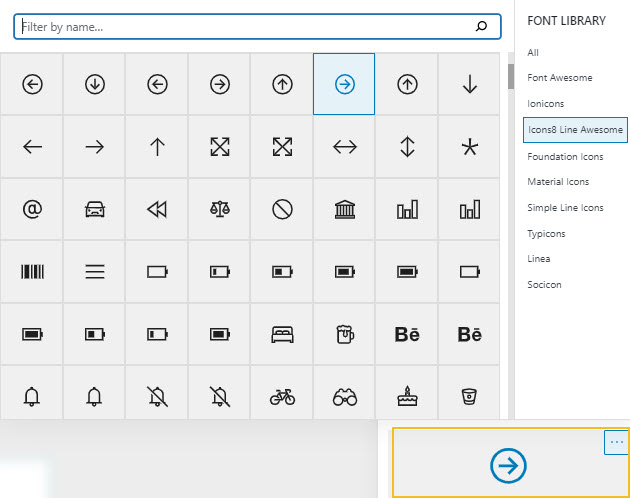
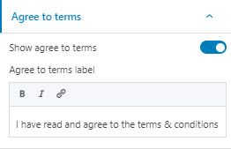
Agree to terms. If you switch on this option you will be able to paste your own agree to terms text. You can also add a link to your terms and conditions page.
Style
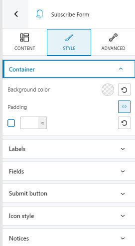
At this level you have the following options:
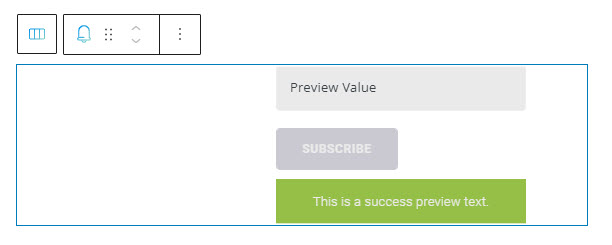
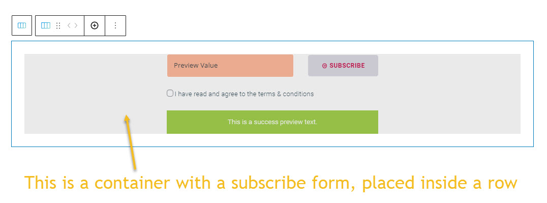
- Container. All the elements of the subscribe form are placed inside a container. In the screenshot below I have set up a gray background color for the container, so that you can notice it better. The container lays inside a row block. The edges you notice belong to the row.
At the container lever you can set up its background color, as well as paddings.
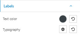
- Labels. Here you can change the label text color and typography.
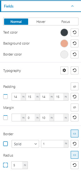
- Fields. Here you can make the following changes across the normal, hover, and focus states:
- changing the text, background and border colors,
- adjusting the typography,
- customizing margins and paddings,
- customizing a border.
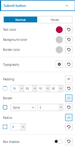
- Submit button. Here you can make the following changes in the normal and hover states:
- changing the text, background and border colors,
- adjusting the typography,
- customizing margins and paddings,
- customizing a border and box shadow.
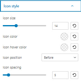
- Icon styling. At the content level you could add an icon to the submit button. Here, you can:
- Change the icon size. The maximum size is 50px.
- Customize the icon color and icon hover color.
- Position the icon before or after the button text.
- Set up the spacing between the icon and the button text, on a scale from 0 to 50 pixels.
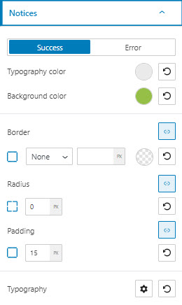
- Notices. Whenever a form is filled in or submitted, some notices can show up depending on the success or failure of the submission. Here you can style these notices as following:
- Typography and background color,
- Border customization,
- Typography styling.
Advanced
At this level, you can make edits across the container, fields, labels, submit buttons, icons, agree to terms, success and error messages, across various states (normal, hover, or focus). Here are the available customizations:
- Background. Here you can make adjustments to background color and type.
- Spacing. Here you can set up the margins and paddings for the subscribe form block.
- Border and shadows. Here you can add borders with a different color, radius and thickness to your block. Also, you can add box shadows. You have full control over the position, blur, spread, and color of the box shadow.
- Typography. You can set up a different font family, font size, and weight for the text. You can add decorations to text, set up capitalization, and adjust line height and letter spacing. When you select the “default” option you’ll be taken to the General Settings, where you can change defaults (color scheme, typography, etc.).
- Responsive. Here you can decide whether the block will show or not on desktop, tablet, or mobile.
- Miscellaneous. At this level, you can set up the z-index of your block (vertically order the elements that overlap), set up if the element overflows or not (displaying the content of the block flowing out of its container into the surrounding area), add HTML anchors and CSS classes.