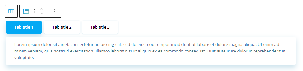
Tabs can be used for structuring information and making it more accessible. It allows you to group info under certain sections that are easy to navigate. You can drag the tab block to the section you want on your page from the block inserter, or add the block from any “+” sign on your canvas.
The tab block is available inside Kubio PRO.
When you select the tab block, you will see a toolbar showing up on top of it, with several basic editing options. In a previous chapter, we explained the common editing options for all blocks. In the case of the tab block, here are the ones that apply: positioning, duplicate, insert before, insert after, copy style, paste style, paste style and link, and remove block. The copy and paste styling options are available with the PRO plans.
Tab block: customizations within the block editing panel
The moment you select any block, the block editing panel will open up on the right-hand side. It always has three options: content, style, and advanced. The possibilities inside vary from block to block. Let’s look at what distinguishes the tab block from the rest of the blocks.
Content
By default, the tabs are set up horizontally. Inside “Content” you can make them vertical if you want. Now, here’s how you can make content changes to your tabs:
- Customize tabs width. You can have them stretched, full-width, or just leave them in the default auto.
- Attach icons.
- Add new tab items and their URLs. The tab titles are added in the Kubio editing panel, not directly on the website canvas.
The actual content of the tabs are in fact paragraph blocks, and can be edited as such.
Style
A tab is structured in tab items and their content. Tabs also have three states: normal, hover, and active. With Kubio you have full control over the tab styling for all three states. Now, here are the available customizations for the tab items:
- Tab background,
- Title color,
- Tab border,
- Typography,
- Text align.
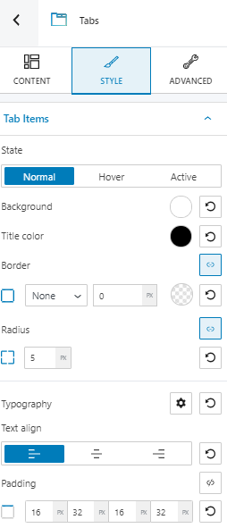
In the case of tab content, you can customize:
- Typography,
- Horizontal align,
- Padding,
- Content elements vertical spacing.
Here‘s more info on how to deal with customizing color and backgrounds.
Here‘s more info on how to customize typography.
Advanced
At this level, you can make edits across the:
- Container,
- Content,
- Tab bar,
- Tab items,
- Icons.
Below are the available customizations.
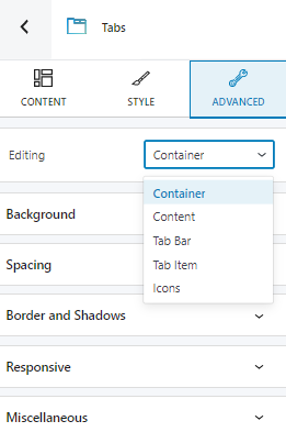
- Background. Here you can make adjustments to background color and type.
- Spacing. Here you can set up the margins and paddings for the tab block.
- Border and shadows. Here you can add borders with a different color, radius and thickness to your block. Also, you can add box shadows. You have full control over the position, blur, spread, and color of the box shadow.
- Responsive. Here you can decide whether the block will show or not on desktop, tablet, or mobile.
- Miscellaneous. At this level, you can set up the z-index of your block (vertically order the elements that overlap), set up if the element overflows or not (displaying the content of the block flowing out of its container into the surrounding area), add HTML anchors and CSS classes.