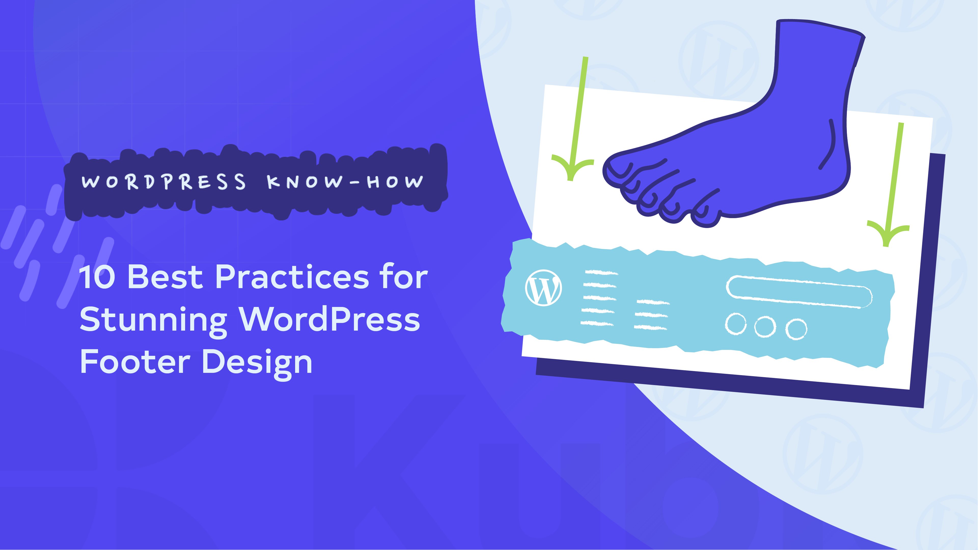
When it comes to web design, it’s easy to forget about the footer – but they are more important than you think. Studies show that 45% of users scroll to the bottom of the page. So, this means that a well-designed footer can be a powerful tool that can significantly enhance user experience and engagement.
Footers guide users who need a little extra help finding their way around your site and offer quick access to essential documents like privacy policies, which helps build trust. A smartly designed footer can also boost engagement by including calls to action, like newsletter sign-ups or social media links. It’s a subtle yet effective way to reinforce your brand identity and keep communication open with your visitors. Plus, from an SEO point of view, footers can help users discover more of your content by including links to key pages.
Many WordPress users struggle with footer design, often ending up with cluttered, ineffective sections. We want to share 10 best practices to turn your footer into an asset. Plus, we’ll show you how to implement these tips using Kubio’s customizable blocks, making it easy for users of any skill level!
10 best practices for crafting a stunning WordPress footer
The footer, the bottom section of your website that appears on every page, isn’t just a handy spot for links. It’s also essential for navigation, credibility, and user experience. Let’s take a look at these best practices so you can create a footer that looks great, enhances your site’s functionality, and boosts visitor engagement!
1. Include all essential information
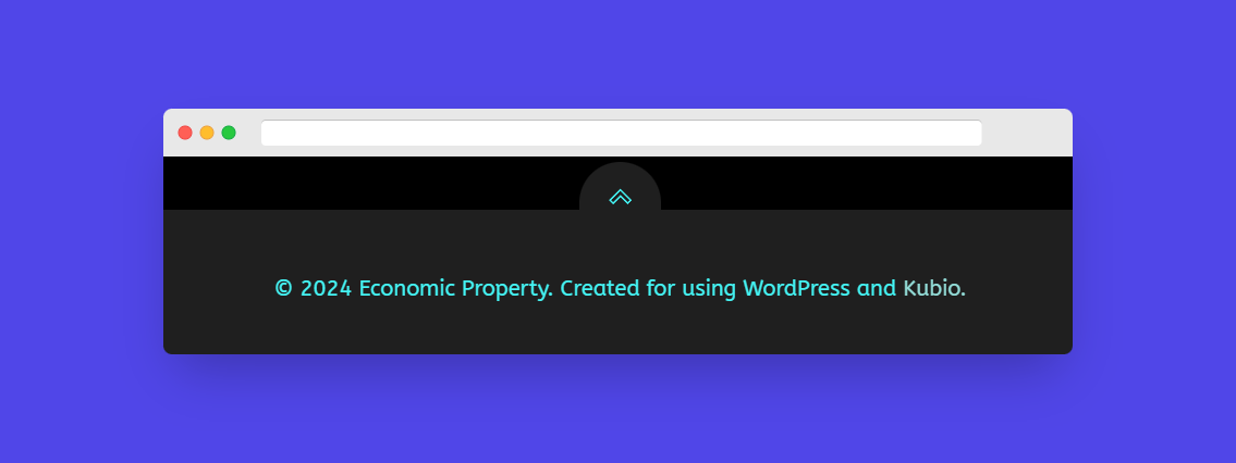
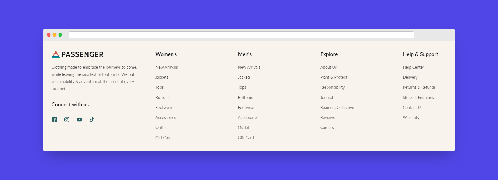
Your footer should cover the basics. Start with a copyright notice, like: ©[Year] [Your Company Name], to protect your content. Include links to your privacy policy and terms of use to build trust and meet legal standards. Make sure contact details are easy to find – whether it’s an email address, phone number, or a link to a contact form. Lastly, add a sitemap with links to key pages like About, Contact, and popular blog posts. This not only improves user experience but also boosts your site’s SEO too!
2. Showcase social proof
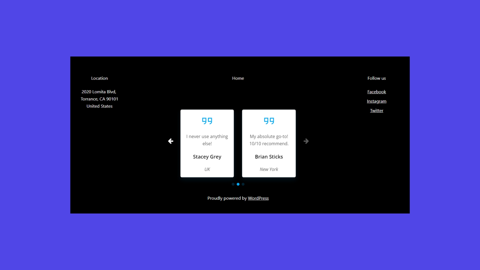
Boost your site’s credibility by adding social proof to your footer. Include social media icons linked to your active profiles, and feature a short, powerful customer testimonial. Display logos of media outlets that have featured you, along with client logos from recognizable brands you’ve worked with. Don’t forget to show off any awards or certifications relevant to your industry. These elements build trust with visitors.
? Idea: Think about adding a carousel testimonial feature to highlight multiple pieces of social proof without cluttering your footer’s design!
3. Include a prominent call to action

A strong call to action (CTA) in your footer can boost conversions massively. To make it effective, use action verbs like Subscribe, Download, or Get Started. Create a sense of urgency with phrases like Limited Time Offer, and keep your CTA short and snappy (2 to 5 words is ideal!) Make it pop by using contrasting colors or buttons that draw the eye. Tailor your CTA to what’s most relevant, whether it’s an email signup, a special offer, or a donation link.
? Idea: Try out different CTAs to see which resonates best with your audience – just because you choose one, doesn’t mean you have to stick with it if it isn’t working!
4. Ensure mobile responsiveness
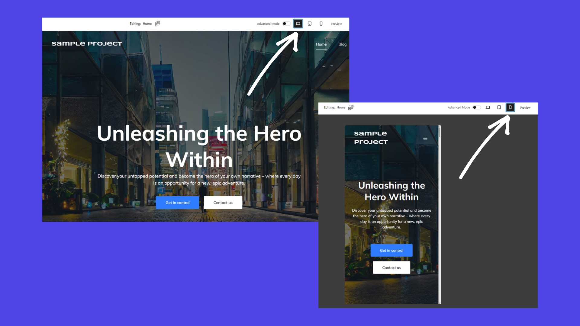
As mobile traffic continues to grow, it’s important that your footer works on all devices. Start by simplifying the layout with a single-column design for small screens. Make sure buttons and links are large enough to tap easily, and adjust font sizes so the text is readable without zooming. For longer content, consider using collapsible sections, like accordions, to keep things tidy. Finally, thoroughly test your footer on various devices and screen sizes to ensure it looks great everywhere.
? Insider knowledge: Kubio’s website builder offers built-in responsive design features, making it easy to customize your footer for different devices using the mode toggle in the editor.
5. Consider design and aesthetics
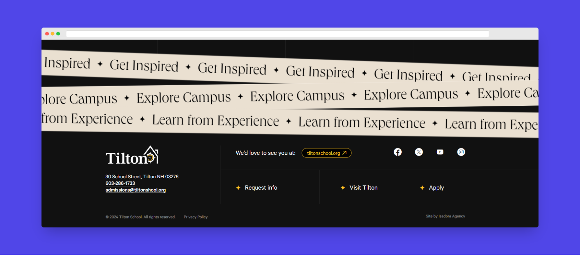
An attractive footer can improve your site’s overall design. Start by using whitespace to balance content and create a clean look. Choose contrasting colors to clearly separate the footer from the main content. Keep the design simple by avoiding clutter and focusing on readability with clear fonts and appropriate sizes. Establish a visual hierarchy by arranging elements to naturally guide the user’s attention.
6. Maintain consistent branding and design elements
Your footer should blend with the rest of your site, reflecting your brand’s identity just as clearly as your business cards or social media pages. Use your brand’s colors throughout the footer and match the typography with the fonts used across your site. Incorporate your logo to reinforce brand recognition, and make sure the overall design aligns with your site’s aesthetic. Keep the language in your footer consistent with your brand’s voice to maintain a cohesive and professional user experience.
Remember that consistency in these elements strengthens your brand and enhances the overall user journey!
7. Use different footers for different pages
Tailoring your footer to fit specific landing pages can significantly improve the user experience. For example, on product pages, include links to shipping information or return policies. On blog posts, think about adding related article suggestions or author bios. The contact page could benefit from additional contact methods or office hours, while the home page might feature a comprehensive sitemap or key service highlights. On the About page, include team members, social links, or company values.
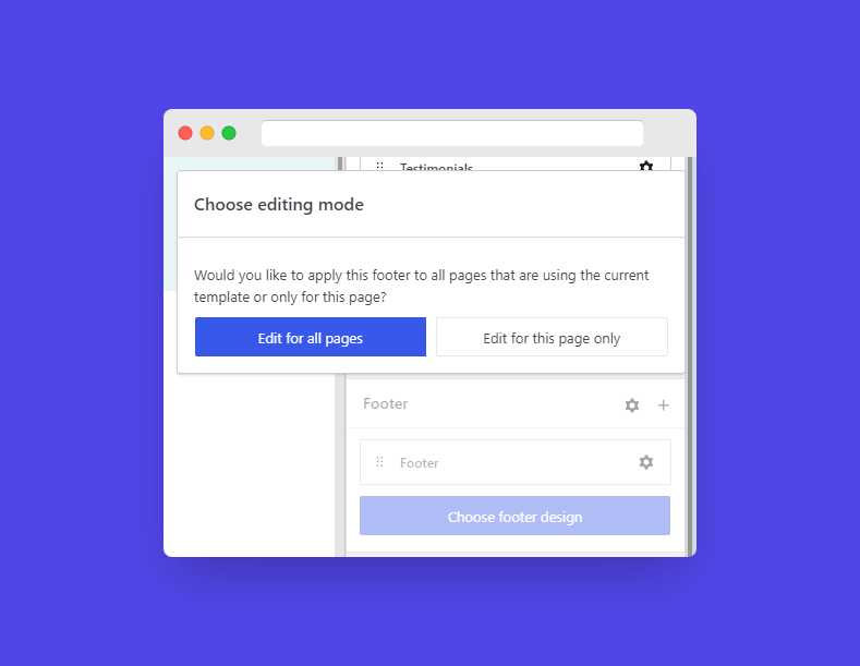
This strategy means visitors find the most relevant information easily, improving navigation and encouraging desired actions. In fact, with the Kubio editor, you can choose whether you want to edit for all pages or just edit the page you’re on!
? Quick tip: Try using a CTA that adapts based on the page content, making it more relevant and impactful for visitors.
8. Insert functional code snippets
Enhance your site’s functionality by adding specific code snippets to your footer. For instance, you can insert Google Analytics code to track visitor behavior or add a Facebook Pixel for ad tracking and retargeting. Integrating chat widgets can improve customer support with live chat options, while including GDPR-compliant cookie consent notices ensures legal compliance.
These simple additions can offer valuable insights and elevate the user experience. With Kubio, adding these code snippets to your footer is straightforward, even if you’re not very tech-minded.
9. Make sure the footer is accessible

An accessible footer is needed to ensure all visitors can navigate your site effectively. Start by using sufficient color contrast so that text is easily readable against the background. Implement proper heading structures with correct HTML tags for each section. Make sure keyboard navigation is enabled, with all links tabbable and focus states clearly visible. Use descriptive link text, avoiding vague phrases like “click here”. Finally, thoroughly test your footer’s accessibility with tools like WAVE to confirm usability for all users.
10. Review and update regularly
Regular maintenance is essential to keep your footer current and relevant. Start by updating the copyright year annually and review social proof elements to ensure they reflect your latest achievements. Check all links to make sure they’re functional, and update contact information as needed. Align the footer content with any changes in your business focus, and use analytics data to optimize its performance.
Set a quarterly review schedule to make sure everything stays accurate and valuable. Kubio’s user-friendly interface makes these updates simple, helping you maintain an effective footer that consistently serves your visitors well!
Step-by-step guide to customizing your footer design in Kubio Blocks
To implement the best practices for footer design, you’ll need a website builder like Kubio, making it easy to create and customize your entire website, including your footer, with a user-friendly interface that requires no coding experience. Its advanced features allow you to replace the default WordPress footer with a custom design using the footer template part.
Here’s a simple guide to customizing your footer in Kubio Builder:
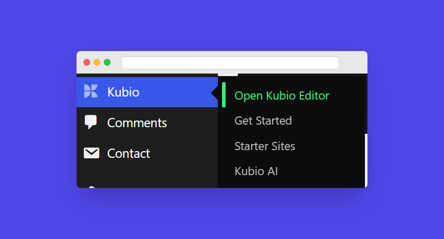
- From your WordPress dashboard, go to the Kubio Builder editor.
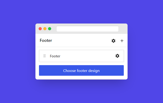
- In the page editing panel, find the footer section. If you’re using the free version, you’ll see that all pages share the same footer. With the Pro version, you can create and assign different footers to different pages, tailoring the user experience.
- Customize your footer:
- Start by choosing a footer layout from the available options. Kubio offers both single-column and multi-column layouts.
- Use Kubio’s drag-and-drop functionality to add text, images, links, social media icons, and other content blocks to your footer.
- Customize colors, typography, and spacing to align with your brand’s style. Kubio’s real-time preview allows you to see changes instantly.
- Kubio automatically adjusts your footer for mobile devices, but you can fine-tune it using the responsive design mode toggle.
- Before finalizing, preview your footer across different devices and screen sizes to ensure it looks perfect everywhere.
Kubio’s intuitive interface makes it easy to perform these customizations, helping you create a footer that not only follows best practices but also enhances your site’s overall design and functionality. Want to know more? Check out this video on how to create and customize footers in Kubio:
Streamline the process with AI-generated pages
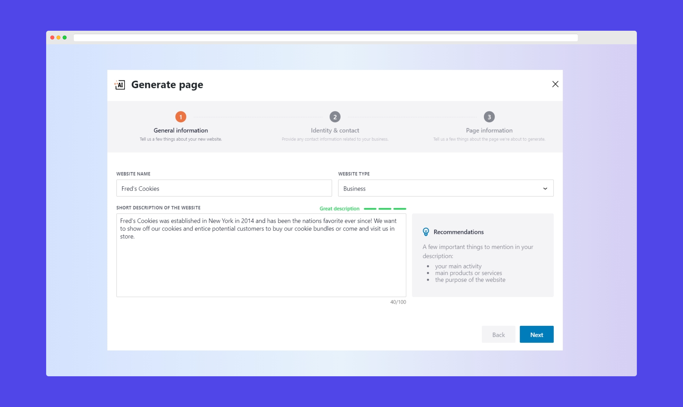
Kubio’s AI-powered page generation feature can significantly streamline your footer design process. To regenerate only the footer, simply hover over the footer section in the Kubio Builder editor and press the Regenerate button in the top right corner. Input your specific requirements, such as layout preferences, branding elements, and key content blocks. The AI will then generate a footer design based on your inputs (yes, it really is as easy as that!).
Once the footer is generated, you can review and customize it to match your site’s unique style and needs. This feature not only saves time but also provides valuable design inspiration, making it easier to create a professional-looking footer with minimal effort!
Elevate your WordPress site: Craft your perfect footer with Kubio Builder
Boost your WordPress site by transforming your footer with Kubio Builder. Kubio simplifies the process, making it easy to implement best practices and create a footer that’s not just functional but also visually appealing.
With Kubio’s user-friendly tools, you can enhance your site’s navigation, boost user experience, and maintain a cohesive brand presence. So, whether you’re looking to refresh an outdated footer or build a new one from scratch, Kubio gives you the power to craft a footer that truly stands out!Start redesigning your footer today with Kubio!


