The pricing table block allows you to show prices in a visually appealing way. Whether you are selling a SaaS product, event tickets, or just want to display pricing tiers, this block is what you need. Besides the actual prices, you can provide other useful product details, such as features, benefits, and more.
The pricing table block is available inside Kubio PRO.
You can drag the block to the section you want directly from the block inserter, or add the block from any “+” sign on your canvas.
The pricing block comprises several other blocks. You can remove or add new blocks to it. For example, the default Kubio pricing block looks like this:
Basic
For 1 Site
per month
Premium
For 4 Sites
per month
Advanced
For 100 Sites
per month
It combines the following blocks:
- Heading blocks for the tier names. Find out how to customize headings, here.
- A paragraph block below each heading, to provide further tier information. Find out how to customize paragraph blocks, here.
- Pricing blocks containing the offer across each tier. Find out how to customize the pricing block, here.
- Icon list with features/benefits details across every tier. Find out how to customize icon lists, here.
- Buttons with a call to action. Find out how to customize the button block, here.
When you hover over the elements in the table, you will notice “+” signs. As previously mentioned, they will open the block inserter. You can use it to add more blocks to the pricing table.
We’re using the Event PRO starter site for the following examples.
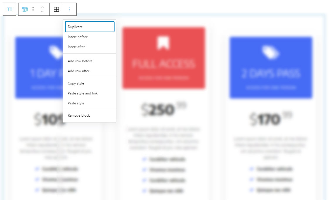
There’s a pricing table on the “Prices” page. Now, when the pricing table is selected, a toolbar shows up on top of it, with several basic editing options. In a previous chapter, we explained the common editing options for all the Kubio blocks. In the case of the current block, here are the ones that apply: positioning, duplicate, insert before, insert after, add row before, add row after, copy style, paste style, paste style and link, and remove block.
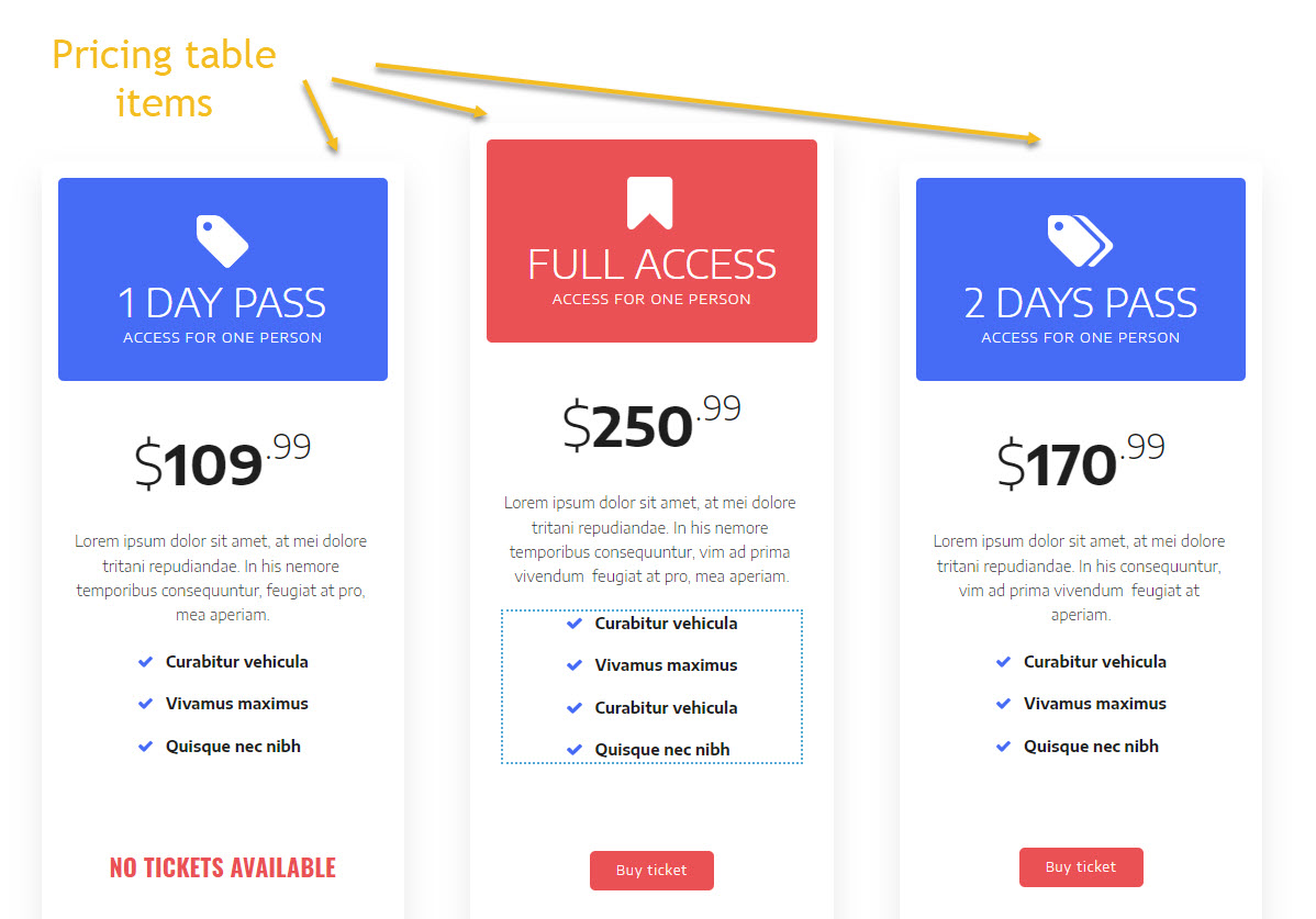
The pricing table is made of pricing table items. Each pricing offer will have its own pricing table item. These items are placed inside columns.
Each pricing table can be edited separately, see here how.
Now, let’s see how we can customize the pricing table inside the block editing panel.
So, the moment the block gets selected, you’ll notice a panel on the right with these menu items: Content, Style, and Advanced. Here you can transform the pricing table block anyway you see fit. Let’s go inside.
Content
Inside “Content” there are two types of edits that you can make: layout + spacing and alignment.
Let’s start with the layout customizations. At this level you can:
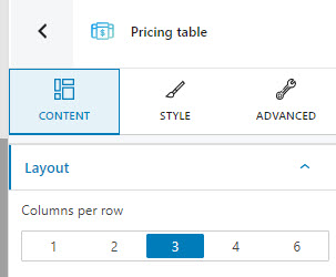
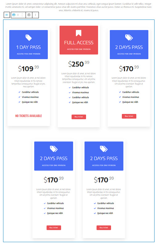
- Decide how many pricing items you want to place inside a row.
- Add new pricing items to the table. Use the “Add item” button for this. If you want to have 3 items on a row, but you add 5 items, the extra two items will form a second row, as shown below:
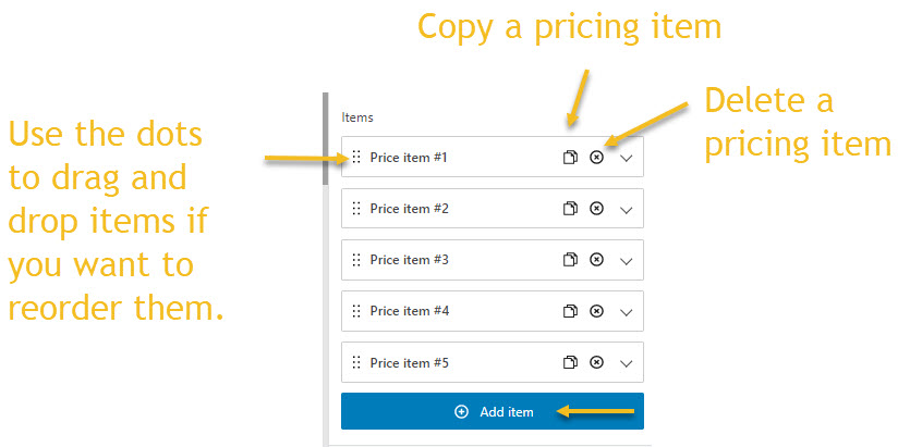
- Copy, delete, and reorder pricing items.
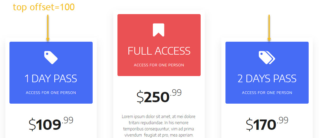
- Add a top offset for the pricing items. The value is between 0 and 100. It will add a space on top of the pricing item. In the example below the items no. 1 and 3 have a top offset of 100, the one in the middle has a top offset of 0.
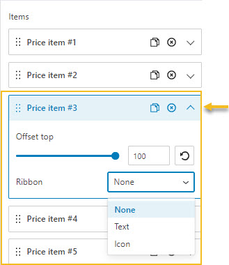
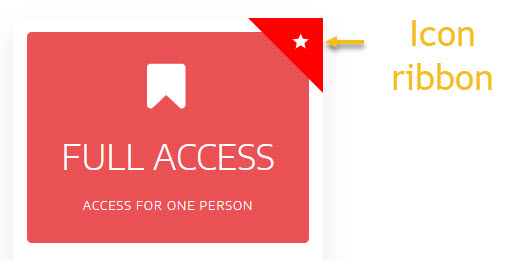
- Add a promo ribbon if you want to signal special offers. Use the dropdown at the item level arrow to see the option.
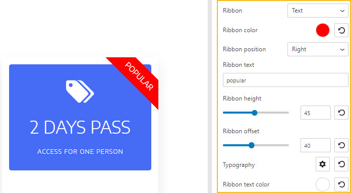
You can choose between a text or icon ribbon.
In the case of the text ribbon you can:
- Choose the ribbon color,
- Choose between a left or right position,
- Type the text you want to show on the ribbon,
- Specify the ribbon height. There’s a slider with values between 0 and 100, that you can choose from. The default option is 45.
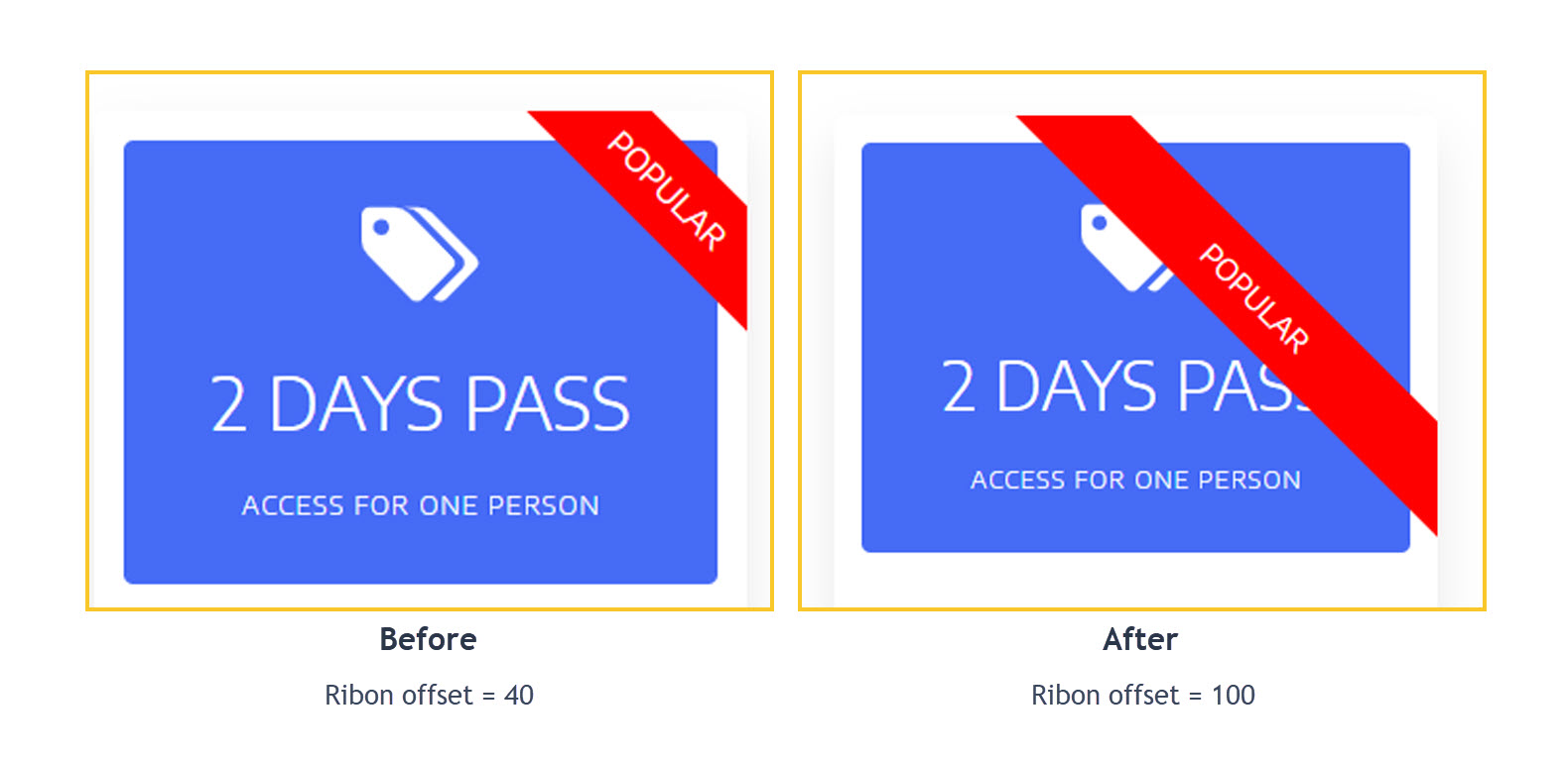
- Specify the ribbon offset. There’s a slider with values between 0 and 100, that you can choose from. The default option is 40. Below you have a comparison between the 40 and 100 ribbon offsets.
- Change the typography for the texton the ribbon. More details on how to make typography changes, here.
- Change the ribbon text color.
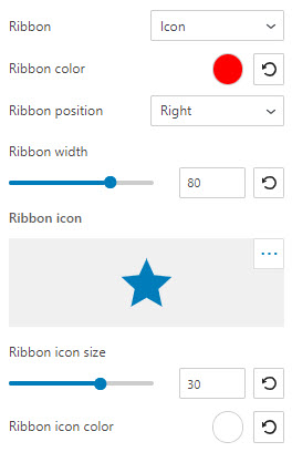
In the case of the icon ribbon you can:
- Change the ribbon color,
- Change the ribbon position to left or right,
- Customize the ribbon’s width. The maximum width is 120 px, while the default one is 80 px,
- Choose a different icon from the icon picker option. There are 8 libraries available,
- Customize the ribbon icon size. The maximum size is 50px, while the default is 30px.
Moving on to the spacing and alignment, here’s what you can customize:
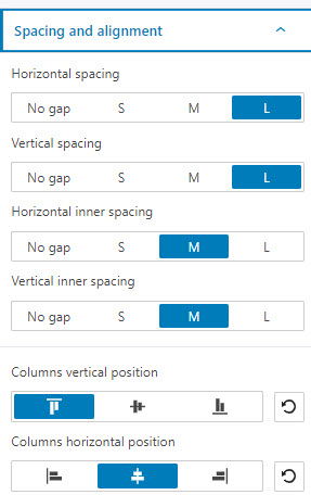
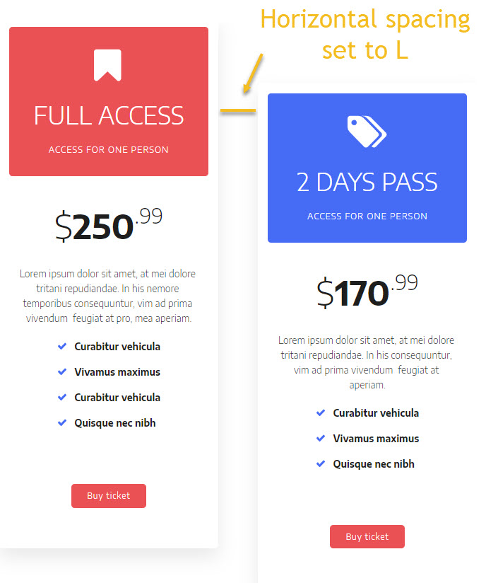
- Horizontal spacing. Use this option if you want to bring the pricing items closer together or spread them more. You can choose between no gap, small (S), medium (M), and large (L).
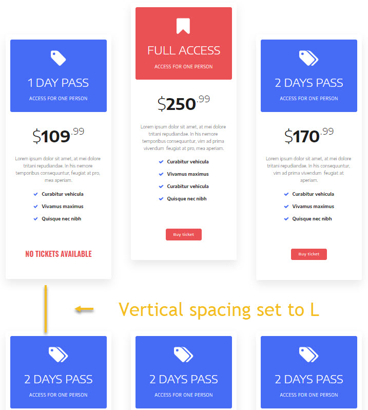
- Vertical spacing. Use this option to bring the content of a block closer to the top and bottom edges, or further from them. You can choose between no gap, small (S), medium (M), and large (L).
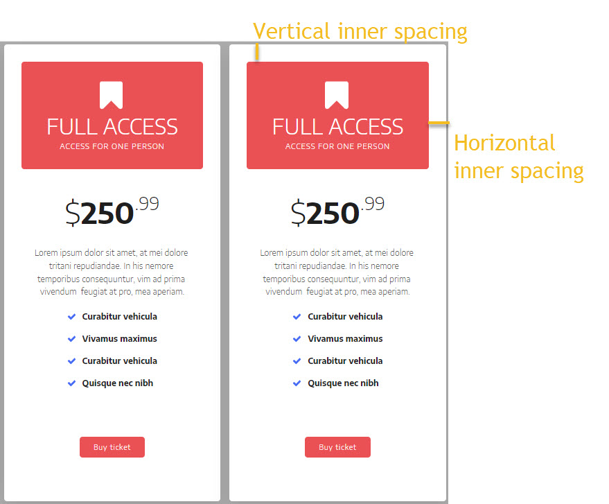
- Horizontal and vertical inner spacing. These settings allow you to control the distance between the edges of the pricing items and their content. This setup can be done at the pricing item level as well. When done so, it will override the settings done at the pricing table level. This is because child styling has priorities over parent styling. Find out more about child-parent relationships and element hierarchies, here.
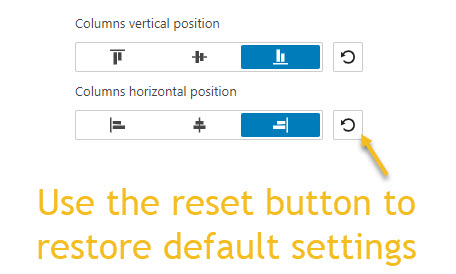
- Columns vertical position. With this option you can align the pricing columns inside the pricing table.
- Columns horizontal position. Let’s say you have 2 pricing items inside a table with 4 columns. You can use this option to move items to the left, center , or right.
Style
Inside the block editing panel, you can make the following pricing table styling adjustments:
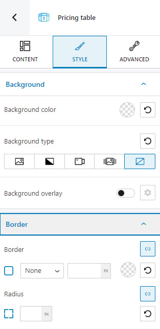
- Add a pricing table border. More info on how to customize borders, here.
- Select the background type,
- Set up the background color,
- Add a background overlay.
You can find here more info on how to make color changes and work with backgrounds and overlays.
Advanced
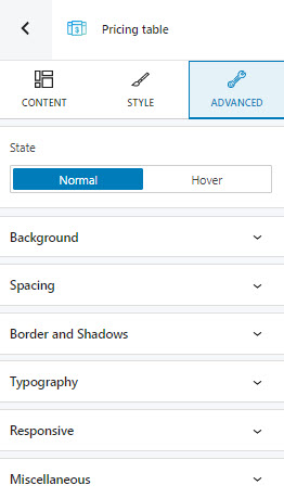
At this level, you can make edits for the normal, hover, and active states across the pricing table. Here are the available customizations:
- Background. Here you can make adjustments to background color and type.
- Spacing. Here you can set up the margins and paddings for the pricing block.
- Border and shadows. Here you can add borders with a different color, radius and thickness to your block. Also, you can add box shadows. You have full control over the position, blur, spread, and color of the box shadow.
- Typography. You can set up a different font family, font size, and weight for the text. You can add decorations to text, set up capitalization, and adjust line height and letter spacing. When you select the “default” option you’ll be taken to the General Settings, where you can change defaults (color scheme, typography, etc.).
- Responsive. Here you can decide whether the block will show or not on desktop, tablet, or mobile.
- Miscellaneous. At this level, you can set up the z-index of your block (vertically order the elements that overlap), set up if the element overflows or not (displaying the content of the block flowing out of its container into the surrounding area), add HTML anchors and CSS classes.
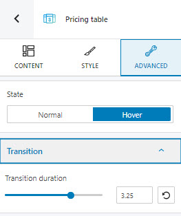
Now, let’s say you want a certain background color when the pricing table is in the normal state, and a different background color, when hovered. This means that a transition will take place when switching between states. You can set up a duration for the transition inside Advanced – > Hover -> Transition -> Transition duration. You can choose a value between 0 and 5 seconds, from the slider.
Customizing the pricing items
Now, I mentioned earlier that the pricing block is made of pricing items. These items can be settled separately. Let’s select an item. I like to use the breadcrumb view for this. I start by selecting any block inside the table. Let’s choose a heading. Now, head over to the bottom of the canvas. You’ll notice some breadcrumbs, they show you how content gets placed inside other content.
For example, our selected heading is placed inside a column, the column is placed inside a row, while the row is placed inside the pricing table item.
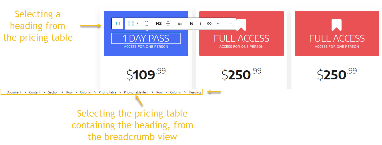
Let’s click on the pricing table item from the breadcrumbs view. Now that the selection is made, we can use the block editing panel on the right to make further edits. You can probably recognize the content, style, and advanced options. Let’s take them one by one.
Content
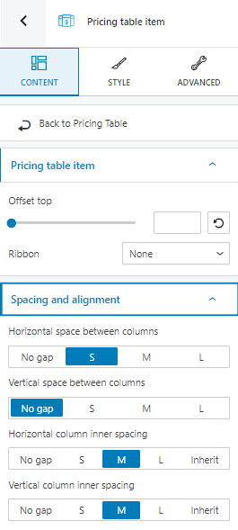
At this level you can:
- Add a top offset to the pricing item. This is explained above.
- Add a ribbon to mark special offers. You can use text or icon ribbons. We’ve mentioned above how ribbons can be customized,
- Customize the horizontal space between columns. Use this option if you want to bring the pricing items closer together or spread them more. You can choose between no gap, small (S), medium (M), and large (L).
- Customize the vertical space between the columns. If you have more rows with pricing items, you can use this option to bring the pricing items from adjacent rows closer together or spread them more. This option also brings the items closer or further from the edges of the table.You can choose between no gap, small (S), medium (M), and large (L).
- Horizontal and vertical inner spacing. These settings allow you to control the distance between the edges of the pricing items and their content.
Style
Inside the Kubio block editing panel, you can make the following pricing item styling adjustments:
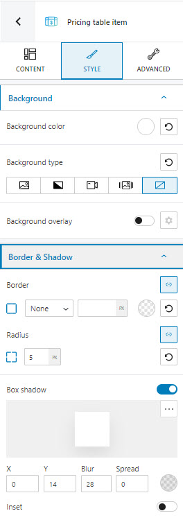
- Add a border. More info on how to customize borders, here.
- Add a border and/or a box shadow. More info on how to do this, here.
- Select the background type,
- Set up the background color,
- Add a background overlay.
You can find here more info on how to make color changes and work with backgrounds and overlays.
Advanced
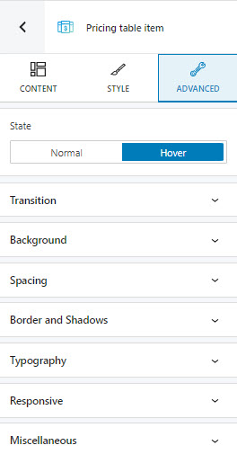
At this level, you can make edits for the normal, hover, and active states across the pricing table items. Here are the available customizations:
- Background. Here you can make adjustments to background color and type.
- Spacing. Here you can set up the margins and paddings for the pricing block.
- Border and shadows. Here you can add borders with a different color, radius and thickness to your block. Also, you can add box shadows. You have full control over the position, blur, spread, and color of the box shadow.
- Typography. You can set up a different font family, font size, and weight for the text. You can add decorations to text, set up capitalization, and adjust line height and letter spacing. When you select the “default” option you’ll be taken to the General Settings, where you can change defaults (color scheme, typography, etc.).
- Responsive. Here you can decide whether the block will show or not on desktop, tablet, or mobile.
- Miscellaneous. At this level, you can set up the z-index of your block (vertically order the elements that overlap), set up if the element overflows or not (displaying the content of the block flowing out of its container into the surrounding area), add HTML anchors and CSS classes.
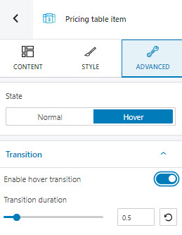
Now, let’s say you want a certain background color when the pricing table item is in the normal state, and a different background color, when hovered. This means that a transition will take place when switching between states. You can set up a duration for the transition inside Advanced – > Hover -> Transition -> Transition duration. You can choose a value between 0 and 5 seconds, from the slider.
Important! You can always revert any setting to its defaults using the reset button.