A form is made of form fields, form button, form submit button, and form reset button. You can define their overall style inside General Settings -> Form Elements.

The customizations can be made across the normal, hover, focus, and disabled states for the form fields, and buttons (form button, submit and reset buttons).
The below changes can be made for all the fields and buttons.
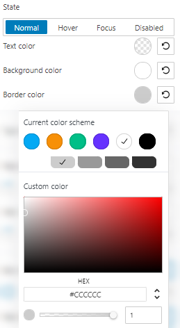
Changing the text, border, and background color

You can pick a color from the current color scheme, use the slider, or just type in your desired color code in the “HEX” field. Then, you can switch to the RGB color mode if it suits you better from the dropdown arrow.
You can also adjust the opacity. The slider offers you values from 0 to 1, where 1 means there’s no transparency.
Make paddings and margins changes
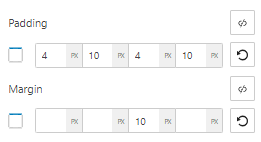
Paddings control the space inside an element, while the margins control the area outside a component.

You can set up the same padding or margin for top, bottom, left, and right in pixels (PX), or you can assign different values if you select the link symbol.
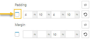
Now, pay attention to the rectangle on the left. The moment you select a space to assign a value, the rectangle will get a blue-colored margin. This is how you know which margin you are making changes to. The default margin order is top, right, bottom, left. So, in the example below, I am assigning 10 pixels for the padding on the right.

You can always go back to the initial setting if you hit the reset button.
Make changes to global borders
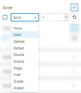
There are several border types that you can choose from.

You can assign a certain thickness in pixels to your border. For example, you can set up the same thickness for top, bottom, left, and right in pixels (PX), or you can assign different values if you select the link symbol.
You can also add a radius to your form element. Same as above, you can assign different values for top, bottom left and right, if you select the link symbol.

